7,382 search results
(0.072 seconds)
- Sign Stickers JNL by Jeff Levine,
$29.00 In the early 1960s, the Duro Decal Company of Chicago, Illinois added to its line of water-applied decal lettering a retail sign cabinet of die-cut, pressure sensitive vinyl letters and numbers. Four of the six sizes offered for sale were cut from white plastic with a black outline and a secondary gold inline for a tri-color effect. Sign Stickers JNL emulates as closely as possible the look of these nostalgic pieces, complete with the slight shifts in line weight due to hand-cut silk screens and the printing process. For those of you who prefer to make your own multi-colored letters, a three piece fill font set is available for the low price of a single font purchase. Combine the backfill, midfill and frontfill layers for a truly retro look!
 - Clari by Creative9,
$15.00 Meet "Clari" — where simplicity meets style. This user-friendly font effortlessly blends clarity and creativity. Perfect for sleek presentations, user-friendly websites, or captivating social media posts. Its modern design ensures your message is clear and impactful. Elevate your brand with "Clari" — simplicity at its best. Can be used for the design of poster, Big sale sign, greeting card , packaging designs, New Year design and so on with the winter season concept. Apart from that this font is very easy to use in both design and non-design programs because all alternates and glyphs are supported by Unicode (PUA). Features: - A-Z Character Set - Numerals & Punctuations (OpenType Standard) - Stylish and Fashionable - Multilingual Thank you
 - RePublic by Suitcase Type Foundry,
$75.00In 1955 the Czech State Department of Culture, which was then in charge of all the publishing houses, organised a competition amongst printing houses and generally all book businesses for the design of a newspaper typeface. The motivation for this contest was obvious: the situation in the printing presses was appalling, with very little quality fonts existing and financial resources being too scarce to permit the purchase of type abroad. The conditions to be met by the typeface were strictly defined, and far more constrained than the ones applied to regular typefaces designed for books. A number of parameters needed to be considered, including the pressure of the printing presses and the quality of the thin newspaper ink that would have smothered any delicate strokes. Rough drafts of type designs for the competition were submitted by Vratislav Hejzl, Stanislav Marso, Frantisek Novak, Frantisek Panek, Jiri Petr, Jindrich Posekany, and the team of Stanislav Duda, Karel Misek and Josef Tyfa. The committee published its comments and corrections of the designs, and asked the designers to draw the final drafts. The winner was unambiguous — the members of the committee unanimously agreed to award Stanislav Marso’s design the first prize. His typeface was cast by Grafotechna (a state-owned enterprise) for setting with line-composing machines and also in larger sizes for hand-setting. Regular, bold, and bold condensed cuts were produced, and the face was named Public. In 2003 we decided to digitise the typeface. Drawings of the regular and italic cuts at the size of approximatively 3,5 cicero (43 pt) were used as templates for scanning. Those originals covered the complete set of caps except for the U, the lowercase, numerals, and sloped ampersand. The bold and condensed bold cuts were found in an original specimen book of the Rude Pravo newspaper printing press. These specimens included a dot, acute, colon, semicolon, hyphens, exclamation and question marks, asterisk, parentheses, square brackets, cross, section sign, and ampersand. After the regular cut was drafted, we began to modify it. All the uppercase letters were fine-tuned, the crossbar of the A was raised, E, F, and H were narrowed, L and R were significantly broadened, and the angle of the leg and arm of the K were adjusted. The vertex of the M now rests on the baseline, making the glyph broader. The apex of the N is narrower, resulting in a more regular glyph. The tail of Q was made more decorative; the uppercase S lost its implied serifs. The lowercase ascenders and descenders were slightly extended. Corrections on the lower case a were more significant, its waist being lowered in order to improve its colour and light. The top of the f was redrawn, the loop of lowercase g now has a squarer character. The diagonals of the lowercase k were harmonised with the uppercase K. The t has a more open and longer terminal, and the tail of the y matches its overall construction. Numerals are generally better proportioned. Italics have been thoroughly redrawn, and in general their slope is lessened by approximatively 2–3 degrees. The italic upper case is more consistent with the regular cut. Unlike the original, the tail of the K is not curved, and the Z is not calligraphic. The italic lower case is even further removed from the original. This concerns specifically the bottom finials of the c and e, the top of the f, the descender of the j, the serif of the k, a heavier ear on the r, a more open t, a broader v and w, a different x, and, again, a non-calligraphic z. Originally the bold cut conformed even more to the superellipse shape than the regular one, since all the glyphs had to be fitted to the same width. We have redrawn the bold cut to provide a better match with the regular. This means its shapes have become generally broader, also noticeably darker. Medium and Semibold weights were also interpolated, with a colour similar to the original bold cut. The condensed variants’ width is 85 percent of the original. The design of the Bold Condensed weights was optimised for the setting of headlines, while the lighter ones are suited for normal condensed settings. All the OpenType fonts include small caps, numerals, fractions, ligatures, and expert glyphs, conforming to the Suitcase Standard set. Over half a century of consistent quality ensures perfect legibility even in adverse printing conditions and on poor quality paper. RePublic is an exquisite newspaper and magazine type, which is equally well suited as a contemporary book face. - Black Ocean by Fargun Studio,
$14.00 Introducing Black Ocean!! Handwritten font with quick dry strokes and a signature style. perfect for branding projects, home ware designs, product packaging or simply as a stylish text overlay to any background image or posters.
 - Sandria Script by Attract Studio,
$12.00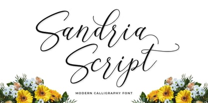 Introducing the latest styles Sandria Script, a sweet calligraphy font, casual and dynamic with a dancing baseline, This font can be used easily and simply, perfect for Branding, Logos, Greeting Cards, Wedding Stationery, Quotes etc.
 - Holywings by Fargun Studio,
$12.00 Introducing Holywings Font!! Handwritten font with quick dry strokes and a signature style. perfect for branding projects, home ware designs, product packaging or simply as a stylish text overlay to any background image or posters.
 - Asterism Clean by Great Lakes Lettering,
$30.00 Asterism Clean is the smooth lined version of Asterism. It is a calligraphy style font with a moving baseline and lots of shining personality. Also contains a bold and a monoline version. This hand written style font is based on one of Molly’s signature calligraphy styles and pairs beautifully with Frosted, Icing, Saint Agnes.
 - Magical Smiles by Tlatous Type,
$19.00 Introducing Magical Smiles by Tlatoustype A fancy and fun handcrafted font that create to impress your audience and make your branding shine. Make your projects dance with this elegant and wonderful font wherever you use it. Use it for your headings, logos, ads, printed quotes, packaging, and even your website or social media branding.
 - Print Shop Sorts JNL by Jeff Levine,
$29.00 Another collection of various stock cuts, cartoons, embellishments, sales helpers, decorations and borders comprise Print Shop Sorts JNL, with all of the images re-drawn from vintage sources.
 - Container Stencil JNL by Jeff Levine,
$29.00 Shipping stencils cut on an antique machine with its somewhat crude slab serif type design inspired Container Stencil JNL, and is available in both regular and oblique versions.
 - Printers Playtoys JNL by Jeff Levine,
$29.00 Printers Playtoys JNL is another set of vintage letterpress cuts and embellishments that have been carefully re-drawn and added to the growing collection at Jeff Levine Fonts.
 - TiedUp by Ingrimayne Type,
$9.00 TiedUp is a distortion of the font Ingone. I no longer remember which font distortion program or procedure I used to get this cut-up or ragged effect.
 - VT Showcard by VarsityType,
$15.00 This condensed block is a true knockout. VT Showcard is a heavy-hitting headliner with presence. Inspired by the boxing showcards of the 60’s and 70’s, VT Showcard towers over body copy and demands attention. This tall and mighty athletic display typeface features chiseled corners and subtle embellishments that reinforce a steady rhythm across its dramatic letterforms. With 7 weights, VT Showcard provides a versatility for sports headlines and similar projects.
 - Ardela Edge by EllenLuff,
$38.00 The altered cut glyphs feature as the capitals of the font; to sample the cuts and ligatures type in ALL CAPS in the Typetester. Ardela Edge is opentype in overdrive. Its a stylised geometric sans serif family with extreme cuts, sharp angles and multi-sensory interactive ligatures. Affected characters are spread into three upper-case only subfamilies, with distinct styles, and different personalities. The bold character breaks and considered ligatures create edgy, modern type that feels like bespoke typography. Ardella Edges three subfamilies appear as - X01, X02, X03 These three styles create thousands of combinations with options from super minimal to the more experimental. This is a hands on designer package, available in 9 weights, with italic and outline faces and as a variable font - each one containing over 550 glyphs. Full European latin based language support. Ardela Edge's three family concept means all character alternates are accessible to all, on any software. The cut glyphs feature as the CAPS of the font, whilst the unaffected letters appear as the lowercase. Many subtle ligatures are accessed by typing in all caps, however to access all ligatures requires software with opentype capabilities, such as Adobe Illustrator, Photoshop, InDesign or Inkscape.
 - Winterflows by Fargun Studio,
$12.00 Winterflows is a handwritten font with quick dry strokes and a signature style. It is perfect for branding projects, homeware designs, product packaging or simply as a stylish text overlay to any background image or posters.
 - Youra Script by Nandatype Studio,
$15.00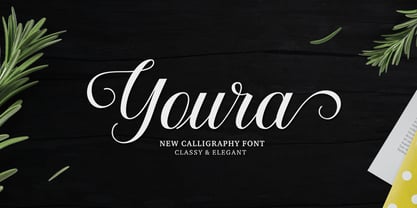 Youra is a simply beautiful, classy and elegant calligraphy font. Can be used for various purposes. such as logos, wedding invitation, t-shirt, letterhead, signage, posters etc. Features OpenType including alternates, ligatures and multiple language support.
 - Janger by Creativemedialab,
$18.00 Introducing Janger, a bold and fun display font. Janger features a reverse contrast style with a retro and psychedelic look that’s simply ideal for design such as posters, t-shirts, branding, heading, titles and many more
 - Violette Brush by Fargun Studio,
$12.00 Introducing Violette Brush Font!! Handwritten font with quick dry strokes and a signature style. perfect for branding projects, home ware designs, product packaging or simply as a stylish text overlay to any background image or posters.
 - Niva by PeGGO Fonts,
$29.00 Niva is a display family font with 6 typographical groups in 10 weights each one, including a standard version, 2 italic widths, an alternative version and true small caps with italic version too. The creative idea follows concepts like future, technology, science, the structural principle focus in simplify complex details on letterforms ‘clean corners’ giving a luminous and sophisticated design with a ‘technologique’ touch, built in legible proportions which works as well as ‘display (titles)’ and even at small ‘text’ requirements. Specially recommended to be applied on digital and prints contexts as magazines, books, printed ads, UI & website design, digital graphics, video and TV screen contents as videogames and mobile apps.
 - Assakita by Alifinart Studio,
$15.00 Assakita simplifies elegance into one truly outstanding handwritten font. It maintains its classy calligraphic influences while feeling contemporary and fresh. This versatility will appeal to a wide range of crafty ideas, from letterheads and titles, to stationery. This font is PUA encoded which means you can access all of the glyphs and swashes with ease. The Assakita font features beautiful and stunning Stylistic Alternates. You can access this feature through software that supports the OpenType Feature or can be accessed via the Character Map on Windows or Font Book on a Mac. Please note that the Stylistic Alternate features are also available on Multilingual Accents. Thank you. Alifinart Studio alifinart@gmail.com
 - Klemer Display by Prioritype,
$17.00 Klemer Display A typeface inspired by the psychedelic effect and simplified even more. Great for poster designs, logos, t-shirt designs or vintage and modern design themes. Features: Uppercase, Lowercase, Numeral, Punctuation & Multilingual. Multilingual contained: Afrikaans, Albanian, Asu, Basque, Bemba, Bena, Breton, Catalan, Chiga, Cornish, Danish, Dutch, English, Estonian, Filipino, Finnish, French, Friulian, Galician, German, Gusii, Indonesian, Irish, Italian, Kabuverdianu, Kalenjin, Kinyarwanda, Luo, Luxembourgish, Luyia, Machame, Makhuwa-Meetto, Makonde, Malagasy, Manx, Morisyen, North Ndebele, Norwegian Bokmål, Norwegian Nynorsk, Nyankole, Oromo, Portuguese, Quechua, Romansh, Rombo, Rundi, Rwa, Samburu, Sango, Sangu, Scottish Gaelic, Sena, Shambala, Shona, Soga, Somali, Spanish, Swahili, Swedish, Swiss German, Taita, Teso, Uzbek (Latin), Volapük, Vunjo, Zulu. Thanks :)
 - Mollis Gothic by Quatype,
$25.00 Mollis Gothic is inspired by medieval gothic calligraphy. The gothic calligraphy is classical and traditional, I want to add something modern to it. So the letters are simplified as lines and without the handwriting feel, just like a sans font. Meanwhile, the gothic calligraphy visual look remained. It expands the usage area because of the modern feel of this font, such as the package, titles, logo, poster design, etc. In September 2021, we created the thin weight. Although Mollis Gothic Thin is from the font family, the kerning set and capital letters’ height are not as same as the regular weight for suiting the thin font’s usage situation.
 - Bentwood by Paragraph,
$22.00 This font takes its name and the overall shape from modern bentwood furniture, namely Scandinavian designs since the 1940s. The curved corners of the letterforms are practically hyperbolic, to convey the tension and strength of the bent plywood. These curves are meant to appear more dynamic than circular or elliptical segments of traditional sans serif fonts. The letterforms are simplified, without extra corners, stems, connections or hooks, yet remain legible at any size. Now at version 2, Bentwood contains Central/Eastern European, Baltic and Turkish character sets and more ligatures with Open Type functionality. Some minor corrections were made to letter shapes and positions, as well as to kerning and spacing.
 - Sommet Slab by insigne,
$24.99 The Sommet family of typefaces has been updated with a new slab serif variant. Expanding on Sommet's successful design principals, Sommet Slab is there when you need more impact and power. Sommet Slab is available with six weights and complementary italics and plenty of OpenType features. Sommet Slab features a tall x-height, and its letterforms are compact, perfect for when layout space is at a premium. Over twenty OpenType alternate characters are available, including friendlier upright italic forms, and a unique simplified lowercase. Sommet Slab also includes oldstyle figures and small caps. Use Sommet Slab whenever you need a powerful and contemporary slab-serif.
 - SF Pastel by Sultan Fonts,
$10.00 About Pastel font family: Pastel font is a simplified Arabic digital Ruqah font, which adopts horizontal formatting characters, The font is available in two styles: Pastel Regular and Pastel Bold. The difference between the two fonts: The Pastel regular font has short ends, The Pastel bold has extended and extended characters. Pastel font for desktop applications Pastel is suitable for large display sizes, especially in the area of advertising, while still functioning well as a text face. The font includes a matching Latin design and support for Arabic, Persian, Kurdish and Urdu. Language families: Arabic, Persian, Urdu, Latin, Kurdish Designer: Sultan Maqtari Design date: 2020
 - Eurostile Candy by Linotype,
$40.99Eurostile Candy is a fun spinoff from Akira Kobayashi's Eurostile Next family. As the name implies, it is based on Eurostile but with many striking new features. Most obviously, the corners and joints have been rounded off to give it a more friendly and softer feel. On top of those changes, the main skeleton of many characters have been modified. Any extra strokes have been removed - such as in the a, s, or t - and joints have been simplified to create even more square shapes - like in the n and r. With these contemporary and futuristic-styled alterations, Eurostile Candy is a cool new design great for many display projects. - Geogrotesque Sharp by Emtype Foundry,
$69.00 Geogrotesque Sharp is a superfamily of seven widths and 99 styles, that puts together the work of a decade. Some design aspects has been simplified but without losing its soul, we have removed ink traps and rounded corners. This update lead Geogrotesque to another dimension, becoming more usable and less idiosyncratic. A Variable Font version is included with the family, or as a separate style. Despite being more web oriented, this new format has gained popularity in recent years, so we thought it was the right moment to launch a variable Geogrotesque. For more info visit emtype website or see the Geogrotesque Sharp PDF.
 - Whitenow by Proportional Lime,
$15.99 In the year 1528 Pierre Attaignant led a revolution in music printing. His method of once-press moveable type, greatly simplifying the original 3 impression process developed by Petrucci, remained in use till near the end of the 17th century. The method could only realize one line of music per staff, and the introduction of barlines as a common means of aligning multiple staves brought this method to a close after nearly two centuries of use. This font is meant to allow the printing of music using that method with the notation of that era. It is largely based on an exemplar printed by Snodham of London.
 - HGBGalaxo Line by HGB fonts,
$23.00 HGB Galaxo is a tribute to Othmar Motter (1927–2010), the Vorarlberg graphic artist and typeface designer, who designed very individual and perfectly crafted typefaces in the 1970's and later. (Motter Ombra, Motter Tectura ...)From a Motter sketch of 5 letters for a logogram, I derived a simplified letterform and developed all the necessary characters. Working on these glyphs and delving deeper into Motter's letterforms, the respect for the accuracy with which he drew his letters (in ink) grew more and more. The spiral resembles the shape of a galaxy, hence the name Galaxo. The font is suitable for retro, poster and logo design.
 - Sports Play JNL by Jeff Levine,
$29.00 Re-drawn and modified from a set of early 1900s die-cut sign letters, Sports Play JNL is a chamfered typeface with an inline that reflects sports-themed topics.
 - Direkta JNL by Jeff Levine,
$29.00Direkta JNL take the classic Art Deco influenced lettering of the 30s and 40s and adds a diagonal triangular cut into the letters, creating an air of forward movement. - Surface Stencil JNL by Jeff Levine,
$29.00 A hand-cut antique brass stencil for marking barrel tops of dill pickles was the source of inspiration for Surface Stencil JNL, available in both regular and oblique versions.
 - Anecdote JNL by Jeff Levine,
$29.00Anecdote JNL gives a serif treatment to Haute Couture JNL, which in turn was modeled after die-cut cardboard letters and numbers used for displays, signs and show cards. - Blado by Monotype,
$29.99Blado is the italic companion to Monotype Poliphilus, revived in the 1920s by Stanley Morison based on a type cut by Ludovico degli Arrighi for Aldus Manutius, around 1526. - Letterpress Nostalgics JNL by Jeff Levine,
$29.00 Classic print shop stock cuts, cartoons, embellishments and other assorted imagery are collected within Letterpress Nostalgics JNL to add "a bit of yesterday" to your print or online projects.
 - Rtoxina by FSdesign-Salmina,
$39.00 Rtoxina. Pixels get smooth. Rtoxina is a new member oft the Atoxina family with experimental character. This experimental pixelfont surprises with carefully rounded pixels. Avoid accidental cuts, using Rtoxina!
 - Feminine Grace by Objectype,
$20.00 "Feminine Grace Font" by Candi Erwanto from Objectype Studio is a perfect blend of elegance and simplicity. With its neat and legible serif style, it's ideal for creating elegant and feminine wedding invitations and print materials. Bring beauty and sophistication to your designs with "Feminine Grace."
 - Belgium by Craft Supply Co,
$15.00 Belgium Font Family is a modern serif font family whose design refers us to the style of modern sans serif. The distinctive features of Belgium Font Family are the relatively low contrast of strokes, the slightly squarish shapes of round characters and the emphasized business like simplicity.
 - Pixeloza 01 by Fontsphere,
$12.00 Pixeloza 01 is a pixel-style, grid-based, display typeface. Pixeloza 01 is available in two complementary options: Pixeloza 01 Regular and Pizeloza 01 Skewo Regular. It is distinguished by its simplicity and original form. It gives a lot of possibilities in creating unconventional, creative, unique projects.
 - Sapiens by Hemphill Type,
$25.99 Sapiens is a prehistoric font family characterised by simplicity & crudeness, as if carved out and assembled by our sapiens ancestors. The family is built with a rough edged style that evolves through various styles and becomes more legible while retaining the raw roots of its origins.