10,000 search results
(0.019 seconds)
- Bello Pro by Underware,
$50.00 Now check this, Underware’s blockbuster type, Bello. Bello Pro is a brush typeface for headline point sizes - it’s big & beautiful. Bello has lots of ligatures and start and ending swashes. They are automatic in Bello Script Pro, which is a cross-platform OpenType font with many OpenType features. Bello has Underware’s world-dominating Latin Plus character set, supporting a total of 219 languages (Latin 1 + 2 and beyond). After a period of hand sketching and lettering, Bello got two main styles: Script and Caps. These two fonts create a strong typographic contrast - while Bello Script Pro is flourished and flowing, Bello Caps Pro provides upright and sturdy capital lettering. As sturdy as brush lettering allows, of course. Careful spacing and kerning ensures* that Bello appears like fluently written handwriting. However, that’s not enough for a hand-lettered feel. Therefore Bello comes with a set of 64 ligatures. Some of them are typographic, some made simply to create a more intimate, natural impression. For the same reasons we have added a few ornaments and a set of snap-on beginning and ending swashes which attach to the lowercase letters of Bello. With Bello Words Pro you can add some two-color words in your text by the pre-designed word logotypes. Trust the brush! *So take care: use ‘metrics’, not ‘optical’ as a spacing setting in layout apps.
 - Yekuana Pro by Neo Type Foundry,
$28.50 Yekuana Pro is a typeface whose design is based primarily on the study of certain geometric ethnic ancestral Venezuelan signs, visually rich and originally used in the enrichment of various utilitarian objects with high symbolic and cultural content. It’s a family that is composed of 330 glyphs y of two weights, including Inline and Outline versions, Stylistic Alternates, Fractions, Ordinals and Ligatures. The combination of their styles through the use of layers by contrasting colors application of allows to obtain new interesting results. Its use is recommended for titles or short phrases and elements of oversized visual communication.
 - Palsam Pro by Abjad,
$110.00 Since the beginning, Palsam was intended to be a super multilingual family, with a real cursive Arabic companion, and a display cut. The typeface was designed to be used for setting text and titles of contemporary Arabic content, specially magazines, and websites. The Arabic and Latin scripts were designed at the same time, to make a true authentic bilingual typeface. Both scripts have affected each other in several ways through the entire design process, which happened within ten years. Palsam has an inviting, approachable, fashionable and humanist look. Thanks to its low contrast, open apertures, detailed calligraphic strokes, and smooth counters, which also make it easy to read at smaller sizes. The main highlight for Palsam was the Cursive companion. For the first time, the calligraphic Ijaza style was used as a model for designing the Arabic cursive. Since the Ijaza is a hyper combination of Naskh and Thuluth, which makes it perfect to be a companion for the upright Naskh. Moreover this script was used in margins, and to highlight specific content inside a paragraph in older manuscripts. With true cursive companions in five weights, and many opentype features, Palsam grants all the tools needed to set complex information and editorial designs applications. More than 1000 characters are included per weight, including small caps, fractions, old style and lining numbers, ligatures, contextual ligatures, and discretionary ligatures. It supports over 40 languages that use the Latin extended, as well as Arabic, Farsi, and Urdu Languages. The latin script was designed in collaboration with the Slovenian type designer Alja Herlah.
 - Borough Pro by The Type Fetish,
$45.00 Inspired by a hand painted sign from Lanesboro, MN. Borough is an OpenType font that contains four variations of every character in its extended character set. Using Contextual Alternatives in OpenType savvy applications will allow the font to rotate through the variations to give a more random look to the text.
 - Curely Pro by Konstantine Studio,
$15.00 Start from the idea of our free font, Curely, which has hit the milestone - a 70K project views on Behance and a thousand times more download (still going). Now we came up with the Pro version of it. More complex, more features, and absolutely more playful. So, please welcome, Curely Pro. A Versatile casual handmade decorative lettering typeface. Still inspired from the girly things and cuteness overload in every letters. Perfectly fit for your cute, sweet, lovely, and casual branding or logo project. Or any design stuff that need a lovely cute touch on it, let the Curely Pro smooch it all the way baby!
 - Economica PRO by Underground,
$29.90 Economica Pro is a font specially developed for printing complex situations. It has been tested successfully in very small sizes without losing legibility. It's ink traps ensure its smooth operation even in low quality papers. Ideal for newspapers.
 - Astaire Pro by Hackberry Font Foundry,
$24.95 This is a deco-style text OpenType Pro font loosely based on Koch's Locarno as seen in KochAltschrift a recent free German tribute to Koch's work. I was familiar with Meek's Letraset presstype version called Locarno, but I never liked the proportions used by either Meeks or Koch. So I radically revised ascender, descender, and x-height to make them more usable and brought the shapes within my sense of design. Mine is probably closer to Meeks than Koch, but hopefully it is a tribute to both. Astaire looks much more modern and it is much more usable. I added oldstyle figures, small cap figures, small caps, several ligatures, and more. There are an italic, bold, and bold italic also in this family
 - Fry Pro by omtype,
$37.00 The typeface Fry was developed in 2008 specially for the Sky-Fish company (fish and seafood dealer). This type is designed for small texts and has a friendly and a fairytale historic flavor. Fry takes the openness and dynamism of humanistic sans serif, the simple and softness of lubok’s letters (primitive style) and the fluidity of shallow marine fry. Despite its funny style, Fry works well even in the 5 point size. In large sizes Fry demonstrates its originality, vivacity and softness, in the small characteristics become less visible, and Fry’s readability becomes more important. This makes the typeface suitable for many tasks of typography. The typeface includes extended set of Latin, Cyrillic and Greek, old style and lining figures, historical alternates and special local features. The combination of lubok’s aesthetics and funny dynamic forms make a nature of Fry. Fry was exhibited on Svjato Cyrillic (Kharkov, Ukraine) festival in 2008. It was awarded for excellence in type and graphic design at Modern Cyrillic 2009 competition. Also it received the second prize in display category at Granshan 2011. Fry was selected among 50 typefaces for the Call for type exhibition in the Gutenberg museum (2013).
 - Little Days - Unknown license

- KG Shadow of the Night - Personal use only

- Airplanes in the Night Sky - Personal use only

- Alpha Flight Solid Small Caps - Unknown license

- 10.15 Saturday Night R BRK - Unknown license

- 10.15 Saturday Night [R] (BRK) - Unknown license

- Tecna Dark Right Triangle BNF by Descarflex,
$30.00 The Tecn@ Dark&Light Triangle Background Nomenclature Font family is differentiated by the direction of the triangle tip in the 4 cardinal points. The family were designed to head, enumerate, indicate or highlight writings or design plans, for this reason, the characters are available only in capital letters and some signs or symbols that can serve such purposes. A triangle or empty character is included so that the user can use it overlaying any character of his choice or to be used alone.
 - Kawaii Food Font - Personal use only

- LDJ Knick Knack by Illustration Ink,
$3.00This fun font will get you singing that old favorite song ... It's fun. - Dine And Dance JNL by Jeff Levine,
$29.00 Sheet music featuring a song from the 1933 film "Torch Singer" starring Claudette Colbert was the basis for Dine and Dance JNL. A multi-line Art Deco design, it epitomizes both the typographic style and the night life of the time, when supper clubs featuring big bands were at their peak. Torch Singers were female vocalists who typically sang melancholy love songs of lost love and heartbreak.
 - PALMSPRINGS PERSONAL USE - Personal use only

- Nuixyber Pro Convert - Personal use only

- Source Code Pro - 100% free

- Dot.com Reverse Pro - Unknown license

- PR8 London Ads - Unknown license

- Wolf's Bane Pro - Personal use only

- VTC Letterer Pro - Unknown license

- Amiga Forever Pro - Unknown license

- Schnebel Slab Pro by URW Type Foundry,
$35.99 The refreshingly clear Antiqua Schnebel Slab is a refreshingly clear and strong interpretation of a contemporary Antiqua with subtle contrast and firm serifs, which offer excellent readability at very small size, and, at the same time, provide a lot of expression for use in headlines. The italics, drawn specifically for this purpose, contribute to a harmonious picture, which never loses creative tension, thanks to its aesthetics. The careful addition of ligatures, small caps, and proportional and old-style figures allows for well-proportioned typesetting. The condensed and expanded variants, which also come in 6 weights each, offer plenty of freedom to design with numerous combinations. Schnebel Slab Pro combines especially well with Schnebel Sans Pro.
 - Chocolate Box Pro by CheapProFonts,
$10.00 The lowercase has classical Roman letterforms, and together with the cute, swirly capitals they make for a slightly more feminine take on the genre. Trajan lettering - with added sugar! ALL fonts from CheapProFonts have very extensive language support: They contain some unusual diacritic letters (some of which are contained in the Latin Extended-B Unicode block) supporting: Cornish, Filipino (Tagalog), Guarani, Luxembourgian, Malagasy, Romanian, Ulithian and Welsh. They also contain all glyphs in the Latin Extended-A Unicode block (which among others cover the Central European and Baltic areas) supporting: Afrikaans, Belarusian (Lacinka), Bosnian, Catalan, Chichewa, Croatian, Czech, Dutch, Esperanto, Greenlandic, Hungarian, Kashubian, Kurdish (Kurmanji), Latvian, Lithuanian, Maltese, Maori, Polish, Saami (Inari), Saami (North), Serbian (latin), Slovak(ian), Slovene, Sorbian (Lower), Sorbian (Upper), Turkish and Turkmen. And they of course contain all the usual "western" glyphs supporting: Albanian, Basque, Breton, Chamorro, Danish, Estonian, Faroese, Finnish, French, Frisian, Galican, German, Icelandic, Indonesian, Irish (Gaelic), Italian, Northern Sotho, Norwegian, Occitan, Portuguese, Rhaeto-Romance, Sami (Lule), Sami (South), Scots (Gaelic), Spanish, Swedish, Tswana, Walloon and Yapese.
 - Schuss Slab Pro by typic schuss,
$42.56 I was working about 10 years exclusively for a type company. Based on my experiences, I built this superfamily. Schuss™ Sans PCG is a humanistic sans-serif with a little contrast. Small Caps, greek and cyrillic are included. Also tab, prop, lining, old style and small cap figures. It's a typeface with clear and open characters. All complicated shapes are cleaned and simplified with a bit elegance. Schuss™ Slab Pro is a slab serif, based on the Schuss™ Sans. Schuss™ News Pro is the modeled style between Schuss™ Slab Pro and Schuss™ Serif Pro. Schuss™ Serif Pro is the antiqua shape. Additionally all serifs are cleaned up. There is just one-side-serif in the "n" for example. Tab figures (except small caps), mathematical signs and currency symbols have a width system accross all styles and weights.
 - Iwata Kyokasyo Pro by IWATA,
$199.00 児童教育のためにトメ、ハネ、ハライ、筆順や画数を明確にした書体です。 教育用書籍だけでなく、様々な書籍にもご使用いただけます。
 - Appetite Pro Rounded by Serebryakov,
$39.00 Appetite Pro Rounded is an extension of the world wide popular display fonts Appetite Pro (2016) and Appetite Rounded (2011). Appetite Pro Rounded consists of 10 weights — 5 regular and 5 italic — from Light to Heavy. It’s a multilingual and international rounded font, with a full western latin, cyrilyc (russian, belarusian, ukrainian) and basic Greek support. Appetite Pro Rounded font family special designed made in addition for Appetite Pro. Due to the 10 weights rounded font and 10 weights normal weights palette you can solve a wide variety of professional problems without spending money on extra fonts for titles, sub-titles and main text.
 - Nexus Typewriter Pro by Martin Majoor,
$49.00 Nexus (2004) consists of three matching variants – a serif, a sans and a slab – which makes it a highly versatile typeface. Nexus started as an alternative to Seria, a typeface Majoor had designed some 5 years earlier. But soon the design developed into a new typeface, with numerous changes in proportions and in details and with a redrawn italic. Besides the three connected versions (Nexus Serif, Nexus Sans, Nexus Mix) Majoor designed a monospaced version called Nexus Typewriter. The Nexus family is a workhorse typeface system like Scala, with features such as small caps in all weights, four different sorts of numbers and an extensive set of ligatures. All fonts in the Nexus family come in regular, italic, bold and bold italic. Free bonus: there are more than 100 elegant Swash italics and dozens of arrows and other icons. The Nexus family was awarded the First Prize at the Creative Review Type Design Awards 2006.
 - Economica Cyrillic PRO by Underground,
$29.90 Economica Pro is a font especially developed for design in complex situations: It is ideal for use in small sizes on screen and in print. It has been tested successfully for use in very small sizes without losing legibility. Its ink traps ensure smooth operation even on low quality papers. It is an ideal font for newspapers, news portals and all designs requiring space saving. Now also in Cyrillic!
 - Laureen pro Arabic by Zaza type,
$29.00 Laureen pro typeface Laureen pro is an Arabic typeface that has a very particular appearance. It combines the characteristics of different genres; most notably the contrast of serif faces. While its design is influenced by Kufic and the Naskh style. Laureen pro consists of two typefaces, text and display, and 4-weights. It’s a perfect choice for bold headlines, oversize typography, fashion logos, branding, identity, website design, album art, covers, posters, advertising, etc.
 - Fontleroy NF Pro by CheapProFonts,
$10.00 I have completely redone the spacing in this font, making the sidebearings more conventional. And after replacing the kerning with fresh pairs working together with the new spacing the font looks like a real gem. I love it! The inline version has a wider spacing after the letters CEK = no connecting words. Otherwise just as lovely and retro! Nick Curtis says: "Here’s a strange hybrid: I took the lower case from the formal script font Stuyvesant, straightened out its rather extreme 22° slant, and combined them with caps from the font Bellevue, again making them upright, and adding an inline effect. The result is a font that flows very nicely, with a nice balance between clean lowercase characters and swashy caps. Thanks to Deb Dunbar for naming this font. Fontleroy Brown is the solid version, produced at the request of the King of Ding, Jeff Levine." ALL fonts from CheapProFonts have very extensive language support: They contain some unusual diacritic letters (some of which are contained in the Latin Extended-B Unicode block) supporting: Cornish, Filipino (Tagalog), Guarani, Luxembourgian, Malagasy, Romanian, Ulithian and Welsh. They also contain all glyphs in the Latin Extended-A Unicode block (which among others cover the Central European and Baltic areas) supporting: Afrikaans, Belarusian (Lacinka), Bosnian, Catalan, Chichewa, Croatian, Czech, Dutch, Esperanto, Greenlandic, Hungarian, Kashubian, Kurdish (Kurmanji), Latvian, Lithuanian, Maltese, Maori, Polish, Saami (Inari), Saami (North), Serbian (latin), Slovak(ian), Slovene, Sorbian (Lower), Sorbian (Upper), Turkish and Turkmen. And they of course contain all the usual “western” glyphs supporting: Albanian, Basque, Breton, Chamorro, Danish, Estonian, Faroese, Finnish, French, Frisian, Galican, German, Icelandic, Indonesian, Irish (Gaelic), Italian, Northern Sotho, Norwegian, Occitan, Portuguese, Rhaeto-Romance, Sami (Lule), Sami (South), Scots (Gaelic), Spanish, Swedish, Tswana, Walloon and Yapese.
 - Faber Sans Pro by Ingo,
$42.00 A classic-modern sans serif appearing in two forms — ”standard“ and a ”stylistic alternate“ with uncial script-orientated characters which give the font a completely different ”look.“ Faber Sans is a sans serif in the classic-modern style of type creations of the early 20th century — godfathered by Futura from Paul Renner and Gill Sans from Eric Gill. Unlike classic sans serifs, Faber Sans includes a ”true“ italic. Faber Sans Pro will perfectly pair with the accompnying Roman Faber Serif Pro.
 - SF Droob Pro by Sultan Fonts,
$19.99 Droob Pro is a Latin Arabic typeface for print and web, an upgraded version of the Droob7 font, featuring clarity and high readability. The Droob Pro font family contains two weights: Regular and Bold. This font supports Arabic, Latin, Farsi, Urdu, and Kurdish.
 - Railroad Gothic Pro by Red Rooster Collection,
$60.00 Railroad Gothic Pro is a condensed, sans serif typeface, exclusively licensed from the Ludlow Collection. The original Railroad Gothic was produced by Ludlow in the early 1900’s, and Steve Jackaman (ITF) produced the digital version in 2017. The font provides support for Latin 1, Central, and Eastern European languages, and Cyrillic. Railroad Gothic Pro is reminiscent of typefaces used in 1900’s railyards, hence the name.
 - Arthouse Display Pro by FHFont,
$19.00 Arthouse is a display font with a vintage style. It includes OpenType features such as standard ligatures, discretionary ligatures, stylistic sets, decorative elements, and is suitable for various designs, and weddings, events, t-shirts, logos, badges, stickers, and awesome work.
 - Iwata GMincho Pro by IWATA,
$199.00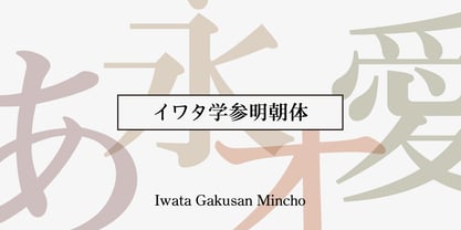 教科書や参考書、問題集などの教育教材作成のために開発された明朝体です。 筆やペンの入り、押さえ、ハネ、トメ、筆順などを理解しやすいようデザインしています。


