10,000 search results
(0.072 seconds)
- Blacklist by Great Studio,
$18.00 Blacklist is a high-contrast typography inspired by transitional and contemporary typography. Fonts extend their use by giving weights ranging from thin to black. The natural curve, a swollen and sloping stem, grows in character as the font gains weight. While the thinner weight has lowered contrast and optical correction to create a warm and soft look. Featuring beautiful italics, excellent weight and extensive language support. Blacklist excels in display settings such as headlines, titles, branding projects, Logo design, packaging, magazine headings, advertising, short or long text. Blacklist also comes with two versions of Variable Regular and Italic to make it easier for designers to explore and perfect beautiful designs, unearthing lots of visual tones and hidden secrets.
 - Sispectly Harmonies Italic by suhadidesign,
$15.00 Sispectly Harmonies classic and nostalgic serif Hi ladies and gentlemen! In accordance with market demand for classic retro design fonts, I created a serif font that suits your views. The Sispectly Harmonies font is a classic nostalgic serif font. is here to become a market favorite. We made this font look elegant, classy, easy to read, stylish, attractive and easy to use. Sispectly Harmonies Font is a great choice for retro designs, logos, magazines, classic, classy designs, newspapers, modern, books, brand names, branding, and other projects. The Sispectly Harmonies font is here to enhance the quality of your designs. Follow us for the next classy font creation :) Feature: • Uppercase • Lowercase • Regular version • Italicized version • Multilingual Support • Numbers and punctuation
 - Kondes by Tour De Force,
$25.00 Kondes is our "101 Dalmatians" – it's 101th release in our catalog! And it is the 1st one that belongs to variable typefaces. Kondes (which is made up word as mixture of "condensed" and "kondezovan" on Serbian) is simple, compact, straight-in-your-face sans serif family with 9 weights and 9 Italics. It was designed with purpose to serve and to be use in any project, from editorial to website. For example, Black weight could be used effectively as poster type, in big sizes while Regular fits perfectly as main webfont. Stem joining is done with generous ink trap that divides and opens letter contours, so letter breaths in smaller sizes. Contains extended Latin character set. Enjoy!
 - HS Alhandasi by Hiba Studio,
$59.00 HS Alhandasi is an Arabic display typeface. It is useful for book titles and graphic projects where a contemporary, streamlined look is desired. The font is based on the simple lines of modern and simplified Kufi calligraphy, that support Arabic, Persian and Urdu. This font was created in the beginning as regular weight in 2007 for use in technical and engineering company. The company tends to follow the geometrical shape with equal dimensions in both vertical and horizontal storks. There is also a tendency to make all characters to be similar to oval shape with the impression that they are all geometrical and clear. I followed that with two other weights in 2011, thin and bold.
 - VTC AntiqueFizz - Unknown license

- CA Capoli by Cape Arcona Type Foundry,
$29.00 CA Capoli is a fine script typeface with a vintage touch. Perfect for illustrative titles or logotypes. It comes in two styles, Regular and Stroke. The inspiration came during our trip to Italy, where we took a short rest in a bar during a hot day. We discovered a simple ceramic ashtray on the table. The word “Nido” was inscribed in a typeface that looked like it dated back to the 1950s. We made some investigations about the word, its meaning and origin but it still remains a big mystery. Was it the name of a hotel or a restaurant or some vintage Italian cigarettes? We don’t know. We were so amazed about the design of the logo that we decided to create a typeface out of it. A sophisticated endeavor because we just had four letters. How could the rest of the letters – if it ever existed – have looked like? Our hypothesis is CA Capoli. A typeface with a full Central European character set and some nice alternative letters to chose from. When we thought about “Nido” and its possible derivation of hotel business, we felt like creating a small side project for this typeface, a brand for a fictional hotel called Hotel Capoli with business cards, letterheads, a reception book, key fobs and embroidered patches for the service dress of the hotel service stuff. The Hotel Capoli is located at the wonderful beach of Cape Arcona on the fictional country of Arcona Islands where our type foundry is located.
 - The FT Ornamental font by Fenotype is a true celebration of intricate design and decorative flair. It stands as a testament to the exquisite craftsmanship of typography, where every character and gly...
- Soft Mouth by Alit Design,
$20.00 Introducing the stunning "Soft Mouth Victorian Typeface," a font that encapsulates the essence of Victorian elegance. This font style exudes an air of refinement and opulence, perfect for adding a touch of grandeur to your design projects. The "Soft Mouth Victorian Typeface" offers a versatile range of options with its four font families: Regular, Hole, Ornament, and Serif. The "Regular" font family serves as a reliable choice for everyday text, providing legibility and clarity. The "Hole" font family adds a unique twist, featuring intricate designs with hollowed-out letterforms, creating an intriguing visual effect. The "Ornament" font family boasts exquisite decorative elements, allowing you to embellish your designs with ornate flourishes. Lastly, the "Serif" font family offers a classic and refined aesthetic, perfect for evoking a sense of tradition and sophistication. This typeface includes a comprehensive set of ligatures and alternates, enabling seamless connections between letters and enhancing the overall flow and visual harmony of your text. With an impressive collection of 666 glyphs, you'll have an extensive range of characters and symbols at your disposal, allowing you to unleash your creativity and experiment with various typographic compositions. Whether you're working on elegant invitations, branding projects that require a touch of vintage sophistication, or creating elaborate typographic artworks, the "Soft Mouth Victorian Typeface" is a must-have resource. Its Victorian elegance, extensive features such as ligatures and alternates, a rich collection of 666 glyphs, and the added bonus of frames and floral embellishments, make it an invaluable asset for bringing a sense of timeless charm to your creative endeavors.
 - Frutiger Arabic by Linotype,
$149.00 Neue Frutiger Arabic was created by Nadine Chahine and a team of designers and font engineers from the Monotype Studio, under the direction of Monotype type director Akira Kobayashi. The family is available in 10 weights from Ultra Light to Extra Black. Neue Frutiger Arabic embodies the same warmth and clarity as Adrian Frutiger's original design, but allows brands to maintain their visual identity, and communicate with a consistent tone of voice, regardless of the language. It is part of the Neue Frutiger World collection, offering linguistic versatility across environments – suited to branding and corporate identity, advertising, signage, wayfinding, print, and digital environments.
 - Jocham by Hubert Jocham Type,
$39.00 Since I have my new logotype people are asking me about the typeface it is based on. But it did not exist and I did not believe that it would actually work. I still love my logotype and so I went on to try to make it work as a font. After many different versions and some doubts I am glad to present Jocham. It is the first typeface with my name. For an obvious reason. There is only one weight with an italic. I tried different weight, but they were all not as strong as the final.
 - Neue Frutiger Vietnamese by Linotype,
$29.00 Neue Frutiger Vietnamese''' was developed by a team of designers and font engineers from the Monotype Studio under the direction of Monotype type director Akira Kobayashi. The family is available in 10 weights from Ultra Light to Extra Black, with matching italics. Neue Frutiger Vietnamese embodies the same warmth and clarity as Adrian Frutiger's original design, but allows brands to maintain their visual identity, and communicate with a consistent tone of voice, regardless of the language. It is part of the Neue Frutiger World collection, offering linguistic versatility across environments – suited to branding and corporate identity, advertising, signage, wayfinding, print, and digital environments.
 - Neue Frutiger Arabic by Linotype,
$79.00 Neue Frutiger Arabic was created by Nadine Chahine and a team of designers and font engineers from the Monotype Studio, under the direction of Monotype type director Akira Kobayashi. The family is available in 10 weights from Ultra Light to Extra Black. Neue Frutiger Arabic embodies the same warmth and clarity as Adrian Frutiger's original design, but allows brands to maintain their visual identity, and communicate with a consistent tone of voice, regardless of the language. It is part of the Neue Frutiger World collection, offering linguistic versatility across environments – suited to branding and corporate identity, advertising, signage, wayfinding, print, and digital environments.
 - Bones Stone by Azetype,
$19.00 Presenting Bones Stone! A Bold Script Font with more than 9 Alternates and Extra. This font made with the perfect combination of each character. You can type by Mix & Match with an alternate version and extra swashes to get a unique combining. It looks original and can be used for all your project needs. Each glyph has its own uniqueness and when meeting with others will provide dynamic and pleasing proximity. This font can be used at any time and any project. You can see in the presentation picture above, Bones Stone looks Authentic on design projects. So, Bones Stone Font can't wait to give its touch to all your design projects such as quotes, poster design, personal branding, promotional materials, logotype, product packaging, etc. Besides that, Bones Stone also has some ligature that gives a surprise when you type certain characters combining. The ligatures are ff, tt, and ll. WHAT'S INCLUDED? 1. Bones Stone Basic • The first version comes with uppercase, lowercase, ligatures, numeral, punctuation, symbols, and Standard Latin Multilingual Support (Afrikaans, Albanian, Catalan, Danish, Dutch, English, French, German, Icelandic, Indonesian, Italian, Malay, Norwegian, Portuguese, Spanisch, Swedish, Zulu, and More). 2. Bones Stone Stylistic Alternate • The Second version comes with uppercase, lowercase, ligatures, numeral, punctuation, symbols, and Standard Latin Multilingual Support (Afrikaans, Albanian, Catalan, Danish, Dutch, English, French, German, Icelandic, Indonesian, Italian, Malay, Norwegian, Portuguese, Spanisch, Swedish, Zulu, and More). 3. Bones Stone Stylistic Set • It comes with 12 stylistic glyphs. Just access using Opentype Tools. 5. Bones Stone Swash • It comes with 47 underline swashes. Just type c_1 until c_47 to feature all. Enjoy the Font and Happy Creating! Thank You Azetype Studio
 - Silver Sale by Azetype,
$12.00 Presenting Silver Sale! A SIgn Painting Font with a set of alternate and 28 swashes. This font is made with the perfect combination of each character. You can type by Mix & Match with an alternate version to get a unique combination. It looks original and can be used for all your project needs. Each glyph has its own uniqueness and when meeting with others will provide dynamic and pleasing proximity. This font can be used at any time and on any project. You can see in the presentation picture above, Silver Sale looks casual and clean on design projects. So, Silver Sale can't wait to give its touch to all your design projects such as sign painting, quotes, poster design, personal branding, promotional materials, website, logotype, product packaging, etc. WHAT'S INCLUDED? 1. Silver Sale Basic • The first version comes with uppercase, lowercase, numeral, punctuation, symbols, and Standard Latin Multilingual Support (Afrikaans, Albanian, Catalan, Danish, Dutch, English, French, German, Icelandic, Indonesian, Italian, Malay, Norwegian, Portuguese, Spanisch, Swedish, Zulu, and More). You can also access alternate and swash by Opentype Features or typing c_1 until c_28 to feature swash. 2. Silver Sale Alternate • The second version comes with uppercase, lowercase, numeral, punctuation, symbols, and Standard Latin Multilingual Support (Afrikaans, Albanian, Catalan, Danish, Dutch, English, French, German, Icelandic, Indonesian, Italian, Malay, Norwegian, Portuguese, Spanisch, Swedish, Zulu, and More). You can also access swash by Opentype Features or typing c_1 until c_28 to feature swash. 3. Silver Sale Swash • The first version comes with 28 swashes. Simply access just type all alphabet, period (.) and comma (,). Thank You Azetype Studio www.azetypestudios.com
 - Alingtone by Azetype,
$12.00 Presenting Alingtone Font Duo! A Display Font with 2 Versions, Alternates, and Extra. This font made with the perfect combination of each character. You can type by Mix & Match with an alternate version and extra swashes to get a unique combining. It looks original and can be used for all your project needs. Each glyph has its own uniqueness and when meeting with others will provide dynamic and pleasing proximity. This font can be used at any time and any project. You can see in the presentation picture above, Alingtone looks Versatile on design projects. So, Alingtone Font can't wait to give its touch to all your design projects such as quotes, poster design, retro design, vintage design, business, advertisment, personal branding, promotional materials, logotype, product packaging, etc. Besides that, Alingtone Script also has some ligature that gives a surprise when you type certain characters combining. The ligatures are ee, ll, oo, ii, nn, yy, ff, rr, tt, and ss. WHAT'S INCLUDED? 1. Alingtone Script • The First Version comes with uppercase, lowercase, ligatures, numeral, punctuation, symbols, and Standard Latin Multilingual Support (Afrikaans, Albanian, Catalan, Danish, Dutch, English, French, German, Icelandic, Indonesian, Italian, Malay, Norwegian, Portuguese, Spanisch, Swedish, Zulu, and More). 2. Alingtone San • The Second Version comes with ALLCAPS, numeral, punctuation, symbols, and Standard Latin Multilingual Support (Afrikaans, Albanian, Catalan, Danish, Dutch, English, French, German, Icelandic, Indonesian, Italian, Malay, Norwegian, Portuguese, Spanisch, Swedish, Zulu, and More). 3. Alingtone Script Alternate • It comes with uppercase, lowercase, numeral, punctuation, and symbols. 4. Alingtone Swash • It comes with 21 underline swashes. Just type c_1 until c_21 to feature all. Enjoy the Font and Happy Creating! Thank You Azetype Studio
 - Ionic No 5 by Monotype,
$51.99 Ionic No5 is a refresh of a classic Linotype Clarendon-style serif, another restored classic from the Monotype library, much like the recent updates to Walbaum and Helvetica Now. The original typeface was designed to be printed and read at small sizes, popular with newspapers in the 20th Century at its birth. The restoration and refinement of this typeface has bestowed a greater sense of clarity and directness, smartly stylish, and an utterly captivating appeal. Because these styles were so popular for books and newspapers for so long we associate them with being editorial or bookish, not dull, but thoughtful. Designers today can use that association to their advantage as a visual shortcut to convey similar meaning and tone. More attention was given on modernising the typeface with precious use and the introduction of sharp edges & finishes. The thinnest weights can give a dancing typewriter aesthetic, being low stroke contrast. The heavy weights have an unquestionable presence on the page. Overall, the typeface has a richness and almost illustrative quality about it. The true depth of Ionic No.5 could enable each weight to be a poster by itself. Ionic N°5™ font field guide including best practices, font pairings and alternatives.
 - CorpusCare - Unknown license

- Universitas Studii Salamantini - Unknown license

- Jeff-Chris - Unknown license

- fat marker - Unknown license

- Devroye Extra - Unknown license

- KG Shake It Off by Kimberly Geswein,
$5.00 Hand-drawn by my 10-year-old daughter, this font comes in 4 whimsical styles- chunky, 3D, regular, and outline.
 - Hubbub by Elemeno,
$25.00A casual, inline party font. Hubbub is always relaxed and confident in every social situation. comes in regular and bold. - Elah Spring by RodrigoTypo,
$25.00 This is a more artistic version of "Elah Pro" containing Regular and alternative version as well as Dingbats and Ornaments.
 - FT Brush by Fenotype,
$14.95 FT Brush is a calligraphy style font family of three members - light, regular & bold. Combine different cuts for vivid outcome.
 - Herron by Fontron,
$35.00Herron is a monoline Sans face with all rounded ends in Condensed and Italic, Regular and Italic, Expanded and Italic. - Corona LT by Linotype,
$29.99Corona was designed by C.H. Griffith and appeared with Mergenthaler Linotype in 1941. It is a part of Griffith’s Legibility Group’, on which he began working in 1922 and which contains typefaces especially well-suited to newsprint. Corona is based on forms of the Ionic type, perhaps the first style designed specifically for newspapers. The font is relatively small but gives an impression of strength and modernity. - Carolina by Linotype,
$29.99Carolina is a part of the 1990 program Type before Gutenberg, which included the work of twelve contemporary font designers and represented styles from across the ages. Linotype offers a package including all these fonts on its web page, www.fonts.de. Gottfried Pott designed his Carolina in the tradition of the Carolingian Minuskel. The rhythmic flow of the font gives text a light and elegant feel. - HGB Info by HGB fonts,
$21.00 HGB Info is a display typeface for my Linotype Nautilus Monoline. This came about while working on the corporate design for the municipality of Weissach im Tal. Shorter ascenders and descenders and a broader letter shape result in more compact word images. The ups and downs are cut vertically. This works particularly well in large degrees. This is the area of application on signage and information systems.
 - Bank Sans EF by Elsner+Flake,
$35.00 With its extended complement, this comprehensive redesign of Bank Gothic by Elsner+Flake offers a wide spectrum for usage. After 80 years, the typeface Bank Gothic, designed by Morris Fuller Benton in 1930, is still as desirable for all areas of graphic design as it has ever been. Its usage spans the design of headlines to exterior design. Game manufacturers adopt this spry typeface, so reminiscent of the Bauhaus and its geometric forms, as often as do architects and web designers. The creative path of the Bank Gothic from hot metal type via phototypesetting to digital variations created by desktop designers has by now taken on great breadth. The number of cuts has increased. The original Roman weight has been augmented by Oblique and Italic variants. The original versions came with just a complement of Small Caps. Now, they are, however, enlarged by often quite individualized lower case letters. In order to do justice to the form changes and in order to differentiate between the various versions, the Bank Gothic, since 2007 a US trademark of the Grosse Pointe Group (Trademark FontHaus, USA), is nowadays available under a variety of different names. Some of these variations remain close to the original concept, others strive for greater individualism in their designs. The typeface family which was cut by the American typefoundry ATF (American Type Founders) in the early 1930’s consisted of a normal and a narrow type family, each one in the weights Light, Medium and Bold. In addition to its basic ornamental structure which has its origin in square or rectangular geometric forms, there is another unique feature of the Bank Gothic: the normally round upper case letters such as B, C, G, O, P, Q, R and U are also rectangular. The one exception is the upper case letter D, which remains round, most likely for legibility reasons (there is the danger of mistaking it for the letter O.) Because of the huge success of this type design, which follows the design principles of the more square and the more contemporary adaption of the already existing Copperplate, it was soon adopted by all of the major type and typesetting manufacturers. Thus, the Bank Gothic appeared at Linotype; as Commerce Gothic it was brought out by Ludlow; and as Deluxe Gothic on Intertype typesetters. Among others, it was also available from Monotype and sold under the name Stationer’s Gothic. In 1936, Linotype introduced 6pt and 12pt weights of the condensed version as Card Gothic. Lateron, Linotype came out with Bank Gothic Medium Condensed in larger sizes and a more narrow set width and named it Poster Gothic. With the advent of photoypesetters and CRT technologies, the Bank Gothic experienced an even wider acceptance. The first digital versions, designed according to present computing technologies, was created by Bitstream whose PostScript fonts in Regular and Medium weights have been available through FontShop since 1991. These were followed by digital redesigns by FontHaus, USA, and, in 1996, by Elsner+Flake who were also the first company to add cursive cuts. In 2009, they extended the family to 16 weights in both Roman and Oblique designs. In addition, they created the long-awaited Cyrillic complement. In 2010, Elsner+Flake completed the set with lowercase letters and small caps. Since its redesign the type family has been available from Elsner+Flake under the name Bank Sans®. The character set of the Bank Sans® Caps and the Bank Sans® covers almost all latin-based languages (Europe Plus) as well as the Cyrillic character set MAC OS Cyrillic and MS Windows 1251. Both families are available in Normal, Condensed and Compressed weights in 4 stroke widths each (Light, Regular, Medium and Bold). The basic stroke widths of the different weights have been kept even which allows the mixing of, for instance, normal upper case letters and the more narrow small caps. This gives the family an even wider and more interactive range of use. There are, furthermore, extensive sets of numerals which can be accessed via OpenType-Features. The Bank Sans® type family, as opposed to the Bank Sans® Caps family, contains, instead of the optically reduced upper case letters, newly designed lower case letters and the matching small caps. Bank Sans® fonts are available in the formats OpenType and TrueType.
 - LTC Bodoni 175 by Lanston Type Co.,
$39.95 Giambattista Bodoni created this modern typeface in 1790 which served as the structural model for Sol Hess’s faithful rendition. Hess made necessary adjustments for mechanical typesetting on Lanston’s Monotype composition system. Remastered in 2006 by Paul Hunt.
 - MTC Agrinaya by Martype co,
$22.00 Agrinaya is a condensed display font with high contrast and feels like a serif style to make it more stylish and modern, this font is made for logotypes, branding, editorial designs, and more. Thank You & Happy Designing!
 - Halleyo by Din Studio,
$29.00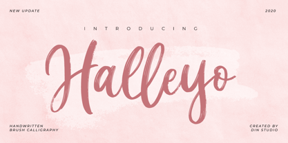 Halleyo is a brush handwritten font. With a classy and natural handwritten style, it brings a classy and beautiful typeface. Halleyo is best used for branding, logotype, and quotes. Features: - Multilingual Support - PUA Encoded - Numerals and Punctuation
 - Aneska Kids by Ditatype,
$29.00 Aneska Kids is a display font. Made with a playful style, it brings a fun and chic typeface. Chalk Brush is best used for card, branding, logotype, and quotes. Features: - PUA Encoded - Multilingual Support - Numerals and Punctuation
 - Take Note by wearecolt,
$9.00 Take Note Craft Handwritten Display Introducing Take Note, a beautiful and playful handwritten font. Using ligatures and stylistic alternatives for a natural flow and feel. A cute handwritten font for logotype, blog heading or even Instagram quotes.
 - Atomed by Jadatype,
$12.00 Atomed is a display font with Futuristic Feel. suitable for events, logotypes, Sci-fi stuff, modern & futuristic vibe, social media, products, and so on. Contains standard English letters, numbers, punctuation, ligature, and several accents that support multilingualism.
 - Instabread by Motokiwo,
$12.00 Instabread, a bold script font that is suitable for headline, logotype, apparel, invitation, branding, packaging, advertising etc. This typeface is comes in uppercase, lowercase, large range of punctuation, symbols & numerals, contextual alternates and ligatures, also support multilingual.
 - Beatney by Blankids,
$24.00 Introducing of our new product the name is Beatney a Classy Signature Font. Beatney inspired by modern script style this font is a fun theme very good for display, tshirt design, craft, quote sign, logotype and etc
 - Galardino by Sibelumpagi,
$18.00 Galardino is a clean and simple marker font, it has a unique style based on the handwritten look. Galardino font would be good for branding, logotype, poster, badge, book cover, invitation, tshirt design, packaging and many more.
 - Baby Born by Nurf Designs,
$14.00 Baby Born is a playful and childish display font. It is suitable for greeting card, birthday invitation, labels, packaging, t-shirt designs, logotypes and much more. Baby Born comes with uppercase, lowercase, numerals, punctuations & multilingual support characters.


