10,000 search results
(0.048 seconds)
- Ballstomer by Maulana Creative,
$13.00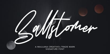 Ballstomer Signature Font Give your designs an authentic handcrafted feel. Ballstomer Signature Font is perfectly suited to logo, stationery, branding, typography quotes, magazine or book cover, website header, clothing, branding, packaging design, restaurant and more.
 - Dirty Bunny by Letterafandi Studio,
$14.00 Dirty Bunny is a Display font. That font is perfect for ; logos, greeting cards, a package design, a brand identity, craft design, any DIY project, book title, wedding invitation, packaging, another christmas project and more.
 - Hei cute by Cocodesign,
$10.00 Hei Cute is a modern calligraphy font design, including regular. You can use this lovely font for various purposes: logos, product packaging, wedding invitations, branding, headlines, signage, labels, signatures, book covers, posters, quotes, and more.
 - Allegoria by Fed Tunik,
$15.00 The font consists of two styles, includes more than 200 essential symbols that can satisfy any task. Suitable for banner designs, book covers, magazine headlines, website titles, and logo design. Thank you for your purchase!
 - Theatrics JNL by Jeff Levine,
$29.00Theatrics JNL gives a rounded corner treatment to Prismatiq JNL; which in turn was modeled from lettering found in an early 1900s French lettering book displayed at an online image sharing site. Limited character set. - Irendy by Gatype,
$10.00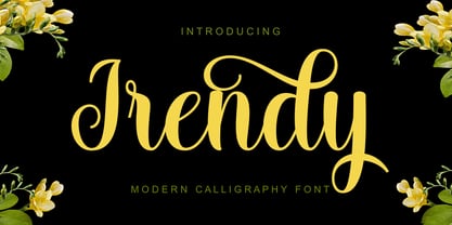 Irendy is a sweet calligraphy font and includes pretty swashes. It can be used for various purposes such as logos, product packaging, wedding invitations, branding, headlines, signage, labels, signature, book covers, posters, quotes and more.
 - Posie by Great Lakes Lettering,
$30.00 Posie is a hand made font created in Procreate by MJ herself. It's a fun and whimsical font that would be perfect for greeting cards, toys, picture books or anything that requires a naive sensibility
 - Serba by Sealoung,
$15.00 Serba is a fun, unique look serif display. With a modern look, it looks perfect when paired with a conventional serif/sans serif. It can be used for mastheads, posters, business identity and just about anything else. The all-inclusive also includes the complete set: All caps Multilingual character Number Punctuation
 - Blog by BA Graphics,
$45.00Blog has a new distinctive look and comes in four weights light, regular, medium and bold. It can be seen as quite elegant in the light weights while looking masculine in the heavy weight. Its unique look lends to so many different applications. Blog works well for both headline and text. - Boxer Punch by Putracetol,
$28.00 Boxer Punch - Soft Bold Font Boxer Punch - Soft Bold Font is a stylish and modern font designed to catch the attention of your audience. The font's unique design combines a soft bold shape with a cute sans serif, making it perfect for creating eye-catching designs. The idea behind creating Boxer Punch was to incorporate the concept of understated realism into the font. This is evident in the font's smooth and elegant lines, which make it perfect for a variety of design projects. The font is ideal for those looking to create a professional touch in their designs, while also maintaining a stylish and modern feel. Boxer Punch is an excellent choice for anyone looking for a font that is versatile and can be used in a variety of different contexts. It is perfect for sports-themed work projects, as well as branding, packaging, logo design, album covers, posters, and social media graphics. One of the standout features of Boxer Punch is its versatile OpenType features, including alternates and ligatures, which allow for even more creative freedom when designing with the font. Additionally, the font comes with uppercase and lowercase characters, as well as support for multilanguage, numbers, punctuation, and symbols. Inside the font package, you'll find three different file formats: Boxer Punch otf, Boxer Punch ttf, and Boxer Punch woff. This means that no matter what platform you are using, Boxer Punch will work seamlessly with your software. Boxer Punch is a font that is sure to make your designs stand out from the crowd. Its unique design and versatile features make it perfect for anyone looking to add a touch of elegance and style to their work. If you're looking for a stylish and modern font that is perfect for sports-themed work projects or a variety of other design projects, then Boxer Punch is the font for you. In summary, Boxer Punch - Soft Bold Font is a versatile and modern font that combines a soft bold shape with a cute sans serif to create a unique and stylish design. With its versatile OpenType features, multilanguage support, and uppercase and lowercase characters, Boxer Punch is perfect for a wide range of design projects.
 - Octin Vintage by Typodermic,
$11.95 Introducing Octin Vintage, the typeface that combines toughness and style in a delicately textured design. With its versatile 2 styles—sans and serif—and 3 weights—regular, bold, and black—Octin Vintage is the perfect choice for any project that requires a bold, eye-catching headline. Whether you’re creating designs for police, sports, prison, construction, school, or military themes, Octin Vintage delivers the rugged, vintage look that will help your designs stand out. Its timeless appeal is sure to capture the attention of your audience and leave a lasting impression. And it’s not just about looks—Octin Vintage is designed for versatility and ease of use, making it an ideal choice for both experienced designers and beginners. With its finely crafted letterforms and subtle textures, Octin Vintage adds a touch of sophistication and style to any design. So if you’re looking for a typeface that combines toughness, style, and versatility, look no further than Octin Vintage. Try it out today and discover the difference that this delicately textured design can make in your next project Check out the rest of the Octin families: Octin Sports, Octin College, Octin Prison, Octin Stencil & Octin Spraypaint. Most Latin-based European writing systems are supported, including the following languages. Afaan Oromo, Afar, Afrikaans, Albanian, Alsatian, Aromanian, Aymara, Bashkir (Latin), Basque, Belarusian (Latin), Bemba, Bikol, Bosnian, Breton, Cape Verdean, Creole, Catalan, Cebuano, Chamorro, Chavacano, Chichewa, Crimean Tatar (Latin), Croatian, Czech, Danish, Dawan, Dholuo, Dutch, English, Estonian, Faroese, Fijian, Filipino, Finnish, French, Frisian, Friulian, Gagauz (Latin), Galician, Ganda, Genoese, German, Greenlandic, Guadeloupean Creole, Haitian Creole, Hawaiian, Hiligaynon, Hungarian, Icelandic, Ilocano, Indonesian, Irish, Italian, Jamaican, Kaqchikel, Karakalpak (Latin), Kashubian, Kikongo, Kinyarwanda, Kirundi, Kurdish (Latin), Latvian, Lithuanian, Lombard, Low Saxon, Luxembourgish, Maasai, Makhuwa, Malay, Maltese, Māori, Moldovan, Montenegrin, Ndebele, Neapolitan, Norwegian, Novial, Occitan, Ossetian (Latin), Papiamento, Piedmontese, Polish, Portuguese, Quechua, Rarotongan, Romanian, Romansh, Sami, Sango, Saramaccan, Sardinian, Scottish Gaelic, Serbian (Latin), Shona, Sicilian, Silesian, Slovak, Slovenian, Somali, Sorbian, Sotho, Spanish, Swahili, Swazi, Swedish, Tagalog, Tahitian, Tetum, Tongan, Tshiluba, Tsonga, Tswana, Tumbuka, Turkish, Turkmen (Latin), Tuvaluan, Uzbek (Latin), Venetian, Vepsian, Võro, Walloon, Waray-Waray, Wayuu, Welsh, Wolof, Xhosa, Yapese, Zapotec Zulu and Zuni.
 - Cable beach by Gatype,
$12.00 Cable beach Script is an elegant calligraphy font, it's casual and pretty. Can be used for various purposes. such as logos, product packaging, wedding invitations, branding, headlines, signage, labels, signatures, book covers, posters, quotes and more. Cable beach Script is encoded with PUA Unicode, which allows full access to all additional characters without having to special design. software. Mac users can use Font Book, and Windows users can use the Character Map to view and copy any additional characters to paste into your favorite text. To enable the OpenType Stylistic alternative, you need a program that supports OpenType features such as Adobe Illustrator CS, Adobe Indesign & CorelDraw X6-X7, Microsoft Word 2010 or a later version. and there are additional ways to access alternatives, using the Character Map (Windows),Nexus Font (Windows), Font Book (Mac) or a software program such as PopChar (for Windows and Mac). If you need any help or suggestions please contact me via email "chaidirgata@gmail.com" Thank you for your purchase!.
 - Tessie Letters by Ingrimayne Type,
$8.00 A tessellation is a shape that can be used to completely fill the plane—simple examples are isosceles triangles, squares, and hexagons. Tessellation patterns are eye-catching and visually appealing, which is the reason that they have long been popular in a variety of decorative situations, such as quilting. The TessieLetters fonts contain letter shapes that can be used to construct tessellation patterns. Each family has two styles, an outline style and a filled or black style. The black style can be used to construct colored patterns. To see how patterns can be constructed, see the files here for TessieLettersACE, TessieLettersFQ, TessieLettersGJKMN, TessieLettersLL, TessieLettersTT, TessieLettersOSZ, and TessieLettersSingles. Many or these patterns were discovered/created by the font designer during the past twenty years in the process of designing maze books, coloring books, and a book about tessellations. The TessieLetters are picture or dingbat fonts. For fonts of tessellating letter shapes that can be used for text, see the Tescellations family.
 - Penicillin AOE by Astigmatic,
$19.95 Penicillin is a psuedo thematic/destructive typestyle, looking more like a grunge/deteriorated or stencil typestyle, but actually a typestyle made to look as if formed of bacteria cells. From the fungus that breeds the bacteria that heals, comes a highly readable typestyle to add a little offbeat degeneration look to any design. The end result, a little funky fungus of a font, easy to read and fun to look at...let Penicillin cure your design ailments!
 - Nastarkib by Arabetics,
$39.00 An isolated typeface design with a calligraphic flavor. The Nastarkib font family employs visual features from the Urdu Persian Nastaliq Calligraphy. Visual connectivity is accomplished by overlapping glyphs with downward slopes. This font family has four members including normal and bold weights with two styles each, regular and left-slanted italic styles. This font family design follows the guidelines of Mutamathil Taqlidi type style with one glyph for every basic Arabic Unicode character or letter, as defined in the latest Unicode Standards, and one additional final form glyph, for the freely-connecting letters in traditional Arabic cursive text. Nastarkib employs variable x-height values. It includes only the Lam-Alif ligatures. Soft-vowel diacritic marks, harakat, are selectively positioned. Most of them appear by default on the same level, following a letter, to ensure that they would not interfere visually with letters. Tatweel is a zero-width glyph. Keying the tatweel key before Alif-Lam-Lam-Ha will display the Allah ligature. Nastarkib includes both Arabic and Arabic-Indic numerals, in addition to standard punctuations.
 - Dsert by Latinotype,
$26.00 D Sert—based on the Pirata typeface—is inspired by 70s Chilean constructivist design and the political propaganda posters artwork of La Unidad Popular (Chilean political coalition). D Sert is the result of the combination of the Chilean graphic art revival with new trends, such as the handmade movement and super font families. The super family comprises 47 weights and comes with two versions: D Sert and D Sert Alt, plus extras. Diagonal strokes are significantly different between the two versions: diagonals of the Alt version are much more logical than the diagonals of the normal version. Another difference is the bowls of the capitals: in the D Sert version, they slightly project above the cap height, making it a more daring version and bringing it closer to calligraphy; contrarily, in the Alt version, bowls do not project above the cap height, which makes it a more tidy font. This way, the combination of the two versions and extras provides the user with the freedom to create any kind of artwork.
 - Amfibia by ROHH,
$40.00 Amfibia™ is a soft, flat-sided geometric grotesk family with a lot of character, equipped with tons of ligatures and swashes. Its main function is display use of all kinds, however it is prepared to serve as paragraph text typeface thanks to its 5 widths, giving total amount of 100 fonts. It is crafted for a broad variety design situations - from posters, magazine editorial use, logo design & branding, to web design, user interfaces and mobile applications. Main features: - 5 widths (Narrow, Condensed, Normal, Expanded, Wide), each consisting 20 fonts - 10 weights for each width (from Hairline to Black) - handdrawn, carefully crafted obliques - over 900 glyphs, full of swashes, initial forms, terminals and ligatures - pronounced ink traps and large x-height improving legibility in small sizes as well as adding strong personality to display sizes - flat-sided letter shapes adding vertical rhythm and elegance to narrow widths - extended latin language support - OpenType features (swashes, initials, terminals, standard and discretionary ligatures, stylistic sets, contextual alternates, case sensitive forms, lining, oldstyle and tabular figures, slashed zero, fractions, superscript and subscript, ordinals, currencies and symbols)
 - Isabel Condensed by Letritas,
$30.00 Isabel Condensed and Isabel were made out of necessity to create a new font for children and teenagers, that could be enough friendly and versatile for text in words or even easy-to-read long texts. The purpose of Isabel is to combine all the nice and friendly features of the simple letters that the teachers teach to the pupils at primary school, as they starting to learn to read, together with the normal editorial fonts we read every day. In this way it generates a very joyful serif font, or even friendly font, with some conservative aspects. In other words, Isabel is a font that, despite of being a “classic features” typography, is proud to show its innocent and ingenuous elements, this gives to the font a new point of view. The family is composed of 3 parts: the regular version, the italic version and the unicase version. Each one of them has 5 weights. The italic version has 825 characters; the regular and unicase have 739 and are composed for 220 latin languages, plus cyrilic.
 - Brother 1816 by TipoType,
$24.00 This year we commemorate the 200th anniversary of the first sans-serif typeface. and what better way to celebrate, than to design our own sans-serif! Brother 1816 is a very flexible, multifaceted and solid typeface, mixing Geometric shapes with Humanistic strokes at the same time. You can choose between a pure geometric or humanistic style, or even mix the +20 alternate characters to create the feeling that you need for your projects. Its humanistic nature makes it easy to read, legible in small sizes; perfect for branding, editorial and signage. Its geometric nature works for bigger applications in need of more personality, like branding, headlines, posters, etc... This makes Brother an excellent tool for an incredible wide range of uses. It has a total of 32 fonts, which are divided into 2 groups: normal (16 weights) & printed (16 weights). Each weight has +460 characters, +20 alternates, angular and straight edges, swashes, fractions, ordinals and much more.... Brother has also been specially designed for web (using hinting instructions), making it work in small and large sizes on different types of screen resolutions.
 - Magneta by Positype,
$25.00 To describe what inspired Magneta would be to add a little Dwiggins, throw in some Benton with a hint of Austin, wrap it up in a crisp, contemporary package and serve. The skeleton of the family is a Garalde (like my earlier Epic) but with a desire to produce something much more transitional and contemporary, I sought to simplify, simplify, simplify. Cap and ascenders share the same height, the x-height is slightly larger than expected which should make a functional typeface for editorial, headlines or where more visually complex systems are needed. The modulation is much more intentional than historical and creates some interesting interactions between the various weights. There are both Normal and Condensed widths available with 6 different weights and matching italics, small caps, oldstyle figures, swashes, stylistic and discretionary ligatures (that includes some fun majuscule ligatures in the roman styles), there is no lack of typographic goodness for the designer. To add some spice, a set of Decorative Ornaments have been created that include geometric, floral, curvilinear patterns and much more.
 - Broadside by Device,
$39.00 Broadside is a versatile, authoritative and functional family inspired by the sans serifs seen on ’40s and ’50s patriotic posters and period advertising. It is available in seven weights across condensed, normal and extended widths, each with reweighed italics. The type from this period was very often hand-drawn, and so differs considerably from poster to poster. Many American examples of this period use a Photo-Lettering style called Murray Hill and its derivatives, although their UK counterparts, designed by such luminaries as Abram Games or Tom Eckersley, are more stylistically diverse. Even though no single model is available to base a digitisation on, there are certain recurring stylistic quirks that give the type its unique flavour, and so the most interesting examples from several sources were be combined for the final family. Alternate short descenders, allowing for tighter line spacing, can be toggled on or off in the Opentype panel of Indesign or Illustrator. Tabular and lining numerals and a single-story ‘a’ are also available in all weights and styles.
 - Someri by Arabetics,
$39.00 Someri (English: Sumerian) is an Arabetic type design with a Cuneiform spirit. The Someri family follows the guidelines of the Mutamathil Taqlidi type style. It has one glyph for every basic Arabic Unicode character or letter, as defined in Unicode Standards version 5.1, and one additional, final-position, glyph for each Arabic letter that is normally connected with other letters from both sides in traditional cursive Arabic strings. Someri employs variable x-height values. It includes all required Lam-Alif ligatures and uses ligature substitutions and selected marks positioning but it does not use any other glyph substitutions or forming. Text strings composed using types of this family are non-cursive with stand-alone isolated glyphs. Tatweel (or Kashida) glyph is a zero width space. Keying it before any glyph will display that glyph isolated form. Keying it before Alif Lam Lam Ha will display the Allah ligature. Someri family includes both Arabic and Arabic-Indic numerals; all required diacritic marks, Allah ligature, in addition to all standard English keyboard punctuations and major currency symbols. Fonts are available in regular and italic styles.
 - Magneta Condensed by Positype,
$25.00 To describe what inspired Magneta would be to add a little Dwiggins, throw in some Benton with a hint of Austin, wrap it up in a crisp, contemporary package and serve. The skeleton of the family is a Garalde (like my earlier Epic) but with a desire to produce something much more transitional and contemporary, I sought to simplify, simplify, simplify. Cap and ascenders share the same height, the x-height is slightly larger than expected which should make a functional typeface for editorial, headlines or where more visually complex systems are needed. The modulation is much more intentional than historical and creates some interesting interactions between the various weights. There are both Normal and Condensed widths available with 6 different weights and matching italics, small caps, oldstyle figures, swashes, stylistic and discretionary ligatures (that includes some fun majuscule ligatures in the roman styles), there is no lack of typographic goodness for the designer. To add some spice, a set of Decorative Ornaments have been created that include geometric, floral, curvilinear patterns and much more.
 - Silsilah by Arabetics,
$39.00 The Silsilah family follows the guidelines of the Mutamathil Taqlidi type style. It has one glyph for every basic Arabic Unicode character or letter, as defined in Unicode Standards version 5.1, and one additional, final-position, glyph for each Arabic letter that is normally connected with other letters from both sides in traditional cursive Arabic strings. Silsilah employs variable x-height values. It includes all required Lam-Alif ligatures and uses ligature substitutions and selected marks positioning but it does not use any other glyph substitutions or forming. Text strings composed using types of this family are non-cursive with stand-alone isolated glyphs. Tatweel (or Kashida) glyph is a zero width space. Keying it before any glyph will display that glyph isolated form. Keying it before Alif Lam Lam Ha will display the Allah ligature. Silsilah family includes both Arabic and Arabic-Indic numerals; all required diacritic marks, Allah ligature, in addition to all standard English keyboard punctuations and major currency symbols. Fonts are available in regular and italic styles.
 - Nuqat by Arabetics,
$39.00 An isolated letters typeface design with a comic feel. All letters start with a prominent circular dot. All final shape letters end with a smaller dot, in addition. The Nuqat (Arabic for dots) font family has four members which include two weights, normal and bold, and comes in regular and left-slanted italic styles. This font family design follows the guidelines of Mutamathil Taqlidi type style with one glyph for every basic Arabic Unicode character or letter, as defined in the latest Unicode Standards, and one additional final form glyph, for the freely-connecting letters in traditional Arabic cursive text. The Nuqat font family employs variable x-height values. Nuqat includes only Lam-Alif ligatures. Soft-vowel diacritic marks, harakat, are selectively positioned. Most of them appear by default on the same level, following a letter, to ensure that they would not interfere visually with letters. Tatweel is a zero-width glyph. Keying the tatweel key before Alif-Lam-Lam-Ha will display the Allah ligature. Nuqat includes both Arabic and Arabic-Indic numerals, in addition to standard punctuations.
 - Enamela by K-Type,
$20.00 Enamela (rhymes with Pamela) is a monoline square sans that is available in normal width and condensed versions. Although rooted in the early years of sans serif type, the Enamela fonts have a timeless quality that is practical and unpretentious. The letterforms derive from vitreous enamel signage dating from the Victorian era and widely used in Britain for street nameplates, Post Office signs, the plates on James Ludlow wall postboxes, railway signs and direction signs, as well as for circular Automobile Association wayfinding plaques throughout the first half of the twentieth century. The quirky terminals, stemming from the compression of geometric type, invite comparison with the Charles Wright fonts used for UK vehicle registration plates. Enamela and Enamela Condensed are both available in three weights – regular, medium and bold – and as italics (optically corrected obliques). A commonly used alternative M with a vertex that touches the baseline is provided at the Alt-M (µ) keystroke on a Mac, or Alt-0181 on Windows. A commonly used G with a plain vertical throat, no crosspiece, is assigned Unicode FF27 (full width capital G).
 - Zin Slab by CarnokyType,
$46.00 Zin Slab is a contemporary slab-serif typeface designed for various situations of typographic usage. Characteristic feature is a large x-height and balans between neutral construction of letters (strictly vertical axis) and dynamic open forms (opened terminals). Another typical feature is a visually narrower connection between stems and strokes. The complete font family consist of three width proportions (Normal, Condensed and Extended). Every sub-family has 5 weights, ranging from Light to Black with matching Italics. Each font includes small capitals, old-style and tabular figures, standard and discretionary ligatures, alternate glyphs and a many of typographic options applied by the Opentype features. Zin Slab can be effectively used for both text and display typesetting. It can be used especialy in magazine layouts and editorial design, as well in advertising typography, orientation systems, corporate identities and many other situations. Zin Slab is a member of the Zin super family, which also includes Zin Sans, Zin Serif and Zin Display fonts. You can try Demo styles in Medium weight fully for free.
 - Zin Sans by CarnokyType,
$46.00 Zin Sans is a contemporary sans-serif typeface designed for various situations of typographic usage. Characteristic feature is a large x-height and balance between neutral construction of letters (strictly vertical axis) and dynamic open forms (opened terminals). Another typical feature is a visually narrower connection between stems and strokes. The complete font family consist of three width proportions (Normal, Condensed and Extended). Every sub-family has 5 weights, ranging from Light to Black with matching Italics. Each font includes small capitals, old-style and tabular figures, standard and discretionary ligatures, alternate glyphs and a many of typographic options applied by the Opentype features. Zin Sans can be effectively used for both text and display typesetting. It can be used especially in magazine layouts and editorial design, as well in advertising typography, orientation systems, corporate identities and many other situations. Zin Sans is a member of the Zin type system, which also includes Zin Slab, Zin Serif and Zin Display fonts. You can try Demo styles in Medium weight fully for free.
 - Platz Groteske FJ by Frncojonastype,
$27.00 fj Platz Groteske™ is the new font from frncojonastype project that culminates after almost 5 years of learning and development. fj Platz Groteske™ is a Neo-grotesk font with slight geometrical proportions with humanistic terminations. For this occasion, this font will show the normal version, however, the entire project contemplate condensed family, extended and the development of alphabets as Cyrrilic and Greek. This proposal is to improve the legibility in the Neo-grotesk fonts with generous gaps, vertical and square counter form and ascendents that exceed slightly the capitals. Counts with old numbers, small caps, modern numbers, tabular, numerators and denominators to fraccions, reference numbers to notes and formulas to face confidant and complex different stages. Ideal to editorial projects of informative content - scientific and titular of a huge impact because of the various alternative characters, stylistic options and a optometrical version to risky designers. To exclusive licenses and to follow the develop of this project, please visit frncojonas.com (WIP) Learn about upcoming releases, work in progress and get to know us better! Instagram: @frnco.jonas
 - Poem Script Pro by Sudtipos,
$79.00 Poem Script is a mixed collection of interpretations conjuring a late nineteenth century American pen script style. Though not an actual Italian letterform, this style was called “Italian Alphabet” stemming from an old penman’s term for an alphabet where the stress or shades are opposite their normal placement. The American variant followed from the late eighteenth century British hand also confusingly called “Italian Hand,” which itself evolved from some seventeenth century French batarde scripts. It showcases the phenomenal control and mastery of hand skills required to create such ornamental and lively letters centuries ago. Producing the shaded strokes in reversed positions such as this required holding the pen in a position horizontal to the baseline, or the letterforms would have to be written backwards or by rotating the paper at peculiar and extreme angles to achieve the effect. Exotic, elaborate and very attractive, Poem Script contains plenty of variations on each letter and comes with hundreds of calligraphic ornaments. Poem Script received a Certificate of Excellence at the Type Directors Club NY and was selected at the Bienal Tipos Latinos 2012.
 - Hero If Plus by Ingo,
$12.00 A type of “handwriting” discovered by chance, extremely abstract On April 8, 1948 a certain Walter Plaga wrote a crude poem about a hero on a commemorative plaque. The very poor reproduction of the handwritten original, etched into a metal sheet, produced extremely abstract forms so that — even if unintentional — a script completely void of bowls was created. That which originally was the normal clumsy handwriting of a layman thus transformed into a pseudo-modern deconstructive typeface, which in the 21st century appears contemporary. The capital letters especially reflect the original: in part they show forms labeled incorrectly ”old German“ handwriting, which is actually Latin, in the letters A D G I J K L S V W X Z , whereas C H N O P R appear very modern. Truly a form of handwriting: without joining the letters, especially between the lower case characters, a silhouette effect is formed. To a great extent Hero is impressive due to its driven-to-the-limit abstraction and to a lesser extent by retaining an antiquated and nearly illegible effect.
 - Bousni Ronde by Linotype,
$29.99The Bousni family's six faces display links unexpected by most readers of western alphabets. Inspired by both by Arabic calligraphy, and contemporary bitmap design, Bachir Soussi Chiadmi created this playful series of faces. Letters in each of the six typefaces link together, but not in the ways normally expected from script fonts. Suited for a wide array of fun functions, Bousni Carre and Bousni Ronde (each available in Light, Medium, and Bold weights) bring new a style and flavor to your collection. All six fonts in the Bousni family are included in the Take Type 5 collection from Linotype GmbH. The Bousni family espouses similar construction traits with other fonts from Linotype. Specifically, the straight lines and joints in the three Bousni Carre fonts are based off of a grid system similar to Anlinear, another member of the Take Type 5 collection from Linotype GmbH. The letter connections throughout the Bousni family are similar to Arabic kashidas, a typographic feature found recently in many non-Arabic typefaces, such as Linotype Atomatic." - Isabel SemiCondensed by Letritas,
$30.00 Isabel SemiCondensed, together with Isabel condensed and Isabel were made out of necessity to create a new font for children and teenagers, that could be enough friendly and versatile for text in words or even easy-to- read long texts. The purpose of Isabel is to combine all the nice and friendly features of the simple letters that the teachers teach to the pupils at primary school, as they starting to learn to read, together with the normal editorial fonts we read every day. In this way it generates a very joyful serif font, or even friendly font, with some conservative aspects. In other words, Isabel is a font that, despite of being a “classic features” typography, is proud to show its innocent and ingenuous elements, this gives to the font a new point of view. The family is composed of 3 parts: the regular version, the italic version and the unicase version. Each one of them has 5 weights. The italic version has 825 characters; the regular and unicase have 739 and are composed for 220 latin languages, plus cyrilic.
 - Urge Text by Eclectotype,
$30.00 It started with an italic, or to be more precise, half an italic. The slanted styles of Urge Text exhibit a certain bipolarity, the tops of glyphs having a standard italic form, the bottoms of glyphs being more Roman in their construction. This sturdy footing really locks the italics to the baseline, making them very legible while still being distinct from the uprights. The same bipolar approach didn't work very well in upright styles, so the Romans are more toned down. Ranging from the almost monoline, Egyptian style light weights to higher contrast ‘Modern’ bolds, there is much potential for use in typographically demanding scenarios. The family consists of six weights, normal and condensed widths, all with italics, making a total of 24 fonts; it’s a highly usable text typeface with an array of OpenType features. All styles include small caps, multiple figure styles (proportional- and tabular-, oldstyle and lining, small cap proportional figures, numerators, denominators, superscript and subscript), standard ligatures, alternate forms (stylistic sets), automatic fractions, case sensitive forms, and a handy (perhaps!) ‘percent off’ ligature in the discretionary ligatures feature.
 - Bousni Carre by Linotype,
$29.99The Bousni family's six faces display links unexpected by most readers of western alphabets. Inspired by both by Arabic calligraphy, and contemporary bitmap design, Bachir Soussi Chiadmi created this playful series of faces. Letters in each of the six typefaces link together, but not in the ways normally expected from script fonts. Suited for a wide array of fun functions, Bousni Carre and Bousni Ronde (each available in Light, Medium, and Bold weights) bring new a style and flavor to your collection. All six fonts in the Bousni family are included in the Take Type 5 collection from Linotype GmbH. The Bousni family espouses similar construction traits with other fonts from Linotype. Specifically, the straight lines and joints in the three Bousni Carre fonts are based off of a grid system similar to Anlinear, another member of the Take Type 5 collection from Linotype GmbH. The letter connections throughout the Bousni family are similar to Arabic kashidas, a typographic feature found recently in many non-Arabic typefaces, such as Linotype Atomatic." - Raqmi by Arabetics,
$45.00 Raqmi was designed as a serif like font with relatively uniform glyph thicknesses, perfect simplified straight lines and curves, and emphasized isolated letters. This font family supports all Arabetic scripts covered by Unicode 6.1, and the latest Arabic Supplement and Extended-A Unicode blocks, including support for Quranic texts. It includes two weights: regular and light, each of which has normal and left-slanted Italic versions. The script design of this font family follows the Arabetics Mutamathil Taqlidi style utilizing varying x-heights. The Mutamathil Taqlidi type style uses one glyph per every basic Arabic Unicode character or letter, as defined by the Unicode Standards, and one additional final form glyph, for each freely-connecting letter of the Arabic cursive text. Raqmi includes the required Lam-Alif ligatures in addition to all vowel diacritic ligatures. Soft-vowel diacritic marks (harakat) are selectively positioned with most of them appearing on similar high and low levels—top left corner—, to clearly distinguish them from the letters. Tatweel is a zero-width glyph.
 - Backstroke by Eclectotype,
$50.00 Normal and upright italic script fonts line a well-trodden path; left-leaning fonts (or "rightalics" as they're confusingly called), on the other hand, are a rarity. Here at Eclectotype Fonts we don't like to do things too conventionally, so here's Backstroke, a laid back script with a unique voice. With contextual alternates for start and end forms of certain characters, swash versions of L, Q and Z (surely the most used initial caps!), and a handful of stylistic sets, Backstroke is a restrained script. Stylistic sets are: 1. the start forms of i, j, m, n, and p are used always instead of only at word starts. 2. lower case ascenders get a whole lot loopier. 3. alternate versions of G, N and Y. 4. swash L, Q and Z. 5. swaps the default Polish script lslash for a more familiar version While fonts that lean the wrong way may be a bit more difficult to fit into your layouts than boring old regular italics, they will reward you with their individuality. Why not give it a go?
 - Celebrate The Day Pro by CheapProFonts,
$10.00 The freeflowing and quite feminine style of this script appealed to me, but it needed a bit of taming. Quite a few of the letterforms have been normalized - to better accommodate the diacritics. :) All fonts from CheapProFonts have very extensive language support: They contain some unusual diacritic letters (some of which are contained in the Latin Extended-B Unicode block) supporting: Cornish, Filipino (Tagalog), Guarani, Luxembourgian, Malagasy, Romanian, Ulithian and Welsh. They also contain all glyphs in the Latin Extended-A Unicode block (which among others cover the Central European and Baltic areas) supporting: Afrikaans, Belarusian (Lacinka), Bosnian, Catalan, Chichewa, Croatian, Czech, Dutch, Esperanto, Greenlandic, Hungarian, Kashubian, Kurdish (Kurmanji), Latvian, Lithuanian, Maltese, Maori, Polish, Saami (Inari), Saami (North), Serbian (latin), Slovak(ian), Slovene, Sorbian (Lower), Sorbian (Upper), Turkish and Turkmen. And they of course contain all the usual "western" glyphs supporting: Albanian, Basque, Breton, Chamorro, Danish, Estonian, Faroese, Finnish, French, Frisian, Galican, German, Icelandic, Indonesian, Irish (Gaelic), Italian, Northern Sotho, Norwegian, Occitan, Portuguese, Rhaeto-Romance, Sami (Lule), Sami (South), Scots (Gaelic), Spanish, Swedish, Tswana, Walloon and Yapese.
 - Nasrallah by Arabetics,
$39.00 The Nasrallah family follows the guidelines of the Mutamathil Taqlidi type style. It has one glyph for every basic Arabic Unicode character or letter, as defined in Unicode Standards version 5.1, and one additional, final-position, glyph for each Arabic letter that is normally connected with other letters from both sides in traditional cursive Arabic strings. Nasrallah employs variable x-height values. It includes all required Lam-Alif ligatures and uses ligature substitutions and selected marks positioning but it does not use any other glyph substitutions or forming. Text strings composed using types of this family are non-cursive with stand-alone isolated glyphs. Tatweel (or Kashida) glyph is a zero width space. Keying it before any glyph will display that glyph isolated form. Keying it before Alif Lam Lam Ha will display the Allah ligature. Nasrallah family includes both Arabic and Arabic-Indic numerals; all required diacritic marks, Allah ligature, in addition to all standard English keyboard punctuations and major currency symbols. Fonts are available in regular and italic styles.
 - Core Sans DS by S-Core,
$20.00 Core Sans DS is a rounded version of Core Sans D and a modern interpretation of condensed sans-serif typeface designed by S-Core and the whole family consists of 2 widths (Condensed, Normal), 7 weights (Thin, Light, Regular, Medium, Bold, Heavy, Black) with their corresponding italics. Core Sans DS features a condensed geometric construction and has a large x-height which enhances legibility. The family is ideal for signage, headline as well as body text. Core Sans DS is a part of the Core Sans Series such as Core Sans N SC, Core Sans N, Core Sans NR, Core Sans M, Core Sans G,Core Sans A, Core Sans GS and Core Sans ES. Letterform in this type family is simple, clean and highly readable. The spaces between individual letter forms are precisely adjusted to create the perfect typesetting. Core Sans DS supports complete Basic Latin, Cyrillic, Central European, Turkish, Baltic character sets. Each font includes proportional figures, tabular figures, numerators, denominators, superscript, scientific inferiors, subscript, fractions and case features.