10,000 search results
(0.02 seconds)
- Conners Corners NF by Nick's Fonts,
$10.00 Here's another collection of ornate border elements gleaned from the 1888 specimen books of James Conner's Sons United States Type Foundry in New York City. Refer to the PDF guide for detailed, yet simple, instructions for constructing nine delightfully different border patterns.
 - Heathtop by Warnetype,
$6.00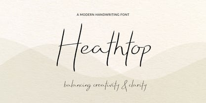 A modern handwritten script font that balances creativity with clear legibility that contains upper & lowercase characters, all punctuation and numerals. Designed so the text reflects stylish natural handwriting, with ligatures and carefully kerned characters mixed with unjoined letters for a contemporary feel.
 - Nitrous Oxide by Gassstype,
$29.00 Hello Everyone, introduce our new product Font Nitrous Oxides This Is Modern Sport Fonts.This is a Textured Natural Style and classy style with a clear style and dramatic movement. That is has charming, authentic and relaxed characteristic more natural look to your text.
 - Ribelano by Frantic Disorder,
$12.00 Ribelano is a serif display font that represents clear, contrast, and sharpness. The font comes in 6 different weight styles from Light to Black and it comes with 300+ glyphs. Perfectly suited for display needs such as heading, branding, logos, poster, etc.
 - Rasangar by Gassstype,
$27.00 Hello Everyone, introduce our new product Font Rasangar This Is Blackletter Display Font.This is a Textured Natural Style and classy style with a clear style and dramatic movement. That is has charming, authentic and relaxed characteristic more natural look to your text.
 - Gallos by W Type Foundry,
$25.00 What comes to your mind if I say Architype, Geometric, Gaelic, and Uncial? An impossible combination of features? An unrealistic setup of tastes as weird as your music list? Or some part of a joke told by your favourite comedian? Just chill and stick to the idea that is possible. Gallos combines the conceptual historical elegance of the Uncials with the practical rationalism of the Geometric style. Moreover, this typeface is composed by two sub families: Gallos Uncial and Gallos Architype. The letters “M”, “N”, “W”, “a”, “m”, “n”, “r”, and “w” differ between these two models. The first one is related to both: The Uncial script aspect displaying the leaned “a” with a closed bowl, and the classical geometric style depicting more conventional uppercase and lowercase letters “m” and “n”. The Architype one is inspired by Paul Renner’s Architype model, thus the leaned “a” has an open counter, the “r” is composed by a stem and a dot, and the rest of the mentioned letters were built using square rational features. Both models are connected by classical Uncial features such as the curved stroke “e” and curved shaft “t”, and with Gaelic vibes which can be seen in uppercase and lowercase letters “K” and “X”. Also, the curved descender “g” and “y”, alongside the curved stem “z” connect really well with the rest of the system and provide more uniqueness to the Gallos type family. Without further ado, we say to you: let’s make Uncials popular again!
 - Ingeo by Blancoletters,
$40.00 Between the most rigid geometric letterforms and the most expressive calligraphy works there are, undoubtedly, countless combinatory possibilities. Ingeo is just one of them. Located very close to a geometric approach it shows, however, a clear willingness to accommodate in its structure the calligraphic traits of our alphabet. In Ingeo geometry grows from the inside, meaning that all its counters are based on geometric shapes. Around them, contours are later defined. The solid mass resulting from that interaction is modulated in specific areas in a way that evokes the way a writing hand finishes a letter and starts the following one. Ingeo seeks to accommodate calligraphic features in its geometric structure without any complexes, in the same way a computer engineer writes a song or a poet admires the orbits of planets and satellites. In this vast and unmapped realm between seemingly opposing concepts is where Ingeo finds its playground. There, that interaction is pushed to its limits and the resulting letterforms are later confronted with typographical conventions to assess whether they survive. Ingeo comes with 695 glyphs in its character set with support for more than 270 languages. Among these glyphs you can find 5 stylistic sets, 19 useful science-related icons as well as 7 different designs for ampersands.
 - H-AND-S by AND,
$89.00 A common creation: (to pass from one hand to the other): For the first time, various hand-signs from diverse sources are unified into one single visual style. This compendium is the result of 15 years of incubation and 7 years of creation. In his travels throughout the world, graphic designer Jean-Benoit Levy, principal of the visual studio AND, has collected pictures of multiple hand signage. Uncertain what to do with those signs, he kept them year after year until the idea came to unify almost 200 handsigns into one single family. In accordance with this entire collection, the name of the typeface is a mix: "h-and-s". A global collection: (To put in good hands): We all have one thing in common: Hand-signs are an international language, they are meant to be understood by all of us. Each of us regularly comes in contact with modern hieroglyphs such as the hand-sign-codes that are so prevalent in our daily life. This way of communication belongs to no one in particular and to all of us in general. Even if the sense of certain signs varies from one culture to the other, there is a common hand-sign language. We are surrounded by this language of handsigns each time we step in a store, we eat, open a container of milk, we clean up, use package of wash-powder, by shaving, when we work, use tools, at home, by tearing the envelope of a condom, by traveling, etc. When we encounter these signs, we all understand them easily. A visual connection: (To go hand in hand): This typeface is a global visual statement. Collecting, ordering, redrawing, unifying. Reconstructed and assembled into one original alphabet, H-AND-S is a unique and complex signs program. Our choice is based on daily gestures and global hand-codes. Logically this typeface starts with the "American Sign Language" and expands on two type-variations, each on two levels of keyboard. The international team of H-AND-S would like to send his special thanks to all of the anonymous graphic designers throughout the world who designed different hand-signage and who influenced and inspired to create such a sign collection into one unified family. We, the global nomad team of AND, hope that you will enjoy our H-AND-S. Additional Credits Production: Studio AND. www.and.ch. Concept, Idea & Creative Direction: Jean-Benoît Lévy, Switzerland / USA. Research & Sketches: Eva Schubert, Germany. Illustration, Graphic Design & Visual Fusion: Diana Stoen, USA. Transfer, Adaptation & Refining: Moonkyung Choi, Korea. Finalization & Checking: Sylvestre Lucia, Switzerland. Coaching & Technical Advice: Mike Kohnke, USA. Creative Energy & Implementation: Joachim Müller-Lancé, Germany / USA.
 - Vigilance BRK Pro by CheapProFonts,
$10.00 A very angular font, not one curve in sight - it's hip to be square! The font includes quite a few alternate letterforms, which I've also made available in combinations with diacritics. These alternates are available via your programs' glyph palette or using the OpenType functions "Stylistic Alternates" and/or "Stylistic Sets ss01-ss04". ALL fonts from CheapProFonts have very extensive language support: They contain some unusual diacritic letters (some of which are contained in the Latin Extended-B Unicode block) supporting: Cornish, Filipino (Tagalog), Guarani, Luxembourgian, Malagasy, Romanian, Ulithian and Welsh. They also contain all glyphs in the Latin Extended-A Unicode block (which among others cover the Central European and Baltic areas) supporting: Afrikaans, Belarusian (Lacinka), Bosnian, Catalan, Chichewa, Croatian, Czech, Dutch, Esperanto, Greenlandic, Hungarian, Kashubian, Kurdish (Kurmanji), Latvian, Lithuanian, Maltese, Maori, Polish, Saami (Inari), Saami (North), Serbian (latin), Slovak(ian), Slovene, Sorbian (Lower), Sorbian (Upper), Turkish and Turkmen. And they of course contain all the usual "western" glyphs supporting: Albanian, Basque, Breton, Chamorro, Danish, Estonian, Faroese, Finnish, French, Frisian, Galican, German, Icelandic, Indonesian, Irish (Gaelic), Italian, Northern Sotho, Norwegian, Occitan, Portuguese, Rhaeto-Romance, Sami (Lule), Sami (South), Scots (Gaelic), Spanish, Swedish, Tswana, Walloon and Yapese.
 - Krizi Amo Pro by CheapProFonts,
$10.00 Inspired by the lettering on a perfume, Halmos extrapolated a complete uppercase alphabet, and he also created a matching lowercase. Now the character set has been expanded completely, and this stylish Art Deco font is ready to create some headlines, new logos and wordmarks in many more languages. ALL fonts from CheapProFonts have very extensive language support: They contain some unusual diacritic letters (some of which are contained in the Latin Extended-B Unicode block) supporting: Cornish, Filipino (Tagalog), Guarani, Luxembourgian, Malagasy, Romanian, Ulithian and Welsh. They also contain all glyphs in the Latin Extended-A Unicode block (which among others cover the Central European and Baltic areas) supporting: Afrikaans, Belarusian (Lacinka), Bosnian, Catalan, Chichewa, Croatian, Czech, Dutch, Esperanto, Greenlandic, Hungarian, Kashubian, Kurdish (Kurmanji), Latvian, Lithuanian, Maltese, Maori, Polish, Saami (Inari), Saami (North), Serbian (latin), Slovak(ian), Slovene, Sorbian (Lower), Sorbian (Upper), Turkish and Turkmen. And they of course contain all the usual "western" glyphs supporting: Albanian, Basque, Breton, Chamorro, Danish, Estonian, Faroese, Finnish, French, Frisian, Galican, German, Icelandic, Indonesian, Irish (Gaelic), Italian, Northern Sotho, Norwegian, Occitan, Portuguese, Rhaeto-Romance, Sami (Lule), Sami (South), Scots (Gaelic), Spanish, Swedish, Tswana, Walloon and Yapese.
 - Ambulance Shotgun Pro by CheapProFonts,
$10.00 Another grungy masterpiece from Guillaume - this one with a woodprint touch. I have made the lowercase letters different from the uppercase by removing the cross-shaped counters and flipping where possible. Even the numbers have solid variants - available as OpenType "Stylistic Alts". Enjoy the new flexible possibilities! ALL fonts from CheapProFonts have very extensive language support: They contain some unusual diacritic letters (some of which are contained in the Latin Extended-B Unicode block) supporting: Cornish, Filipino (Tagalog), Guarani, Luxembourgian, Malagasy, Romanian, Ulithian and Welsh. They also contain all glyphs in the Latin Extended-A Unicode block (which among others cover the Central European and Baltic areas) supporting: Afrikaans, Belarusian (Lacinka), Bosnian, Catalan, Chichewa, Croatian, Czech, Dutch, Esperanto, Greenlandic, Hungarian, Kashubian, Kurdish (Kurmanji), Latvian, Lithuanian, Maltese, Maori, Polish, Saami (Inari), Saami (North), Serbian (latin), Slovak(ian), Slovene, Sorbian (Lower), Sorbian (Upper), Turkish and Turkmen. And they of course contain all the usual "western" glyphs supporting: Albanian, Basque, Breton, Chamorro, Danish, Estonian, Faroese, Finnish, French, Frisian, Galican, German, Icelandic, Indonesian, Irish (Gaelic), Italian, Northern Sotho, Norwegian, Occitan, Portuguese, Rhaeto-Romance, Sami (Lule), Sami (South), Scots (Gaelic), Spanish, Swedish, Tswana, Walloon and Yapese.
 - Dyer - Unknown license

- MCapitals - 100% free

- Topaz - Unknown license

- Afolkalips by Arterfak Project,
$15.00 Introducing 'Afolkalips' a tribal display font. Inspired by hinterland culture in the world, especially Papua Tribe, Indonesia. The Papuan Culture has many native tribes based on their location, culture and different ancestors. The equation is, they have a culture of decorating the body with paint from plants. The motives are also diverse, but with the characteristics of firm lines. In addition to various line motifs, Papuan hinterland people also explore colors that distinguish one tribe from another. You can see it on face decoration, as well as their body parts. The tools they used to paint their faces were usually with wood or leaves. Clear lines are etched, producing a natural, rough and authoritative form. It is this form that inspires us in designing the 'Afolkalips' typeface. All-capitals font with strong strokes that very recommended for headline or display on a traditional theme. Complete with 50+ custom ligatures that give you more variations. Also featured with 28 accents. This font also has ornament swashes to give your design more tribal looks, you can use the swashes as a frame or decoration. Suitable for your design such as poster, flyer, t-shirt design, logo, magazine, signage, or billboard. Afolkalips is a minimalist-joyful font which is flexible to apply in bright theme or elegant style. What you'll get : - Uppercase - Lowercase - Numbers - Punctuations - Symbols - Stylistic alternates - Ligatures - Accents Hope you like it! Thank you for your support and happy designing!
 - P22 Klauss Kursiv by IHOF,
$29.95 P22 Klauss Kursiv is the first ever digital revival and expansion of the last face Karl Klauß designed for the Genzsch & Heyse foundry in Stuttgart before he died in 1956. Karl Klauß’s classical training in the graphic arts gave him solid chops to use as a springboard for design ideas that remained relevant among the countless trends fleeting around the turmoil of two world wars. By the mid-1950s, a kind of ornamental deco aesthetic was well on its way into mainstream design in post-war Europe, and demand was high for unique, lively and non-minimal ad faces. Klauß, a reliable designer with a proven track record of calligraphic faces, pushed the envelope on his own calligraphy and designed something that packages elegance in a boldness seldom seen before in luxury scripts. Quite a bit of talent is on display in Klauss Kursiv. In spite of the restraint this kind of design imposes on itself almost by default, the interplay between thick and thin never seems forced or challenging. Clear, natural strokes build a compact alphabet that demonstrates the wrist control of a veteran calligrapher. Creative nib angling segues into very clever start-and-stop constructs to make attractive forms that work quite well together, yet stand well to individual scrutiny. P22 Klauss Kursiv comes with a load of built-in alternates and ligatures in a font of over 470 glyphs, providing extended support for Latin languages.
 - Mamirolle by The Ampersand Forest,
$20.00 Sometimes a sans serif just needs a sister. Meet Mamirolle! A geometric wedge-serif companion to Mimolette! (OR is Mimolette the sans serif companion to Mamirolle.... hmmmmm....) Mamirolle, like her sister, is great for text and display alike—she's super-readable AND super-legible, and her different weights lend themselves to creating clear contrast in your textual hierarchy! And she's got some nifty features, too! Mamirolle has a two-story a and g in the upright versions, but if you want a one-story a and g, just turn on Stylistic Set 01! Her italic is a true italic, not just an oblique. Want more playful cursive alternatives in the italic? Activate Stylistic Set 02, and you've got them in the A, E, K, Q, R, and k. She's got true small caps in all styles! She's got true fractions in all styles, as well as oldstyle (small cap) and lining numerals, in both tabular and proportional widths. Best of all, perhaps, Mamirolle was made with love, as always, by yer pals in the Ampersand Forest.
 - Ultra System by Set Sail Studios,
$14.00 Introducing Ultra System; A modern exploration of 8 fonts, each carefully designed to naturally compliment one another. With 6 clean sans fonts and 2 textured script fonts, Ultra System gives you a variety of ways to combine and arrange each font, allowing you to create striking & modern typographic designs. This typeface collection consists of 8 fonts; Ultra System Script • A textured, bouncy & flowing marker script font containing upper & lowercase characters, numerals, and a large range of punctuation. Ultra System Script Alt • This is a second version of Ultra System Script, with a completely new set of both upper and lowercase characters. If you wanted to avoid letters looking the same each time to recreate a custom-made style, or try a different word shape, simply switch to this font for an additional layout option. Ultra System Sans • A wide, bold sans font containing uppercase only characters, numerals, and a large range of punctuation. Ultra System Sans Line One • A thick outlined version of Ultra System Sans, pair this with other Ultra System Sans fonts to add emphasis to words or phrases. Ultra System Sans Line Two • A thin outlined version of Ultra System Sans, pair this with other Ultra System Sans fonts to add emphasis to words or phrases. Ultra System Sans Italic • Italic variations are included for all 3 Ultra System Sans fonts. FAQs; Accessing Ligatures • Ligatures are supported by most desktop graphics & text software (not just the fancy ones!), including Photoshop, Illustrator, InDesign, Word, Pages & Keynote. Many programs will automatically have this feature switched on for you, but if you need any help accessing then please feel free to drop me a message. Language Support • All Ultra System fonts support the following languages; English, French, Italian, Spanish, Portuguese, German, Swedish, Norwegian, Danish, Dutch, Finnish, Indonesian, Malay, Hungarian, Polish, Croatian, Turkish, Romanian, Czech, Latvian, Lithuanian, Slovak, Slovenian
 - Avenir Next Thai by Linotype,
$79.00 Avenir Next Pro is a new take on a classic face—it’s the result of a project whose goal was to take a beautifully designed sans and update it so that its technical standards surpass the status quo, leaving us with a truly superior sans family. This family is not only an update though; in fact it is the expansion of the original concept that takes the Avenir Next design to the next level. In addition to the standard styles ranging from ultralight to heavy, this 32-font collection offers condensed faces that rival any other sans on the market in on and off—screen readability at any size alongside heavy weights that would make excellent display faces in their own right and have the ability to pair well with so many contemporary serif body types. Overall, the family’s design is clean, straightforward and works brilliantly for blocks of copy and headlines alike. Akira Kobayashi worked alongside Avenir’s esteemed creator Adrian Frutiger to bring Avenir Next Pro to life. It was Akira’s ability to bring his own finesse and ideas for expansion into the project while remaining true to Frutiger’s original intent, that makes this not just a modern typeface, but one ahead of its time. Avenir Next Variables are font files which are featuring two axis, weight and width. They have a preset instance from UltraLight to Heavy and Condensed to Roman width. The preset instances are: Condensed UltraLight, Condensed UltraLight Italic, Condensed Thin, Condensed Thin Italic, Condensed Light, Condensed Light Italic, Condensed, Condensed Italic, Condensed Demi, Condensed Demi Italic, Condensed Medium, Condensed Medium Italic, Condensed Bold, Condensed Bold Italic, Condensed Heavy, Condensed Heavy Italic, UltraLight, UltraLight Italic, Thin, Thin Italic, Light, Light Italic, Regular, Italic, Demi, Demi Italic, Medium, Medium Italic, Bold, Bold Italic, Heavy, Heavy Italic.
 - Avenir Next Rounded by Linotype,
$42.99Avenir Next Pro is a new take on a classic face—it’s the result of a project whose goal was to take a beautifully designed sans and update it so that its technical standards surpass the status quo, leaving us with a truly superior sans family. This family is not only an update though; in fact it is the expansion of the original concept that takes the Avenir Next design to the next level. In addition to the standard styles ranging from ultralight to heavy, this 32-font collection offers condensed faces that rival any other sans on the market in on and off—screen readability at any size alongside heavy weights that would make excellent display faces in their own right and have the ability to pair well with so many contemporary serif body types. Overall, the family’s design is clean, straightforward and works brilliantly for blocks of copy and headlines alike. Akira Kobayashi worked alongside Avenir’s esteemed creator Adrian Frutiger to bring Avenir Next Pro to life. It was Akira’s ability to bring his own finesse and ideas for expansion into the project while remaining true to Frutiger’s original intent, that makes this not just a modern typeface, but one ahead of its time. Avenir Next Variables are font files which are featuring two axis, weight and width. They have a preset instance from UltraLight to Heavy and Condensed to Roman width. The preset instances are: Condensed UltraLight, Condensed UltraLight Italic, Condensed Thin, Condensed Thin Italic, Condensed Light, Condensed Light Italic, Condensed, Condensed Italic, Condensed Demi, Condensed Demi Italic, Condensed Medium, Condensed Medium Italic, Condensed Bold, Condensed Bold Italic, Condensed Heavy, Condensed Heavy Italic, UltraLight, UltraLight Italic, Thin, Thin Italic, Light, Light Italic, Regular, Italic, Demi, Demi Italic, Medium, Medium Italic, Bold, Bold Italic, Heavy, Heavy Italic. - Gambler by Fenotype,
$25.00 Gambler is a characteristic display type collection of 7 font styles with both clean and textured -making it total 14 fonts designed to play together. Gambler strikes with witty and elegant appeal combining vintage and modern elements. Gambler is an effective set for creating identities for branding, posters, book covers, headlines, logotypes, prints on garments, restaurant menus, beer labels and so on, both offline and online. Gambler Script is a smooth contrasted script that comes in two weights and it is packed with plenty of OpenType features: Standard Ligatures and Contextual Alternates are automatically on and they help to keep the flow and connections smooth. From Stylistic Alternates you’ll find characters with pointed endings and some other small variations. For extra flair try Swash or Titling Alternates. Gambler Script is PUA encoded so you can access the extra characters in most graphic design softwares. Gambler Brush is a soft brush script with low contrast and large x-height. Gambler Brush comes with following OpenType features: Standard Ligatures and Contextual Alternates that are automatically on and that keep the connections smooth. For less uneven word picture try Stylistic or Swash Alternates. Gambler Brush is PUA encoded so you can access the extra characters in most graphic design softwares. Gambler Flare is a flared serif with sharp edges and wide characters Gambler Flare comes in two weights. Gambler Gothic is a rigid condensed sans serif that comes in two styles: Regular and Shadow. Gambler Gothic Shadow has a narrow lining giving a three dimensional expression to the font. Gambler fonts are designed to play together, in pairs, or all together but they also work great as themselves or combined with other Fenotype Fonts.
 - Corelia by Hurufatfont,
$24.00 Corelia; It has a compact, lean, industrial and neutral body structure. Text and Display versions provide a very wide usage area. Ideal for modern brand designs. It includes rich OpenType features with custom number styles.
 - Atomic Alice by Letterhead Studio-YG,
$46.00 Atomic Alice was designed by Yuri Gordon in 2018. This typeface is simple and clear, with strong character. Gives wide opportunity to create expressive texts with 877 glyphs. Atomic Alice has has some OpenType features including small caps, stylistic alternates and huge amount of ligatures.
 - Woodtype Borders 2 NF by Nick's Fonts,
$10.00 Here’s a workman-like collection of border elements gleaned from the specimen books of various American manufacturers of woodtype from around 1840 to 1885. Refer to the PDF guides for detailed, yet simple, instructions for constructing various border patterns, all with Victorian grace and charm.
 - Rockin Rocker by Gassstype,
$27.00 Hello Everyone, introduce our new product Font Rockin Rocker This Is A Rough Display Font.This is a Textured Natural Style and classy style with a clear style and dramatic movement. That is has charming, authentic and relaxed characteristic more natural look to your text.
 - Rockin Stncl by Gassstype,
$29.00 Hello Everyone, introduce our new product Font Rockin Stncl This Is Rough Stencil Display Font.This is a Textured Natural Style and classy style with a clear style and dramatic movement. That is has charming, authentic and relaxed characteristic more natural look to your text.
 - Caffe Lungo by Hanoded,
$15.00 Caffe Lungo is a beautiful set of handmade fonts. Lungo is very legible, very clear, but has that authentic ‘handmade’ look. Caffe Lungo comes in three weights, each with its own Italic style. I also added ligatures for the g_j and j_j letter combinations.
 - Mighty Sans by Gassstype,
$27.00 Hello Everyone, introduce our new product Font Mighty Sans This Is Bold Sans Display Font.This is a Textured Natural Style and classy style with a clear style and dramatic movement. That is has charming, authentic and relaxed characteristic more natural look to your text.
 - Quacks by Gassstype,
$29.00 Hello Everyone, introduce our new product Font QUACKS This Is Rough Display Font.This is a Textured Natural Style and classy style with a clear style and dramatic movement. This font QUACKS is great for your next creative project such as logos, printed quotes, invitations, cards,
 - Woodtype Borders NF by Nick's Fonts,
$10.00 Here's a handy-dandy collection of border elements gleaned from the specimen books of various manufacturers of woodtype from around 1840 to 1885. Refer to the PDF guide for detailed, yet simple, instructions for constructing sixteen different border patterns, all with Victorian grace and charm.
 - Digi Antiqua by Linotype,
$39.00DigiAntiqua was designed by the Hell Design Studio in 1968. Its basic forms were influenced by the slab serif fonts produced at the beginning of the industrial era in England around 1820. Its clear and timeless forms are extremely legible even in small point sizes. - Monaqi by Typebae,
$12.00 Introducing Monaqi Sans Serif Font Monaqi is a clear and multifunctional san serif family font. Can be used as a plain text font, stylish title or logo, very useful for your various project needs. What's Included? Uppercase & Lowercase Numbers & Punctuation Alternates Multilingual Support PUA Encoded
 - Smaragd by Linotype,
$29.99Smaragd is a light and gracious font especially appropriate for titles and cards. It is Gudrun Zapf von Hesse’s interpretation of Baroque adornment engravings. Smaragd is clear and festive, well-suited to titles and headings, initials and private printed materials, such as cards and stationery. - Retroxoid by PizzaDude.dk,
$20.00 You may recognize the looks of Retroxoid - if not, then let me help you out: Retroxoid is actually a font I made back in 2007. I ran prints of the font, through a very bad copymachine, used a wet cloth to make the print look worn, scanned the prints and voila! Retrozoid, my very first Open Type font, was born! Now in 2010, Retroxoid has risen from the past, and is ready to burst your designs with clean, round and futuristic shapes!
 - Ace Sans by Factory738,
$15.00 Ace Sans is a modern and minimalist sans serif font family. The combination of minimal and geometric elements renders a modern design. Ace Sans family includes 8 fonts, clean and modern caps, thereby creating more variability. This is irreproachable sans serif to diversify your headlines, branding visual identity, poster, logo, magazines and etc. 8 Weights (Thin, Extralight, Light, Regular, Medium, Bold, Extrabold, Black) Oblique font is available Numbers & Punctuation Extensive Language Support Thanks for looking, and I hope you enjoy it.
 - Dynasty by Device,
$39.00 Dynasty is an extensive and versatile family that exploration and modernisation of the typographic quirks associated with the 'American Gothic' type school (in much the same way as English Grotesque was an exploration of Gill/Johnston idea-space) and adds chamfered elements to dots and tails to emphasise and extend the early machine-made aesthetic. Elegantly clean and readable at headline and small text settings, where (as with all fonts in small sizes) the introduction of tracking will improve legibility.
 - Adhesive Serif Letters JNL by Jeff Levine,
$29.00 A few scant examples of die cut gummed letters (R, C, Y and &) provided the design inspiration for Adhesive Serif Letters JNL. Influenced by the Caslon style, this typeface offers clean, legible titling. The sample letters were once manufactured by the Tablet and Ticket Company of Chicago and sold under their brand name of Willson's [named for the founder of the company]. Gummed letter sets were available in a variety of styles and sizes for various sign, merchandising and marking needs.
 - Emblema by Corradine Fonts,
$29.95 Emblema is an evocative font that exudes Art Deco style from early decades of the 20th Century. Its geometric shapes give a clean and modern look to any design where it is applied. Emblema was designed in 12 subtly different weights and is ideal for achieving the same weight in a single word when using different point sizes. Open Type users can access an extensive set of alternative and ornamental characters including 3 different size sets of caps, providing the utmost in versatility.
 - Nicestrips by Maulana Creative,
$12.00 Nicestrips is a fancy casual script font With clean stroke, super slanted and fun character. It has Opentype features of ligatures and some alternate lowercase character, To give you an extra creative work. Nicestrips script font support multilingual more than 100+ language. This font is good for logo design, Social media, Movie Titles, Books Titles, a short text even a long text letter and good for your secondary text font with sans or serif. Make a stunning work with Nicestrips font. Cheers, MaulanaCreative
 - Waika by Hazztype,
$16.00 Waika is a modern sans serif font that seamlessly blends a rounded aesthetic with condensed proportions, resulting in a contemporary and versatile typeface. Its smooth curves and absence of serifs contribute to a clean and friendly appearance, making it suitable for a wide range of applications. The deep inktrap adds a touch of sophistication and uniqueness to each character, ensuring legibility and visual appeal in various design contexts. Waika is a dynamic choice for projects seeking a balance between modernity and approachability.


