10,000 search results
(0.042 seconds)
- Mortal Wave by Stringlabs Creative Studio,
$29.00 Mortal Wave results out of a stunning pairing of a brush pen and pencil that makes it look incredibly endearing and authentic. Use this gorgeous and unique display font to bring any DIY project to life!
 - River City Sandwriting by River City,
$24.98 I searched all over the internet looking for a realistic sand writing font and came away empty handed. Undaunted by this, I grabbed my business partner, Mary and trekked down to our local river, the Arkansas (pronounced ar-KAN-sas around here). Using sticks, we scratched out the entire alphabet in the sand, including upper & lowercase, and punctuation marks! I photographed the characters, converted them to line art on my computer and used font creating software to turn it into a true type font! This font was designed for adding dates, places and messages to your beach photos that looked as if you wrote it in the sand before you took the picture! It is a decorative font best used in large, headline sizes. To make it appear more realistic, select a darker color from the sand in the photo to use for the type instead of black!
 - Nora - Unknown license

- Noma by Spinturnix,
$15.00 Noma is a new wide-set display font with a minimal geometric style. I designed Noma because I wanted a tech-inspired font that has plenty of character while remaining legible. Noma is a great choice for high-impact headings and logotypes. I hope you enjoy, thanks for checking it out!
 - GFY Handwriting Fontpak #2 by Chank,
$99.00Explore a diverse range of 23 different handwriting styles with the new Go Font Yourself! Volume 2 Fontpak. This is a collection of 23 new, genuine handwriting fonts in OpenType format for Mac or PC. Fancy cursive or extrabold marker, stylish script or sassy scribbles; this fontpack is loaded a lot of personality. And if that's not enough handwriting styles for you, check out the original: GFY Handwriting Fontpak (Volume 1). - Lucas Brandis by Proportional Lime,
$9.99 In the early days of printing everything had to be worked out from scratch. This set of lettering is based on section headings used by the Printer Lucas Brandis (no known relation), the first printer to operate in the city of Lübeck around 1473. They remind me of a medieval version of the spray paint graffiti so often seen on the sides of trains. A bit on the crude side, but also and importantly extremely noticeable. So whether you use it for creating old styled printing or some wild modern eye grabbing text item, its robust and sturdy shapes will be certain to grab the eye.
 - FS Lucas by Fontsmith,
$80.00 Pure and not-so-simple Maybe it’s the air of purity, openness and transparency that they transmit, but geometric typefaces are more popular than ever among leading brands. Based on near-perfect circles, triangles and squares, geometric letterforms look uncomplicated, even though making them readable is anything but – something the designers of the first wave of geometric fonts discovered nearly a century ago. Many of the world’s most recognisable brands in technology, retail, travel, food, manufacturing and other industries continue to be drawn to the straightforward, honest character that geometric fonts convey. Fontsmith set out in 2015 to develop a typeface in the same tradition, but optimised for the demands of modern brands – online and offline usage, readability and accessibility. And, of course, with the all-important Fontsmith x-factor built in. FS Lucas is the bold and deceptively simple result. Handle with care The letterforms of FS Lucas are round and generous, along the lines of Trajan Column lettering stripped of its serifs. But beware their thorns. Their designer, Stuart de Rozario, who also crafted the award-winning FS Millbank, wanted a contrast between spiky and soft, giving sharp apexes to the more angular letterforms, such as A, M, N, v, w and z. Among his inspirations were the colourful, geometric compositions of Frank Stella, the 1920s art deco poster designs of AM Cassandre, and the triangular cosmic element symbol, which led him to tackle the capital A first, instead of the usual H. The proportions and angles of the triangular form would set the template for many of the other characters. It was this form, and the light-scattering effects of triangular prisms, that lit the path to a name for the typeface: Lucas is derived from lux, the Latin word for light. Recommended reading Early geometric typefaces were accused of putting mathematical integrity before readability. FS Lucas achieves the trick of appearing geometric, while taking the edge off elements that make reading difficult. Perfectly circlular shapes don’t read well. The way around that is to slightly thicken the vertical strokes, and pull out the curves at the corners to compensate; the O and o of FS Lucas are optical illusions. Pointed apexes aren’t as sharp as they look; the flattened tips are an essential design feature. And distinctive details such as the open terminals of the c, e, f, g, j, r and s, and the x-height bar on the i and j, aid legibility, especially on-screen. These and many other features, the product of sketching the letterforms in the first instance by hand rather than mapping them out mechanically by computer, give FS Lucas the built-in humanity and character that make it a better, easier read all-round. Marks of distinction Unlike some of its more buttoned-up geometric bedfellows, FS Lucas can’t contain its natural personality and quirks: the flick of the foot of the l, for example, and the flattish tail on the g and j. The unusual bar on the J improves character recognition, and the G is circular, without a straight stem. There’s a touch of Fontsmith about the t, too, with the curve across the left cross section in the lighter weights, and the ampersand is one of a kind. There’s a lot to like about Lucas. With its 9 weights, perfect proportions and soft but spiky take on the classic geometric font, it’s a typeface that could light up any brand.
 - Lucy Samuels by Samuelstype,
$32.00
- Degrading Morals - Unknown license

- KT Nirma by Kotivoro Lab,
$14.00 KT Nirma Sans Nirma is a typeface with 9 Weight Sans Serif from thin to Black, inspired by Founders Grotesk, This project start from April 2022 and start from the stretch until shaped the solid character to represent the Dynamic Sans Serif. Nirma has total 462 glyph and 218 Support language. Nirma support Latin Basic, Latin-1 Supplement, Latin Extended A-B, Spacing Modifier Letters, and Combining Diacritical Marks. The Solid Character has multi function Display Sans & Body text based on Display Grotesk. Especially in te Thin to Regular is more legible for body text and the black one good for Display Sans, with dinamyc shape and more wide.
 - Nomad SS by Sensatype Studio,
$15.00 NOMAD is a vintage vibes font are produced with modern style and ready for historical projects. Based on our experience as a graphic designer who works for a lot of companies, we often are requested to design a graphic with a vintage feels and modern style. So, we try to brainstorming and create this font to make the idea is going out. This is perfect for show off in historical style and vintage vibes. You will get vintage, modern, and certainly unique style with this font. NOMAD font is also included full set of: All Uppercase letters Multilingual characters Numerals Punctuations Wish you enjoy our font. :)
 - RMU Koralle by RMU,
$25.00 Koralle was an abundant family of grotesque font styles which had been released by Schelter & Giesecke in the first quarter of the previous century. Out of this family four of the most impressive styles were revived, whereby I stuck as close to the original as possible. All styles contain even the weird-looking capitalized German double-s of which I am a strong opponent.
 - Coral Blush by Set Sail Studios,
$16.00 Explore a stunning typography pairing with Coral Blush; a carefully crafted and perfectly balanced set of elegant serif and realistic script typefaces. Here’s what’s included; Coral Blush Serif • An all-caps Serif font containing uppercase, all punctuation & numerals. Coral Blush Script • A thin and realistic textured handwriting font, hand-drawn with a real fine-tip pen. Contains, lowercase, uppercase, all punctuation & numerals. Also includes 88 built-in ligatures. Coral Blush Script Alt • This is a second version of Montrose Script, with a completely new set of upper & lowercase characters. 88 Script Ligatures • Coral Blush Script fonts contain 88 ligatures (double letter glyphs) to help your text flow more naturally and recreate authentic, handwritten text. Many programs will automatically have this feature switched on for you, but if you need any help accessing them, please feel free to drop me a message. Language Support; English, French, Italian, Spanish, Portuguese, German, Swedish, Norwegian, Danish, Dutch, Finnish, Indonesian, Malay, Hungarian, Polish, Turkish, Slovenian
 - TT Corals by TypeType,
$29.00 TT Corals useful links: Graphic presentation | Customization options TT Corals is a modern humanist sans-serif which has many typical traits of the beginning of the 20th century. For increased functionality, we created 6 styles of various weights: thin, light, regular, bold, extrabold and black. Its distinctive smooth lines and separate elements allow TT Corals to be used for a variety of design applications. It fits classical literature or music perfectly, and is appropriate for any creative or innovative content. TT Corals inspires new ideas for your creativity and art with its freshness and novelty. FOLLOW US: Instagram | Facebook | Website TT Corals language support: Acehnese, Afar, Albanian, Alsatian, Aragonese, Arumanian, Asu, Aymara, Banjar, Basque, Belarusian (cyr), Bemba, Bena, Betawi, Bislama, Boholano, Bosnian (cyr), Bosnian (lat), Breton, Bulgarian (cyr), Cebuano, Chamorro, Chiga, Colognian, Cornish, Corsican, Cree, Croatian, Czech, Danish, Embu, English, Erzya, Estonian, Faroese, Fijian, Filipino, Finnish, French, Friulian, Gaelic, Gagauz (lat), Galician, German, Gusii, Haitian Creole, Hawaiian, Hiri Motu, Hungarian, Icelandic, Ilocano, Indonesian, Innu-aimun, Interlingua, Irish, Italian, Javanese, Judaeo-Spanish, Judaeo-Spanish, Kalenjin, Karachay-Balkar (lat), Karaim (lat), Karakalpak (lat), Kashubian, Khasi, Khvarshi, Kinyarwanda, Kirundi, Kongo, Kumyk, Kurdish (lat), Ladin, Latvian, Laz, Leonese, Lithuanian, Luganda, Luo, Luxembourgish, Luyia, Macedonian, Machame, Makhuwa-Meetto, Makonde, Malay, Manx, Maori, Mauritian Creole, Minangkabau, Moldavian (lat), Montenegrin (lat), Mordvin-moksha, Morisyen, Nahuatl, Nauruan, Ndebele, Nias, Nogai, Norwegian, Nyankole, Occitan, Oromo, Palauan, Polish, Portuguese, Quechua, Rheto-Romance, Rohingya, Romanian, Romansh, Rombo, Rundi, Russian, Rusyn, Rwa, Salar, Samburu, Samoan, Sango, Sangu, Scots, Sena, Serbian (cyr), Serbian (lat), Seychellois Creole, Shambala, Shona, Slovak, Slovenian, Soga, Somali, Sorbian, Sotho, Spanish, Sundanese, Swahili, Swazi, Swedish, Swiss German, Swiss German, Tagalog, Tahitian, Taita, Tatar, Tetum, Tok Pisin, Tongan, Tsonga, Tswana, Turkish, Turkmen (lat), Ukrainian, Uyghur, Vepsian, Volapük, Võro, Vunjo, Xhosa, Zaza, Zulu.
 - Coral Pen by Khurasan,
$6.00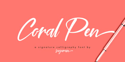 Introducing the Coral Pen script, a font that is very fresh and unique, handmade style. Coral Pen script is perfectly suited for logos, signatures, stationery, posters, apparel, branding, wedding invitations, cards, taglines, layout designs, and much more.
 - OK Moral by Tour De Force,
$25.00 Glyphfight at the OK Moral – single weight Western style typeface. High inverted contrast, generous width, decorative serifs, extended Latin support. It is our 103rd release.
 - Coral Reef by Vozzy,
$10.00 Introducing a clean script font named Coral Reef. This smooth font is perfect for lettering with alternates for small letters (for the last letter for example) and multilingual support.
 - Koralle NF by Nick's Fonts,
$10.00This typeface made its first appearance in Schelter & Giesecke's 1915 specimen book. It exhibits the cleanness and crispness one might expect in a sans-serif face, along with a few unexpected grace notes that make it warm and friendly, as well. Both versions of this font include the complete Unicode Latin 1252, Central European 1250 and Turkish 1254 character sets. - Coral Pro by Scholtz Fonts,
$19.95 Coral Pro is a relaxed and very readable script font. Based on the earlier Coral script. It has been updated, and now has all the features usually included in a fully professional font. Language support includes all European character sets. Coral Pro Black is a bolder script than the original Coral, and has an in-your-face, clear and casual look. It's great used for anything from "schoolgirl diaries" to fashion media.
 - Morally Serif by Tebaltipis Studio,
$15.00 Morally - Modern Bold Serif Font is a stylish font It has both modern and retro look. Comes with alternatives and ligatures, helps to create stunning logos, quotes, posts, blog posts. branding projects, magazine imagery, wedding invitations, and much more. WHAT'S YOU GET ? Unique Letterforms Works on PC & Mac Simple Installations Accessible in the Adobe Illustrator, Adobe Photoshop, Microsoft Word Fully accessible without additional design software. I really hope you'll get pleasure using Morally Font and it will be perfect addition to your font collection! Contact me with an inbox message If you have any question. Thank you! Happy Creating.
 - Morales Bonaven by Runsell Type,
$16.00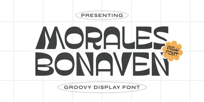 Morales Bonaven font is perfect for many of your projects like logos & branding, photography, invitations, watermarks, advertisements, product designs, stationery, wedding designs, labels, product packaging, special events and much more.
 - Noema Pro by DBSV,
$130.00 About family “Noema Pro” Steps… The name “Noema” is again borrowed from ancient Greek word, which may have different meanings depending on the phrase: meaning, logic, significance, purpose, reason, value, nod, implied. In this font i tried and here(like in “ErisPro”) to give a different illustration in letters with a reverse dial(…sloping or recline) from Italic, simply because of whims or because the monotony is tiring me… This series is composed and includes twenty-four fonts with 658 glyphs each, with true italics, true Sloping and supports of course: Latin, Greek & Cyrillic.
 - Nomad Decorative by Struvictory.art,
$21.00 NOMAD is a modern display capital font with bohemian motives. The font is created in classic proportions and decorated with celestial and boho decor. NOMAD uppercase is decorated with bohemian patterns. The font is suitable for the design on the theme of astrology, mysticism, spirituality, witchcraft, magic, esotericism. NOMAD has extensive language support, it includes English, French, German, Italian, Spanish, Portuguese, Danish, Norwegian, Swedish, Finnish, Estonian, Turkish.
 - Nomadic Dreams by Shakira Studio,
$19.00 Nomadic Dreams: Modern Serif Elegance with Infinite Possibilities Nomadic Dreams is meticulously crafted with sleek, well-defined letterforms that convey a contemporary charm. The serifs are thoughtfully designed to bring a touch of class and readability to every character, making it suitable for a variety of design applications. What sets Nomadic Dreams apart is its diverse range of alternates and ligatures. These design elements offer a playground for creativity, allowing you to customize and tailor your text to evoke different moods and styles. Whether you're looking for a classic look or something more whimsical, Nomadic Dreams provides the tools to bring your vision to life. This font is not just a static typeface; it's a dynamic expression of your design narrative. Nomadic Dreams is perfect for editorial design, branding, invitations, or any project where the seamless integration of modernity and classic elegance is paramount. Here's what you get: Regular & Italic All Multilingual symbol Opentype features ( ligature, alternate ) Accessible in the Adobe Illustrator, Adobe Photoshop, Adobe InDesign, even work on Microsoft Word. PUA Encoded Characters - Fully accessible without additional design software. Multilingual character supports : (Afrikaans, Albanian, Catalan, Croatian, Czech, Danish, Dutch, English, Estonian, Finnish, French, German, Hungarian, Icelandic, Italian, Lithuanian, Maltese, Norwegian, Polish, Portuguese, Slovenian, Spanish, Swedish, Turkish, Zulu) Follow my shop for upcoming updates, and for more of my work, Thank you!
 - Lucid Type B Outline (BRK) - Unknown license

- Lucid Type A Outline (BRK) - Unknown license

- Lucid Type A Outline BRK - Unknown license

- Lucid Type B Outline BRK - Unknown license

- 101! Dad Goes Formal - Unknown license

- Serif Formal Oblique JNL by Jeff Levine,
$29.00 An advertisement in a 1936 issue of “The Film Daily” for the movie “Mr. Deeds Goes to Town” had much of its copy set in an extrabold typeface similar to the Beton/Stymie/Karnac group of slabserif designs. This is now available digitally as Serif Formal JNL in both regular and oblique versions.
 - OL Hebrew Formal Script by Dennis Ortiz-Lopez,
$30.00 This font contains every variant found in the Hebrew Bible such as the “mutilated” Waw in Numbers 25: verse 12, the small Heh in Genesis 2: verse 4 and the Nun Inversum before Numbers 10: verse 35 and after verse 36 and elsewhere as well as oversized consonants and various double-wide consonants used in inscriptions.
 - 99 Names of ALLAH Handwriting by Islamic Calligraphy75,
$12.00 We have transformed the “99 names of ALLAH” into a font. That means each key on your keyboard represents 1 of the 99 names of ALLAH Aaza Wajal. The fonts work with both the English and Arabic Keyboards. We call this Calligraphy "Handwriting" for obvious reasons. The first "Alef" has a "fatha", this indicates that the name can be pronounced only one way, "AR-RAHMAAN". (in the zip file you will find a pdf file explaining the differences in the "harakat", pronunciation and spelling according to the Holy Quran). The calligraphy is very easy to read, no letters overlaps and the decorative symbols are at minimum. Decorative letters used in this calligraphy: "Mim, Aain, Sin, HHe, He, Saad & Ta". Purpose & use: - Writers: Highlight the names in your texts in beautiful Islamic calligraphy. - Editors: Use with kinetic typography templates (AE) & editing software. - Designers: The very small details in the names does not affect the quality. Rest assured it is flawless. The MOST IMPORTANT THING about this list is that all the names are 100% ERROR FREE, and you can USE THEM WITH YOUR EYES CLOSED. All the “Tachkilat” are 100% ERROR FREE, all the "Spelling" is 100% ERROR FREE, and they all have been written in accordance with the Holy Quran. No names are missing and no names are duplicated. The list is complete "99 names +1". The +1 is the name “ALLAH” 'Aza wajal. Another important thing is how we use the decorative letters. In every font you will see small decorative letters, these letters are used only in accordance with their respective letters to indicate pronunciation & we don't include them randomly. That means "mim" on top or below the letter "mim", "sin" on top or below the letter "sin", and so on and so forth. Included: Pdf file telling you which key is associated with which name. In that same file we have included the transliteration and explication of all 99 names. Pdf file explaining the differences in the harakat and pronunciation according to the Holy Quran. Here is a link to all the extra files you will need: https://drive.google.com/drive/folders/1Xj2Q8hhmfKD7stY6RILhKPiPfePpI9U4?usp=sharing
 - H74 Norway Black by Hydro74,
$15.00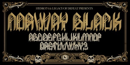
- MC Landrit Almesa by Maulana Creative,
$14.00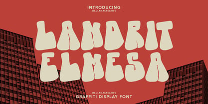 Landrit Almesa graffiti display font. Heavy stroke, fun character with a bit of ligatures. To give you an extra creative work. Landrit Almesa graffiti display font support multilingual more than 100+ language. This font is good for logo design, Social media, Movie Titles, Books Titles, a short text even a long text letter and good for your secondary text font with script or serif. Make a stunning work with Landrit Almesa graffiti display font. Cheers, Maulana Creative
 - David Lozano Lucas - 100% free

- FS Lucas Paneureopean by Fontsmith,
$90.00Pure and not-so-simple Maybe it’s the air of purity, openness and transparency that they transmit, but geometric typefaces are more popular than ever among leading brands. Based on near-perfect circles, triangles and squares, geometric letterforms look uncomplicated, even though making them readable is anything but – something the designers of the first wave of geometric fonts discovered nearly a century ago. Many of the world’s most recognisable brands in technology, retail, travel, food, manufacturing and other industries continue to be drawn to the straightforward, honest character that geometric fonts convey. Fontsmith set out in 2015 to develop a typeface in the same tradition, but optimised for the demands of modern brands – online and offline usage, readability and accessibility. And, of course, with the all-important Fontsmith x-factor built in. FS Lucas is the bold and deceptively simple result. Handle with care The letterforms of FS Lucas are round and generous, along the lines of Trajan Column lettering stripped of its serifs. But beware their thorns. Their designer, Stuart de Rozario, who also crafted the award-winning FS Millbank, wanted a contrast between spiky and soft, giving sharp apexes to the more angular letterforms, such as A, M, N, v, w and z. Among his inspirations were the colourful, geometric compositions of Frank Stella, the 1920s art deco poster designs of AM Cassandre, and the triangular cosmic element symbol, which led him to tackle the capital A first, instead of the usual H. The proportions and angles of the triangular form would set the template for many of the other characters. It was this form, and the light-scattering effects of triangular prisms, that lit the path to a name for the typeface: Lucas is derived from lux, the Latin word for light. Recommended reading Early geometric typefaces were accused of putting mathematical integrity before readability. FS Lucas achieves the trick of appearing geometric, while taking the edge off elements that make reading difficult. Perfectly circlular shapes don’t read well. The way around that is to slightly thicken the vertical strokes, and pull out the curves at the corners to compensate; the O and o of FS Lucas are optical illusions. Pointed apexes aren’t as sharp as they look; the flattened tips are an essential design feature. And distinctive details such as the open terminals of the c, e, f, g, j, r and s, and the x-height bar on the i and j, aid legibility, especially on-screen. These and many other features, the product of sketching the letterforms in the first instance by hand rather than mapping them out mechanically by computer, give FS Lucas the built-in humanity and character that make it a better, easier read all-round. Marks of distinction Unlike some of its more buttoned-up geometric bedfellows, FS Lucas can’t contain its natural personality and quirks: the flick of the foot of the l, for example, and the flattish tail on the g and j. The unusual bar on the J improves character recognition, and the G is circular, without a straight stem. There’s a touch of Fontsmith about the t, too, with the curve across the left cross section in the lighter weights, and the ampersand is one of a kind. There’s a lot to like about Lucas. With its 9 weights, perfect proportions and soft but spiky take on the classic geometric font, it’s a typeface that could light up any brand. - Feldicouth Norm - Unknown license

- Norm Pen by Authentic,
$39.50 NormPen is based on an ancestor of the German DIN-Schrift. The font was traced with a plastic template on transparent paper, scanned and worked over carefully to keep the handmade, authentic touch.
 - Normative Lt by Green Type,
$19.00 Normative Lt is a sans serif type family by Green Type, a low cost version of Normative Pro, includes only a Unicode Latin 1252 character set. Normative Lt is a font with wide sphere of application, legible from very small size to very large ones. Can be used both in technical documentation, office work, business communication, as well as in advertising, visual communication, magazines and posters, in branding and packaging.
 - ITC Nora by ITC,
$29.99ITC Nora was designed by James Montalbano when he was on a 1930s sign-lettering kick, poring over showcard manuals to find inspiration for new typeface designs. A few letters led him to create this informal, goofy" script, which falls between the many formal scripts and the completely extravagant. ITC Nora displays a free-flowing openness and elegance."


