9,495 search results
(0.037 seconds)
- Love Princes by Sulthan Studio,
$10.00 Love Princes is a handwritten script font that was written using a marker on paper and then I made it into a charming and very natural font, with two very cool writing characters if paired or used in one of your works
 - Sundoes by ahweproject,
$9.00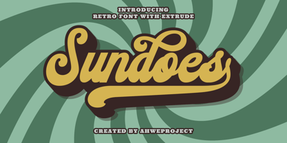 Sundoes is a cool and fun script display font. With a retro and groovy vibe, this font is suitable for a wide pool of design ideas. This font is PUA encoded which means you can access all glyphs and swashes with ease!
 - Nijikon Japan by Letterara,
$14.00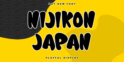 Nijikon Japan is a cool and friendly display font, inspired by Japanese cartoons. Get inspired by its childlike charm and use it to create fun designs. This font is PUA encoded which means you can access all of the cute glyphs with ease!
 - Linea Nera NF by Nick's Fonts,
$10.00Here's another Disco-era darling, based on Wolf Magin's contemporary offering, originally called Black Line. It's a natural choice for sassy headlines with a cool Retro vibe. Both versions contain the complete Latin 1252, Central European 1250 and Turkish 1254 character sets. - LD Dear Diary by Illustration Ink,
$3.00If you've got a secret to tell, or just crave a unique font for cool scrapbook journaling, "Dear Diary" will fit the bill. This true type font looks handwritten with tall uppercase letters, and small, narrower lowercase script. Have some fun with it! - Emmy by Emily Lime,
$19.00 Emmy is the second family from this up and coming foundry. A versatile font, Emmy has many different styles to suit your needs. Easy to read and fun to use...it's perfect for a children's book, logo or other cool design project!
 - Kralken by ahweproject,
$9.00 Kralken is a cool, modern and detailed serif font. It will add a luxury spark to any design project that you wish to create! This font is PUA encoded which means you can access all of the amazing glyphs and ligatures with ease!
 - Bat Boo by AEN Creative Studio,
$15.00 Bat Boo is a cool and spooky display font. This font is PUA encoded which means you can access all of the glyphs and swashes with ease! Add it confidently to your favorite creations and let yourself be amazed by the outcome generated.
 - Sunia Rabica by Arttype7,
$15.00 Sunia Rabica is a cool looking and incredibly unique display font, inspired by the arabic art. It is defined by smooth curves and is perfect for fashion branding or editorial designs. Add it confidently to your projects, and you will love the results.
 - Cute Molly by MJB Letters,
$9.00 Cute Molly is a very cute handwritten font created with great attention to produce beautiful, funny and stunning works. Your project will definitely look very cool with this font which has 3 weights: regular, thin and bold. Grab it fast and happy designing!
 - Notably Absent by Ali Hamidi,
$10.00 Notably Absent is a cool and fun styled display font. It will elevate a wide range of crafting ideas, from cards, to branding, labels and much more. Add it confidently to your favorite creations and let yourself be amazed by the outcome generated.
 - Murisa Mondriana by Murisa Studio,
$10.00 Mondriana is a cool and modern looking sans serif font. It will elevate a wide range of crafting ideas, from cards, to branding, labels and much more. Add it confidently to your favorite creations and let yourself be amazed by the outcome generated.
 - Graffiti PTx by Pedro Teixeira,
$15.00 This font was inspired on graffiti texts, sentences of street walls. The intention it's to give an style of old school words spreaded on some walls around the world. This can be cool for an design of a poster, headlines and so on.
 - Electroz by 4RM Font,
$30.00 Electroz font is a techno themed font made with futuristic values, made with condensed width and slanted cuts at the corners of the letters making this font look cool and have a strong futuristic value. suitable for use in futuristic-themed designs
 - Hallo Witch by Sakha Design,
$12.00 Hallo Witch is a cool and spooky decorative font. Add it to each of your Halloween related designs and notice how easily they stand out. This font is PUA encoded which means you can access all of the glyphs and swashes with ease!
 - Absolute Kiddos by Krakenbox Studio,
$15.00 Absolute Kiddos is a cute and playful display font. Use this font to add that special cool touch to any design idea you can think of! It is perfect for any branding project such as logos, t-shirt printing, creative products, and more
 - Upton by Halbfett,
$30.00Upton is a modern and condensed sans serif. The initial inspiration for its design came from lettering Wim Crouwel created for a poster design. It also takes some cues from neutral grotesks like Helvetica and Akzidenz. Because of its narrow letterforms, Upton is best applied to headlines and poster-sized typography. Upton’s italics were designed with high-quality compensation for all circles and strokes. Upton ships in two different formats. Depending on your preference, you can install the typeface as two Variable Fonts or use the family’s 14 static OpenType font files instead. Those weights run from Extralight to Extrabold. While the static-format fonts offer a good intermediary-step selection, users who install the Variable Font have vastly greater control over their text’s stroke width. The weight axes in Upton’s Variable Fonts allow users to differentiate between almost 1,000 possible font weights. That enables you to fine-tune your text’s exact appearance on-screen or in print. In its fonts, Upton has several ligatures. That includes optional “discretionary ligatures,” which bring a unique tone to display usage. For instance, the fonts include optional ligatures for the letter combinations “E-T”, “F-l”, “L-E-T-T-E”, “L-E-T-T”, “L-E-T”, “L-E-L-O”, “L-U”, “i-j”. and “m-m”. There are also many alternate glyphs. Stylistic Set 1 substitutes in new forms for “G”, “R”, “a”, “f”, “g”, “i”, “r”, “t”, and “y”. Six more Stylistic Sets have alternates for the “æ”, “g”, “k”, “o”, “K”, “O”, and “Q”. Additional OpenType features activate other useful features, such as fractions, numbers in circles, or symbols. - Rubis by Nootype,
$45.00 Rubis is a contemporary serif typeface with a sharp aspect designed for long running text. It’s a family with a serious aspect but it keeps a certain charm. The idea behind Rubis was to create a typeface with flawless curves, every letter and symbol has been designed in this idea, it can be seen in the terminals which finish the letter with an extreme fluidity. It’s a family which mixes classical influence such as the calligraphic terminaison and the sharpness of a modern typeface. The Regular and Medium are optimized for long text while the Light and Black can be useful for Title. The range of style give a good flexibility to this family. It’s an excellent family for editorial use. Rubis consists in a 10 styles family, from Light to Black with their corresponding italics. Each font includes OpenType Features such as Small Caps, Proportional Figure, Tabular Figures, Numerators, Superscript, Denominators, Scientific Inferiors, Subscript, Ordinals, Fractions and ligatures. Rubis family supports Latin and Cyrillic, all these languages are covered: Latin language support: Afar, Afrikaans, Albanian, Asturian, Azeri, Basque, Bosnian, Breton, Bulgarian, Catalan, Cornish, Corsican, Croatian, Czech, Danish, Dutch, English, Esperanto, Estonian, Faroese, Filipino, Finnish, Flemish, French, Frisian, Friulian, Gaelic, Galician, German, Greenlandic, Hungarian, Icelandic, Indonesian, Irish, Italian, Kurdish, Latin, Latvian, Lithuanian, Luxembourgish, Malagasy, Malay, Maltese, Maori, Moldavian, Norwegian, Occitan, Polish, Portuguese, Provençal, Romanian, Romansch, Saami, Samoan, Scots, Scottish, Serbian, Slovak, Slovenian, Spanish, Swahili, Swedish, Tagalog, Turkish, Walloon, Welsh, Wolof Cyrillic language support: Adyghe, Avar, Belarusian, Bulgarian, Buryat, Chechen, Erzya, Ingush, Kabardian, Kalmyk, Karachay-Balkar, Karakalpak, Kazakh, Komi, Kyrgyz, Lak, Macedonian, Moldovan, Mongol, Permyak, Russian, Rusyn, Serbian, Tatar, Tofa, Tuvan, Ukrainian, Uzbek .
 - Deadfall by Mofr24,
$11.00 Discover Deadfall, the ultimate horror display font that will send shivers down your spine! What sets Deadfall apart is its unique blend of fear-inducing aesthetics and multilingual capabilities. This Monospace typeface exudes a captivating dripped and splash style, adding an extra layer of terror to your designs. Notably, Deadfall supports the Cyrillic alphabet, making it an ideal choice for a global audience. Deadfall offers both regular and italic variations, granting you even more creative possibilities. Whether you're designing posters, crafting marketing materials, conjuring chilling movie titles, creating Death metal logotypes, or working on Halloween-themed crafts, Deadfall will infuse your projects with a bone-chilling atmosphere. To ensure versatility, consider pairing Deadfall with related font families or other typefaces that complement its macabre charm. Its functional aspects include an extensive character set and special features, making it suitable for a wide range of applications. The design concept behind Deadfall revolves around the idea of capturing the essence of horror. The font's distinctive dripped and splash style adds a sense of chaos and unease to any composition, immersing the viewer in a world of terror. The inclusion of the Cyrillic alphabet reflects our commitment to providing a font that caters to diverse audiences, bringing fear to every corner of the globe. We created Deadfall to meet the demand for a truly spine-tingling font that conveys a sense of horror and foreboding. Whether you're a graphic designer looking to evoke fear or a Halloween enthusiast seeking to amplify the spooky atmosphere, Deadfall is here to unleash terror in your designs. Get ready to embrace the darkness with Deadfall - the ultimate font for all things haunting and macabre!
 - Poligon by Halbfett,
$30.00 Poligon is a large family of geometric sans serif fonts. It is inspired by classic typefaces from the geometric-sans genre, like Futura and Avant Garde Gothic, whose shapes were constructed from circles and straight lines. Every character has been crafted to give it a distinct and individual feel. The family is an excellent choice for both corporate design and editorial design projects because of its range of weights, as well as its legibility in text. The typeface family ships in two different formats. Depending on your preference, you can install the typeface as two Variable Fonts or use the family’s eight static OpenType font files instead. Those weights run from Thin to Black. While the static-format fonts offer a good intermediary-step selection, users who install the Variable Fonts have vastly greater control over the stroke width in their upright and italic texts. The weight axes in Poligon’s Variable Fonts allow users to differentiate between almost 1,000 possible font weights. That enables you to fine-tune your text’s exact appearance on-screen or in print. But even the static fonts satisfy the need for flexibility, creating harmonious variations of texture and emphasis. Despite their rigid geometry, the fonts have a playful air to them. That playfulness and uniqueness can be dialed up by applying stylistic alternates via the fonts’ four Stylistic Sets. The first of these replaces “G”, “M”, and “&” with alternate, more outgoing shapes. Stylistic Set 2 has an alternate “ß”; Stylistic Set 3 has a “Q” with a longer tail and another “G”. Stylistic Set 3 has alternates for “A”, “K“, “Q”, “R”, “S”, “Y”, and “Z”.
 - Istanbul Type by Bülent Yüksel,
$19.00 "Istanbul Type" has a modern streak which is the result of a harmonization of width and height especially in the lowercase letters to support legibility. "Istanbul City" has the modernity of the west and the orientalist texture of the east as the city that unites the Asian and European continents. "Istanbul Type" also includes these features. It is a unique character that reflects the spirit of "Istanbul City". Many letter alternatives prepared with care have been created for all letters. You can make dozens of combinations from a word using these alternative letters. "Istanbul Type" is an effective set for creating identities for branding, posters, book covers, headlines, logotypes, restaurants, menu cards, wedding invitations and so on. "Istanbul Type" provides advanced typographical support for Latin-based languages. An extended character set, supporting Central, Western and Eastern European languages, rounds up the family. The designation “Istanbul Type 500 Regular” forms the central point. The first figure of the number describes the stroke thickness: 100 Thin to 900 Bold. "Istanbul Type" 5 weights and italics total 10 types. The family contains a set of 2.200+ characters. Case-Sensitive Forms, Classes and Features, Fractions, Superior, Inferior, Denominator, Numerator, Old Style Figures just one touch easy In all graphic programs. Attention! "Typography Line" is not suitable for use. When using it for special effects, it may be necessary to "Convert / Create Outlines" it first and then "Pathfinder Unite" it. You might have a crush on this typeface :) Do not hesitate to consult me for information about fonts before, during and after purchasing. You can contact me at "buyuksel@hotmail.com". Enjoy using it.
 - Istanbul Type Variable by Bülent Yüksel,
$69.00 "Istanbul Type Variable" has a modern streak which is the result of a harmonization of width and height especially in the lowercase letters to support legibility. "Istanbul City" has the modernity of the west and the orientalist texture of the east as the city that unites the Asian and European continents. "Istanbul Type Variable" also includes these features. It is a unique character that reflects the spirit of "Istanbul City". Many letter alternatives prepared with care have been created for all letters. You can make dozens of combinations from a word using these alternative letters. "Istanbul Type Variable" is an effective set for creating identities for branding, posters, book covers, headlines, logotypes, restaurants, menu cards, wedding invitations and so on. "Istanbul Type Variable" provides advanced typographical support for Latin-based languages. An extended character set, supporting Central, Western and Eastern European languages, rounds up the family. The designation “Istanbul Type Variable 500 Regular” forms the central point. The first figure of the number describes the stroke thickness: 100 Thin to 900 Bold. "Istanbul Type Variable" 5 weights and italics total 10 types. The family contains a set of 2.200+ characters. Case-Sensitive Forms, Classes and Features, Fractions, Superior, Inferior, Denominator, Numerator, Old Style Figures just one touch easy In all graphic programs. Attention! "Typography Line" is not suitable for use. When using it for special effects, it may be necessary to "Convert / Create Outlines" it first and then "Pathfinder Unite" it. You might have a crush on this typeface :) Do not hesitate to consult me for information about fonts before, during and after purchasing. You can contact me at "buyuksel@hotmail.com". Enjoy using it.
 - Eckhart by ROHH,
$29.00 Eckhart™ is a modern didone, high-contrast typeface designed to create elegant, original and expressive character. This versatile font family is delivered in four optical sizes, making it a complete type system for all kinds of use, from branding to setting paragraph text. It is equipped with ligatures, swashes and alternates to enrich design possibilities and make it very distinctive as a display typeface. Eckhart family features a very playful and energetic color font, giving broad new possibilities of display use, especially interesting for posters and magazines. Eckhart Color is delivered both as OTF color font as well as regular layered font in 6 layers - it helps to achieve maximum software compatibility and control over colors. Eckhart consists of 74 fonts in 4 optical sizes - 33 uprights and their corresponding true italics + color fonts. It has extended language support as well as broad number of OpenType features, such as case sensitive forms, standard and discretionary ligatures, stylistic sets, lining, oldstyle figures, slashed zero, fractions, superscript and subscript, ordinals, currencies and symbols. --- Color font - user information: Eckhart Color Folk - OTF color font format has pre-defined color palette. In order to change the colors, please convert the text to outlines. You need compatible software to use the OTF color file, such as Adobe Photoshop CC, Adobe Illustrator CC, Pixelmator, etc. Eckhart Color Layered fonts - use the fonts one on top of the other in the order the fonts are numbered. These are regular OTF files, they work in all professional graphic software and you can edit the color of each layer. For web use - please use the color fonts as graphics, because not all web browsers support them.
 - European Soft Pro by Bülent Yüksel,
$19.00 EUROPEAN SOFT PRO ABOUT FAMILY: What makes "European Soft Pro" elegant, friendly and contemporary is its very rounded curves with very open terminals. "European Soft Pro" has been designed with a higher "x-height" than other fonts in its class to make tiny readability more obvious in any use situation. It will be ideal for use in small sizes such as business cards or mobile applications. This typeface is also equipped with powerful OpenType features to satisfy the most demanding professionals. It has solid features like case sensitivity, small, true capitals, full ligatures, tabular figures for tables, old style figures to elegantly insert numbers into your sentences and more alternative characters to give personality to your projects. The extended, "European Soft Pro" supports around 85 languages in the Latin, Cyrillic and Greek scripts, and its non-Latin components were developed with native consultants. With over 1200+ glyphs per style, "European Soft Pro" cares about localised letterforms and has the OpenType features to match. FEATURE SUMMARY: - 9 weights: Thin, ExtraLight, Light, Book, Regular, Medium, Bold, ExtraBold, and Black. - 4 widths: Normal, Narrow, Condensed, and Extra Condensed. - Matching italics (12º) for all weights and widths . - Matching small caps for all weights and widths. - Lining and old style figures (proportional and tabular). - Alternate characters (A, G, M, N, R, U, a, g, l, m, n, u, y). - Unlimited fractions. - Automatic ordinals (1st, 2nd, 3rd, etc.). - 24 Dingbats + 19 Social Media and Block Chain icons. - Extended language support: Most Latin-based scripts (including Vietnamese), Cyrillic, and Greek. - Extended currency support. You can contact me at buyuksel@hotmail.com, pre-purchase and post-purchase with questions and for technical support. You can enjoy using it.
 - European Sans Pro by Bülent Yüksel,
$19.00 EUROPEAN SANS PRO ABOUT FAMILY: What makes "European Sans Pro" elegant, friendly and contemporary is its very rounded curves with very open terminals. "European Sans Pro" has been designed with a higher "x-height" than other fonts in its class to make tiny readability more obvious in any use situation. It will be ideal for use in small sizes such as business cards or mobile applications. This typeface is also equipped with powerful OpenType features to satisfy the most demanding professionals. It has solid features like case sensitivity, small, true capitals, full ligatures, tabular figures for tables, old style figures to elegantly insert numbers into your sentences and more alternative characters to give personality to your projects. The extended, "European Sans Pro" supports around 85 languages in the Latin, Cyrillic and Greek scripts, and its non-Latin components were developed with native consultants. With over 1200+ glyphs per style, "European Sans Pro" cares about localised letterforms and has the OpenType features to match. FEATURE SUMMARY: - 9 weights: Thin, ExtraLight, Light, Book, Regular, Medium, Bold, ExtraBold, and Black. - 4 widths: Normal, Narrow, Condensed, and Extra Condensed. - Matching italics (12º) for all weights and widths . - Matching small caps for all weights and widths. - Lining and old style figures (proportional and tabular). - Alternate characters (A, G, M, N, R, U, a, g, l, m, n, u, y). - Unlimeted fractions. - Automatic ordinals (1st, 2nd, 3rd, etc.). - 24 Dingbats + 19 Social Media and Block Chain icons. - Extended language support: Most Latin-based scripts (including Vietnamese), Cyrillic, and Greek. - Extended currency support. You can contact me at buyuksel@hotmail.com, pre-purchase and post-purchase with questions and for technical support. You can enjoy using it.
 - Frescito Variable by Mans Greback,
$69.00 Frescito is a modern sans-serif typeface that embodies a fresh, cool, and street-smart aesthetic. Designed to be both balanced and versatile, its clear and legible monoline style is designed for branding and advertising in editorial and digital design. Only one font file, but the file contains multiple styles. Use the sliders in Illustrator, Photoshop or InDesign to manually set any weight and width. This gives you not only the predefined styles, but instead more than a thousand ways to customize the type to the exact look your project requires. More info about Variable Fonts: https://mansgreback.com/variable-fonts Inspired by the energetic spirit of the city and its vibration, Mans Greback set out to create a typeface that would stand out against vivid moment; a type that would work in a traditional café just as well as for contemporary merchandise. The result is a font that combines the best of both worlds: an air of freshness and modernity with an unpretentious, timeless and classy appeal. The font is built with advanced OpenType functionality and has a guaranteed top-notch quality, containing stylistic and contextual alternates, ligatures, and more features; all to give you full control and customizability. It has extensive lingual support, covering all Latin-based languages, from Northern Europe to South Africa, from America to South-East Asia. It contains all characters and symbols you'll ever need, including all punctuation and numbers.
 - Bigfoot by Canada Type,
$24.95 Bigfoot is the fattest font ever made. It began as a simple exercise given to students in a design course: Most people don't appreciate type because they don't really know what it actually is. One way to understand it is looking at it like a combination of sculptures that have to work together to achieve a certain harmony, where each letter form is one of those sculptures. Most people understand and appreciate that a sculpture starts from a rock of an incomprehensible form, which is manipulated by someone into becoming the recognizable or abstract work of art it eventually is. Consider type design a kind of two-dimensional sculpting. You have a rectangle. Take away as a little as possible from it until it is recognizable as the letter A. Repeat to get the letter B, and so on. After all 26 minimal letters are made, do they actually function as an alphabet to build words and sentences that are recognizable to the human eye? This exercise can trigger thoughts and theories about the overall subjective nature of identifying abstract yet somewhat familiar shapes. It can go into the psyche of art in general. But one thing for certain, this exercise has so far helped a few people find a new appreciation for finely crafted typefaces. If you are a design educator, your students' typographical perspective and arguments would benefit from it. And if you are a designer, well, fat faces are all the rage these days, and this is as fat as it can get. Please note that that this typeface, due to its minimalistic nature, does not include accented characters. It does however support the full C0 Controls and Basic Latin Unicode set. All proceeds from this font go to support the Type Club of Toronto.
 - Civane by insigne,
$- High atop the mountain of fonts, a new structure has been raised--one solid and strong against the challenges of time. Civane is a victorious conqueror among fonts, standing above the clutter and the mundane. Its firm structure joins effortlessly with graceful calligraphy in a new flowing, inscriptional typeface. Civane is inspired by monuments of great civilizations, whose lofty inscriptions remain chiseled into the very stones and columns of their structures. The font’s medium contrast with its flared stroke ends lead the reader to feel the solemn presence found in these great obelisks and shrines. Even Civane’s thinnest weight holds a quiet power over its audience. Still, its classic lines provide a beautiful flow between the strong letters, allowing the reader’s eye to move easily across the page. Civane supports OpenType features and comes with upright italics, alternates, ligatures, old-fashioned figures, titling and small caps. Preview all these features in the interactive PDF manual. The font family has 48 fonts, with three widths and eight weights. The font family also includes glyphs for 72 languages; over 550 glyphs per font stand ready for you to command throughout your design. Civane is built for advertising and display typesetting as well as title and small text, making it an excellent choice for websites as well as flyers and packaging. Use it for defining your brand or for creating designs that evoke academia, militaria, monuments, automobiles, signs, and so on. Its 48 well-designed fonts are well-equipped to help you leave your mark on history. Production assistance from Lucas Azevedo and ikern.
 - Artesanias - Personal use only

- Flim-Flam - Personal use only

- Battleforce 5 - Personal use only

- Freitag Display by Zetafonts,
$39.00 Probably as a reaction to the pragmatism of modernist design, the seventies saw an explosion of buoyant, vivacious typography. Psychedelia fueled a return to the melting, lush shapes of Art Nouveau while Pop culture embraced the usage of funky, joyful lettering for advertising, product design and tv titling. New low-cost technologies like photo-lettering and rub-on transfer required new fonts to be expressive rather than legible, pushing designers to produce, bubbly, high-spirited masterpieces, where geometric excess and calligraphic inventions melted joyfully. Freitag is Cosimo Lorenzo Pancini's homage to this era and its typography. His starting point was the design of a heavy sans serif with humanist condensed proportions, flared stems and reverse contrast, that generated both the main family, and a variant display subfamily. The main typeface family slowly builds the tension and design exuberance along the weight axis - a bit like our desire for the weekend increases during the week. In Light and Medium weights the font shows a more controlled, medium-contrast design, tightly spaced for maximum display effect. The Book weight follows the same design but uses a more relaxed letter spacing to allow usage in smaller sizes and short body copy. As weight increases in the Bold weight the style becomes more expressive, with a visible reverse contrast building up and culminating in the Heavy weight with his clearly visible "bell bottoms" feel. In the display sub-family the design is pushed further by introducing variant letterforms that have a stronger connection to calligraphy and lettering. Also, the weight range becomes a optical one, with weights marked as Medium, Large, XLarge, as bringing the contrast and the boldness to the extreme creates smaller counterspaces that require bigger usage sizes. Another important addition of the display sub-family is the connected italics that sport swash capitals and cursive letterforms, developed with logo design and ultra-expressive editorial design in mind. To balance the extreme contrast in the XL weight, contrast of punctuation is reduced, creating a rich, highly-dynamic texture wherever diacritics and marks are used in the text. The full family includes 16 styles + 4 variable fonts, allowing full control of the design over its tree-hugging design space. All 20 fonts share an extended latin charset with open type features including case sensitive forms, single and double story variants and alternate glyphs. According to its creator, "Freitag is the typeface that sounds like an imaginary Woodstock where on the stage with Jimi Hendrix with Novarese, Motter, Excoffon and Benguiat playing onstage with Jimi Hendrix". Jeepers creepers!
 - Clio by LeType,
$75.00 Clio, Clio XS and Clio Condensed —each available separately— is a big family of 72 fonts. They were designed by Gabriel de Souza in 2012. They are simple and stylish and they have the ideal appearance to your work. Furthermore, features such as italics, obliques, great language support and flexibility. They can be applied in many different forms but their primary use is indicated to display use and luxurious trade mark creation and also available for Clio Icons.
 - Village by Font Bureau,
$40.00 David Berlow undertook the revival of Frederic W. Goudy’s Village family in the early ’90s as the first real step in the successful redesign of Esquire magazine. Goudy originally cut Village No. 2 in 1932 to bring early ideas up to date, adding the italic a year or two later for his own satisfaction. Font Bureau expanded Village, the model for Goudy’s mature style, into a ten-part series designed for Esquire’s use in text and display; FB 1994
 - Christmas Picture by Reyrey Blue Std,
$18.00 Introducing, Christmas Picture Typeface. A classical and fun serif italic version. It's created specially for the Christmas Spirit. Christmas Picture is a great design choice this Xmas season for inspirational quote designs, logo designs, simple and classy Logos, web font, branding, product packaging, and much more. This font is PUA-encoded, which means you can easily access all of the glyphs! Features : All Uppercase and Lowercase Number & Symbol Supported Languages Stylistic Alternate PUA Encoded Hope you enjoy our font!
 - Rocking the Kasbah NF by Nick's Fonts,
$10.00This lively script is based on a handlettered offering from The Hunt Brothers, which they called simply "Ornamental Italic". Ornamental, yes, but there’s also a lot of action and attitude in this typeface. Please note that, due to the extreme slant of the characters, spacing in the font has been optimized for upper- and lowercase use. Both versions of this font contain complete Unicode 1252 (Latin) and Unicode 1250 (Central European) character sets, with localization for Romanian and Moldovan. - Scansky by Satori TF,
$20.80 Scansky is a carefully crafted contemporary modern sans serif typeface. It comes with 28 fonts, regular and condensed sub-families, and matching italics. Scansky was designed to give a distinct, corporative look to your artwork, suited for signage, web, and corporate print material. It is equipped with an extended character set to support Central, Eastern and Western European languages. And the good news is that the SemiBold weights are free of charge so you can try it. :)
 - Jekatep by ActiveSphere,
$30.00 Jekatep is a sans-serif display font and works best in text and display applications, such as posters, headline, magazine, logos, titles, product branding, corporate branding and publishing. Jekatep font has three weights; light, regular, and bold, each available in italic, making a total of six styles. Each style has a full upper and lower-case, accents, punctuation and a selection of monetary symbols. Currently Available for Mac and PC, in Open Type, PostScript or TrueType.
 - Casey by 50Fox,
$15.00 Say hello to Casey Typeface! A fancy and beautiful editorial serif with luxury ligatures, alternates glyphs and multilingual support - with a complementary italic version. It's a versatile font that looks great in big and small sizes. This has a wide variety of uses, including editorial projects, logo design, clothing branding, product packaging, magazine headers, and so much more. It's ideal for any type of graphic design project or as a stylish text overlay to any image.
 - Palio by Eurotypo,
$34.00 Palio is a family of fonts derived from the classic Didone, its capitals are slightly condensed and the lower case definitively abandon the reminiscent of the baroque endings strokes, which are still endure in many typefaces. It is an elegant font especially the slant version that actually is a truly italic. This version very readable and is enriched with a series of alternative variables and swashes that make it more expressive for certain projects that need some flowering.


