10,000 search results
(0.034 seconds)
- Uchrony Cube - Personal use only

- Alegria by Outras Fontes,
$24.00 Alegria is a font family for joyful communication. The family consists of Alegria Roman (with upper/lowercase and oldstyle figures), Alegria Caps (with uppercase, small caps and lining figures), Alegria Bright (a small caps version with a three-dimensional feel) and Alegria Fill (that can be used as a second layer with Bright or Caps faces to create multiple colors on the text). Alegria family is suitable for short display texts and can be used in many ways you can creatively think of.
 - Gondola SD - 100% free

- Bola - Unknown license

- Palmer Lake by Jen Wagner Co.,
$13.00 Features: Palmer Lake Print: Uppercase letters, numbers, & extended punctuation Palmer Lake Script: Lowercase letters, numbers, & extended punctuation Non-English support for the international designer Same stroke thickness with each font, so you don't need to make any time-consuming adjustments to get it looking right! Palmer Lake Print (uppercase font) letters are the same height as the Script lowercase letters, so making quotes is super easy! This is such a fun new duo, perfect for creating quotes, logos, or just adding a hand-written touch to any project! While other fonts usually take some size adjusting to look just right, Palmer Lake duo has the same stroke thickness for both fonts, so you can set each font to the same size and you're done! Plus, the uppercase letters of the Print font are the same height as the lowercase letters of the Script font (see the samples), so lining them up with one another is a breeze! Each font also has alternates for each letter, so when you type uppercase or lowercase for each font, the letters will change slightly. For example, tying in all caps with the Script font will connect each letter, whereas typing all lowercase will disconnect each letter. Test it out for yourself in the box above!
 - FS Maja by Fontsmith,
$50.00 Youthful Fontsmith received a brief to develop a font that would form part of the broadcast identity for the UK’s first digital Freeview channel – E4. It needed to work seamlessly in text and display, both in print and on-screen, and please the eye of the target audience, 18-34-year-olds. So, young, fresh and informal. No problem. Except for one thing: the timing. Daughter As he worked on FS Maja, Jason Smith was occupied by another imminent deadline: the birth of his third child. The pressure was mounting, but rather than let it get to him, Jason embraced the challenge and made light of the tension, fashioning a bright, bubbly, entertaining type with a personality made for memorable headlines. Beautifully random FS Maja’s soft, rounded shapes and assured, fluent lines encompass lots of notable features that contribute to its warm, fun-loving personality, including: a very large x-height; a short, rounded serif to allow for close spacing and give texture to body text; a slight convexity, or bulge, in the stroke terminals; a calligraphic fluidity in the entry to the down-stroke of most lowercase letters; open, generous curves, especially in the “B”, “P” and “R”; and a “w” made of two “u”s.
 - Axalp Grotesk by ROHH,
$39.00 Axalp Grotesk™ is a post-Swiss-Style modernist sans serif type family characterized by the play between elegant rounded shapes and sharp angular details. It is minimal, legible, well balanced and charismatic. Its heavy weights deliver powerful yet friendly impact. Thin ones emanate elegance, fine lines and precision. The family has very versatile proportions and generous x-height allowing a successful use for user interfaces, all sorts of display and branding scenarios, as well as a paragraph text typeface. Contemporary minimalistic approach makes Axalp Grotesk an outstanding design tool for creating modern visual identities and user interfaces. A truly universal sans serif family where beautiful forms and proportion work together with careful spacing, kerning and hand-hinting. Axalp Grotesk is an attractive contemporary alternative to the classics of Swiss Design School such as Akzidenz-Grotesk, Univers and Helvetica. It is bright, crisp, modern and friendly in character, and features an alternative stylistic set for more minimalistic and neutral look, simplifying such characters as “Q”, “J”, “a” and “y”. The family has extended latin language support, as well as broad number of OpenType features, such as stylistic alternates, case sensitive forms, ligatures, contextual alternates, lining, oldstyle, tabular and circled figures, slashed zero, fractions, superscript and subscript, ordinals, currencies and symbols.
 - Solstice by Atlantic Fonts,
$26.00 Bright with many interlocking and connecting ligatures and warm with hand-drawn irregularity, Solstice is something to celebrate. Based on the inspiring hand writing of creative friend, Kimberly Mahan.
 - Element M One by ElementM,
$20.00 Element M One is a clear and bright typeface with a touch of futurism. Specially made for signing, posters, covers and corporate identities. Also a perfect typeface for headlines.
 - Boxed Round by Tipo Pèpel,
$18.00 Boxed Round is a rounded version of the popular Boxed font, a typeface whit 18 weights, brightly conceived and designed to look good on small screen devices, but offering also enlightened looks on paper. The semi-modular geometric font shapes seek to be fully responsive to the grid of screen’s pixels to deliver a crisp, fluid reading rate. The rounded version offers a more warm, sweet, edible appearance that will give more freshness to your texts. Due to its extensive range of weights and subtle difference in thickness, compensating for the stain of characters between different CSS styles is really easy. It offers an extensive set of Latin characters, even the Cyrillic.
 - PF Adamant Pro by Parachute,
$59.00 The Adamant family is a serif typeface that comes in six weights, from Light to ExtraBold, each with italic and small caps versions. It has received an original typeface award from Granshan Awards 2010. Every font in this family includes ligatures, lining and oldstyle figures in proportional and tabular widths, fractions, alternate characters, and other typographic features. The weights are finely balanced so that they can be easily combined, depending on type of paper and print conditions. Its proportions, sturdy serifs, high x-height and wide apertures make it very readable at small sizes. It is suitable for setting books, magazines and newspapers, but is also appropriate for use in large sizes like in poster design.
 - Kardia by Rodrigo Fuenzalida,
$50.00 Kardia is a versatile type family that lets you compose a wide range of texts, from extensive reading materials to striking, eye-catching headlines and titles. Features include ample proportions that have been revised to maintain similar line performance across all its weights. It also has an elevated x-height which facilitates reading in small bodies, in addition to help building solid headlines. Inspired by brush lettering, it takes many features from calligraphic strokes and the foundational style, adapted to a contemporary typographic language. It has 4 weights, all of them including their corresponding italics, small caps and character set that supports Central, Western and South Eastern European, Afrikaans and many more.
 - Roihu by Melvastype,
$32.00 Roihu is a sans serif type family with 16 fonts: eight upright and eight italic weights. Each weight offers more than 1,100 glyphs. Roihu includes some groovy stylistic alternates and swashes that make your titles, packaging, logos, etc. pop out. Roihu also includes small caps, old style and lining figures, and ligatures to make sure your text and designs won't be boring. Download the PDF specimen from the Roihu gallery to see more-specific OpenType instructions and a full glyph set. Opentype features: - small caps - stylistic alternates - swashes - proportional lining figures - proportional old style figures - tabular lining figures - tabular old-style figures - standard ligatures - discretionary ligatures - case-sensitive punctuation - fractions - ordinals - superscript - subscripts - arrows
 - Karmaline by Mysterylab,
$9.00 Karmaline is a six-weight sans serif font family with a unique and expressive design. This font has some intriguing special features such as subtly tapered topheavy vertical strokes and selected wedge-shaped horizontal strokes. It is evocative of designs from Switzerland, Germany, and the Netherlands in the period spanning 1900 – 1930, but with thoroughly modern features like high legibility at small sizes, even inter-character weight and flow, and a high x-height. You'll find Karmaline's semi-condensed width to be useful for both strong headlines and for comfortable copyfitting in narrow column widths. This font also works very well when adding layered shadow and highlight effects, and is a great choice for logos.
 - Applied Sans by Monotype,
$57.99 The Applied Sans™ family is a reinterpretation of the first sans serif typefaces used in what was then called, “jobbing or trade” work – typefaces like Venus and Ideal Grotesk. While built on the foundation of these late 19th and early 20th century designs, Applied Sans adds to it all the required features for modern typographic communication. The design benefits from a large x-height, open counters, generous apertures and a subtle modulation in stroke weight. These ensure character legibility and make for a design that is inviting and easy to read. Applied Sans family’s wide range, precise gradation of weights and extensive language support guarantees the design’s effectiveness in a wide and varied range of uses.
 - Aurore Grotesque by Device,
$39.00 Aurore Grotesque is an elegant, robust geometric sans for both text and headline. It has a classic European heritage that references the posters of Cassandre and the modern sans of Paul Renner or Karl Gustav Möhring, but is entirely new and does not slavishly follow any historical reference. The low lower-case x-height gives it character and definition in running text, while the capitals-only Titling variant lends weight and punch to headlines. The full range of weights, each with matching italics, make it perfect for brochures, magazines, advertising, web, app and corporate uses. Includes lining, old-style and tabular numerals, arrows, stylised geometric alternates, and a full international character set.
 - Saprona by RichardDesignCo,
$29.00 Saprona is a powerful sans-serif with a curved terminals, a tall x-height, narrow letterforms and seven weights. 400 Glyphs. Extensive Language Support. 84 Languages. Advanced OT Features. 7 Weights. Fully Variable. Updates. Advanced OpenType Features include Old Style Figures, Fractions, Denominators, Numerators, Standard Ligatures, Case Sensitive Forms, Alternates to satisfy the most demanding professionals. Curved terminals and unique letterforms make for a sans serif with a unique appearance that can make your brand or design stand out. Saprona is designed to be very versatile therefore it works great in all areas whether it is Editorial Design, Graphic Design, Web Design, UI Design and Print. And is well suited for both Headings and Body Text.
 - Silver Archer by SilverStag,
$14.00 In a world of fleeting trends, Silver Archer stands as a testament to enduring elegance and timeless design. Inspired by the classic sans serif typefaces of the mid-20th century, Silver Archer exudes an air of sophistication and refinement, making it an ideal choice for a wide range of typographic applications. With its meticulously crafted proportions and harmonious stroke contrast, Silver Archer strikes a perfect balance between traditional aesthetics and contemporary sensibilities. Its open counters and generous x-height ensure exceptional legibility, both on screen and in print, while its nine weights, ranging from Thin to Black, with each weight complemented by its italic counterpart, provide ample flexibility to suit any design mood or hierarchy.
 - Kwalett by Ingrimayne Type,
$5.50 Kwalett is a sans serif typeface family with low contrast and a high x-height. Kwalett has two widths, each with five weights and each weight has an italics. The family is derived from the thinnest member of the Qualettee family. As members of that family get bolder, their contrast increases. As members of the Kwalett family get bolder, their contrast remains very low. Kwalett is designed to work better as text than the Qualettee family. The family has two ways to get fractions. A few fractions are preformed and are accessed with the OpenType discretionary ligatures feature. The OpenType fraction feature uses the superscript and subscript numbers to create any fraction.
 - ITC Motter Corpus by ITC,
$40.99ITC Motter Corpus was designed by the Austrian type designer Othmar Motter in 1993 to combine the display advantages of a sans serif extra bold design with the legibility of a roman weight. The Motter Corpus is available in the weights regular and condensed regular. The capitals with their strong strokes display slight irregularities and natural looking outlines. When used in very large point sizes the tiny serifs become noticeable. Distinguishing characteristics of this typeface are the unusual design of the g with its upward reaching ear and that of the capital C, whose curve ends in an angular stroke in its upper third. Almost, but not quite, a sans serif, the typeface has diminutive serifs which, along with its modulated weight contrasts, make ITC Motter Corpus remarkable legible in display applications and will give text a nostalgic feel. A similar typeface is Linotype Bariton. - Cushy by Jeff Kahn,
$- Cushy is a versatile san serif font that’s stuffed with numerous plush swashes and unique alternates. But it’s not limited to display use only. Cushy is well suited for text or display applications. Cushy’s large “x” height, square proportions, and generous even weight enhance its legibility in all point sizes. The font’s bold personality radiates friendliness and warmth. Clean classic proportions lend it authority and vigor. Cushy bends around corners and flows throughout. You won't find any sharp corners. The diagonal strokes possess a subtle arch and enhance its characteristics. Available in 8 styles with multiple weights: Thin, Light, Regular, Bold, including italics. Cushy includes stylistic sets, stylistic alternates, swashes, ligatures & discretionary ligatures, and foreign language diacritic glyph support. Cushy provides 40 distinctive swash options, 17 ligatures, and 13 alternates. Weights include Thin, Light, Regular, Bold, with italics. Cushy is suited for corporate ID, retail, magazines, books, brochures, websites, logotypes, etc.
 - Josefa Rounded Pro by Ingo,
$42.00 A sans serif without rough edges Josefa Rounded is a beautiful text typeface. It’s unostentatious forms and balanced narrow proportions along with the softened round edges make it to appear gentle and pleasing even in longer texts. modern very legible narrow proportions high x-height distinctive forms Dtermining for the personality of Josefa Rounded are also particular idiosyncratic letters. For instance B P and R is designed openly; the bars of E and F equal each other; lower case c and e are distinctly withdrawn in their lower zone; y is symmetrical. Short ascenders generate compact word images. Cap height is shorter than the ascenders, so capitals are only little higher than x-height. Josefa Rounded is provided in 7 weights including the corresponding italics. Tabular figures and proportional figures are available through the appropriate OpenType function as well as ligatures and discretionary ligatures.
 - Kidnap Note - Personal use only

- SHARKBOY & lavagirl - Personal use only

- Comic Relief - Personal use only

- Hounslow by Device,
$29.00 Hounslow is closely related to Acton in structure, and takes the latter’s simple block construction into the third dimension. Three variants – open, solid and shadow – can be freely mixed in one setting for effect. Originally designed solely in the italic variant, an upright was added by request. A further unreleased set with a range of line weights was later commissioned by the New York Times magazine, and used extensively in their television supplement.
 - Cosen by Larin Type Co,
$16.00 Cosen is an elegant, modern and contrast sans-serif font family, and a great fashionable solution for your project. It includes upright and Italic style, each of them has four weights from thin to bold. This is a multi-purpose font that is perfect for fashion project, it is contrasted, modern and easy to read. With it, you can create logos, banners, use in advertising, packaging, book covers and magazines, headings, descriptions and much more.
 - Sherika by Seniors Studio,
$15.00 Sherika is a cool and authentic sans serif font family. Seven weights plus matching italics. Simple geometry with nuance that adds warmth. t’s a perfect choice for branding, magazines, posters, advertising, packaging, headlines, logos, web, print etc. 14 styles: 7 uprights and matching italics. 232 glyphs. Latin based languages. OpenType features, including ligatures. Variable Font Includes. If you need help or advice, please contact me by e-mail "seniorsstudio@gmail.com" Thank you!
 - Have a Nice Day by Cultivated Mind,
$20.00 Have A Nice Day is a handwritten font created by Cindy Kinash. This font features three font styles (Basic/Tall/Wide) and comes in three weights (Light/Regular/Bold). All three font styles can be used together as one unique and fun font! This font also includes a set of fun hand drawn ornaments like smiley faces, flowers, leaves, insects, frames, captions, desserts, food, clouds, and catchwords that will surely brighten your day! Enjoy!
 - Kari by Positype,
$39.00 Kari is a complete redraw and expansion of the award-winning typeface originally released in 2005. Featuring both upright and ‘italic’ styles, this soft and curvy script is perfect for packaging, expressive headlines, and fun settings. Feature-rich and flexible, Kari is stocked full of alternate characters, swashes, titling options, expanded numeral sets, new dingbats, and a lot more… and for the first time, the much-requested ‘Medium’ weight is now available.
 - Rockford Sans by Fenotype,
$20.00 Rockford is a geometrical Sans Serif with subtly rounded edges. Rockford comes in eight weights and matching Italics. With its large x-height and round features it’s both legible and friendly. It’s suited to cover a wide variety of tasks from editorial to brand design, advertising, logos and more. Rockford is equipped with plenty of OpenType features to perform well. Rockford comes with Small Caps, Old Style Figures, superior and inferior figures and fractions.
 - Konnect by Adam Ladd,
$25.00 Konnect is a geometric sans serif featuring a blend of modern, classical, and playful characteristics. The simple, clean forms and classically-inspired proportions give it a timeless quality and interesting rhythm. A large x-height, closed apertures, and horizontal/vertical terminals create a distinct appearance. It includes a wide range of weights, from fine and functional Hairline to hefty and confident Black, each with italics, all ideal for branding, advertising, logos, magazines, and more.
 - Gramary by Maulana Creative,
$14.00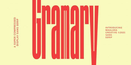 Gramary is a Super Compressed display font. With bold weight stroke, upright and fun character with a bit of ligatures. To give you an extra creative work. Gramary font support multilingual more than 100+ language. This font is good for logo design, Social media, Movie Titles, Books Titles, a short text even a long text letter and good for your secondary text font with script. Make a stunning work with Gramary font. Cheers, MaulanaCreative
 - Osande by XdCreative,
$20.00 Osande is a modern sans serif font with neo-Grotesque touch, more homogenous forms with minimal stroke contrast. Osande the font family contains 3 basic forms: italics, obliques, and upright. Each of which has 7 different weights ( Thin, Extra Light, Light, Regular, Medium, Semibold, and Bold ). Osande can easily be matched to an incredibly large set of projects, so add it to your creative ideas and notice how it makes them stand out! Thank you.
 - JennerikInformal by Ingrimayne Type,
$9.95 JennerikInfml is a friendly, casual typeface family that has the appearance of neat hand printing. It began as the italics to Jennerik, but I ended up separating it and giving it a different set of upper-case letters. Although its lower-case letters were designed as italics, it was originally published in 1992 with three weights as upright letters without a slant or skew. The revision of 2020 added the oblique or slanted styles.
 - Senza by Blackmoon Foundry,
$40.00 Senza is a contemporary, neutral, all-purpose sans serif family designed by Elena Albertoni. It was specially designed for the use on screen. With open shapes and large x-heights Senza guarantees high legibility for body text in small sizes. Senza ’s character-set covers all European languages written in Latin alphabet including real small caps, ligatures, proportional and tabular figures. Senza comes in four weights from Light to Black with matching italics.
 - Secretary Typewriter by Ana's Fonts,
$16.00 Secretary Typewriter is a typewriter font in a lighter, softer weight that makes it perfect for more delicate designs. Use it in long or short texts, in digital collages, branding and packaging, social media posts, logotypes, etc. Secretary Typewriter includes: Contextual alternates. Each letter and number has 3 slight variations that appear "randomly" for extra realism. Underline version of the font. For a grungier look. New! Jumpy version of the font, based on contextual alternates.
 - Moisette by Nasir Udin,
$32.00 Moisette is a serif typeface inspired by the classic and the modern. Developed in 7 weights with its complementary italics, Moisette offers many possibilities to be applied in many graphic, editorial, or branding projects, for short paragraph or display purposes. Moisette has high-contrast stem ratio to give it an elegant touch and luxurious appeal, and its high x-height makes sentences more legibility. It supports Latin and Cyrillic character set (incld. Bulgarian & Serbian Cyrillic).
 - Anguita Sans by Latinotype,
$29.00 Anguita Sans is a condensed sans serif font family of 8 weights with matching italics- 16 styles in all. The font is characterized by rounded terminals, a large x-height and a condensed structure, which allows you to create a good vertical rhythm. Anguita Sans is a stylish and versatile typeface perfectly suitable for a wide range of applications- especially titles and short lines of text, in both print and digital media.
 - Whiskey State by Mans Greback,
$59.00 Whiskey State strides onto the canvas like a cowboy entering a saloon: Tall, confident, and impossible to ignore. The font boasts an impressive height, stretching upwards with the same vigor as plumes of smoke rising from a smoldering campfire. Every letter stands upright and proud, imbued with the spirit of the Old West, yet exuding a contemporary coolness and innovativity. Its serifs aren't just appendages; they are expressions, giving the typeface its unique, assertive character.


