10,000 search results
(0.296 seconds)
- Retro Mango by Ahmad Jamaludin,
$19.00 Say hello to Retro Mango! The font that's as chunky as it is funky! Retro Mango is all about playful, bold vibes, with a dash of cuteness that's hard to resist, thanks to its soft corners. This font is like a friendly face you just want to hug, and it brings that fun-loving spirit to your designs :D Plus, you get three family styles to choose from: Regular, Bold, and Extra Bold to helps to create stunning logos, quotes, posts, blog posts, branding projects, magazine imagery, wedding invitations, and much more. What's Included? Retro Mango Main File Regular, Bold and Extra Bold version Instructions (Access special characters, even in Cricut Design) Unique Letterforms Works on PC & Mac Simple Installations Accessible in Adobe Illustrator, Adobe Photoshop, Microsoft Word even Canva! PUA Encoded Characters. Fully accessible without additional design software. Language Support: Danish, English, Estonian, Filipino, Finnish, French, Friulian, Galician, German, Gusii, Indonesian, Irish, Italian, Luxembourgish, Norwegian Bokmål, Norwegian Nynorsk, Nyankole, Oromo, Portuguese, Romansh, Rombo, Spanish, Swedish, Swiss-German, Uzbek (Latin) Thank you Dharmas Studio
 - Baedar by Craft Supply Co,
$20.00 Introducing Baedar – Bold Rounded Sans Serif Font Baedar – Bold Rounded Sans Serif, a font designed to captivate your attention, is both inviting and approachable. Its rounded corners create a warm and friendly vibe that instantly draws in readers. Eye-Catching Appeal Baedar’s boldness immediately grabs your eye, making it perfect for headlines and attention-grabbing text. Whether it’s a poster, website, or marketing material, this font ensures your message unequivocally stands out. Versatile Usage Furthermore, with its rounded edges, Baedar exudes friendliness. Consequently, it suits a wide range of projects, from branding to social media posts, adding a touch of approachability to your content. Readability and Impact Moreover, Baedar combines readability with visual impact, making it ideal for conveying important messages with flair. Its boldness ensures crystal-clear clarity, while the rounded corners gently soften the overall look. In Conclusion Baedar – Bold Rounded Sans Serif Font strikes the perfect balance between eye-catching design and friendliness, making it an excellent choice for various creative endeavors. Therefore, seize your audience’s attention and convey your message effectively with this versatile font.
 - Asgard by Zetafonts,
$39.00 Francesco Canovaro designed Asgard as a way to mix his passion for the raw energy of extra bold sans serif typography with the expressivity of high contrast and calligraphy-inspired letterforms. He built the typeface around a strong geometric sans skeleton, to make the letters feel solid and powerful while using wood-type vernacular solutions to solve density through high contrast details. The typeface name was chosen as an homage to the mythical homeland of the Norse Gods, evoking a land of fierce warriors, power and strength - but also of divine, delicate beauty. Thanks to the help of Andrea Tartarelli and Mario de Libero the original design was extended along with the design space, expanding the number of weights and widths with a "workhorse typeface" approach, and adding also a slanted axis to experiment with italics. The result is a super-family of 9 styles of 8 weights for a total of 72 fonts, each coming with an extended set of 968 glyphs covering over 200 languages using Latin, Greek and Cyrillic scripts. The three variation axes (width, weight, slant) are also all accessible in a variable font version that is included with the whole family. This gives the designer a full range of options for typesetting, with the Roman and Fit widths providing basic display and text-sized alternatives, and the Wide width adding more display and titling options. The inclusion of backslant italic styles gives Asgard an extra chance to add its voice to the typographic palette. To complement this, all Asgard fonts have been given a full set of Open Type Features including standard and discretionary ligatures, stylistic sets, positional numerals and case sensitive forms. Dynamic and expressive, Asgard is a super-family that manages to look brutal and refined at the same time, quoting the vernacular typographic practices of letterpress print while expressing the contemporary zeitgeist. • Suggested uses: perfect for contemporary branding and logo design, bold editorial design, dynamic packaging and countless other projects. • 73 styles: 8 weights + 8 italics + 8 backslant italics, 3 different widths + 1 variable font. • 968 glyphs in each weight. • Useful OpenType features: Access All Alternates, Contextual Alternates, Case-Sensitive Forms, Glyph Composition / Decomposition, Discretionary Ligatures, Denominators, Fractions, Kerning, Standard Ligatures, Lining Figures, Localized Forms, Mark Positioning, Mark to Mark Positioning, Alternate Annotation Forms, Numerators, Oldstyle Figures, Ordinals, Scientific Inferiors, Stylistic Set 1, Stylistic Set 2, Stylistic Set 3, Subscript, Superscript, Slashed Zero • 219 languages supported (extended Latin, Greek and Cyrillic alphabets): English, Spanish, Portuguese, French, Russian, German, Javanese (Latin), Vietnamese, Turkish, Italian, Polish, Afaan Oromo, Azeri, Tagalog, Sundanese (Latin), Filipino, Moldovan, Romanian, Indonesian, Dutch, Cebuano, Igbo, Malay, Uzbek (Latin), Kurdish (Latin), Swahili, Greek, Hungarian, Czech, Haitian Creole, Hiligaynon, Afrikaans, Somali, Zulu, Serbian, Swedish, Bulgarian, Shona, Quechua, Albanian, Catalan, Chichewa, Ilocano, Kikongo, Kinyarwanda, Neapolitan, Xhosa, Tshiluba, Slovak, Danish, Gikuyu, Finnish, Norwegian, Sicilian, Sotho (Southern), Kirundi, Tswana, Sotho (Northern), Belarusian (Latin), Turkmen (Latin), Bemba, Lombard, Lithuanian, Tsonga, Wolof, Jamaican, Dholuo, Galician, Ganda, Low Saxon, Waray-Waray, Makhuwa, Bikol, Kapampangan (Latin), Aymara, Zarma, Ndebele, Slovenian, Tumbuka, Venetian, Genoese, Piedmontese, Swazi, Zazaki, Latvian, Nahuatl, Silesian, Bashkir (Latin), Sardinian, Estonian, Afar, Cape Verdean Creole, Maasai, Occitan, Tetum, Oshiwambo, Basque, Welsh, Chavacano, Dawan, Montenegrin, Walloon, Asturian, Kaqchikel, Ossetian (Latin), Zapotec, Frisian, Guadeloupean Creole, Q’eqchi’, Karakalpak (Latin), Crimean Tatar (Latin), Sango, Luxembourgish, Samoan, Maltese, Tzotzil, Fijian, Friulian, Icelandic, Sranan, Wayuu, Papiamento, Aromanian, Corsican, Breton, Amis, Gagauz (Latin), Māori, Tok Pisin, Tongan, Alsatian, Atayal, Kiribati, Seychellois Creole, Võro, Tahitian, Scottish Gaelic, Chamorro, Greenlandic (Kalaallisut), Kashubian, Faroese, Rarotongan, Sorbian (Upper Sorbian), Karelian (Latin), Romansh, Chickasaw, Arvanitic (Latin), Nagamese Creole, Saramaccan, Ladin, Kaingang, Palauan, Sami (Northern Sami), Sorbian (Lower Sorbian), Drehu, Wallisian, Aragonese, Mirandese, Tuvaluan, Xavante, Zuni, Montagnais, Hawaiian, Marquesan, Niuean, Yapese, Vepsian, Bislama, Hopi, Megleno-Romanian, Creek, Aranese, Rotokas, Tokelauan, Mohawk, Onĕipŏt, Warlpiri, Cimbrian, Sami (Lule Sami), Jèrriais, Arrernte, Murrinh-Patha, Kala Lagaw Ya, Cofán, Gwich’in, Seri, Sami (Southern Sami), Istro-Romanian, Wik-Mungkan, Anuta, Cornish, Sami (Inari Sami), Yindjibarndi, Noongar, Hotcąk (Latin), Meriam Mir, Manx, Shawnee, Gooniyandi, Ido, Wiradjuri, Hän, Ngiyambaa, Delaware, Potawatomi, Abenaki, Esperanto, Folkspraak, Interglossa, Interlingua, Latin, Latino sine Flexione, Lojban, Novial, Occidental, Old Icelandic, Old Norse, Slovio (Latin), Volapük.
 - Pleiad by URW Type Foundry,
$39.99 Seven superb scripts, to be freely mixed with one another. Alone, each of them flows nicely, but combined they reach ultimate vitality and grace. The Pleiades are one of the most beautiful constellations in the sky, and in Greek mythology they were seven divine sisters. Luxurious freedom of choice and excellent readability make Pleiad the perfect face for a variety of projects, from stylish invitations to magazine ads, from poetry books to restaurant logos. Sometimes calm, sometimes flittering – but always fair and graceful – this sublime calligraphic type family will hold an everlasting fascination.
 - Abrosia by Gassstype,
$23.00 Here comes a New font, Introducing Abrosia It's All Caps Display Font is a Textured Natural Style and Authentic Classy Style, this font is great for your creative projects such as watermark on photography, and perfect for logos & branding, invitation,advertisements, special events or anything that need handwritting taste. Abrosia a natural Hand Drawn feel. This handmade font will make your design has a beautiful natural touch for each details. It is perfect for any design project as Invitation,logo, book cover, craft or any design.
 - Scribbles AF by Andrew Foster,
$18.00 Updated October 2014. Scribbles AF is the perfect choice when you want to add a little personality to your design. The font comes in five weights and has been created using scans of real handwriting. The soft, rounded edges of each letter in Biro, Felt Tip, Marker and Chunky give it a very relaxed and friendly appearance, or for something a little more quirky why not try the Ink version? Ideal for notes, labels, packaging and child-friendly projects. What will you use it for?
 - Charlotte Amalie by Almarkha Type,
$33.00 Charlotte Amalie – Stylish Signature and classy style, this font is great for your creative projects such as watermark on photography, and perfect for logos & branding, photography, invitation, watermark, advertisements, product designs, stationery, wedding designs, label, product packaging, special events or anything that need handwriting taste. What’s Included : Standard glyphs Web Font Works on PC & Mac Simple installationsAccessible in the Adobe Illustrator, Adobe Photoshop, Adobe InDesign, even work on Microsoft Word. PUA Encoded Characters – Fully accessible without additional design software. Fonts include multilingual support Cheers! Thank You
 - Timothea Signature by Timurtype,
$14.00 Introducing by Timurtype Studio! Timothea Signature is a Stylish Signature Font This font resembles handwriting. With attention to detail and stylish strokes in every line, this font adds a touch of sophistication and distinctive style to any design or text it is applied to. The distinctive nature of small lines makes them perfect for creating attention-grabbing titles, logos, or other elements. Timothea Signature Font also supports multilingualism. Enhance your designs with our original fonts, feel free to comment or provide feedback, Enjoy the fonts 😊
 - Chanilly by MC Creative,
$10.00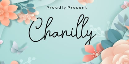 Chanilly is monoline script font which natural movement and elegant for signature style. is perfect for branding projects, logo, wedding designs, social media posts, advertisements, product packaging, product designs, label, photography, watermark, invitation, stationery and any projects that need handwriting taste. What’s Included : Standard glyphs Ligature Works on PC & Mac Simple installations Accessible in the Adobe Illustrator, Adobe Photoshop, Adobe InDesign, even work on Microsoft Word. PUA Encoded Characters – Fully accessible without additional design software. Fonts include multilingual support for; ä ö ü Ä Ö Ü ß ¿ ¡
 - Sheila by Laura Worthington,
$25.00 Sheila strikes the perfect balance between casual handwriting and careful calligraphy, making it both approachable and aspirational. Put Sheila’s airy, breezy letterforms to use in friendly or feminine settings like inspirational quotes and fashion layouts. Contextual alternates and ligatures lend Sheila natural-looking connections; swash forms add flair. Great news! Laura Worthington fonts have been specially coded so that almost anyone can access all of the swashes, alternates and ornaments without the need for professional design software. For more information and instructions, visit: http://bit.ly/1qJNnsO
 - Mix Blimp by Mix Fonts,
$13.00 Introducing BLIMP – a fun, playful, and charming handwritten font. Ideal for adding a personal touch to your social media posts, quotes, packaging, digital crafts, greeting cards, marketing materials, and more. This font was created using an iPad Pro and Apple Pencil for a truly authentic, digital handwriting style. Don’t let boring fonts weigh you down – add some bounce to your designs with BLIMP. – Mix Blimp includes the following characters: ABCDEFGHIJKLMNOPQRSTUVWXYZ abcdefghijklmnopqrstuvwxyz 0123456789 !@$#%^&*()`~♥❤✿•· ÷×+−±≈=≠[]<>‹›:;'",.|/?{}<>“”‘’-–—_…©®™<>«»°¹²³¡¿₱¢€£¥§† ÁÀÂÄÃÅĂĀĄÆĆČÇÐÉÈÊËĖĒĘIÍÌÎÏĪĮŁŃÑÓÒÔÖÕØŌŐŒŚŠȘȚÚÙÛÜŰŪŲÝŸŹŽŻÞ áàâäãåăāąæćčçðéèêëėēęıíìîïīįłńñóòôöõøōőœśšșțúùûüűūųýÿźžżþß Alternates: ff ll tt zz
 - Austaly by Multype Studio,
$14.00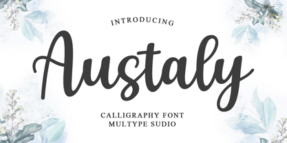 Austaly is a beautiful modern calligraphy font, featuring fun characters with their font characteristics. Austaly is perfect for branding projects, logo, social media posts, wedding designs, advertisements, product packaging, watermark, invitation, stationery and any projects that need handwriting taste. What’s Included : Standard glyphs & Ligature Works on PC / Mac Simple installations Accessible in the Adobe Illustrator, Adobe Photoshop, Adobe InDesign, even work on Microsoft Word PUA Encoded Characters, Fully accessible without additional design software. Multi-lingual support Thank you for your purchase! Hope you enjoy with our font!
 - Holiday In Paradise by Senekaligrafika,
$12.00 “Holiday In Paradise” is a playful handwriting font special for summer display, that puts a smile on your project and will inspire you to create something fun and memorable. “Holiday In Paradise” will help you to create special and touching typographical design for holiday projects, for every day or the happiest day in life, happy birthday cards, baby shower, greeting card, headings, flyer, product packaging, book cover, printed quotes, logos, and many more. It is really universal and modern font. The owner of endless possibilities!
 - Outedis by Twinletter,
$12.00 Outedis is a unique, cute, and charming handwritten font. you can use it for designs with various kinds of creations that require a touch of beauty, this font is the right choice for your elegant project. This font is designed with a natural touch of handwriting refined to create portions and compositions that suit your needs. So this font is perfect for crafts, kids writing, adventure posters, banner titles, wedding invitations, product packaging logos, quotes, social media page covers, furniture banner titles, book covers, and more.
 - Radish & Garlick by Jehansyah,
$9.00 This font is inspired by clean handwriting that is a bit simple, but still maintains elegance and creates a luxurious feel in the design, Radish and garlick This handcrafted font, so cute and so cute for any design you want to look simple yet aesthetically pleasing, use this design for all your design needs, it will potentially be your best font choice use it for all your design needs, print media, brochures, social media, social media status, letters, invitations, and much more. Thank you very Much
 - Big Sale by HIRO.std,
$14.00 Oneself is Handwritten Font This font describes about girly, feminist, elegant, dynamic, humanist, easy to use and will bring a good harmony when the letters are connected and paired each other. FEATURES - Uppercase and Lowercase letters - Support Ligatures - Numbering and Punctuations - Multilingual Support - Works on PC or Mac USE Oneself works great in any branding, logos, magazines, invitation, wedding designs, social media posts, advertisements, product packaging, product designs, label, photography, watermark, invitation, stationery, quotes and any projects that need handwriting taste. Enjoy using! Thanks. HIRO.std
 - Ellyshabeth by DLetters Studio,
$13.00 Ellyshabeth Signature Script Font is perfect for Logo, Signature, Social Media Posts, Advertisements, Magazine, Product Packaging, Label, Sticker, Photography, invitation, Business Cards, and any projects that need handwriting taste. Each basic character (“A”) is followed by Unicode variants of the same character (Á, Ä…), then OpenType variants (small caps, alternates, ligatures, Swash…). This way you can see all the variations on a single character in one place. Thanks for your support, please kindly send us a message for any question about our product. Hope you like it.
 - Angelica Jealous by Jimtype Studio,
$17.00 Introducing Angelica Jealous is a monoline script font with a handwritten style an authentic and fashionable. This font is very special because it has a large selection of additional letters built in with a set of alternate uppercase and lowercase letters and the Angelica Jealous was built to match the handwriting style as closely as possible with the addition of 72 custom ligatures. This font looks very awesome for quotes, branding, logos & branding, weddings, watermark, web, crafting, social media, product design, advertisements, and much more.
 - Alexandria Signature by Ergibi Studio,
$20.00 Alexandria Signature is a modern Signature font crafted in an elegant and professional style with alternative characters. perfect font for creating signature logos and watermarks for photography studios or personal photography logos, best for initial logo or brand signatures.Alexandria Signature includes a full set of beautiful handwritten upper and lower case letters, numbers, assorted punctuation marks. All lowercase letters include start and end strokes, providing a realistic handwriting style. If you have any questions about our fonts, please feel free to contact us Thank You Ergibi Studio
 - Butter Notes by Aminmario Studio,
$20.00 Butter Notes is a sweet and jolly crafting font. This font is great for your creative projects such as watermark on photography, and perfect for logos & branding, photography, invitation, watermark, advertisements, product designs, stationery, wedding designs,label, product packaging, social media, movie titles, books titles, a short text even a long text letter and good for your secondary text font with sans or serif. And also for special events or anything that need handwritting taste. Thanks for checking out this font. I hope you enjoy it!
 - Kasturi by MC Creative,
$9.00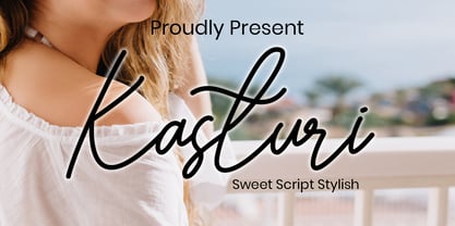 Kasturi is monoline script font which natural movement and stylish. Kasturi is perfect for branding projects, logo, wedding designs, social media posts, advertisements, product packaging, product designs, label, photography, watermark, invitation, stationery and any projects that need handwriting taste. What’s Included : Standard Glyphs Ligature Works on PC & Mac Simple installations Accessible in the Adobe Illustrator, Adobe Photoshop, Adobe InDesign, even work on Microsoft Word. PUA Encoded Characters – Fully accessible without additional design software. Fonts include multilingual support for; ä ö ü Ä Ö Ü ß ¿ ¡
 - Nm Hello Soulmate by NM Fonts,
$9.42 is a font that converts free handwriting into digital. The uppercase and lowercase "O" are designed in a heart shape to further enhance the loveliness. This font is perfect for working with various digital devices. It is often used in apps such as Notepad, GoodNote on iPad, and can also be used as a system font on mobile. Use this font to show off your style on social media (Instagram, Pinterest, etc.)! Of course it's perfect for printing! This font will be by your side anytime, anywhere.
 - Oneself by HIRO.std,
$17.00 Oneself is Handwritten Font This font describes about girly, feminist, elegant, dynamic, humanist, easy to use and will bring a good harmony when the letters are connected and paired each other. FEATURES - Uppercase and Lowercase letters - Support Ligatures - Numbering and Punctuations - Multilingual Support - Works on PC or Mac USE Oneself works great in any branding, logos, magazines, invitation, wedding designs, social media posts, advertisements, product packaging, product designs, label, photography, watermark, invitation, stationery, quotes and any projects that need handwriting taste. Enjoy using! Thanks. HIRO.std
 - Brigstone by Tony Type Studio,
$13.00 Brigston Calligraphy is a calligraphic font with a modern style and an elegant touch, inspired by Italian women's handwriting and ancient manuscripts. Carefully designed to work together in harmony making it perfect for wedding favors, book covers, greeting cards, logos, branding, business cards and certificates, even for any design work that requires modern, formal or extravagant. Try Calligraphy Desired, enjoy the wealth of OpenType features and let its elegant fun and excitement make you happy and boost your creativity! You can use this font very easily.
 - Osmont by Jorsetype,
$20.00 Osmont a work that is purely a result of handwriting, has a natural characteristic. this is perfect for invitations, signatures, blogs, social media, business cards, product brands. Osmont has Stylistic standard, Stylistic Alternates and ligatures. and includes uppercase and lowercase letters, numbers and punctuation marks. FILE INCLUDE Osmont (OpenType,PUA) OpenType features can be accessed by using OpenType smart programs such as Adobe Photo Shop, Adobe Illustrator, Adobe Indesign, Corel Draw and Microsoft Office. special greetings for all, all of us all smoothly in running the routine
 - Queen Smoothie by Timurtype,
$14.00 Introducing by Timurtype Studio! Queen Smoothie is a Handwritten Script Font This font resembles handwriting. With attention to detail and beautiful strokes in every line, this font adds a touch of sophistication and distinctive style to any design or text it is applied to. The distinctive nature of small lines makes them perfect for creating attention-grabbing titles, logos, or other elements. Queen Smoothie Font also supports multilingualism. Enhance your designs with our original fonts, feel free to comment or provide feedback, Enjoy the fonts 😊
 - Smack by ITC,
$29.99Smack, from American designer Jill Bell, is oriented toward a young generation who does not want to mind the rules. The font invites unconventional and playful use. The figures seem to be almost coincidentally shaped. Letters alternate between thin and thick strokes alternate and are accompanied by fine dots which almost look like accidental drops of ink on the paper. Smack is an illustrative font with unmistakable handwriting character and is perfect for cartoons, comics and anything else which is not supposed to take life too seriously. - Toms Handwritten by URW Type Foundry,
$49.99 This handwritten font was brought to our attention by one of our customers. Tom Bernard Anyz had offered his handwriting font at dafont.com, a free-font portal for private customers where Toms Handwritten is enjoying great popularity. We liked the design at first glance – it is so innocent and sketch-like, similar to a quick note or message. We reworked and completed Toms Handwritten for professional usage. Apart from the already available Latin character set for West and East, we also added Greek and Cyrillic.
 - Gullathi by MC Creative,
$8.00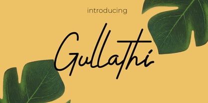 Gullathi is monoline script font which natural movement and elegant for signature style. perfect for branding projects, logo, wedding designs, social media posts, advertisements, product packaging, product designs, label, photography, watermark, invitation, stationery and any projects that need handwriting taste. What’s Included : Standard glyphs Ligature Works on PC & Mac Simple installations Accessible in the Adobe Illustrator, Adobe Photoshop, Adobe InDesign, even work on Microsoft Word. PUA Encoded Characters – Fully accessible without additional design software. Fonts include multilingual support for; ä ö ü Ä Ö Ü ß ¿ ¡
 - Adora Bella by PeachCreme,
$20.00 We're excited to unveil our new beautiful script font, "Adora Bella." "Adora Bella" was inspired by clean handwriting with a natural flow and works well for various designs, including wedding stationery, Instagram quotes, modern logos, packaging, websites, and many more. "Adora Bella" features fabulous beginning and ending lowercase swashes as well as lowercase heart swashes. A connecting heart swash may be used to tie two words or letters together; however, it is important to remember that this is intended to be used for joining lowercase words.
 - Eve Bells by Senekaligrafika,
$12.00 “Eve Bells” is a playful handwriting font special for holiday dan christmas display, that puts a smile on your project and will inspire you to create something fun and memorable. “Eve Bells” will help you to create special and touching typographical design for holiday projects, for every day or the happiest day in life, happy birthday cards, baby shower, greeting card, headings, flyer, product packaging, book cover, printed quotes, logos, christmas project, and many more. It is really universal and modern font. The owner of endless possibilities!
 - Dulya by Pesotsky Victor,
$15.00 "Dulya" is a weird, funny and irrational font. The design of the letters is based on the handwriting which is usually taught in school but the letters' graphics are geometrically transformed to make them interesting. The font has many alternative characters, so you can very freely control the texture of the text. Dulya supports Basic Latin and Extended Latin, Cyrillic — in total about 90 languages are supported. The font has one Regular weight, alternative characters, Uppercase and lowercase. Dulya font was designed by Viktor Pesotsky.
 - Amstirdam PS by pentagonistudio,
$17.00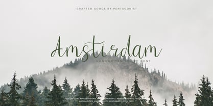 Amstirdam Is Clean Script Font Inspired By Handwriting Characters. SOFTWARE REQUIREMENTS : Fonts and alternate : No special software required they may be used in any basic program /website apps that allows standard fonts That's it folks! You can go ahead and get cracking :) Follow My Shop For Upcoming Updates Including Additional Glyphs And Language Support. And Please Message Me If You Want Your Language Included or If There Are Any Features or Glyph Requests, Feel Free to Send me A Message. Have a Good Day !
 - Atalon Pro by Afkari Studio,
$17.00 Atalon Pro Is A Scratch Handwritten font made with the natural scratch typeface. Written loosely and with a special balanced look as authentic handwriting font. Atalon A Scratch is Perfect to use in all your projects that call for a natural handwritten, easy legible hand-drawn font. Features: Uppercase Lowercase Numerals & basic punctuations Regular style Multilingual Support Works on PC & Mac Simple installations Accessible in Adobe Illustrator, Adobe Photoshop, Adobe InDesign, and even work on Microsoft Word PUA Encoded Characters Fully accessible without additional design software.
 - Beautinela by Almarkha Type,
$29.00 Beautinela Script is a beautiful mono-line font, perfect for logo design, branding, clothing design, signature, posters, wedding invitations and so much more! My goal with this font was to create an easily legible script font which would work for a wide variety of purposes. This font retains my personality within the characters as they were initially based off my own handwriting and later tidied up to create a set of consistent characters. Having that handmade feel and personal touch certainly gives it a hint of authenticity.
 - Bronx by ITC,
$29.99Bronx is a contemporary, highly stylized script typeface that captures the effect of quickly rendered brush lettering. The capitals are intended only for initialing purposes but may be joined with the lowercase letters, which can be linked together to reproduce the look of handwriting. This design has great potential for use in work associated with the fashion industry. British designer David Quay originally produced Bronx for Letraset in 1986, and it is just one of the many styles of type developed by this talented and renowned designer. - Rosalia by preussTYPE,
$25.00 Rosalia is an impulsive typeface designed by Heinz Schumann in 1964 as Stentor for Typoart Dresden. The marked stroke contrast and the spontaneous look typical of handwriting gives the typeface a lively, energetic character. The generous capitals lean slightly to the right and contrast beautifully with the reserved, upright lower case letters and can also be used for initialing. Rosalia is a good choice for headines and texts in middle to large point sizes. OpenType features: Contains 390 Glyhps Central European faces Standard Ligatures Discretionary Ligatures
 - ITC Gema by ITC,
$29.99ITC Gema is the work of Brazilian graphic designer Claudio Rocha. It was first written in a small size to keep the surface irregularity of a non-coated paper when enlarged for use as a display font," says Rocha. Many strokes do not quite join, giving Gema the visual effect of a stencil typeface, the distinguishing characteristic of the font. "Some characters have my own handwriting gestures," says Rocha, like elongated endings and angular shapes. Gema comes complete with an unusual variety of ligatures and alternate characters." - Aku Cinta by MC Creative,
$10.00 Aku Cinta is monoline script font which natural movement and romance style. is perfect for branding projects, logo, wedding designs, social media posts, advertisements, product packaging, product designs, label, photography, watermark, invitation, stationery and any projects that need handwriting taste. What’s Included : Standard glyphs Ligature Works on PC & Mac Simple installations Accessible in the Adobe Illustrator, Adobe Photoshop, Adobe InDesign, even work on Microsoft Word. PUA Encoded Characters – Fully accessible without additional design software. Fonts include multilingual support for; ä ö ü Ä Ö Ü ß ¿ ¡
 - Asillynne by Reyrey Blue Std,
$12.00 Say Hi! to new handwriting typeface Asillynne. Asillynne come with natural movement make your design looks elegant, classy and beauty for your latest project. This font is ideal for branding and decorate your any project, are perfect for wedding invitation or your blog. Also with their help, you can create a logo or beautiful frame for your home. Or just use for your book covers, stationery, marketing, magazines and more. Features : · All Uppercase and Lowercase · Number & Symbol · Supported Languages · Alternates and Ligatures · PUA Encoded