10,000 search results
(0.099 seconds)
- Ditho by Mifiq,
$14.00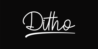 Ditho is an excellent handwritten script font. Ditho is suitable for social media posts, advertisements, logos & branding, invitations, product design, photography, watermarks, labels, wedding designs, product packaging, any event that requires a handwriting.
 - Ninces by Twinletter,
$15.00 cartoon, bubble, bubble letter, San serif, funny, kids, movie, cinema, playful, poster, minions, game, handwriting, child, comic, comic book, youtube, school, teacher, cute, dental, quote, event, typeface, children, fun, drink, headlines, magazine, branding,
 - Hand Boys by Jorsecreative,
$20.00 Hand Boys Is a typeface signature font that is inspired from Boys handwriting style. Suitable for making Greeting Cards, invites, quotes, book content, T-shirt, child magazine contents, short story, poster label etc.
 - Hola by Cuda Wianki,
$35.00 Hola! This is our new handwritten font. It's casual, young and pretty, perfect for logotypes, magazines, writing notes and comments. Thanks to many ligatures and alternate characters it is varied handwriting font. Enjoy!
 - Phylactere by Cubo Fonts,
$29.00 This font draws its inspiration from handwriting, in order to maintain a certain dynamism and irregularity. It's a serifless font, with small capital characters, always readable at any dimension, despite a tight tracking.
 - Birch by ParaType,
$25.00 Designed at ParaType (ParaGraph) in 1995 by Tagir Safayev. Based on informal pen handwriting. For use in advertising and display typography. A set of Western characters was added in 2011 by Gennady Fridman.
 - Ravan by TrendGFX Design Studios,
$16.00 From the designers of ECLYPSE and CUBA presents another brand new idea to the 21st century. A typical handwriting font, inspired by one of my friends. I digitized it and called it RAVAN.
 - Hyang Soo by Phoenix Group,
$9.00 Hyang soo type face is a collection of fonts with the theme of love and affection, this font is made like handwriting in everyday life, which makes this font close to our lives.
 - Miranda by Tim Rolands,
$19.00A mysterious beauty hidden away on a secret island by her eccentric wizard father? No: An elegant display face influenced by Aldine old-style letterforms, Miranda brings classic sophistication to any project. The family includes regular and bold weights. - Montarsi by insigne,
$32.00 Montarsi is a typeface designed by Jeremy Dooley, inspired by Arabic calligraphy and contemporary design trends. The letters are fluid and graceful, inspired by the curves and swirls of Arabic script. Montarsi is a bold, contemporary calligraphic face with broad strokes and high contrast. It has a variety of styles and weights to give you an extensive range of design options. This font family, which includes eight weights, is ideal for producing brief texts for editorial, fashion, branding, magazine, television, window displays, and other media applications. Small caps, old-style figures, and width variations are also included. It's ideal for writing brief sentences because of the increased x-height. Montarsi is a classic spirit reinvented in a modern language, influenced by the delicate curves of letters and the way ink glides across paper. We especially thank Lucas Azevedo and ikern.
 - Lineam by Richarts,
$9.00 In old Latin language Lineam mean line and that what Lineam is: a line based Sans Serif Display font. Lineam is a simple and clean looking font family and can be used for a range of cases. It is a modern sans serif font with geometric feeling and comes with 8 weights and matching italics.
 - Florens LP by LetterPerfect,
$39.00 Florens is a flourished, semi-formal script that designer Garrett Boge modeled after his own italic calligraphy, which is a contemporary version of the chancery script of the Italian Renaissance. In addition to the standard character set, a Flourished font provides old-style figures, special dingbats, and swash variants for all upper and lowercase characters.
 - Carmine Tango by Monotype,
$29.99Carmine Tango is an elegant script based on a 1934 design by Lucian Bernhard. The Carmine Tango font is a good script for many situations, including invitations, menus and brochures. - Jacbos by Twinletter,
$14.00 Jacbos is a playful font with an abstract shape like paper folds, which is unique but elegant and attractive in its use All Capital sans is charming and brave, a font with a bold style and strong character makes your design look bold to convey a message to the audience in every design. This font is perfect for a variety of school design projects, essays, vintage, retro, and various outdoor events, storytelling, branding, banners, posters, movie titles, food and beverages, clothing, and more.
 - Poster Sans by K-Type,
$20.00 The Poster Sans display fonts have the enduring functionality of vintage condensed grotesques. They are loosely based on Ludlow 6-EC, and perfect for signs and posters. The Basic Package includes the Regular and Bold weights, and also a useful Outline version. Poster Sans Extreme may hold the record for the slimmest usable font available. The latest versions of the Regular, Bold and Extreme weights offer improved outlines and now include a full compliment of Latin Extended-A European accented characters.
 - Narcis by VP Creative Shop,
$15.00 Introducing Narcis, the delightful retro bold script font that's bound to add a touch of nostalgia and flair to any project! This charming typeface boasts a unique blend of boldness and elegance, making it perfect for various design purposes. With its alternate and ligature glyphs, Narcis offers a wonderful range of creative possibilities. These additional characters add extra variety to your text, giving it a truly personalized and artistic feel. Whether you're designing a logo, poster, invitation, or any other project, Narcis' alternates and ligatures will help you achieve a distinct and eye-catching look. But that's not all! Narcis is also impressively versatile when it comes to language support, accommodating up to 87 languages. This means you can confidently express yourself in multiple languages without compromising on the font's aesthetics or legibility. Narcis comes in both regular and italic styles, allowing you to emphasize specific parts of your text or create a dynamic interplay between the two styles. The regular style offers a bold and confident appearance, while the italic style adds a touch of sophistication and movement to your design. Whether you're a seasoned designer or just starting on your creative journey, Narcis is sure to become your go-to font for adding that retro touch with a modern twist. Its warm and friendly demeanor will instantly win you over, making every project a joyful and visually captivating experience. So go ahead and give Narcis a try – you won't be disappointed! Language Support : Afrikaans, Albanian, Asu, Basque, Bemba, Bena, Breton, Chiga, Colognian, Cornish, Czech, Danish, Dutch, Embu, English, Estonian, Faroese, Filipino, Finnish, French, Friulian, Galician, Ganda, German, Gusi,i Hungarian, Indonesian, Irish, Italian, Jola-Fonyi, Kabuverdianu, Kalenjin, Kamba, Kikuyu, Kinyarwanda, Latvian, Lithuanian, Lower Sorbian, Luo, Luxembourgish, Luyia, Machame, Makhuwa-Meetto, Makonde, Malagasy, Maltese, Manx, Meru, Morisyen, North Ndebele, Norwegian, Bokmål, Norwegian, Nynorsk, Nyankole, Oromo, Polish, Portuguese, Quechua, Romanian, Romansh, Rombo, Rundi, Rwa, Samburu, Sango, Sangu, Scottish, Gaelic, Sena, Shambala, Shona, Slovak, Soga, Somali, Spanish, Swahili, Swedish, Swiss, German, Taita, Teso, Turkish, Upper, Sorbian, Uzbek (Latin), Volapük, Vunjo, Walser, Welsh, Western Frisian, Zulu How to access alternate glyphs? To access alternate glyphs in Adobe InDesign or Illustrator, choose Window Type & Tables Glyphs In Photoshop, choose Window Glyphs. In the panel that opens, click the Show menu and choose Alternates for Selection. Double-click an alternate's thumbnail to swap them out. Mock ups and backgrounds used are not included. Thank you! Enjoy!
 - Ballomont by HansCo,
$15.00 Ballomont is a Bold Luxury Handwriten that is luxurious in a casual and distinctive style. With each letter having been carefully designed to make your text look beautiful. With its modern script style, this font will be suitable for various projects, for example: quotes, blog titles, branding, logos, fashion, invitations, greeting cards, posters, business cards, clothing, letters, stationery, and more. This one should make your designs instantly professional and amazingly! Be a perfect professional in a minute and start creating with this font today! Enjoy
 - Rockwell by Monotype,
$40.99 Whether you call them slab serif, square serif, or Egyptian, you know them when you see them – sturdy, nearly monoweight designs with blunt, straight-edged serifs and a no-nonsense attitude. The Rockwell® Nova family is a fine example of this appealing and eminently usable type style. This is a design that is both robust and adaptable. Marked by the flat top-serifs on the cap A, unusual Q tail and high-legibility two-storied lowercase a, Rockwell has a bit of handmade charm that distinguishes it from the cool, more modern interpretations of the slab serif style. The family is excellent for branding, headlines and other display uses. The simple shapes and hearty serifs also make it a good choice for short blocks of textual content in both print and on-screen environments. The light and bold weights are perfect for setting blocks of text copy, while the extra bold and condensed designs bring authority to display copy. Throw in a little color, and you amp up Rockwell’s messaging power. The regular and italic designs perform handsomely, in the most modest of screen resolutions. With four weights of normal proportions, each with a complementary italic, and three condensed designs, two with italics, the family is a commanding and versatile graphic communicator. Rockwell’s large x-height, simple character shapes and open counters, make for an exceptionally legible design. It should not, however, be set so tight that its serifs touch, as this will erode legibility and impair readability. A benefit to Rockwell’s slab serifs, however, is that the design combines beautifully with both sans serif typefaces and a variety of serif designs. Rockwell OpenType® Pro fonts have an extended character set supporting Greek, Cyrillic, most Central European and many Eastern European languages, in addition to providing for the automatic insertion of ligatures and fractions. Looking for its perfect pairing? Look no further than ITC Berkeley Old Style, Between™, ITC Franklin Gothic®, Harmonia Sans™, Metro® Nova or Frutiger® Serif.
 - Times New Roman PS Cyrillic by Monotype,
$67.99In 1931, The Times of London commissioned a new text type design from Stanley Morison and the Monotype Corporation, after Morison had written an article criticizing The Times for being badly printed and typographically behind the times. The new design was supervised by Stanley Morison and drawn by Victor Lardent, an artist from the advertising department of The Times. Morison used an older typeface, Plantin, as the basis for his design, but made revisions for legibility and economy of space (always important concerns for newspapers). As the old type used by the newspaper had been called Times Old Roman," Morison's revision became "Times New Roman." The Times of London debuted the new typeface in October 1932, and after one year the design was released for commercial sale. The Linotype version, called simply "Times," was optimized for line-casting technology, though the differences in the basic design are subtle. The typeface was very successful for the Times of London, which used a higher grade of newsprint than most newspapers. The better, whiter paper enhanced the new typeface's high degree of contrast and sharp serifs, and created a sparkling, modern look. In 1972, Walter Tracy designed Times Europa for The Times of London. This was a sturdier version, and it was needed to hold up to the newest demands of newspaper printing: faster presses and cheaper paper. In the United States, the Times font family has enjoyed popularity as a magazine and book type since the 1940s. Times continues to be very popular around the world because of its versatility and readability. And because it is a standard font on most computers and digital printers, it has become universally familiar as the office workhorse. Times?, Times? Europa, and Times New Roman? are sure bets for proposals, annual reports, office correspondence, magazines, and newspapers. Linotype offers many versions of this font: Times? is the universal version of Times, used formerly as the matrices for the Linotype hot metal line-casting machines. The basic four weights of roman, italic, bold and bold italic are standard fonts on most printers. There are also small caps, Old style Figures, phonetic characters, and Central European characters. Times? Ten is the version specially designed for smaller text (12 point and below); its characters are wider and the hairlines are a little stronger. Times Ten has many weights for Latin typography, as well as several weights for Central European, Cyrillic, and Greek typesetting. Times? Eighteen is the headline version, ideal for point sizes of 18 and larger. The characters are subtly condensed and the hairlines are finer." - Times New Roman Seven by Monotype,
$67.99In 1931, The Times of London commissioned a new text type design from Stanley Morison and the Monotype Corporation, after Morison had written an article criticizing The Times for being badly printed and typographically behind the times. The new design was supervised by Stanley Morison and drawn by Victor Lardent, an artist from the advertising department of The Times. Morison used an older typeface, Plantin, as the basis for his design, but made revisions for legibility and economy of space (always important concerns for newspapers). As the old type used by the newspaper had been called Times Old Roman," Morison's revision became "Times New Roman." The Times of London debuted the new typeface in October 1932, and after one year the design was released for commercial sale. The Linotype version, called simply "Times," was optimized for line-casting technology, though the differences in the basic design are subtle. The typeface was very successful for the Times of London, which used a higher grade of newsprint than most newspapers. The better, whiter paper enhanced the new typeface's high degree of contrast and sharp serifs, and created a sparkling, modern look. In 1972, Walter Tracy designed Times Europa for The Times of London. This was a sturdier version, and it was needed to hold up to the newest demands of newspaper printing: faster presses and cheaper paper. In the United States, the Times font family has enjoyed popularity as a magazine and book type since the 1940s. Times continues to be very popular around the world because of its versatility and readability. And because it is a standard font on most computers and digital printers, it has become universally familiar as the office workhorse. Times?, Times? Europa, and Times New Roman? are sure bets for proposals, annual reports, office correspondence, magazines, and newspapers. Linotype offers many versions of this font: Times? is the universal version of Times, used formerly as the matrices for the Linotype hot metal line-casting machines. The basic four weights of roman, italic, bold and bold italic are standard fonts on most printers. There are also small caps, Old style Figures, phonetic characters, and Central European characters. Times? Ten is the version specially designed for smaller text (12 point and below); its characters are wider and the hairlines are a little stronger. Times Ten has many weights for Latin typography, as well as several weights for Central European, Cyrillic, and Greek typesetting. Times? Eighteen is the headline version, ideal for point sizes of 18 and larger. The characters are subtly condensed and the hairlines are finer." - Times New Roman WGL by Monotype,
$67.99 In 1931, The Times of London commissioned a new text type design from Stanley Morison and the Monotype Corporation, after Morison had written an article criticizing The Times for being badly printed and typographically behind the times. The new design was supervised by Stanley Morison and drawn by Victor Lardent, an artist from the advertising department of The Times. Morison used an older typeface, Plantin, as the basis for his design, but made revisions for legibility and economy of space (always important concerns for newspapers). As the old type used by the newspaper had been called Times Old Roman," Morison's revision became "Times New Roman." The Times of London debuted the new typeface in October 1932, and after one year the design was released for commercial sale. The Linotype version, called simply "Times," was optimized for line-casting technology, though the differences in the basic design are subtle. The typeface was very successful for the Times of London, which used a higher grade of newsprint than most newspapers. The better, whiter paper enhanced the new typeface's high degree of contrast and sharp serifs, and created a sparkling, modern look. In 1972, Walter Tracy designed Times Europa for The Times of London. This was a sturdier version, and it was needed to hold up to the newest demands of newspaper printing: faster presses and cheaper paper. In the United States, the Times font family has enjoyed popularity as a magazine and book type since the 1940s. Times continues to be very popular around the world because of its versatility and readability. And because it is a standard font on most computers and digital printers, it has become universally familiar as the office workhorse. Times?, Times? Europa, and Times New Roman? are sure bets for proposals, annual reports, office correspondence, magazines, and newspapers. Linotype offers many versions of this font: Times? is the universal version of Times, used formerly as the matrices for the Linotype hot metal line-casting machines. The basic four weights of roman, italic, bold and bold italic are standard fonts on most printers. There are also small caps, Old style Figures, phonetic characters, and Central European characters. Times? Ten is the version specially designed for smaller text (12 point and below); its characters are wider and the hairlines are a little stronger. Times Ten has many weights for Latin typography, as well as several weights for Central European, Cyrillic, and Greek typesetting. Times? Eighteen is the headline version, ideal for point sizes of 18 and larger. The characters are subtly condensed and the hairlines are finer."
 - Times New Roman by Monotype,
$67.99 In 1931, The Times of London commissioned a new text type design from Stanley Morison and the Monotype Corporation, after Morison had written an article criticizing The Times for being badly printed and typographically behind the times. The new design was supervised by Stanley Morison and drawn by Victor Lardent, an artist from the advertising department of The Times. Morison used an older typeface, Plantin, as the basis for his design, but made revisions for legibility and economy of space (always important concerns for newspapers). As the old type used by the newspaper had been called Times Old Roman," Morison's revision became "Times New Roman." The Times of London debuted the new typeface in October 1932, and after one year the design was released for commercial sale. The Linotype version, called simply "Times," was optimized for line-casting technology, though the differences in the basic design are subtle. The typeface was very successful for the Times of London, which used a higher grade of newsprint than most newspapers. The better, whiter paper enhanced the new typeface's high degree of contrast and sharp serifs, and created a sparkling, modern look. In 1972, Walter Tracy designed Times Europa for The Times of London. This was a sturdier version, and it was needed to hold up to the newest demands of newspaper printing: faster presses and cheaper paper. In the United States, the Times font family has enjoyed popularity as a magazine and book type since the 1940s. Times continues to be very popular around the world because of its versatility and readability. And because it is a standard font on most computers and digital printers, it has become universally familiar as the office workhorse. Times?, Times? Europa, and Times New Roman? are sure bets for proposals, annual reports, office correspondence, magazines, and newspapers. Linotype offers many versions of this font: Times? is the universal version of Times, used formerly as the matrices for the Linotype hot metal line-casting machines. The basic four weights of roman, italic, bold and bold italic are standard fonts on most printers. There are also small caps, Old style Figures, phonetic characters, and Central European characters. Times? Ten is the version specially designed for smaller text (12 point and below); its characters are wider and the hairlines are a little stronger. Times Ten has many weights for Latin typography, as well as several weights for Central European, Cyrillic, and Greek typesetting. Times? Eighteen is the headline version, ideal for point sizes of 18 and larger. The characters are subtly condensed and the hairlines are finer."
 - Times New Roman Small Text by Monotype,
$67.99In 1931, The Times of London commissioned a new text type design from Stanley Morison and the Monotype Corporation, after Morison had written an article criticizing The Times for being badly printed and typographically behind the times. The new design was supervised by Stanley Morison and drawn by Victor Lardent, an artist from the advertising department of The Times. Morison used an older typeface, Plantin, as the basis for his design, but made revisions for legibility and economy of space (always important concerns for newspapers). As the old type used by the newspaper had been called Times Old Roman," Morison's revision became "Times New Roman." The Times of London debuted the new typeface in October 1932, and after one year the design was released for commercial sale. The Linotype version, called simply "Times," was optimized for line-casting technology, though the differences in the basic design are subtle. The typeface was very successful for the Times of London, which used a higher grade of newsprint than most newspapers. The better, whiter paper enhanced the new typeface's high degree of contrast and sharp serifs, and created a sparkling, modern look. In 1972, Walter Tracy designed Times Europa for The Times of London. This was a sturdier version, and it was needed to hold up to the newest demands of newspaper printing: faster presses and cheaper paper. In the United States, the Times font family has enjoyed popularity as a magazine and book type since the 1940s. Times continues to be very popular around the world because of its versatility and readability. And because it is a standard font on most computers and digital printers, it has become universally familiar as the office workhorse. Times?, Times? Europa, and Times New Roman? are sure bets for proposals, annual reports, office correspondence, magazines, and newspapers. Linotype offers many versions of this font: Times? is the universal version of Times, used formerly as the matrices for the Linotype hot metal line-casting machines. The basic four weights of roman, italic, bold and bold italic are standard fonts on most printers. There are also small caps, Old style Figures, phonetic characters, and Central European characters. Times? Ten is the version specially designed for smaller text (12 point and below); its characters are wider and the hairlines are a little stronger. Times Ten has many weights for Latin typography, as well as several weights for Central European, Cyrillic, and Greek typesetting. Times? Eighteen is the headline version, ideal for point sizes of 18 and larger. The characters are subtly condensed and the hairlines are finer." - Times New Roman PS Greek by Monotype,
$67.99In 1931, The Times of London commissioned a new text type design from Stanley Morison and the Monotype Corporation, after Morison had written an article criticizing The Times for being badly printed and typographically behind the times. The new design was supervised by Stanley Morison and drawn by Victor Lardent, an artist from the advertising department of The Times. Morison used an older typeface, Plantin, as the basis for his design, but made revisions for legibility and economy of space (always important concerns for newspapers). As the old type used by the newspaper had been called Times Old Roman," Morison's revision became "Times New Roman." The Times of London debuted the new typeface in October 1932, and after one year the design was released for commercial sale. The Linotype version, called simply "Times," was optimized for line-casting technology, though the differences in the basic design are subtle. The typeface was very successful for the Times of London, which used a higher grade of newsprint than most newspapers. The better, whiter paper enhanced the new typeface's high degree of contrast and sharp serifs, and created a sparkling, modern look. In 1972, Walter Tracy designed Times Europa for The Times of London. This was a sturdier version, and it was needed to hold up to the newest demands of newspaper printing: faster presses and cheaper paper. In the United States, the Times font family has enjoyed popularity as a magazine and book type since the 1940s. Times continues to be very popular around the world because of its versatility and readability. And because it is a standard font on most computers and digital printers, it has become universally familiar as the office workhorse. Times?, Times? Europa, and Times New Roman? are sure bets for proposals, annual reports, office correspondence, magazines, and newspapers. Linotype offers many versions of this font: Times? is the universal version of Times, used formerly as the matrices for the Linotype hot metal line-casting machines. The basic four weights of roman, italic, bold and bold italic are standard fonts on most printers. There are also small caps, Old style Figures, phonetic characters, and Central European characters. Times? Ten is the version specially designed for smaller text (12 point and below); its characters are wider and the hairlines are a little stronger. Times Ten has many weights for Latin typography, as well as several weights for Central European, Cyrillic, and Greek typesetting. Times? Eighteen is the headline version, ideal for point sizes of 18 and larger. The characters are subtly condensed and the hairlines are finer." - Times New Roman PS by Monotype,
$67.99In 1931, The Times of London commissioned a new text type design from Stanley Morison and the Monotype Corporation, after Morison had written an article criticizing The Times for being badly printed and typographically behind the times. The new design was supervised by Stanley Morison and drawn by Victor Lardent, an artist from the advertising department of The Times. Morison used an older typeface, Plantin, as the basis for his design, but made revisions for legibility and economy of space (always important concerns for newspapers). As the old type used by the newspaper had been called Times Old Roman," Morison's revision became "Times New Roman." The Times of London debuted the new typeface in October 1932, and after one year the design was released for commercial sale. The Linotype version, called simply "Times," was optimized for line-casting technology, though the differences in the basic design are subtle. The typeface was very successful for the Times of London, which used a higher grade of newsprint than most newspapers. The better, whiter paper enhanced the new typeface's high degree of contrast and sharp serifs, and created a sparkling, modern look. In 1972, Walter Tracy designed Times Europa for The Times of London. This was a sturdier version, and it was needed to hold up to the newest demands of newspaper printing: faster presses and cheaper paper. In the United States, the Times font family has enjoyed popularity as a magazine and book type since the 1940s. Times continues to be very popular around the world because of its versatility and readability. And because it is a standard font on most computers and digital printers, it has become universally familiar as the office workhorse. Times?, Times? Europa, and Times New Roman? are sure bets for proposals, annual reports, office correspondence, magazines, and newspapers. Linotype offers many versions of this font: Times? is the universal version of Times, used formerly as the matrices for the Linotype hot metal line-casting machines. The basic four weights of roman, italic, bold and bold italic are standard fonts on most printers. There are also small caps, Old style Figures, phonetic characters, and Central European characters. Times? Ten is the version specially designed for smaller text (12 point and below); its characters are wider and the hairlines are a little stronger. Times Ten has many weights for Latin typography, as well as several weights for Central European, Cyrillic, and Greek typesetting. Times? Eighteen is the headline version, ideal for point sizes of 18 and larger. The characters are subtly condensed and the hairlines are finer." - Julius Thyssen - Unknown license

- Weaver Birds by Essentials Studio,
$16.00 introducing by Essentials Studio Weaver Birds Is a A Playfull Handwriting Font Weaver Birds is perfect for product packaging, branding project, megazine, social media, wedding, or just used to express words above the background.
 - Clothe by Mans Greback,
$59.00 Clothe is a vintage handwriting typeface. The genuine calligraphic style gives any project a handmade feeling.. Drawn and put together by Måns Grebäck, this font supports hundreds of languages. Use [ ] { } for swashes. Example: Clothe[
 - Altra Mano by Kate Brankin,
$32.00 Altra Mano is based on the designer’s second style of handwriting, one that is more refined and controlled. Altra Mano is a decorative display typeface ideal for headlines, logotypes, magazines, posters and short text.
 - Uyuni by Alejandro Arrojo,
$20.00 An imperfect handwriting and retro style font. Informal, authentic and very versatile. Lover of adventure travel, alternative sports, and home cooking. It feels more comfortable in large sizes but also can tell little stories.
 - KG Primary Dots by Kimberly Geswein,
$5.00 A dotted font perfect for teaching penmanship to students. With handwriting lines and without, perfect for making worksheets and projects for classrooms. This style matches KG Primary Penmanship, a solid version of this font.
 - Mayari by Lurinzu Studios,
$16.00 “Mayari" is an elegant and expressive display typeface that is inspired by the characteristic and vibes of female warrior in Filipino Mythology named: Mayari. Mayari is the “goddess of moon”. This typeface holds the perfect balance of expressiveness as a display whilst also holds well of being a body type. This typeface is best used when you want to express elegance, class and sophistication in your designs. *This font includes letters, numbers, multi-language, and all essential marks needed. * Two(2) weights are currently available for this typeface: Regular and Italic
 - Radens by Almarkha Type,
$33.00 Introducing Radens Vintage Bold Script, Inspired by Modern Vintage & Retro style and combination with old american traditional style. that will fulfill your design needs for quotes,sporty theme, logotype, wordmark, etc. This has many opentype features and support multi language.
 - Public Transportation JNL by Jeff Levine,
$29.00On the sides of freight cars, passenger trains, trolleys, buses and cable cars was once found identifying letters and numbers with a bold, yet quaint hand-painted look. Public Transportation JNL emulates the old-style look of those bygone years. - Aircheck JNL by Jeff Levine,
$29.00 Inspired by building signage for the old CBS broadcasting facility in Los Angeles, Aircheck JNL is a bold, wide sans serif - reminiscent of Art Deco lettering of the 1940's, and perfectly suited for headlines and titles that get attention.
 - Cast Iron - Unknown license

- Rodeo Rebels by Putracetol,
$24.00 Rodeo Rebels is a display typeface with a retro, cowboy, and western theme. It's perfect for designs that require a bold and masculine touch, such as branding, packaging, posters, and headlines. The font was inspired by vintage rodeo posters and the American Old West, where bold, slab-serif typography was a common sight. To make the most out of Rodeo Rebels, consider using it in designs that require a rugged and tough aesthetic, such as clothing and apparel, whiskey and beer packaging, and Western-themed events. Pairing it with other vintage-inspired elements, such as distressed textures and illustrations, can also help create a cohesive look and feel. With its bold and rugged aesthetic, Rodeo Rebels is a font that demands attention. It's perfect for projects that require a vintage and masculine vibe, and its features make it a versatile choice for a wide range of designs. Give your projects a touch of the American Old West with Rodeo Rebels, and let its bold and rugged style do the talking.
 - Vanrott by Ergibi Studio,
$15.00 Vanrott is an old font with two styles: Regular and Destroyed. Both styles have a bold, prominent, old-fashioned but modern look! Vanrott is perfect for those of you who need fonts for titles, logos, clothing, invitations, branding, packaging, advertisements, and more. Vanrott includes uppercase and lowercase letters, punctuation, symbols, numbers, stylistic sets, alternate, ligatures as well as multi-lingual support.
 - Gans Fulgor by Intellecta Design,
$12.00See also other font families inspired by Gans' original typefaces: Gans Tipo Adorno , Gans Lath Modern , Gans Titular Adornada , Gans Ibarra , Gans Antigua , Gans Antigua Manuscrito and Gans Radio Lumina . - CloisterBlack BT - Unknown license


