10,000 search results
(0.051 seconds)
- Krong by Joelmaker,
$18.00 Krong is a set of font family, modern Geometric in which there are several combinations of unique style sets, so ready to help you to make your designs look elegant. Krong Each contains nine weights ranging from Thin to ExtraBold, all with companion italics. The font includes more than 819 glyphs, covering all European languages written in Latin script. Krong OpenType features: Stylistic Alternates, Sylistic Set, Standard Ligatures, Discretionary Ligatures for lowercase and uppercase, Case Sensitive Forms, Arrows, Circled and Black Circled Figures, Proportional Old Style figures, Tabular Lining figures, Slashed Zero, Fractions, Superscript and Subscript figures.
 - VVDS Clementia by Vintage Voyage Design Supply,
$15.00 • Clementia – a stylish condensed serif font with Art Deco mood and huge variety of stylistic alternates and ligatures. Thereby your typographic gets a unique and authentic style for a vide variety of projects. Cafe's menu, wedding invitation, branding, magazine's headers, t-shirt prints, posters - all these projects will breathe uniqueness. Your typography may be more discreet with basic stylistic set or it can be more playful, artistic and expressive with any of ligatures or stylistic alternates. • 970 Glyphs total; True Italics; Open Type Features as stylistic alternates, ligatures, old style / tabular / fraction / superior figures, manicules and small caps; Multilingual (Include alternates)
 - Linotype Really by Linotype,
$29.99Linotype Really, designed by Gary Munch, is a typeface family of six weights with italics and small capitals that offers a broad palette of expressions to draw from, sensibly light to brightly stentorian. The moderate-to-strong contrast of the vertical to horizontal strokes recalls the Transitional and Modern styles of Baskerville and Bodoni, and the subtly obliqued axis of the stoke weight recalls the old-style faces of Caslon. A strong belt of sturdy serifs completes the Realist sensibility of a clear, readable, no-nonsense text face whose clean details offer the designer a high-impact display face. - Miklos by George Tulloch,
$21.00 The gifted Hungarian punch-cutter and printer Miklós Kis was active in Amsterdam in the 1680s. Among the many fonts that he cut during those years were a ‘mediaen’ (pica-sized) roman and italic, and the digital Miklós fonts are an interpretation of these ‘mediaen’ types. The character set has been extended to cover all the European languages that use the Latin alphabet, and the fonts offer OpenType features such as small capitals; old-style and lining figures, both proportional and tabular; fractions; superior and inferior numbers; superior alphabet; contextual and stylistic alternates; and intelligent application of long ‘s’.
 - Quador by Fontador,
$24.99 Quador is a squarish serif, especially designed for contemporary typography on print and screen. The superellipse-based forms and high x-height allow large and open letterforms, perfectly adapted to the pixel grid on screen. With rounded serifs Quador provides a soft and friendly atmosphere. The font contains 6 weights from light to ultrabold plus true italics. 1.115 glyphs include 187 ligatures, small caps, tabular, old style, fractions …, and a wide range of flexibility for latin language and cyrillic support for every typographical needs. Quador is a contemporary serif typeface, special for logotypes, brands, magazines and editorial.
 - Humber by Fettle Foundry,
$10.00 Humber is a rational sans serif typeface designed with a large X-height to provide clarity at both text and display sizes – with subtle features that really shine at larger sizes. Inspired by 20th century typefaces and modern European designs, Humber is suitable for a wide range of projects and audiences looking for a typeface that feels professional – without being overly familiar. Featuring seven weights and matching italics, discretionary ligatures, lining, old-style, and tabular figures, and conditional kerning for accented characters, Humber is truly versatile. With over 738 glyphs, Humber supports over 339 latin-based languages.
 - Butterflies - Unknown license

- Lightmorning - Unknown license

- PDRPT - Personal use only

- Fol S - Unknown license

- Crem S - Unknown license

- Denmas by Beewest Studio,
$50.00 Denmas Font is Engaved Bold Decorative Font that ornamental. This Font is Best as tittle of the novel, Poster, Theatre, Logo and also tatoo. This font is bold , strong , classic and luxurious in the same time.
 - Concapita by Lone Army,
$15.00 Concapita is a bold modern vintage display font, featuring thick and weighty characters. Ideal for headlines and branding, its fat, bold strokes seamlessly blend contemporary and vintage aesthetics, creating a unique and attention-grabbing typographic style.
 - Caroni by Franzi draws,
$- Caroni is a cute handmade typeface, which was originally created in 2018 as a free font. It has a simple and clean look, and works great for longer texts. Caroni has already been used in numerous children's books, so now it was time to extend Caroni's look, and add more styles. The Caroni Family at a glance If you like Caroni, you will love the Caroni font family! Caroni now comes in bold and italic, and it has nine awesome siblings: Avenue (all dressed up with stylish serif strokes) Lime (the skinny version of Caroni) Avenue Lime (the skinny version of Caroni Avenue) Tabanca (dark and heavy, this is Caroni's brush version) Doubles (enhanced with fine lines) Fete (with fun little dots) Coconut (Caroni's outline style) Soursop (Outline with dots, a great display font) Carnival (a quirky and fun all-caps version) Caroni was created while staying with a friend in Trinidad, hence the names :) Languages supported: Afrikaans, Albanian, Asu, Basque, Bemba, Bena, Bosnian, Catalan, Cebuano, Chiga, Colognian, Cornish, Corsican, Croatian, Czech, Danish, Dutch, English, Estonian, Faroese, Filipino, Finnish, French, Friulian, Galician, Ganda, German, Gusii, Hungarian, Icelandic, Ido, Inari Sami, Indonesian, Interlingua, Irish, Italian, Javanese, Jju, Jola-Fonyi, Kabuverdianu, Kalenjin, Kinyarwanda, Kurdish, Latvian, Lithuanian, Lojban, Low German, Lower Sorbian, Luo, Luxembourgish, Luyia, Machame, Makhuwa-Meetto, Makonde, Malagasy, Malay, Maltese, Manx, Maori, Morisyen, North Ndebele, Northern Sami, Northern Sotho, Norwegian Bokmål, Norwegian Nynorsk, Nyanja, Nyankole, Occitan, Oromo, Polish, Portuguese, Romanian, Romansh, Rombo, Rundi, Rwa, Samburu, Sango, Sangu, Sardinian, Scottish Gaelic, Sena, Shambala, Shona, Slovak, Slovenian, Soga, Somali, South Ndebele, Southern Sotho, Spanish, Swahili, Swati, Swedish, Swiss German, Taita, Taroko, Teso, Tsonga, Tswana, Turkish, Turkmen, Upper Sorbian, Vunjo, Walloon, Welsh, Western Frisian, Wolof, Xhosa, Zulu
 - TT Drugs Condensed by TypeType,
$29.00 TT Drugs useful links: Graphic presentation | Customization options TT Drugs Condensed—a modern font family which consists of 5 condensed sans serifs with a special contrast formula of lines and stems. TT Drugs Condensed is a condensed version of the TT Drugs font family. These fonts are perfect for design in the pharmaceutical industry: packaging, posters, blissery. However, those fonts can also be used in any other design, for example, in printing, logotypes and websites. Font family includes 10 most popular typefaces: thin, light, regular, bold, black and 5 appropriate italics. TT Drugs Condensed—a versatile tool for any design tasks. FOLLOW US: Instagram | Facebook | Website TT Drugs OpenType features: Case Sensitive Forms, Tabular Figures, Fractions, Numerators, Denominators, Superiors, Scientific Inferiors. TT Drugs language support: Acehnese, Afar, Albanian, Alsatian, Aragonese, Arumanian, Asu, Aymara, Banjar, Basque, Belarusian (cyr), Bemba, Bena, Betawi, Bislama, Boholano, Bosnian (cyr), Bosnian (lat), Breton, Bulgarian (cyr), Cebuano, Chamorro, Chiga, Colognian, Cornish, Corsican, Cree, Croatian, Czech, Danish, Embu, English, Erzya, Estonian, Faroese, Fijian, Filipino, Finnish, French, Friulian, Gaelic, Gagauz (lat), Galician, German, Gusii, Haitian Creole, Hawaiian, Hiri Motu, Hungarian, Icelandic, Ilocano, Indonesian, Innu-aimun, Interlingua, Irish, Italian, Javanese, Judaeo-Spanish, Judaeo-Spanish, Kalenjin, Karachay-Balkar (lat), Karaim (lat), Karakalpak (lat), Kashubian, Khasi, Khvarshi, Kinyarwanda, Kirundi, Kongo, Kumyk, Kurdish (lat), Ladin, Latvian, Laz, Leonese, Lithuanian, Luganda, Luo, Luxembourgish, Luyia, Macedonian, Machame, Makhuwa-Meetto, Makonde, Malay, Manx, Maori, Mauritian Creole, Minangkabau, Montenegrin (lat), Mordvin-moksha, Morisyen, Nahuatl, Nauruan, Ndebele, Nias, Nogai, Norwegian, Nyankole, Occitan, Oromo, Palauan, Polish, Portuguese, Quechua, Rheto-Romance, Rohingya, Romansh, Rombo, Rundi, Russian, Rusyn, Rwa, Salar, Samburu, Samoan, Sango, Sangu, Scots, Sena, Serbian (cyr), Serbian (lat), Seychellois Creole, Shambala, Shona, Slovak, Slovenian, Soga, Somali, Sorbian, Sotho, Spanish, Sundanese, Swahili, Swazi, Swedish, Swiss German, Swiss German, Tagalog, Tahitian, Taita, Tatar, Tetum, Tok Pisin, Tongan, Tsonga, Tswana, Turkish, Turkmen (lat), Ukrainian, Uyghur, Vepsian, Volapük, Võro, Vunjo, Xhosa, Zaza, Zulu.
 - MARIAMNE by Type Innovations,
$39.00 MARIAMNE is an original design by Alex Kaczun. It is an elegant, modern and traditional interpretation based on and modeled after his successful "Contax Pro" and "New Age Gothic" typeface series. As such, it has generous proportions with clean, crisp lines—ideally suited for easy reading and long lines of copy. Alex felt that the skeleton for "Contax" was perfectly suited to transform the design into a modern version of 'old-style', somewhat reminiscent of German Black Letter. Numerous modifications where made to the body proportions, stems and shapes. True 'old-style' serifs and unusual 'cross-strokes' where added for a touch of distinction. The 'cross-strokes' where added at exactly visual mid-point on the overall heights. This gives the typeface a romantic, female-like quality to the overall design. Strong, yet delicate. Visually stimulating in appearance and function. The result is a truly unique transitional and modern design. Unlike other typefaces, MARIAMNE incorporates uniform stems throughout the capitals, lower case and figures. This gives the design a uniform appearance in overall color and strength. There is a perfect visual balance between inter-letter spacing, stem weights and proportions. The accents are equally large, bold and command attention. This font includes a large 'Pro' character set, which supports most Central European and many Eastern European languages. As a result, the design is ideally suited for display copy as well as text composition. In the near future, Alex plans to expand the typeface series to include a light and heavy weight, along with true italics.
 - Really No 2 W2G by Linotype,
$124.99Really No. 2 is a redesign and update of Linotype Really, a typeface that Gary Munch first designed in 1999. The new Really No. 2 offers seven weights (Light to Extra Bold), each with an Italic companion. Additionally, Really No. 2 offers significantly expanded language support possibilities. Customers may choose the Really No. 2 W1G fonts, which support a character set that will cover Greek and Cyrillic in addition to virtually all European languages. These are true pan-European fonts, capable of setting texts that will travel between Ireland and Russia, and from Norway to Turkey. Customers who do not require this level of language support may choose from the Really No. 2 Pro fonts (just the Latin script), the Really No. 2 Greek Pro fonts (which include both Latin and Greek), or the Really No. 2 Cyrillic Pro fonts (Latin and Cyrillic). Each weight in the Really No. 2 family includes small capitals and optional oldstyle figures, as well as several other OpenType features. Really No. 2's vertical measurements are slightly different than the old Linotype Really's; customers should not mix fonts from the two families together. As to the design of Really No. 2's letters, like Linotype Really, the characters' moderate-to-strong contrast of its strokes recalls the Transitional and Modern styles of Baskerville and Bodoni. A subtly oblique axis recalls the old-style faces of Caslon. Finally, sturdy serifs complete the typeface's realist sensibility: a clear, readable, no-nonsense text face, whose clean details offer the designer a high-impact selection. - Really No 2 Paneuropean by Linotype,
$103.99Really No. 2 is a redesign and update of Linotype Really, a typeface that Gary Munch first designed in 1999. The new Really No. 2 offers seven weights (Light to Extra Bold), each with an Italic companion. Additionally, Really No. 2 offers significantly expanded language support possibilities. Customers may choose the Really No. 2 W1G fonts, which support a character set that will cover Greek and Cyrillic in addition to virtually all European languages. These are true pan-European fonts, capable of setting texts that will travel between Ireland and Russia, and from Norway to Turkey. Customers who do not require this level of language support may choose from the Really No. 2 Pro fonts (just the Latin script), the Really No. 2 Greek Pro fonts (which include both Latin and Greek), or the Really No. 2 Cyrillic Pro fonts (Latin and Cyrillic). Each weight in the Really No. 2 family includes small capitals and optional oldstyle figures, as well as several other OpenType features. Really No. 2's vertical measurements are slightly different than the old Linotype Really's; customers should not mix fonts from the two families together. As to the design of Really No. 2's letters, like Linotype Really, the characters' moderate-to-strong contrast of its strokes recalls the Transitional and Modern styles of Baskerville and Bodoni. A subtly oblique axis recalls the old-style faces of Caslon. Finally, sturdy serifs complete the typeface's realist sensibility: a clear, readable, no-nonsense text face, whose clean details offer the designer a high-impact selection. - Really No 2 by Linotype,
$29.99 Really No. 2 is a redesign and update of Linotype Really, a typeface that Gary Munch first designed in 1999. The new Really No. 2 offers seven weights (Light to Extra Bold), each with an Italic companion. Additionally, Really No. 2 offers significantly expanded language support possibilities. Customers may choose the Really No. 2 W1G fonts, which support a character set that will cover Greek and Cyrillic in addition to virtually all European languages. These are true pan-European fonts, capable of setting texts that will travel between Ireland and Russia, and from Norway to Turkey. Customers who do not require this level of language support may choose from the Really No. 2 Pro fonts (just the Latin script), the Really No. 2 Greek Pro fonts (which include both Latin and Greek), or the Really No. 2 Cyrillic Pro fonts (Latin and Cyrillic). Each weight in the Really No. 2 family includes small capitals and optional oldstyle figures, as well as several other OpenType features. Really No. 2's vertical measurements are slightly different than the old Linotype Really's; customers should not mix fonts from the two families together. As to the design of Really No. 2's letters, like Linotype Really, the characters' moderate-to-strong contrast of its strokes recalls the Transitional and Modern styles of Baskerville and Bodoni. A subtly oblique axis recalls the old-style faces of Caslon. Finally, sturdy serifs complete the typeface's realist sensibility: a clear, readable, no-nonsense text face, whose clean details offer the designer a high-impact selection.
 - Romanicum - Personal use only

- Godger by Craft Supply Co,
$20.00 Godger Condensed Sans Serif: Boldness Redefined Step into the bold world of Godger, where strength and simplicity converge. This bold, masculine font is a powerhouse, built for strong, memorable branding. Its condensed form is not only space-efficient but also packs a punch, perfect for headlines that demand attention. Masculine and Commanding Godger’s bold, condensed letters exude a sense of command, making it a go-to for titles needing a masculine touch. Each letter is crafted for high impact, ensuring your words aren’t just read, but felt. This font doesn’t whisper; it shouts with a clear, authoritative voice.
 - Ozonos by Kufic Studio,
$15.00 Ozonos is a brand & design font to make your products look more bold and elegant. Rounded, Elegant, Minimalist & Bold Font that goes smoothly with any font, especially script fonts. The bold design of the font emphasizes your product, brand design and will surely satisfy your clients. The complete font set will surely bring a chic design touch to your website, the font is designed so easily be read & bring the bold effect to any kind of design. Kufic Studio is a platform that provides professional and high quality designs & fonts to fill the gap that has been missing in the market.
 - 99 Names of ALLAH Minimal by Islamic Calligraphy75,
$12.00 We have transformed the “99 names of ALLAH” into a font. That means each key on your keyboard represents 1 of the 99 names of ALLAH Aaza Wajal. The fonts work with both the English and Arabic Keyboards. We call this Calligraphy "Minimal" because of the minimal decoration and simplistic design. The first "Alef" has a "hamzit wasel", this indicates that the name can be pronounced both as "AR-RAHMAAN" or "R-RAHMAN" (in the zip file you will find a pdf file explaining the differences in the "harakat", pronunciation and spelling according to the Holy Quran). This calligraphy is not only minimal in its design but easy to read, very few letters overlaps and the decorative symbols are at minimum. Decorative letters used in this calligraphy: "Mim, Aain, Sin, HHe, He & Saad". Purpose & use: - Writers: Highlight the names in your texts in beautiful Islamic calligraphy. - Editors: Use with kinetic typography templates (AE) & editing software. - Designers: The very small details in the names does not affect the quality. Rest assured it is flawless. The MOST IMPORTANT THING about this list is that all the names are 100% ERROR FREE, and you can USE THEM WITH YOUR EYES CLOSED. All the “Tachkilat” are 100% ERROR FREE, all the "Spelling" is 100% ERROR FREE, and they all have been written in accordance with the Holy Quran. No names are missing and no names are duplicated. The list is complete "99 names +1". The +1 is the name “ALLAH” 'Aza wajal. Another important thing is how we use the decorative letters. In every font you will see small decorative letters, these letters are used only in accordance with their respective letters to indicate pronunciation & we don't include them randomly. That means "mim" on top or below the letter "mim", "sin" on top or below the letter "sin", and so on and so forth. Included: Pdf file telling you which key is associated with which name. In that same file we have included the transliteration and explication of all 99 names. Pdf file explaining the differences in the harakat and pronunciation according to the Holy Quran. Here is a link to all the extra files you will need: https://drive.google.com/drive/folders/1Xj2Q8hhmfKD7stY6RILhKPiPfePpI9U4?usp=sharing ---------------------------------------------------------------------------------------------------------------------------
 - 99 Names of ALLAH Subhanahu by Islamic Calligraphy75,
$12.00 We have transformed the “99 names of ALLAH” into a font. That means each key on your keyboard represents 1 of the 99 names of ALLAH Aaza Wajal. The fonts work with both the English and Arabic Keyboards. We call this Calligraphy "Subhanahu Wa Ta'ala" because we have added "Subhanahu Wa Ta'ala" to each and every name. The first "Alef" has a "hamzit wasel", this indicates that the name can be pronounced both as "AR-RAHMAAN" or "R-RAHMAN" (in the zip file you will find a pdf file explaining the differences in the "harakat", pronunciation and spelling according to the Holy Quran). The calligraphy is rectangular shaped, and the "fatha" is big and covers almost the entire name, in most of the names. Decorative letters used in this calligraphy: "Mim, Aain, Sin, HHe, He, Ta, Kaf & Saad". Purpose & use: - Writers: Highlight the names in your texts in beautiful Islamic calligraphy. - Editors: Use with kinetic typography templates (AE) & editing software. - Designers: The very small details in the names does not affect the quality. Rest assured it is flawless. The MOST IMPORTANT THING about this list is that all the names are 100% ERROR FREE, and you can USE THEM WITH YOUR EYES CLOSED. All the “Tachkilat” are 100% ERROR FREE, all the "Spelling" is 100% ERROR FREE, and they all have been written in accordance with the Holy Quran. No names are missing and no names are duplicated. The list is complete "99 names +1". The +1 is the name “ALLAH” 'Aza wajal. Another important thing is how we use the decorative letters. In every font you will see small decorative letters, these letters are used only in accordance with their respective letters to indicate pronunciation & we don't include them randomly. That means "mim" on top or below the letter "mim", "sin" on top or below the letter "sin", and so on and so forth. Included: Pdf file telling you which key is associated with which name. In that same file we have included the transliteration and explication of all 99 names. Pdf file explaining the differences in the harakat and pronunciation according to the Holy Quran.
 - 99 Names of ALLAH Kids by Islamic Calligraphy75,
$12.00 We have transformed the “99 names of ALLAH” into a font. That means each key on your keyboard represents 1 of the 99 names of ALLAH Aaza Wajal. The fonts work with both the English and Arabic Keyboards. We call this Calligraphy "Kids" because it looks as if a child is writing the names. The first "Alef" has a "hamzit wasel", this indicates that the name can be pronounced both as "AR-RAHMAAN" or "R-RAHMAN" (in the zip file you will find a pdf file explaining the differences in the "harakat", pronunciation and spelling according to the Holy Quran). Some of the letters in the calligraphy are unusually big, they look as a child is writing them. No decorative letters are used in this calligraphy. Purpose & use: - Writers: Highlight the names in your texts in beautiful Islamic calligraphy. - Editors: Use with kinetic typography templates (AE) & editing software. - Designers: The very small details in the names does not affect the quality. Rest assured it is flawless. The MOST IMPORTANT THING about this list is that all the names are 100% ERROR FREE, and you can USE THEM WITH YOUR EYES CLOSED. All the “Tachkilat” are 100% ERROR FREE, all the "Spelling" is 100% ERROR FREE, and they all have been written in accordance with the Holy Quran. No names are missing and no names are duplicated. The list is complete "99 names +1". The +1 is the name “ALLAH” 'Aza wajal. Another important thing is how we use the decorative letters. In every font you will see small decorative letters, these letters are used only in accordance with their respective letters to indicate pronunciation & we don't include them randomly. That means "mim" on top or below the letter "mim", "sin" on top or below the letter "sin", and so on and so forth. Included: Pdf file telling you which key is associated with which name. In that same file we have included the transliteration and explication of all 99 names. Pdf file explaining the differences in the harakat and pronunciation according to the Holy Quran.
 - 99 Names of ALLAH Handwriting by Islamic Calligraphy75,
$12.00 We have transformed the “99 names of ALLAH” into a font. That means each key on your keyboard represents 1 of the 99 names of ALLAH Aaza Wajal. The fonts work with both the English and Arabic Keyboards. We call this Calligraphy "Handwriting" for obvious reasons. The first "Alef" has a "fatha", this indicates that the name can be pronounced only one way, "AR-RAHMAAN". (in the zip file you will find a pdf file explaining the differences in the "harakat", pronunciation and spelling according to the Holy Quran). The calligraphy is very easy to read, no letters overlaps and the decorative symbols are at minimum. Decorative letters used in this calligraphy: "Mim, Aain, Sin, HHe, He, Saad & Ta". Purpose & use: - Writers: Highlight the names in your texts in beautiful Islamic calligraphy. - Editors: Use with kinetic typography templates (AE) & editing software. - Designers: The very small details in the names does not affect the quality. Rest assured it is flawless. The MOST IMPORTANT THING about this list is that all the names are 100% ERROR FREE, and you can USE THEM WITH YOUR EYES CLOSED. All the “Tachkilat” are 100% ERROR FREE, all the "Spelling" is 100% ERROR FREE, and they all have been written in accordance with the Holy Quran. No names are missing and no names are duplicated. The list is complete "99 names +1". The +1 is the name “ALLAH” 'Aza wajal. Another important thing is how we use the decorative letters. In every font you will see small decorative letters, these letters are used only in accordance with their respective letters to indicate pronunciation & we don't include them randomly. That means "mim" on top or below the letter "mim", "sin" on top or below the letter "sin", and so on and so forth. Included: Pdf file telling you which key is associated with which name. In that same file we have included the transliteration and explication of all 99 names. Pdf file explaining the differences in the harakat and pronunciation according to the Holy Quran. Here is a link to all the extra files you will need: https://drive.google.com/drive/folders/1Xj2Q8hhmfKD7stY6RILhKPiPfePpI9U4?usp=sharing
 - Good Night JNL by Jeff Levine,
$29.00 The beautiful hand lettering on the sheet music cover for Will R. Anderson's "Good Night Dear" (circa 1908) features quaint, semi-calligraphic lettering in the Art Nouveau Style. The song itself was popularized by Billie Burke [best remembered as the Good Witch in “The Wizard of Oz”] in the musical comedy "Love Watches".
 - Careista by AEN Creative Studio,
$12.00 Careista is a sweet and flowing handwritten font. It is PUA encoded which means you can access all of the glyphs and swashes with ease! It maintains its classy calligraphic influences while feeling contemporary and fresh. Fall in love with its incredibly distinct and timeless style and use it to create spectacular designs!
 - Palm Honey by PeachCreme,
$19.00 We were quite often asked to create heart font with modern letters, stepping back a little from a calligraphic look (Hi, Sophia Ronald!) Palm Honey beautifully works for modern wedding stationery projects. Palm Honey has beginning lowercase, ending lowercase, connecting heart lowercase alternates. You can test your custom text in the box above!
 - Lavery by Greater Albion Typefounders,
$18.00 Lavery is a calligraphic display face, drawing its inspiration from the designs of the early years of the 20th century. It has an extensive range of ligatures and other opentype features and a delightfully hand-drawn feel. Lavery combines a great deal of character with clear legibility and a spirit of fun.
 - Handcaster by Adante Creative,
$23.00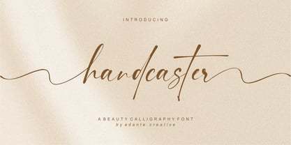 Introduced by Adante.Creative Proudly presenting Handcaster Handcaster is a beautiful calligraphic font. Handcaster is perfect for product packaging, branding projects, magazines, social media, wedding invitations, or just used to express words above the background. Handcaster has multilingual support. Enjoy the font, feel free to comment or feedback, send me PM or email.
 - Rankensteen by Ingrimayne Type,
$9.00 Many blackletter and calligraphic typefaces are elegant and can be used for items like invitations and liturgical or religious texts. Rankensteen is probably not one of them. It is crude and bizarre and with a somewhat menacing appearance. It seems more appropriate for a letter from a pirate than for a formal invitation.
 - Balzano by Adobe,
$29.00In 1994, John Benson designed Balzano, Alexa and Caliban, three typefaces with a similar calligraphic character. Balzano differs from the other in its vertical figures, adding a static element to the otherwise lively, flowing components. Balzano is good for short texts and headlines, anywhere in which a personal, elegant look is desired. - Classic Cool by Celebrity Fontz,
$19.99An original calligraphic typeface blending the penmanship of French royalty with smooth, modern strokes. The result is a classical flowing design. Includes many accented characters from the Latin-1 Supplement set and others as well as kerning pairs for a tighter look in applications such as Word for Windows that support font kerning. - Peristiwa Script by Attract Studio,
$14.00 Peristiwa Script is an elegant, full featured vintage inspired calligraphic script font with lots of alternative characters and OpenType features. Perfectly handwritten touch with a heavy right angle is perfect for logos, wedding invitations, modern websites, greeting cards and more! Font Pairing : Bethany Elingston Including: Alternates & Ligatures OpenType support Multilingual PUA encoded.
 - Adventure Island by Larin Type Co,
$12.00 Adventure Island this is a stunning font family that consists of two types of fonts, script and sans serif, and each has 8 weights (Regular, Rough, Halftone, Pressed, Bold, Bold rough, Bold halftone, Bold pressed,). With their help, a lot of options are opened for you to create your projects, both in vintage and in modern style. These fonts are like twin brothers, they fit perfectly and complement each other. The Script type has flowing shapes and is made to shine and lively for the full hand-signature effect. Sans serif type is also made in monoline and has rounded corners and smooth lines. The script style has alternatives for uppercases and many alternates for lowercaes, with them you can make your design more expressive, varied and playful, change them and you will see how many options you can get for your design, also use swashes touches to complement your design. Enjoy using! The font includes 8 script fonts and 8 sans serif fonts (Regular, Rough, Halftone, Pressed, Bold, Bold rough, Bold halftone, Bold pressed,) Full alphabet with Uppercase and Lowercase A-z for script Full alphabet with Uppercase for sans serif Numbers, fractions for all fonts Punctuation and mathematical symbols for all fonts Alternates Uppercase and Lowercase also ampersand for script Swashes for script Multilingual support all fonts
 - FS Kim by Fontsmith,
$80.00 Unconventional beauty FS Kim is bold and intriguing – exuberant and unmissable, but playing a supporting role when needed. This typeface shines brightest as a display font, and is perfect for applications across fashion, theatre, cultural projects and pretty much any brand that wants to make a statement. While FS Kim is dramatic, it’s incredibly versatile, too, and works to showcase content in a stylish, striking way. This font makes you look, and makes you curious – perfect for brands and publishers that relish unconventional beauty. A playful text version While FS Kim’s text version is more constrained than the display, the strength and playfulness remain. Modifications for the text version include larger x-heights, longer ascenders and descenders, wider proportions and spacing, longer and more defined serifs and a lower contrast. “The overall idea is that it’s not an optical size,” Radoeva explains. Text and display maintain a strong connection that mean they can be used together. A display with a twist The calligraphic starting point helped to create familiar forms, while a contemporary display feel is achieved through short wedge serifs, with bold touches added through the font’s exaggerated forms and details. FS Kim’s narrow proportions, short ascenders and descenders, and tighter spacing make the font suitably compact for display use. The overall aesthetic feels bold and sharp, but closer inspection reveals that all the corners are softened. Decorative inlines In an unusual twist, FS Kim’s display version was first drawn using a broad-nib pen to create familiar forms and elegance while still breaking from serif traditions and making it all about standout character. There are also two additional styles, based on the Regular and Black with inlines – in uppercase, figures and symbols. The inline brings an extra option for an even stronger, more decorative display use.
 - FS Kim Variable by Fontsmith,
$349.99Unconventional beauty FS Kim is bold and intriguing – exuberant and unmissable, but playing a supporting role when needed. This typeface shines brightest as a display font, and is perfect for applications across fashion, theatre, cultural projects and pretty much any brand that wants to make a statement. While FS Kim is dramatic, it’s incredibly versatile, too, and works to showcase content in a stylish, striking way. This font makes you look, and makes you curious – perfect for brands and publishers that relish unconventional beauty. A playful text version While FS Kim’s text version is more constrained than the display, the strength and playfulness remain. Modifications for the text version include larger x-heights, longer ascenders and descenders, wider proportions and spacing, longer and more defined serifs and a lower contrast. “The overall idea is that it’s not an optical size,” Radoeva explains. Text and display maintain a strong connection that mean they can be used together. A display with a twist The calligraphic starting point helped to create familiar forms, while a contemporary display feel is achieved through short wedge serifs, with bold touches added through the font’s exaggerated forms and details. FS Kim’s narrow proportions, short ascenders and descenders, and tighter spacing make the font suitably compact for display use. The overall aesthetic feels bold and sharp, but closer inspection reveals that all the corners are softened. Decorative inlines In an unusual twist, FS Kim’s display version was first drawn using a broad-nib pen to create familiar forms and elegance while still breaking from serif traditions and making it all about standout character. There are also two additional styles, based on the Regular and Black with inlines – in uppercase, figures and symbols. The inline brings an extra option for an even stronger, more decorative display use. - Ongunkan Venetic Script by Runic World Tamgacı,
$50.00 Venetic is an extinct Indo-European language, usually classified into the Italic subgroup, that was spoken by the Veneti people in ancient times in northeast Italy (Veneto and Friuli) and part of modern Slovenia, between the Po Delta and the southern fringe of the Alps, associated with the Este culture.[3][1][4] The language is attested by over 300 short inscriptions dating from the 6th to the 1st century BCE. Its speakers are identified with the ancient people called Veneti by the Romans and Enetoi by the Greeks. It became extinct around the 1st century when the local inhabitants assimilated into the Roman sphere. Inscriptions dedicating offerings to Reitia are one of the chief sources of knowledge of the Venetic language
 - 1467 Pannartz Latin by GLC,
$38.00 This family was inspired by the edition De Civitate Dei (by Sanctus Augustinus) printed in 1467 in Sobiano (Italy, Roma) by Konrad Sweynheym and Arnold Pannartz who was the Punchcutter. It is one of the first few “Roman style” fonts, just before the birth of Jenson’s pattern (look at 1470 Jenson Latin). The present font contains all of the specific latin abbreviations and ligatures used in the original (about 54). Added are the accented characters and a few others not in use in this early period of printing. Decorated letters such as 1512 Initials, 1550 Arabesques, 1565 Venetian, or 1584 Rinceau can be used with this family without anachronism. If Italic style is required (not yet existing in early time of printing), we recommend using 1557 Italique.


