10,000 search results
(0.042 seconds)
- CUKIER by Borutta Group,
$29.00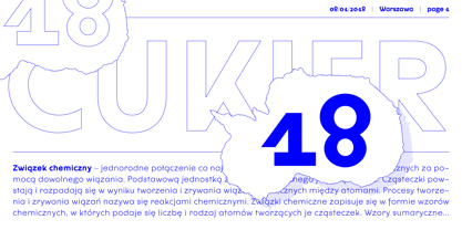 After my previous typefaces inspired by the flavour of local typography (Massimo, Picadilly & Zigfrid), I'd like to present new one, called CUKIER. This family was designed mainly for branding purposes - visual identity of CUKIER.WORKS Agency. Cukier is a sans serif, geometric typeface, inspired by the vernacular typography from Zanzibar (Tanzania). A lot of letters have intentionally made mistakes in a drawing, and this it what makes the whole font unusual. Family consist 10 styles – 5 weights with italics.
 - sh klicker by shType,
$30.00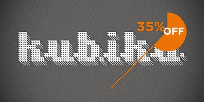 sh klicker is the first release by shType. Inspired by and built upon the metrical skeleton of pixel based typefaces, sh klicker opens up a whole new way in perceiving the classic impression of static grids. sh klicker is a modular, pixel based, graphically rich shapeshifter in eight different weights, best suited as a display font or where it is possible to use larger type sizes. Comes in Latin, Greek and Cyrillic with additional characters for most European languages.
 - Cicero by Présence Typo,
$36.00Cicero was the first typeface designed by Thierry Puyfoulhoux in 94. It is what could be called a semi-serif. Only the serifs which occur naturally when drawing letters with a flat nib pen have been retained. The absence of certain serifs allows for much tighter spacing. The remaining serifs still stabilize the baseline, although less effectively than a "full-serif" typeface. By borrowing features from both the sans and serif styles, Cicero truly stands at their crossroads. - Fucha by Oliveira 37,
$20.00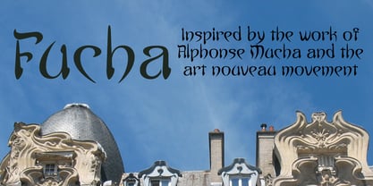 Fucha is a typography inspired by the Art Nouveau movement, and by the lettering of Alphonse Mucha's posters. Fucha is a decorative display font in the Art Nouveau style that originated over a century ago. The style showcases in its elaborate, lightweight curves a bold approach to organic lines and luxurious decor. A complete repertoire of Latin Extended-A characters is contained in the font. Supporting 219 Latin languages, which are spoken in different 212 countries.
 - Blue Goblet by insigne,
$19.99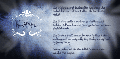 Blue Goblet is a script developed for the pending illustrated children’s book from Portland Studios, The Blue Goblet. The font has grown to a comprehensive system, with a wide array of ornaments available. Blue Goblet is usable in a wide range of settings, and includes a full complement of OpenType features and a more playful alternate. Blue Goblet is a collaboration between Portland Studios and insigne. It was designed by Cory Godbey and digitized by Jeremy Dooley.
 - Vilonti by Owl king project,
$39.00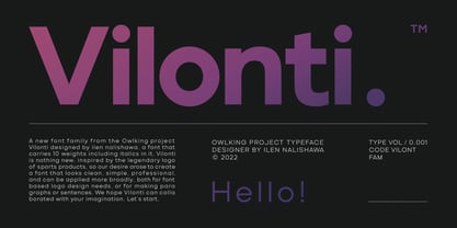 Vilonti a new font family from the Owlking project Vilonti designed by ilen nalishawa. a font that carries 20 weights including italics in it. Vilonti inspired by the legendary logo of sports products, so our desire arose to create a font that looks clean, simple, professional, and can be applied more broadly, both for font based logo design needs, or for making paragraphs or sentences. We hope Vilonti can collaborated with your imagination. Let's start desiging. be happy.
 - Durer Display by iframe,
$28.00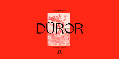 Durer is a modern font, its soft curves and refined details create a sense of elegance. Inspired by the work of Albrecht Dürer (21 May 1471 – 6 April 1528), who was a German painter, printmaker, and theorist of the German Renaissance. Born in Nuremberg, Dürer established his reputation and influence across Europe in his twenties due to his high-quality woodcut prints. 551 Glyphs Upper / lower case, numbers, punctuation Language support: Latin / Greek Designed by iframe type foundry
 - Sicret by Mans Greback,
$29.00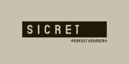 Sicret is a perfectly geometric typeface family. It was drawn by Måns Grebäck in 2020, and each one of its glyphs was manually created by following a strict mathematical pattern consisting of only two basic shapes, in four different combinations, set on a three units tall grid. The resulting product is a true monoline font with a solid character, with an official look while yet going towards sci-fi because of its digital nature. The family consists of nine weights: Thin, Extra Light, Light, Regular, Medium, Semi Bold, Bold, Extra Bold and Black. The range of weights makes it very adaptable, and all the weights works very well together to give a sentence or graphic tone and emphasization. As Sicret is a font with over 850 glyphs, it is guaranteed to contain all characters you'll ever need, including all punctuation and numbers. It has a very extensive lingual support, covering Greek, Cyrillic, Hebrew as well as European and American languages.
 - Sagrantino by Monotype,
$50.99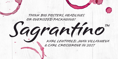 Sagrantino™ shines at large sizes – and in vibrant colors. Think big posters, commanding headlines, massive banners and oversized packaging. Set headlines in the Highlight or Shadow designs and running copy in the Regular – all on the same page! Sagrantino could be called the Lava Lamp of fonts. It’s slick, glossy, retro and futuristic. Somehow, it’s fresh and quirky-classic at the same time. This is a design that challenges you to think outside the text box. In fact, Sagrantino is so lively, it took three Monotype typeface designers, Karl Leuthold, Juan Villanueva and Carl Crossgrove, to draw it. Because it’s a script, Sagrantino pairs perfectly with just about any other design – except another script. Maintain the futuristic retro vibe by combining Sagrantino with a typeface like Biome™ or Neo™ Tech. Looking for a counterpoint? Try a cool sans like Avenir® Next or Univers® Next. OpenType® Pro fonts of Sagrantino enable automatic insertions from a crowd of fancy ligatures and delightful alternate characters – in addition to offering an extended character set supporting most Central European and many Eastern European languages.
 - Shelf by SzymonType,
$-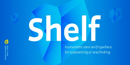 Shelf is a humanistic sans-serif font of cool and solid character. Its frugal, clean and organic drawing as well as its name were inspired by the ice shelf landscape. Shelf was designed as a universal tool for creating a coherent information and navigation systems with accompanying publications, such as visual identity of exhibitions including catalogues. It is suggested to set long texts in Roman and Italic, while the best combination for a wayfinding system is Roman and Oblique. Every weight, therefore, contains Roman, Italic and Oblique versions. The variety of over 1500 glyphs constitutes a rich set of Latin script characters. Shelf includes small caps, a broad set of figures, a wide set of alternative style variants, arrows and a number of OpenType features.
 - StoneWash by Scholtz Fonts,
$15.00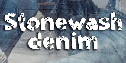 StoneWash is a funky, grunge font, with a monumental marble finish. The font combines an “old as the hills grunge” look with IN YOUR FACE, modern lines. It has a look of very old, washed out denim, about to disintegrate. StoneWash has all of the grunge characteristics: -- it’s dirty and corroded -- it’s coarse & broken -- it’s rough & pitted It also has the characteristics of an African style font: -- it’s ethnic -- it’s irregular -- it’s primitive -- it’s rustic -- it’s vibrant Use StoneWash for a great variety of applications: -- think advertisements - think flyers - think graffiti art - think posters - think magazine pages. You have to have StoneWash.
 - Faubourg by Positype,
$39.00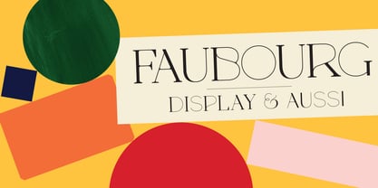 Faubourg marks the first professional typeface release by Marie Boulanger. As much traditional as it is unconventional in its celebration of letterforms, this typeface dances on the page and screen as it moves from a more conventional appearance to monoline and back again. The flowing silk-like undulation only accentuates this distinguishing feature and produces one opportunity after the next for headline settings where the word is as important as the content supporting it.
 - Supra Compressed by Wiescher Design,
$29.00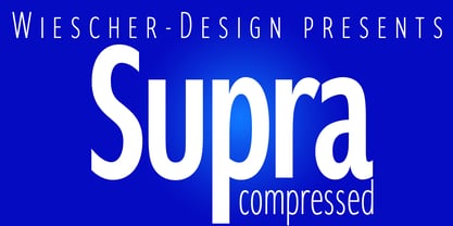 Supra-compressed – designed by Gert Wiescher in 2013 – is the extreme version of this family. But despite it being very slim it is still – because of its openness – a very readable font. The light and normal weights and the dominant x-height with its high ascenders make for easy reading of long copy. The heavy and x-light weights are great for elegant headlines. Supra is a versatile OpenType family with lots of different weights.
 - Mensura by Graviton,
$20.00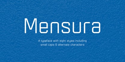 Mensura font family has been designed for Graviton Font Foundry by Pablo Balcells in 2012. It is a modular, geometric typeface with subtle rounded angles that provides a soft, pleasent appearence. It has been conceived to be primarily a display typeface, but given its clarity it can also be used for composing short and intermediate length texts. Mensura consists of 8 styles and 4 weights plus italics. Each containing small caps and several alternate characters.
 - Postman by Juan I. Siwak,
$20.00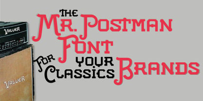 Postman is a typeface inspired by old documents, banknotes and leading product brands. It has cursive and elegant capital letters and its lowercase letters are actually small caps of geometric shapes as if they were made of metal and nailed with bolts. It is ideal for classic products that consider nobility and tradition among their virtues. It evokes classic products that lasted over time. Includes OpenType features, like ligatures, alternates, and more.
 - Elita by Wiescher Design,
$14.00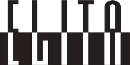 »Elita« is a 100% geometric font designed on a 3 by 16 grid that makes it very slim. There are no optical tricks employed, it is purely geometric. The extreme narrow font design gives it high black and white contrast. The font is not made to write long copy, but it is perfect if you want to employ that magic between pure geometric and almost impossible to read. Just look at the samples and enjoy!
 - 1880 Kurrentshrift by GLC,
$38.00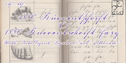 This font was inspired by the old form of the so called "Kurrentschrift" German handwriting, based on late medieval cursive. It is also known as "Alte Deutsche schrift" ("Old German script"). It was taught in German schools until 1941, when Adolf Hitler decided to forbid it. As it is a little hard to read, we are proposing here two versions: the "pure" Kurrentschrift, and an adapted "Easy" one, with simplified difficult characters.
 - Grand by North Type,
$-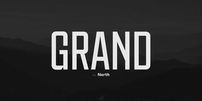 Inspired by old school sign painting techniques, Grand is a display condensed sans serif that isn't shy to put its foot down. Its verticality and bulky curves combined with its sharp angular connections between the bowls and stems give Grand a distinctive look and feel. It comes in 12 styles (6 weights and accompanying italics), and supports over 200 languages. Grand Regular and Grand Italic are both available for free (personal and commercial use).
 - Hoeflers by Maulana Creative,
$12.00 Hoeflers is a Hand-lettered font inspired by the vintage 70's sign board, music, shop and movies, it has a rough stroke outline and then we fill it. Hoeflers includes opentype features Ligatures. It support multilingual more than 100+ language. This font is good for logo design, Movie Titles, Books Titles and any awesome project you create. Make a stunning work with Hoeflers Rough sans font. Its a caps only fonts. Cheers, MaulanaCreative
 - Moisette by Nasir Udin,
$32.00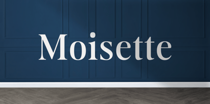 Moisette is a serif typeface inspired by the classic and the modern. Developed in 7 weights with its complementary italics, Moisette offers many possibilities to be applied in many graphic, editorial, or branding projects, for short paragraph or display purposes. Moisette has high-contrast stem ratio to give it an elegant touch and luxurious appeal, and its high x-height makes sentences more legibility. It supports Latin and Cyrillic character set (incld. Bulgarian & Serbian Cyrillic).
 - Angilla Script by Mans Greback,
$59.00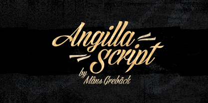 Angilla Script is a tattoo inspired calligraphy typeface. It was drawn and created by Måns Grebäck during 2019 and 2020. While having a feminine flow, it has confidence, attitude and dare. Use it for a concert poster, a logotype or to give any project a bit of extra personality. It has an extensive lingual support, covering European and Asian Latin scripts. The font contains all characters you'll ever need, including all punctuation and numbers.
 - Gothic Story by Mvmet,
$10.00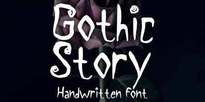 Gothic Story is a kid-friendly gothic handwritten display font, inspired by 90s gothic movies. It will be perfect for your gothic and Halloween-themed needs! You can use it for anything ranging from t-shirts and clothing, to your gothic book designs, Halloween party needs, greeting cards, stickers, posters, banners, or anything that needs a cool touch. Try it to create fabulous designs and feel the gothic and Halloween vibes with it!
 - Now Appearing JNL by Jeff Levine,
$29.00Now Appearing JNL is a digital version of some hand-lettering spotted on an early 1960s ad for a Miami Beach night club. Its fun, casual appearance makes it perfectly suitable for any project that conveys a relaxed atmosphere. The font was intentionally not kerned, so the free-flowing form of the lettering is at its best, but it can be set tight by hand if a more compact look is desired. - Lucca by João Henrique Lopes,
$39.00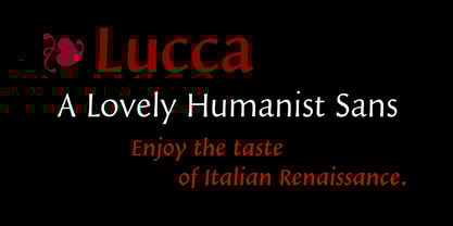 Inspired by Italian Renaissance fonts like Poliphilus, Blado, Centaur and Arrighi, Lucca presents a simple charm and a powerful classic feel. It is cute, friendly, clear and superbly readable. Its low contrast provides Lucca a firm yet flexible substance, making it sensual and enticing. There’s a certain degree of abstraction in the precise endings, and the whole design was made to survive even in the harshest conditions, conserving its readability and beauty.
 - Xena - Unknown license

- AdverGothic by ParaType,
$25.00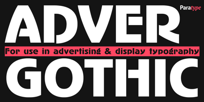 Designed at ParaType in 1989 by Vladimir Yefimov based on Advertisers Gothic, 1917, by Robert Wiebking, inspired by Art Nouveau lettering. For use in advertising and display typography.
 - 1543 Humane Jenson by GLC,
$38.00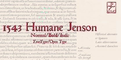 In 1543 the well-known “De humani corporis fabrica” treatise on anatomy by André Vesale, was printed by Johann Oporinus in Basel (Switzerland). Various typefaces were used for this work, mostly in Latin but including Greek characters. Its Jenson-type font was the one which inspired this font. It is a very elegant one, including the “long s”, a few abbreviation forms and ligatures. As it was a Latin text, there were no accented characters and a few capitals were absent. I had to reconstruct them. A render sheet, in the font file, makes all characters easy to identify on the keyboard. This font may be used as a “modern” one for web-site titles, posters and flier designs, publishing ancient texts... and anything else you want! One of the most elegant types ever cut, it stands up very well to enlargement, remaining as readable as in its original small size.
 - Rustica by TipoType,
$24.00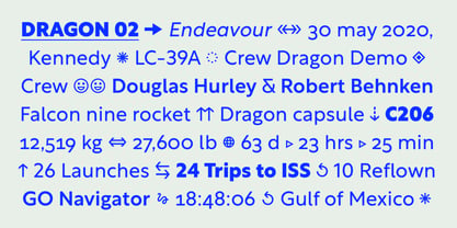 The world has changed; we want it to change. But it has a history too. Rustica draws back to the sans typeface tradition and updates it for the 21st century; we aim to go back to the humanist values without dismissing the role played by technology.It’s a GeoHumanist sans serif. Type design looks back at its past to return with renovated strength to its march to the future. Rustica is based on a humanist architecture with the addition of the determination and precision of the geometry of the classic sans of the early 20th century. Thus, a typographic conception typical of 21st century communications: returning to the human values of closeness and proximity, adding the certainty of knowledge and science. Rustica is born out of the DNA of our awarded font Rotunda, contributing to this typographic ecosystem humanist notes enhanced by the precision and discipline of geometry.
 - Ardoise Std by Typofonderie,
$59.00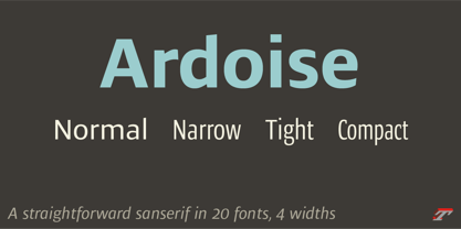 A straightforward sanserif in 20 fonts, 4 widths Ardoise met the needs of publications. By extension, it met the needs of a newpapers typeface featuring a low contrast, straightforward forms, as Franklin Gothic. The verticals metrics and proportions of Ardoise are calibrated to match perfectly others Typofonderie families. Four widths to answer all situations Ardoise, inspired by the needs of today’s fine newspapers offers simple and tense shapes designed to renew and revitalize. Ardoise could be considered as an homage to Antique Olive, but quite indirectly and as an organic result of the designer’s longstanding admiration of the work of Roger Excoffon. Ardoise shares a purity and dynamics with Excoffon’s designs giving it a unique elegance and excellent readability. Its sturdiness means it is virtually immune it to distortion. In addition, a few alternates glyphs (a, c, g) can be used to alter the overall tone of a text setting.
 - Ongunkan South Arabian Script by Runic World Tamgacı,
$49.99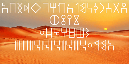 The Ancient South Arabian script (Old South Arabian 𐩣𐩯𐩬𐩵 ms3nd; modern Arabic: الْمُسْنَد musnad) branched from the Proto-Sinaitic script in about the 9th century BCE. It was used for writing the Old South Arabian languages Sabaic, Qatabanic, Hadramautic, Minaean, and Hasaitic, and the Ethiopic language Ge'ez in Dʿmt. The earliest inscriptions in the script date to the 9th century BCE in Yemen. There are no letters for vowels, which are marked by matres lectionis. Its mature form was reached around 800 BCE, and its use continued until the 6th century CE, including Ancient North Arabian inscriptions in variants of the alphabet, when it was displaced by the Arabic alphabet In Ethiopia and Eritrea, it evolved later into the Ge'ez script, which, with added symbols throughout the centuries, has been used to write Amharic, Tigrinya and Tigre, as well as other languages (including various Semitic, Cushitic, and Nilo-Saharan languages).
 - My Darling by Type Innovations,
$39.00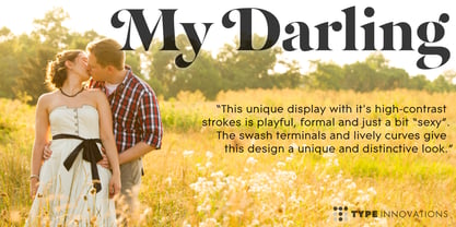 ‘My Darling’ is a stunning new typeface by Alex Kaczun. Inspired by the Didone shapes, ‘My Darling’ incorporates some Didot, a little Caslon, a splash of Scotch and a pinch of old Times. This unique display, with its high-contrast strokes is playful, formal and just a bit ‘sexy’. The swash capital terminals and lively curves, give this design a unique and distinctive look. It works well as a headline font, and because it was designed with generous counters, proportions and spacing—works equally well over a large range of text point sizes. My Darlings' character set supports most Central European and many Eastern European languages. Alex hopes to add many style variations, along with alternate glyph sets and weights to further enhance this offering. Stay tuned!
 - Hont by Remedy667,
$18.00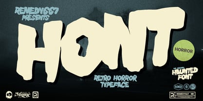 Hont, the original Haunted Font is here. We've captured the essence of an old-school horror film and now you can use it to create awesome-looking titles for all your projects. With its chunky appearance, this font is perfect for vintage poster designs, t-shirt designs, logos, or anything that needs a hint of spooky. Hont is the ultimate Haunted Font that looks amazing on all projects. Inspired by classic mid-century horror films, it will give your projects just the right amount of classic horror. Features Doubles Elimination gives you a more natural look. Inspired by classic mid-century horror films. Includes a Remedy667 Font Catalog PDF, all your favorite fonts in one handy catalog. Possibly haunted, may possess you to create awesome work.
 - Huxley Alt by HiH,
$8.00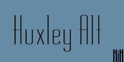 Huxley Alt is just that — an alternative to Huxley Vertical by ATF. It represents one of my earliest efforts. I liked the crispness of Huxley Vertical, but wanted a lowercase and with some modulation of the strokes as in Empire, also by ATF. Huxley Alt is the result. Highly condensed. Set it large or lose it. Huxley Alt is a bargain-priced font with 226 glyphs, covering the usual Western European accents (ref MS Code Page 1252). If you like the style, but would like more glyphs and/or a range of weights, may we suggest our Huxley Amore. Huxley Amore has 379 glyphs and covers the Eastern European, Baltic and Turkish code pages (1250, 1254 and 1257). We also offer Huxley Cyrillic in a single weight.
 - Galea Display by Letra Type,
$50.00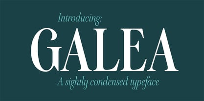 Galea is a slightly condensed serif typeface with long extenders. Its elongated proportions and graceful terminals seek to bring femininity and elegance to any layout. It is a display face that works well at large sizes in editorial contexts as a headline, titling or introduction to a text. Galea was designed by Isabel Urbina Peña while at Cooper Union’s Type@Cooper Extended Program, 2012 and released on May, 2014. Galea obtained an Honorable Mention from the Fine Press Book Association in the Text Family Category, 2013. Also, it is featured in the book "Playing with Type: 50 Experiments" by Lara McCormick, Rockport Press, on Parenthesis Magazine, Autumn 2013 on Behance's Typography Served and will appear on "Typography Magazine", Japan (Nov 2014).
 - HWT Roman Extended Lightface by Hamilton Wood Type Collection,
$24.95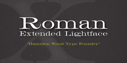 The Roman alphabet has seen endless variations in interpretations of its classical form, and various wood type styles managed to explore everything from XXX condensed to hyper extended and expanded. This delicate and handsomely proportioned extended Roman was issued by Page Manufacturing Co. in 1872 and released as simply “No. 251” after Page was acquired by Hamilton. It is a rare font to find in print shops, most likely due to the very fine lines that would no doubt be less durable that bolder gothic jobbing fonts. While being quite wide, it still holds the elegant grace of wide Romans such as Craw Modern. This new digitization features a full Western and Eastern European Character set as well as ligatures and alternate characters.
 - Wordmark by W Type Foundry,
$28.00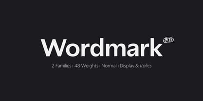 Wordmark is our new fully equipped branding tool. Designed with a refreshed humanist style, much loved by brands that need to deliver their message in a serious way, with a current look. Drawn by the cool eye of Gaspar Muñoz, expect this font to be as good or even better than its predecessor "Herokid". "Wordmark" is super complete; it includes condensed, thin, expanded, and heavy weights plus italics with two complementary systems that work together in a powerful way. "Wordmark Normal" offers great readability for text and signage, big or small. And "Wordmark Display", designed with a noticeably taller X height specifically made for headlines, big windows, and big screens. With 48 different styles keep it simple and make reliable designs with "Wordmark".
 - Yumo by Thinkdust,
$10.00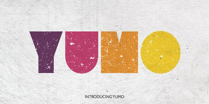 Yumo is a new, textured remix of the original 2010 Yume typeface, and has plenty to offer of its own. Angular and blocky, this typeface creates impactful text with a hint of playfulness, expanded upon by its rough finish. There are no extraneous edges to this font because most of them have been subsumed into the characters themselves, so any sharpness it may have from the squared corners is removed by the lack of thin strokes or serifs. Perfect for headlines and large text that wants to stand out, Yumo’s big, bold text will help your message make an impact. Playing with colours on the textured surface only helps to strengthen this effect, so that Yumo will blow people away, whatever you want to say.
 - Magreb by 38-lineart,
$19.00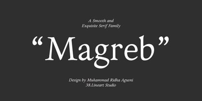 Magreb is a classic serif font inspired by Garamond and Venetian Serif Styles, accentuating softness and conveying luxury. This family of four weights and their corresponding italics is an old style construction and bridges the glory of the past with the elegance of the present. The process of making this fonts starting with an ellipse brush with a certain slope so that it resembles calligraphy pen strokes. followed by creating the basic serif elements, refining the vectors and softening each joint so that it looks natural. Next, develop it from regular weight to weight bold. Magreb has expanded the latin character set to support 200+ latin based languages. We added opentype features suchs superscript and subscript; Numeretor and Denominator; Old Style figures and lining figures.
 - Garnet Euro Typewriter by Coniglio Type,
$19.95Garnet is a rare TT typewriter face, made digital from analog samples gathered with great care by Coniglio Type. A time and place; type and life. Garnet Euro Typewriter is the first new release by designer Joseph V Coniglio in over 5 years. It is contemporary designer type, made from the struck steel hammers of an art deco san serif face transferred from a mechanical 1926 Royal Portable typewriter. It has an obsessively complete commercial roman character set ––for the pre-opentype environment of the late 1990's. Yes, it has that great “Monopoly Game” question mark -- and all on a period-piece typewriter! You should have no trouble grafting that sorely needed Euro symbol.” –And he very well did! - Trasandina by TipoType,
$24.00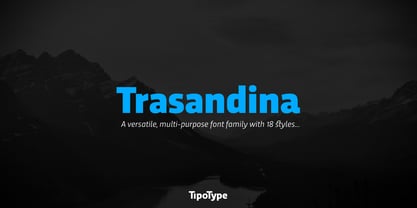 Trasandina is a very unique font-family: a modern, versatile, workhorse typeface with a special personality, given by the mix of humanist and geometric models, remaining far from both extremes. This typeface has 9 styles plus their matching italics, it has an incredible wide range of weights, from very thin to an ultra thick stem. This was made following the Luc(as) de Groot’s Interpolation Theory. Trasandina’s versatility also resides in the +800 characters that each weight includes, having several open type features and language support for more than 200 languages. This font has been specially designed for web (using hinting instructions), making it work in small and large sizes on different types of screen resolutions. Trasandina’s most interesting feature is its flexibility: On one hand, is easy to read thanks to its humanistic letterforms which allow this typeface to be legible in small sizes while remaining neutral (specially around its middle weights). And, at the same time, it’s perfect for logos and posters that need a lot more personality, this is mainly due to its more geometric nature in light and bold weights. Thank you for your support! It’s people like you that allow our team to keep enjoying creating new fonts. That’s why we’d like to hear from you! Send us your work using our fonts: info@tipotype.com, and you'll have a special 50% OFF on Tipotype at Myfonts
