10,000 search results
(0.049 seconds)
- Pinklatte by Typebae,
$15.00 Pinklatte Font is a captivating handwritten brush script font that exudes a sense of free-spirited elegance. This font brings a touch of personal charm to any project. Whether used for invitations, posters, or branding, Pinklatte Font adds a distinctive and stylish flair, capturing the essence of individuality and creativity in its handwritten form. What Includes? Uppercase, Lowercase, Numeral & Punctuation Ligature & Swashes PUA Encoded Characters - Fully accessible without additional design software. Multilingual Support:
 - Michael Sheikh by Silverdav,
$18.00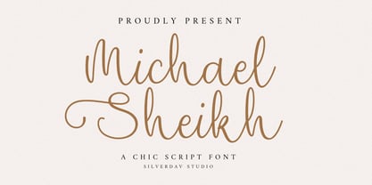 Introducing the “Michael Sheikh” font, a playful and unique handwriting typeface designed to infuse your projects with a touch of whimsy and character. This font offers a delightful collection of alternate characters, providing you with endless creative possibilities. With “Michael Sheikh,” you can effortlessly add and charming touch to your designs. Its handcrafted style lends authenticity and warmth, making it perfect for a wide range of applications, from invitations to branding and beyond.
 - Swaziland by Get Studio,
$15.00 Introducing... Swaziland Modern Calligraphy Font! For those of you who are needing a touch of elegance and modernity for your designs. This font is particularly well-suited to create the most lovely wedding designs, invitations, mood board, social-media template or for your editorial design needs. Swaziland comes with more than 430 glyphs, includes beginning and ending swashes, alternate swash characters, uppercase and lowercase letters, numerals, and a large range of punctuation.
 - Ambassador Script by Canada Type,
$69.95 When Aldo Novarese designed his “tipo inglese” Juliet typeface, he had a simple objective in mind: Reduce the inclination angle of the traditional 18th and 19th centuries English script in order to make the punchcutter’s job easier and the resulting metal type more durable. But when Juliet was released by Nebiolo in 1955, it was a big surprise to both typesetters and calligraphers all over Europe. Novarese’s idea of working the standard copperplate script within the limited technology of the time proved to be a marvel in optical metal sizing (Juliet was available in sizes ranging from 12 to 60 pt), but also opened the door to new calligraphic possibilities. Easier readability and a very friendly color were obvious side effects of the reduced angle. So soon after its release, calligraphers worldwide began emulating the angle reduction and experimenting with the application of the same concept to other calligraphic genres. Today, more than 50 years later, many professional calligraphers point to Novarese’s Juliet as an opening to fresh ideas and new directions in 20th century elegant calligraphy. Ambassador Script, this digital version of Aldo Novarese’s surprising masterpiece, is the result of more than a thousand hours of work. Going above and beyond its duty as a revival, it was expanded by a great number of alternates, swashes, beginning and ending forms, as well as accompanying flourishes and snap-on strokes for even more ending forms. Ambassador Script also supports almost every known Latin-based language, which makes its name all the more fitting. Ambassador Script is available in all popular font formats. The True Type and Postscript Type 1 versions come in 12 fonts, available in different piecemeal configurations or a full volume. The OpenType version collects more than 2300 characters in a single feature-rich font that can sing mightily in OpenType-supporting applications. Ambassador Script is ideal for weddings, invitations, greeting cards, book and magazine covers, or anywhere a touch of calligraphic elegance is desired.
 - Laurentian by Monotype,
$29.99 Maclean's is a weekly Canadian newsmagazine with a broad editorial mission. A typical issue covers everything from violence on the other side of the globe to the largest pumpkin grown in a local county. In 2001, Maclean's invited Rod McDonald to become part of the design team to renovate" the 96-year-old publication. The magazine wanted to offer its readers a typographic voice that was professional, clean, and easy to read. Above all, the typeface had to be able to speak about the hundreds of unrelated subjects addressed in each issue while remaining believable and uncontrived. A tall order, perhaps? Now add in that this would be the first text typeface ever commissioned by a Canadian magazine. McDonald, who some have called Canada's unofficial "typographer laureate," took on the challenge. McDonald used two historic models as the basis for Laurentian's design: the work of French type designer Claude Garamond, and that of the English printer and type founder, William Caslon. From Garamond Laurentian acquired its humanist axis, crisp serifs and terminals that mimic pen strokes. Caslon's letters are less humanistic, with a more marked contrast in stroke weight and serifs that appear constructed rather than drawn. These traits also made their mark on Laurentian. Using these two designs as a foundation, McDonald drew Laurentian with the narrow text columns and small type sizes of magazine composition in mind. He gave his letters strong vertical strokes and sturdy serifs, a robust x-height and a slightly compressed character width A tall order, per McDonald's genius is evident in the face's legibility, quiet liveliness and in the openness of the letters. The result is a typeface that not only met Maclean's demanding design brief, but also provides exceptional service in a wide variety of other applications. Laurentian is available in three weights of Regular, Semi Bold and Bold, with complementary italics for the Regular and Semi Bold, and a suite of titling caps."
 - Alta Mesa by FontMesa,
$25.00Alta Mesa is a revival of an old type design from the 1800's that was sold by most of the type foundries in the US and Europe of that time period so it is difficult to know the foundry of origin. New with this version are the fill fonts and plain styles, the fill fonts may be used as stand alone fonts, however the letter spacing is much wider, the plain versions are recommended if you desire a solid black weight. The regular Fill font is in registration with the Regular and Open versions while the Fill L font is in registration with the L and Open L versions. This was a very charming font in its time which was heavily used on old billheads and letterheads. We're pleased to bring this type design, which hasn't been used for over 100 years, into the digital world today. - Carlin Script by Linotype,
$40.99The Carlin Script family, inspired by the Carolingian minuscule alphabet (ca 800 A.D.), is one of the great new families available through Linotype's Library's Take Type 5 collection. Take a closer look at these beautiful characters; with them, one can create a different, more personal feeling than commonly comes from more available script and chancery fonts. Like a monk with his writing table, German designer Hans-Jürgen Ellenberger created this new design, which includes 10 different weights, bringing scribal excellence directly to your keyboard. The Carlin Script family includes an additional Initial set-allowing the creation of medieval-flavored drop or initial caps in snap. And the critics are raving: Carlin Script was a winner in the New York-based Type Directors Club's 2003 Type Design Contest!" - Rantika by Arterfak Project,
$15.00 Rantika is a cute brush font, created with additional bold on the strokes and mostly curved edges of the letterforms. This font comes from the manual brush stroke which has an informal stroke thickness that makes the font looks more natural. Bring the happiness with Rantika, make your design more cheerful because you can use this font for cards, apparel, merchandise, invitation, food or menu design, poster, cute quote, holiday design, and many more! Fonts featured : Uppercase Lowercase Numbers Punctuation Accented characters Stylistic set Ligatures Thank you for watching
 - JAF Domus Titling by Just Another Foundry,
$42.00 JAF Domus Titling is a rounded typeface with classical Roman proportions. It is unique in that it was designed as an all-caps sans from the beginning. The fonts range from Extralight to Extrabold and include a large number of accented characters as well as small caps and alternates.
 - HU Cheonggye by Heummdesign,
$15.00 HU Cheonggye is a typeface for titles with thick strokes and wide flats, mainly produced with a retro feel. In order to bring out the characteristics of the retro typeface, a difference in thickness between horizontal and vertical strokes was applied, and obtuse right-angled serifs were applied.
 - VLNL Bint by VetteLetters,
$35.00 Kornelis de Vries, a headmaster from the Dutch province of Friesland, cultivated new potato breeds that he named after pupils in his school. In the early 1900s he came up with the tasty Bintje (a Frisian girl’s name) and it became a big success – in Belgium and France it has remained the most popular potato for french fries to this day, more than a century since its introduction. Donald Roos took 10 kilos of fresh Bintje potatoes and cut the Bint typeface by hand with a short, sharp knife. He then inked each character once and printed it twice; the second, lighter printing is accommodated in the lower case alphabet. The Bint family offers a script to make the letters bounce up and down the baseline; with OpenType functionality the font randomly chooses each character from the upper- or lowercase alphabet. ‘Tabular lining figures’ will activate a series of negative numerals in boxes; ‘Discretionary ligatures’ activates specially designed letter combinations like ‘www’ as well as arrows and stars. Bint has a distinct, slightly rough handmade appearance, making it useful for a wide range of designs.
 - Bessemer by Sivioco,
$10.00 Bessemer is an all-caps sans-serif display font inspired by industrial lettering from the 20th century. On its own, it has a predominantly factory-made feel, but is versatile enough to work well in a variety of settings. In other words, it feels just at home on a series of technical guides as it does on a range of hair styling products. Bessemer comes in 5 weights ranging from Light to Bold and has been designed with chamfered edges. This makes it really easy to customize and create your own custom type. It also includes the following OpenType features: • Proportional Lining Figures • Tabular Lining Figures • Superior & Inferior Figures • Numerators & Denominators • Ordinals • Fractions Perfect for logos, posters, t-shirts, packaging and use in video. Delivered in TTF and OTF format. Supports all Western, Central and South Eastern European languages.
 - Mattiface by Balpirick,
$15.00 Mattiface is a modern handwritten font, perfect for both formal and non-formal designs. This versatility will appeal to a wide range of crafty ideas, from letterheads and titles, to stationery.
 - Longshanks by Mysterylab,
$21.00 Longshanks is a condensed serif display font with a low waist, blade-like strokes, and other unusual detailing. This font features a medium-low x-height and works very well at larger display sizes. It's an excellent choice for any headline, banner, or title that would benefit from an old-world, historical, fantasy, magic, or sword & sorcery vibe. It also harks back to the metallic foil stamped type treatments from 1980s – 1990s romance novel book cover design. The offbeat features are subtle enough to leave this font with a very high degree of legibility in spite of its strong and dynamic treatment of certain serifs and finials. The namesake for this typeface is King Edward I of England, whose nickname was Edward the Longshanks.
 - Libreville by Firstype Studio,
$16.00 Hello, design enthusiasts! Allow me to present "Libreville" - a contemporary serif font that seamlessly blends style, readability, and uniqueness. Libreville is a modern serif typeface designed to meet contemporary design demands. With its sleek and elegant characters, this font effortlessly combines sophistication with excellent readability. The unique aspects of Libreville set it apart, making it a standout choice for a wide range of design projects. Key Features: - Contemporary Elegance: Libreville exudes contemporary elegance, making it an ideal choice for projects that demand a touch of modern sophistication. - Excellent Readability: The font is meticulously crafted to ensure optimal readability, making it suitable for various design applications, from editorial work to branding. - Unique Characteristics: Libreville brings a unique flair to serif typography, allowing your designs to stand out with a distinctive touch. - Versatility: Whether applied to branding, editorial design, or any creative project, Libreville's versatility makes it adaptable to various design needs. Libreville is your go-to serif font for achieving a perfect balance between contemporary aesthetics and classic sophistication. Feel free to reach out if you have any inquiries or require further information. Your feedback is highly appreciated. Thank you for considering "Libreville" for your design endeavors.
 - FE Gigant by Egor Stremousov,
$50.00 The font has a pronounced decorative effect and is suitable for the gaming, publishing and film industry. The Cyrillic alphabet conveys the spirit and atmosphere of Soviet constructivism. It is well suited for names of Soviet (or pseudo-Soviet) trademarks, large headings, signs, giant letter structures, etc. The Latin part is not tied to the Soviet period and can be applied in a wider range. Sharp angles and unnatural proportions create dynamics, strength and heaviness.
 - Glimp Variable by OneSevenPointFive,
$60.00 Variable version of 'Glimp' font family Glimp Variable supports 3 axis flexibility across width, weight and italic in a single font. It also comes with the static styles available as options in the font style selection menu. It features rich set of opentype features such as stylistic sets, contextual alternates, case sensitive forms, superscripts, subscripts, fractions, and more. Glimp Variable is made to be your go-to choice for a wide range of projects, whether you're working on branding, web design, print materials, or presentations. It elevates your designs or brand effortlessly, embracing your creative vision. Variable Axis Ranges: Width - wdth - 75 to 100 Weight - wght - 100 to 900 Italic - ital - 0 to 1
 - Soft Press by Canada Type,
$24.95 This is the rounded, softer version of Canada Type's popular Press Gothic. Originally done in 2011 for a global publisher, this font has already seen plenty of magazine and book cover action, perhaps even more than the sharp condensed face that spawned it. And like Press Gothic, Soft Press comes with small caps and biform/unicase forms, in addition to the main upper/lowercase set. The extended language support covers a wide range, including Greek and Cyrillic, Turkish, Baltic, Central and Eastern European languages, Celtic/Welsh and Esperanto. The Pro version combines all three TrueType fonts into one OpenType-programmed font, taking advantage of class-based kerning, the small caps feature, and the stylistic alternates feature for the biform shapes.
 - Wagner Round by Canada Type,
$24.95 This is the rounded, softer version of Canada Type's popular Wagner Grotesk. Originally done in 2011 for a global publisher, this font has already seen plenty of magazine and book cover action, perhaps even more than the sharp condensed face that spawned it. And like Wagner Grotesk, Wagner Round comes with small caps and biform/unicase forms, in addition to the main upper/lowercase set. The extended language support covers a wide range, including Greek and Cyrillic, Turkish, Baltic, Central and Eastern European languages, Celtic/Welsh and Esperanto. The Pro version combines all three TrueType fonts into one OpenType-programmed font, taking advantage of class-based kerning, the small caps feature, and the stylistic alternates feature for the biform shapes.
 - Love Script by Positype,
$55.00 Love Script came about as a way to finally answer the requests by individuals to take my brush pen/marker lettering styles and turn them into a typeface. Literally, everything lined up perfectly and there was a renewed impetus to push this genre, this style of lettering I have adapted over the years into what will become a series of brush pen/marker typefaces. The first I chose to complete was a high-contrast variant… I seem to be attracted to high contrast, high energy letters (think Lust, Lust Slim and Lust Script). As I was finalizing everything, I kept saying ‘I love this script’, which ultimately led the christening of the typeface as Love Script. For more fun, visit the Love Script Minisite Designer’s note: for this font to truly sing, be sure you have Contextual Alternates on in your OpenType settings. Hope you love it as much as I do.
 - Mercurial by Grype,
$16.00 Geometric/Technical style logotypes have been developed for car chrome labels since the early 1980’s, but automobile companies don't monopolize the style by any means. During the 80’s and 90’s, a lot of these logos leaned towards the geometric sans styles and the swiss styling of fonts like Handel Gothic, while playing with varying degrees of squared rounds and varying expanded widths per logotype. Mercurial has this flavor, but it wasn’t derived from logotypes. Instead, it began as a digitization of a film typeface from LetterGraphics in the early 70's known as "Sam". It visual ties to this genre of automotive logotypes and fonts like Handel Gothic lend a familiarity to it, yet it has an identity all its own. As with so many automotive logotypes, this singular style film typeface, lacked an expansive family which shows off all potential the logotypes have and what they "could" be and do. And that's where we come in. What originally began as this family’s Regular Width - Bold Style has been expanded into a collection of 3 Width Families, each containing 5 Weights. Here’s what’s included with the Mercurial Complete bundle: 396 glyphs per style - including Capitals, Lowercase, Numerals, Punctuation and an extensive character set that covers multilingual support of latin based languages. (see the final poster graphics for a preview of the characters included) 3 widths in the collection: Narrow, Regular, & Wide 5 weights in each width family: Light, Book, Regular, Medium & Bold. Here’s why the Mercurial Family is for you: - You’re in need of stylish sans font family with a range of widths and weights. - You’re love those 80’s automotive logos, but want more range of use. - You’re looking for an alternative to Handel Gothic. - You’re looking for a clean techno typeface for your rave poster designs. - You just like to collect quality fonts to add to your design arsenal.
 - FS Sinclair by Fontsmith,
$80.00 ZX Spectrum In 1982, a home computer came on the market that would launch the UK IT industry. The ZX Spectrum sold five million units and spawned thousands of software titles. It was the must-have gadget for every teen. FS Sinclair is inspired by the memory of Sir Clive Sinclair’s greatest creation: the experience of entering its clunky command codes and reading its simple, grid-placed type. Smart, switched-on, great in text and display, FS Sinclair is a modern grid-based font, drawn with the Spectrum in mind and brought to life by well thought-out design. Formula Having completed the font for Channel 4’s brand update, the Fontsmith team defined the formula for its next font: the creative essence of the C4 work but with more structural discipline, more rigid form and a little more seriousness. The new font wouldn’t look self-consciously retro but it would reference the past and, it was hoped, influence the future. Readability Like the ZX Spectrum, it took a while for the new font to do exactly what it was meant to do. Many of the early concepts by Phil Garnham and Jason Smith were too jagged – the result of an awareness of getting too close to existing fonts of the same ilk, such as Wim Crouwel’s Gridnik. Eventually, FS Sinclair evolved into a more readable, functional grid-based type design that answered Phil and Jason’s original, self-set brief. Idiosyncratic There’s a technological, systems feel to FS Sinclair but ultimately, humans are in charge. The lowercase “a”, “n”, “m” and “r” have clean-cut “ears”, and the square-ish design is softened by round joins on the inside of the letterforms. The idiosyncratic design of letters such as “g”, “j”, “k”, “v”, “w” and “y” bring the design up to date. This is a modular font with character, and a range of weights that allow varied application.
 - dT Ampla by dooType,
$35.00 dT Ampla shares many characteristics of the versatile sans typefaces of today: nice range of five weights with matching italics, 40+ supported languages, contemporary upper-to-lowercase proportions and impeccable performance in big and text sizes. However, all these features are designed with distinct shapes and details. Notice the angled terminals – the cut at the end of the strokes – or how the vertical strokes in the italics seem to 'bend' a little, for instance. The sum of these and many more design decisions result in a typeface capable of delivering a strong presence to sites, interfaces, apps, magazines and corporate graphic language.
 - Aspire Narrow SmallCaps by Grype,
$18.00 While the Aspire SmallCaps family finds its roots of inspiration in the ACURA automotive company logo, with its wider base, the Aspire Narrow SmallCaps family condenses those styles into something more suitable for larger bodies of text in a more standardized width. Aspire Narrow SmallCaps is perhaps the most true to form tribute to the original all capitals inspiration logotype. It maintains all capital forms (whether standard or smallcaps) and yet is still strikingly powerful in its presence and readability including numerals, and a comprehensive range of weights, creating a straightforward, uncompromising collection of typefaces that lend a solid foundation and a broad range of expression for designers. Here's what's included with the Aspire Narrow SmallCaps Family bundle: - 430 glyphs per style - including Capitals, Small Caps, Numerals, Punctuation and an extensive character set that covers multilingual support of latin based languages. (see the 6th graphic for a preview of the characters included) - Stylistic Alternates - alternate characters that remove the angled stencil cuts for a more standardized text look. - 3 weights in the family: Light, Regular, & Black. - 3 obliques in the family, one for each weight: Light, Regular, & Black. - Fonts are provided in TTF & OTF formats. The TTF format is the standard go to for most users, although the OTF and TTF function exactly the same. Here's why the Aspire Narrow SmallCaps Family is for you: - You're in need of automotive sans font family with a range of weights and obliques - You're love that ACURA letter styling, and want to design anything within that genre - You're looking for an alternative to Eurostile with more stylized letterforms. - You're looking for a battle-tech typeface for your futuristic war chest labelling. - You just like to collect quality fonts to add to your design arsenal
 - American West by FontMesa,
$20.00 Inspired by an old document from the New York and Western Railroad, American West brings the olden days to mind.
 - Magenos Soft by Graphite,
$18.00 Magenos Soft is the rounded version of Magenos typeface family. It is a modern geometric sans serif family characterized by its simplicity and extensive functionality. With its open apertures, geometric architecture and low contrast strokes, it expresses a sincere tone with a modernistic, neutral, yet friendly personality. It has been designed to work well for a wide range of applications and is a reliable workhorse. Equally suitable for print and screen usage, it works well for both text and display at a wide range of point sizes. The addition of true italics gives the whole family a dynamic edge and flexibility. Magenos Soft comes with many OpenType features including stylistic alternates, standard ligatures, oldstyle and lining (proportional and tabular) numerals, slashed zero and a variety of symbols, making it a perfect choice for contemporary and professional typography.
 - Daguin by Konstantine Studio,
$18.00 Introducing DAGUIN, inspired by the medieval look and feel in fashion visual, fusion up with the contemporary modern serif to reach the wider range of visual trend possibilities. From past to the future. Perfectly fit for your logo, magazine, look book, social media branding and content, beauty blog, fashion branding, website, clothing, merchandise, mood board concept, etc.
 - Bulgary Reagans by Letterhend,
$12.00 Bulgary Reagans is a pair of font that brings the playful looks with casual feel. The handwritten sans serif combined with the natural hand writing script are the perfect match for you who needs a typeface for headline, logotype, apparel, invitation, branding, packaging, advertising etc. Features : Uppercase & lowercase Numbers and punctuation Alternates & Ligatures Multilingual PUA encoded
 - Stratus by Marc Foley,
$15.00 Stratus is a neutral sans-serif family, consisting of six weights. The design is heavily influenced by '90s screen fonts. It has been tested and developed using a range of different operating systems and web browsers. You'll find it works incredibly well at small sizes and user interfaces.
 - Modestine by Kavoon,
$15.00 Modestine comes with a full set of upper and lower case characters - giving you the extra freedom to turn your text into authentic custom-made hand lettering. Modestine font Includes a large range of glyphs including numerals, punctuation & multilingual support. Punctuation & numbers Splashes & Splatters Uppercase letters Multi Language
 - Neue Haas Unica Paneuropean by Linotype,
$65.00Neue Haas Unica by Toshi Omagari: The original purpose behind the creation of the typeface Haas Unica was to provide a sympathetic update of Helvetica. But now the font designer Toshi Omagari has decided to make this typeface his own and has thus significantly supplemented and extended it. In the late 1970s, at the same time at which hot metal typesetting was being replaced by phototypesetting, the Haas Type Foundry commissioned a group of specialists known as "Team '77" consists of Andre Gurtler, Christian Mengelt and Erich Gschwind to adapt Max Miedinger's font The characters of Haas Unica are somewhat narrower than those of Helvetica so that the larger bowls, such as those of the "b" and "d", appear more delicate and have a slightly more pleasing effect. In general, the spacing of Haas Unica was increased to provide for improved kerning and thus enhance the legibility of the typeface in smaller point sizes. Major changes were made to the lowercase "a", in that the curve of the upper bowl became rounder and its spur was eliminated. The form of the "k" was additionally modified to remove the offset leg so that both diagonals originate from the main stem. The outstroke of the uppercase "J" was also significantly curtailed. In addition to many minor alterations, such as to the length of the horizontal bars of the "E", "F" and "G" and to the angle of the tail of the "Q", the leg of the "R" was extended and made more diagonal. In the case of the numerals, the upper curve of the "2" was reduced and the lower loops of the "5" and "6" were correspondingly adapted. The sweep of the diagonal of the "7" was also reduced. Several decades later, Toshi Omagari returned to the original sketches with the objective of reinvigorating this almost totally forgotten typeface. First, however, he needed to revise the drafts prepared by Team '77 to adapt them for digital typesetting. So Omagari carefully adjusted the proportions of the glyphs, achieving a more uniform overall effect across all line weights and removed details that had become redundant for contemporary typefaces. It was also apparent from the old drafts that it had been the case that the original plan was to create more than the four weights that were published. Omagari has added five additional styles, giving his Neue Haas Unica? a total of nine weights, from Ultra Light to Extra Black. He has also greatly extended the range of glyphs. Providing as it does typographic support for Central and European languages, Greek and Cyrillic texts, Neue Haas Unica is now ready to be used for major international projects. In addition, it has been supplied with small caps and various sets of numerals. With its resolute clarity and excellent typographic support, Neue Haas Unica is suitable for use in a wide range of new contexts. The light and elegant characters can be employed in the large point sizes to create, for example, titling and logos while the very bold styles come into their own where the typography needs to be powerful and expressive. The medium weights can be used anywhere, for setting block text and headlines. - Kontrast Grotesk by DizajnDesign,
$55.00 Kontrast Grotesk represents a contrast in type design based on a different principle. It was inspired by W. A. Dwiggins and his experiments with the stroke variations. Contrast in this typeface is created not only with the influence of the writing tool (the thickness of horizontal strokes in relation to vertical), but by setting the primary and secondary construction strokes of the characters (e.g. glyph “E”). The grotesque types are usually with no or minimal contrast. Having the contrast has created a new and original look of this typeface without compromising the legibility. The fonts are designed for fluent reading on the screen. A little wider proportions are specially welcome with no need for saving a space as it is in printed media. Kontrast Grotesk family consists of five weights, with italics, small caps and italic small caps. Fonts contains a range of opentype features.
 - Koya Sans by JAM Type Design,
$15.00 Koya Sans is a contemporary, humanist sans with a friendly yet clear and distinct personality. It is designed for excellent legibility, particularly for long continuous reading. The sharp terminals add liveliness and variety to the carefully crafted letterforms. Koya Sans, a highly versatile type family consisting 12 styles that are designed to work equally well on paper and on screen. The family ranges from Thin to Black variations, with complimenting italics. Inspired by a trip to the Buddhist temple of Kōyasan south of Osaka, Japan, this carefully crafted sans serif typeface with its sharp terminals loosely emulating the sharp corners of the temple’s pagoda roof.
 - Adams by Canada Type,
$24.95 Adams is a revival and major expansion of Dolf Overbeek's Studio typeface and Flambard, its bold counterpart, originally published by the Amsterdam Type Foundry in 1946 and 1954. This digital version adds small caps and a new light weight. Adams is a simple upright, flat brush script, with stroke angles carefully designed to give the same color in all sizes. It is reminiscent of the sign lettering commonly found in the 1930s and 1940s. The Adams fonts are available in all popular font formats, and the character sets cover a wide range of codepages, including Central and Eastern European languages, Esperanto, Turkish, Baltic, Celtic/Welsh.
 - Miyagi by Thinkdust,
$10.00 Miyagi brings the classic Yagi Link Double to the digital world, a modern form for a timeless typeface. Miyagi pays tribute to the decade it was created while pushing it into the boundaries of the future as well, a double image to match its double lines. Complex in design but easy to read, Miyagi embodies the stylistic ideas inherent in typeface design.
 - Kingthings Gothique - 100% free

- Kingthings Xstitch - 100% free

- Kingthings Xander Outline - Unknown license

- Noble Serenity by Hipfonts,
$9.00 Introducing Noble Serenity, where timeless beauty meets serene elegance. This exquisite serif font is a harmonious blend of sophistication and tranquility, designed to elevate your designs with a touch of refined grace. With its clean lines, delicate curves, and perfectly balanced proportions, Noble Serenity exudes an aura of understated charm and sophistication. Each letter is meticulously crafted, reflecting the meticulous attention to detail and craftsmanship of a bygone era. Whether you're designing wedding invitations, luxury branding, or editorial layouts, Noble Serenity brings an air of refined beauty to your projects. Discover the captivating allure of Noble Serenity and let your designs embrace the essence of timeless elegance. Elevate your typography to new heights with this font that whispers of tranquility and commands attention with its noble presence.
 - Funny Frog Display by Sipanji21,
$15.00 Funny Frog - A Fun Display Font With Cute Characters. It will elevate a wide range of design projects to the highest level, be it branding, headings, Kids Zone, designs, invitations, Snack Package, logotype, wall art illustration, apparel, labels, and much more!


