10,000 search results
(0.049 seconds)
- Rough Cut NF by Nick's Fonts,
$10.00An old Art Nouveau typeface named "Daphne" provided the inspiration for this decidely different font. This version is upright, but the linocut treatment employed visually suggests the slight rightward slant of the original typeface. Bold, unusual and distinctive. Both versions of the font include 1252 Latin, 1250 CE (with localization for Romanian and Moldovan). - Neubau by TipografiaRamis,
$29.00 Neubau is a condensed geometric display typeface, designed in 2009. The inspiration for this face came from Joost Schmidt lowercase letters developed during 1925-28 in Bauhaus Dessau. Schmidt was one of the proponents of New Typography – a movement advocating the use of only lowercase letters which were constructed strictly geometrically using only ruler and compass. Neubau family consists of two subfamilies - Neubau Sans and Neubau Serif, each of them in three weights - light, regular and bold. Neubau typeface is recommended for use as a display font, and has been generated in a single OpenType format with Western CP1252 character set.
 - Goldburg by Typodermic,
$11.95 Step back in time and discover the unique personality of Goldburg—a typeface that draws its inspiration from the typography on Idaho’s historical markers. Developed in the late 1950s by George Bowditch, this lettering has a distinct style that sets it apart from other typefaces. Based on unknown historical sources, it brings a touch of mystery and intrigue to your design projects. With its diverse elements and unusual personality, Goldburg offers your message a truly distinct voice. Whether you’re designing a logo, creating a poster, or crafting a unique branding package, Goldburg is sure to capture the attention of your audience. The vintage typographical theme of Goldburg adds a touch of nostalgia to any design project. Its strong, bold lines and unique curves are reminiscent of a bygone era, making it a perfect choice for anything from retro logos to vintage-style packaging. Incorporate the Goldburg typeface into your next design project and let its unique personality shine through. With its timeless appeal and vintage charm, Goldburg is sure to become a beloved classic in your design arsenal. Most Latin-based European writing systems are supported, including the following languages. Afaan Oromo, Afar, Afrikaans, Albanian, Alsatian, Aromanian, Aymara, Bashkir (Latin), Basque, Belarusian (Latin), Bemba, Bikol, Bosnian, Breton, Cape Verdean, Creole, Catalan, Cebuano, Chamorro, Chavacano, Chichewa, Crimean Tatar (Latin), Croatian, Czech, Danish, Dawan, Dholuo, Dutch, English, Estonian, Faroese, Fijian, Filipino, Finnish, French, Frisian, Friulian, Gagauz (Latin), Galician, Ganda, Genoese, German, Greenlandic, Guadeloupean Creole, Haitian Creole, Hawaiian, Hiligaynon, Hungarian, Icelandic, Ilocano, Indonesian, Irish, Italian, Jamaican, Kaqchikel, Karakalpak (Latin), Kashubian, Kikongo, Kinyarwanda, Kirundi, Kurdish (Latin), Latvian, Lithuanian, Lombard, Low Saxon, Luxembourgish, Maasai, Makhuwa, Malay, Maltese, Māori, Moldovan, Montenegrin, Ndebele, Neapolitan, Norwegian, Novial, Occitan, Ossetian (Latin), Papiamento, Piedmontese, Polish, Portuguese, Quechua, Rarotongan, Romanian, Romansh, Sami, Sango, Saramaccan, Sardinian, Scottish Gaelic, Serbian (Latin), Shona, Sicilian, Silesian, Slovak, Slovenian, Somali, Sorbian, Sotho, Spanish, Swahili, Swazi, Swedish, Tagalog, Tahitian, Tetum, Tongan, Tshiluba, Tsonga, Tswana, Tumbuka, Turkish, Turkmen (Latin), Tuvaluan, Uzbek (Latin), Venetian, Vepsian, Võro, Walloon, Waray-Waray, Wayuu, Welsh, Wolof, Xhosa, Yapese, Zapotec Zulu and Zuni.
 - Balneario by Sudtipos,
$39.00 Cities often have their own voice, a voice that can be read... in each location and each business, voice portraying a cultural fabric with an array of manifestations. Balneario Script is a small tribute to a coastal port and tourist city. Through the Sign Painters, in its golden age, a clear, friendly, practical, and functional way of making itself heard evolved. Far from wanting to be perfect, a typeface seeks to be close, warm, and casual. Inspired by the gestures of the brush, Balneario Script reverts to the use of “Casual Letters” so used by Sign Painters. In this adaptation, we sought to adjust its morphology to optimize its performance in small formats and extend the system to include lower case letters as part of the set. The set of fonts has two script weights in addition to an all caps version. The design emphasizes creating a harmonious morphological criterion. Friendly, rhythmic, and with a firm stroke Balneario Script is unique, ideal for headlines and short texts that need to be gestural but simple and highly functional. This typeface was designed to be used in promotional posters or for relaxed and fun Packagings. Balneario Script goes beyond constructive or functional aspects. It seeks to capture the smell of the sea, the warm summer breeze and the nostalgic feeling of a city that from its daily life, knew how to forge a unique personality. This atmosphere allows it to host millions of tourists year after year, and with them reinforce their spirit each summer.
 - Stereo Gothic by Dharma Type,
$14.99 The concept of this font is very simple. Wide and Legible, No decorative, just simple. The variety of weights make your design more flexible.
 - HS Future Sans by Hiba Studio,
$59.00 HS Future Sans is the sans serif version of HS Future. It has three weights and was converted to OpenType to support Arabic, Persian and Urdu to be compatible with the various operation systems and modern software. The smoothing of this font and the combination of straight and curved parts without the serif gave the user additional option beside HS Future family. It made it a beautiful typeface appropriate to the titles, and able to meet the desire of the user in the design of ads and modern designs of various types of audio and visual.
 - Vanillate by Letterhend,
$10.00 Vanillate is a unique monoline script typeface with two styles of monoline. This font is comes in uppercase, lowercase, punctuation, symbols, numerals, stylistic set alternate, and ligatures. This consist of 4 fonts: Vanillate Regular that is the regular version of this font. Vanillate Alt is the regular version with an overlapping effect. Vanillate Rounded is the regular version with rounded edge. Vanillate Rounded Alt is the rounded version with an overlapping effect on it.
 - Presidio by Woodside Graphics,
$19.95Presidio is a stylized version of the hand-lettered calligraphy typical of the Mission era of early California. This lettering was often unique to an individual hand, but the characters shared a common style, and had their roots in the Middle Ages when monks and scholars copied whole books one letter at a time. "Presidio" replicates this style with subtle variations in each character, giving the font its authentic charm. - Parabrite by Okaycat,
$19.50Parabrite arrives as a vision of the future. The future is brite - Parabrite - this is unavoidable now. The composition of Parabrite is found to be based on a set of technical behaviors defined from a set of four sub-glyphs and their interactions, similar to the make up of our D.N.A. (A,C,G,T). Likewise, Parabrite's block matrix is composed of four units (S,L,I,C). These units are only allowed to group together according to predefined set of mathematical rules, and affect each other symbiotically. The smallcase letters stand five feathers high, while the capitals add an extra two feathers width. Parabrite is extended, containing the full West European diacritics & a full set of ligatures, making it suitable for multilingual environments & publications. Use Parabrite when you dream of a future world. Since Parabrite is adapted to be quickly read by a wide assortment of electronic scanners, legibility to humans suffers a little, although robots report it is much easier on the eyes. They are happy to read it for you too, if you are having trouble. - Volaroid by Din Studio,
$22.00 Introducing Volaroid font duo , simply font with modern and vintage style combination. This will bring a modern and vintage atmosphere together. Minimalist design for your best project. Volaroid font best use for logotype, branding, and t-shirt printing. Whats included? : - volaroid script - volaroid sans Volaroid feature : - Swash (A-Z,a-z) - SS 1 (A-Z,a-z) - SS 2 (a-z) - SS 3 (a-z) - SS 4 (a-z) - S.Alt 1&2 (b,d,h,k,l,t) - PUA encoded - Multilingual Support. --- Notes = Every swash, stylishtic set and alternates have include in Volaroid Script (ttf.otf,woff) I hope this font can meet your design needs. Feel free to contact me in the message or direct email donis4design@gmail.com.
 - Bradlay by Sabrcreative,
$25.00 Discover the allure of exquisite script typography with the Bradlay Script Font. Infused with timeless sophistication, this typeface effortlessly captures the essence of graceful hand-lettering, making it an exceptional choice for projects that demand a touch of elegance.
 - Earthbound - 100% free

- Givonic by Letterhend,
$17.00 Givonic is a new geometric sans serif and clean variable font. The typeface is versatile to blend in your design- with 6 weight, ranging from regular, medium, thin, bold, semibold, extrabold, light, extralight and black & 18 styles + variable type to touch a lot of personality. Perfect anywhere you need a right finas touches for branding, publishing, titles, book, magazine , and use on UI/UX design. Features: Variable Font uppercase & lowercase numbers and punctuation multilingual 9 weight & 18 Style PUA encoded More about variable fonts : https://creativemarket.com/blog/what-is-a-variable-font if you have any questions don't hesitate to send our email at letterhend.com/tutorials/using-opentype-feature-in-any-software/
 - Cordel by Tipos do aCASO,
$23.90Cordel is the first digital typeface created by the founder of Tipos do aCASO in 1998. Its design refers to the unique woodcuts features used to illustrate the covers of old cordeis, pamphlets of Brazilian northeastern popular poetry. This unicase font presents irregular widths and spacing, a caricature of those woodcut graphics. - Ernie by Jim Ford,
$39.99 Ernie is a new animated typeface by Jim Ford, intended as a complimentary serif design to Freeman Craw’s fun retro hit, Ad Lib. The serif drawings mimic the behaviors of Ad Lib, on a Clarendon-esque structure. The application of Ad Lib’s behaviors to a serif design highlights it's quirky characteristics; notably in the added contrast, the bending of serifs and the translation to Ernie’s ball terminals. The lowercase g is probably the most extreme example of this "translation." Ernie has a savvy system of text animation built in; with dualing lowercase alphabets, 34 ligatures, and an extensive glossary of custom words, all programmed to automatically make intelligent pseudorandom wordshapes. It's called RMS, aka the Randomagic System. The glossary of “buzz” words is based on the most common and powerful words in marketing and advertising, as well as words that are specific to Ernie’s intended uses.. Additionally, Ernie Alt provides the opposite randomization effects in lowercase text, thus reversing the rhythm of the bounce. Ernie Sorts is a bonus font which includes fun printers fists, expandable banners and other graphic elements. The Ernie character and cartoons were created by Johnny Sampson, as a visualization of the typeface, it's character and it's unique features.
 - Chalk Hand Lettering by Fontscafe,
$39.00 If you are into the vintage feel, you will love this one. This is as vintage as it probably gets. There are probably only a handful of places in the world where schools still use blackboards and chalk – they’ve given way to their white board and marker counterparts for decades now. White boards are definitely more practical and less messy when compared to chalk, but then if you are creatively inclined you will agree that a little bit of mess is worth it if you are going to get the effects that you desired! Well, we can give you the effects minus the mess with our chalk hand lettering fonts! As the name suggests, this font gives you that distinctly unique chalk on slate feel, and if you are wondering what’s distinct about it; writing on slate or blackboard was a slow process which required deliberated and concentrated efforts resulting in a handwriting which was usually quite different to a person’s handwriting on paper. Typography of chalk on slate was an everyday event in the classrooms of yesterday, and today we hardly ever get to see one of these if it all. Writing on a black board with chalk was quite an interesting achievement in its own right, if you ended up with anything legible and if your writing remained focused and ‘in-line’! But of course like everything else, his took time to master and when you did get it right, chalk hand lettering was quite an enjoyable experience! For semi-permanent designs, say for example an eventful day at school; students of the day would create beautiful typography on the boards, and add a solidarity to it sometimes by shading one side of the lettering – usual y the right side towards which the lettering leaned. This is the effect our chalk hands lettering shaded variation gives you. You could get this font individually, but we strongly advise you check out the “chalk hand lettering pack” font. It includes the simple “chalk hand lettering” (minus the shading effect) and also a “chalk hand elements” bag of tricks. The elements is a collection of graphic art which resemble shapes and designs that used to be added to chalk art, to beautify the typography. If you enjoyed seeing the effects of our Chalk Hands font, and the shaded variant – you are simply going to go gaga over Chalk Hand Elements! The chalk hand font of course enables you to make typographic art similar to the effect of chalks on slates and black boards. This was quite the art form in the days gone by! The shaded variation added a bit of solidarity and the technique was commonly used to make semi-permanent designs say for example a welcome note when somebody important was to visit. Classic chalk hand designs, especially the semi permanent ones often had little pieces of art to help beautify the creation as a whole. It could simply be symmetrical graphics appearing before and after the title and headings, maybe just an interesting shape to fill in an empty area on the board, and such…our Chalk Hand Elements offers you a ton of such graphics. The two chalk hand variations and the elements are all included in the Chalk Hand Family, and this is strongly recommended if you want to make designs that are truly reminiscent of the days of chalk on slate.
 - Kayto by Majestype,
$20.00 Kayto Script is the second collaboration of Erwin Indrawan as the calligrapher and Dexsar Harry Anugrah of Majestype as the typeface designer. Today the resurgence of calligraphy has reached the summit, with social media as the vehicle, we are now familiar with many styles of calligraphy. One of the popular styles is brush lettering, especially the pointed brush calligraphy. Kayto Script is an exploration in pointed brush calligraphy. It’s an interpretation of modern brush calligraphy that combines cursive writing with the East Asian calligraphy flair. Kayto is made with a real brush and held perpendicular to the paper so the brush can twist and turn freely to follow the movement of the hand. This technique gives a natural gesture and energetic look to the strokes. Kayto has a unique rhythm of brush pressure to generate the thick-and-thin strokes... the beating heart of brush calligraphy. Instead of the mechanical thick-and-thin strokes like the regular calligraphy, Kayto is written with a lot of variety of pressure that is somewhat melodic but still conform with the discipline. The result is a script that feels personal and characterized with lively energy. And just like handwriting, every letter in Kayto script is crafted with many varieties of glyphs and ligatures to make an unlimited combination of personalized lettering. Because of its natural letterforms, Kayto Script is best suited to complement anything that is earthy or has nature as the ground. Erwin, the calligrapher, has used Kayto in many of his watercolor illustrations. Another ideas are wedding names on invitations or place cards, logo for any natural products, inspirational quotes, business cards and the list goes on... but in the end, if you wish for something personal and truly one of a kind then Kayto script the one you want. Also, Kayto offer a free version called "Kayto Doodles" designed by Adiet Pramudya.
 - Solantra by Stephen Rapp,
$44.00 Solantra is a solidly crafted handwritten script. I’ve long felt that beautiful writing is more pleasing to the eye than the more attention grabbing swashes and flourishes. That being said, both have their role in design and Solantra has a large slice of each. Solantra combines vintage style handwriting with all its quirks and English Roundhand of that same era. The result is a solid setting script filled with charm and personality. With default Adobe Illustrator settings for Ligatures and Contextual Alternates active, the vintage charm is in full display. Want to add more flair? There are loads of more embellished letters inside the full version. Solantro takes into account how scripts are actually written so that connections from letter to letter are more fluid and rhythmic than the average script font. In natural script/handwriting most letters end at the bottom right and move up to connect with the next. Some letters like o, v, and w, however; end at the top right. Rather than force these letters to dip down and go back up they should ideally connect from that upper right point. This is accomplished through a series of alternate letters and ligatures with extensive contextual feature programming. So, for example, you might get one version of a ligature in the middle of a word and a different one at the beginning or end of that word. Solantra also takes into account another often overlooked feature of natural handwriting. When you write you inevitably pick your pen up from the paper at times. This is often just to reposition the hand, but in the days of writing with dip pens this was also needed to attain a fresh supply of ink. Having these occasional breaks in connections makes the writing less static and more rhythmic. While the Basic versions are limited to a standard character set and several ligatures and alternates for better settings of text, the full pro versions contains 1292 glyphs and an abundance of features. Even with numbers there are options like Oldstyle numbers, fractions, and ordinals. Central European language support is included as well as some select ligatures that use accents. To see more on the technical aspects and instructions on using Solantra, please check out the user’s guide in the Gallery section. **Note: The Pro versions of Solantra which do not have the word “Basic” attached to the title, have everything in them. So if you license a Pro version there is no need to get the Basic versions.
 - Lloyd Serif by Ivan Kostynyk,
$- Initially, I participated in the contest to design the logo for Bill Lloyd. In the end, the design was rejected, but letters remained. I then decided to continue with the idea and complete the entire typeface. After a couple of months, I realized that the typeface was imperfect, and now that I’m working on an updated Lloyd type, this one is free. The main characteristic of the typeface is its bold and curvy shapes. It is also tall and original in design. It was a great experience because it taught me how failure inspires people to move on, and create something better.
 - Meastro by Ferry Ardana Putra,
$39.00 It's been a while... more than three months we developed our brand new font. We call them "Meastro". Fun fact though, we want to call it "Maestro", but you know... we were afraid of the copyright thing. Meastro Script is a fun, bold, luscious, retro display script font. We crafted this font very carefully and make them very smoothly attach to each other. Especially, on the script version. You can see every character's tail beautifully connected one to another without using ligatures' help. This font takes full advantage of the Open Type format with several automatic ligatures that occur as you type for your preferred design. Moreover, the manual stylistic alternates allow you to choose the letters you prefer. Alternates occur automatically as you type in supported programs when you have "Ligatures" or "Stylistic Alternates" turned on. Meastro is Created with a ton of stylistic alternates, swashes, and ligatures, and also comes with layerable fonts to recreate the effect without uncomfortable overlaps of the extruded shadow effect. On this pro pack, you will also get the Meastro Display font! On this font you will meet the unique blocky and squared design, making your design feel classic and retro-like. Combine them and “boom”, you will be the “Maestro” of the vintage design! This retro typeface is perfect for logotypes, t-shirts, vintage badges, retro quotes, branding, packaging, posters, signboards, social media needs, etc. ——— Meastro features: A full set of uppercase and lowercase characters Layered Style Numbers and punctuation Multilingual language support PUA Encoded Characters OpenType Features +553 Total Glyphs (Script) +235 Total Glyphs (Display) +238 Stylistic Alternates +30 Ligatures +69 Swashes and more (Shiny and Graffiti Spray Effect Included!) ——— ⚠️To enable the OpenType Stylistic alternates, you need a program that supports OpenType features such as Adobe Illustrator CS, Adobe InDesign & CorelDraw X6-X7, Microsoft Word 2010, or later versions. There are additional ways to access alternates/swashes, using Character Map (Windows), Nexus Font (Windows), Font Book (Mac), or a software program such as Pop Char (for Windows and Mac).
 - Frutiger Capitalis by Linotype,
$29.00Frutiger Capitalis Regular and Outline belong to the group of typefaces for the Linotype’s Type Before Gutenberg project. However, they are not based on direct historical sources. At first glance, they may seem related to the roman type Capitalis Monumentalis, but upon closer examination, the fonts reveal a vitality unknown to the characters the Romans etched in stone. Frutiger confesses that creating Capitalis was “a liberation”. After working on so many sophisticated and meticulously designed typefaces, Frutiger Capitalis was a breath of fresh air. Stylistically, Frutiger Capitalis Outline forms a bridge to Frutiger Capitalis Signs, a whole universe of its own. Frutiger Capitalis Signs is a personal cosmos of symbols, many are immediately “legible”, others leave room for interpretation. Some of the symbols are the product of Frutiger’s imagination, such as his “Life Signs” — soft, hand drawn figures whose lines have no apparent beginning or end, creating both interior and exterior spaces, new forms emerging at each glance. These contoured drawings have accompanied Frutiger throughout his professional life, a fantasy garden which has provided an important balance to his many years of disciplined typeface design. Yet he does not consider himself an artist. Frutiger says he simply “wants to tell stories, to draw thin lines, create contours of signs; that is my style”. - Henderson Slab by Sudtipos,
$39.00 A few bold caps drawn by Albert Du Bois for the 1906 Henderson Sign Painter book started me in the direction of looking at how sign painters approached slabs after the industrial revolution. The usual happened from there. My exercise in the early lettering roots of what eventually became the definition of geometric typography ended up having a life of its own. The majuscules led to minuscules, one idiosyncratic bold weight led to six more, and uprights led to italics. What was kind-of-interesting in the early twentieth century persuaded me to make it interesting enough a century later. This of course meant alternates, swashes, the standard baggage that keeps calling my name. Henderson Slab is a family of seven weights plus italics, all full of open features and extended Latin language support. Part of this family’s appeal is its coverage of nearly the entire of the slab serif through the last 100 years — the basis is the manual, humanist origins, the swashed forms come right out of the phototypesetting era, and the alternates and mostly modern constructs of contemporary ideas. The result is a set with the ability to function in modern spaces, from corporate to editorial, in text or display, while both winking and nodding at the roots of what is now considered a geometric endeavor. (Basic version do not include alternates, swashes, etc).
 - Chronosfer by Anomali Creative,
$19.99 The concept of this font are Inspired by stories of space travel, interstellar war. social life in the galaxy. So we chose the name Chronosfer, which was said to be similar to Chromosphere. The chromosphere is the second most outer layer of the Sun. Several thousand kilometres thick, it resides above the photosphere and beneath the corona. Due to its low density, it is relatively transparent, resulting in the photosphere being regarded as the visual surface of the Sun. What Featured on this font? Glyphs count is 281 glyphs each style. Have some alternate characters International Language Support Best to use on Hi-Tech Style design Space or cosmos theme design
 - Prolexia by Dyslexica,
$10.00 Prolexia is designed to make the font friendly towards those with dyslexia. All the characters are unique with no rotation or mirroring, this makes it harder for the mind to mix up similar glyphs. The characters are made with the illusion of perspective: this helps orient characters in the correct direction to make mental reorientation harder. Finally the o shape is somewhat flattened, this also helps to counteract mental rotation of characters.
 - BAXAU by Twinletter,
$17.00 Baxau is a superhero-themed display font that brings strength, courage, and modernity to your projects. With a strong, bold, and bold style, this font is the perfect solution for creating an impressive and aggressive look. The Baxau font features letters that combine boldness with a modern twist, creating a fresh and energized look. Each character exudes undeniable power and charisma, delivering compelling and inspiring messages to your audience. With features such as ligature and alternate, Baxau provides unlimited flexibility and creativity. You can combine these font elements to create unique and exciting style variations. Multilingual support also allows you to use Baxau in multiple languages, so your project can reach a global audience. Baxau is the perfect choice if you need a font that is attractive, powerful, modern, and true to the superhero theme. With a strong message and features that give room for creative experimentation, this font will quickly grab the attention of your potential customers and make a memorable impression in no time. What’s Included : File font All glyphs Iso Latin 1 Alternate, Ligature Simple installations We highly recommend using a program that supports OpenType features and Glyphs panels like many Adobe apps and Corel Draw so that you can see and access all Glyph variations. PUA Encoded Characters – Fully accessible without additional design software. Fonts include Multilingual support
 - ITC Goudy Sans by ITC,
$29.99 Frederic W. Goudy designed three weights of this friendly-looking sans serif font from 1922-1929 for Lanston Monotype in the United States. Goudy was attempting to impart freedom and personality to the sans serif form at a time when geometric sans serifs, such as Futura, were gaining rapid world-wide popularity. To achieve this challenging goal, he looked to lapidary inscriptions and manuscript writing for inspiration. He included elements such as slight swellings of terminal strokes, slab serifs on a few of the caps, alternate uncial forms, and a few swash strokes. The result is uniquely Goudy: charming, instinctive, and just right for adding warmth to magazine or advertising layouts. The design staff at ITC updated and filled out the family for a total of eight styles in ITC Goudy Sans. ITC Goudy Sans® font field guide including best practices, font pairings and alternatives.
 - Alfie by Monotype,
$29.99 Alfie™ is lively, friendly, inviting and easy on the eyes. What more could you want in a script? How about four flavors of the same design? Alfie Script is a delightful connecting script with a touch of comfortable elegance. Use it for everything from social announcements to headlines and packaging. Alfie Casual is a little more laid-back with letters standing on their own. It works great in short blocks of text copy, subheads and navigational links. Alfie Informal has spirited serifs and its own demeanor, while Alfie Small Caps does a fine job of supporting its other siblings. There’s an immediacy to words and messages set in these lighthearted confections. Jim Ford was practicing drawing with a new brush pen when the inspiration for Alfie came to him. He had filled several pages in a notebook with letters and, at one point, realized that there might be a typeface among them. As it turned out, there were four. The process, however, wasn’t choosing one design and modifying it. The makings of all the designs were on the pages. It was just a matter of culling out the right collection of characters to build the foundations for the four flavors of Alfie. Because they share the same family roots, each design in the Alfie family can be paired and intermixed. Ford admits that there’s a hint of Emil Klumpp’s 1950s Murray Hill typeface (https://www.myfonts.com/fonts/bitstream/murray-hill/) in the Alfie family. Just enough to give the design a 50s vibe. (Some fashions never go out of style.)
 - Yugoslavia - Personal use only

- Tropican by Letteralle,
$23.00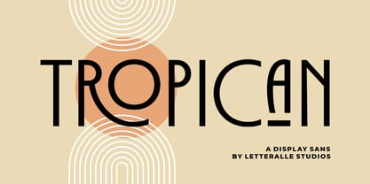 Tropican is an uppercase sans serif font with a vintage and minimal style. Tropican brings many ligatures that will make this font even more interesting and different. Tropican is a versatile font, perfect for display, editorial projects, Logo design, Wedding, Clothing Branding, product packaging, magazine headers, or simply as a stylish text overlay to any background image. I hope you enjoy! Letteralle Studios
 - Smouchy Font Duo by me55enjah,
$10.00 SMOUCHY FONT DUO Smouchy in two different style, hand letter sans and hand brush with rugged stroke bring more expressive look. Combine this two typeface make it more fun to use. Features: Smouchy: All Caps, numeral, punctuation & ligatures Smouchy Book: Uppercase, lowercase, punctuation, multi languages Add some extras to make your design more smouchy :) Thank you for your visit. Hope you enjoy :)
 - Moliere by Eurotypo,
$44.00 The life of Molière is a story of struggle, hard work, domestic unhappiness, death and burial in obscurity and almost in shame. Molière left behind a body of work that not only changed the face of French classical comedy, but has also come to influence the work of other dramatists from around the world. Despite his own preference for tragedy, which he had tried to further with the Illustre Théâtre, Molière became famous for his farces, which were generally in one act and performed after the tragedy. Both the comic and the serious drama were powerfully affected by the work of Molière, not only in his own age and country but everywhere and up to the present time. Didot is a name given to a group of typefaces named after the famous French printing and type producing family. The classification is known as modern, or Didone. The typeface we know today was based on a collection of related types developed in the period 1784–1811. Firmin Didot cut the letters, and cast them as type in Paris. Along with Giambattista Bodoni of Italy, Firmin Didot is credited with establishing the use of the "Modern" classification of typefaces. The types that Didot used are characterized by extreme contrast in thick strokes and thin strokes, by the use of hairline serifs and by the vertical stress of the letters. As in the extreme contrasts of the literature of Molière, in Didione's typefaces, thick and thin strokes, straight and curved, are the most relevant characteristic for an era marked by the changes.
 - Aviano Royale by insigne,
$34.99 Aviano returns to lend its classic line to its newest variation, Aviano Royale--named so because of the rich flow the calligraphic capitals give the established font. The extended lowercase characters give an air of formality to the face as well and bestow on the family a deeper sense of wealth and power. This recent development of a timeless font, part of insigne’s annual tradition of adding to the Aviano family, was elected the clear winner in a poll of insigne design’s social media followers. And is it any wonder why? The long-handed elegance of Royale features graceful script capitals as well as widely tracked and smaller titling capitals, all which make Royale ideal in high-end applications and branding where titling with a taste of gentility is required. Royale’s suite boasts a number of OpenType alternates, most importantly of which are the alternate forms for the capitals. Whereas the default forms of the face are regal, it’s flourishes must be activated through the swash set. For a look more restrained, activate the stylistic alternates. It’s like having three different fonts in one! Additionally, there are baseline lowercase forms. The lowercase forms are 20% smaller in height than Aviano’s lowercase forms, so the families are not interchangeable. However, they can still be used well together. The script capitals could also be used separately as drop capitals and nicely complement any of the other 12 Aviano families. It’s time to look beyond common. For the look of refinement you desire, design with Aviano Royale.
 - Sixties Pin Buttons JNL by Jeff Levine,
$29.00 During the turbulent era of the 1960s, the youth of America found various ways to protest against "The Establishment". Whether it was campus unrest, protest songs, sit-ins or other methods, the message was the counter-culture movement. Arising from this disenchantment with traditional social standards, a small but effective means of protest arose that made no sound, yet spoke volumes - the pin button. Statements against the war in Vietnam, free love, drug use and other messages popped up on little metal discs pinned to tee shirts, suspenders, head band and hats. Sixties Pin Buttons JNL recreates twenty-six of these messages in both white on black (upper case keys) and black on white (lower case keys). Blank buttons in both white and black are found on the parenthesis keys.
 - RMU Koralle by RMU,
$25.00 Koralle was an abundant family of grotesque font styles which had been released by Schelter & Giesecke in the first quarter of the previous century. Out of this family four of the most impressive styles were revived, whereby I stuck as close to the original as possible. All styles contain even the weird-looking capitalized German double-s of which I am a strong opponent.
 - Surakarta by Parquillian Design,
$39.00 Surakarta is a display face of western characters with numerous optional ligatures modeled after the graceful Javanese alphabet still taught in many schools on the island of Java in Indonesia, though it has been replaced by the latin alphabet for most everyday purposes. This is the second in Parquillian Design’s series of fonts inspired by some of the beautiful lesser-known native scripts of Southeast Asia.
 - Gothiks Round by Blackletra,
$50.00 Gothiks Round is the rounded version of Gothiks. It is a narrow 6-weight display sans-serif influenced by Texturas. The rhythm and verticality of Texturas can be easily identified on the letters with diagonal strokes like A N M K k V v W w X x Y y Z z: here they are all vertical. This kind of morphology was chosen because it accepts condensation in a very natural way, giving to this sans-serif a very unique personality. The intermediate weights can be used for short texts while extreme weights are excellent for big sizes. It has an extensive character set—with extensive language support—and many OpenType features like fractions, small capitals and different figure sets. Default figures align with lowercase. The typeface’s name refers to the plural of the word Gothic, which in turn can refer to both sans-serifs or Blackletter, depending on geographic location.
 - Bio Sans by Dharma Type,
$29.99 Bio Sans is a super neutral sans-serif family for text designed by Ryoichi Tsunekawa and the whole family consists of 6 weights from ExtraLight to ExtraBold and their matching Italics. The basic concept of this family is the same as Bebas Neue which is our most popular free font and used all over the world, that is to say, Neutral, Natural, Minimal, Harmless, Super-flat, Transparent and Legible. The basic skeleton of their letterform was designed geometrically and the sophisticated design gives them universality, neutrality and sense of unity for the use in all media, all purposes and their large x-heights makes this family legible and readable even on small size screen. Bio Sans supports almost all European languages: Western, Central, South Eastern Europeans and afrikaans. And proportional figures, superior figures, inferior figures, denominators, numerators, fractions, ordinals and case-sensitive-forms can be accessed by using OpenType features.
 - Back In Black by IKIIKOWRK,
$17.00 Proudly present Back In Black - Hand Brush Type, created by ikiiko. Back in Black is a hand-drawn brush font that attempts to reflect the urban vibe of suburban walls. The expressive stroke style of this typeface mimics the look of graffiti and other street art with bold strokes that produce striking, eye-catching graphics. Large-scale text elements work very well with this font. They can be used to produce a wide variety of designs, from playful and whimsical to edgy and rebellious. Additionally, a level of artistic expression unattainable with more conventional fonts is made possible by the strong strokes and asymmetrical shapes. This type is very suitable for making a poster, magazine layout, book cover, quotes, or simply as a stylish text overlay to any background image. What's Included? Uppercase & Lowercase Numbers & Punctuation Stylistic Ligature Multilingual Support Works on PC & Mac
 - Kitchen Stink by Bogstav,
$15.00 Just like a nice breakfast, Kitchen Stink is a great way to start the day! :) You may already have guessed that the fontname is the result of a wordplay. Sometimes it's funny how a single letter can completely change the meaning of a word. In this case! With this font, you are dealing with a gentle mixture of a basic handwritten font, a comic font and oldschool grafitti! The result is this steady, sometimes a bit off, but legible crunchy handwritten font!
 - Terlingua NF by Nick's Fonts,
$10.00Xylotype guru Rob Roy Kelly identified this specimen from his personal collection as "Phanitalian". This addition to the Whiz-Bang Woodtype series takes its name from a small Texas town in the middle of nowhere which has risen to international prominence—at least for folks interested in such things—as the site of the World Championship Chili Cook-off. Both versions of this font contain the Unicode 1252 (Latin) and Unicode 1250 (Central European) character sets, with localization for Romanian and Moldovan.

