10,000 search results
(0.046 seconds)
- Walnut Candy by Nathatype,
$29.00 Ready to enhance your branding? Looking for that “something” that’ll make your audience go WOW and clients get on board immediately? Ready to enhance your branding? Looking for that “something” that’ll make your audience go WOW and clients get on board immediately? If you need to create a big, bold logo for your business, work on a poster for an event, or whatever your project may be-then this is the perfect font for you. Walnut Candy-A Signature Font Walnut Candy is a handcrafted font designed to bring your branding to life and add a touch of elegance, modernity and style. Perfect for social media branding projects, fashion designs, printed quotes, packaging, or even as a stylish text overlay to any background image. Our font always includes Multilingual Support to make your branding reach a global audience. Features: - Ligatures - Stylistic Sets - PUA Encoded - Numerals and Punctuation Thank you for downloading premium fonts from Nathatype
 - Whitechapel BB by Blambot,
$20.00During the investigation of the infamous murders in Whitechapel, police received several letters allegedly from Jack the Ripper. Of the hundreds received, the so-called, “Dear Boss” letter actually included some details of a crime that had yet to be committed. Soon after, the information in this letter would be corroborated at a crime scene. This font was inspired by the handwriting in that letter. It includes dozens of European characters…and just might be the writing of Jack himself! - Greene Designs by Woodside Graphics,
$19.95This font consists of 26 design elements derived and adapated from various architectural works of Charles and Henry Greene who created hundreds of designs for houses, furniture and decorative arts in their own unique interpretation of the "Arts & Crafts" style in the early years of the 20th Century, mostly in Pasadena, California. Many of the picture elements are designed to form distinctive borders, and the variety of designs contained in this font encourages their use in many creative ways. - Waltograph UI - Unknown license

- Garmisch Rund NF by Nick's Fonts,
$10.00Emil Rudolf Weiss's eponymous Rundgotisch of 1937 provided the pattern for this streamlined version of classic German blackletters. All versions of this font include the Unicode 1250 Central European character set in addition to the standard Unicode 1252 Latin set. - Lunanic by Ingrimayne Type,
$9.00 Lunanic is a geometric novelty typeface family with a touch of graffiti. The letters are formed from a circle with a notch or nick taken out, a shape that reminds me of a partial lunar eclipse. Half of the family have the nick on the left and half on the right. The faces are monospaced and so tightly spaced that there is no space between most of the letters so the filled styles cannot be used alone without tweaking. There are several ways to tweak them to make them readable: adjacent letters can be colored differently, the characters spacing can be increased, or an outlined style can be layered on top of the filled letters. The family does not have a true lower case. Most of the characters in the lower-case slots are alternates for those on the upper-case keys and they can be mixed in whatever way the user finds best. The family has twelve members: two orientations with three weights each and each of these six has an outline style to go with it. Lunanic is fun, bizarre, weird, and obviously a decorative display font.
 - Hebrew Siddur by Samtype,
$59.00 This is a classic design from the beginning of the 20th century. This font can be used in many kinds of books. This font has the modern Hebrew punctuation: Shevana, Kamatz Katan, Dagesh Hazak, and Cholam Chaser.
 - MVB Embarcadero by MVB,
$79.00 MVB Embarcadero lies in a space between grotesque sans serifs and the vernacular signage lettering drawn by engineers. It’s a style that happens to convey credibility and forthrightness without pretense—it’s anti-style, actually. All of this makes for the most versatile of typefaces, capable of delivering any kind of message while staying out of the way. As is often the case with a type design that develops over several years, Embarcadero isn’t the realization of a specific concept. In the ’90s Mark van Bronkhorst began digitizing a blocky slab serif from the Victorian era, which was then set aside for many years. He later revisited the design, paring it down to its bare essentials, and as more time passed, it evolved from a grid-based outline to curves that echoed the rigid skeleton of the original. Eventually it became a complete family with all the readability requirements of a text sans serif, yet maintaining the subtle eccentricities of its inspiration. Functionally, the Embarcadero family is as adaptable as its design. The OpenType Pro set of 20 fonts contains two widths and five weights, each with italics, small caps, a full set of figures, bullets and arrows, and support for most Latin-based languages. In all, Embarcadero is suitable for headlines or text. And—thanks to its simple, square form—it’s ideal for type on screen too.
 - Yolanda Love Script by Letterara,
$12.00 Yolanda Love Script is a stylish script font that features a varying baseline, smooth line, modern and with a depth love. For those of you who are need a touch of love and modernity for your designs or branding, it can be used for various purposes such as headings, wedding, invitation, signature, logos, branding, t-shirt, letterhead, signage, lable, news, posters, badges etc. A wide range of swashes (a-z), alternates (A-Z), and ligature are included so that you can give your logo or name a custom, hand-calligraphy look.
 - Amster by PampaType,
$60.00 Amster is an energetic & refined type created by Francisco Gálvez, with a sharp idea on how elegance & legibility can meet harmoniously. Amster can build a text that is highly readable as well as friendly. It has five weights of roman & cursive both with smallcaps and fully-equipped with all OT sorts and even a wonderful set of illuminated initials. Amster is a very versatile typeface, allowing for a wide range of uses: screen to print, small text to display, science to poetry. Amster speaks more than 200 languages.
 - Ludwigon by IbraCreative,
$17.00 Ludwigon is a contemporary serif typeface that seamlessly melds timeless elegance with a modern sensibility. With its gracefully elongated serifs and refined letterforms, Ludwigon exudes sophistication and readability, making it a versatile choice for a wide range of applications. Its clean lines and balanced proportions lend an air of classic refinement, while subtle design nuances, such as tapered stroke endings and graceful curves, infuse it with a touch of contemporary flair. Ludwigon strikes a harmonious balance between tradition and innovation, making it a compelling choice for projects seeking a timeless yet fresh typographic aesthetic.
 - Anargya by IbraCreative,
$17.00 Anargya is a timeless beauty classic serif typeface that exudes elegance and sophistication. Its meticulously crafted letterforms showcase a harmonious balance between thick and thin strokes, creating a sense of timeless grace and legibility. With a refined, high-contrast design, Anargya brings a touch of traditional charm to contemporary designs, making it a versatile choice for branding, editorial, and luxury aesthetics. Its gracefully tapered serifs and graceful curves imbue it with an air of sophistication and refinement, making it a perfect choice for projects that demand a timeless, classic typographic style.
 - Beebzz Rounded by Popskraft,
$19.00 Everybody loves black colour, strict stylish and elegant shapes. We strive to be perfect. Right? But... Do not you think that we have lost something? Maybe child's spontaneity? The Beebzz Rounded font brings you back to those perfect times, when there was no need to be serious, when the whole world was not so serious. Beebzz Rounded is an original font family designed for headlines, titles and subtitles. It has his own unique style in expressive, perfectly condensed forms, inspired by child calligraphy and strong geometric typefaces. Beebzz Rounded is a font family that is ideal for display, text, print, branding, signage, and also for user interfaces, mobile devices, especially web design creation, with a set of optimal characters for your design in any layout.
 - Caligraf by Mans Greback,
$29.00 Caligraf is a classical calligraphy script. It was drawn and created by Måns Grebäck during 2019 and 2020. The character design blends traditional soft flowing handwriting with a modern, sharp look, and its angle and weight balance gives it a determined and progressive pace. Caligraf is a multistyle font family, composed of Thin, Light, Regular, Bold and Black. Its range ensures usability in any context, while also giving the ability to emphasize phrases or words. Use it in an invitation, a diploma, a logotype or in a decorative body text. Being a font with over 850 glyphs, it is guaranteed to contain all characters you'll ever need, including all punctuation and numbers. It has an extensive lingual support, covering European and Asian Latin scripts.
 - Beebzz by Popskraft,
$19.00 Everybody loves black colour, strict stylish and elegant shapes. We strive to be perfect. Right? But... Do not you think that we have lost something? Maybe child's spontaneity? The Beebzz font brings you back to those perfect times, when there was no need to be serious, when the whole world was not so serious. Beebzz is an original font family designed for headlines, titles and subtitles. It has his own unique style in expressive, perfectly condensed forms, inspired by freehand child calligraphy and strong geometric typefaces. Beebzz is a font family that is ideal for display, text, print, branding, signage, and also for user interfaces, mobile devices, especially web design creation, with a set of optimal characters for your design in any layout.
 - Mike Kunkel by Comicraft,
$29.00 Yes it's true, from time to time those awfully nice chaps at Comicraft have been known to create fonts for artists simply because We Love Their Work. Affable HEROBEAR AND THE KID kreator, Mike "He's just like your Favorite Uncle" Kunkel was lettering his beautiful children's comic strip with a font used by many, many other comic strip creators. John "JG" Roshell put a stop to all that and created a font based on Mike's own unique hand lettering style and now we make it available to you so that you can bring a little bit of Mike's Magick to your own warm and fuzzy work... because the Mike Kunkel font will help you remember your childhood... pass it on.
 - La Coffee by Creativetacos,
$12.00 Introducing La Coffee Font, a sleek, cool and professional handmade font that is perfect for adding a unique touch to your branding, logos, or your instagram quotes. It includes uppercase, lowercase, numbers, symbols and with Latin extended character support, it is versatile for a variety of creative endeavors, while exuding a rustic charm. La Coffee will look great on invitations, packaging, slideshows, logos, headlines, lettering, posters, branding, inspirational quotes, headlines, magazine layouts, website designs, advertising, invitations, packaging designs, book covers and any other creative endeavour. What's Inside the Product? - Weight of the Font: Regular The Font Kit comes packed with: - Big Letters (Uppercase) - Small Letters (Lowercase) - Numbers & Symbols - Multilingual Support Here's a sneak peek at the characters supported: - All the letters from A-Z (uppercase and lowercase) - All the numbers from 0-9 - All these special characters - !"#$%&'()*+,-./:;=?@[]^_`{|}~ ¡¢£¤¥§¨©ª«®°±²³´¶¸¹º»¿ˆˇ˜–—‘’‚‛“”„†‡•…‰‹›⁄€™− - And a range of international characters like á â à ä å ã æ ç é ê è ë í î ì ï ı ñ ó ô ò ö õ ø œ š ß ú û ù ü ý ÿ ž  À Ä Å Ã Æ Ç É Ê È Ë Í Î Ì Ï Ñ Ó Ô Ò Ö Õ Ø Œ Š Û Ù Ü Ý Ÿ
 - Zrnic by Typodermic,
$11.95 Looking for a typeface that perfectly captures the essence of industrial precision and futuristic design? Look no further than Zrnic. With its unique blend of boxy, plastic letterforms and strategically placed gaps, Zrnic delivers a stark, high-tech look that’s perfect for conveying your message with clarity and impact. Zrnic’s six weights and italics give you a range of options to choose from, allowing you to fine-tune the look and feel of your designs to perfectly match your needs. Whether you’re creating technical documentation, product manuals, or other materials that require a precise, professional look, Zrnic has got you covered. With Zrnic, you don’t have to worry about your message getting lost in the noise. Our unique design allows your text to stand out with crystal-clear precision, ensuring that your audience can quickly and easily understand your message. Zrnic’s gaps are strategically placed to reduce overall weight, giving you a clean, minimalistic look that’s perfect for modern designs. These gaps also provide increased impact, allowing your text to stand out and capture your audience’s attention. Zrnic is the ultimate tool for designers who want to convey the notion of technological precision with their designs. With its high-tech, industrial look and range of weights and italics, Zrnic is the perfect choice for technical documentation, product manuals, and other materials that demand a precise, professional look. Most Latin-based European writing systems are supported, including the following languages. Afaan Oromo, Afar, Afrikaans, Albanian, Alsatian, Aromanian, Aymara, Bashkir (Latin), Basque, Belarusian (Latin), Bemba, Bikol, Bosnian, Breton, Cape Verdean, Creole, Catalan, Cebuano, Chamorro, Chavacano, Chichewa, Crimean Tatar (Latin), Croatian, Czech, Danish, Dawan, Dholuo, Dutch, English, Estonian, Faroese, Fijian, Filipino, Finnish, French, Frisian, Friulian, Gagauz (Latin), Galician, Ganda, Genoese, German, Greenlandic, Guadeloupean Creole, Haitian Creole, Hawaiian, Hiligaynon, Hungarian, Icelandic, Ilocano, Indonesian, Irish, Italian, Jamaican, Kaqchikel, Karakalpak (Latin), Kashubian, Kikongo, Kinyarwanda, Kirundi, Kurdish (Latin), Latvian, Lithuanian, Lombard, Low Saxon, Luxembourgish, Maasai, Makhuwa, Malay, Maltese, Māori, Moldovan, Montenegrin, Ndebele, Neapolitan, Norwegian, Novial, Occitan, Ossetian (Latin), Papiamento, Piedmontese, Polish, Portuguese, Quechua, Rarotongan, Romanian, Romansh, Sami, Sango, Saramaccan, Sardinian, Scottish Gaelic, Serbian (Latin), Shona, Sicilian, Silesian, Slovak, Slovenian, Somali, Sorbian, Sotho, Spanish, Swahili, Swazi, Swedish, Tagalog, Tahitian, Tetum, Tongan, Tshiluba, Tsonga, Tswana, Tumbuka, Turkish, Turkmen (Latin), Tuvaluan, Uzbek (Latin), Venetian, Vepsian, Võro, Walloon, Waray-Waray, Wayuu, Welsh, Wolof, Xhosa, Yapese, Zapotec Zulu and Zuni.
 - Inglenook Corner NF by Nick's Fonts,
$10.00This whimsical wonder is based on the lettering of Laurence Schall, as presented in Lewis F. Day's 1910 classic, Alphabets Old and New. The typeface radiates a charm reminiscent of the works of many talented artists (including Howard Pyle and Arthur Rackham) who illustrated children's books around the turn of the twentieth century. The Opentype version of this font supports Unicode 1250 (Central European) languages, as well as Unicode 1252 (Latin) languages. - Rajjah Familia by Creativemedialab,
$20.00 Rajjah Familia - Blackletter font family Blackletter (sometimes black letter), also known as Gothic script, Gothic minuscule, or Textura, was a script used throughout Western Europe from approximately 1150 until the 17th century. Blackletter is currently widely used in modern creative design trends ranging from tattoo lettering, calligraphy, clothing brands, music, sports, labels and much more. Rajjah Familia looks gothic but easy to read, neat and beautiful. Comes with light, regular, medium and bold version. Rajjah is the right choice for your next projects!
 - Interstellar by Loshaj Foundry,
$10.00 Interstellar is inspired by science fiction movies and writings. My initial idea for the font was to be used for signage and user interfaces that would appear on spaceships and bases. However, Interstellar is very flexible and can be used in many creative ways. For example, it is perfectly suited for graphic design applications ranging from editorial, corporate, web, interaction, and product design. The font contains 400+ glyphs which includes uppercase letters, numbers, symbols, accented characters, and multiple language support. Check it out.
 - Old Miami Beach JNL by Jeff Levine,
$29.00 The grandeur of what was Miami Beach had its golden years peak in the 1940s. One of the grande dame hotels that stood at Collins Avenue and 23rd Street was the Roney Plaza; built in the 1920s and demolished around 1969. An online auction offered a pair of gummed labels provided by the hotel to be used by their guests for shipping souvenir packages back home, thus also giving the hotel a promotional plug. Jeff Levine not only created two typefaces from this hand-lettered label - Old Miami Beach JNL and Old Miami Beach Nights JNL (a solid black version), but painstakingly recreated the look of the label for the promotional flag and banner for the fonts.
 - Devil Candle by Mans Greback,
$49.00 Devil Candle evokes a symphony of sinister whispers, a reflection of the murky depths of hell. Its refined serif characters, in narrow to wide stances, echo the undulating flames of a devil's candle, flickering ominously in the abyss. Ideal for the bone-chilling narratives of horror movies, this typeface encompasses the raw essence of Halloween and satanic lore, effectively encapsulating the pulse of terror that courses through the veins of the enchanted and the damned.
 - Chipen by 38-lineart,
$14.00 I am pleased to present you an excellent futuristic font "Chipen" in unique graphic style! This font consists of regular, expanded, regular italic and expanded italic, these 4 fonts are encapsulated in one variable. With one font variable, this will cover 4 styles and cover all the weights between regular and expanded. If you are used to working with variable fonts it will give you more weight options, if you have never tried this variable font it will be an amazing new experience for you, take a look at this video snippet: https://youtu.be/jgqNPGeoVjc Chipen comes in bold and with a “RoundCube” cut, this is perfect for modern, Sci-Fi, and technology themes. Coupled with the stripe in the middle of the makes it appear more sporty. Not only that, this stripe can also display "Eighties" if you package it in a retro concept. Another strength of this font is the lowercase ligature, we present a lot of ligatures and one of them might be suitable for your logo brand. Finally, this font is a dynamic font with a variable concept capable of covering more 'weight', unique to appearing in various eras, exploring the world of retro and even science and fiction.
 - Mymoon by Tour De Force,
$25.00 Mymoon is geometric modern sans serif family that comes in 22 weights. Aimed for universal use, in any size and in any media. It has slight retro characteristics and mostly neutral overall impression. With wide range of thickness, from Thin to Heavy, all weights are well synchronized to match ideally. Contains extended Latin character set with OT features such as OldStyle and Tabelar numerals and fractions.
 - Senar by Larin Type Co,
$14.00 Senar is a great font family that includes 20 fonts ( Slab serif - 5 weights upright and 5 weights oblique, Sans serif - 5 weights upright and 5 weights oblique ). It is a modern, versatile and easy-to-read font that is perfect for a wide range of design solutions, such as logos, branding, label, packaging, web titles, text descriptions, as a primary or secondary, and much more.
 - ID Grotesk by ID Typeface,
$20.00 ID Grotesk is a contemporary typeface that combines modern design with a classic feel. Its unique inktraps add an intriguing touch, enhancing both aesthetics and legibility. Suitable for various projects, ID Grotesk is a versatile choice that brings a fresh twist to traditional typography. ID Grotesk boasts a comprehensive collection of 14 styles, including Thin, Light, Book, Regular, Medium, Semibold, Bold, and their corresponding italic variants.
 - Masifa by Hurufatfont,
$19.00 Masifa has compact, simple, functional and neutral body structure. It has 5 widths from Normal to Ultra Condensed. Each width includes 9 weights from Hairline to Black and their matching italics. Also, every weight includes rich OpenType Features like Small Caps and custom number styles. Due to its large family, it is ideal for a wide range of usage from large-scale designs to small product labels.
 - Hegarown by Rvandtype,
$12.00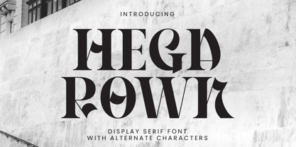 Introducing Hegarown Font, a captivating display font with a contemporary and cool aesthetic that makes it an ideal choice for a wide range of creative projects. Whether you're designing logos, establishing brand identities, crafting invitations, creating stunning stationery, shaping wedding designs, or producing eye-catching social media posts, Hegarown Font is your go-to solution. Features: Alternate Characters Numbers and punctuation Multilingual PUA encoded Thank You
 - Ayesha by Rotterlab Studio,
$15.00 Ayesha is beautiful and lovely script font with many alternative styles, ligatures, swash and multilingual glyphs. Ayesha can be used for wide ranges of application, such as wedding design, logo, poster, name card, invitations, social media posts, and others. Files include: Ayesha Script.OTF + PUA-Encoded + Can be used in any software, like Adobe Photoshop, Illustrator, even Microsoft Word, PowerPoint and others + Multilingual glyphs. Thank You
 - Mitchell Wesley by Fargun Studio,
$18.00 Mitchell Wesley is a beautiful Handwritten Font, A beautifully handcrafted font combined with brush style that’ll make your guests sing and elevate your projects! Every stroke, and curve was created to entice happiness and elegance. It suitable for wedding invitation, greeting cards, T-Shirt, Logo or any design that you create. Comes with a complete set of standard characters, Alternates, Ligatures, Punctuation & International glyphs
 - Uertas by Sign Studio,
$15.00 Uertas font brings a modern calligraphy feel. It's perfect for freestyle urban typography, modern logotypes, product branding, or just a quote that you want to stand out.
 - Horror Graffiti Cholo by Biroakakarati,
$10.99 This handwritten font is inspired by the cholo calligraphy of graffiti artists. It has a scary design, which is suitable for horor film posters and at the same time for signs and tattoo designs. It has an original style an effect font also available in a color version with drops of blood or paint to give a more lively touch. Try using it for your halloween party invitations or for your tattoo designs, for scary greeting cards. I used the word "Cholo" because this lettering in inspired by cholo-graffiti culture in Los Angeles in 70's years. The one of the best rappresent is Charles "Chaz" Bojorquez the father of cholo-lettering. Cholo because i think that in 70's in Los Angeles neighborhoods where graffiti-culture grow up there was a persons whit a mixed multicultural connexion and Chaz is one of them. Cholo-graffiti or Cholo-lettering is a specifing style o lettering. I think this is a good keyword for this lettering.
 - Kachelofen by Proportional Lime,
$9.99 Konrad Kachelhofen was a printer in the city of Leipzig beginning around 1483. He printed many works by contemporary authors and also many of the classics. He acquired an unusually large amount of typefaces for his shop, a place that included a wine bar and book store. This particular face is based on the Typ.8:170G GfT101 Gesamtkatalog der Wiegendrucke. He probably died in 1529 after passing his business on to his son-in-law Melchior Lotter.
 - Catalina by Kimmy Design,
$10.00 Earlier this year I visited a bakery in Newport Beach, CA and fell in love with the organic design and typography of the place. Hand-drawn menus, table cards, chalkboards, and wall quotes surrounded the charming spot. It inspired me to create a new font family based on the combination of hand drawn fonts. Included in this package are 5 font families, with 2 graphic ornament fonts. Each font family contains at least a light, medium and bold. Here is a breakdown of what's cookin' at Catalina's Bakery: Catalina Anacapa: Tall and skinny, this font comes in 3 weights for both sans and slab serif styles. It includes contextual alternatives (giving 3 versions of each letter), stylistic alternatives for select letters (A, K, P, Q, R, Y) and also includes Small Caps. Catalina Avalon: Based off Anacapa, this sub family has a high contrasting line weight. It comes in light, regular and bold as well as an inline alternative for both sans and slab serif styles. Avalon also includes opentype features such as contextual alternatives (giving 3 versions of each letter), stylistic alternatives for select letters (A, K, P, Q, R, Y) and small caps for each letter. Catalina Clemente: In a more standard width, Clemente is one of the two sub families that can be used for paragraph text as well as headlines. It's organically geometric in style and comes in ALL CAPS and lowercase, includes upright and custom italics, and has the opentype feature giving 3 versions of each letter. Catalina Script: A great compliment with the display sub-families, Catalina Script rounds out the package with a hand-drawn cursive flair. It includes contextual alternatives (giving 2 variations to each letter) as well as stylistic alternatives for many of the capital and lowercase letters. It has special ligatures for some letter combinations, and titling alternatives for all the capital letters. Catalina Typewriter: The second of the paragraph text sub-families, this typewriter inspired hand-drawn font family works great as either a display or paragraph text. It has contextual alternatives with 3 versions of each letter, and comes in both upright and custom italics versions. Catalina Extras! These two fonts go perfectly with the Catalina Family. They includes borders, frames, arrows, banners, flourishes and more. Catalina Flourish has all of it's options in a light and bold style, to use the light version type all lowercase letters, then to make something bold, used it's uppercase (or shift+) characters. For a breakdown of graphic/letter correlation, see the breakdown PDF. All of Catalina was drawn by the same hand, using the same ink and technique. While they contrast in their type styles, they work together perfectly to create one cohesive font family.
 - CP Company by FSD,
$23.37 C.P. Company is a group of types including 4 different forms and it is a complementary sign of communication for the C.P. Company clothes maker. C.P. Company communication makes use of media such as the press and the web and that’s the reason why we have always felt the need for a font that would not show incongruities through the monitor. Therefore we have decided to change the structure of glyphs like a, e, g, s… in the most contrasted versions to prevent the serifs from touching the internal parts of the letters and in this manner we have made a really unusual stylistic choice for a group of types. The difference between the height of caps and smalls is very low (about 20%) so that the smalls are easy to read even when their dimensions are on a very small scale. Moreover this stylistic solution gives the possibility to avoid using the small capitals in case of charts and catalogue codes (i.e. Tricot M5) and provides more vertical compactness between the lines. Even a sentence written in capital letters next to another one written in smalls does not look so much contrasted from a typographical point of view and then it is not unpleasant. The limits due to different constructive principles have been overcome by means of a grid based on the automatic division of EM square of 9-point type and in this manner the letters have a wider face. The font is even more unusual owing to the style chosen that belongs to the classical tradition of hair-lined types for glyphs like e and also thanks to ligatures like ? in the characters set. CP Company is a geometrical font whose alphabet makes use of the style of types that preceded the Helvetica, matched with more experimental and updated solutions. Numbering is monospaced. The bending of number 2, the slight raising of the oblique serif of number 4 and the presence of a hair-line in number 7 are the solutions adopted to make the types match in a more balanced manner.
 - PR Swirlies 02 by PR Fonts,
$10.20 This font is a collection of calligraphic ornaments suitable for invitations, gift tags,etc. These designs are assembled from hand drawn elements, and mirrored elements have been modified slightly, to increase the hand-drawn appearance. They would also be right at home framing the dialogue screens of a silent film.
 - BD Gitalona Variable by Balibilly Design,
$139.00 We introduce our Variable Font from the high-complex BD Gitalona font family. Consisting of 3 axes; weight, optical size, and serif, that will give you a different experience extending the family of BD Gitalona. We don't want to mention how many families can be generated from this variable font. During the development process, we got up to more than 50 families and stopped to allow you to continue to play with the slide buttons. And again, BD Gitalona is filled with an explorative and experimental decorative version that we present separately. Figure out the decorative version BD Gitalona Moxa to make the aesthetic appeal of this whole typeface here! Inspiration The world of entertainment moves non-stop. One by one, figures appeared and left. We expect to create something to entertain previous trends with packaging more relevant to the present. More specifically, we admire and are inspired by some of the world's leading and top singers with a segmented nature. We imagine so many figures that can affect every viewer. However, each artist or singer has a segment because almost all of them have characteristics. The Design The basic design of this typeface begins with a transitional serif shape with sharp, shapeless corners. Then in the middle of the invention, there was an opportunity to explore it further from the readability side by adding an optical variable that can adjust the serif thickness when used together between large, medium to paragraph text sizes for editorials. The shift from serif to sans-serif with the contrast initiated by the shift of the serif family form as a different variable also makes this font richer in terms of the features it contains. Parts are expected to add to the user satisfaction with the complexity of this font. The Features BD Gitalona consists of one sub-family intended for body text with nine weights from Thin(100) to Black(900) and four other display sub-families such as Display serif, Flick, Harmony Sans and Contrast Sans. Each consists of four weights Thin(100), Regular Weight(400), Bold(700), and Black(900). And again, there are also retailed separately; the BD Gitalona Variable font, which is designed to accommodate all Subfamily in 1 font file, and BD Gitalona Moxa, an experimental typeface. A total of 700+ glyphs in each style. Advanced OpenType features functionally and aesthetically, such as Case-sensitive forms, small caps, standard and discretionary ligatures, stylistic alternates, ordinals, fractions, numerator, denominator, superscript, subscript, circled number, slashed zero, old-style figure, tabular and lining figure. Supports multi-languages including Western Europe, Central Europe, Southeast Europe, South America, and Oceania.
 - Leather by Canada Type,
$24.95 Over the past few years, every designer has seen the surprising outbreak of blackletter types in marketing campaigns for major sports clothing manufacturers, a few phone companies, soft drink makers, and more recently on entertainment and music products. In such campaigns, blackletter type combined with photos of usual daily activity simply adds a level of strength and mystique to things we see and do on a regular basis. But we couldn't help noticing that the typography was very odd in such campaigns, where the type overpowers all the other design elements. This is because almost all blackletter fonts ever made express too much strength and time-stamp themselves in a definite manner, thereby eliminating themselves as possible type choices for a variety of common contemporary design approaches, such as minimal, geometric, modular, etc. So extending the idea of using blackletter in modern design was a bit of a wild goose chase for us. But we finally found the face that completes the equation no other blackletter could fit into: Leather is a digitization and major expansion of Imre Reiner's forgotten but excellent 1933 Gotika design, which was very much ahead of its time. In its own time this design saw very little use because it caused problems to printers, where the thin serifs and inner bars were too fragile and broke off too easily when used in metal. But now, more than seventy years later, it seems like it was made for current technologies, and it is nothing short of being the perfect candidate for using blackletter in grid-based settings. Leather has three features usually not found in other blackletter fonts: - Grid-based geometric strokes and curves: In the early 1930s, blackletter design had already begun interacting back with the modern sans serif it birthed at the turn of the century. This design is one of the very few manifestations of such interaction. - Fragile, Boboni-like serifs, sprout from mostly expected places in the minuscules, but are sprinkled very aesthetically on some of the majuscules. The overall result is magnificently modern. - The usual complexity of blackletter uppercase's inner bars is rendered simple, geometric and very visually appealing. The contrast between the inner bars and thick outer strokes creates a surprising circuitry-like effect on some of the letters (D, O, Q), wonderfully plays with the idea of fragile balances on some others (M, N and P), and boldly introduces new concepts on others (B, F, K, L, R). Our research seems to suggest that the original numerals used with this design in the 1930s were adopted from a previous Imre Reiner typeface. They didn't really fit with the idea of this font, so we created brand new numerals for Leather. We also expanded the character set to cover all Western Latin-based languages, and scattered plenty of alternates and ligatures throughout the map. The name, Leather, was derived from a humorous attempt at naming a font. Initially we wanted to call it Black Leather (blackletter...blackleather), but the closer we came to finishing it, the more respect we developed for its attempt to introduce a plausible convergence between two entirely different type categories. Sadly for the art, this idea of convergence didn't go much further back then, due to technological limitations and the eventual war a few years later. We're hoping this revival would encourage people to look at blackletter under a new light in these modern times of multiple design influences.
 - Entitled JNL by Jeff Levine,
$29.00Way back before digital imaging, video tape and computer editing, the home movie enthusiast had to shoot on film his own titles using any one of a variety of movie titling kits on the market. One common approach was to arrange white ceramic letters on a colored background and film them. A set of such letters provided the inspiration for Entitled JNL from Jeff Levine. The classic, sleek Art Deco lines of this font makes it an all-purpose design for any headline needs.
