10,000 search results
(0.051 seconds)
- Moskau Pattern by Letter Edit,
$49.00 The design of the typeface Moskau Grotesk and Moskau Pattern is based on the signage created for the Café Moskau in Berlin by the graphic artist Klaus Wittkugel in the beginning of the 1960s. The Café Moskau, across from the Kino International on Karl-Marx-Allee in Berlin Mitte was one of the prestige edifices of the former DDR (German Democratic Republic). Built in the early 1960s, it advanced over the years and changing social developments to a trademark building of the capital. The lettering display on the roof was created by the graphic artist Klaus Wittkugel (October 17, 1910 – September 19, 1985). He had been Professor at the School for Applied Arts in Berlin, and, in addition to the creation of many posters, book covers and postage stamps, he was responsible for the signage of the Kino International as well as for the complete graphic treatment for the Palace of the Republik. The signage for the Café Moskau with the words »RESTAURANT«, »CAFÉ«, »KONZERT« and »MOCKBA« set in capital letters, becomes the basis for the Moskau Grotesk which was developed by Björn Gogalla in 2013. This face should not be seen as an imitation. A few shortcomings were »fixed«. In favor of maintaining the core characteristics some unique features were, however, not relinquished. Lower case letters and the missing capital letters were designed from scratch. It is not surprising that the plain, unassuming geometrical direction of the basic character style forms a bridge to the architecture of the 1960s. Inspired by the then favored, diverse possibilities inherent in the architectural example and wall reliefs, two complimentary pattern fonts emerged.
 - Moskau Grotesk by Letter Edit,
$39.00 The design of the typeface Moskau Grotesk is based on the signage created for the Café Moskau in Berlin by the graphic artist Klaus Wittkugel in the beginning of the 1960s. The Café Moskau, across from the Kino International on Karl-Marx-Allee in Berlin Mitte was one of the prestige edifices of the former DDR (German Democratic Republic). Built in the early 1960s, it advanced over the years and changing social developments to a trademark building of the capital. The lettering display on the roof was created by the graphic artist Klaus Wittkugel (October 17, 1910 – September 19, 1985). He had been Professor at the School for Applied Arts in Berlin, and, in addition to the creation of many posters, book covers and postage stamps, he was responsible for the signage of the Kino International as well as for the complete graphic treatment for the Palace of the Republik. The signage for the Café Moskau with the words »RESTAURANT«, »CAFÉ«, »KONZERT« and »MOCKBA« set in capital letters, becomes the basis for the Moskau Grotesk which was developed by Björn Gogalla in 2013. This face should not be seen as an imitation. A few shortcomings were »fixed«. In favor of maintaining the core characteristics some unique features were, however, not relinquished. Lower case letters and the missing capital letters were designed from scratch. It is not surprising that the plain, unassuming geometrical direction of the basic character style forms a bridge to the architecture of the 1960s. Inspired by the then favored, diverse possibilities inherent in the architectural example and wall reliefs, two complementary pattern fonts emerged.
 - Tisdall Script by Fine Fonts,
$29.00 Tisdall Script is based upon the brush-drawn script lettering of Hans Tisdall, who was the designer of many distinctive lettered book jackets for Jonathan Cape in the 1950s. Michael Harvey, also a designer of lettered book jackets, long admired Tisdall’s style and so, with the blessing of his widow, designed this typographic tribute. The augmented Tisdall Script Plus version, has many alternative characters and ligatures, together with Opentype features, to enable their automatic substitution where the application in which they are used permits.
 - Souttia by Sakha Design,
$10.00 Souttia is a slim and exquisite handwritten font. Stylish, graceful, and flowing, this font will definitely elevate the look of any of your beautiful creations while keeping them grounded and natural.
 - Librada Pro by Typehead Studio,
$12.00 Librada Pro is a Sans-serif style font.librada pro font has 9 variants of style weight, ranging from Thin, Regular, Bolt, Outline Style and Texture Style. Each variation has 2 types of styles Regular and italic. Librada Pro Font is suitable for any design needs, invitation design, branding, Cover Book design, advertising design, Art Quote, Home decor, Book Title, special events, birthday, custom mug, pillow, t-shirts, any handwriting signature style needs and more. Librada Pro Font supports the following languages : Albanian, Basque, Breton, Chamorro, Dutch, English, Finnish, Frisian, Galician, German, Italian, Malagasy, Portuguese, Spanish, Swedish. Thank you for your watching! Hope you Like it and you're having fun with Librada Pro ! Happy creating! Thanks. Typehead Studio
 - Rare Bird Specimen II by Rare Bird Font Foundry,
$100.00 RARE BIRD SPECIMEN II Specimen II is an elegant hand by Karla Lim of Written Word Calligraphy. It floats across the page on gossamer wings. Specimen II pairs well with classic typefaces like Baskerville, Garamond and Bodoni. OBSERVATIONS Specimen II is exquisitely delicate but not fragile. Best suited for unforgettable affairs. DEFINING CHARACTERISTICS Opentype programming, formal title & preposition wordart, 7 alternate ëandí options, Roman numerals, in and out-stroked letterforms at beginning and end of words, multiple alternate lowercase t cross-strokes, realistic double-letter ligatures, seamlessly connecting calligraphic letters, alternate capital letters, old style numerals, basic Latin encoding. POTENTIAL SIGHTINGS Wedding stationery suites, logo design, luxury product packaging, fragrance, wine labels.
 - Balestya Script by sizimon,
$15.00 Balestya Script is a modern calligraphy font. Balestya a beautiful for logotype, website header, fashion design,wedding card design and any more. Balestya comes with elegant style, It also comes as a Balestya Normal, Balestya Medium, and Balestya Bold. It contains a full set of lower & uppercase letters, a large range of punctuation, numerals, and multilingual support. Whats Include : Balestya Normal, Medium, Bold PUA Encoded Multilingual support : (Danish,Finnish,English,,Spanish,Dutch,German,Icelandic,Italian,Norwegian,Portuguese,Indonesian, Swedish) To access the alternate glyphs, you need a program that supports OpenType features such as Adobe Illustrator CS, Adobe Photoshop CC, Adobe Indesign and Corel Draw. If you have any question please do not hesitate to contact me. Thank You!
 - Stargation by Letterhend,
$19.00 Stargation is a display script that has unique anatomy with thin and condensed glyhps which brings out a casual and playful feel. Works well to be applied to logos and the other various formal forms such as invitations, labels, magazines, books, greeting / wedding cards, packaging, fashion, make up, stationery, novels, labels or any type of advertising purpose. Features : uppercase & lowercase numbers and punctuation multi-lingual support ligatures alternates swashes PUA encoded We highly recommend using a program that supports OpenType features and Glyphs panels like many of Adobe apps and Corel Draw, so you can see and access all Glyph variations. Email us to letterhend@gmail.com if you need something! Happy Designing!
 - Sunchery by sizimon,
$20.00 Sunchery Script is a modern calligraphy font. It is elegance, modernity, and friendly. Sunchery a beautiful for wedding card design, logotype, website header, fashion design, and any more. It contains a full set of lower & uppercase letters, a large range of punctuation, numerals, and multilingual support. Sunchery Include : Uppercase, lowercase, numeral, punctuation & Symbol Multilingual support Stylistic alternates Standard ligatures 28 Decorative Shapes PSD + EPS + PNG 17 Floral Illustrations PSD + EPS + PNG PUA Encoded Characters Fully accessible without additional design software. To access the alternate glyphs, you need a program that supports OpenType features such as Adobe Illustrator CS, Adobe Photoshop CC, Adobe Indesign and Corel Draw. If you have any question please do not hesitate to contact me.Thank You!
 - Hildor San by MIX.Jpg,
$12.00 Hildor San is a san serif font with full set of uppercase and lowercase letters, multilingual symbols, numerals, punctuation and ligatures. Hildor San elegant san serif font 9 family, classic and elegant style for poster design, magazines, beauty branding with a flower-shaped asterisk glyph suitable for your beautiful and elegant design concept. Features Standard glyphs uppercase and lowercase letters Numerals, a large range of punctuation and ligatures. Lowercase letters include ending swashes. Works on PC & Mac. Simple installations, accessible in the Adobe Illustrator, Adobe Photoshop, Adobe InDesign, even work on Microsoft Word. PUA Encoded Characters – Fully accessible without additional design software. Fonts include multilingual support for; ä ö ü Ä Ö Ü ß ¿ ¡
 - Vintage Bridge by Nathatype,
$29.00 Get ready to transcend to a world of magic, laughter, and butterflies. Your projects will spark delight and engage everyone who sees it! Wait no more, we will give you the best choice. Vintage Bridge-A Monoline Script Font Vintage Bridge is a handcrafted font, made to bring out a slice of retro vibes. Every hand-drawn stroke and curve will delight and add brightness and fun to wherever it’s placed. Ideal to create amazing headings, logos, menus, and social media graphics. Vintage Bridges includes Multilingual Support to make your branding reach a global audience. Features: Alternates Ligatures Stylistic Set Bonus Ornament PUA Encoded Numerals and Punctuation Thank you for downloading premium fonts from Nathatype
 - Blackoak by Adobe,
$29.00Joy Redick designed Blackoak, a big and heavy Egyptienne-sytle titling slab serif face, in 1990. The extremely robust style of the characters in this typeface was consciously distorted; creating letterforms that appear flattened and stretched, like a rubber band. Blackoak is drawn in the style of old wood tpes, just like those that one envisions when one thinks of the large, decorative posters that once filled Wild West America. The wood type collection of the Smithsonian Institute in Washington, DC acted as a primary source of inspiration for this design. True to its rooks, Blackoak is meant for use exclusively in headlines in very large point sizes, or for logos and other corporate advertising purposes. - ITC Ziggy by ITC,
$29.99ITC Ziggy was designed by Bob Alonso, who says it started out as phone doodles in the early 1970s." Alonso rediscovered the sketches years later, thought they revived the feel of the 70s, and decided to digitize the typeface. He liked the form of the letter Z best, so named the font Ziggy. ITC Ziggy reminds its designer of "elephant bellbottoms" and its style as a display face instantly evokes a nostalgia for the 1970s. - Komu by DizajnDesign,
$39.00 Komu is the revival of a style of letters frequently used on billboards during the socialist period in the former Czechoslovakia. These were usually uppercase letters made of paper and covered with a layer of aluminum foil. People just had to pick the letters (that included a variety of widths and sizes) out from a box and pin them up on a styrofoam billboard, thus making it easy to announce any event. Komu consists of two styles. Version A is rather squarish and includes some weird characters (K, 5, narrow E, strange diacritics) while version B is more rounded with most letters equally wide (with the exception of E, F and L, which look really wide next to the rest). The optical disparity of the original letters was kept, so that some of them look slightly darker than the others. Komu is intended to be used on posters, books and other products about Socialism in our region and includes full support for languages based on latin script.
 - Giambattista by Wiescher Design,
$39.50 Giambattista is a long-time project of mine finally come to an end. After redesigning all of Giambattista Bodoni's work and then some additional cuts I started a long time ago with this Non-Bodoni Bodoni. The idea came to me while redesigning the original Chancellerosa (chancery). I thought Bodoni just didn't have the right approach to a chancery, this was just not his cup of tea! Maybe that is why he never used the Chancellerosa very much for his own printshop in Parma. So I thought someone has to design a script, that looks like Bodoni could have designed it but is more lively than his. Over the years I have been working on and off on the face and it turned out to become three typefaces which can be freely mixed. Here is my modern version of a script in the style of Giambattista, meant as an hommage, I called it Giambattista. Your modern scribe Gert Wiescher
 - Interzone by MYSTERIAN,
$9.00 This type crept up the sense that it was made in Eastern Europe by poorly trained urbanites from a crippled nation, or that it is the remains of a contemporary gothic (like Eckmann) stencil. The choice of what this type signifies is up to the public. Lately I like the idea of 'putting on' (in McLuhan's sense) a genre of idea that is somewhat different from my tradition's beliefs, and fitting a core category of that toward a teleological/eschatological advantage. Therefore postmodernist/apocalyptic carelessness (which I may 'put on' by using this type) is how I abstain from the cravings of immortality, or more so that wanting it is pointless. It’s stands as memento morí; that I will have to die someday. I have to become less, He must become more. Of course, Interzone may signify a classic Joy Division track from Unknown Pleasures as well as the Cold Warish ongoings of conflicted eastern European life. I considered naming this Lunik 9.
 - Flefixx by Sun Young Oh,
$54.00 Flefixx is a typeface designed to support a project "Flefixx", an idiosyncratic visual language and typeface system that unfolds narratives based on common combinations of letters. In this visual language, just as individual letters come together like puzzle pieces to form different meanings or words based on combinations, the typeface is also constructed from fragmentary elements, each playing a distinct role as if they are individual pieces. The intentional exposure of the intersections of these fragments emphasizes the typeface's creation through interconnected elements. Furthermore, diacritics and dots are strategically positioned as ornaments, enhancing their presence within the gaps between letters. This concept aligns with the theme of composition and connectivity among fragments, allowing strong rhythmic patterns to emerge as letters and symbols blend in a paragraph. Additionally, the prominent and bold punctuation marks serve to provide pauses and clarity within sentences that incorporate both letters and the visual language. They contribute to articulating sentence structure amidst the dynamic flow of sentences with combined characters and visuals.
 - StudioSans by BrightHead Studio,
$20.00 StudioSans — is a modern representative of the class of sans-serif fonts inspired by the traditional Swiss design and typography of the mid 20th century. This is a minimal, clean and open font family with friendly forms. Focuses on functionality, has a high x-height and short ascender and descender elements. This is combined with soft circles and high legibility of characters contributing to comfortable reading. The family contains six weights from ExtraLight to ExtraBold. Each of them has in its arsenal more than 450 glyphs and knows more than 50 languages. Support for OpenType Features focused on the Oldstyle Figures (including signs of currencies and interest), Case-Sensitive Forms, Standarts and Discretionary Ligatures, Slashed Zero and Etc.
 - Boot Camp JNL by Jeff Levine,
$29.00 Boot Camp JNL has the same roots as Jeff Levine's Condensed Stencil JNL, as they were both modeled from a set of vintage brass interlocking stencils made by the Stafford Manufacturing Company. The previous font was drawn from limited examples of the stencils seen in an online photograph, so a number of the basic characters had to be improvised. Since then, a nearly complete set was obtained and the alphabet and numerals are truer to the original design. Additionally, both Regular and Oblique versions of Boot Camp JNL are available.
 - Kyhota by Ingrimayne Type,
$14.95 The six typefaces of the Kyhota group all have an “Old West” look to them. KyhotaOne has very thick slab serifs compared to KyhotaTwo. KyhotaBarbed is more condensed than either and has little barbs on the verticals, something that was a feature of a number of nineteenth century typefaces in this style. KyhotaFezdaz is condensed, without barbs, and with the slab serifs replaced with a flare serif. KyhotaBigBottom and KyhotaBigTop play with the weighting of the serifs, with one (either top or bottom) very thin and the other very thick.
 - ANWUTOK by Twinletter,
$17.00 Say hello to summer freshness with the Anwutok font! With a cheerful Display theme, this font is the perfect solution for creating projects with a relaxed and bright feel. Anwutok comes with impressive features. With ligatures and alternates, you can easily combine interesting characters and create unique and creative typography designs. Apart from that, Anwutok also supports multilingualism, allowing you to adapt this font to different languages. This gives you flexibility and extends the reach of your project to a wider market. With a fresh and playful style, Anwutok brings a fun and uplifting touch to your designs. Each letter is designed with care to convey evocative beauty. Choose Anwutok as your constant companion in creating enthralling and relaxing projects. Get this font now and let summer inspiration decorate your creations. What’s Included : File font All glyphs Iso Latin 1 Alternate, Ligature Simple installations We highly recommend using a program that supports OpenType features and Glyphs panels like many Adobe apps and Corel Draw so that you can see and access all Glyph variations. PUA Encoded Characters – Fully accessible without additional design software. Fonts include Multilingual support
 - Garamond Rough Pro by Elsner+Flake,
$59.00 With its animated contours, and set in an appropriate size, the Garamond Rough typeface attempts to simulate printed hot metal typesetting. Its roughened edges make it appear softer and less crisp, and, thus, takes the harshness out of the type image. The size of the offered type complement as well as the number of its affiliated symbols makes it ideal for differentiated text setting. Furthermore, its display types make surprising visual accents possible. The origins of the design of Garamond Rough go back to the middle of the 16th century. They are ascribed to Claude Garamond who was one of the first typographers who designed typefaces specifically for the setting of books. During the course of the past centuries and decades, many different variations and new design interpretations of the Garamond typeface were developed to accommodate the most diverse typesetting and printing practices in many different countries. As such, today’s designers can take advantage of a comprehensive digital repertoire for text and display applications. Translation Inga Wennik
 - Grafema LC by Letter Collective,
$30.00 Grafema LC was designed by Jacklina Jekova & Todor Georgiev and published by Letter Collective. Grafema LC contains 16 styles and family package options. This Font Family Features: • 578 glyphs in 7 variants – upright, italic, textured, filled, rough, traditional contrast and inverted; • Handwritten with a calligraphic flat brush in 2 brush angles – 35° and 85°; • Extended Latin and Extended Cyrillic; • Coverage of multiple OpenType features – ligatures, stylistic alternates, and contextual alternates; • Suitable for web, print, motion graphics, etc; • Perfect for headlines, posters, packaging and greeting cards, etc. Grafema LC is a system of display typefaces consisting of 7 variants – upright, italic, textured, filled, rough, traditional contrast and inverted. Grafema LC started off as handwritten calligraphic works using a flat brush and variable angles of writing – 35° and 85°. It supports Extended Latin and Extended Cyrillic – more than 120 languages all together. The balanced natural texture of Grafema LC with unique details makes it perfect for headlines, but also suitable for long text. It is perfect for graphic design projects, like packaging, posters, events, blogs, social media and greeting cards. Grafema LC comes with a range of OpenType features – including old-style numerals, typographic features such as ligatures, stylistic and contextual alternates. The typeface is suitable for web, print and motion graphics.
 - Geoparody by Typodermic,
$11.95 Introducing Geoparody, the typeface that channels the free-spirited energy of the 1960s with its bold, groovy style. This typeface is inspired by the iconic Anonymous font, which rose to fame as the font of choice for the hit TV quiz show, Jeopardy. Geoparody takes the original Anonymous typeface to new heights with a range of six weights and italics. Plus, you can unleash your creative side with OpenType stylistic alternates, featuring an alternate “X” and “Y” that add an extra touch of playfulness to your designs. Whether you’re designing a retro poster, a funky album cover, or a psychedelic website, Geoparody will help you stand out with its distinctive style. So, let your creativity run wild with Geoparody, the typeface that captures the rebellious, futuristic spirit of the late 1960s. Most Latin-based European writing systems are supported, including the following languages. Afaan Oromo, Afar, Afrikaans, Albanian, Alsatian, Aromanian, Aymara, Bashkir (Latin), Basque, Belarusian (Latin), Bemba, Bikol, Bosnian, Breton, Cape Verdean, Creole, Catalan, Cebuano, Chamorro, Chavacano, Chichewa, Crimean Tatar (Latin), Croatian, Czech, Danish, Dawan, Dholuo, Dutch, English, Estonian, Faroese, Fijian, Filipino, Finnish, French, Frisian, Friulian, Gagauz (Latin), Galician, Ganda, Genoese, German, Greenlandic, Guadeloupean Creole, Haitian Creole, Hawaiian, Hiligaynon, Hungarian, Icelandic, Ilocano, Indonesian, Irish, Italian, Jamaican, Kaqchikel, Karakalpak (Latin), Kashubian, Kikongo, Kinyarwanda, Kirundi, Kurdish (Latin), Latvian, Lithuanian, Lombard, Low Saxon, Luxembourgish, Maasai, Makhuwa, Malay, Maltese, Māori, Moldovan, Montenegrin, Ndebele, Neapolitan, Norwegian, Novial, Occitan, Ossetian (Latin), Papiamento, Piedmontese, Polish, Portuguese, Quechua, Rarotongan, Romanian, Romansh, Sami, Sango, Saramaccan, Sardinian, Scottish Gaelic, Serbian (Latin), Shona, Sicilian, Silesian, Slovak, Slovenian, Somali, Sorbian, Sotho, Spanish, Swahili, Swazi, Swedish, Tagalog, Tahitian, Tetum, Tongan, Tshiluba, Tsonga, Tswana, Tumbuka, Turkish, Turkmen (Latin), Tuvaluan, Uzbek (Latin), Venetian, Vepsian, Võro, Walloon, Waray-Waray, Wayuu, Welsh, Wolof, Xhosa, Yapese, Zapotec Zulu and Zuni.
 - Selectric Century by Indian Summer Studio,
$45.00 Also known as Schoolbook. 900+ glyphs. After Linn Boyd Benton's and Morris Fuller Benton's 1894 lower contrast version of Scotch Modern, Didone. The part of the large project on revival and further development (by drawing many additional glyphs) of the 20th century’s typewriters’ fonts. And especially the most famous, versatile and beautiful typewriter: IBM Selectric’s golfball fonts, lost for the civilization for many decades after ‘80s, not being created since then in digital vector form. This new sub-project started in July 2018 for the restoration of the most beautiful classical typefaces, used during the 20th century on the extremely rare now IBM Selectric Composer typewriters / desktop publishing systems. Together with Nick Hamze and the Right Reverend Theodore Munk, the collectors of old typewriters. IBM showed the perfect taste by developing these best historical book typefaces of the human civilization for typewriters. So people could type then using both the real book faces, and the famous classical ones.
 - Atocha by Sudtipos,
$49.00 It was expected that Joluvian’s third type font would be inspired by the city where he currently resides: Madrid, Spain. His previous creations had originated in Venezuela (Zulia) and The Philippines (Salamat), both, places where he had once lived. Joluvian believes “now is the time to pay tribute and show gratitude towards a city that has bestowed me with so many fortunes.” He considers that Madrid’s people, streets, scents, flavor and sounds are gift enough to awaken the creative urgency in any artist. This time around, it is being expressed through the crafts of the Typographic industry. Since his arrival in Spain, Joluvian has been attached to the city’s central area, specifically to the renowned Atocha Street and its railroad station. It was precisely on that street that Joluvian and Mauco Sosa, his friend and partner, decided to establish the Patera Studio: a charming creative space that birthed the concept for this new font which they proudly named Atocha Script. The artists where still in the final phases of their previous script, Salamat, when the idea for Atocha came about. This dynamic is actually very typical of the artistic process, in which every finished product spawns the need to create its next level offspring. “Working on Atocha and Atocha Caps has been a very pleasant journey. We have given our best efforts, for we wanted to offer a typeface that was both versatile and user-friendly on a number of applications, showing a wide scope of alternatives in our glyphs,” says the artist. The illustrations were created by Mauco, to ensure visual integration that would showcase the work of both members of the Patera Studio and their complementing aesthetic voices. Atocha, as Salamat and Zulia before, was digitized by Alejandro Paul.
 - Big Sale by HIRO.std,
$14.00 Oneself is Handwritten Font This font describes about girly, feminist, elegant, dynamic, humanist, easy to use and will bring a good harmony when the letters are connected and paired each other. FEATURES - Uppercase and Lowercase letters - Support Ligatures - Numbering and Punctuations - Multilingual Support - Works on PC or Mac USE Oneself works great in any branding, logos, magazines, invitation, wedding designs, social media posts, advertisements, product packaging, product designs, label, photography, watermark, invitation, stationery, quotes and any projects that need handwriting taste. Enjoy using! Thanks. HIRO.std
 - Norsen by Craft Supply Co,
$20.00 Introduction Meet Norsen – Classic Serif, where the vintage aura intertwines seamlessly with modern sophistication. Initially, its presence elevates designs with a unique classical elegance. Embodying Versatility Notably, Norsen is versatile, suiting various design necessities effortlessly. Also, it easily molds itself, fitting perfectly into different creative realms, ensuring each design shines uniquely. Classical Elegance Immersed in a classical charm, every letter in this font tells a story. Additionally, its serif details bring stories and messages to life with grace and depth, enhancing readability and visual appeal.
 - Golden Meaning by HIRO.std,
$17.00 Golden Meaning is a handwritten font. This font describes about stylist, fun and elegant, catchy, dynamic, simple, humanist, clean, easy to use and will bring a good harmony when the letters are connected and paired each other. FEATURES - Support Opentype Features - Support Ligatures - Lowercase beginning and ending alternate - Alternate Swash - Numbering and Punctuations - PUA Encoded Characters - Multilingual Support - Works on PC or Mac USE Golden Meaning works great in any wedding invitations, branding, logotype, apparel, and any projects that need simple script taste. Enjoy using! Thanks. HIRO.std
 - Rollerblack by HIRO.std,
$17.00 Rollerblack is a handwriting font. This font describes about semi casual, elegant, catchy, dynamic, humanist, easy to use and will bring a good harmony when the letters are connected and paired each other. FEATURES - Support Opentype Features - Support Ligatures - Alternate ending swash - Numbering and Punctuations - PUA Encoded Characters - Multilingual Support - Works on PC or Mac USE Rollerblack works great in any branding, logos, magazines, apparel, wedding designs, social media posts, advertisements, product packaging, product designs, label, photography, watermark, invitation, stationery and any projects that need handwriting taste.
 - Oneself by HIRO.std,
$17.00 Oneself is Handwritten Font This font describes about girly, feminist, elegant, dynamic, humanist, easy to use and will bring a good harmony when the letters are connected and paired each other. FEATURES - Uppercase and Lowercase letters - Support Ligatures - Numbering and Punctuations - Multilingual Support - Works on PC or Mac USE Oneself works great in any branding, logos, magazines, invitation, wedding designs, social media posts, advertisements, product packaging, product designs, label, photography, watermark, invitation, stationery, quotes and any projects that need handwriting taste. Enjoy using! Thanks. HIRO.std
 - Human Diary by HIRO.std,
$19.00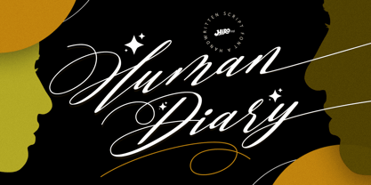 Human Diary is a handwritten script font. This font describes about casual, luxury, elegant, stylish, dynamic, easy to use and will bring a good harmony when the letters are connected and paired each other. FEATURES - Uppercase and Lowercase letters - Support Opentype Features - 34 Ligatures - Alternate Lowercase - Swash - Numbering and Punctuations - PUA Encoded Characters - Multilingual Support - Works on PC or Mac USE Human Diary works great in any wedding invitations, branding, logotype, magazine, photography, and any projects that need elegant script taste. Enjoy using! Thanks. HIRO.std
 - Sunday Vibes by HIRO.std,
$21.00 Sunday Vibes is clean, bold, funky script. This font describes about stylist, fun and elegant, catchy, dynamic, humanist, readable, easy to use and will bring a good harmony when the letters are connected and paired each other. FEATURES - Support Opentype Features - Support Ligatures - Stylistic Alternates - Numbering and Punctuations - PUA Encoded Characters - Multilingual Support - Works on PC or Mac USE Sunday Vibes works great in any logotype, magazines, apparel, social media posts, advertisements, product packaging, product designs, label, and any projects that need funky script.
 - Eve Adam by HIRO.std,
$16.00 Eve Adam is a lovely script font. This font describes about elegant, classy, dynamic, stylish, catchy, feminist, easy to use and will bring a good harmony when the letters are connected and paired each other. FEATURES - Support Opentype Features - Support Ligatures - Uppercase beginning swash - Lowercase beginning and ending swash - Numbering and Punctuations - PUA Encoded Characters - Connecting heart - Multilingual Support - Works on PC or Mac USE Delissa Beauty works great in any wedding invitations, branding, logotype, quotes and any projects that need lovely script taste.
 - FF QType by FontFont,
$62.99 German type designer Achaz Reuss created this display and sans FontFont in 2004. The family has 26 weights, ranging from Extra Light to Black in Compressed, Condensed, Normal, Semi Extended, and Extended and is ideally suited for advertising and packaging, logo, branding and creative industries, poster and billboards as well as sports. FF QType provides advanced typographical support with features such as ligatures, alternate characters, case-sensitive forms, fractions, super- and subscript characters, and stylistic alternates. It comes with tabular lining and proportional lining figures.
 - Tilson by Marc Lohner,
$28.00 Meet Tilson, a versatile workhorse family for both texts and headlines based on a geometric and straight-lined design. It will give your apps, websites, logos, posters and so much more a techy and masculine look and feel. However, some friendly rounded details, such as the i-dot, add a rather pleasant personality to this family. With more than 200 languages covered, many opentype features on board, obliques, and weights ranging from Thin to Black, Tilson is a truly versatile companion for your next design project.
 - Tendencies by HIRO.std,
$22.00 Tendencies – Graffiti Font This font describes culture, hip-hop, gravity, style, spray, road, travel, is easy to use and will bring good harmony when the letters are connected with alternate styles and paired with each other Tendencies has more than 489 Glyphs FEATURES - Ligatures - Stylistic Alternates - Uppercase - Lowercase - Numbering and Punctuations - Multilingual Support - Works on PC or Mac - Simple Installation USE Tendencies works great in any branding, board, logos, apparel, produk pagaking, magazines, label, films, stationary, poster, etc. and any projects that need street art taste.
 - Gundrada ML by HiH,
$12.00 Gundrada ML was inspired by the lettering on the tomb of Gundrada de Warenne. She was buried at Southover Church at Lewes, Sussex, in the south of England in 1085. The Latin inscription on her tomb, STIRPS GUNDRADA DUCUM, meaning “Gundrada, descendant of the Duke” may have led to the speculation that she was the daughter of William, Duke of Normandy and bastard son of Robert the Devil of Normandy and Arletta, daughter of a tanner in Falaise. In 1066 William defeated Harold at the Battle of Hastings and was crowned William I of England. More commonly known as William the Conquerer, he commissioned a string of forts around the kingdom and charged trusted Norman Barons to control the contentious Anglo-Saxon population. William de Warenne, husband of Gundrada, was one of these Barons. There has also been the suggestion that Gundrada may have been the daughter of William’s wife, Matilda of Flanders, by a previous marriage. According to the Dictionary of National Biography (Oxford University Press, Oxford, England 1921-22), both of these contentions are in dispute. Searching the past of a thousand years ago is like wandering in a heavy fog: facts are only dimly in view. Regardless, I know that I found these letterforms immediately engaging in their simplicity. Unadorned and unsophisticated, they have a direct honesty that rests well in the company of humanistic sans serifs like Franklin Gothic or Gill Sans, appealing to a contemporary sensibility. The lettering on the tomb is in upper case only. Although Gundrada does not sound Norman French to me, her husband certainly and her father probably were Norman French. Nonetheless, the man that carved her tombstone was probably Anglo-Saxon, like most of the people. For that reason, we are quite comfortable with a fairly generic lower case from an Anglo-Saxon document of the time. The time was a time of transition, of contending language influences. This font reflects some of that tension. Features 1. Multi-Lingual Font with 389 glyphs and 698 Kerning Pairs. 2. OpenType GSUB layout features: onum, dlig, liga, salt & hist. 3. Tabular Figures and Alternate Old-Style Figures. 4. Alternate Ruled Caps (line above and below, matching to brackets). 5. Central Europe, Western Europe, Turkish and Baltic Code Pages. 6. Additional accents for Cornish and Old Gaelic. 7. Stylistic alternates A, E, y and #. 8. Ligatures ST, Th, fi and fl. 9. Historic alternate longs. The zip package includes two versions of the font at no extra charge. There is an OTF version which is in Open PS (Post Script Type 1) format and a TTF version which is in Open TT (True Type)format. Use whichever works best for your applications.
 - DeDisplay by Ingo,
$24.99 A type designed in a grid, like on display panels Type is not only printed. There were always and still are a number of forms of type versions which function completely differently. Even very early in the history of script there were attempts to combine a few single elements into the diverse forms of individual characters and also efforts to construct the forms of letters within a geometric grid system. The “instructions” of Albrecht Dürer are probably most well-known. But although designers of past centuries assumed the ideal to basically be an artist’s handwritten script, the idea which developed in the course of mechanization was to “build” characters in a building block system only by stringing together one basic element — the so-called grid type was discovered, represented most commonly today by »pixel types.« But even before computers, there were display systems which presented types with the help of a mechanical grid display, like the display panels in public transportation (bus, train) or at airports and train stations. In a streetcar, I met up with a modern variation of this display which reveals the name of each tram stop as it is approached. This system was based on a customary coarse square grid, but the individual squares were also divided again diagonally in four triangles. In this way it is possible to display slants and to simulate round forms more accurately as with only squares. The displayed characters still aren’t comparable to a decent typeface — on the contrary, the lower case letters are surprisingly ugly — but they form a much more legible type than that of ordinary [quadrate] grid types. DeDisplay from ingoFonts is this kind of type, constructed from tiny triangles which are in turn grouped in small squares. The stem widths are formed by two squares; the height of upper case characters is 10, the x-height 7 squares. DeDisplay is available in three versions: DeDisplay 1 is the complex original with spaces between the triangles, DeDisplay 2 forgoes dividing the triangles and thus appears somewhat darker or “bold,” and DeDisplay 3 is to some extent the “black” and doesn’t even include spaces between the individual squares.
 - Amigie by Craft Supply Co,
$20.00 Introduction to Amigie – Display Serif Amigie – Display Serif is a unique display font that stands out with its distinctive serif design. Its bold and innovative shape makes it perfect for eye-catching displays and powerful branding. This font captures attention, offering a fresh take on traditional serif styles. Design and Innovation Each character in Amigie – Display Serif boasts a unique serif shape, blending classic elegance with modern creativity. The font features sharp, clean lines, and its unique serifs add a touch of sophistication. Furthermore, its balanced proportion ensures that each letter is clear and impactful, perfect for making a statement. Versatility and Functionality Amigie – Display Serif is not just visually striking but also highly versatile. It’s ideal for a wide range of applications, from editorial designs to bold advertising. Additionally, it works exceptionally well for headlines, logos, and packaging, where its unique character can shine. This font is also highly legible, making it suitable for both digital and print media.