10,000 search results
(0.018 seconds)
- Simpliciter Sans by Cercurius,
$19.95 Simpliciter Sans is a typeface based on the lettering used in the 20th century on technical drawings, either written by free hand or using templates. The lettering was made with a round pen, therefore all lines got rounded ends. All lines had the same thickness in uppercase, lowercase and small caps. The upright style was used on construction drawings and the italic style on machine drawings. The backslant style was used on maps for names of water bodies — seas, lakes, rivers etc. — and for water depth. Simpliciter Sans is primarily intended for texts on drawings, diagrams, charts and maps, but it can also be used for signs and labels. It also works surprisingly well as a body type in smaller sizes.
 - Isle Headline by Mans Greback,
$19.00 Isle Headline is a high-quality serif typeface family, drawn by Måns Grebäck during 2018 and 2019. It is a sharp font with a clear and attentive look, adapted for headlines, titles and large type settings. It comes in four weights, each one as italic, totaling in eight styles: Light and Light Italic, Medium and Medium Italic, Bold and Bold Italic, Black and Black Italic. The font family can be used in a combination with a font of a different style, or together with its sister font Isle Body, also a serif font, which has the same basic structure but with a softer look and adapted for body text and smaller type. Each style contains ligatures and support for a wide range of languages.
 - Fleur by Lián Types,
$39.00 La vie est une fleur dont l'amour est le miel Fleur is the French for flower and I've chosen this language for a good reason. Over the past 5 years, I've had the opportunity to travel a lot to Paris and I've always tried to catch every moment and detail of this delightful city through the eyes of the designer inside me. Paris is full of surprises, mainly for us, artists. In fact, I believe the city is a museum itself. Every corner of any street has something inspiring. But, there’s something I particularly love and I want to address here: The Palais Garnier. Built between 1861 and 1875, this opera house is a dream made true for many of us, who love somptuosité. Garnier, the architect of this magnificent building, said that the style he proposed was not Grecian nor Roman/baroque, he created something new and called it Napoleonic: Luxurious at its best. Fleur is inspired in this palace which, in fact, has some similar letters inside. Garnier put his name at the ceiling of the Rotonde des Abonnés: Letters are interlacing each other with nicely done art nouveau curves. I thought I could take this idea and achieve something very delicate and imposing at the same time if the font consisted entirely of caps with the logic of a didone and a bit of art-nouveau. This mix of elegance and flamboyance gave birth to Fleur which has a wide range of uses but was mainly intended for perfumes, fashion magazines, storefronts, book covers or logos. Not only you'll find many decorative glyphs, but also a vast amount of unique ligatures will make you really adore this font. Get Fleur and profite de la vie TECHNICAL As suggested above, the font has many open-type coded alternates and a vast amount of unique ligatures. Install the font in applications that support them, like Adobe Illustrator or Photoshop.
 - Stinger by Zetafonts,
$39.00 Since their first appearance as Italians on the pages of the 1821 William Caslon type specimens, reverse contrast typefaces have been typography's best loved quirky outcasts. Subverting the traditional relationship between thick verticals and thin horizontals made them perfect for eye-catching advertisements. The unexpected contrasts and the thick slabs produced by reverse-contrast serifs became ubiquitous in period posters, and synonymous with wild west and circus iconography. In designing Stinger, the Zetafonts design team composed by Maria Chiara Fantini, Andrea Tartarelli and Francesco Canovaro and orchestrated by Cosimo Lorenzo Pancini decided to marry this subversive tradition with the workhorse approach of modernist sans serif typefaces like Univers, developing a super-family with four widths, each in five different weights, from thin to heavy. This gives the designer a full range of options for type setting, with the Normal and Fit widths providing two different text-sized alternatives, the wide width adding display and titling options and the Slim ready to deal with the space-saving necessities of extremely long texts. True italics have been added developed for all weights and variants, bringing the Stinger family to a total of 40 fonts, with a latin extended + Russian Cyrillic character set covering over 200 languages, and open type features including positional numbers, stylistic sets and alternate forms. In the crowded panorama of contemporary grotesque typefaces, all aiming to stark geometric perfection, Stinger stands out with its bold choices and strong personality. From the calligraphy-inspired terminals in the thin weights to the logo-ready sculptural approach in the heavy weights, each variant manages to look striking without forgetting the readability and flexibility lessons of modern reverse-contrast classics like those designed by Excoffon or Novarese. A variable version is included with the full family, allowing maximum flexibility and control for the designer over the wide range of expression capabilities of the Stinger super family.
 - Protest by Society of Fonts,
$29.00 Protest is inspired by protest posters and the power of the people! Each glyph is written by hand with a Sharpie® Magnum marker on big sheets of paper. It is designed to fit more into the poster and still be legible for the media from a block away. It's bold, slightly condensed, and neatly drawn with love and conviction, with the warm imperfection that comes from being hand drawn. Protest consists of over 1,430 glyphs. This includes 300 alphanumeric glyphs with 3 contextual alternates each, 20 stylistic alternate glyphs, and 20 protest themed dingbats. Contextual alternates will rotate through automatically when OpenType features are enabled, giving it more human irregularity. Protest supports 219 latin-based languages, using Underware’s Latin Plus glyph set.
 - Dutch Mediaeval Book by Canada Type,
$29.95This is the elaborately expanded version of what is arguably the most classic and popular of all historic Dutch faces: Sjoerd Hendrik de Roos's Hollandse Mediaeval from 1912. Over the decades, many pressmen and typography connoisseurs have gushed loving prose about this typeface. An extended family of two weights, corresponding italics, small caps, four condensed fonts, four book fonts, a set of initials and some very Dutch ornaments, Dutch Mediaeval is a versatile workhorse that flows comfortably and artistically, with the elegance of the main weights nicely complemented by the sturdiness of the bolds. Very few text faces are this clean and inviting while being crafty as well. The Dutch Mediaeval family comes with quite a few OpenType features and extended Latin language support. - Dutch Mediaeval by Canada Type,
$29.95This is the elaborately expanded version of what is arguably the most classic and popular of all historic Dutch faces: Sjoerd Hendrik de Roos's Hollandse Mediaeval from 1912. Over the decades, many pressmen and typography connoisseurs have gushed loving prose about this typeface. An extended family of two weights, corresponding italics, small caps, four condensed fonts, four book fonts, a set of initials and some very Dutch ornaments, Dutch Mediaeval is a versatile workhorse that flows comfortably and artistically, with the elegance of the main weights nicely complemented by the sturdiness of the bolds. Very few text faces are this clean and inviting while being crafty as well. The Dutch Mediaeval family comes with quite a few OpenType features and extended Latin language support. - Random But Perfect by Aldedesign,
$18.00 Random But Perfect is Nice Bold Script Font - A stylish and quirky new bold script. Random But Perfect font was created to look as close to a readable bold script as possible by including over a lot ligatures, titling, and swash. This font is for those who want to show something strong and modern. You may use this font if you want to attract modern buyers. The font design seems to show that you have a passion in the business and give your love to the products and services you are offered to customers. Because it is an eye-catching bold script font, you can use it for a variety of purposes including design, branding, signature, logo, poster, and many more.
 - Magnolica by Essentials Studio,
$16.00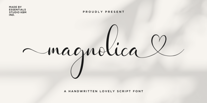 Introducing by Essentials Studio Proudly Present, Magnolina Magnolina Is a Lovely Script Font With Swash and Ligature More Than 50 Stylish love Alternate Magnolina is perfect for product packaging, branding project, megazine, social media, wedding, or just used to express words above the background.
 - Goldie Rainbow by Balpirick,
$15.00 Goldie Rainbow is a flowing and lovely handwritten font, created with the help of a beautiful brush pen. Fall in love with its incredibly versatile style and use it to create gorgeous wedding invitations, beautiful stationary art, eye-catching social media posts, and much more!
 - AMOUR by Cultivated Mind,
$29.00 Amour is a romantic handwritten retro inspired font by Cultivated Mind. This type face includes 4 fonts (basic/thin/ornaments/frames) and four weights. Amour works lovely for stationery, valentine’s day, magazines, weddings, invitations, websites and anytime you would like to express your love.
 - Harmond by Dirtyline Studio,
$25.00 Harmond a new fresh & modern serif with a strong style, a dancing baseline! So beautiful on invitation like greeting cards, branding materials, business cards, quotes, posters, and more! Harmond Display Typeface is the part of a strong and modern display family. This typeface both impressive at display sizes and easily readable in text size, while the sharp shapes of the triangular serifs and the distinctive letter shapes show their strength in logo design and impressive editorial use. Harmond come with elegant style, strength and contrasts, with features an extended latin character set of 470 glyphs covering over 88 languages. Casta is ready to be like a top model on the design catwalk, making your projects looking classic but contemporary, finely tuned but assertive, and elegant as the best luxury fashion.
 - Dismedia by Lee Mounsey,
$13.95 Dismedia: A Bold Display Typeface with a Subtle Retro Sci-Fi Aesthetic. While a lot of futuristic, cyberpunk and techno themed typefaces can often be over-the-top, unreadable or cheesy, Dismedia takes a more subtle approach with its design. Inspired by the wide futurist fonts of the 1970’s and 80’s, its rounded corners and bold linework was built to invoke the atmosphere of a future envisioned by the past. Whether on VHS covers in 1984; nightclub signs in 2084; or spaceship insignia in 2184, Dismedia will upgrade your design into a brand new era. [ Feature Set Includes: ] A Display Typeface A Bold Sans Serif with Rounded Corners 430+ Glyphs Ligatures & Stylistic Alternatives Extended Mathematics & Currency Symbols Language Support for 90+ Latin Languages Including: Afrikaans, English, French, Italian, Spanish & Swedish.
 - P22 Underground by P22 Type Foundry,
$24.95 Underground Pro expands on the historical design by Edward Johnston, licensed exclusively to P22 from the London Transport Museum. The overall design of Underground Pro is kept as intended by Johnston and remains within his system of proportions. Additional OpenType features, such as Small Caps and Petite Caps, are included in all 6 weights. A Titling option that mimics London Transport signage is offered in the medium weight. The addition of many Unicode ranges for unprecedented language support makes this the most expansive P22 font family ever. Each Pro font weight collectively contains over 5000 glyphs, covering most Latin based languages, with separate Greek (polytonic) and Cyrillic versions. The outlines of the original Regular and Bold have been subtly redrawn and expanded, they are now available as Medium and Heavy respectively.
 - Demogen Sans Condensed Font by Azzam Ridhamalik,
$19.00 Sans Condensed Font Demogen, A bold and strong condensed font that’s here to make a statement. Drawing inspiration from the sleek modern designs of the 2000s, Demogen brings back that iconic vibe with a fresh twist. This font is your go-to choice for creating stunning posters, captivating website headlines, and sleek interface designs. Demogen typeface has a strong presence and is perfect for display sizes, making it an excellent candidate for impressive logo design with its contemporary sans serif design. It has OpenType features and an Extended Latin character set boasting over 370+ glyphs covering more than 88 languages. Sans Condensed Font Demogen will ensure your design communicates effortlessly to a global audience. Features: Uppercase, Lowercase, Numbers, Punctuation Ligatures Opentype Feature PUA Encoded Characters Extended Latin Multilanguage
 - Jano Round by Craceltype,
$37.00 Jano Round™ is a sans serif type family with a friendly and synergetic profile. Designed with rounded forms, low contrast and a somewhat techie feel, Jano Round™ is a highly legible typeface suited for any text application and typographic reproduction. Jano Round™ has 18 styles and its a workhorse type system. It covers 290+ languages, including extended latin, cyrillic and greek writing systems. With over 1800 glyphs per style, its Opentype features include alternative shapes, small caps, standard and discretionary ligatures, localized forms in latin and cyrillic, case sensitive forms, numerators and denominators, proportional and tabular figures, slashed zero, fractions and more. The engaging personality and the huge set of features and glyphs makes Jano Round™ an excellent choice for branding, editorial, web and broadcast.
 - Sixties Pin Buttons JNL by Jeff Levine,
$29.00 During the turbulent era of the 1960s, the youth of America found various ways to protest against "The Establishment". Whether it was campus unrest, protest songs, sit-ins or other methods, the message was the counter-culture movement. Arising from this disenchantment with traditional social standards, a small but effective means of protest arose that made no sound, yet spoke volumes - the pin button. Statements against the war in Vietnam, free love, drug use and other messages popped up on little metal discs pinned to tee shirts, suspenders, head band and hats. Sixties Pin Buttons JNL recreates twenty-six of these messages in both white on black (upper case keys) and black on white (lower case keys). Blank buttons in both white and black are found on the parenthesis keys.
 - Wagon by Dirtyline Studio,
$25.00 Wagon a new fresh & modern serif with a strong style, a dancing baseline! So beautiful on invitations like greeting cards, branding materials, business cards, quotes, posters, and more! Wagon Display Typeface is part of a strong and modern display family. This typeface is both impressive at display sizes and easily readable in text size, while the sharp shapes of the triangular serifs and the distinctive letter shapes show their strength in logo design and impressive editorial use. Wagon comes with elegant style, strength and contrasts, with features an extended latin character set of 415 glyphs covering over 87 languages. Wagon is ready to be like a top model on the design catwalk, making your projects look classic but contemporary, finely tuned but assertive, and elegant as the best luxury fashion.
 - Cockcrow by Eurotypo,
$32.00 Cockcrow is a new geometric sans with modern proportions and a simple yet appealing personality resulting in a modernist, neutral and friendly typeface. Take advantage of Cockcrow’s extended OpenType features including such as swashes, stylistic sets, stylistic and contextual alternates in capitals & small letters, and ligatures that allow you to mix and match pairs of letters. This will help your creativity and make it easier to make expressive and elegant your typographic work. In addition, it contains a Central European language support to fit your design. With Cockcrow you can also write all in capitals. Cockcrow looks lovely on wedding invitations, greeting cards, logos, posters, labels, logos, business-cards, fashion, magazines, food packaging and menus, book covers and whatever your imagination holds! Cockcrow was made to make your project more beautiful and attractive.
 - Cosmic Hippie by Hipfonts,
$9.00 Transport yourself back to the vibrant era of the 1970s with Comisc Hippie, a groovy font that embodies the essence of that extraordinary decade. This typeface is a nostalgic journey through time, with its swirling curves and playful letterforms. Inspired by the counterculture movement, Comisc Hippie exudes a sense of peace, love, and individuality. Its bold and psychedelic style captures the free-spiritedness of the era, making it an ideal choice for adding a touch of retro charm to your designs. Whether you're working on posters, album covers, or any project that calls for a dose of nostalgia, Comisc Hippie will transport you to a groovy world of colorful expression and timeless coolness. Let the spirit of the 70s shine through with this font that embodies the era's iconic aesthetics.
 - Miguity by Nathatype,
$29.00 Miguity is a display serif font in thick volumes designed to leave professional, formal, lovely impressions. This font’s character is the hook on the final corners of each letter. Plus, some of the letters show swinging wipes on their edges. It surely eases the eyes to explore the text to add its readability. Features: Ligatures Stylistic Sets Multilingual Supports PUA Encoded Numerals and Punctuations You can use Miguity on various designs, for example the posters, banners, logos, magazine covers, quotes, name cards, headings, printed products, merchandises: social media, and so on. Find out how to use this font by watching the font preview. Hopefully you have great experience using this font. Feel free to contact us if you require more information when you are experiencing a problem. Thank you. Happy designing.
 - Autentico realistic handwriting by Redy Studio,
$19.00 Beautiful and sexy handwriting types. You will love the look of this font. Autentico font was inspired by modern calligraphy, but with a more crushed look, making it perfect for wedding invites, greeting cards, or logos. Use the upper case letters to add elegance to images or give your design some style. We included a full set of lower and upper case letters, numbers, punctuation marks, and 93 ligatures to take your design to the next level. Authentico features: A full set of upper & lowercase characters Numbers & punctuation 93 Gorgeous ligatures Alternates in lowercase Multilingual symbols PUA Encoded Characters – Fully accessible without additional design software. Feel free to give me a message if you have a problem or question. Thank you so much for taking the time to look at one of our products.
 - Silentgraph by Din Studio,
$29.00 Silentgraph is a script font made from handwriting in lovely designs to make your designs prominent. Every stroke expresses beauty and cursive styles of which letters are interconnected. Details of each letter show curvy wipes and high contrasts on its edges. Use this font for big-sized texts to be legible. Features: Stylistic Sets Multilingual Supports PUA Encoded Numerals and Punctuations Silentgraph fits for various design projects, such as posters, banners, logos, magazine covers, quotes, headings, printed products, invitations, name cards, merchandise, social media, etc. Find out more ways to use this font by taking a look at the font preview. Thanks for purchasing our fonts. Hopefully, you have a great experience using our font. Feel free to contact us for further information when you have a problem using the font. Thank you. Happy designing.
 - Senlot by insigne,
$34.99 Steal the spotlight with Senlot. A high contrast sans serif, Senlot’s figure is perfect for enrapturing your audience. The font shows off a unique calligraphic stress, which--with the contrast--makes the face quite usable in luxury and high quality design work. The gorgeous appearance of Senlot is accompanied by a complete set of small capitals and a true italic. Dress your text in any of nine separate styles from Thin to Bold. Senlot also holds a full set of OpenType features, including titling capitals, superscripts and subscripts, and oldstyle figures and has an extended Latin cover with span for over 72 languages. A special thanks to Lucas Azevedo and ikern for production assistance on Senlot. Let Senlot’s beauty and simplicity carry the stage on your new text or webpage.
 - Aestetico by Latinotype,
$29.00 This beautiful font explores 3 very individual styles of one typeface. Each style pays homage to classic sans serif typefaces while adding contemporary flair to its characteristics. With both formal and informal styles, Aestetico explores how the shapes and curves of letters change their perception and focus. The informal letters are rounder and more quirky while the formal style utilizes more traditional sans serif letterforms. The whole set (54 styles) consists of 3 sister families, each in 9 weights with matching italics. The 3 variants ensure every design project is covered by Aestetico; its versatile nature is perfect for a huge variety of applications from editorial design to branding, advertising, publications and digital. As you would expect from Latinotype, this font comes with a standard character set (395 glyphs) and supports over 200 languages.
 - WildSong by Scholtz Fonts,
$19.00 WildSong was inspired by the exuberant flight and beautiful song of birds. While most brush scripts take their cue from mid-twentieth century samples, WildSong is a fresh, contemporary alternative. WildSong reflects a dynamic interplay between dark and light, creating a sense of drama while hinting at a calligraphic background. Words suggest a baseline, yet are not bound by it. Letters interweave in a seemingly random dance, sometimes connecting smoothly, then breaking that connection as a calligraphic scribe does intuitively. Exuberant swash alternatives to uppercase letters, as well as ligatures can be accessed through both the type and glyph palettes. The font contains over 235 characters - (upper and lower case characters, punctuation, numerals, symbols and accented characters are present). It has all the accented characters used in the major European languages.
 - Driver Gothic by Canada Type,
$29.95 Driver Gothic is based on the typeface used for Ontario license plates. Although unique among Canadian provincial license plates, this face is very similar to, if not outright identical with, the face used on car plates in 22 American states: Arizona, Connecticut, Florida, Illinois, Iowa, Kentucky, Louisiana, Maine, Michigan, Mississippi, Missouri, Montana, Nebraska, Nevada, New Hampshire, New Mexico, Ohio, Oklahoma, Vermont, Washington, and West Virginia. Driver Gothic is available in all popular font formats, and is comprised of a very extended character set (over 750 characters) covering a wide range of languages, including Central and Eastern European languages, Greek, Cyrillic, Esperanto, Turkish, Baltic and Celtic/Welsh. Driver Gothic Pro, the OpenType version, contains class-based kerning and push-button stylistic alternates for use with apps that support advanced typography. Buckle up!
 - CA Zentrum by Cape Arcona Type Foundry,
$40.00 CA Zentrum is a compelling mix of conciseness and pragmatism. Bold, distinct and original, contemporary and versatile. At a closer look, it reveals rounder reading-friendly forms. The choice of weights aims at an easy, straight forward use. A set of five well-balanced weights and three widths ranging from light to black and from condensed to wide. This variety ought to be enough to cover most needs without throwing the typographer into questions. The family’s glyph set supports over 100 Latin languages. With its blend of timelessness and modernity, the type-family is uniquely suited for modern corporate visual languages, websites, corporate design, editorial design and advertising. Careful spacing and a great choice of OpenType features make it especially well suited for text copy and/or editorial design.
 - Moments by DearType,
$35.00 Moments is a charming font family inspired by all those moments in life that make us smile. As usual, it is a combo of an informal script, two handmade sans variations and some extras to spice up your designs. The script has 1300+ lovely glyphs with lots of stylistic variations, ligatures and swashes, which you can mix and match for a more interesting effect. The dancing baseline makes it very casual and full of personality, thus a great addition to every design project. Moments is versatile and can be used on cards, posters, merchandise, book covers, websites, packaging, and basically anywhere you like. The overall feel of the font is warm, elegant and informal and it is perfect if you want to convey a sense of friendliness and style.
 - Essonnes by James Todd,
$40.00 Made up of sixteen individual weights and spread over three different optical sizes, Essonnes is designed to bring utility back to the Didot genre. It’s a common belief among designers that Didones don’t work for text. This wasn’t true in 1819 and it isn’t true today. Like its forbearers, Essonnes is a truly optical family—not just a study in adjusting contrast. The text and display weights have been designed from the ground up for their intended roles. This means that everything from the height of the uppercase & lowercase letters have been specifically tuned for their intended purpose. Like many typefaces, Essonnes started after falling in love with a piece of history. In this case, it was the eccentric forms of Pierre Didot’s Type and the evolution of the High contrast Didone throughout the 19th century. It was out of curiosity and love for these forms that led to the first draft of what would become Essonnes back in 2011. These unique situations—screens, modern printing methods, the previous 200 years of typographic innovation since the original design, my own life experiences—have led to a typeface that, while based on history, is not stuck in it.
 - Ranger by Ingrimayne Type,
$12.95 Ranger is a geometric font with no curves. The lower-case letters have an extremely high x-height.
 - Stricken Brush by Nurf Designs,
$10.00 Stricken Brush is a very cool brushed font. Suitable for posters, movie titles, book covers, quotes and more.
 - Poultry Sign by Ingrimayne Type,
$5.95 While searching through microfilm of an old, 1932 newspaper, I stumbled on the word "Poultry" written with trapezoidal letters. I did not recall seeing lettering like this and it inspired me to design a typeface that could produce a similar result. Poultry Sign has two widths each with three weights giving the family six styles. It is monoline, monospaced, and all caps. The letters on the lower-case keys reverse the trapezoid of those on the upper-case keys. The designer's expectation is that the most common use for this typeface will alternate upper-case and lower-case keys, and to make this effect easy, included in the font is a contextual alternatives (calt) OpenType feature that automatically produces this result if your word processor supports this feature. To get text with all letters with big bottoms or all letters with with big tops, this feature must be turned off. The spacing of the letters is identical within each width so the styles can be layered to produce bi-colored or tri-colored letters. There is a second set of numbers that can be accessed with an OpenType stylistic alternative. Also accessible with OpenType stylistic alternatives are variations of letters T, N, L, Y, and V.
 - Charmelade by Bogstav,
$17.00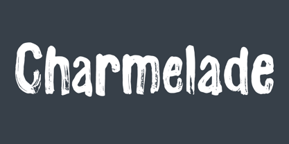 Another handmade brush font with that lovely green and organic feeling! :)
 - LHF Grants Antique by Letterhead Fonts,
$33.00 Nice for an authentic old fashioned flavor without being over-bearing.
 - Rodinia by Sylvestre Studios,
$20.00 Rodinia displays my love of the carnival and the Slavic culture.
 - Queenica by Artisticandunique,
$55.00 Queenica - Sans serif font family - Multilingual supports, 12 Style If you're looking for a stylized sans serif font, Queenica might be the font you're looking for with its unique structure. Queenica is a distinctive modern sans serif font. It offers rich solutions to your creative projects with its alternative versions. You can easily use the sans serif font feature in many areas. You can create your text with normal characters and highlight bold characters and titles. This font offers a wide variety of styles to help you discover the best mood for your projects, from body text to large headlines, from classic to modern and bold styles. Well suited for books and magazines, magazine covers, editorials, headlines, websites, logos, invitations, branding, advertising and more. CHARACTER RANGES : Basic Latin, Latin-1 Supplement, Latin Extended-A, Latin Extended-B, General Punctuation, Currency Symbols, CJK Symbols And Punctuation, Private Use Area (plane 0), Alphabetic Presentation Forms -Uppercase typeface -Lowercase typeface -Numbers -Symbols With this font you can create your unique designs. If you have a question, please contact me. Have a good time.
 - Alevander by Rotterlab Studio,
$15.00 Introducing Alevander Script Alevander Script is a classic calligraphy font. This is a classic thin font with an italic style. Here will get a beautiful classic font. This font has several modern swirls that can make work look elegant, sweet and perfect. With a style like this, this font would be perfect for logos, branding projects, homeware designs, product packaging, mugs, quotes, posters, shopping bags, logos, t-shirts, book covers, business cards, invitation cards, greeting cards, and more. all other beautiful projects. Can use this font for work very easily. Because there are many features in it. Contains a full set of lowercase and uppercase letters, punctuation marks, numbers, web fonts and multilingual support. This font also includes several binding styles and an alternative Stylistic Set for those who have software capable of working with OpenType (Corel Draw / Photoshop / Illustrator / InDesign). If you don't have a program that supports OpenType features like Adobe Illustrator and CorelDraw X Versions, you can access all the alternative glyphs using Font Book (Mac) or Character Map (Windows): Thank you for buying!
 - Hiatus by Stephen Rapp,
$59.00 Hiatus bridges the gap between formal scripts used for invitations and more classic settings and casual scripts that exude a warmer tone. Like many formal scripts, Hiatus is fully connecting. Its low body height combined with generous letterspacing adds an elegant profile to lines of text. Like casual scripts, Hiatus has a warm, hand-lettered appearance with great rhythm. Solid in structure; Hiatus also sets well at smaller sizes. Type enthusiasts will enjoy the variety of options. For optimal text flow, both letters and ligatures have alternate versions programmed to come in at the appropriate place for both beginnings and endings as well as in various contextual settings. In addition, there are variations and flourished versions of almost every letter and ligature. Some ligatures have as many as 12 variations. Also included are fractions, a set of old-style numbers, and a set of ornamental flourishes. Hiatus is a unique contemporary script with the strength of a time-tested classic. Please note that this version supports a wider range of languages compared with the lower-priced version available through other channels.
 - Plantin by Monotype,
$29.99 Plantin is a Renaissance Roman as seen through a late–industrial-revolution paradigm. Its forms aim to celebrate fine sixteenth century book typography with the requirements of mechanized typesetting and mass production in mind. How did this anomalous design come about? In 1912 Frank Hinman Pierpont of English Monotype visited the Plantin-Moretus Museum in Antwerp, returning home with “knowledge, hundreds of photographs, and a stack of antique typeset specimens including a few examples of Robert Granjon’s.” Together with Fritz Stelzer of the Monotype Drawing Office, Pierpont took one of these overinked proofs taken from worn type to use as the basis of a new text face for machine composition. Body text set in Plantin produces a dark, rich texture that’s suited to editorial and book work, though it also performs its tasks on screen with ease. Its historical roots lend the message it sets a sense of gravity and authenticity. The family covers four text weights complete with italics, with four condensed headline styles and a caps-only titling cut. Plantin font field guide including best practices, font pairings and alternatives.