10,000 search results
(0.018 seconds)
- Treatmill by Wacaksara co,
$14.00 Treatmill is a playful hand-lettered font family. There are 9 font families included from thin to black styles. It is perfect for title, headings, flyer, greeting cards, product packaging, book cover, printed quotes, logotype, apparel design, album covers, children book, comic etc. Treatmill comes with uppercase, lowercase, numbers, punctuation, multilingual support. Cheers!!
 - Whatnot by Hanoded,
$15.00 Whatnot is a beautiful, hand drawn all caps font. It was made with a fine-liner on smooth paper. Whatnot can be used for almost all designs, in particular for posters, books and ads. Whatnot comes with a full range of alternate lower case letters and upper and lower case are freely interchangeable.
 - Raegan by madeDeduk,
$18.00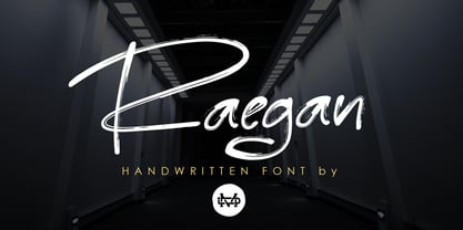 Raegan is a handwritten Brush. This font perfect is for poster design, book covers, merchandise, fashion campaigns, newsletters, branding, advertising, magazines, greeting cards, album covers, and quote designs and more. Feature: - Uppercase - lowercase - Numbers and Symbol - International Glyphs - Alternative Uppercase - Alternative lowercase If you need anything else please contact me by message.
 - Korejat by Inumocca,
$20.00 Korejat Modern Typeface , All Caps Serif simple and Playfull. come with some simple Alternates for covering your Project, like Branding, Movie Title, Headline Letter, Bookcover or Book Content, Magazine cover, Poster, Quotes Lettering, Logos, and more your project design. - Unique glyphs - Multilingual Characters - UPPERCASE - Numeric - Symbol - Punctuation Character - Alternates Set inumocca type Studio
 - Winttra Wonsy by HandletterYean,
$10.00 Winter is coming and Winttra Wonsy is here to celebrate it. Winttra Wonsy is a perfect addition to make your holiday and winter more exciting. Feel free to use it for any craft work, book cover, name card, poster, logo, magazine, cover, banner, t-shirt, or even artwork in a large scale.
 - Helaw Wolau by Inumocca,
$13.00 Helaw Wolau Halloween Display Font, simple and strong Character. come with some simple Ligature for covering your Project, like Branding, Movie Title, Headline Letter, Bookcover or Book Content, Magazine cover, Poster, Quotes Lettering, Logos, and more your project design. - Unique glyphs - Multilingual Characters - UPPERCASE - Lowercase - Numeric - Symbol - Punctuation Character - Ligature inumocca type Studio
 - Attaboy by Hanoded,
$15.00 Attaboy is a posh word for ‘well done’. It was made with a broken marker pen to give it that ‘eroded’ look. It is an all caps typeface, but upper and lower case can be mixed. Attaboy comes with stylistic alternates for the lower case glyphs and all the diacritics you need.
 - Traditional Spancer by Inumocca,
$18.00 Traditional Spancer Modern Serif Typeface , simple and powerfull. come with some simple Alternates for covering your Project, like Branding, Movie Title, Headline Letter, Bookcover or Book Content, Magazine cover, Poster, Quotes Lettering, Logos, and more your project design. - Unique glyphs - Multilingual Characters - UPPERCASE - Lowercase - Numeric - Symbol - Punctuation Character - Ligature - Alternates inumocca type Studio
 - Loxley by Canada Type,
$24.95 Drawn shortly before Jim Rimmer's passing in 2010, Loxley was designed to be used in a fine press edition of the folklore story of Robin Hood. It was named after the cited birthplace of the story's classic hero. Loxley's shapes were inspired the same early Roman faces (such as Subiaco from the late 1400s) that influenced Frederick Goudy's Aries, Franciscan and Goudry Thirty types. It exhibits the preculiarities of Jim's left-handed calligraphy, as well as his outside-the-box thinking with exit strokes and serif variations. Loxley was remastered for the latest technologies in 2013. Now it comes with a character set of over 450 glyphs, including plenty of stylistic alternates, a full compliment of f-ligatures, a Th-ligature, basic fractions, ordinals, a long s for historic setting, comprehensive class-based kerning, and extended Latin language support. 20% of this font's revenues will be donated to the Canada Type Scholarship Fund, supporting higher typography education in Canada.
 - P22 Barabajagal by IHOF,
$29.95 P22 Barabajagal is a unique take on the display fat face by way of doodling fun. Somewhat informed by the shapes of an early 1970s film type called Kap Antiqua Bold, this font’s aesthetic is the stuff of boundless energy and light humour, where an uncommon “peak” angle drawing perspective results in sturdy trunks, fat bottom curls, and active ascenders eager for mobility in space. This is the kind of font that makes you wonder whether it was drawn with rulers, protractors and compasses, or just by a mad doodler’s crazy-good free hand. Regardless, Barabajagal easily turns the geometry of modern forms into an exercise in sugar-loaded fun. It’s a very good tool to use in design geared at kids and young adults, such as food and toy packaging, books, animation, cartoons and games. Barabajagal comes with over 550 glyphs, lots of alternates, and a few ligatures and swash caps. It also contains extended support for Latin languages.
 - Finador by Julien Fincker,
$24.00 Finador is a modern, soft geometric sans family. The functional style of a geometric sans has been soften by open apertures and rounded corners. This makes it functional and friendly. The default version has open, modern apertures. Stylistic Set 2 includes the whole set with closed, classic apertures. A slightly different look. It´s like having a second font in just one font. So it´s up to you to choose the right look for your projects. The Finador family includes 8 weights, from thin to heavy + their matching italics. With 900+ glyphs per style it supports over 200+ latin based languages, includes an extended currency symbol set and a lot of Open Type Features like small caps, ligatures, fractions, alternates and many more. The lightest and boldest weights are good for display usage, while the middle weights can be also used for body text. As a versatile allrounder Finador supports almost every of your needs. It has the ability to become your next favorite workhorse family.
 - Lada by HS Fonts,
$49.00 About LADA Font Family The font family LADA is available in 1 weights and 2 styles: Black. There are 2 style variations of the font style. Type Designer: Kuncho Kunev The name of family - Lada is the name of slavonic goddes of harmony, joy, youth and love. Lada is also the name of our main designer's wife. Release date: December, 2020 HermesSOFT Ltd. Lada styles design is based on the design of corporate identity of the building National Palace of Culture, opened at 1981 in Sofia, Bulgaria. All the labels, tables, symbols and information identity was based on this design idea. There are some photos of these labels. There also are included all Cyrillic vowels with accents that are really necessary for the professional typesetting in Cyrillic languages. Supported Languages: Western Europe (Greek not included), Central/Eastern Europe, Baltic, Turkish, Romanian, Cyrillic. Supported Code Pages: Macintosh and Windows, any for above languages. Opentype features includes kern and ligatures.
 - ZF Gently by ZooFont,
$22.00 Gently, newly released by ZooFont, is a sans serif typeface that harmoniously combines straight lines and curves in a clean form. The stable form, which has its origins in handwriting, and the look of analog sensibility are enough to inspire confidence. Gently has a total of 9 weights, so it can be used freely anywhere, from body text to headlines. In addition, the height of the letters is economically calculated to achieve a reasonable line spacing, ensuring comfortable readability in various digital media. A cool breeze blows, a soft smile spreads across your lips, When I'm with you, the love in my heart seems to awaken. Your sweet whispering voice makes my heart flutter. Gently has the following features: 9 weights (from Ultra light to Ultra Black) extended latin 450+ glyphs fixed width numbers The Latin extension offers more than 130 languages with extensive multilingual Latin support for Western, Central, and Southeastern Europe.
 - ITC CuppaJoe by ITC,
$29.99 Nick Curtis's love affair with typography began when he was barely past adolescence, in a neighborhood alley of East Dallas. On a routine patrol for tossed treasures, he came across a type specimen catalog: a big, fat green binder displaying hundreds of fonts! He was hooked. Curtis's career has taken him from production art to graphic design to art direction, but type has always remained his graphic passion, especially the provocative designs produced from the late 19th through the early 20th centuries. Curtis's inspiration for ITC CuppaJoe comes from Art Deco lettering, but not from the typical sources. Depending upon your age or your interest in early twentieth-century package design ITC CuppaJoe might look familiar. Its foundation is the label art for Bokar, A&P's premium coffee during the 1930s. Curtis built on the gently sweeping curves and bold angular strokes of the original coffee-can lettering to create a distinctive typeface that commands attention. Rich, full-bodied, satisfying - now that's a ITC CuppaJoe!
 - Beardstown by Swell Type,
$15.00 Beardstown is solid, hardworking & no-nonsense. It may be a little gritty & rough around the edges, but it can also be open, warm and welcoming. Beardstown is a little Midwestern town on a river with a town square where you can buy comic books from a spinner rack at the front of the drugstore and read 'em with a root beer float from the soda counter in the back. The Beardstown font is perfect for t-shirts, sports graphics, beer cans, trading cards, carnival posters and record albums. But that’s it. I mean, you could use it on foofy hipster stuff like organic produce, vegan meat substitutes, electric car accessories or mountain bike parts, but you risk Beardstown coming over there to kick your butt. Features: three versions of each letter and two versions of each number automatically rotate for authentic print texture thirteen catchwords (like "and" "of" "for" & "the") accessible in Discretionary Ligatures support for 223 languages including Western & Central Europe, Vietnamese & Cyrillic
 - Neon Bugler by Breauhare,
$35.00 Neon Bugler is a font based on the third logo created by Harry Warren in early 1975 for his sixth grade class newsletter, The Broadwater Bugler, at Broadwater Academy in Exmore, Virginia, on Virginia’s Eastern Shore. This font design has these principles as its parameters: The letters generally follow what would be natural stroke directions; no sharp corners, all gentle turns; no lines back up over each other, cross each other, or run into each other. All of this civility between the lines produces an unintentional but welcome neon quality about it. This font can have a variety of vibes depending on its context--it has a certain nostalgia to it, yet it also has a slick, clean, futuristic look. It can even be used in a semi-grunge setting. This is a very versatile font! And if you like this font, check out the new boxy version of it, Neon Bugler Squared! Digitized by John Bomparte.
 - Retail Packaging JNL by Jeff Levine,
$29.00 The retail storage box for a vintage metal numbering stamp manufactured by the American Numbering Machine Company had its brand name hand lettered in an Art Nouveau style that most likely went back to the 1920s, as the company was in existence from 1908 to around 1971. Numbering machines were used in offices, schools, libraries, and anywhere a series of numbers needed to be marked onto printed items. Similar to what was called a ‘crash numberer’ used in letterpress shops, the machines could be set to do a run of digits [for example: 4000, 4001, 4002] or repeat numbers for forms used as carbon copies. As computers took over most forms of printing, the use of numbering machines dwindled, but they are still available. The American Numbering Machine Company was one of several Brooklyn, New York companies that specialized in the manufacture of these machines. Retail Packaging JNL replicates the lettering from their packaging, and is available in both regular and oblique versions.
 - Majora Pro by Latinotype,
$29.00 Majora Pro is a slab serif typeface which derives its name from a Portuguese historical toy manufacturer. The font comes in 8 styles, ranging from a delicate Thin to a robust Black, with matching italics and an upright version of stencil fonts, resulting in a total of 24 weights. Majora Pro is well-suited to a wide range of design projects which include packaging, editorial design, screen use, etc. Its humanistic features and moderate contrast between thick and thin strokes make it also suitable for long block of texts while having a high degree of legibility. The font includes a set of alternate glyphs which help give your compositions a different and unique look. The Stencil version was specially designed for use in signage, packaging, titles and headings. Majora Pro contains an extensive set of 750 characters (including small caps, different figure styles, etc.) that support over 200 Latin-based languages. Majora is the previous version of Majora Pro.
 - Sigma by Wiescher Design,
$30.00 »SIGMA« is the name for the Greek voiceless »S«. It is also called the »Lunar Sigma«, in Hellenistic times the letter was simplified to »C«. I thought SIGMA was a nice name for my new, very readable and friendly Sans typeface. »SIGMA« has that classical Sans beauty with friendly touches that make it unique. You will love this font. It is a great everyday workhorse with seven weights from Thin to Bold and all the necessary weights in between. Great for body copy and headlines! With 875 Glyphs it is a truly European font designed for all Central European and Latin using countries. »SIGMA« has a set of Cyrillic that is – besides Russia – also good for Serbia, Macedonia and Ukraine. It has oldstyle- and lining-, tabular- and tabular-oldstyle-figures, many ligatures. »SIGMA« comes in Normal and Oblique, I made it Oblique instead of Italic which would have been too playful for this friendly font. Enjoy!
 - Diverge Variable by Vishnu Sathyan,
$2.90 Introducing Diverge, a dynamic variable font with two axes - Weight and x-height. Inspired by the sleek and modern design of driveways in apartment complexes, Diverge is a font that stands out with its contemporary, yet sophisticated look. The Weight axis of Diverge ranges from Thin to Black, offering designers a wide range of options to choose from. The Thin weight is perfect for delicate and refined designs, while the Black weight commands attention with its bold and impactful appearance. The x-height axis of Diverge ranges from 420 to 800, giving designers greater control over the font's legibility and versatility. Whether used in body text or headings, Diverge's x-height axis allows for greater flexibility in design, making it a valuable addition to any designer's toolkit. Diverge's variable design is perfect for a wide range of applications, from branding and advertising to editorial design and web development. Its unique look and feel will make any design project stand out from the crowd.
 - Sigma Condensed by Wiescher Design,
$30.00 »SIGMA« is the name for the Greek voiceless »S«. It is also called the »Lunar Sigma«, in Hellenistic times the letter was simplified to »C«. I thought SIGMA was a nice name for my new, very readable and friendly Sans typeface. »SIGMA« has that classical Sans beauty with friendly touches that make it unique. You will love this font. It is a great everyday workhorse with seven weights from Thin to Bold and all the necessary weights in between. Great for body copy and headlines! With 875 Glyphs it is a truly European font designed for all Central European and Latin using countries. »SIGMA« has a set of Cyrillic that is – besides Russia – also good for Serbia, Macedonia and Ukraine. It has oldstyle- and lining-, tabular- and tabular-oldstyle-figures, many ligatures. »SIGMA« comes in Normal and Oblique, I made it Oblique instead of Italic which would have been too playful for this friendly font. Enjoy!
 - Versus by Latinotype,
$29.00 A unicase typeface inspired by Latin American wrestling. Versus is a type system designed for use with short and block text. The font, based on well-known typefaces found on boxing posters, combines Latin American elements and wrestling; it is this mixture of widths and weights and different styles which helps give your designs a unique flavour and personality. Versus is a unicase sans serif font well-suited for display use; its orthogonal terminals and short ascenders and descenders make it ideal for block of texts. By mixing different weights, you can have a wide range of design options—short text, isolated words, logos, titles, branding design, posters, etc. The Versus family comes in 9 weights—from a lightweight and condensed Extra Light to an expanded and heavy Ultra. Its character set supports over 200 different languages. The font also includes a large number of stylistic alternates and a complete ligature set which give your compositions a strong identity and personality.
 - Chayno by Twinletter,
$17.00 Welcome to the world of Chayno, where handwritten style meets fun casualness. Are you looking for a sleek yet casual and playful look for your various visual projects? Chayno is the perfect choice. With three different variants, including Regular, Outline, and Shadow, Chayno gives you the flexibility to deliver effects that suit your design needs. You can create a clean, professional look or add a fun, playful touch to your project. Chayno also features creative ligatures and alternate characters, allowing you to explore a variety of fun letter variations. Not only that, this font supports multiple languages, ensuring your message can be received by audiences all over the world. With Chayno, every word becomes more than just text - it becomes an expression and an experience. Let's make your messages attractive and uplifting together with these cheerful fonts. Chayno - turns words into fun adventures. Immediately use this font to bring joy to all your projects!
 - Neon Bugler Squared by Breauhare,
$35.00 Neon Bugler Squared is a soft, boxy version of Neon Bugler, which is a font based on the third logo created by Harry Warren in early 1975 for his sixth grade class newsletter, The Broadwater Bugler, at Broadwater Academy in Exmore, Virginia, on Virginia’s Eastern Shore. This font design has these principles as its parameters: The letters generally follow what would be natural stroke directions; no sharp corners, all gentle turns; no lines back up over each other, cross each other, or run into each other. All of this civility between the lines produces an unintentional but welcome neon quality about it. This font can have a variety of vibes depending on its context-it has a certain nostalgia to it, yet it also has a slick, clean, futuristic, sci-fi look. It can even be used in a semi-grunge setting. This is a very versatile font! Digitized by John Bomparte.
 - Cheria by Ahmad Jamaludin,
$15.00 Say hello to our new Retro font, Cheria! Cheria - A chunky serif texture with a bit of humanist touch. With its good readability, Cheria is perfect for both displays as well as body text. Inspired by all the retro aesthetics making a comeback, Cheria is perfectly suitable for creating thoughtful yet still contemporary designs such as logos, packaging, editorial, and more. Cheria - Has a unique shape, where all uppercase letters have alternates so you can combine them to make your text and header look more interesting! What you get : Regular and Bold family Alternate and Ligature Instructions ( Access special characters, even in circuit design ) Letters, numbers, symbols, and punctuation Use in many programs even in Canva Multilingual Support Language Support: Danish, English, Estonian, Filipino, Finnish, French, Friulian, Galician, German, Gusii, Indonesian, Irish, Italian, Luxembourgish, Norwegian Bokmål, Norwegian Nynorsk, Nyankole, Oromo, Portuguese, Romansh, Rombo, Spanish, Swedish, Swiss-German, Uzbek (Latin) Come and say hello over on Instagram! https://www.instagram.com/dharmas.studio/ Dharmas Studio
 - Pearly Smiles by RagamKata,
$16.00 "Pearly Smiles," a delightful handwritten font meticulously crafted with love and attention to detail. This font encapsulates the essence of joy and brings a touch of whimsy to your design projects. "Pearly Smiles" embodies the playful nature of handwritten script, with its charming curves and natural stroke variations. Every letter reflects the genuine warmth and sincerity of my personal handwriting, infusing your designs with a sense of individuality and happiness. With its elegant yet cheerful style, "Pearly Smiles" is versatile and perfect for a wide range of creative applications. Whether you're designing logos, branding materials, invitations, greeting cards, or any project that calls for a lighthearted and personal touch, this font will add a touch of enchantment and personality. The meticulously designed letterforms of "Pearly Smiles" ensure both legibility and artistic appeal. Its balanced proportions and thoughtfully crafted characters make it a pleasure to work with, whether on digital or printed mediums
 - Savaneta by Arterfak Project,
$20.00 Savaneta is an all caps stylish serif font, designed for display and headline. Inspired by the classic metal movable type (circa the 1440s), with the medium serif thickness. Savaneta is a versatile serif combined with calligraphic sense by adding about 300+ alternates characters so you can create a calligraphic design with ease! This font looks strong and feminine at the same time, that possible to be applied for many purposes. Savaneta is perfect for logos, logotype, letterhead, branding, cards, wedding invitations, label design, posters, apparel, quotes, and short body text. It contains over 500 glyphs and is complete with basic Latin characters. P.S: To access the alternates characters, you need a program with OpenType panel like Adobe Illustrator, Adobe Photoshop, or you can simply copy-paste the alternates characters by accessing Font Book (Mac) and Characters Map (Win) Features included: Uppercase Small case Numbers Symbol Standard Latin accents. Stylistic alternates Stylistic set 01-10 Thank you for visiting, and have a nice day!
 - Untitted - Unknown license

- Liebelei Pro by Wannatype,
$29.90 “Liebelei” – dalliance, flirtation, hanky-panky; kind of diminutive of “Liebe” (German for love) The typeface Liebelei has its roots back in 1932, when Vienna-based painter Rudolf Vogl created the poster for a movie called Liebelei after the popular play by Arthur Schnitzler. Only the title letters existed of that typeface. I loved the letters from first sight and proceeded by adventurously interpreting the missing characters. The goal was to create letterforms that fit to the original from the 1930s and represent a modern multi-purpose font. It should be an easy-to-use italic font with warm and friendly details and a huge variety of alternates and languages. The characteristic curled ends of most letters provide a script touch to the Liebelei. The first font entirely designed was the bold one which corresponds to the original poster lettering, although I tweaked the proportions a tiny bit to a more contemporary shape. Liebelei covers Western, Central European, and Central Eastern European Languages and contains also complete Greek and Cyrillic character sets. Liebelei is best for poster design as well as detailed usage, for example handsome tables, since it supports small caps, different kinds of numerals and fractions.
 - HWT Tuscan Extended by Hamilton Wood Type Collection,
$24.95 Tuscan wood types cover a fairly wide range of styles, and there is sometimes confusion over what is classified as a Gothic Tuscan and what is considered an Antique Tuscan. HWT American Chromatic and P22 Tuscan Expanded are more precisely faces of the Antique Tuscan variety. Gothic Tuscans are generally absent of the heavy serifs typically associated with their Antique Tuscan brethren (although decorative bifurcation of terminals can imply serifs). Additional internal decoration with spikes along the stems gives some Tuscans their distinctive look, these faces are often described as “Circus Types.” Tuscan Extended is an extremely wide design, with a distinctive slab crossbar running through the center of most characters. Each letter is a complex system in its own right. This typeface is best used very large in short headline work. The style defies falling clearly into either the Antique Tuscan or Gothic Tuscan category. The new HWT version of Tuscan Extended has been meticulously redrawn by Frank Grießhammer. During production, he also incorporated a number of new letterforms, bringing the font to over 300 characters (including a full ASCII character set and Central European accented characters).
 - Pickatoon by Colllab Studio,
$14.00 "Hi there, thank you for passing by. Colllab Studio is here. We crafted best collection of typefaces in a variety of styles to keep you covered for any project that comes your way! Pickatoon is a fun display font that we made because we knew what people wanted. Pickatoon has the look of your favorite childhood markers. It's not just for comic books, it's for EVERYTHING. It's for your Instagram selfies, it's for school projects, it's for your business logo, it's for your coloring books—it even works great with watercolors! We put a lot of time into making Pickatoon perfect. We knew you'd need it to be thick and thin and fat and skinny, so we did our best to make sure all those variations were available in every letter. And when you're drawing, you don't just want to draw the same thing over and over again—you want to be able to change things up with some simple tools. So we made sure that Pickatoon had different ways you could vary the thickness and give your work some character. Start create with this font!! A Million Thanks www.colllabstudio.com
 - EVOL - 100% free

- PG Gothique Variable by Paulo Goode,
$300.00 IMPORTANT: This is the VARIABLE VERSION of PG Gothique This is my addition to a long line of traditional gothic typefaces. As you can probably tell, PG Gothique Variable is inspired by classics such as Trade Gothic, News Gothic, Franklin Gothic, Alternate Gothic, and Gothic Gothic. Well, maybe not the last one... But Paulo, we have all those already, why would we want to add PG Gothique Variable to our collection? This typeface has many subtle design nuances that differentiates itself from its historical influences. Also, this is possibly the most comprehensive Latin gothic font family released to date. It has 99 default styles that cover pretty much every width and weight you could ever need, while this variable version unlocks options to match your exact style preference – including the angle of italic. PG Gothique Variable is designed to handle a multitude of applications, from branding projects, to titles, body text, user interfaces, and film poster credits. This typeface has a style that will suit the purpose. There are 99 default instances in this family, ranging from Thin to Ultra weights across six widths in both roman and italic. Activate Stylistic Set 1 and you will get the alternate slab-serif-style capital “I” that offers improved legibility when placed adjacent to a lowercase “l”. PG Gothique Variable has an extensive character set that covers every Latin European language. See full details and hi-res examples at https://paulogoode.com/pg-gothique
 - Meso Deko by Deniart Systems,
$15.00 Contains over 90 characters based on decorative symbols.
 - Loveslick by PizzaDude.dk,
$20.00A playful font that just smells like love! - Fairy Heart by Namara Creative Studio,
$9.00 Cute and lovely display font that comes with a unique style to make it suitable for any purpose, such as handicrafts, product packaging, quotes, product design, craftsmen, labels or any other projects which need a playful and lovely touch.
 - ITC Ellipse Script by Typorium,
$30.00 The Typorium presents a new optimized and enriched version of ITC Ellipse which first appeared in 1996 in the International Typeface Corporation typeface library. ITC Ellipse Script is a complementary typeface to ITC Ellipse Neo, designed a very legible handwriting style. ITC Ellipse Script is both modern and classic. Modern in the unusual shape based on the geometric ellipse form. And classic in the structure of some letters like the lower cases c, e, g, o, s. These letters alone could come from a traditional typeface, but they fit perfectly with the atypical rest of the alphabet giving it a present-day and traditional mix. Furthermore, the ellipse shape fits naturally in the italic styles, giving the font an organic and fluid feeling. ITC Ellipse Script offers OpenType features such as alternate characters for upper and lower case, and an extended accented character set to support many languages. Five weights have been created for each style to offer a wide range of graphic possibilities in a tidy digital footprint. Designer: Jean-Renaud Cuaz Publisher: Typorium MyFonts debut: Nov 1, 2020 Le Typorium présente une nouvelle version optimisée et enrichie d'ITC Ellipse qui est apparue pour la première fois en 1996 dans la bibliothèque de caractères de l'International Typeface Corporation. ITC Ellipse Script est une police complémentaire à ITC Ellipse Neo, conçue dans un style d'écriture très lisible. ITC Ellipse Script est à la fois moderne et classique. Moderne dans le dessin inhabituel basé sur la forme géométrique de l’ellipse. Et classique dans la structure de certaines lettres comme les minuscules c, e, g, o, s. Ces lettres pourraient provenir d'une police de caractères traditionnelle, mais elles s'intègrent parfaitement avec le reste de l'alphabet plus insolite en lui donnant un mélange de modernité et de tradition. De plus, la forme de l'ellipse s'intègre naturellement dans les styles italiques, donnant à la police une sensation organique et fluide. ITC Ellipse Script offre des fonctionnalités OpenType telles que des caractères alternatifs pour les capitales et les bas de casse, et un jeu de caractères accentués étendu pour prendre en charge de nombreuses langues. Cinq graisses ont été créés pour chaque style afin d'offrir un large éventail de possibilités graphiques pour une empreinte numérique rigoureuse.
 - Dever by insigne,
$24.00 Dever’s brute, industrial lines are rounded up in this new typeface from Jeremy Dooley. Dever combines plenty of inspirations. It’s the flair of the Wild West melded with a shout out to the sign painters and package lettering artists of the 1800s. Dever’s big, bold, and handy frame moves through all three of the family’s strapping members. First is the sans. No doubts on what this brother’s like. Dever Sans is as straight-forward as you’ll find in this family with its four separate weights and numerous distressed options. The second of the kin’s a bit of half-breed, you might say. Pointed serifs bring a sharpness to this outfit. Rounding out the family is Dever Wedge, a bit of wild rodeo all its own. This poke’s a quick draw with any of its 107 font, and with it’s auto-replacing alternates, no two repeating characters are alike. You’re guaranteed a great show anytime Dever leaves the chute. The route to Dever was long, with many a switchback. The Wedge variant was designed first, shelved, then developed into Plathorn. But I wanted to return to those brutish forms and decided to round out the family with a sans, serif and plenty of other options. Any of the Dever family have an extended character set including Central and Eastern European languages. The strong faces have specially adapted sub-families, too, so they’re bound and determined to have an outstanding impact at whatever size you use ‘em. It’s a hard ride ahead corralling all those words. Be sure and add these able-bodied boys to your posse today!
 - Breite Kanzlei by URW Type Foundry,
$39.99 Ralph M. Unger, known for his preference for blackletter designs, brought this beautiful blackletter variant back to life. Based on artwork from old catalogues, he redesigned, digitally remastered and completed the character set for this typeface. Breite Kanzlei cannot be avoided by blackletter lovers!
 - Boxcase by Vishnu Sathyan,
$49.00 Boxcase is inspired by pixel fonts from the 20th century. Instead of having sharp corners, which was a limitation back then, Boxcase comes with soft touchable corners. Diagonally chopped pixels/boxes, merges smoothly with the rest of the shape, giving a slide like feel to the letterforms.

