10,000 search results
(0.041 seconds)
- Wooden Nickel NF Pro by CheapProFonts,
$10.00 A nice, black display face - for a retro/western poster look. I have kept the quirky “t”, increased the dot above “i” and “j” slightly, improved the spacing/kerning and modified/added all the usual diacritics. A pretty easy reworking of a good quality font. Nick Curtis says: "An old favorite, Bernhard Antique Bold Condensed, cleaned up and fattened up. Warm, charming, personable … suitable for any occasion." ALL fonts from CheapProFonts have very extensive language support: They contain some unusual diacritic letters (some of which are contained in the Latin Extended-B Unicode block) supporting: Cornish, Filipino (Tagalog), Guarani, Luxembourgian, Malagasy, Romanian, Ulithian and Welsh. They also contain all glyphs in the Latin Extended-A Unicode block (which among others cover the Central European and Baltic areas) supporting: Afrikaans, Belarusian (Lacinka), Bosnian, Catalan, Chichewa, Croatian, Czech, Dutch, Esperanto, Greenlandic, Hungarian, Kashubian, Kurdish (Kurmanji), Latvian, Lithuanian, Maltese, Maori, Polish, Saami (Inari), Saami (North), Serbian (latin), Slovak(ian), Slovene, Sorbian (Lower), Sorbian (Upper), Turkish and Turkmen. And they of course contain all the usual “western” glyphs supporting: Albanian, Basque, Breton, Chamorro, Danish, Estonian, Faroese, Finnish, French, Frisian, Galican, German, Icelandic, Indonesian, Irish (Gaelic), Italian, Northern Sotho, Norwegian, Occitan, Portuguese, Rhaeto-Romance, Sami (Lule), Sami (South), Scots (Gaelic), Spanish, Swedish, Tswana, Walloon and Yapese.
 - Isbit Pro by CheapProFonts,
$10.00 Inspired by the shape of melting icecubes (“isbit” is the norwegian word for “ice cube”), this small superelliptical font family is perfect for logos and headlines. An alternate lowercase a and n is available as stylistic alternates - and a straight lowercase j (which also will be automatically substituted when the normal j would collide with the preceding glyph). ALL fonts from CheapProFonts have very extensive language support: They contain some unusual diacritic letters (some of which are contained in the Latin Extended-B Unicode block) supporting: Cornish, Filipino (Tagalog), Guarani, Luxembourgian, Malagasy, Romanian, Ulithian and Welsh. They also contain all glyphs in the Latin Extended-A Unicode block (which among others cover the Central European and Baltic areas) supporting: Afrikaans, Belarusian (Lacinka), Bosnian, Catalan, Chichewa, Croatian, Czech, Dutch, Esperanto, Greenlandic, Hungarian, Kashubian, Kurdish (Kurmanji), Latvian, Lithuanian, Maltese, Maori, Polish, Saami (Inari), Saami (North), Serbian (latin), Slovak(ian), Slovene, Sorbian (Lower), Sorbian (Upper), Turkish and Turkmen. And they of course contain all the usual “western” glyphs supporting: Albanian, Basque, Breton, Chamorro, Danish, Estonian, Faroese, Finnish, French, Frisian, Galican, German, Icelandic, Indonesian, Irish (Gaelic), Italian, Northern Sotho, Norwegian, Occitan, Portuguese, Rhaeto-Romance, Sami (Lule), Sami (South), Scots (Gaelic), Spanish, Swedish, Tswana, Walloon and Yapese.
 - Amorra Script by Zane Studio,
$15.00 Amorra Script is a classic thin font with italics style. Here you will get a beautiful classic font. This font is available in several modern rounds that can make your work look elegant, sweet and perfect. With this style, this font will be suitable for logos, branding projects, household designs equipment, product packaging, mugs, quotes, posters, shopping bags, logos, t-shirts, book covers, business cards, invitation cards, greetings card, and all the other beautiful projects. Amorra Script, including various language support. You can use this font for your work easily. Because there are many features in it. Contains complete set upper and lower case letters, punctuation, numbers, and multilingual support. This font also includes several ligaments and alternatives Style Set Style For those of you who have good software OpenType function (Corel Draw / Photoshop / Illustrator / InDesign). If you don't have a program that supports the OpenType feature like Adobe Illustrator and the CorelDraw X version, you can access all alternatives glyphs use Font Book (Mac) or Character Map (Windows): How to access all alternative characters using Adobe Illustrator: https://www.youtube.com/watch?v=XzwjMkbB-wQ How to access all alternative characters, using Windows Character Map with Photoshop: https://www.youtube.com/watch?v=Go9vacoYmBw Thank you & Congratulations on the Design
 - Art Gothic HiH by HiH,
$10.00 Art Gothic was attributed to the Central Type Foundry of St. Louis, Missouri, USA by Henry Lewis Bullen, writing in INLAND PRINTER in 1907, with a reproduction shown in Kelly’s American Wood Type. The typeface appears on the cover of an issue of “The Superior Printer” pictured in Typology by Heller and Fili dated in the 1870s. Art Gothic was designed in 1884 by Gustav Schroeder and proved to be one of the more popular and enduring of the American-designed Victorian display faces of the period, appearing frequently in ads in various publications. The Hamilton Mfg. Co showed a very similar wood type, No. 232, with a modified and rather heavy-handed upper case in 1892. As late as 1897, it may be found in the advertising section of The Ivy of Trinity College of Hartford, Connecticut and was included in the Norwood Press 1902 Specimen Book. Our font includes a complement of five upper case and four lower case alternatives as follows: 123=C, 125=E, 135=H, 137=S, 172=c, 175=e, 215=m and 247=s. Great for period pieces. ART GOTHIC HIH is clean, readable, and surprisingly modern-looking; unlike so many overly complex Victorian display fonts, it can be used in text sizes.
 - FS Conrad by Fontsmith,
$50.00 Art into type In 2008, Fontsmith were approached by their friend, Jon Scott, to investigate whether a typeface could assume the aesthetic of one artist’s body of work. Jon’s not-for-profit charity, Measure, was organising an event for the artist, Conrad Shawcross, whose giant mechanical installation, entitled Chord, was going on public display in the long-disused Kingsway tram tunnel in Holborn. Chord explores the way we perceive time, as either a line or a cycle. Two enormous machines with dozens of rotating arms and moving in opposite directions, weave rope with almost infinite slowness. An unusual brief Phil Garnham visited Conrad in his Hackney studio to get a feel for his work and ideas. “Conrad is a very clever and philosophical guy. He struggled to see how typeface design had any relevance to him and his art. This was going to be a challenge.” The artist presented the type designer with a pile of rope and a huge diagram of sketches and mathematical workings. “This was, in essence, my brief.” Phil developed three concepts, the simplest of which ticked all the boxes. “The idea of the strokes in the letterforms appearing and ending at peaks or points of origin fitted perfectly with Conrad’s idea of time occurring and ending at two ends of the sculpture.” Two versions Phil planned modules for two versions of the typeface: one with five lines in the letterforms and one with seven. He then drew the modules on-screen and twisted and turned them to build the machine that is FS Conrad. “This is not a simple headline typeface,” says Phil. “It’s not a rigid structure. It has varying character widths, and it’s informed by real typographic insight and proportions so that it actually works as piece of functioning, harmonious type.”
 - Shinn Kickers JNL by Jeff Levine,
$29.00 Conrad X. 'Cobb' Shinn (Sept. 4, 1887- Jan. 28, 1951) was a Fillmore, Indiana-born post card illustrator who sold a series of successful novelty postcard lines which included (among others) Charlie Chaplin, automobiles and the Dutch culture in the beginning years of the 20th Century. After serving in World War I, Shinn found the market for novelty postcards dwindling, and he also lent his artistic skills to cartoon features and illustrating many children's books [including his own, under the nickname 'Uncle Cobb'] which taught easy step-by-step drawing methods. Some time in the 1920s, he eventually migrated into the field of supplying electrotypes and stereotypes of 'stock cuts' of photos and line art to the printing trade. In the days of letterpress printing, this was the forerunner of paper clip art and its successor, electronic clip art. Purchasing many of his designs from 'journeyman' artists of the time, the diversity of Cobb Shinn's stock cuts library grew with the passing years, reflecting changing times, styles and topics. Some of the illustrators whose signed works were presented in Shinn's 'CUTalogs' [as he called his stock cuts catalogs] include Mary Clemmitt, Louis H. Hippe, E.C. Klinge, Nelson White, Harvey Fuller, Bess Livings, Lois Head, Harvey Peake and Van Tuyl. Upon his passing in 1951, it's not known how long the Indianapolis-based company existed before finally closing its doors. One of the more popular series of cartoons were the line illustrations of men and women affectionately called 'little big head guys' by many modern fans of these cuts because the heads of the characters were drawn somewhat larger than the rest of their bodies. Shinn Kickers JNL is a collection twenty-six of these illustrations, and just like a kick in the shin (as the pun in the name implies), these charming cartoons get your attention.
 - Cabrito Inverto by insigne,
$- Life’s always more fun when you reverse the stress. The same goes for the new member of the Cabrito family. Cabrito itself is a recently developed slab serif made for the kid’s book The Clothes Letters Wear. Cabrito proved to be more popular than I thought, and I promised I would create an inverted style for this new addition to the font world--a variant that would pair well with the original or even stand well on its own. And so now, here it is. Cabrito Inverto, which features the reversed stress of the strokes from a font’s “normal” traits. Inverted stress fonts are most often associated with cowboys and the Old West. The inverted stress gives it a happy-go-lucky appearance, not to be taken too seriously. It’s a pleasantly rounded, not-so-strictly geometric typeface with handwriting-inspired forms. Whew, that’s a mouthful! Inverto’s bundle of alternates is accessible in any OpenType-enabled program. It contains a workforce of alternates, swashes, and alternate titling caps to embellish the font. Also bundled are swash alternates, aged design and style figures, and compact caps. Peruse the PDF brochure to examine out these solutions in action. OpenType-enabled purposes such as Adobe suite or Quark will allow ligatures and alternates. This font family also includes the glyphs for 72 different languages. Cabrito Inverto does pair well with Cabrito. There is even an extra font weight, Black, for when you want to punch it up a bit. Jeremy Dooley designed Inverto to be a welcoming, day-to-day font family. Use it to express friendliness on just about anything, from candy to food to children’s toys. Cabrito Inverto’s one-of-a-kind visual appearance brings a bundle of fun to the party. Buy Cabrito Inverto to give a boost to your designs every day of the week.
 - Hugh Ultra Wide by Fateh.Lab,
$15.00 Hugh is the development of a wide type font, we create a work of art that combines a very strong spirit of wide type, for those of you artistic art lovers, this good news for you, because Hugh has a high artistic soul. This is the start of a happy year for you, get this font right away and develop your wild ideas, Hugh is the answer for you now. Its weight is superior in posters, social media, headlines, titles, large format print - and wherever you want to be noticed
 - Muliya Tat by Sulthan Studio,
$14.00 Muliya Tat Is a hand calligraphy, smooth, modern and clasik, calligraphy wavy, which was created to meet the needs of your next design project, hopefully you like it. Muliya tat Calligraphy, Can used for various purposes. such as the title, signature, logo, correspondence, wedding invitations, letterhead, signage, labels, newsletters, posters, badges, etc. Muliya tat Calligraphy features 406 glyphs and has given PUA unicode (specially coded fonts), can be accessed easily with the character map, can be accessed in full by the lovers of letters or artisans to increase career in the design world.
 - Erehwon Roman NF by Nick's Fonts,
$10.00This charming font, with its hints of the exotic, originally carried the rather prosaic name of Show Card Roman. It appeared in the book "Art Alphabets and Lettering: an encyclopedia of lettering including the most important standard alphabets and such classics as are in most demand for the use of engravers, designers, and all lovers of art" by the evidently rather verbose J. M. Bergling (1866-1933). As a nod to its exotic overtones, the font is named after the 1872 utopian novel of the same name by Samuel Butler. - Wilke Kursiv by Canada Type,
$24.95 Martin Wilke’s underrated yet influential deco classic from 1932 has both feet firmly planted in the high traditions of Western European calligraphy while carefully and subtly introducing some traits from the sweeping geometric/minimalist vision of the time. In a way, it was one of the representatives of the European anti-type typefaces of that era, when print media was searching for the elusive aesthetic balance between humanism and geometry. This typeface enjoyed some popularity in Germany for a few years, and went on to influence further type designs in Holland and Italy. After the second World War, the black hole that swallowed a big chunk of Europe’s print culture, new influences and technologies overtook the scene, and selective historical emphasis ensued, highlighting some of the era’s designs and overlooking others. Further selective picking in the digital era all but buried Wilke’s body of work - unfairly so, because he was just as important in German type history as Bernhard, Post, Schneidler, Tiemann and Trump. The original metal Wilke Kursiv came in one weight. This digital version goes a long way in expanding on that original offering. Now Wilke’s masterpiece comes in three weights, and with a full Pro treatment including swash caps, small capitals, five types of figures, automatic fractions, and plenty of other OpenType niceties. Each of the Wilke Kursiv Pro fonts comes with over 700 characters, and contains support for most Latin-based languages. Also available are three non-Pro fonts in each weight.
 - Daily Sans by Up Up Creative,
$15.00 Introducing Daily Sans, a complete sans serif font family with 10-weights, plus italics (20-fonts total). Daily Sans was designed to be an everyday-use geometric typeface with excellent legibility and a neutral tone. It's a perfect go-to for branding, web, and print design projects and can stand out on its own or play a supporting role in font pairings. It’s great for body/paragraph type as well as for larger display type. Because the goal was to create a font you can truly use for any project, purpose, or occasion, Daily Sans includes a wide range of weights starting from the very thin Hairline all the way through to the very bold Heavy. This means that you’re always able to find just the right weight for your needs, and it makes creating type hierarchies a breeze. Daily Sans comprises 20 fonts, each with approximately 450 glyphs - including 16 standard and discretionary ligatures, three ampersand variants, a full set of arrows, and more - and supports over 200 languages. The OpenType features can be very easily accessed by using OpenType-savvy programs such as Adobe Illustrator and Adobe InDesign. (To access these awesome features in Microsoft Word, you'll need to get comfortable with the advanced tab of Word's font menu.) PLEASE ENJOY! I can't wait to see what you make with Daily Sans. Feel free to use the #upupcreative and #dailysansfont tags to show me what you've been up to.
 - Toby Font by Ingo,
$19.00 A playful handwriting of a child Twelve-year old Tobias Düsel designed the characters of this font in 2002 during his family’s furlough in the USA. He drew the alphabet freehand in pencil on a piece of stationery, and clearly had examples of the well-known college and military fonts in mind. The characters in their basic form are geometrically thought out, as well as the construction of the shadows. But remarkably, while drawing, Tobias Düsel did not reach for the obvious aid of a ruler. In fact, the strokes of the letters are not linear, rather are recognizably well-balanced with declining and increasing straights as can be seen in polished classical fonts. Originally this font consists only of upper case letters — all other characters (punctuation marks, figures and similar) have been modified from the components of the capital letters. Complementary to the original Outline-Shadow-Version TobyFont Empty, the variations TobyFont Inside and TobyFont Full are also available. ”Empty“ is, so to speak, the frame of the typeface as “Inside” is the filling, and “Full” is the sum of both. All three versions have the exact same body size so that they can be placed over one another congruently. In this way the effect of a font in two or three colors can be attained. TobyFont is excellently suitable for designing “picturesque” or “hand-carved” contents; large weights are especially charming and striking.
 - Ladington by Gloow Studio,
$25.00 Ladington is a retro and modern typeface inspired by 60s - 80s designs with more unique exploratory styles such as swoshes and alternative characters. This font is made from a manual sketch with lots of strokes then finished into a font. Create your design project with this font and extra illustrations to make it more beautiful. This font is also suitable for designs such as logos, stickers, t-shirt designs, banners, posters, signs, display designs, packaging and other amazing designs! Enyoy with our products and feel free to contact us for support! Feature : Complete Set of Uppercase & Lowercase Characters Numbers & Punctuation Multilingual Language PUA encoded Open Type Feature To use the alternative features of OpenType Stylistic (including swosh), you must use a program that supports OpenType such as Adobe Illustrator CS, Adobe Indesign, Corel Draw X6-X7 and Microsoft Office 2010 or later versions. An additional way to access alternatives/swoshes is using Character Map (Windows), Nexus Font (Windows), Font Book (Mac), or any of the more programs that have Character Pop. Thank you for buying our products and supporting us! We hope that this font will become part of your design project. If you have any other questions, inquiries or concerns, don't hesitate and have fun contacting us directly. We'd love to be able to help you even more! If you are satisfied with our product, please put your star in our design review, it is very great moment for us. Thank You! :)
 - FS Untitled Variable by Fontsmith,
$319.99Developer-friendly The studio has developed a wide array of weights for FS Untitled – 12 in all, in roman and italic – with the intention of meeting every on-screen need. All recognisably part of a family, each weight brings a different edge or personality to headline or body copy. There’s more. Type on screen has a tendency to fill in or blow so for each weight, there’s the choice of two marginally different versions, allowing designers and developers to go up or down a touch in weight. They’re free to use the font at any size on any background colour without fear of causing optical obstacles. And to make life even easier for developers, the 12 weight pairs have each been designated with a number from 100 (Thin) to 750 (Bold), corresponding to the system used to denote font weight in CSS code. Selecting a weight is always light work. Easy on the pixels ‘It’s a digital-first world,’ says Jason Smith, ‘and I wanted to make something that was really functional for digital brands’. FS Untitled was made for modern screens. Its shapes and proportions, x-height and cap height were modelled around the pixel grids of even low-resolution displays. So there are no angles in the A, V and W, just gently curving strokes that fit, not fight, with the pixels, and reduce the dependency on font hinting. Forms are simplified and modular – there are no spurs on the r or d, for example – and the space between the dot of the i and its stem is larger than usual. The result is a clearer, more legible typeface – functional but with bags of character. Screen beginnings FS Untitled got its start on the box. Its roots lie in Fontsmith’s creation of the typeface for Channel 4’s rebrand in 2005: the classic, quirky, edgy C4 headline font, with its rounded square shapes (inspired by the classic cartoon TV shape of a squidgy rectangle), and a toned-down version for use in text, captions and content graphics. The studio has built on the characteristics that made the original face so pixel-friendly: its blend of almost-flat horizontals and verticals with just enough openness and curve at the corners to keep the font looking friendly. The curves of the o, c and e are classic Fontsmith – typical of the dedication its designers puts into sculpting letterforms. Look out for… FS Untitled wouldn’t be a Fontsmith typeface if it didn’t have its quirks, some warranted, some wanton. There’s the rounded junction at the base of the E, for example, and the strong, solid contours of the punctuation marks and numerals. Notice, too, the distinctive, open shape of the A, V, W, X and Y, created by strokes that start off straight before curving into their diagonal path. Some would call the look bow-legged; we’d call it big-hearted. - FS Untitled by Fontsmith,
$80.00 Developer-friendly The studio has developed a wide array of weights for FS Untitled – 12 in all, in roman and italic – with the intention of meeting every on-screen need. All recognisably part of a family, each weight brings a different edge or personality to headline or body copy. There’s more. Type on screen has a tendency to fill in or blow so for each weight, there’s the choice of two marginally different versions, allowing designers and developers to go up or down a touch in weight. They’re free to use the font at any size on any background colour without fear of causing optical obstacles. And to make life even easier for developers, the 12 weight pairs have each been designated with a number from 100 (Thin) to 750 (Bold), corresponding to the system used to denote font weight in CSS code. Selecting a weight is always light work. Easy on the pixels ‘It’s a digital-first world,’ says Jason Smith, ‘and I wanted to make something that was really functional for digital brands’. FS Untitled was made for modern screens. Its shapes and proportions, x-height and cap height were modelled around the pixel grids of even low-resolution displays. So there are no angles in the A, V and W, just gently curving strokes that fit, not fight, with the pixels, and reduce the dependency on font hinting. Forms are simplified and modular – there are no spurs on the r or d, for example – and the space between the dot of the i and its stem is larger than usual. The result is a clearer, more legible typeface – functional but with bags of character. Screen beginnings FS Untitled got its start on the box. Its roots lie in Fontsmith’s creation of the typeface for Channel 4’s rebrand in 2005: the classic, quirky, edgy C4 headline font, with its rounded square shapes (inspired by the classic cartoon TV shape of a squidgy rectangle), and a toned-down version for use in text, captions and content graphics. The studio has built on the characteristics that made the original face so pixel-friendly: its blend of almost-flat horizontals and verticals with just enough openness and curve at the corners to keep the font looking friendly. The curves of the o, c and e are classic Fontsmith – typical of the dedication its designers puts into sculpting letterforms. Look out for… FS Untitled wouldn’t be a Fontsmith typeface if it didn’t have its quirks, some warranted, some wanton. There’s the rounded junction at the base of the E, for example, and the strong, solid contours of the punctuation marks and numerals. Notice, too, the distinctive, open shape of the A, V, W, X and Y, created by strokes that start off straight before curving into their diagonal path. Some would call the look bow-legged; we’d call it big-hearted.
 - Spaza by Scholtz Fonts,
$15.00In parts of Africa, in the poorer, rural and peri-urban areas there are many small shops or convenience stores which are called "Spaza" shops. The owners of these shops often don't have access to commercial signwriting and write their signs themselves. The font "Spaza" is based on these hand-lettered signs. This lettering has a refreshing simplicity and spontaneity, yet retains great legibility. In the font "Spaza", there are three styles: - Spaza Regular - with normal upper and lower case; - Spaza Small Caps - in which the lower case is a true "small caps" and not a shrunken version of the upper case (generated by the operating system); - Spaza Double Caps - in which the lower case characters have been replaced by an alternate set of capital letters. The font thus contains two sets of differing upper case characters. You can use characters from both these sets to give a true feeling of randomness because if the same character occurs twice in a word, different versions of the character can be used. Spaza can be used with great effect in a great variety of applications such as advertisements, flyers, posters and in magazine pages. Spaza contains a full character set and has been carefully spaced and kerned. - Chipen by 38-lineart,
$14.00 I am pleased to present you an excellent futuristic font "Chipen" in unique graphic style! This font consists of regular, expanded, regular italic and expanded italic, these 4 fonts are encapsulated in one variable. With one font variable, this will cover 4 styles and cover all the weights between regular and expanded. If you are used to working with variable fonts it will give you more weight options, if you have never tried this variable font it will be an amazing new experience for you, take a look at this video snippet: https://youtu.be/jgqNPGeoVjc Chipen comes in bold and with a “RoundCube” cut, this is perfect for modern, Sci-Fi, and technology themes. Coupled with the stripe in the middle of the makes it appear more sporty. Not only that, this stripe can also display "Eighties" if you package it in a retro concept. Another strength of this font is the lowercase ligature, we present a lot of ligatures and one of them might be suitable for your logo brand. Finally, this font is a dynamic font with a variable concept capable of covering more 'weight', unique to appearing in various eras, exploring the world of retro and even science and fiction.
 - Lady Edith by MKGD,
$13.00 Lady Edith harkens back to the days of flappers and cocktail parties. The early part of the twentieth century, when Art Deco was at it’s height and high fashion was all the rage. A time of beauty, class and elegance. A minimalistic font with clean lines and just enough flare to make it unique. The perfect font for any occasion that needs a bit of high end magic. There is no lower case for Lady Edith as it is a decorative font. The Upper case version serves both the upper and lower case keys. Lady Edith has a glyph count of 397 and supports the following languages; Supported Languages: Afrikaans, Albanian, Asu, Basque, Bemba, Bena, Bosnian, Catalan, Chiga, Colognian, Cornish, Croatian, Czech, Danish, Embu, English, Esperanto, Estonian, Faroese, Filipino, Finnish, French, Friulian, Galician, German, Gusii, Hungarian, Icelandic, Indonesian, Irish, Italian, Kabuverdianu, Kalaallisut, Kalenjin, Kamba, Kikuyu, Kinyarwanda, Latvian, Lithuanian, Low German, Lower Sorbian, Luo, Luxembourgish, Luyia, Machame, Makhuwa-Meetto, Makonde, Malagasy, Malay, Maltese, Manx, Meru, Morisyen, North Ndebele, Norwegian Bokmål, Norwegian Nynorsk, Nyankole, Oromo, Polish, Portuguese, Romanian, Romansh, Rombo, Rundi, Rwa, Samburu, Sango, Sangu, Scottish Gaelic, Sena, Shambala, Shona, Slovak, Slovenian, Soga, Somali, Spanish, Swahili, Swedish, Swiss German, Taita, Teso, Turkmen, Upper Sorbian, Vunjo, Walser, Zulu
 - Nasser by Eyad Al-Samman,
$3.00 “Nasser” is a Kufic modern Arabic typeface. It is suitable for books' covers, advertisement light boards, and titles in magazines and newspapers. It is very distinctive when used in black and white printout. It decorates colored pages and makes artworks more attractive. This font comes in three different weights. My father’s name is “Nasser”. Consequently, “Nasser” Typeface was designed for eternizing the memory of my late father. He was the person who taught me how to like arts, literature, and languages. Besides, my first cute child is named also “Nasser.” The main characteristic of “Nasser” Typeface is in its modern non-descender style for some of its Arabic characters such as “Sad”, “Seen”, “Sheen”, “Qaf” and others. The shape of the characters' “dot”, “dots”, and “point” is innovative; a triangle with a semi-circle shape. “Nasser” Typeface is suitable for books' covers, advertisement light boards, and titles in magazines and newspapers. Its characters' modern Kufic styles give the typeface more distinction when it is used also in posters, greeting cards, covers, exhibitions' signboards and external or internal walls of malls or metro’s exits and entrances. It can also be used in titles for Arabic news and advertisements appeared in different Arabic and foreign satellite channels.
 - Spyced - Personal use only

- Raytone by Nurf Designs,
$16.00 Raytone is a cute and delicate handwritten font, designed with the help of a brush pen. It has a cheerful style that will elevate your projects to the highest level. Use this lovely font to brighten up any kids and school projects.
 - Feilla by AEN Creative Studio,
$20.00 Feilla is a cute valentine’s handwritten font featuring lovely ornaments. This font is perfect for romantic-themed designs, especially when combined with pink or bright colors. It is PUA encoded, which means you can access all of the glyphs and swashes with ease!
 - Florensa by Variatype,
$16.00 Florensa was designed carefully with love and passion, created for type poster design, graphic design, logotype, branding, and choose everything you want. Contains more than 50 beautiful ligatures to produce a modern look and playful typography, upgrade your design creativity with Florensa.
 - P22 Mexican Relics by IHOF,
$24.95 Mexican Relics is a collection of over 100 dingbats in font format based on images found on a variety of clay stamps primarily from pre-Columbian Mexico. This font brings ancient artwork featuring fantastic animals and geometric shapes into the computer age.
 - Life Cinema Screen by Andrey Ukhanev,
$- This font was inspired by an old photographic film package I found. Over time, the vertical slits in the letters have become more complex and acquired slanted sections. The font is suitable for accidences: headlines, posters... maybe you can suggest something interesting ;)
 - Brittwey by Balevgraph Studio,
$12.00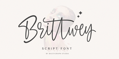 Brittwey is a lovely and delicate script font that exudes elegance and class. This font was particularly crafted for those who need a beautiful and refreshing look to their designs What's Included? Uppercase & Lowercase Numbers & Punctuation Ligature, Alternate & Swashes Multilingual Support PUA Encoded
 - Bushel And Peck by Make Media Co,
$12.00 Introducing Bushel and Peck - A flirty, bouncy, SMOOTH Script with over 50 alternates, a handy Sans Serif, and an adorable Dingbat style with loads of farmhouse charm. Use this sweet trio to make logos, greeting cards, signage, apparels, totes, mugs and more!
 - Sweet Mia by Angele Kamp,
$24.00 Sweet Mia is a playful modern calligraphy font with a dancing baseline. This sweet font has nice smooth lines and is perfect for crafters and cutting machines. Sweet Mia will look gorgeous on cards, mugs, quotes, logos and all your other lovely projects.
 - Emmie by Fontmill Foundry,
$15.00 Emmie is a friendly display face with fat curly terminals, which is great for billboards, branding, headlines and editorial design as well as screen based applications. It has over 450 glyphs and includes opentype features such as discretionary ligatures and stylistic alternates.
 - Badcab by Dismantle Destroy,
$19.00This is a great poster font. It was created by hand, scanned and digitalized for quality. After, it was distressed with custom made brushes. The font is in all capitals with two versions of each letter. Font includes over 100 characters and glyphs. - Lindore by Irina Vascovet,
$16.00 Lindore is a handwritten pointed pen calligraphy script that has a fun and whimsical personality. Perfect for posters, wedding invitations, and all of your favorite quotes! We would love to see how you use the font! Use #lindorefont to tag us on Instagram!
 - Romance Sans by AEN Creative Studio,
$15.00 Romance Sans is a modern display font featuring lovely ornaments. This font is perfect for romantic themed designs, especially when combined with red or bright colors. It is PUA encoded which means you can access all of the glyphs and swashes with ease!
 - Valentine Cute by AEN Creative Studio,
$14.00 Valentine Cute is a quirky display font featuring lovely ornaments. This font is perfect for valentine themed designs, especially when combined with pink or bright colors. It is PUA encoded which means you can access all of the glyphs and swashes with ease!
 - Just Overthink by Sronstudio,
$18.00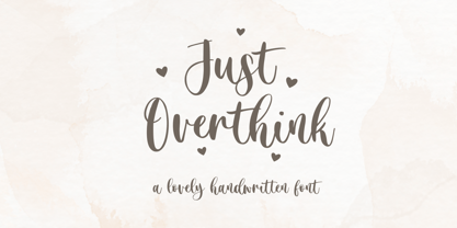 Just Overthink - Lovely Font - This font perfect for branding, invitation, stationery, wedding designs, social media posts, advertisements, product packaging, product designs, label, photography, watermark, special events, and more. Features: Uppercase and lowercase letters Multilingual, numerals, and punctuation Follow Instagram: @sronstudio Thank You!
 - Amelliz by Stringlabs Creative Studio,
$29.00 Amelliz is an exquisite handwritten font, created with the help of an elegant brush pen. Fall in love with its incredibly versatile style and use it to create gorgeous wedding invitations, beautiful stationary art, eye-catching social media posts, and much more!
 - AM False Etruscan by Alberto Milli,
$30.00I created this font following my love for Etruscans, their culture and their myths. Many times I looked for a false, but similar, Etruscan TrueType font on the Internet, but I didn't find it, so one day I decided to make it myself. - Atakana Script by Afkari Studio,
$15.00 Atakana Scipt is a New Handwriting Font script that make with love. This font is suitable for any branding of your design needs, wedding invitation, romantic project, studio brand, logo, invitations, social media posts, clothing, invitation, poster, cafe/resto sign and others.
 - Uptown JNL by Jeff Levine,
$29.00 Uptown JNL was found amidst the pages of a 1944 edition of the vintage lettering design book entitled "Sixty Alphabets". This lovely Art Deco typeface has slight curvature to the straight lines of the letter forms and a wonderful hand-lettered look.
 - Southwell by Balevgraph Studio,
$12.00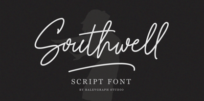 Southwell is a lovely and delicate script font that exudes elegance and class. This font was particularly crafted for those who need a beautiful and refreshing look to their designs. What's Included? Uppercase & Lowercase Numbers & Punctuation Ligature, Alternate & Swashes Multilingual Support PUA Encoded
