5,221 search results
(0.012 seconds)
- VVDS My Spellbound by Vintage Voyage Design Supply,
$10.00 My Spellbound an authentic groovy typeface. So, The Stranger Things series is already watched and you'll waiting the last one season for another two years. Well, if you miss for late 70s or early 80s in your design – this one is for you. Smooth, groovy and playful – exactly for your vintage projects. This typeface will suit for the display block texts like package labels or will be perfect for an any display header. Create a vintage t-shirt print or make groovy stickers - Spellbound will suits perfectly. A lot of alternates will give you a really wide range of results. You may combine it with Italics and get a really playful pair. Two characters for any caps and up to 6 alternates for lowercases. Regular and true Italic Open Type Features Multilingual I would really love to see what you create with my products, so please feel free to tag me @vintagevoyagedesign on Instagram. Happy creating! Thank you.
 - World Madly by Putracetol,
$16.00 World Madly - Display Font is a delightful and quirky typeface designed with an environmental theme in mind. This font exudes a sense of fun and playfulness with its rounded and condensed letterforms, making it a perfect choice for projects related to nature and the Earth. Featuring a remarkable array of ten alternative font versions, each inspired by elements of the Earth and plant life such as tree trunks, leaves, globes, roots, and trees, World Madly is purposefully created for Earth Day-themed designs. It seamlessly integrates into projects with themes centered around nature, green initiatives, and the Earth. This font is an ideal choice for creating designs like Earth Day-themed invitations, birthday invites, party decorations, logos, stickers, clothing, packaging, children's books, magazines, and more. With its crafty and playful style, World Madly lets you express your love for the planet and the environment in your creative projects, adding a touch of eco-consciousness.
 - Bookish by Hackberry Font Foundry,
$24.95 This all started with a love for Jenson. I know there're hundreds of variations on that theme. But, that is where I began, several years ago. How far it came, as usual as I wandered through the vagaries of font design, is not unusual. If you've read any of my font design books, you know my design processes are quite loose and spontaneous. I wanted the general feel of a favorite old font, but softer, easier, and more comfortable. I built these on the same vertical metrics as my Librum Publishing Group. However, this family is not part of that group. I used the metrics because that shows my current taste in fonts. This family does work with the Librum group—but to be honest, I haven't experimented enough to come up with a good companion. I suspect I'll need to make another companion family. I may need make a non-modulated bold version also. But, that remains to be seen. I'm pleased with this.
 - Hacksaw Brush by Ferry Ardana Putra,
$17.00 Hacksaw is dry brush font handmade with a dedicated soul. This super condensed and trippy typeface was designed to be exclusive and is perfect for those who love condensed, wild, natural brushed feel fonts. This typeface is perfect for creating elegant branding and headlines for handmade, food & beverage, artisan goods, quotes, invites, t-shirts, logos, and, or use it to elevate your social media feed! Hacksaw features: A full set of upper & lowercase characters Numbers & punctuation Multilingual language support PUA Encoded Characters Dozen of Swashes OpenType Features ——— ⚠️To enable the OpenType Stylistic alternates, you need a program that supports OpenType features such as Adobe Illustrator CS, Adobe InDesign & CorelDraw X6-X7, Microsoft Word 2010 or later versions. There are additional ways to access alternates/swashes, using Character Map (Windows), Nexus Font (Windows), Font Book (Mac) or a software program such as Pop Char (for Windows and Mac). ⚠️For more information about accessing alternative, you can see this link: http://adobe.ly/1m1fn4Y
 - Vuelta by Dora Typefoundry,
$19.00 Vuelta display is a modern random style font that combines serifs and sans in one font file. With serif as uppercase and sans as lowercase. You can use both uppercase and lowercase in the same word which will make your text more distinct too plus some alternatives so this font really stands out. This font is perfectly made to be applied especially in logos, and other various formal forms such as display, header, headline, poster, logos, etc on a big typography. **Features:** - All Caps Font with different uppercase and lowercase - Number & Symbol - Supported Languages - Alternates and Ligatures - PUA Encoded **What is included:** - Vuelta Display Regular We highly recommend using a program that supports OpenType features and Glyphs panels like Adobe apps and Corel Draw, so you can see and access all Glyph variations. This type of family has become the work of true love, making it as easy and fun as possible.I really hope you enjoy it! Thank you Enjoy the font and go get creative :)
 - Pearly Smiles by RagamKata,
$16.00 "Pearly Smiles," a delightful handwritten font meticulously crafted with love and attention to detail. This font encapsulates the essence of joy and brings a touch of whimsy to your design projects. "Pearly Smiles" embodies the playful nature of handwritten script, with its charming curves and natural stroke variations. Every letter reflects the genuine warmth and sincerity of my personal handwriting, infusing your designs with a sense of individuality and happiness. With its elegant yet cheerful style, "Pearly Smiles" is versatile and perfect for a wide range of creative applications. Whether you're designing logos, branding materials, invitations, greeting cards, or any project that calls for a lighthearted and personal touch, this font will add a touch of enchantment and personality. The meticulously designed letterforms of "Pearly Smiles" ensure both legibility and artistic appeal. Its balanced proportions and thoughtfully crafted characters make it a pleasure to work with, whether on digital or printed mediums
 - Adecion by Dora Typefoundry,
$15.00 Adecion is designed for maximum visual and emotional impact. Its four weights excel in posters, social media, headlines, large format print - and anywhere else you want to get noticed. Hidden between straight lines and firm confidence is a hint of charm and mischievous character; Adecion gives your words a powerful sound as well as fun to use. Perfect for graphic design and any screen use of your projects such as branding, magazines, editorials, wedding invitations, logo design, posters, social media, and more! FEATURES: • 4 Font weight • Uppercase & Lowercase • Alternative Uppercase • Numbers & Punctuation • Characters with accents • Supports Multiple Languages WHAT'S INCLUDED: • Adecion - Light. • Adecion - Regular. • Adecion - Bold. • Adecion - Extra Bold. This type of family has been the work of real love, making it as easy and enjoyable as possible. I really hope you enjoy it! I can't wait to see what you do with Adecion! Feel free to use the #Dora Typefoundry tag and the # Adecion Display font to show what you've been up to!
 - Redbird by Eurotypo,
$34.00 Redbird is a modern hand-painted script with an irregular baseline. Rough edges and imperfect lines give to this brush font a unique and trendy look. All glyphs have been carefully painted giving your words a wonderful flow. Fat and thin stroke in this font impresses the harmony. Want to give your projects an organic, hand-painted look? Redbird font contains 584 glyphs, with inky lines, and "perfect or imperfect" painted edges, including a few extra character alternates, swashes and ligatures for a genuine hand-lettered effect. This font includes OpenType features that may only be accessible via OpenType-aware applications, a Central European language support. Bonus: 60 useful ornaments and a lot of catchwords that you use for the most demanding design project! Redbird looks lovely on wedding invitations, greeting cards, logos, business cards and is perfect for using in ink or watercolour based designs, fashion, magazines, food packaging and menus, book covers and more!
 - FingerSpeller BF by Bomparte's Fonts,
$40.00 Many years ago I studied American Sign Language in an effort to better communicate with some friends of mine within the deaf community. I found ASL to be a beautifully expressive language from a vibrant and active culture. Out of that attempt came this stylized depiction of the manual alphabet used in finger-spelling. Until recently it had only existed in analog form, born of pen and ink on paper. So now I'm glad to say it’s turned digital. Typing a period (.) will reveal the sign for “I Love You” (a combination of the letters I, L and Y), which fits nicely within the shape of a heart. Holding down the shift key while again typing period (greater symbol) will reveal the heart in its filled-in form, which can serve as an underlay. Use these in an application that supports layering in order to create different color combinations. There’s a stylistic alternate letter “S” and an “OO” ligature which can be accessed in OpenType-savvy apps.
 - Blackline by Rhd Studio,
$19.00 Black line style - New modern & fresh script with handwritten and script style makes this font look elegant, natural, stylish and perfect for any extraordinary project that requires a handwritten feel. I am made with love and unique!! Blackline includes a full set of beautiful handwritten upper and lower case letters, numbers, assorted punctuation marks and bindings. All lowercase letters include starting and ending strokes, providing a realistic handwriting style. What did you get, honey? You will get : - Alternative Ligatures & Styles - Fonts include multilingual support for; Afrikaans, Albanian, Catalan, Danish, Dutch, English, Icelandic, Italian, Spanish, Portuguese, German, Swedish, Norwegian, Polish, Indonesian, Zulu To use beautiful strokes, you need a program that supports OpenType features such as Adobe Illustrator CS, Adobe Photoshop CC, Adobe Indesign, and Corel Draw. but if your software doesn't have Glyphs panel, you can install additional font swash file: If you have any questions about the latest fonts, please give us a short message thank you Rhd Studio
 - Azkia Script by madjack.font,
$15.00 Azkia Script is a beautiful and lovely script font with many alternative styles, ligatures, swashes, and multilingual glyphs. Azkia is a script typeface with a noble vintage look. Created in response to current graphic design trends. Get inspiration from classic labels, vintage packaging, and vintage sign painting. This Brightina script will add a touch of worldly knowledge to your artwork. The classic nuance is perfect for those of you who need fonts, especially for logos, clothing, signage, branding, packaging, advertising, and others. I've designed a number of examples, so you can see how they're used. Azkia Script also has many alternatives for ascender, descenders, swash, and ligature. It also has several options for tails and underscores. To provide a huge number of possibilities to play with and come up with some unique designs. Azkia Script comes complete with: • Uppercase, lowercase, numbers, punctuation & symbols • Multilingual support • Alternative styles • Swash • Binder If you have any problems, questions or anything about my fonts, please send us an email.
 - Lady Rene by Sudtipos,
$59.00 Looking back on my production to date, neither so little nor so large, it does not come as a surprise to find myself now introducing Lady René. A brief review of my career would read as follows: graphic designer graduated from Buenos Aires University, a 10-year professorship in Typography in the same institution, an illustrator in the making. For almost 15 years now my work has focused on the design of editorial pieces, predominantly books and CD sleeves. Typography proper has always been central to my research projects. All my obsessions eventually embodied as much the search for a perfect, spotless text as for a daring and provoking one. In my view, "how-to-say-something" ranks highest amongst a graphic designer’s responsibilities. It was in this vein that I called in the written word to illustrate, to draw, to narrate. Why not reverse the saying and proclaim that “a word is worth a thousand images”? If so, one single word could trigger endless meanings, associations, ideas, and memories in every reader’s mind. Language, we know, has a strong power and is a living expression of a culture. In my illustrations, letters and drawings reunite in one synergy said and unsaid, the finiteness of the message and the freedom of the free reading. And this is how and when, Lady René, my first born type font sees the light of day conceived out of a love of illustration and a reverence for the written word, recalling the whimsicality of the handmade drawing and reflecting its sensitive, warmth and spontaneity. Enabled by the characteristics of Open Type and the hard, outstanding work of designer Ale Paul, Lady René succeeds in composing texts in a simple, organic way by means of its contextual and stylistic alternates, swash characters, ligatures and connecting words. A bundle of decorative miscellanea completes the set of signs, enabling the user considerable freedom to create new typographic landscapes. Lady René is then prepared, very much like a character in a short story, to come to life in the reader’s mind. I expect you will enjoy her as much as I did creating her. Laura Varsky
 - Quarter Braille by Echopraxium,
$20.00 Presentation QuarterBraille (Abbreviated as "QB" thereafter) is a decorative, steganographic and lattice font. Its core design concept is that Braille dots are represented as "quarters of a square"[1]. This is illustrated by posters 1 and 2 (NB: these glyph parts will be called "QB dots" thereafter). The other glyph parts (see poster 3) are purely decorative and meaningless in terms of Braille dots encoding[2]. All glyph parts are meant to generate a wide variety of patterns from horizontal and vertical combinations of glyphs. There is also a graphic convention to differentiate uppercase from lowercase letters with the presence or absence of shape subparts (in the "endings", "quarter of a circle with a ring" and "quarter of a diamond with a small square in the middle") like shown by poster 4. This font is suitable for very short texts (e.g. logos, acronyms, quotes, ambigrams, pangrams, palindromes, etc...) but on the other hand it may be used for steganographic purpose like geocaching as well as fictive alphabets (e.g. Alien/SciFi/Fantasy/Antique civilizations). Posters 1. Font Logo: the displayed text is " Quarter " followed by " Braille". There's a rainbow layer above the text to highlight the "QB dots", this is achieved by A..Z glyphs with "only QB dots" (codes 230..255) 2. Anatomy of a Glyph (L) and "QB Dots" (quarters of a square) 3. Glyphs Parts: Square and Cross (Inverted square), Circle and Inverted Circle (with or without the small circle in the middle), Diamond (with or without the small square in the middle), Inverted Square and Circle, Shape combos, Ending 4. Uppercase vs Lowercase (tiny shape subparts are shown in red) 5. Sample 1: Bathroom sink with QB tiles on the credence 6. Sample 2: Hands knuckle tatoos: "LOVE/HATE"[4] 7. Sample 3: Poker Hand: pocket Aces. It's an Ace of Hearts (Ah) on the left and an Ace of Spades (As) on the right. Like in regular cards, the card value (e.g. Ah) is displayed twice: at the top and rotated by 180 degrees at the bottom. This poster also illustrates that QB could be used to print embossed playing cards with tactile and visual display of card values. 8. Sample 4: Pangram: "Adept quick jog over frozen blue whisky mix" 9. Sample 5: Latin Magic Square: "SATOR AREPO TENET OPERA ROTAS" (NB: for compensation of the 2/3 glyph ratio, letters on each line are separated by a space: "S A T O R", ...). 10. Sample 6: Quote of Mahatma Gandhi: "Learn as if you will live forever, live like you will die tomorrow.". This is also a demonstration of border glyphs combinations. 11. Sample 7: Steganography use case: the text is a sequence of 64 aminoacids (1 Letter notation), this protein was described in a research paper "The complete Aminoacid sequence of an amyloid fibril protein AA of unusual size (64 residues) 1975". 12. Sample 8: Border Glyphs with the provided styles and mixed styles. The words are the same than in poster 9 ("SATOR AREPO TENET OPERA ROTAS"). Despite the 2/3 glyph ratio, the "TENET cross" was achieved by both inserting spaces in horizontally ("T ENE T") and by using the "thin borders glyphs". Notes a. Border glyphs[3] are meant to enhance the esthetics of text samples displayed with QB b. Special characters (e.g. *$()[].,;:&@# ...) are provided and follow the NABCC (North American Braille Computer Code) convention. c. A..Z Glyphs with only the "QB dots" are provided as demonstrated by posters 1 and 2 (A/N: this was very useful to create them). d. Glyph Map: 32..64: Special characters - 161..187: "Thin variant" of Border glyphs, 192..229: Border glyphs, 230..255: A..Z with only the "QB dots" - Codes 176 an 181 are "regular SPACE" (empty glyph). Footnotes 1. There is indeed two shapes which represent the braille dot: the "quarter of a square" and the "quarter of a cross". It's because a cross may be considered as an "inverted square" because the square corners are merged in the center. 2. That's why the SPACE glyph is only made of decorative/meaningless glyph parts (i.e. no "QB dots"). 3. For other fonts with border glyphs, please take a look at my other "decorative Braille fonts" (GoBraille, HexBraille, KernigBraille, StackBraille, MaBraille, DiamondBraille, LorraineBraille). 4. LOVE/HATE knuckle tatoos are inspired by the anthology scene from "The Night of the Hunter" movie (Charles Laughton 1955), it also appearead in "Do The Right Thing" movie (Spike Lee 1989). Disclaimer This font is not appropriate and not meant to print text documents in Braille for the blind readers audience.
 - Hand Stamp Swiss Rough Sans by TypoGraphicDesign,
$19.00 The typeface Hand Stamp Swiss Rough Sans is designed for the Typo Graphic Design font foundry in 2015 by Manuel Viergutz. A display sans serif type for headlines with an authentic used stamped style by hand. It started analogous with 42 stamps. Vintage look plus state-of-the-art OpenType-features like contextual alternates (calt) for more hand-stamped feeling with the automatic generated stylisitc set loop. Decorative ligatures like CT, LL, LI, LU, MM, OO, TH, TT, TU, UH and Versal Eszett (German Capital Sharp S) type the word LOVE for ❤ and the word SMILE for ☺. Character Set: Latin Extended (Adobe Latin 3). 1086 glyphs with 4× A–Z, 4× a–z, 4× 0–9 and 100+ extra icons like arrows, dingbats, symbols, geomatric shapes, catchwords and many alternative letters. Have fun with this font & use the DEMO-FONT (with reduced glyph-set) FOR FREE! Example of use from the Font The font works best for headline size. Logo, Poster, Editorial Design (Magazine or Fanzine), Flyer, Music Covers or Webdesign (Headline Webfont for your website), Webbanner, Animations … ■ Font Name: Hand Stamp Swiss Rough Sans ■ Font Weights: Regular + Mix + Icons + DEMO (with reduced glyph-set) ■ Font Category: Display & Decorative ■ Font Format: .otf (OpenType Font for Mac + Win) + .ttf (TrueType Font) ■ Glyph Set: 1086 glyphs ■ Language Support: 28+ for Latin Extended (Adobe Latin 3). Afrikaans, Albanian, Catalan, Croatian, Czech, Danish, Dutch, English, Estonian, Finnish, French, German, Hungarian, Icelandic, Italian, Latvian, Lithuanian, Maltese, Norwegian, Polish, Portugese, Romanian, Slovak, Slovenian, Spanisch, Swedish, Turkish, Zulu ■ Specials: 100+ decorative extras like icons for arrows, dingbats, emojis, symbols, geometric shapes, catchwords + German Capital Eszett. Open Type Features: Kerning (kern), Access All Alternates (aalt), Stylistic Alternates (salt), Stylistic Set 1 (ss01) … Stylistic Set 6 (ss06), Localized Forms (locl), Subscript (subs) Superscript (sups), Ordinals (ordn), Proportional Figures (pnum), Oldstyle Figures (onum), Lining Figures (lnum), Tabular Figures (tnum), Slashed Zero (zero), Fractions (frac), Denominators (dnom), Numerators (numr), Standard Ligatures (liga), Contextual Alternates (calt) e. g. Stylistic Set-Loop and Decorative Ligatures (dlig) e. g. type the word “LOVE” for ❤ or “SMILE” for ☺ ■ Design Date: 2015 ■ Type Designer: Manuel Viergutz
 - WildWords Lower by Comicraft,
$49.00 WILD WORDS! WILD WORDS! Buh-Buh-Buh-DUH-DUH! WILD WORDS! Wild Words never lose it! Wild Words never chose this way… Wild Words never close their eyes… Wild Words always sh-- I'm sorry? WILD WORDS is NOT a song by Duran Duran? Really? But I got myself the Simon Le Bon ’80s haircut and my MAD MAX outfit and everything… It’s a font from Comicraft? Now available in lower case? Well that’s good too, right? Comicraft fonts are created BY comic book letterers FOR lettering comic books. Accept no substitutes! See the family related to WildWords Lower: Wild Words
 - Garvis Pro by James Todd,
$40.00 Inspired by both turn of the century neoclassical forms and Dutch Fleischmann Type, Garvis is designed to bring the character of those typefaces into more modern times by increasing the sturdiness of the forms without losing their character. At display sizes, this typeface displays the subtle inconsistencies commonly found in traditional metal type printing. This detail is designed to virtually disappear at text size so as not to become distracting while still giving the text a warm, human quality. Garvis includes support for all contemporary (and many historic) Latin orthographies as well as complete IPA support.
 - Arigola by Hashtag Type,
$27.97 Arigola is a beautiful slab serif defined by its Art Nouveau spirit that gives it a particular charm; one that is eye pleasing and helps distinguish products against its competitors. Naturally highlighting words to give a striking title and create an extra visual weight, Arigola embraces natural forms inspired by the living world with great rhythm. Arigola offers an excellent range of alternative characters to add personality to projects and stand out from the crowd with its own voice. Full details include 4 weights with over 500 characters, manually edited kerning and a range of OpenType features.
 - Juno by W Type Foundry,
$20.00 JUNO is a soft & friendly script font for display use. Inspired by latin American vernacular signs, defined by the freshness of the freehand strokes, and mixed with the rigor of typography. Juno is well suited for packaging, headlines, advertising and any handmade feels graphic. Designed with a wide range of options, its variables move between tow poles; regular to black & condensed to expanded, plus true italics. This 40 font family sums up to 5 weight subfamilies: Regular, Semi Condensed, Condensed, Semi Expanded, Expanded. Designed with powerful opentype features, alternate characters and extended language support. We’re proud to introduce: Juno.
 - GOR by Dima Pole,
$23.00 GOR type was born from a one letter: GOR has gracefully form lines and pleasant proportions. The special charm of this font comes from a combination of narrow and wide letters, rounded letters, which is creating a lively and original character. A particularly interesting solution is the ligatures composed by the characteristic letters makes the text looks gorgeous, giving a special flavor (contextual ligatures). GOR includes all letters of Europeans and Slavonic alphabets, standard and oldstyle numbers, small capitals, just about 1000 characters, and more than 20 Opentype features, so that it can be used in completely different situations.
 - Natural Curves OG by Kingpin Designs,
$9.00 'Natural Curves OG' is a friendly typeface that works seamlessly without any trimmings. It's perfect for giving any work a hand-drawn look and feel. The typeface is balanced so the eye doesn't move straight to any singular letter, which means that creating a hierarchy with other elements in your design is simple. Colour blocking to support brand identity is easy with this typeface, and it adds character simply and authentically. This typeface was created for my own brand's identity, and it's been great to add splashes of art in the form of type all over my website and collateral.
 - Povetarac Didone by Tour De Force,
$25.00 Povetarac Didone font family is part of Povetarac Superfamily together with Povetarac Sans and Povetarac Display. Available in 6 weights with matching italics, Povetarac Didone relays on lively uppercase proportions that took inspiration from vintage typefaces. It is well balanced family, elegant and fully recognizable. One of its characteristics are straight and wide terminals without usual serifs for this kind of typefaces. Playful and harmonic italics are one more uniqueness of Povetarac Didone. They were gently crafted to fulfil they role not just for editorial use, but as display typeface as well. Comes with Fractions and extended Latin character map.
 - Anti by Type Firm,
$39.99 If we look up the definition of the word "grotesque", we find the following: "Odd or unnatural in shape, appearance, or character; fantastically ugly or absurd; bizarre." Following this definition, the design for Anti aims to create an un-compromised version of a grotesque sans-serif – where decorative details live in balance with brutalist shapes. The result is an alphabet with a slightly modernist feeling and an eccentric touch, that work wonders at small sizes. The typeface comes with four weights – light to bold – and features a character set supporting Central and Eastern European as well as Western European languages.
 - Goby by Atlantic Fonts,
$26.00 Goby has several distinct personalities, and can definitely help you make some waves. Lower case Goby is sweet, lively, easy to read, bold, and always friendly. Goby also works great in all-caps, and if you turn on discretionary ligatures, discover a huge stash of funky two and three-letter ligatures that can make ordinary words look extraordinary. The Goby font family also includes Goby Graphics, an ocean-y collection of illustrations by Amy Dietrich. If you need some artful seaweed, a head of coral, a seahorse, or maybe a smiling hermit crab, the unique images of Goby Graphics will work swimmingly.
 - Rogliano by TipoType,
$25.00 Rogliano is an affable Slab Serif. On one hand it responds to the classic tenet of strong and direct alphabets of the Industrial Revolution period. While nourishing the text of a warm environment, it takes the freedom to flirt with lettering and lithographic posters of the Victorian era: due to its multiple stylistic alternatives, borders and decorative ornaments. This wide range of voices makes Rogliano a versatile typeface that can move from the mechanical to humanistic with absolute ease, and perform efficiently from branding to editorial design. Rogliano offers 14 weights with support for more than 200 latin languages.
 - Ersatz by Galapagos,
$39.00Ersatz has its vibrant roots in the Mediterranean climate of Spain. Tired of the functional monoline sanserif fonts used throughout Europe from road signage to corporate identity, Richard Dawson and Dave Farey, British type designers who crave color and sunlight, created a style that is refreshing and lively. The basic constructions are simple and attractive, mixing lower case shapes into the capitals - and unique letterforms into the lower case. There's a raunchy feel to Ersatz, soft curves and back kicks, if you listen very carefully you can hear the sharp guitars and the soft tambourine of the Flamenco. - Sixties Symbols JNL by Jeff Levine,
$29.00The 1960s was the most tumultuous decade of the 20th century. Sixties Symbols JNL collects twenty-six icons and phrases from that time of change and unrest including the peace symbol, a dove, a daisy—even the militant 'power fist' that signified rebellion against mainstream society. There's also a blank lapel button on the Y/y keys and a blank protest poster on the Z/z keys for your own special message. For the more daring, the left and right brace Keys {and } have the 'one finger salute' the radical hippie factions displayed generously. Use that one with discretion! - Tuesnight by PintassilgoPrints,
$29.00 Tuesnight feels like party! Inspired by movie posters from the sixties, but with quite a contemporary accent, this is a lively face, packed with lots of alternates and interlocking pairs. There are also swashes to this side, swashes to that side, stylistic alternates... A zip-zap guide: typing upper- or lower-keys you get different lettershapes. Turn on the Contextual Alternates to get instant cycling of these. For accessing the interlock pairs, click on Standard Ligatures. Or just dive into a glyphs palette and pick your choices. Tuesnight feels like a party, and you're sure invited! Have fun!
 - Lucky Organics by IbraCreative,
$12.00 Lucky Organic is an endearing and charming handwritten bubble font that radiates pure cuteness and playfulness. With its whimsical and rounded letterforms, Lucky Organic captures the essence of joyful innocence. Each letter is nestled within a delightful bubble, creating a captivating and cheerful visual effect. The font's organic curves and friendly design make it an ideal choice for projects that crave a touch of adorable charm, such as children's books, playful logos, and vibrant signage. Lucky Organic effortlessly transforms any text into a lively display of creativity, bringing a smile to faces and a sense of light-hearted wonder to designs.
 - Walnut Cream by Nathatype,
$29.00 Want to live up the hype of your brand? It's all here. The cute elegant Walnut Cream is a beautiful combination of the handcrafted script font and the uppercase display font to beautify your designs. The font features a set of lower and uppercases, numerals, punctuations, multilingual supports, stylistic sets, ligatures and swashes. It is best to apply for various purposes, such as branding, logotypes, promotions, quotes, and more. See the previews above to get some inspiration on how to use them. Happy designing! Thank you for purchasing from Natha Studio. For further details and queries, feel free to contact us.
 - Hiroshima Gyoshi by 38-lineart,
$14.00 Hiroshima Gyoshi is a handwritten font inspired by ancient Japanese calligraphy. The thick and random strokes look very prominent and play with negative space. You will feel the rhythm in irregularity. it is a bold handwritten font, carefully handcrafted to become a true favorite. Its casual charm makes it appear wonderfully down-to-earth, readable and, ultimately, incredibly versatile. This fantastic font is best suited for headlines of all sizes, as well as for blocks of text that have both maximum and minimum variations. Whether it’s for web, print, moving images or anything else – Hiroshima Gyoshi will look spectacular
 - Liga Sans by Linotype,
$29.99The German designer Alexander Dosiehn developed the Liga Sans type family as part of his graduate thesis at the Fachhochschule Düsseldorf in 2001. Liga Sans is a sans serif typeface that acts as a bridge between classical modern styles. Traces of pen forms and brush strokes can be seen mixed together with the most legible elements from grotesk-style faces in the alphabet’s letterforms. These features work together to create a style that works very in many sizes, including smaller ones! Liga Sans is an original, lively addition to the porfolio from Linotype suitable for text, magazines, and corporate identity work. - My Script by Wiescher Design,
$39.50 MyScript is exactly that: my script; only this one is for everybody’s use! Originally I designed it as a Christmas present for my friends and clients; they liked it. So I thought other people might like it as well. I cleaned it up just enough so that it did not lose its character. And, of course, I made all glyphs so that it is really useful as an everyday, unpretentious script. And I added a small cap version and a swashes version to give you even more reason to use it. It turned out a really readable script. Your scribe, Gert Wiescher
 - Hepives by Nocturnal Workspace,
$12.00 Hepives born to be a clothing trademark for the adventurous lover community. Initially we only made a typographic logo with the name "HEPIVES" then we developed it again into a font. inspired by old vintage denim labels, old clothes commercials, labels on 90s tapes.. Ideal for use in logos, flyers, invitations, labels, clothes and more. FEATURES Standard Ligature Stylistic Alternate Fraction, Numerator, Denominator Includes a range of multilingual characters. To improve the quality of use & enrich the font family, we always update the fonts that have been published. Feel free to give us suggestions. Thank you!
 - Ambient by IHOF,
$24.95 “When you push the stage props of the life aside, there will remain the truth ...” Ambient is a deconstructed sans-serif font, which captures the essence of basic Roman letterforms... with a few twists. Gabor Kothay was born July 19th, 1962. He works as a graphic designer and teaches second-form art students. Typeface design was a hobby for many years but it has become an everyday routine with Fontmunkasok and Fontana Type Foundry. He lives with his wife and two daughters in a suburb of Szeged, a sunny southern Hungary town that lies on the banks of the Tisza river.
 - Bonbon by Fenotype,
$35.00 Bonbon is a delicious script family of three weights. With the total number of over 850 glyphs per font Bonbon is loaded with alternates: there are at least four alternates for each letter. Turn on Swash, Contextual, Stylistic or Titling Alternates to easily access the variants in any Open Type savvy program or manually select them from Glyph palette. Turn on Small Caps to activate a complete set of clear yet lively capital letters designed to go with the font. For the best results, combine Bonbon with Bonbon Ornaments, a set of 180 swooshes, swashes, ornaments and pictograms to complete your designs.
 - Macho by Dada Studio,
$29.00 Macho has a complex nature. He’s a true “gentle giant”. He kicks asses as a splendid fighter, but also, being a gentle lover, leaves girls breathless. You can count on him in any situation and it’s always good to have him by your side. The brave Macho supports all Latin languages, as well as Cyrillic. His família consists of nine weights plus matching italics. It is stuffed up with various OpenType features such as small capitals, fractions, local forms, ordinals, alternates, ligatures and a full set of superscript and subscript glyphs. A good buddy of Clavo, Servus and Sharik.
 - Contemporary Sans by Ludwig Type,
$45.00 Contemporary Sans is a unique grotesque with a distinct contrast between its horizontal and vertical strokes that gives it a lively and elegant appearance. Friendly, subtly formed strokes and individual letter forms make it both legible and pleasant to read at small sizes, and striking at display sizes. Its narrow proportions make it a very easily useable typeface, particularly for narrow columns or tight headlines. It is suited to a wide range of applications, from corporate to editorial design, where a clear and distinctive impression is required. Visit this minisite to see the Contemporary Sans webfonts in action.
 - Bebek by Ali Güzel,
$9.00 Bebek is drawn on a classic geometric sans serif skeleton but applies baby moves. 'Bebek' gets its name from the Turkish word 'baby' because the font is as cute as a baby and full of surprises. Suggested uses: perfect for modern branding and logo design, editorial design, web design, packaging, and countless other projects; 2 styles: 2 weights; Useful OpenType features: Access All Alternates, Small Capitals From Capitals, Case-Sensitive Forms, Glyph Composition / Decomposition, Denominators, Fractions, Kerning, Lining Figures, Localized Forms, Mark Positioning, Mark to Mark Positioning, Alternate Annotation Forms, Numerators, Oldstyle Figures, Ordinals, Proportional Figures, Stylistic Alternates, Small Capitals
 - Fresh Peach by Flawlessandco,
$9.00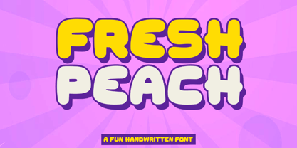 Introducing "Fresh Peach" - a fun and bold handwritten font that brings a burst of energy and playfulness to your designs. With its vibrant and lively letterforms, Fresh Peach adds a delightful touch of creativity and excitement. There's some connected letters and some alternates that suitable for any graphic designs such as branding materials, t-shirt, print, business cards, logo, poster, t-shirt, photography, quotes .etc This font support for some multilingual. Also contains uppercase A-Z and lowercase a-z, alternate character, numbers 0-9, and some punctuation. If you need help, just write me! Thanks so much for checking out my shop!
 - Risoluto by Jawher Matmati,
$39.99 Risoluto is an italic font made to mimic the beautiful italic typefaces used in the 19th and 20th century by music publishers. It was based on an italic typeface found in a publication by Max Eschig from the 1950s. Hundreds of specimen for each glyph were studied and carefully drawn in a way to have a sharp rendering without losing any of the old charm. The oblique "g" is one of the characteristics of such old typefaces. Risoluto covers a large range of languages and symbols and offers stylistic alternates for numerals, contextual ligatures and music accidentals.