8,036 search results
(0.024 seconds)
- Goofy Wakle by Maulana Creative,
$14.00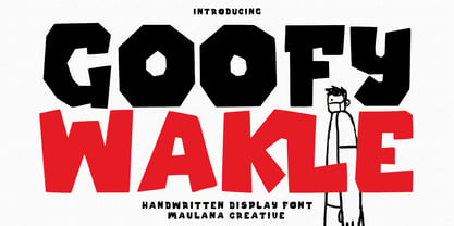 Berthillas is an upright casual script font. With high contrast stroke, fun character. To give you an extra creative work. Berthillas font support multilingual more than 100+ language. This font is good for logo design, Social media, Movie Titles, Books Titles, a short text even a long text letter and good for your secondary text font with sans or serif. Make a stunning work with Berthillas font. Cheers, Maulana Creative
 - MC Cluchy by Maulana Creative,
$14.00 Cluchy playful display font. Heavy stroke, fun character with a bit of ligatures. To give you an extra creative work. Cluchy playful display font support multilingual more than 100+ language. This font is good for logo design, Social media, Movie Titles, Books Titles, a short text even a long text letter and good for your secondary text font with script or serif. Make a stunning work with Cluchy playful display font.
 - Suerte by Resistenza,
$39.00 Say hello to Suerte. This new typeface with inverted contrast and bifurcated serifs was inspired by Caslon’s Italian type and by Aldo Novarese’s Estro, published by the turinese foundry Nebiolo. Our aim was to develop a wood type typeface adding a new personality incorporating Tuscan serifs. The complete alphabet was designed with a flat long brush and Indian ink and then vectorized. Suerte contains a big set of icons and dingbats.
 - Epistula by JOEBOB graphics,
$30.00 Containing over 100 ligatures, Epistula is a loosely written font, resembling my own natural way of writing. It has a nice flow and the pointy tail-ends give it a certain speed. Creating Epistula has been a long process, but returning to the drawing board a few times has – in my humble opinion – paid off. This font comes in two weights: regular and medium. Because sometimes one flavour just isn’t enough…
 - Hatchira by Maulana Creative,
$13.00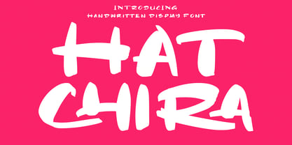 Hatchira is a Japan vibes handwritten display font. With reverse contrast stroke, fun character. To give you an extra creative work. Hatchira font support multilingual more than 100+ language. This font is good for logo design, Social media, Movie Titles, Books Titles, a short text even a long text letter and good for your secondary text font with sans or serif. Make a stunning work with Hatchira font. Cheers, Maulana Creative
 - Voltura by Maulana Creative,
$13.00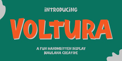 Voltura is a handwritten display font. With sharp bold stroke, fun character. To give you an extra creative work. Voltura font support multilingual more than 100+ language. This font is good for logo design, Social media, Movie Titles, Books Titles, a short text even a long text letter and good for your secondary text font with sans or serif. Make a stunning work with Voltura font. Cheers, Maulana Creative
 - Tilda by Etewut,
$30.00 Tilda is a sans serif typeface with big potential. It’s gonna be your daily font, because it perfectly fits to different tasks. Tilda is good as long text but also cool as eye-catch title. This font can be like human ages: childhood, adolescence, youth, adulthood and maturity: stylish THIN, fancy LIGHT, great REGULAR, golden BOLD, brilliant HEAVY And beautiful Isabella Bersellini created illustrations, say her hello! http://www.isabellabersellini.com
 - Swanville by Ingrimayne Type,
$5.00 Swanville developed as part of a train font that eventually became LetterTrain. The letters of Swanville are bold, have a funny “serif” on the top but not on the bottom, and when the letters have interiors, the interior has the shape of the letter. Lower-case letters are smaller versions of the upper-case letters. Because development of this face stopped long ago, it has a limited character set.
 - Gumpops by Maulana Creative,
$13.00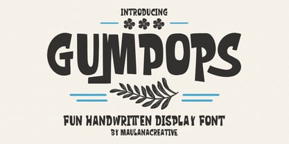 Gumpops is a cute handwritten display font. With bold sharp stroke, fun character. To give you an extra creative work. Gumpops font support multilingual more than 100+ language. This font is good for logo design, Social media, Movie Titles, Books Titles, a short text even a long text letter and good for your secondary text font with sans or serif. Make a stunning work with Gumpops font. Cheers, Maulana Creative
 - Bosque Line by Asenbayu,
$15.00 Bosque Line is a condensed display font that has an attractive appearance that brings you to a modern urban feel. Inspired by the long exposure of tree trunks in forest, Bosque line letters are designed with tall and clean shapes. Alternate and ligature features are available to make your work more attractive. It's perfect for your projects such as: posters, logos, book covers, social media posts and many more. Thank you!
 - Broukha by Maulana Creative,
$15.00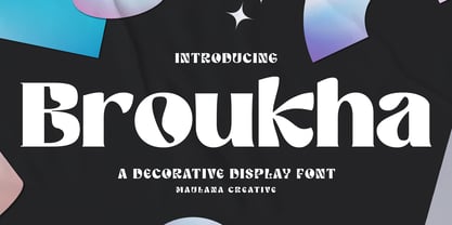 Broukha is a decorative display font. With bold contrast stroke and fun character. To give you an extra creative work. Broukha font support multilingual more than 100+ language. This font is good for logo design, Social media, Movie Titles, Books Titles, a short text even a long text letter and good for your secondary text font with sans or serif. Make a stunning work with Broukha font. Cheers, Maulana Creative
 - Badoni by Chank,
$49.00"Grunge Typography? I invented it!" claims Chank Diesel. Badoni was created in 1993 for use in CAKE, a fanzine that reveled in grunge music. As creative director of CAKE, Chank wanted the magazine's design to reflect the music it glorified. Kurt Cobain was alive and miserable. Soundgarden had long hair. Seattle was everywhere. Chank's answer was Badoni, a gritty and distressed typeface that is a sign of the grunge glory years. - Norsics by Maulana Creative,
$12.00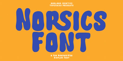 Norsics is a casual modern handwritten display font. With wavy bold stroke, fun character. To give you an extra creative work. Norsics font support multilingual more than 100+ language. This font is good for logo design, Social media, Movie Titles, Books Titles, a short text even a long text letter and good for your secondary text font with sans or serif. Make a stunning work with Norsics font. Cheers, Maulana Creative
 - Arthur Serif by Gatype,
$16.00 Arthur is an edgy modern serif font. The long, classic serifs make for a unique high-contrast typeface that's all stylish. It appears regularly and boldly with lower and uppercase letters, numbers, punctuation marks plus multilingual letters. A must have for every modern graphic designer now! Features Include: Uppercase and lowercase Number Punctuation (OpenType Standard) Accents (Multilingual Characters) Alternative Style Ligatures and Style Sets Works on PC and Mac Simple installation
 - Betm Rounded by Typesketchbook,
$39.00 The typeface of Betm Rounded is based on the successful Betm font family by font foundry Typesketchbook. Font designer Chatnarong Jingsuphatada created Betm as a Rounded version to Betm. Both type families consist of ten weights plus with italic versions. Betm’s typeface has a friendly and modern sans serif appearance. This modern geometric font is very legible and can be used for headlines as well as small and long text.
 - Melancholie by Anmark,
$18.00 I’m pleased to introduce my handwritten font Melancholie. Melancholie is a calm and elegant font. It is perfect for invitations, cards, branding projects, packaging, magazines, social media, logos, signatures, quotes, headers and many more... You can use it for long texts or short phrases. The modern calligraphy uppercase letters are ideal for monograms and logos. Melancholie supports Spanish, German, French, Italian, Portuguese, Swedish, Norwegian, Danish, Finnish and others.
 - Spaziel Serif Round by Maulana Creative,
$12.00 Spaziel Round serif is a modern serif font. With regular round stroke, and fun character. To give you an extra creative work. Spaziel font support multilingual more than 100+ language. This font is good for logo design, Social media, Movie Titles, Books Titles, a short text even a long text letter and good for your secondary text font with Script typeface. Make a stunning work with Spaziel font. Cheers, MaulanaCreative
 - Debright by Maulana Creative,
$13.00 Debright is a fat handwritten display font. With low bold contrast stroke, fun character. To give you an extra creative work. Debright font support multilingual more than 100+ language. This font is good for logo design, Social media, Movie Titles, Books Titles, a short text even a long text letter and good for your secondary text font with sans or serif. Make a stunning work with Debright font. Cheers, Maulana Creative
 - Soul Leo by Otto Maurer,
$16.00 Soul Leo ist a special Version of my font „Soul“ (soul ultra black). For a long Time i want to make a Font like this. Before FL6 that was impossible. I know it is a big File Size for a Font with all the Graphics but i need a Font like this for a LadyProjekt. And so i did it myself. I hope you like it as i do!
 - Elsewhere by Comicraft,
$29.00 Someday, a long time from now, in a galaxy not so very far away, you'll find yourself Suddenly transported to the nether-realms of Elsewhere, bathed in the light of the mystic moons of Meanwhile... While you're waiting for that day, check out this font by John "JG" Roshell. It may not provide you with the same transcendental experience, but JG assures us that it really is the next best thing.
 - Collibryums by Maulana Creative,
$11.00 Collibryums is a modern signature font inspired by social media advertising and product titles. It has Opentype features Ligatures. Collibryums support multilingual more than 100+ language. This font is good for logo design, Social media, Movie Titles, Books Titles, a short text even a long text letter and good for your secondary text font with sans or serif. Make a stunning work with Collibryums signature font. Cheers, MaulanaCreative
 - Monster Movies JNL by Jeff Levine,
$29.00 A 1967 ad for Aurora “Monster Scenes Custom Builder Kits” featured the drippy, gooey hand lettering long associated with science fiction and horror movies. The letters in the ad were auto-scanned and additional characters were completed with the end result being a horror-themed font with sharper angles and lines instead of drips. This is now available as Monster Movies JNL, which is available in both regular and oblique versions.
 - Trigar by Maulana Creative,
$13.00 Trigar is an all caps font. With 2 style stroke, fun character. To give you an extra creative work. Trigar font support multilingual more than 100+ language. This font is good for logo design, Social media, Movie Titles, Books Titles, a short text even a long text letter and good for your secondary text font with script or handwriting. Make a stunning work with Trigar font. Cheers, Maulana Creative
 - Acardia by Letteralle,
$23.00 I'd like to introduce you Acardia! a stunnig signature font. Font with natural flow and feminine style. Each letter is deliberately imperfect to make it look more natural and charming. Acardia comes with multilingual support, long range ligature, and ending swash from a-z. Acardia is perfect for many design needs such as merch, T-shirts, titles, book covers, social media posts, websites, events, and many more. Enjoy the font, Thanks!
 - Jantze by Fontosaurus,
$19.95The Jantze font is a project undertaken by Dan Bailey of Fontosaurus and Michael Jantze, creator of the nationally-syndicated comic strip, The Norm. All their royalties from the font will go to The Lance Armstrong Foundation. For those that have been living under a rock for the last five years, Lance is a professional bike racer that overcame advanced testicular cancer to not only come back to his sport, but to dominate its premiere event, the Tour de France. In climbing to the top of his sport, he has become a legend among cyclists and a beacon of hope for those battling cancer and their families. His foundation provides financial grants to researchers working to improve our odds against the disease, individuals stricken with cancer, and survivors of the disease that are advocates for survivorship issues in their communities. Michael Jantze and Dan Bailey would like you to consider the quote from Ralph Waldo Emerson that brought us to this project: "The purpose of life is not to be happy. It is to be useful, to be honorable, to have it make some difference that you have lived and lived well. We hope that you will help us help Lance Armstrong's legacy be more than that of just sports legend. We hope that you will help those that may someday help you as much as we hope that you will never have to suffer the ravages of cancer. We hope. - Compendium by Sudtipos,
$99.00 Compendium is a sequel to my Burgues font from 2007. Actually it is more like a prequel to Burgues. Before Louis Madarasz awed the American Southeast with his disciplined corners and wild hairlines, Platt Rogers Spencer, up in Ohio, had laid down a style all his own, a style that would eventually become the groundwork for the veering calligraphic method that was later defined and developed by Madarasz. After I wrote the above paragraph, I was so surprised by it, particularly by the first two sentences, that I stopped and had to think about it for a week. Why a sequel/prequel? Am I subconsciously joining the ranks of typeface-as-brand designers? Are the tools I build finally taking control of me? Am I having to resort to “milking it” now? Not exactly. Even though the current trend of extending older popular typefaces can play tricks with a type designer’s mind, and maybe even send him into strange directions of planning, my purpose is not the extension of something popular. My purpose is presenting a more comprehensive picture as I keep coming to terms with my obsession with 19th century American penmanship. Those who already know my work probably have an idea about how obsessive I can be about presenting a complete and detailed image of the past through today’s eyes. So it is not hard to understand my need to expand on the Burgues concept in order to reach a fuller picture of how American calligraphy evolved in the 19th century. Burgues was really all about Madarasz, so much so that it bypasses the genius of those who came before him. Compendium seeks to put Madarasz’s work in a better chronological perspective, to show the rounds that led to the sharps, so to speak. And it is nearly criminal to ignore Spencer’s work, simply because it had a much wider influence on the scope of calligraphy in general. While Madarasz’s work managed to survive only through a handful of his students, Spencer’s work was disseminated throughout America by his children after he died in 1867. The Spencer sons were taught by their father and were great calligraphers themselves. They would pass the elegant Spencerian method on to thousands of American penmen and sign painters. Though Compendium has a naturally more normalized, Spencerian flow, its elegance, expressiveness, movement and precision are no less adventurous than Burgues. Nearing 700 glyphs, its character set contains plenty of variation in each letter, and many ornaments for letter beginnings, endings, and some that can even serve to envelope entire words with swashy calligraphic wonder. Those who love to explore typefaces in detail will be rewarded, thanks to OpenType. I am so in love with the technology now that it’s becoming harder for me to let go of a typeface and call it finished. You probably have noticed by now that my fascination with old calligraphy has not excluded my being influenced by modern design trends. This booklet is an example of this fusion of influences. I am living 150 years after the Spencers, so different contextualization and usage perspectives are inevitable. Here the photography of Gonzalo Aguilar join the digital branchings of Compendium to form visuals that dance and wave like the arms of humanity have been doing since time eternal. I hope you like Compendium and find it useful. I'm all Spencered out for now, but at one point, for history’s sake, I will make this a trilogy. When the hairline-and-swash bug visits me again, you will be the first to know. The PDF specimen was designed with the wonderful photography of Gonzalo Aguilar from Mexico. Please download it here http://new.myfonts.com/artwork?id=47049&subdir=original
 - P22 Frenzy by IHOF,
$24.95 Frenzy evolved from a logo for a Gen X product offered by a very staid company. It is a sythesis of Classic Roman Capitals and American Typewriter—with a bit of frenetic energy stirred in. It is dedicated to the designers son, who is the epitome of the font... contained chaos.
 - Adam Kubert by Comicraft,
$49.00 Joe Kubert's son Adam has a story or two to tell as well; the AdamKubert font, based on Adam's own pen lettering in BATMAN/PREDATOR, was created by Comicraft for Marvel's ULTIMATE X-MEN series. Comicraft fonts are created BY comic book letterers FOR lettering comic books. Accept no substitutes!
 - British Stencil JNL by Jeff Levine,
$29.00 British Stencil JNL was sketched from images of a vintage stencil set made by Reese and Sons of England that was being sold on ebay. In truth, this is a semi-stencil, as some of the characters are solid; lacking the breaks in the letter shapes so typical of stencil alphabets.
 - Bithead by Comicraft,
$19.00 INFO DUMP: Get jacked into cyberspace direct feed, no buffer with this hotwired font by John 'Son of a Glitch' Roshell. Initial upload to Ghost Rider 2099 was prematurely aborted, but not before the downramp pusbag Ozymandias pirated a jagged beta version and assaulted the Uncanny X-Men during 'Onslaught.'
 - Dear Sarah Pro by Betatype,
$119.00 Carefully considered letters written long-hand, sealed in an envelope and sent across continents were once the only connection for distant friends and lovers. Dear Sarah is a type that evokes the emotion of those handwritten messages. Using alternates, ligatures and a complex system for randomization and natural connected characters, Dear Sarah seeks to push the boundaries of digital type. The guiding question that drove the design of Dear Sarah was whether it was possible to create a natural looking script that worked well in running text. Hand-written types often work for two or three words, but as soon you you look at them in a paragraph, their unnatural textures make them feel contrived. As one of the first serious types to explore OpenType for a connected script, Dear Sarah uses a unique system to create natural connections. Often script types rely on one connecting point to make sure that all their characters fit together properly. Characters that naturally connect much higher, such as the ‘o’ or ‘v’ are distorted to connect at the same point as an ‘a’ or a ‘c’. Dear Sarah uses multiple sets of lower-case characters to connect at multiple points, creating a much more natural looking script. OpenType is also used to create variety, by using randomization techniques to insert disconnected characters as well as alternates, ligatures, swashes and ink blots to create a natural rhythm across multiple lines.
 - Rotis Sans Serif by Monotype,
$45.99 Rotis is a comprehensive family group with Sans Serif, Semi Sans, Serif, and Semi Serif styles, for a total of 17 weights including italics. The four families have similar weights, heights and proportions; though the Sans is primarily monotone, the Semi Sans has swelling strokes, the Semi Serif has just a few serifs, and the Serif has serifs and strokes with mostly vertical axes. Designed by Otl Aicher for Agfa in 1989, Rotis has become something of a European zeitgeist. This highly rationalized yet intriguing type is seen everywhere, from book text to billboards. The blending of sans with serif was almost revolutionary when Aicher first started working on the idea. Traditionalists felt that discarding serifs from some forms and giving unusual curves and edges to others might be something new, but not something better. But Rotis was based on those principles, and has proven itself not only highly legible, but also remarkably successful on a wide scale. Rotis is easily identifiable in all its styles by the cap C and lowercase c and e: note the hooked tops, serifless bottoms, and underslung body curves. Aicher is a long-time teacher of design and has many years of practical experience as a graphic designer. He named Rotis after the small village in southern German where he lives. Rotis is suitable for just about any use: book text, documentation, business reports, business correspondence, magazines, newspapers, posters, advertisements, multimedia, and corporate design.
 - Ongunkan Camunic Script by Runic World Tamgacı,
$60.00 The Camunic language is an extinct language that was spoken in the 1st millennium BC in the Valcamonica and the Valtellina in Northern Italy, both in the Central Alps. The language is sparsely attested to an extent that makes any classification attempt uncertain - even the discussion of whether it should be considered a pre–Indo-European or an Indo-European language has remained indecisive. Among several suggestions, it has been hypothesized that Camunic is related to the Raetic language from the Tyrsenian language family, or to the Celtic languages. The extant corpus is carved on rock. There are at least 170 known inscriptions, the majority of which are only a few words long. The writing system used is a variant of the north-Etruscan alphabet, known as the Camunian alphabet or alphabet of Sondrio. Longer inscriptions show that Camunic writing used boustrophedon. Its name derives from the people of the Camunni, who lived during the Iron Age in Valcamonica and were the creators of many of the stone carvings in the area. Abecedariums found in Nadro and Piancogno have been dated to between 500 BC and 50 AD. The amount of material is insufficient to fully decipher the language. Some scholars think it may be related to Raetic and to Etruscan, but it is considered premature to make such affiliation. Other scholars suggest that Camunic could be a Celtic or another unknown Indo-European language.
 - Night Train by FontMesa,
$19.95 Night Train is a new font built from the ground up; while Night Train may resemble an old classic wood type there are a few lines that make this font a little more modern setting it apart from other wood type revivals. If you're a railroad enthusiast you're sure to enjoy the steam locomotive graphic located on the less than and greater than keys on all versions of this font, due to the fine detail of this train illustration the best printing results will be at 600dpi or higher on a laser printer. An alternate K and R are within the Night Train fonts, for Win Type1 these alternates are on the left and right bracket keys, for Truetype and OpenType you may access the alternates by using the Character Map in Windows or Adobe Illustrator, for OpenType you may also find them on the stylistic alternates page of the glyph map in Illustrator. There's something new with Night Train that the sign making people will love, for the first time FontMesa is pleased to offer a block shadowed version in four directions. One fill font is all that is needed for all four open faced fonts, you'll need an application that works in layers in order to use the fill font with the open faced fonts, simply place the fill font in its own layer then move it behind one of the open faced fonts of Night Train. The Night Train name has been on my list to use as a font name for a few years, a friend from years ago used to sail his boat in the Mackinac race from Chicago to Mackinac Island, the name of that boat was the Night Train. Watching the 2010 Olympic four man U.S. bobsled team win gold with their sled also called Night Train has inspired me to complete this font.
 - Erotique by Zetafonts,
$39.00 Designed by Cosimo Lorenzo Pancini and Mariachiara Fantini with the help of Solenn Bordeau, Erotique is an evolution of the original design by Zetafonts for Lovelace, that challenges its romantic curves with the glitchy and fluid aesthetic of trans-modern neo-brutalist typography. The seductive "evil serif" look of the Pheimester-like Oldstyle letter shapes is made edgier by the quirky connections and unexpected calligraphic twirls that marry digital distortions to traditional penmanship. Sensuous but sharp, Erotique speaks the language of teasing, and unrequited love, over-the-top and restrained like a show of Japanese Kinbaku, and beautifully heartbreaking like a friendzone valentine. Designed for display use, this high-contrast serif typeface is ready to take center stage in projects where a subtle elegance and an edgy, aggressive touch are required. For branding use it is paired by a Erotique Ornaments, a set of interlocking patterns based on the font letter-shapes, allowing for striking packaging, digital and ambient design. For editorial use it can add a sharp sensuality to logos and titles thanks to an impressive array of alternate glyphs, subtle ligatures and a set of whiplike fleurons, collected in the Erotique Flourishes pack. The typeface has been developed in the regular, medium and bold weight plus a monoline version, all of which have been paired with an Alternate version to give immediate access the more exotic alternate letterforms. With a character set of over five hundred glyphs, all the the weights of Erotique cover almost 200 languages using extended latin, and include advanced Open Type features as Stylistic Alternates, Standard and Discretionary Ligatures, Positional Numerals, Swash and Case Sensitive Forms. If you are a typeface lover, be warned: Erotique could be your fatal attraction!
 - Divina Proportione by Intellecta Design,
$29.00 Divina Proportione is based from the original studies from Luca Pacioli. Luca Pacioli was born in 1446 or 1447 in Sansepolcro (Tuscany) where he received an abbaco education. Luca Pacioli was born in 1446 or 1447 in Sansepolcro (Tuscany) where he received an abbaco education. [This was education in the vernacular (i.e. the local tongue) rather than Latin and focused on the knowledge required of merchants.] He moved to Venice around 1464 where he continued his own education while working as a tutor to the three sons of a merchant. It was during this period that he wrote his first book -- a treatise on arithmetic for the three boys he was tutoring. Between 1472 and 1475, he became a Franciscan friar. In 1475, he started teaching in Perugia and wrote a comprehensive abbaco textbook in the vernacular for his students during 1477 and 1478. It is thought that he then started teaching university mathematics (rather than abbaco) and he did so in a number of Italian universities, including Perugia, holding the first chair in mathematics in two of them. He also continued to work as a private abbaco tutor of mathematics and was, in fact, instructed to stop teaching at this level in Sansepolcro in 1491. In 1494, his first book to be printed, Summa de arithmetica, geometria, proportioni et proportionalita, was published in Venice. In 1497, he accepted an invitation from Lodovico Sforza ("Il Moro") to work in Milan. There he met, collaborated with, lived with, and taught mathematics to Leonardo da Vinci. In 1499, Pacioli and Leonardo were forced to flee Milan when Louis XII of France seized the city and drove their patron out. Their paths appear to have finally separated around 1506. Pacioli died aged 70 in 1517, most likely in Sansepolcro where it is thought he had spent much of his final years. De divina proportione (written in Milan in 1496–98, published in Venice in 1509). Two versions of the original manuscript are extant, one in the Biblioteca Ambrosiana in Milan, the other in the Bibliothèque Publique et Universitaire in Geneva. The subject was mathematical and artistic proportion, especially the mathematics of the golden ratio and its application in architecture. Leonardo da Vinci drew the illustrations of the regular solids in De divina proportione while he lived with and took mathematics lessons from Pacioli. Leonardo's drawings are probably the first illustrations of skeletonic solids, an easy distinction between front and back. The work also discusses the use of perspective by painters such as Piero della Francesca, Melozzo da Forlì, and Marco Palmezzano. As a side note, the "M" logo used by the Metropolitan Museum of Art in New York City is taken from De divina proportione. “ The Ancients, having taken into consideration the rigorous construction of the human body, elaborated all their works, as especially their holy temples, according to these proportions; for they found here the two principal figures without which no project is possible: the perfection of the circle, the principle of all regular bodies, and the equilateral square. ” —De divina proportione
 - Bango Pro by JCFonts,
$30.00 Bango Pro is a lively, heavyweight font with a strong cartoon feel, perfect for poster design, packaging, and anything that needs to draw attention - in an informal way. Originally released with uppercase and unicase characters only, this new version (commissioned in 2013 by a London-based design agency) includes lowercase characters and some additional OpenType features, like stylistic alternates, fractions, localized forms, among others.
 - Agafia by ParaType,
$25.00 Agafia handwriting script is based on the hand of Agafia Karpovna Lykova - the last member of the Old Believer family lived like an hermit in the Khakass taiga. The face is developed for the new book on the history of Lykov's family by Lev Cherepanov. It's built in OpenType format with a contextual substitution of letterforms and specific ligatures. Designer - Gennady Fridman. Released by ParaType in 2009.
 - Thursday Afternoon by Bogstav,
$15.00 Nothing is as it really should be with Thursday Afternoon. The x-height is jumpy, letters are not in their right places, lines are crunchy, serifs are uneven...the list goes on...but in the end, Thursday Afternoon turns out as a legible and functional font. It has most of the moves from classic serif fonts, but then again it has a mind of its own!
 - DF Staple TXT by Dutchfonts,
$33.00 StapleTXT is a transformation from the monospaced typewriter font Staple mono into a text type. The 'mono' skeleton was used as much as possible but some characters were slightly altered in order to obtain more regularity without losing its specific typewriter atmosphere: little variation in character widths. The font has lining figures and works very well as text system in combination with the Staple mono.