10,000 search results
(0.054 seconds)
- MVB Solitaire Pro by MVB,
$39.00 A typeface is a tool. Sure, there are frilly fonts that are more art than craft, showy faces that exist merely to call attention to themselves. But, in the end, any functional typeface worth its salt lives to serve one thing first: the text, the content. Everything else—the fashion of the moment, the allure of individual words and letters—is secondary. MVB Solitaire™ epitomizes this universal typographic mandate. As a tempered sans serif somewhere between a humanist and a gothic, MVB Solitaire captures a 21st-century neutrality. But practical doesn’t have to mean banal. MVB Solitaire has a soul. While some “neutral” type is dead the moment the ink hits the page, MVB Solitaire delivers text that feels lively, contemporary, relevant. Readers will not tire of this type. Behind the useful exterior is an arsenal of thoughtful technical features. It’s no surprise that this family’s creator, Mark van Bronkhorst, was first a graphic designer before becoming a type designer. Mark built all the goodies into MVB Solitaire that he would appreciate as a user: case-sensitive punctuation; alternate forms that can be invoked individually or together; oldstyle and lining figures in both tabular and proportional widths; slightly shorter lining figures that don’t stand out in running text, but also cap-height figures for all-cap settings; and the ability to speak nearly any Latin-based language. MVB Solitaire aspires to be the sort of workhorse that a designer keeps installed on their system at all times. It is a family bound to have a permanent spot in the font menu, always at the ready for projects (those most common of all) where the typography mustn’t mask the message. It has that quality that all truly useful typefaces have: the capacity to get the job done without getting in the way.
 - Salma Alianda Script by FadeLine Studio,
$23.00 Introduce Salma Alianda Script! This is a modern font script. This font comes with a thin and italic style, made very slowly to get a neat result so it will create a very elegant impression on this font. Available 653 glyphs in it, so you can get used it freely and follow the current trend. With a style like this, this font will be suitable in use for logo's, branding projects, homeware designs, product packaging, mugs, quotes, posters, shopping bags, logo's, t-shirts, book covers, name card, invitation cards, greeting cards, and all your other lovely projects. You can use this font for your job very easily. Because there are many features in it. Contains the complete set of lower and uppercase letters, punctuation, numbers, web fonts, and multilingual support. This font also includes several ligatures and alternative style Stylistic Set For those of you who have software that is capable of working OpenType (Corel Draw / Photoshop / Illustrator / InDesign).
 - Starplayer by Twinletter,
$14.00 The typeface Star Player was created with a powerful and bold idea in mind. Your project will become instantly unique, gorgeous, elegant, and strong as a result of adopting this typeface. Because of its elegant and flexible shape, this font is perfect for use as a title or sentence text; everything will seem lovely and neat, and it will, of course, remain clear and strong. So, what exactly are you waiting for? This font is perfect for games, sporting events, branding, banners, posters, movie titles, book titles, quotes, logotypes, and more. of course, your various design projects will be perfect and extraordinary if you use this font because this font is equipped with a complimentary font family, both for titles and subtitles and sentence text, start using our fonts for your amazing projects.
 - Picture Yourself by Linotype,
$29.99Create your own world with the Picture Yourself collection! Picture Yourself is a graphic image collection, which functions a font family instead of hundreds of EPS files. The family is made up of 24 different symbol typefaces. Designed by the collaborative effort of Karin and Peter Huschka, both living in Germany, Picture Yourself was a winner in the 2003 International Type Design Contest, sponsored by Linotype GmbH. The symbol library found in Picture Yourself offers an astounding array of high-contrast, simple forms, which may be used happily either separately or together in your layouts. Just as the fonts themselves stem from two designers working in collaboration, the imagery of the collection itself stems from two different influences. In large part, the font family was inspired by work displayed in the Frankfurt-based German Architecture Museum's 2003 Oscar Niemeyer exhibition. The photographs and sketches that were displays there inspired the first ideas for the Picture Yourself world of images. More of the typeface's design, as well as its name, were inspired by the underlying philosophy of the Beatles' music, especially the classic song from Lennon and McCartney, "Lucy In The Sky With Diamonds." In comparison with other large pictographic type collections, all of the characters in Picture Yourself fonts share the same horizon. The glyphs themselves are also drawn so that many of them can be combined with one another, creating tall or wide decorative compositions. Additionally, the proportions of the forms of the pictographs are aligned with various industry standards, in order to harmonize workflow. Picture Yourself Portraits (3:4), Landscapes (6:4), Cinema (9:4), and Panorama (12:4) each adhere to one of several photo or video formats. The Picture Yourself family of fonts can best be used with graphics applications like Adobe Photoshop or Illustrator, where different characters may be assigned to different layers, each with their own color. - Odile by Kontour Type,
$50.00 Odile is a text typeface with bracketed head and bracket-free bottom lower case serifs, a quality that counters rigidness most traditional slab serif typefaces possess. This contemporary design draws inspiration from an experimental typeface named Charter originally designed by the American book and type designer William Addision Dwiggins. It consisted of an informal lowercase alphabet, a narrow seemingly non-inclined vertical letter with script attributes, featuring non-joining letterforms. Dwiggins’ contemplated Charter as the italic companion to Arcadia, Experimental No. 221. The Charter project progressed sporadic stalled during the Second World War and came to a halt in 1955. Charter remained incomplete and was never commercially released. Assessing Charter’s whimsical design, its fragments were rethought and developed into a comprehensive text family. Odile Upright Italic reveals recognizable similarities shared by Dwiggin’s Charter and defines the design approach for the family. The steep calligraphic outstroke and low junctions off the stem as in the upright italic “n” or “r”, for example, are gradually lessened in the italic and moved up for the roman weights. The six optically balanced weights range from the delicate Light to stark Black, accompanied by display variants with feminine flair and ardent Ornaments. Two sorts of Initials, one amplified with interweaving swashes, the other more restrained, both are clearly derived from the Upright Italic. This mid-contrast serif offers a wide range of tools for text and display typographies with a palette of strict to playful. This family shines in magazine, book and display use. The graceful serifed type harmonizes perfectly with Elido, Odile’s sans companion. Sans and serif share the family array and OpenType features in perfect tune. Odile offers an extensive character set, numerous OT features including roman and italic Small Caps, five sets of numerals, alluring ligatures, and many more. OT stylistic variants (with accents) offer a one-story “a” for the roman weights, alternate “g” and “s” designs for the italics, and a variant “s” for the Upright Italic.
 - Favio by Anastasia Kuznetsova,
$17.00 I present to you an elegant, playful and very harmonious duo of serif fonts "Favio", inspired by ancient printed texts. It looks great on its own as part of a minimalist design. Play with letters to get different effects. The font "Favio" is guaranteed to give your text an individual and very attractive look. Great for branding, wedding invitations, packaging, quotes and labels. And it is also a bold choice of typography for the design of logos, album covers, illustrations, children's books, posters and much more. Font Features: - A-Z; a-z character set; - 1 language (English); - numbers and punctuation marks, symbols. Fonts can be opened and used in any software that can read standard fonts, even in MS Word. No special software is required to get started. It is recommended to use it in Adobe Illustrator or Adobe Photoshop. Made with love and magic ♡ Thank you for reading it, and do not hesitate to send me a message if you have any questions! ~ Anastasia
 - P22 Posada by P22 Type Foundry,
$24.95 Mexican printmaker Jose Guadalupe Posada (1851-1913) created a massive variety of material—broadsheets, cards, advertisements, posters, etc.—which largely represented a defense of the common man and a manifestation of the horrible and gruesome events of the day. Posada often cut his own lettering that looked like more decorative versions of Gothic wood types. His most notable imagery comes from his Calaveras celebrating the Day of the Dead. Calaveras often represent effigies of living people depicted as skeletons going about their daily activities. These are often humorous and playful in a way that helps bridge this world with the beyond. This font family contains two small caps style fonts and one Extras font containing 60 images.
 - Assinatura by Letterara,
$12.00 Assinatura comes from Portuguese which means signature. Assinatura is a hand drawn script with a natural style. This signature script moves with ease across any design, and adds a large dose of confidence and style.
 - Wingardium by Fromletterel,
$12.00 Wingardium is a stylish and delicatw script font, it is suitable for any project such as logo, branding, label, photigraohy, watermark, special events and all kind of project that needs natural writing vibe.
 - FunFair by Andrew Footit,
$14.00 This fun sans-hand typeface gives your designs and layouts a personal touch that leaves a smile. FUNFAIR has two weights each with italics. FunFair has tall letters and tight kerning to give a natural hand written style. It’s great for posters, cards and headings but also versatile enough for many kinds of typographic layouts.
 - Dime Museum by Solotype,
$19.95This idea of "wrong way weights" was originally called French Clarendon by the Americans, Italienne by the French, and American by the Italians. Sounds like nobody wanted to own up to it. When it was revived by ATF in 1933, it was given the name P. T. Barnum. Many variations have appeared. Dime Museum is an old wood type. - Terrapin by Missy Meyer,
$12.00 Introducing Terrapin! I named this after listening to a song called "Terrapin on a Tightrope." Considering the fact that a terrapin is a kind of turtle, it makes that song title seem pretty harrowing! This font has heavy roots in one of my favorite lettering styles. It's rough, scrappy, and likes to do its own thing. It has a full uppercase and lowercase set, numbers, punctuation, and lots of extended Latin characters for language support. It also includes alternate versions of 17 lowercase letters. Where Terrapin really shines is in the ligatures. I've written separate two- and three-letter combined forms for some of the most common letter combinations, and a few uncommon ones to boot. There are almost 100 ligatures in here, all PUA-encoded so everyone can access them (and also coded so if your software does automatic ligature replacement, they'll pop right in).
 - Andesta by IM Studio,
$19.00 Andesta in a beautiful handwritten style with a touch of love style. Equipped with 391 glyphs Andesta is perfect for branding projects, home appliance design, product packaging, use in business cards, invitation cards, etc. Simply as a stylish text overlay onto a background image or anything else that needs a touch of elegance.
 - Janagrace by Jonahfonts,
$40.00 Janagrace is designed for birthday, holiday cards and can be used effectively in other applications for that calligraphy appearance. Regular: Contain ONLY Regular-Caps. Swash: Swash-Caps with NO Regular Caps. OT Swash: Contain BOTH Regular and Swash-Caps. Swash LIGHT: Swash-Caps with NO Regular Caps. Janagrace, Agile, Charming and Lovely.
 - Katalina by Shape Studio,
$12.00 Katalina Font is a new modern script calligraphy font with an irregular baseline. Trendy and feminine style.Katalina Font Script looks lovely on wedding invitations, thank you cards, quotes, greeting cards, logos, business cards and more. Perfect for using in ink or watercolour. Including initial and terminal letters, alternates, ligatures and multiple language support.
 - Greatness Serif by Shape Studio,
$14.00 Greatness font is a new modern serif calligraphy font with an irregular baseline. Trendy and feminine style.Greatness font looks lovely on wedding invitations, thank you cards, quotes, greeting cards, logos, business cards and more. Perfect for using in ink or watercolour. Including initial and terminal letters, alternates, ligatures and multiple language support.
 - Lovan by Sign Studio,
$15.00 Lovan will bring an elegant, romantic and warm feeling of love to your design project. Equipped with a choice of Alternative Characters and Discretionary Ligatures, all of which are PUA Encoded. Lovan will be a versatile font because it can be used as a Display Font and is still good for writing text.
 - Quindelia by OCSstudio,
$17.00 Quindelia is a beautiful font with lots of love and affection in it, unique ligatures, smooth and elegant strokes, containing six alternatives in it. Quindelia is perfect for weddings, events, invitations, cards, quotes, displays, logos, blog sliders, special addresses, stamps, packaging, greeting cards, romance, etc. ** Thank you for downloading, hopefully it’s useful **
 - Clarinta by Putracetol,
$19.00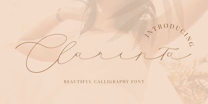 Clarinta, a beautiful script font. a lovely, elegant and sweet script font. Clarinta is perfect for styling logos, stationery, wedding event, invitation, quote, social media, websites and so much more! Come with Opentype feature with a lot of alternates, its help you to make great lettering.This font is also support multi language.
 - SK Boncuk by Salih Kizilkaya,
$9.99 SK Boncuk is a very special font family I designed for my pet. Bead is a very smart and special rabbit. It can understand all commands and do whatever is said. It is very lively and fun in his daily life, but also monotonous. For this reason, I designed a fun font for him, with a single weight but with surprises. This font represents Boncuk's fun but monotonous life. SK Boncuk offers full support for the Latin alphabet and includes all the typographic elements you will need. This font family consists of 8 different fonts and 3288 glyphs and it supports hundreds of different languages thanks to the characters it contains.
 - Silentina by Typodermic,
$11.95 Silent films evoke a sense of nostalgia that is as timeless as the era itself. While the stars of silent cinema may have faded into the past, their influence is still felt in modern-day art, fashion, and design. Silentina is a typeface that embodies the spirit of the silent film era, inspired by the intertitles that were used to convey crucial information to audiences during these films. Buster Keaton, Mary Pickford, Clara Bow, and Rudolph Valentino all graced the silver screen with their emotive faces during the silent film era. These icons used their expressions to convey a range of emotions that captivated audiences and made them fall in love with the magic of cinema. Intertitles, the brief messages that would appear on-screen during the film, were just as essential in conveying information to moviegoers. Silentina is a typeface that pays homage to the unsung heroes of the silent film era—the intertitles. It channels the glitz and glamour of the roaring twenties, taking us back to a time of flapper dresses, jazz music, and speakeasies. But Silentina isn’t just a typeface—it’s a portal to another era. It transports us to a time when movies were an escape from reality, and each trip to the cinema was a chance to lose ourselves in a world of adventure and romance. With Silentina, you can project your message in the same way that the stars of silent cinema projected theirs. This typeface captures the essence of a bygone era, bringing it to life in the modern world. Use it to convey plot information, set the scene, or add a touch of vintage charm to your design. Whatever your message, Silentina will help you communicate it in the same glitzy way as the intertitles of the silent film era. Most Latin-based European writing systems are supported, including the following languages. Afaan Oromo, Afar, Afrikaans, Albanian, Alsatian, Aromanian, Aymara, Bashkir (Latin), Basque, Belarusian (Latin), Bemba, Bikol, Bosnian, Breton, Cape Verdean, Creole, Catalan, Cebuano, Chamorro, Chavacano, Chichewa, Crimean Tatar (Latin), Croatian, Czech, Danish, Dawan, Dholuo, Dutch, English, Estonian, Faroese, Fijian, Filipino, Finnish, French, Frisian, Friulian, Gagauz (Latin), Galician, Ganda, Genoese, German, Greenlandic, Guadeloupean Creole, Haitian Creole, Hawaiian, Hiligaynon, Hungarian, Icelandic, Ilocano, Indonesian, Irish, Italian, Jamaican, Kaqchikel, Karakalpak (Latin), Kashubian, Kikongo, Kinyarwanda, Kirundi, Kurdish (Latin), Latvian, Lithuanian, Lombard, Low Saxon, Luxembourgish, Maasai, Makhuwa, Malay, Maltese, Māori, Moldovan, Montenegrin, Ndebele, Neapolitan, Norwegian, Novial, Occitan, Ossetian (Latin), Papiamento, Piedmontese, Polish, Portuguese, Quechua, Rarotongan, Romanian, Romansh, Sami, Sango, Saramaccan, Sardinian, Scottish Gaelic, Serbian (Latin), Shona, Sicilian, Silesian, Slovak, Slovenian, Somali, Sorbian, Sotho, Spanish, Swahili, Swazi, Swedish, Tagalog, Tahitian, Tetum, Tongan, Tshiluba, Tsonga, Tswana, Tumbuka, Turkish, Turkmen (Latin), Tuvaluan, Uzbek (Latin), Venetian, Vepsian, Võro, Walloon, Waray-Waray, Wayuu, Welsh, Wolof, Xhosa, Yapese, Zapotec Zulu and Zuni.
 - Touch Me by Latinotype,
$69.00 Touch Me is a Script hand-drawn style typeface—designed by Coto Mendoza—resulting from polyrhythmic exploration, sign deconstruction and altered calligraphic contrast plays with watercolour brush. Coto has been using these experimental calligraphy techniques when creating the catchwords for Macarons, the Boho Family, Bikini Season Script and Matcha Script and so forth. Touch Me was inspired by a character in a story written by Coto while attending a literary workshop with Ina Groovie in Santiago de Chile. The character is a tribal girl who lives on an island in the Caribbean. She is heir of ancestral knowledge and possesses wild beauty, very passionate and sensual: intense, strong and free. These features are reflected in the polyrhythm of the typeface's curves: an irregular baseline, variable x-height, different lengths of initial and terminal strokes (that sometimes expand and sometimes shrink) and amount of brush pressure that generates changes in contrast within the characters. This way, when composing, signs with stroke contrast randomly alternate with monolinear ones and with signs of altered contrast, thanks to the typeface's OpenType programming. The family, with more than 3,000 glyphs, provides a number of alternative characters, swashes, ligatures, initial and terminal forms, in short, a vast ocean of choices! Touch Me is a spontaneous typeface with a fresh and unique personality. It is the perfect choice for short text in both print and digital formats. The family comes with a Script Regular version and a seductive Script Drop that you will enjoy a lot! The Extras set includes some catchwords, dingbats and ornaments that allows for endless composition options. The family also comes with a Caps version —designed by Luciano Vergara—in 2 styles: a funny and big-headed condensed Sans Grotesk display of inverted vertical proportion plus a Grotesk, neutral and slightly expressive Petite. Both versions, available in 6 weights, have been especially designed to create hierarchies when composing. This allows for balance between strokes of different weight when it comes to the Sans and Script fonts. Come and dare yourself! Touch Me! Thanks Alisa for sharing your amazing and beautiful picture with us.
 - Sheldon by PintassilgoPrints,
$24.00 Sheldon family draws inspiration from the beautiful and eloquent posters of Polish graphic artist Marian Stachurski. Generously sprinkled with stylistic oddities, this is the perfect typeface for having some cool typographic unevenness without losing the ever-handy sans-serifness. Sheldon is an all caps font but holds different characters on upper- and lower-case slots for a more consistent handcrafted feel. Its OpenType Contextual Alternates feature manages to instantly alternate these glyphs. The family includes 3 handy weights, so it can accommodate numerous typographic tasks. It also brings a very cool picture font, which charmingly completes this useful and visually striking font family. Have fun!
 - Geogrotesque Sharp by Emtype Foundry,
$69.00 Geogrotesque Sharp is a superfamily of seven widths and 99 styles, that puts together the work of a decade. Some design aspects has been simplified but without losing its soul, we have removed ink traps and rounded corners. This update lead Geogrotesque to another dimension, becoming more usable and less idiosyncratic. A Variable Font version is included with the family, or as a separate style. Despite being more web oriented, this new format has gained popularity in recent years, so we thought it was the right moment to launch a variable Geogrotesque. For more info visit emtype website or see the Geogrotesque Sharp PDF.
 - Blue Goblet Frames and Vignettes by insigne,
$21.99The designer-favorite Blue Goblet series has been extended once again with Blue Goblet Frames and Vignettes. These animated and lively frames and vignettes can be resized easily without any loss of quality, and can easily be converted to outlines and modified. Combining them to form unique compositions or inserting them into chapter headings are just a few ideas for these versatile ornaments. Please see the sample .pdf to see all 96 Frames and Vignettes in action, and be sure to check out the rest of the Blue Goblet series, especially Blue Goblet Frames and Vignettes #2 Blue Goblet Frames and Vignettes is a collaboration between insigne Design and Portland Studios. - Tichy by NoCommenType,
$20.00 The "Tichy" typeface is intended for use in titles, headlines and in short text blocks, like citates. However, the typeface is legible even in larger text blocks. It's strong appeal allows the typeface's usage mixed with other graphic elements of the layout without compromising it's readability and it's presence. The typeface's simple initial module (double braked at 135 degrees straight line), the strict rules of forming the letters lead to an unique typeface - masculine, strong and still legible. The Cyrillic glyphs are influenced by the work of the great Bulgarian typographers Boris Angelushev, Vassil Yonchev and Alexander Poplilov, who developed Cyrillic further in 60-s and 70-s of the XX century. Western, East European, Cyrillic, Baltic and Turkish codepages are supported. The font file contains all the basic ligatures, alternate glyphs and kern pairs. It can be used both on Windows and MacOS based computers. The history of "Tichy" typeface began many years ago with a project for logotype design for a small company. It was a kind of designer's game to try making some letters just using one single module. Development of the other glyphs of the latin alphabet was for many years a mandatory exercise for the young colleagues in our studio. Suddenly we realized that this project matured and creation of a new typeface started.
 - Cake and Tarts by Joanne Marie,
$15.00 For weekly freebies, follow me on Instagram @joannemarie_cm Cake & TARTS is a cute handwriting font with lots of personality. The caps work so well together too. I’ve loved making hand lettered designs with it (in fact, that’s how I became to make the font - from my own hand lettering) and have shared some of those with you here. It’s perfect for anything casual. It can be used for a wide range of projects, such as logo designs, party & wedding invitations, t-shirt designs, signs, magazine design, greetings cards, poster design and much more! This casual handwriting script font is clear, smooth and easy to read, making it perfect for large amounts of text too! It has alternates, ligatures and international characters.
 - Royale Imogen by Jehoo Creative,
$16.00 proudly presents Royale Imogen the bold romantic vintage font. Royale Imogen is an elegant and magical serif font. Fall in love with its incredibly versatile style and use it to create gorgeous wedding invitations, beautiful stationery art, eye-catching social media posts, Cover, Magazine, Sticker, Clothes, Quotes and more! Royale imogen has 4 different weights from Thin, Regular, Bold, and Ultra Bold. which makes this font very suitable for any design, apart from being given a different size Royale imogen is also equipped with beautiful alternates and ligatures which are very suitable for a design with a romantic feel, if you want a bold design you just need to turn off the opentype feature. Royale Imogen features: standard capital and lowercase alternate decorations beautiful ligature international character
 - Stapel by ParaType,
$30.00 Stapel is a contemporary closed sans serif with sci-fi looking forms and eloquent, thin stroke joints. The superfamily consists of three subfamilies of different width: Normal, Narrow and Condensed. Each subfamily contains seven weights with corresponding true italics. Additionally, there are several extra wide bold styles. All these styles work perfectly in headings and short display texts. Another important subfamily is Stapel Text which includes upright and italic styles of lower contrast and more generous spacing. Text styles are great for body text in small and medium point sizes. Most styles include alternate characters, proportional and lining figures, math symbols, fractions, currency signs and case-dependent punctuation. A wide range of styles and typographic features makes Stapel ideal for use in brand identity, infographics and all kinds of designs related to technology, science, finance, politics or sports. Stapel was designed by Alexander Lubovenko and released by Paratype in 2020.
 - Distill by MADType,
$19.00 Distill draws its inspiration mainly from Theo van Doesburg's De Stijl era lettering. The type he designed for the Aubette Café, De Stijl Magazine, etc was used as a starting point and then expanded upon. While this typeface was inspired by historical references, it also has the ability to invoke a contemporary feel under the right conditions. Distill will work hard whether you are designing a neo-constructivist poster or a futuristic website. Distill is a family of 12 fonts: 4 weights, each containing condensed, regular, and expanded widths. It also features several alternate characters.
 - Plate Gothic by Monotype,
$29.00Around the turn of the twentieth-century, Steel and copper plate engraving was the most sophisticated and expensive method for producing business cards, stationery, and formal announcements. In engraved printing, the image is incised, or engraved into a hard, flat plate. Ink is applied to the plate, and then wiped off; leaving only the ink that is trapped below the surface in the incised areas. When the paper is pressed against the flat plate, the ink is drawn out of these areas and transferred to the paper. The results are twofold: printing which sits above the surface of the paper, and the reproduction very delicate lines and shapes. For business and formal printing, engraved printing was, and is, considered the best. The problem is that not everybody can afford the best. Type foundries, in the early 1900s, figured that if they could produce a typeface for traditional printing, which had appearance of engraving, they would be able to satisfy the needs of those forced to live with modest printing budgets. Engravers faces were born. Fredric Goudy’s Copperplate Gothic was one of the most popular. Plate Gothic is a version of this style updated for digital technology. It has all the charm and charisma as the metal type and yet is perfect for today's needs. - Liaisons by The Ampersand Forest,
$35.00 A Belle Époque humanist serif in two styles: crisp, high-contrast Haut-Monde and soft, low-contrast Demimonde… When you design a lot of display pieces, you’re often in need of tall, slim type. Liaisons provides that, in a distinct fin-de-siècle style inspired by the great posters of the Gilded Age from Sweden, Denmark, France, and Scotland. (The ampersand alone is a bit of a love letter to Charles Rennie Mackintosh!) Both styles use the same slim skeleton, and are named after the stratum of society where one might find… a “dancing partner.” HAUT-MONDE is a high contrast face of the sort that says “High Society.” Elegant and sleek, it speaks to the refinement of the moneyed classes of a bygone era. Great for high-end products, too! DEMIMONDE is soft and low-contrast — more reminiscent of hand-lettering on Art Nouveau/Jugendstil/Wiener Werkstätte advertisements and posters. A comfortably chic display face all around! Both typefaces feature full Western and Eastern Latin character sets, as well as full Cyrillic/Slavic ones. And, perhaps best of all, both typefaces feature capitals with high, middle, and low waists, so you can change up the look as you see fit! Part of The Ampersand Forest's Sondheim Series
 - Lindraki by Twinletter,
$18.00 The Lindraki Groovy font is a very geometric and crooked font with high contrast between thin and bold lines and shapes. This font has an elegant and distinct style that makes it visually different from many other fonts. It makes your design stand out from the rest. This font will give a unique touch to your design. Never put off using this cool font, as it will help you give extra zest to all kinds of work. This fun font has precisely defined Curves and the subtle strokes of the typeface make this font very pleasing to the eye. So what are you waiting for? Stop procrastinating and incorporate it into your designs right away! What’s Included : Standard glyphs Iso Latin 1 Simple installations We highly recommend using a program that supports OpenType features and Glyphs panels like many Adobe apps and Corel Draw, so you can see and access all Glyph variations. PUA Encoded Characters – Fully accessible without additional design software. Fonts include Multilingual support
 - Ad Lib by Image Club,
$29.99Ad Lib designed by Freeman Craw for the American Type Founders (ATF) in 1961. A bold Grotesque with irregular rectangular counters in round characters. This type was designed by cutting the letter images out and thus has some wood-cut character. Some lower case characters have slight inclination. Initially numerous alternative characters were provided. Unusual shapes make this typeface useful for advertising and display work. - Gageac by Eurotypo,
$29.00 Gageac is a classic "Didona" font, characterized by an extreme contrast in the thick and thin strokes, by the use of short serifs, and by the vertical stress of the letters. This typeface is slightly condensed, the ascenders were lowered, the thick strokes were exaggerated and enriched with a full set of OpenType features of tails, ligatures, alternates and swashes, giving them an excellent legibility and a very clear and elegant appearance. The italic version is a true "italic" so some glyphs were adjusted. Gageac Italic was carefully designed and drawn to be combined with Gageac Regular.
 - Albireo by Cory Maylett Design,
$25.00 Albireo is a typeface for those times when you have more to say than space to say it. It also looks fantastic spread out across the page as though space doesn’t matter. Expertly crafted with a high level of attention to detail, Albireo is an immensely practical and flexible typeface that’s neutral enough to be used almost anywhere a highly condensed, sans-serif face is needed. Despite its down-to-earth functionality, this is a typeface that definitely isn’t lacking in style. It really shines when used for headlines or subheadings in magazines, brochures, posters, newspapers, flyers or on the web. With 42 weights, widths and italics, there’s enough flexibility to make every word fit perfectly. You may buy one font at a time or save money by purchasing packages consisting of the 14 fonts in each width (Extra Condensed, Condensed or Semi Condensed). Save even more by purchasing the entire collection and, in addition to the 42 separate fonts, you'll receive two variable fonts (upright and italic) that cover all the weights, widths and everything in between. So where does the name come from? Well, look upwards at night. Albireo is a binary star in the constellation Cygnus. Through a backyard telescope, Albireo (the star) resolves into two brilliant component stars — one orange and one blue. The beginnings of the typeface were the result of me needing a newspaper feature headline about space exploration. I couldn’t find the right typeface, so I drew my own letters and eventually expanded it out into an entire mega-family. Given its origins, naming it after my favorite star seemed totally appropriate. Check it out. I think you’ll love it. Albireo deserves its place as a shining star in everyone’s font collection. It’s that good — really.
 - Beneta by Linotype,
$29.99Karlgeorg Hoefer designed Beneta in 1991, inspired by the Littera beneventana, the script of the Benedictine scribes from the 10th to the 12th century. During this time, scribes began to use wider pens and set them at a 45 degree angle to the paper, which caused their scripts to have radical stroke contrasts. This script was mainly used for books and certificates but disappeared by the end of the 13th century. Beneta revives the characteristics of this historic script, changing a line of text into an almost ornamental space. Beneta should be used in middle to larger point sizes for shorter texts and headlines. - Jatiny by Twinletter,
$15.00 Jatiny is a graffiti display that has been carefully developed so that each letter has a distinct personality, allowing you to create a unique impression when you use it. Because we give normal thin and thick variants of this font, your entire project will be simple to complete; also, the graphic presentation in your project will be amazing to all of your readers. Your project will be elegant, professional, and, of course, explosive. This graffiti font is great for product logos, poster titles, headlines, packaging, film titles, logotypes, gorgeous writing, and trendy graffiti designs, among other things. Of course, if you utilize this font in your numerous creative projects, they will be perfect and outstanding. Use this typeface right away for your one-of-a-kind and remarkable projects.
 - LAMPOH by Afkari Studio,
$13.00 LAMPOH - The Handmade Scratch Display Font LAMPOH is an artistic and captivating handmade display font, meticulously crafted by a talented type designer to bring uniqueness and authenticity to your creative projects. With its scratch-inspired design, LAMPOH stands out as a one-of-a-kind font that exudes a raw and artisanal charm, making it perfect for various artistic endeavors. Every character in LAMPOH has been meticulously hand-drawn with love and passion, ensuring that each glyph carries a distinct and organic feel. The imperfections and irregularities of the scratch strokes add an element of human touch, providing a genuine and authentic character to the font. LAMPOH comes in both regular and bold styles, giving you the flexibility to choose the perfect weight for your design needs. The regular style boasts elegance and subtlety, while the bold style makes a powerful statement, ideal for headlines and emphasis. LAMPOH's versatile design makes it an ideal choice for a wide range of projects. Whether you're creating eye-catching headlines, attention-grabbing posters, logo designs, merchandise branding, or anything that requires a touch of artistic flair, LAMPOH will effortlessly enhance the visual appeal of your work. The uppercase characters of LAMPOH are bold and expressive, demanding attention with their captivating presence. On the other hand, the lowercase letters bring a touch of playfulness, offering quirky alternatives to add delightful variations to your text. LAMPOH comes complete with a set of thoughtfully crafted standard characters and ligatures, allowing you to elevate your designs even further. These unique elements enhance the font's versatility, making it easy to create visually engaging and harmonious compositions. LAMPOH is designed to seamlessly integrate into various design software, making it effortless to use in your preferred creative tools. From Adobe Illustrator to Photoshop, InDesign, and beyond, the font's compatibility ensures a smooth and hassle-free design process. LAMPOH's high-quality design ensures that it looks equally stunning in both print and digital formats. Whether you're producing posters, brochures, social media graphics, websites, or any other project, this font will consistently deliver outstanding results. LAMPOH is not just a font; it's a work of art that adds a touch of human craftsmanship to your creative projects. With its handmade scratch-inspired design, versatile usage, and expressive characters, LAMPOH brings a unique and authentic flair to any design. Unlock your creativity and let LAMPOH illuminate your artistic vision with its captivating charm. Choose between regular and bold styles to create striking and memorable designs that leave a lasting impression on your audience.
 - Classification JNL by Jeff Levine,
$29.00 Sometimes it's easy to find a name to fit a font design, other times it's a struggle because of the sheer number of digital fonts available and the number of names already taken. Classification JNL stretches a point to arrive at its name. The attractive sans design was found as a hand-lettered title on a piece of vintage sheet music called "My Hawaiian Souvenirs". During the 1940s, the popular mode of travel to other countries was by steamship. Steamship passengers were assigned their accommodations by the type of passage they booked (such as First Class and Tourist), thus they were in various levels of classification. This aside, Classification JNL is a nice alternative to "standard" condensed fonts for design projects.