10,000 search results
(0.034 seconds)
- Reverb by Carmel Type Co.,
$15.00 Designed with the gig poster in mind, Reverb is a throwback to the Fillmore West golden age of psychedelic rock and summertime fun. With 5 distinct weights, this workhorse of a display face has you covered from light and airy to bold and curvy. Concave stems. short descenders with a tall x-height, and a generous helping of stroke contrast define this humanist sans face that's built to shine as a headliner or to spice up some secondary copy.
 - Pantera by Lián Types,
$39.00 ROARRR! THE STYLES -Pantera Pro is the most complete style, and although its default look is mono-rhythmic it gets really playful and crazy like the examples of the posters by just activating the Decorative Ligatures button in the Open-type Panel of Adobe Illustrator. However, I recommend using also the Glyphs Panel because there you'll find much more variants per letter. Pantera Pro is in fact, coded in a way the combination of thicknesses will always look fantastic. -Pantera Black Left, and Pantera Black Right are actually “lite” versions of Pantera Pro: They have very little Open-Type code, so what you see here is what you get. Pantera Black Left has its left strokes thick, while Pantera Black Right has its right strokes thick. -Pantera White is a lovely member in this family that looks lighter and airy, hence its name. With the feature Standard Ligatures activated (liga) the font gets very playful. -Pantera Caps is based on sign painters lettering and since it follows the same pointed brush rules as the other styles, it matches perfectly. -Pantera Claws like its name suggests, is a set of icons that were done by our dear panther. THE STORY It is said that typography can never be as expressive as calligraphy, but sometimes it can get close enough. I tend to think that calligraphic trials, in order to work well as potential fonts, need first to go through very strict filters before going digital: While calligraphy is synonym of freedom (once its rules are mastered), type-design, in the other hand, has its battlefield a little tighter and tougher. When I practice pointed brush lettering, there are so many things happening on the paper. And most of them are delicious. The ones who know my work may see that although many of my fonts are very expressive, my handmade brush trials are much more lively than them. With that in mind, this time I tried to go further and rescue more of those things that are lost in the process of thinking type when first sketches are calligraphic. I wondered if I could create something wild, hence its name Panther, by understanding the randomness that sometimes calligraphy conveys and turning it to something systemic: With Pantera, I created an ordered disorder. Like it happens a lot in many kinds of lettering styles, in order to enrich the written word the scribe mixes the thickness of the strokes and the width of the letters. Like one of my favorite mentors say (1), they make thoughtful gestures Some lively strokes go down with a thick, while some do that with a thin. Some letters are very narrow, meaning some of them will need to be very wide to compensate. Why not?. The calligrapher is always thinking on the following letters, and he/she designs in his head the combination of thicks and thins before he/she executes them. He/she knows the playful rhythm the words will have before writing them. It takes time and skill to master this and achieve graceful results. Going back to the font, in Pantera, this combination of varying thicknesses and widths of letters were Open-Type coded so the user will see satisfactory results by just enabling or disabling some buttons on the glyphs panel. I'm very pleased with the result since it’s not very easy to find fonts which play with the words' rhythm like Pantera does, following of course, a strong calligraphic base. I believe that if you were on the prowl for innovative fonts, this is your chance to go wild and get Pantera! NOTES (1) Phrase by Yves Leterme. In fact, it’s the title of a book by him. EPILOGUE Esta fuente está dedicada a mi panterita
 - Hidetoshy by Zamjump,
$13.00 Hidetoshy is a free-spirited brush font that's perfect for adding a very imperfect handwritten touch to your projects! Great for styling quotes, creating beautiful logos, album cover designs, magazines, signage, social media, blog posts, packaging, and much more! Fresh, fun, free-spirited hydetoshy + handmade with lots of love for your beautiful projects. • Hidetoshy Brush Fonts - Uppercase, lowercase, numbers, symbols, punctuation and multilingual support. • Multilingual Support - Multilingual Support is included for the following languages: English, Cornish, Danish, Dutch, Estonian, Faroe, Filipino, Finnish, French, Friulian, Galician, German, Swiss German, Gusii, Icelandic, Indonesian, Irish, Italian, Kabuverdianu, Kalenjin, Kinyarwanda, Luo, Luxembourg, Malay, Norwegian Bokmål, Norwegian Nynorsk, Portuguese, Romansh, Scottish Gaelic, Spanish, Swedish. Enjoy!
 - Estrand by Firstype Studio,
$16.00 Hello, design enthusiasts! Allow me to present "Estrand" - a distinctive Display font with a penchant for sharp angles and bold character. Estrand features an edgy and angular design, characterized by rigid corners and a slightly condensed form that exudes a sense of precision and boldness. The font is crafted with sharp angles, giving it a unique and commanding presence. Its condensed nature ensures a sleek and modern aesthetic, making it an excellent choice for designs that demand a tinge of fierceness. Key Features: Sharp Angles and Bold Character: Estrand embraces a sharp design with well-defined angles, adding a touch of assertiveness to your typographic compositions. Slightly Condensed Form: The font's condensed structure contributes to a sleek and modern look, allowing for efficient use of space in various design applications. Distinctive and Commanding: With its firm personality, Estrand stands out as a font that commands attention and leaves a lasting impression. Versatility: Whether applied to branding, logos, or any design project, Estrand's unique characteristics make it adaptable to a wide range of creative endeavors. Estrand is your go-to font for designs that demand a sharp and distinctive edge. If you have any inquiries or require further information, feel free to reach out. Your feedback is highly appreciated. Thank you for considering "Estrand" for your design endeavors.
 - Entendre Rough by Wordshape,
$30.00 Entendre Rough defies the conventions of most distressed typefaces, as it is an actual text typeface family. Sure, you can use it for your big display type, but you can also use it for body text. Entendre Rough is a stately, commanding and handsome distressed sans serif typeface family that pulls reference from Trajan capitals, the history of English calligraphy, and a variety of other sources to summon a sense of warmth, consideration, trust and authority. Entendre Rough spans 22 weights and styles including Regular and Condensed versions. The large x-height and refined characteristics of the family lend the family a sober and sophisticated appearance that is suitable for both print design and on-screen use. Entendre Rough includes Central and Eastern European language support as well as Western European language support, including Greek and Cyrillic. Entendre Rough’s generous x-height and medium-length ascenders and descenders offer pronounced readability, making the family useful for text typesetting both in print and on screen. Within, humanist elements are tempered with monumental construction, making the heavier weights go-tos for display design work. All of the Entendre Rough family of typefaces feature Western, Eastern and Central European language support alongside nuanced Greek and Cyrillic. Entendre Rough pairs well with our non-distressed Entendre family and our rounded sans serif family Elpy, sharing similar proportions and spacing.
 - Ambicase Fatface by Teeline Fonts,
$48.00 Most fonts include uppercase and lowercase letters. Some experimentally-minded designers have proposed unicase typefaces as well: rather than having two different forms for a given letter, unicase fonts have one, chosen from the upper- or lowercase forms. Ambicase Fatface takes the next step, offering not "either/or", but rather "both/and". Each letter in Ambicase Fatface is a combination of its traditional upper- and lowercase forms, in an extra-bold style. Its inventive, hybrid forms are a bolder take on those of its 2010 sibling typeface, Ambicase Modern. Ambicase Fatface stands out as a carefully crafted experimental font: its eccentric forms do not hinder its readability. It is suitable for high-style display settings. Ambicase Fatface offers a large character set and extensive OpenType features. Most notably, in modern OpenType-aware applications, Ambicase Fatface can be set in swash mode, which features sophisticated decorative flourishes that differ depending on whether the letter is at the beginning, middle, or end of a word. Ambicase Fatface is available in two optical sizes: Regular and Poster. At very large sizes, the Poster cut, with its finer details, is recommended.
 - Authentic Romantic by SilverStag,
$14.00 A brand new year is here and a brand new font is here as well. I have to say I had so much fun working on this funky slab serif typeface. I have created some quirky letters and over 100 ligatures + the font comes in four weights - light, regular, medium & italic. The font also includes full language support, punctuation, numerals and detailed instructions how to use ligatures in most of the apps on your computer, as well as in Canva. I invite you to check out the preview images, and I hope you will be immersed in my vision for this creative typeface that, I am sure, will work for all kinds of interesting projects you might be working on this year. If you end up publishing your designs on Instagram, tag me - @silverstagco and I will make sure to showcase your design and work to my audience as well! Authentic Romantic - Slab Serif Font Includes: 100+ Ligatures Numerals & Punctuation Language Support Detailed instructions on how to use alternates in most of the apps on your computer as well for Canva Happy creating everyone!
 - Ambicase Modern by Teeline Fonts,
$48.00 Most fonts include uppercase and lowercase letters. Some experimentally-minded designers have proposed unicase typefaces as well: rather than having two different forms for a given letter, unicase fonts have one, chosen from the upper- or lowercase forms. Ambicase Modern takes the next step, offering not "either/or", but rather "both/and". Each letter in Ambicase Modern is a combination of its traditional upper- and lowercase forms, in a modern (didone) style. The inventive, hybrid forms that result are intriguing and handsome. Ambicase Modern stands out as a carefully crafted experimental font: its eccentric forms do not hinder its readability. It is suitable for high-style display settings. Ambicase Modern offers a large character set and extensive OpenType features. Most notably, in modern OpenType-aware applications, Ambicase Modern can be set in swash mode, which features sophisticated decorative flourishes that differ depending on whether the letter is at the beginning, middle, or end of a word. Ambicase Modern is available in two optical sizes: Regular and Poster. At very large sizes, the Poster cut, with its finer details, is recommended. For an extra bold variant, see its sibling typeface, Ambicase Fatface.
 - Bakemono by Zetafonts,
$39.00 Francesco Canovaro created Bakemono as a way to explore the design space around the duality of fixed/proportional width. He was also interested in the concept of monowidth design, inherent in monospaced typefaces, that can bring flexibility and ease of use also to proportional type - allowing you to change the weight of a word without losing the text alignment. In his research on fixed width type design he mixed the lessons of mechanical typewriter technology with the intuitions of eastern brush calligraphy, which has been dealing with for centuries with fixed space grids. The name of the typeface comes from the Japanese shape-shifter yokais that could change their form freely between human and animal, and aptly describes the metamorphic nature of this wide superfamily coming in proportional, monospace and intermediate subfamilies. With a design mixing the expansion principles of the brush with the sharp technicality of typewriter and system fonts, Bakemono can both excel at text size in its regular widths optimized for legibility as well as owning the page at display size with its uncommon design details. Bakemono reflects its multicultural nature with its extended latin + cyrillic charset, soon to be expanded with Bakemono Arabic (exploring the fascinating world of monospaced arabic script) and Bakemono Kana (our first experiment in cjk scripts). • Suggested uses: born to allow you to change the weight of a word without losing the text alignment, Bakemono can both excel at text size in its regular widths optimised for legibility as well as owning the page at display size with its uncommon design details. Perfect for contemporary branding, web design, packaging and countless other projects; • 21 styles: 7 weights x 3 different styles + 1 variable font; • 839 glyphs in each weight; • Useful OpenType features: Access All Alternates, Contextual Alternates, Case-Sensitive Forms, Glyph Composition / Decomposition, Denominators, Fractions, Localized Forms, Mark Positioning, Mark to Mark Positioning, Alternate Annotation Forms, Numerators, Ordinals, Scientific Inferiors, 7 Stylistic Sets, Subscript, Superscript, Slashed Zero • 217 languages supported (extended Latin and Cyrillic alphabets): English, Spanish, Portuguese, French, Russian, German, Javanese (Latin), Vietnamese, Turkish, Italian, Polish, Afaan Oromo, Azeri, Tagalog, Sundanese (Latin), Filipino, Moldovan, Romanian, Indonesian, Dutch, Cebuano, Igbo, Malay, Uzbek (Latin), Kurdish (Latin), Swahili, Hungarian, Czech, Haitian Creole, Hiligaynon, Afrikaans, Somali, Zulu, Serbian, Swedish, Bulgarian, Shona, Quechua, Albanian, Catalan, Chichewa, Ilocano, Kikongo, Kinyarwanda, Neapolitan, Xhosa, Tshiluba, Slovak, Danish, Gikuyu, Finnish, Norwegian, Sicilian, Sotho (Southern), Kirundi, Tswana, Sotho (Northern), Belarusian (Latin), Turkmen (Latin), Bemba, Lombard, Lithuanian, Tsonga, Wolof, Jamaican, Dholuo, Galician, Ganda, Low Saxon, Waray-Waray, Makhuwa, Bikol, Kapampangan (Latin), Aymara, Ndebele, Slovenian, Tumbuka, Venetian, Genoese, Piedmontese, Swazi, Zazaki, Latvian, Nahuatl, Silesian, Bashkir (Latin), Sardinian, Estonian, Afar, Cape Verdean Creole, Maasai, Occitan, Tetum, Oshiwambo, Basque, Welsh, Chavacano, Dawan, Montenegrin, Walloon, Asturian, Kaqchikel, Ossetian (Latin), Zapotec, Frisian, Guadeloupean Creole, Q’eqchi’, Karakalpak (Latin), Crimean Tatar (Latin), Sango, Luxembourgish, Samoan, Maltese, Tzotzil, Fijian, Friulian, Icelandic, Sranan, Wayuu, Papiamento, Aromanian, Corsican, Breton, Amis, Gagauz (Latin), Māori, Tok Pisin, Tongan, Alsatian, Atayal, Kiribati, Seychellois Creole, Võro, Tahitian, Scottish Gaelic, Chamorro, Greenlandic (Kalaallisut), Kashubian, Faroese, Rarotongan, Sorbian (Upper Sorbian), Karelian (Latin), Romansh, Chickasaw, Arvanitic (Latin), Nagamese Creole, Saramaccan, Ladin, Kaingang, Palauan, Sami (Northern Sami), Sorbian (Lower Sorbian), Drehu, Wallisian, Aragonese, Mirandese, Tuvaluan, Xavante, Zuni, Montagnais, Hawaiian, Marquesan, Niuean, Yapese, Vepsian, Bislama, Hopi, Megleno-Romanian, Creek, Aranese, Rotokas, Tokelauan, Mohawk, Onĕipŏt, Warlpiri, Cimbrian, Sami (Lule Sami), Jèrriais, Arrernte, Murrinh-Patha, Kala Lagaw Ya, Cofán, Gwich’in, Seri, Sami (Southern Sami), Istro-Romanian, Wik-Mungkan, Anuta, Cornish, Sami (Inari Sami), Yindjibarndi, Noongar, Hotcąk (Latin), Meriam Mir, Manx, Shawnee, Gooniyandi, Ido, Wiradjuri, Hän, Ngiyambaa, Delaware, Potawatomi, Abenaki, Esperanto, Folkspraak, Interglossa, Interlingua, Latin, Latino sine Flexione, Lojban, Novial, Occidental, Old Icelandic, Old Norse, Slovio (Latin), Volapük
 - Blink Urgent Display by Tebaltipis Studio,
$15.00 Blink Urgent - Modern Bold Serif Font is a stylish font It has both modern and retro look. Comes with alternatives and ligatures, helps to create stunning logos, quotes, posts, blog posts. branding projects, magazine imagery, wedding invitations, and much more.
 - Best Choice by Dharma Type,
$9.99 Best Choice is a family of next-generation monospaced fonts for developing, programming, coding, and table layout. Some desirable features in monospaced fonts are listed below. 1.Easy to distinguish 2.Easy to identify 3.Easy to read Best Choice has very distinguishing letterforms for confusable letters such as Zero&Oh, One&I, and Two&Z. A lot of ingenuity makes this family very distinguishable. Italics have a very large inclination angle to be distinguished from their Roman. For the same reason, Italics are slightly lighter than Romans. Italic is not cursive Italic. It is near the slanted Roman. This is an intentional design to identify Italic letters. Cursive is not suitable for programming font. Very clean and natural letterform is good for reading. Common curvature for tails and hooks makes harmony and a sense of unity. Best Choice supports almost all Latin including Vietnamese and Cyrillic. Try this all-new experiment.
 - Guess by DearType,
$59.00 Guess is a versatile, connecting script, designed to convey elegance and style. It is slender, feminine and friendly, let alone sexy. Guess will work perfectly for fashion, e-commerce brands, trend blogs, or any business that wants to appear classy and chic. The font is ideal for high-end logotypes and magazine headlines, but let’s not forget greeting cards, invitations, posters, ads and the various web usages. When it comes to the glyph set, well, Guess Pro has quite a lot of that (2500+ glyphs) - think multiple languages and tons of swashes and stylistic alternates to unleash your creativity. For all pragmatists out there, there is also a basic version of the font with an extended latin glyph set (no swashes, contextual alternates or stylistic sets). Last, but not least, Guess comes with a neat geometric sans in capital letters, which makes a great addition to the script, and a set of beautiful ornaments and borders that complete the whole look with a bang.
 - Genty by Flavortype,
$19.00 Meets Genty, A new carefully crafted Delightful Bold on a script typefaces. A Creation of combining on our last 2 fonts which is Budge and Glaw. It generates a lot more fun, more trendy and more vibrant. It’s Versatile, Fun, Cute and Beauty feel that you get in Genty Typefaces. Genty Created with a tons of opentype features!. beautiful swashes, contextual alternates, stylistic sets up to 15 alternates, ligatures, ascender & descender swashes, Uppercase swashes, swoosh under the letters and swoosh at final of the letters. Every glyphs for alternates are curated for the best and possible without eliminate characteristic of this fonts. Genty also comes with a Font Pair Sans Serif that complete the needs for your design. Our creation on the display to give you a reference what it looks like on your project. such as Branding, Header, Logotype, Poster, Magazine, Packaging, Food Menus, and etc. It shows that Genty clearly can accommodate various design style.
 - VVDS My Spellbound by Vintage Voyage Design Supply,
$10.00 My Spellbound an authentic groovy typeface. So, The Stranger Things series is already watched and you'll waiting the last one season for another two years. Well, if you miss for late 70s or early 80s in your design – this one is for you. Smooth, groovy and playful – exactly for your vintage projects. This typeface will suit for the display block texts like package labels or will be perfect for an any display header. Create a vintage t-shirt print or make groovy stickers - Spellbound will suits perfectly. A lot of alternates will give you a really wide range of results. You may combine it with Italics and get a really playful pair. Two characters for any caps and up to 6 alternates for lowercases. Regular and true Italic Open Type Features Multilingual I would really love to see what you create with my products, so please feel free to tag me @vintagevoyagedesign on Instagram. Happy creating! Thank you.
 - ATF Garamond by ATF Collection,
$59.00 The Garamond family tree has many branches. There are probably more different typefaces bearing the name Garamond than the name of any other type designer. Not only did the punchcutter Claude Garamond set a standard for elegance and excellence in type founding in 16th-century Paris, but a successor, Jean Jannon, some eighty years later, cut typefaces inspired by Garamond that later came to bear Garamond’s name. Revivals of both designs have been popular and various over the course of the last 100 years. When ATF Garamond was designed in 1917, it was one of the first revivals of a truly classic typeface. Based on Jannon’s types, which had been preserved in the French Imprimerie Nationale as the “caractères de l’Université,” ATF Garamond brought distinctive elegance and liveliness to text type for books and display type for advertising. It was both the inspiration and the model for many of the later “Garamond” revivals, notably Linotype’s very popular Garamond No. 3. ATF Garamond was released ca. 1918, first in Roman and Italic, drawn by Morris Fuller Benton, the head of the American Type Founders design department. In 1922, Thomas M. Cleland designed a set of swash italics and ornaments for the typeface. The Bold and Bold Italic were released in 1920 and 1923, respectively. The new digital ATF Garamond expands upon this legacy, while bringing back some of the robustness of metal type and letterpress printing that is sometimes lost in digital adaptations. The graceful, almost lacy form of some of the letters is complemented by a solid, sturdy outline that holds up in text even at small sizes. The 18 fonts comprise three optical sizes (Subhead, Text, Micro) and three weights, including a new Medium weight that did not exist in metal. ATF Garamond also includes unusual alternates and swash characters from the original metal typeface. The character of ATF Garamond is lively, reflecting the spirit of the French Renaissance as interpreted in the 1920s. Its Roman has more verve than later old-style faces like Caslon, and its Italic is outright sprightly, yet remarkably readable.
 - Auchentaller by HiH,
$12.00 Auchentaller was inspired by a travel poster by Josef Maria Auchentaller in 1906. To our knowledge, it was never cast in type. Grado lies on the northern Adriatic, between Venice and Trieste. At one time the port for the important Roman town of Aquileia. With the decline of the Roman Empire, the upper Adriatic region came under the rule of the Visigoths, the Ostrogoths, the Byzantines, the Lombards, the Franks, the Germans, the Venetians and finally, in 1796, the Austrian Hapsburgs. So it remained until the dissolution of the Austro-Hungarian Monarchy in 1919, following World War I, when the seaport of Trieste was awarded to Italy. With Trieste came Montefalcone, Aquileia and Grado. The area was marked by years of political tension between Italy and Yugoslavia, exemplified by the d'Annunzio expedition to capture Fiume (Rijeka) in September, 1919. Some basic discussion of the period from 1919 to 1939 may be found in Seton-Watson’s Eastern Europe Between The Wars (Cambridge 1945) and Rothschild’s East Central Europe Between The Two World Wars (Seattle 1974). In 1965 I was traveling by train from Venice to Vienna. Crossing the Alps, the train stopped for customs inspection at the rural Italian-Austrian border, just above Slovenia. We were warned not to get off the train because there were still shooting skirmishes in the area. Through all this, Grado remained literally an island of tranquility, connected to the mainland by a only causeway and lines on a map. Auchentaller not only painted the beach scene at Grado, he moved there, living out the rest of his life in this comfortable little island town. His travel illustration contains the text from which the design of our font Auchentaller is drawn. The text translates: "Seaside resort : Grado / Austrian coastal land". Please see our gallery images to see a map locating Grado, as well as Auchentaller’s painting of the resort. Auchentaller is a monoline all-cap font, light and open in design , with a lot of typically art nouveau letter forms. Included in our font are a number of ligatures. As is frequently seen in designs by German speakers, the umlaut is embedded in the O & U below the tops of the letters. This approach led to two whimsies: a happy umlauted O and a sad umlauted U. This font has a clean, crisp look that is very appealing and very distinctive. Auchentaller ML represents a major extension of the original release, with the following changes: 1. Added glyphs for the 1250 Central Europe, the 1252 Turkish and the 1257 Baltic Code Pages. Add glyphs to complete standard 1252 Western Europe Code Page. Special glyphs relocated and assigned Unicode codepoints, some in Private Use area. Total of 336 glyphs. 2. Added OpenType GSUB layout features: pnum, liga, salt & ornm. 3. Added 116 kerning pairs. 4. Revised vertical metrics for improved cross-platform line spacing. 5. Revised ‘J’. 6. Minor refinements to various glyph outlines. 7. Inclusion of both tabular & proportional numbers. 8. Inclusion of both standard acute and Polish kreska with choice of alternate accented glyphs for c,n,r,s & z. Please note that some older applications may only be able to access the Western Europe character set (approximately 221 glyphs). The zip package includes two versions of the font at no extra charge. There is an OTF version which is in Open PS (Post Script Type 1) format and a TTF version which is in Open TT (True Type)format. Use whichever works best for your applications.
 - The Morille by Wildan Type,
$15.00 The Morille is display bold serif typeface. The shape is classic and unique style. You can also get more elegant serif in alternate and ligature. With vintage fill It's great for logotypes, wedding invitations, romantic cards, labels, packaging, spelling of names and others. Add to your most creative ideas and watch how they bring them to life!
 - YT Deal Latin by Yangtype,
$9.00The concept of this letter is calmness. I created a variety of sans-serif fonts, and when I listed the fonts I had created, I was surprised that their shapes were not very different from each other. Among them, this font calmly caught my eye. The power of quiet progress is felt in this unremarkable form. - The Pallace by Cititype,
$19.00 The Pallace feels equally charming and elegant. This stunning handwritten font is a stylish homage to modern calligraphy. It features a varying baseline, smooth lines, gorgeous glyphs and stunning alternates. Fall in love with its incredibly versatile style and use it to create gorgeous wedding invitations, beautiful stationary art, eye-catching social media posts, and much more!
 - Alika by Rezastudio,
$9.00 Alika is beautiful and lovely script font with many alternative style, ligatures, swash and multilingual glyphs. Alika can be used for wide ranges of application, such as wedding design, logo, invitations, social media posts, and others. Features: +PUA-Encoded +Can be used in any software, like Adobe Photoshop, Illustrator, even Microsoft Word, PowerPoint and others +Multilingual glyphs.
 - Ronsley Font Duo by Attract Studio,
$14.00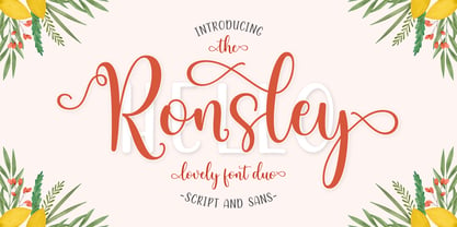 Ronsley Font Duo is a hand-drawn font with a modern look. This Ronsley Font Duo is perfect for any modern project including branding designs, logos, invitations, wedding decorations, website designs, instagram, business cards and more! You can access this easily in most programs. Please check to make sure you know how to access the alternatives. Thank you!
 - Yenthida by RCKY Studio,
$15.00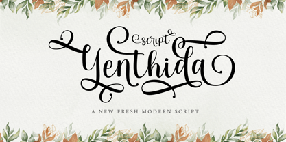 Yenthida Script is a modern calligraphy design, including Regular. This font is casual and beautiful with strokes. Can be used for various purposes. such as logos, product packaging, wedding invitations, branding, headlines, signage, labels, signatures, book covers, posters, quotes, and more. Yenthida Script includes changes in OpenType stylistics, binding, and international support for most Western languages.
 - Handmade Font by Ingrimayne Type,
$14.95 In Handmade Font the letters are made of hands or handprints, something children sometimes do when they are set free with paint. It is caps only but the letters on the lower-case keys differ from those on the upper-case keys. It comes with a large assortment of accented letters to support most European languages.
 - Ramen Sans by Nina Belikova,
$20.00 Ramen Sans is a friendly grotesque type family with the warmth of serif types and a little bit of the edginess of geometric sans! Designed with body text in mind, it offers 5 weights (and their italics), small caps, tabular figures, fractions, numerators, denominators, and supports the Adobe Latin 3 character set (most western and central European languages).
 - Ugly Stick AOE by Astigmatic,
$19.95The Uglystick font is best described by its name. A typestyle that is all shaken up, scribbled, and scrawled, it’s a grungy typeface for those experimental and not so pretty occasions. Definitely a typeface beaten one too many times with the old ugly stick. Put some grit in your design, for the price, you can’t lose! - Sidelle by Beary,
$15.00 Sidelle is an amazing hand lettering script that is attractive and natural. Every single letter have been carefully crafted to make your text look beautiful. This font is suitable for invitations, branding, advertising, classic design, poster designs, and more. This font is PUA encoded so you can access extras from character map in most design software.
 - Buttermilk by Jessica Hische,
$49.00 Buttermilk is the first font from illustrator/designer/typographer Jessica Hische. It’s a wonderful display script that is feminine but bold. It’s equipped with decorative caps (which would make great drop-caps), fancy numerals, and a far too extensive array of ligatures (automatic in most programs thanks to OpenType) to make it easier for you to set it beautifully.
 - Road Work JNL by Jeff Levine,
$29.00 The October 5, 1935 issue of “Universal Weekly” (a publication detailing current film releases from Universal) was promoting the film “Remember Last Night”. Hand lettering used for this advertisement was an ultra-bold sans serif design with chamfered corners and some stylized characters. This is now available digitally as Road Work JNL in both regular and oblique versions.
 - Diolitha by Attype Studio,
$16.00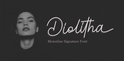 Diolitha is monoline signature font with ending swash. Fall in love with its incredibly versatile style and use it to create spectacular designs! Diolitha is perfect for branding, logo, invitation, stationery, social media post, product packaging, merchandise, blog design, game titles, cute style design, Book/Cover Title and more. What's Included : - Ending Swash - Ligatures - Multilingual Support
 - Heroum by Typebae,
$15.00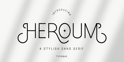 Heroum is stylish and beautiful sans serif font. It will look perfect in photography designs, watermarks, social media posts, advertisements, logos, branding, and various other projects. To use stylistics and ligatues, you don't need to use software that supports opentype, because we have made it separately so it's very easy to use. Features? Stylistic Alternates Ligatures Multilingual PUA Encode
 - MARK Quincy by Sesa Grafika,
$16.00 Mark Quincy is a beautiful handwritten font ideal for logos, wedding stationery, photography watermarks, modern websites, and more. Fall in love with its incredibly distinct and timeless style, and use it to create spectacular designs! Fall for its ravishing style and use it to create gorgeous wedding invitations, beautiful stationary art, eye-catching social media posts, and much more!
 - Strobos by ITC,
$29.99Strobos was designed by Vince Whitlock, who used the Corinthian typeface as a model. It is a dramatic, high-tech alphabet which is most effective in large display sizes. Strobos is a sans serif typeface whose characters are surrounded with details which make each letter look as though it is shaking, spinning, or otherwise constantly moving. - Brush Marker by Fenotype,
$18.00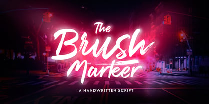 Brush Marker is a strong hand drawn dry brush font. Brush Marker is great for headlines and logotype use. Brush Marker is packed with automatic Contextual Alternates and Standard Ligatures that keep the text vivid. Brush Marker has a wide language support and it is PUA encoded so you can access extra glyphs in most graphic design softwares.
 - Exit Punch by Bogstav,
$17.00 What exactly is an exit punch? I have no clue! :) I named the font after a wordplay with random words, and somehow I found the name suited the font perfect. The letters are awkward and unpredictable in a legible but playful manner. I've added ligatures for the most common double letters, such as bb, cc, dd etc.
 - Lambo by Wahyu and Sani Co.,
$19.00 Lambo is a contemporary italic calligraphy script designed to work together in harmony that makes it very suitable for your graphic design project. It is consists of 7 styles from thin to bold and comes with stylistic alternated. To get the most out of this font, be sure to use an apps that support OpenType features.
 - Misket by Altay,
$9.00 Misket is a display typeface designed by Altay Dagistan. The glyphs were drawn one by one by hand, using traditional calligraphy methods. The font features a modulation called “reversed contrast”. Instead of the stems being thicker than the horizontals like in most typefaces, the contrast is reversed so, the stems are much thinner than the horizontals.
 - Minebold by ahweproject,
$9.00 Minebold is a retro bold handwritten font that will bring you back to the 70s. Fall in love with its unique character and use it to create gorgeous wedding invitations, beautiful stationery art, eye-catching social media posts, and much more! Minebold is PUA encoded, which means you can access all glyphs and swashes with ease!
 - Uncial Romana ND by Neufville Digital,
$29.60 There are many Uncial types in the type catalogues around the world, but most of them have a rough and stiff appearance. The Roman Uncial ND by Ricardo Rousselot stands out for the realism of its strokes, which look as if they are handwritten, bringing freshness and authenticity to its applications. Uncial Romana is a Trademark of BauerTypes SL
 - Dhaelzot by Aisyah,
$12.00 Dhaelzot is a stylish, modern handwriting font with a relaxed, informal feel. With its unique, flowing letters, Dhaelzot adds a personal touch to any design project, making it perfect for use in greeting cards, invitations, and social media posts. The font is highly legible and easy to read, making it ideal for body text as well.
 - Employed by Prioritype,
$23.00 Presents a new typeface. Say hello to the "EMPLOYED" font. A serif font display with a modern and classic style, perfect for you to use in your projects such as branding, logos, or social media posts. A clean and attractive typeface with some awesome alternative character features. Features: Uppercase, Lowercase, Numeral, Punctuation, Multilingual, Ligatures, Alternates & PUA Encoded. Thanks!