10,000 search results
(0.02 seconds)
- Camy by Scholtz Fonts,
$9.50 I wanted to create a "handwriting" font which could be used professionally. I have often needed such a font with a variety of weights and styles for a particular project and have had to resort to mixing fonts, creating a rather messy, amateur job. Camy is named for a little village in South West France where I did much of the initial work on this font. Camy is ideal for contemporary display work, comes in ten styles, and has a contemporary appeal with its casual, easy to read letters. Camy was designed as a total professional package for designers looking for a handwritten font suitable for all kinds of contemporary display work: the idea being that once you have the Camy Professional Pack you don't have to waste time searching for other handwritten fonts. The Family: LIGHT -- NARROW - light weight, condensed width, delicate line -- MEDIUM - light weight, delicate line -- WIDE - light weight, expanded width, delicate line NORMAL WEIGHT -- NARROW - of medium weight and condensed width - perfect for limited space -- MEDIUM - of medium weight -- WIDE - of medium weight and expanded width BLACK - for best readability -- NARROW - condensed width for bolder statements in small areas without losing legibility -- MEDIUM - for bolder statements -- WIDE - expanded width for bolder statements FAT -- WIDE - for maximum impact Use a combination of styles for product branding, book covers, invitations, greeting cards. The Camy combination works well for both headings and body text. Camy contains over 250 characters - (upper and lower case characters, punctuation, numerals, symbols and accented characters are present). It has all the accented characters used in the major European languages.
 - Kostel Infinity Sans by Kostelansky,
$40.00 High-quality type design. Originally designed for headline / logo use. A lot of high-quality glyphs designs in this one so be sure to view the specimen PDF as well as the glyph page. Enjoy. - Kostelansky
 - Plowright by Scriptorium,
$18.00Plowright is a new font based on hand lettering from the 1880s. It's a great example of the style we often associate with signmaking in the old west, with a lot of quirks and original character. - Street Tag Vol 2 by Tomatstudio,
$19.00 Street Tag vol 2 is the second version of Street Tag fonts. Inspired from realistic caligraphy tagging style in many big cities. This style is more bold and readable, perfect for your “street art” designs style. I combined the real graffiti experiences into computer fonts, I think it will be different with other fonts if you can feel it, cause I draw graffiti, tagging and throw ups since I was high school. The real tagging style is never be tidy, but don’t worry, I already adjust the kerning and spacing in the best possible way. You’ll find the better result when you adjust the kerning, and edit baseline manually, especially for the alternates font, if you unfamiliar with these one, you can find many tutorials in youtube, for the example https://www.youtube.com/watch?v=251cTL029M4. what will you get You’ll get some alternates in several alphabet, see that in the font preview, some sample fonts I change the dot in “I” to stars, and I add ‘ into “O”, sometimes we do that in the real walls! You can explore more with this font!
 - Ansage by Sudtipos,
$49.00 Ansage does not claim to be neutral; it escapes from the rationalist sans of closed strokes and regular forms. Meaning Announcement in German, Ansage is versatile and communicates effectively across a broad range of media and formats such as branding, posters, websites, apps, titles and compositions with little spacing). Ansage is a sans serif font with a strong personality that emerges from an interest in and the study of a wide variety of typographic specimens of Gothic fonts from the nineteenth century. The design process behind Ansage brought about constant transformations in form; the result is a compact and robust font, with a large x-height, small ascenders and descenders, and open terminals that grow in expressiveness as it increases in weight. It is available in 10 weights, ranging from Hairline to Black, and 3 widths – Condensed, Regular and Expanded – plus italics, which make a total of 60 perfect variables to combine and contrast with each other. In addition, it also includes multiple open-type functions such as alternative styles, Old Style Figures, Tabular Forms, fractions, case sensitive, ligatures and more.
 - Bigail by Mevstory Studio,
$25.00 Bigail condensed design makes it an ideal choice for display purposes, such as headlines, titles, and logos. Its clean and legible appearance makes it suitable for short text applications, such as captions or taglines, where space is at a premium. Bigail is versatile and well-suited for a variety of design fields, including branding, advertising, editorial design, and web design. Its condensed design is particularly useful for designs where space is limited, such as packaging, signage, and mobile app interfaces. Overall, Bigail is a high quality font that offers excellent readability and legibility while conveying a sense of modernity and sophistication. Its sleek and streamlined design makes it a great choice for a wide range of design applications, making it a valuable addition to any designer’s font library.
 - MARIAMNE by Type Innovations,
$39.00 MARIAMNE is an original design by Alex Kaczun. It is an elegant, modern and traditional interpretation based on and modeled after his successful "Contax Pro" and "New Age Gothic" typeface series. As such, it has generous proportions with clean, crisp lines—ideally suited for easy reading and long lines of copy. Alex felt that the skeleton for "Contax" was perfectly suited to transform the design into a modern version of 'old-style', somewhat reminiscent of German Black Letter. Numerous modifications where made to the body proportions, stems and shapes. True 'old-style' serifs and unusual 'cross-strokes' where added for a touch of distinction. The 'cross-strokes' where added at exactly visual mid-point on the overall heights. This gives the typeface a romantic, female-like quality to the overall design. Strong, yet delicate. Visually stimulating in appearance and function. The result is a truly unique transitional and modern design. Unlike other typefaces, MARIAMNE incorporates uniform stems throughout the capitals, lower case and figures. This gives the design a uniform appearance in overall color and strength. There is a perfect visual balance between inter-letter spacing, stem weights and proportions. The accents are equally large, bold and command attention. This font includes a large 'Pro' character set, which supports most Central European and many Eastern European languages. As a result, the design is ideally suited for display copy as well as text composition. In the near future, Alex plans to expand the typeface series to include a light and heavy weight, along with true italics.
 - Arabetics Harfi by Arabetics,
$59.00 Arabetics Harfi is a Latin Serif typeface with a comprehensive support for the Arabetic scripts, including Quranic texts. Careful spacing and kerning was used to enhance resulting text legibility both scripts. Arabetics Harfi fully supports MS 1252 Western and 1256 Arabic code pages, in addition to all transliteration characters required by the ALA-LC Romanization tables. Users can either select an accented character directly or form it by keying the desired combining diacritic mark following an unaccented character. For Arabic, it fully supports Unicode 6.1, and the latest Arabic Supplement and Extended-A Unicode blocks. The Arabic design of this font family follows the Mutamathil Taqlidi type style with connected glyphs, but it emphasizes a horizontal look and feel rather than verticalone, utilizing slightly varying x-heights. The Mutamathil Taqlidi type style uses one glyph per every basic Arabic Unicode character or letter, as defined by the Unicode Standards, and one additional final form glyph, for each freely-connecting letter of the Arabic cursive text. Arabetics Harfi includes the required Lam-Alif ligatures in addition to all vowel diacritic ligatures. Soft-vowel diacritic marks (harakat) are selectively positioned with most of them appearing on similar high and low levels—top left corner—, to clearly distinguish them from the letters. Tatweel is a zero-width glyph. Arabetics Harfi includes both Arabic and Arabic-Indic numerals, in addition to generous number of punctuation and mathematical symbols. It includes two weights, regular and bold, each of which has normal, right slanted Italic, and left-slanted styles.
 - Guzzo by Monotype,
$50.99 A playful caricature of a midcentury grotesque, Guzzo is a fresh addition to the Monotype Library. Somewhat eccentric and full of surprises, its unmistakable quirk can be found on closer inspection, stemming from details proudly borrowed from brush lettering and calligraphy. The wide range of weights and style can take you through any design space, from the condensed weights squeezing in larger headlines or dense blocks of text with the condensed range, to experimenting with small point sizes, labels or packaging with the extended cut. However, Guzzo’s real charm is probably best expressed through its wonderfully playful shapes, its unusual 'laid-back italics' feature cursive forms and a backslant. The different stylistic sets allow you to decide what you make of Guzzo, with several sets of alternate glyphs steering it in any direction you want. Guzzo is a happy-go-lucky character, and has a warm, humble and painterly quality that - at a glance - may be unrecognizable as a typeface. It can almost pass for hand-lettering. Guzzo pairs exceptionally well with scripts and slab typefaces, and feels most at home in situ with toys, packaging, menus, broadcasting, cartoons and merchandising! Guzzo encourages you to turn up the silliness and is for designers who want to emulate hand-painted and casual motifs. Taking its name from American artist Jeremy Pinc, aka the painter Guzzo Pinc, the typeface channels the quirky, funny and poignant qualities of his paintings - with wacky characters, loosely painted geometric forms and bright colors. For this mid century, authentic, nostalgic typeface - the story is really what you make of it.
 - Buffet Script by Sudtipos,
$99.00 Buffet Script is based on fantastic calligraphy by Alf Becker, arguably the greatest American sign lettering artist of all time. The Alf Becker series of nameless alphabets published by Sign of the Times magazine in 1941 has attracted letter digitizers for a few years now, so it’s really a wonder that a few of those alphabets are still in the non-digital realm. It is understandable, though, that the basis for Buffet Script was not digitally attempted until now. The page presenting this alphabet shows a jungle of letters running into each others and swashes intertwining. The massive amount of work involved in digitizing such lettering, where scanning is nowhere near being an option, is quite obvious at a mere glance. If anyone was going to commit this particular alphabet to a digital form, it would have to be redrawn stroke by stroke and curve by curve on the computer. And don't we love a challenge! But seriously, the challenge was not the main attraction. In a way, the Becker approach to lettering is so far from digital that the imagination is almost forced to work out possibilities and letter combinations to solve problems presented by the scant showings in that magazine. After a few imaginative visualizations, the digital potential becomes clear in the mind, and the eye and hand follow. The result with Whomp (another Alf Becker-inspired work) was an enormous font with a lot of alternates and ligatures. With Buffet Script the imaginative process was no different, but the result particularly shines here, because this is some of the most fascinating flowing calligraphy ever seen. Calligraphy is where the accountability of all the little extra touches, such as alternates and swashes and ligatures, is raised to a higher level than in most other type categories. Buffet Script’s OpenType programming contains discretionary ligatures, stylistic and contextual alternates, interacting with each other to allow the composition of just the right word or sentence. This font is best used where lush elegance is one of the design’s requirements.
 - Sweeper by Gustav & Brun,
$12.00 Sweeper is a font with several personalities; it’s friendly and scary at the same time, almost like Santa Claus, but nicer. Sweeper has got a handy touch with a lot of different possibilities. You can use it in several occasions. Sweeper is suitable in any environment: the business district in London or the shores of Oxelösund. It’s hella wide and hella fun!
 - Une Nuit Parisienne by Megami Studios,
$10.00 This font is based on a lot of the downtempo culture in Paris. Smoky bars, jazz clubs, that sort of thing. How a font can be influenced by intangibles is a question that I can't quite answer, but I can say that when I created it, it strongly reminded me of a couple of times spent in Paris back in the mid-90s.
 - Earworm by Hanoded,
$15.00 An ‘Earworm’ is a catchy tune that keeps repeating itself in your head. I didn’t know this (in Holland (where I’m from), earworm (oorwurm) means earwig - you know, the animal). Earworm is a happy handmade font. It’s a little jittery, a little quirky, but also a lot of fun to use. Now lets hope this fonts stays in your head!
 - Tiemann by Linotype,
$29.99Tiemann Antiqua was designed by Walter Tiemann in 1923 and appeared with the Klingspor font foundry. It is one of the modern book typefaces created in the first half of the 20th century, but differed from most in its Modern Face forms. It displays the same strong stroke contrast and flat serifs but its proportions have more in common with those of neorenaissance fonts. Tiemann Antiqua is an elegant, legible font suitable for books and longer texts, but also found in headlines, newspapers and magazines due to its classic yet unusual appearance. - Elida JNL by Jeff Levine,
$29.00 Elida JNL was modeled from an image of some wood type for sale online. Although the type design most likely has its roots in the classic Bodoni, there were a few characters in the original wood type that had a bit of a square or block shape to them. Those characters were modified in order to keep with the overall roundness of the other characters. The name Elida JNL comes from a small town in New Mexico. Available in six styles: Regular, Oblique, Extra Condensed, Extra Condensed Oblique, Ultra Condensed and Mega Condensed.
 - Thorowgood by Linotype,
$29.99Thorowgood was originally released by the Stephenson Blake typefoundry in the UK. The types were first cut by the English typefounder Robert Thorne, predecessor of William Thorowgood, and first shown in his specimen books in the early nineteenth century. The fat face was revived in roman (1953) and italic. The S and the C appear to be smaller than the other capitals. Most serifs are flat and thin horizontals. In the italic the main strokes of h, k, m, n, and r are curved inwards at the foot. - Love Wins by Resistenza,
$19.00 In 2007 we shared our first pride together. More than 1 million people took the streets of Madrid for this huge celebration … seeing the diversity of people supporting love was incredibly touching. Gay Pride is a celebration of freedom, human rights and the right to love whoever we want. It’s a memorial for the battles, the lives lost and the pain suffered while fighting for a growing list of equal rights. But let’s not forget there are still places where LGTBQ community is repressed and persecuted. As Letter crafters we love seeing the signs people design for their different pride parades, and we wondered… Why don’t we create a collection of handcrafted lettering to share some love and to add a typographic realness to the party? Love Wins Font is a series of 60 phrases handwritten with expertise and love specially designed to celebrate diversity. The lettering was crafted with different calligraphic tools creating diverse aesthetics. You can use them to create your signs, t-shirts, stickers, poster, banners.. all you need is to spread love during your Pride Celebrations (or day-to-day life!).
 - Poultry Sign by Ingrimayne Type,
$5.95 While searching through microfilm of an old, 1932 newspaper, I stumbled on the word "Poultry" written with trapezoidal letters. I did not recall seeing lettering like this and it inspired me to design a typeface that could produce a similar result. Poultry Sign has two widths each with three weights giving the family six styles. It is monoline, monospaced, and all caps. The letters on the lower-case keys reverse the trapezoid of those on the upper-case keys. The designer's expectation is that the most common use for this typeface will alternate upper-case and lower-case keys, and to make this effect easy, included in the font is a contextual alternatives (calt) OpenType feature that automatically produces this result if your word processor supports this feature. To get text with all letters with big bottoms or all letters with with big tops, this feature must be turned off. The spacing of the letters is identical within each width so the styles can be layered to produce bi-colored or tri-colored letters. There is a second set of numbers that can be accessed with an OpenType stylistic alternative. Also accessible with OpenType stylistic alternatives are variations of letters T, N, L, Y, and V.
 - Axalp Grotesk by ROHH,
$39.00 Axalp Grotesk™ is a post-Swiss-Style modernist sans serif type family characterized by the play between elegant rounded shapes and sharp angular details. It is minimal, legible, well balanced and charismatic. Its heavy weights deliver powerful yet friendly impact. Thin ones emanate elegance, fine lines and precision. The family has very versatile proportions and generous x-height allowing a successful use for user interfaces, all sorts of display and branding scenarios, as well as a paragraph text typeface. Contemporary minimalistic approach makes Axalp Grotesk an outstanding design tool for creating modern visual identities and user interfaces. A truly universal sans serif family where beautiful forms and proportion work together with careful spacing, kerning and hand-hinting. Axalp Grotesk is an attractive contemporary alternative to the classics of Swiss Design School such as Akzidenz-Grotesk, Univers and Helvetica. It is bright, crisp, modern and friendly in character, and features an alternative stylistic set for more minimalistic and neutral look, simplifying such characters as “Q”, “J”, “a” and “y”. The family has extended latin language support, as well as broad number of OpenType features, such as stylistic alternates, case sensitive forms, ligatures, contextual alternates, lining, oldstyle, tabular and circled figures, slashed zero, fractions, superscript and subscript, ordinals, currencies and symbols.
 - Ultimate Star by Hatftype,
$15.00 Is a comic display font with distinctive handwritten characters perfect for branding projects, logos, wedding designs, media posts, advertisements, product packaging, product designs, labels, photography, watermarks, invitations, stationery, and any project who need handwritten dishes. Features : Uppercase & Lowercase Multilingual support Number Symbol Punctuation Support in Mac and Windows OS Support in design application (photoshop, illustrator, and more) There it is. I really hope you enjoy it.
 - Casually Nouveau JNL by Jeff Levine,
$29.00 The 1930 sheet music for “A Peach of a Pair” from Paramount Pictures’ “Follow Through” listed the stars and production credits in a wonderfully casual, free-form Art Nouveau hand lettering. This has been recreated digitally as Casually Nouveau JNL, and is available in both regular and oblique versions. For another Art Nouveau typeface with a free-form look, try the similarly named Casual Nouveau JNL.
 - Comic Crunch by Hatftype,
$15.00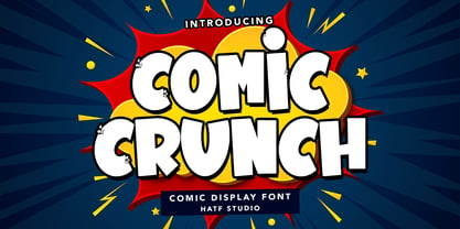 Is a comic display font with distinctive handwritten characters perfect for branding projects, logos, wedding designs, media posts, advertisements, product packaging, product designs, labels, photography, watermarks, invitations, stationery, and any project who need handwritten dishes. Features : 1. Uppercase & Lowercase 2. Multilingual support 3. Number 4. Symbol 5. Punctuation 6. Support in Mac and Windows OS 7. Support in design application I really hope you enjoy it.
 - Parallax by Gleb Guralnyk,
$13.00 Parallax is a modern, creative, geometric typeface with random contrast changes in the characters. It includes 26 contextual alternates that will help you to avoid similar letters in most cases. You can always exchange the letters using stylistic alternates feature. Parallax font have a multilingual support of west european languages, please check out all available characters on screenshot. Thank you and have a nice day!
 - Furius by Typogama,
$29.00 Furius is a display typeface inspired by the split serif style of woodcut or chiseled letters found in roman inscriptions and later popularized by the western genre in the United States. Created as a display typeface, Furius combines a host of Opentype features and equally incoporates a full extended latin and cyrillic character set to provide a versatile and complete design solution for titles or display settings.
 - PR Scrolls 04 by PR Fonts,
$15.50 Inspired by food labels, signs and coats of arms, PR-Scrolls is a collection of images which can be used for framing text in contexts where antiquity, craftsmanship, or traditional quality are conveyed. There are several sets of glyphs which work together to make a variety of shapes, or banners of custom length. Most of the glyphs are presented in a range of four or more widths.
 - PM Eckmannschrift by Paper Moon Type & Graphic Supply,
$15.00 Eckmannschrift is a redrawing based on original sketches and type specimens of the original 1900 Otto Eckmann typeface Eckmannschrift. It includes the original characters designed by Otto Eckmann not included in most modern releases of the font. Though it is a vintage typeface, it has found several popular resurgences of use over its 100 years in existence, including today's retro styles and psychedelic posters from the 1960s.
 - Phonema by Fontop,
$10.00 Warm welcome to my new sans serif typeface PHONEMA. Six stylish and modern fonts are included into this type family. Looks great as headlines on posters, text in magazines, presentations. Also can be used in logos and blog posts. Will reinforce your creative work with eye catching and bold message. Each font has Latin multilingual support as well as uppercase letters, lowercase letters, numbers and basic punctuations.
 - PR Scrolls 02 by PR Fonts,
$10.00 Inspired by food labels, signs and coats of arms, PR-Scrolls is a collection of images which can be used for framing text in contexts where antiquity, craftsmanship, or traditional quality are conveyed. There are several sets of glyphs which work together to make a variety of shapes, or banners of custom length. Most of the glyphs are presented in a range of three or more widths.
 - Party Club by Hatftype,
$17.00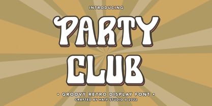 Is a font with groovy retro style. With distinctive handwritten characters perfect for branding projects, logos, merchandise designs, media posts, advertisements, product packaging, product designs, labels, photography, watermarks, invitations, stationery, and any project who need handwritten dishes. Feature : * Symbol * Number * Punctuation * Multilingual support * Support in Mac and Windows OS * Support in design application (photoshop, illustrator, and more) I really hope you enjoy it. * Uppercase
 - Magalith by Samtype,
$39.95 This hebrew typeface is inspired in prayer books from the beginning of the XX century. Even in this Std version You can apply modern hebrew marks like Kamats Katan, Sheva Na, Dagesh Chazak and Cholam Chaser. It's a classic style with the most modern of a digital font technology and a easy lecture. The Caption versions is ideal for small size of texts and footnotes.
 - Malebu by Macrotipo,
$39.00 Malebu is a sans serif font that was created based on grotesque and humanist models with certain geometric features. It is clear, simple, gentle and friendly, and can be used in text sizes. It is easy to read in long texts, magazines, books and the like. The rounded shape makes it friendly and fluent. A short x-height is functional and adds economy without losing consistency.
 - TextFace Type by Forme Type,
$9.99 The idea for this font family, derived from SMS text message faces (Emojis) and found photographs of faces collected over the last ten years. The concept for this project was to a create text-face characters using only the glyphes found in a standard version of a Sans Serif typeface. There are 36 different Textfaces. Available in three weights, Regular, Bold and a Stencil version.
 - Boyscout by Canada Type,
$24.95Digitized from the handwriting of Simone Wilkie's son, Boyscout is a font that demonstrates a mix between the power of learning and individual creative development of a seven year old child. The struggle to conform with observation appears in most letters, while the creative streak shows clearly in letters like the swashed N, the single-stroke Q, the high T, and the charmingly odd, calligraphic z. - Magic Spell JF by Jukebox Collection,
$32.99 Magic Spell is a mystical, fun font based on a handlettered alphabet in an old 1930s book on lettering. It captures that old world feel of magical wizards and fairy tales. Conjur up some fantastic designs with this bewitching font! Jukebox fonts are available in OpenType .otf format and all fonts contain basic OpenType features as well as support for Latin-based and most Eastern European languages.
 - Inked Balterm by Adam Ladd,
$25.00 Inked Balterm is a hand-inked typeface with a humanist touch. It provides visual interest through the contrasting elements of the thin strokes mixed with the solid ball terminals. The placement of each ball terminal is varied and placed at the most defining point of interest and distinction in each letterform; creating an appealing visual rhythm. Great for display and works in smaller text settings.
 - JollyGood Serif by Letradora,
$16.00 JollyGood Serif is another member of the JollyGood family. This is a hand drawn serif/typewriter font that can work both for comics or as a display face . It is a complete complete family with 4 weights in regular and italic (8 fonts in total). It has an amazing character set, with support for most latin languages, as well as extra characters and ligatures.
 - Joy Life by Hatftype,
$17.00 Is a font with groovy retro style. With distinctive handwritten characters perfect for branding projects, logos, clothing designs, media posts, advertisements, product packaging, product designs, labels, photography, watermarks, invitations, stationery, and any project who need handwritten dishes. Feature : * Symbol * Number * Punctuation * Multilingual support * Support in Mac and Windows OS * Support in design application (photoshop, illustrator, and more) AA CAPS! I really hope you enjoy it.
 - Malebu by Muykyta,
$10.00 Malebu is a new sans serif font that was created based on grotesque and humanist models with certain geometric features. It’s clear, simple, gentle and friendly, can be used in text sizes. Its easy to read in long texts, magazines, books and the like. The rounded shape makes it friendly and fluent. A short x-height is functional and adds economy without losing consistency.
 - Spur Wide JNL by Jeff Levine,
$29.00 Spur Wide JNL was modeled from an example of hand lettering from the antique French alphabet book L'Art du Tracé Rationnel de la Lettre. Heavy Roman style letters with spurs (often referred to as Latin) were most popular with sign painters and show card writers in the early part of the 20th century. Spur Wide JNL is available in both regular and oblique versions.
 - Ottocento by Eurotypo,
$39.00 Ottocento is an elegant chancery cursive, derived from XIXth century Italian calligraphy. Slightly inclined and with a fast and marked ductus, this font is well balanced between thick and thin strokes and shows marked ascendings and descendings. Ottocento is rich in stylistic variations with its elaborated upper cases, and stylistically different in traits and different ligatures are considered to make the most of the many OpenType features.