10,000 search results
(0.032 seconds)
- Khakoy by Twinletter,
$13.00 Introducing “Khakoy Font” – Unleash Playful Creativity! Dive into a world of limitless imagination with Khakoy Font, your ultimate tool for injecting a playful spirit into your designs. Khakoy Font is the embodiment of joy and whimsy in typography. Crafted to spark delight, it’s your go-to choice for projects that demand a dash of fun and a pinch of mischief. With its lively and distinct characters, Khakoy Font invites you to explore the playful side of design. It’s a font that ensures your message is conveyed with a contagious sense of playfulness, captivating your audience instantly. Designed to ignite creativity, Khakoy Font adds a touch of amusement to your projects. From cheerful posters to charming children’s books, this font is your partner in crafting designs that leave a lasting, joyful impression. Let your designs break free from the ordinary and embrace the vibrant spirit of Khakoy Font. Elevate your creative game, infuse humor and light-heartedness into your work, and watch your designs come alive with this delightful typeface. Discover the magic of Khakoy Font today! – PUA Encoded Characters – Fully accessible without additional design software.
 - Undergrad by Thomas Käding,
$10.00 This font began its life as a project to design a T-shirt for a student group on a large midwestern university. It has now grown up into a unicode font, including Greek and Cyrillic. It has that look and feel of the T-shirts that are ubiquitous on the campuses of colleges and universities over the world. It would make an ideal tool for designing them, as well as posters and banners. Characters in these fonts include Latin, for English and other European languages; small a and c for names like MacDonald; many fractions, including 0/3 needed in baseball; Latin with diacritical marks for Eastern and Western European, Turkish, and Baltic languages; thorn, eth, cedilla, AE, OE, and sharp S for French, German, Icelandic; Latin extensions for clicks of some African languages; Greek (with tonos); Cyrillic for Russian and many other Slavic and Asian languages that use it; most Runes (the full Futhark plus a few more); six-point Brialle; currency symbols for dollar, cent, pound, yen, euro; and a few other extras like the peace sign. Available styles are regular block letters, outlines, and bold.
 - Geliat by Wahyu and Sani Co.,
$99.99 Geliat would be the youngest brother of Creo, retaining the letterform and proportion but has more geometric looks. This font family comes in two versions which has some different default glyphs. Geliat family has similar letterform with Creo, while the Alt version has common geometric letterform. Italic styles of Geliat were designed using semi-rotalic method. The round parts have 5 degrees italic angle, while the vertical strokes were made in 10 italic degrees. The result gives the styles look more circular than most geometric typefaces with the same 10 degrees italic angle. Each version of Geliat has 2 variable fonts along with 10 different predefined weights from Thin to Heavy with matching italics. Each family member of Geliat also equipped with useful OpenType features such as Ordinals, Superscripts, Scientific Inferiors, Stylistic Sets, Tabular Lining, Standard Ligatures, Fractions, Numerators & Denominators. Each font has 500+ glyphs which covers Western & Eastern Europe, and other Latin based languages. Geliat will be suitable for many creative projects, from logos, posters, presentations, headlines, lettering, branding, quotes, titles, magazines, headings, web banners, mobile applications, art quotes, advertising, packaging design, book title, and more! Sky is the limit!
 - Nestine by Craft Supply Co,
$20.00 Introducing Nestine – Elegant Sans Serif High Contrast Elegance Nestine – Elegant Sans Serif is more than just a font; it’s a visual masterpiece with high contrast that effortlessly exudes an air of elegance and luxury. The Epitome of Elegance Moreover, Nestine epitomizes elegance. Its striking contrast between thick and thin lines creates a visual appeal that is both refined and sophisticated, making it the perfect choice for luxury designs that demand attention. A Minimalist Marvel Nestine’s high contrast design is a minimalist marvel. It relies on the purity of its design to convey sophistication and elegance, proving that simplicity can be the essence of opulence. Ideal for Luxury Design Additionally, Nestine is tailor-made for luxury design projects. From high-end branding to upscale packaging, it adds a touch of opulence and refinement that leaves a lasting impression of sophistication. In Conclusion In summary, Nestine – Elegant Sans Serif is the epitome of high-contrast elegance. It’s the font that effortlessly combines the art of sophistication and luxury. With Nestine, your designs achieve a minimalist yet opulent quality that captivates the viewer, leaving an indelible mark of refined taste and aesthetic beauty.
 - New Yorker Type Classic by Wiescher Design,
$45.00 New-Yorker-Type was one of the first typefaces I tried my hand at in 1985. I meant it as a revival of the typeface used by the New Yorker magazine. I did not scan it. I just looked at the type and redrew it completely by hand. Only much later did I come to know, that there is a bundle of similar typefaces of that period. Rea Irvin's design for New-Yorker magazine was just one of them, maybe the best. In the next step I repaired some of the mistakes that I made more than thirty years ago. Now on the eve of 2020 I gave the font a complete overhaul and added a set of Swash Initials, Cyrillic and Greek glyphs and many ligatures. The font now has 1075 glyphs and is all set for most latin writing systems. On top of that I made two versions, a Classic one with rounded corners and a pointed Pro version for a more up-to-date look. Take your pick. Yours sincerely, honoring Rea Irvin a great type- and magazine-designer, Gert Wiescher
 - Radio Volna by Supfonts,
$12.00 This is my new font, a classic calligraphic script, made with a thick brush. The font is super versatile and suitable for any project. You want to post on instagram? The menu in the cafe? A banner or sign on the website? It's easy! Classic never gets old, your design will always look fresh. And one more thing, this font fully supports Cyrillic! Oh Yes, this is cool news for Russian-speaking designers. Fresh font in the piggy Bank, and satisfied customers. --- Здравствуйте, друзья. Это мой новый шрифт, классическая каллиграфия толстой кистью. Шрифт супер универсальный и подойдёт для любых проектов. Хочешь пост в инстаграм? Меню в кафе? Баннер или надпись на сайт? ЛЕГКО Классика никогда не стареет, ваш дизайн будет выглядеть свежо всегда И еще одна фишка, этот шрифт полностью поддерживает кириллицу! О да, это крутая новость для русскоязычных дизайнеров. Свежий шрифт в копилку, и довольные клиенты --- Test it out below to see how it could look for your next project! Includes: Ful Cyrillic support Latin language support Uppercase and lowercase Numbers and punctuation Ligatures Check out my blog: https://www.instagram.com/zloillev pinterest.com/dmitriychirkov7
 - Sweet Gothic Serif by Sweet,
$39.00Sweet Gothic Serif is a 2009 addition to the Sweet Collection of engraved lettering styles from the 20th Century. It is a serif variant of Sweet Gothic. Sweet Gothic Light (without serifs) is closely based on lettering from an engravers pattern from the early 1900s that was used for tracing letterforms with the engraving machine (pantograph) to make steel engraving plates. The design is related to many similar engravers gothics developed in the early 1900s, but as each engraving house created by hand their own patterns for popular styles of the time, there is variation among the models. Sweet Gothic offers contrast in stroke weight and its unique personality. The bolder weights are new designs, based on the characteristics of the Light. Sweet Gothic Serif has been developed to expand the usefulness of the Sweet Gothics, offering an alternative to Copperplate Gothic. As such, most of the fonts are new designs, yet may seem familiar and ubiquitous given their model. The fonts offer two sizes of figures and monetary symbols: one set is intended for use with upper- and lowercase settings; the second set is the same height as the small caps. - FS Kitty by Fontsmith,
$50.00 Cute FS Kitty is the type equivalent of Bagpuss: plump, cute, cuddly and not fond of exercise. So don’t go giving it a run-out on body copy; FS Kitty is an all-caps font made for showing off in posters and headlines, and on products, point-of sale and especially sweets. Blubber Kitty had been quietly curled up in Phil Garnham’s sketchbook for a year before he brought it out to be brushed up. “It was in the mix as a basic form when I started thinking about FS Lola. It was a twisted, bubbly beauty – quite squishable and huggable. The working file was called Blubber. “At that time it was a basic construction of strokes. I created the ‘A’ first, purely as a shape to play with, not as type. I flipped it for ‘V’, and copied that for a ‘W’. I flipped the ‘W’ for an ‘M’... I thought, ‘This looks a bit wacky, but I like it,’ and just carried on. The most tricky characters were the ‘B’ ‘P’ and ‘R’. I must have drawn about 20 kinds of B for this, just to get it to fit.” Variety “When the regular weight of Kitty had been designed,” says Jason Smith, “it just felt like a natural progression to go on and explore how far we could go with it: Light, Solid, Headline, Shadow.” Phil Garnham thinks there’s still more to come. “There are some really individual characters in this font that I think have yet to be exploited: the Greek Omega symbol, the strange face in the ampersand. Like Bagpuss, Kitty has kept a low profile so far. “We know people are using Kitty. In fact, it was the first of any of our fonts that we sold on the day it was released. But I still haven’t seen it out there in the wild. It’s going to be a exciting moment.”
 - Malabar by Linotype,
$29.99 Malabar is a type family for extensive text. Its design was developed with a nod toward newspapers. Malabar's characters are seriffed and of the Old Style genre. A strong diagonal axis is apparent within the curves. Sturdy serifs help strengthen the line of text in small point sizes, as well as define the overall feeling of the face. Malabar's x-height is very high, a deliberate choice that makes the most important parts of lowercase letters visibly larger in tiny settings. The height of the capital letters is also rather diminutive, allowing for better character fit, as well as eliminating a bit of clumsiness in German, which often includes quite a few uppercase letters. Diacritical marks and additional alphabetic forms required by many Western, Central, and Eastern European languages are naturally a part of the character set, including those needed in the Baltic states, for Romanian, and for Turkish. Malabar's accents are bold and direct, sitting well with their base glyphs. The family includes three weights, each with a companion Italic. Malabar Regular is equipped with small caps, and both it and Malabar Italic include oldstyle figures. All members of the family have both proportional and tabular-width lining figures, as well as special variants of certain punctuation marks vertically adjusted for all-caps text setting. Malabar is informed both by contemporary ideas of typeface design (sheared terminals, the wider-drawn s) as well as by 16th-century masters. Malabar Heavy and Heavy Italic are very loud; their blackness almost shouts out from the page. The Regular's wedge serifs become more slab-ish in nature as the letters' weight increases. Malabar Heavy and Heavy Italic are best relegated to headline use only. Malabar Bold and Bold Italic may be used for text emphasis, a job for which the Heavy is to dark. Malabar received a Certificate of Excellence in Type Design at the Type Directors Club of New York TDC2 competition in 2009.
 - Circulo by MMD Fonts,
$6.29 Bound to rules, unbound in the usage. Hyper geometric, and minimal contrast. Circulo V1 is based on a font project I originally started because of a client I had. I wanted to create a display and text font for their product design brand, which is all about reducing the amount of necessary materials and production steps. Before I started the course at tipo-g it was called -“REDUCE“ and was more or less finished. The concept was based on the name. How far can letter shapes be reduced to their core geometric concepts and still be identified as letters? But in a way, it lacked a unique approach and was just a generic geometric Sans Serif with a lack of finesse. There was already a glimpse of characteristics visible which would later define Circulo V1. The high focus on geometric shapes was not of the same severity, and the angle on the stems was less intense. Those, as I call them, fake serifs turned out to be a significant factor in legibility and the characteristic of the font. Besides those changes and improvements, I decided to implicate a new feature to the concept, a condensed style. I quickly realised that it is impossible to keep my perfect circles and half-circles in this style without breaking my rules for the font. This „problem“ turned out to be the most crucial feature of the condensed set. Circular-based Letters will ignore the rules and boundaries of the condensed style and stay as they are. This feature allows the user to create a unique rhythm in their texts, and if you use the variable font, you can decide how intense this rhythm will be. In this situation, the user can choose which letters are allowed to keep their shapes and which will be put in their condensed corset. All, some or none of them, you decide.
 - FS Kitty Variable by Fontsmith,
$199.99Cute FS Kitty is the type equivalent of Bagpuss: plump, cute, cuddly and not fond of exercise. So don’t go giving it a run-out on body copy; FS Kitty is an all-caps font made for showing off in posters and headlines, and on products, point-of sale and especially sweets. Blubber Kitty had been quietly curled up in Phil Garnham’s sketchbook for a year before he brought it out to be brushed up. “It was in the mix as a basic form when I started thinking about FS Lola. It was a twisted, bubbly beauty – quite squishable and huggable. The working file was called Blubber. “At that time it was a basic construction of strokes. I created the ‘A’ first, purely as a shape to play with, not as type. I flipped it for ‘V’, and copied that for a ‘W’. I flipped the ‘W’ for an ‘M’... I thought, ‘This looks a bit wacky, but I like it,’ and just carried on. The most tricky characters were the ‘B’ ‘P’ and ‘R’. I must have drawn about 20 kinds of B for this, just to get it to fit.” Variety “When the regular weight of Kitty had been designed,” says Jason Smith, “it just felt like a natural progression to go on and explore how far we could go with it: Light, Solid, Headline, Shadow.” Phil Garnham thinks there’s still more to come. “There are some really individual characters in this font that I think have yet to be exploited: the Greek Omega symbol, the strange face in the ampersand. Like Bagpuss, Kitty has kept a low profile so far. “We know people are using Kitty. In fact, it was the first of any of our fonts that we sold on the day it was released. But I still haven’t seen it out there in the wild. It’s going to be a exciting moment.” - Berganza by Cuchi, qué tipo,
$9.95 "Berganza" is a typeface designed as a tribute to the spanish century called "Siglo de Oro". Embellished with several ornaments and swashes, it quickly reminds an age in which castilian arts & letters were flourished, as well as the fantasy knighty fables adventures of heroes, loved ladies and evil villains. Although the Siglo de Oro cannot be set in specific dates, it is generally considered to have lasted more than a century; between 1492, the year of the discovery of America and 1681, the year in which the writer Pedro Calderón dela Barca died. Lope de Vega, Francisco de Quevedo, or even William Shakespeare (in England) are also famous figures of this time. Berganza typeface takes its name from the main character of the picaresque novel "The Conversation of the Dogs" (Cervantes, 1613). Berganza is able to speak with the other dog Scipio on a big number of social & philosophical topics. Talking about technics, Berganza is a modern typeface but with a humanist flavour. Thanks to its various styles and flourishes, it immediately refers to the culteranism aesthetic of that time, whose aim was to elevate the noble over the vulgar. But also, Berganza takes advantage of the contemporary technology, highlighting in his drawing the contrasted forms and certain broken and unusual strokes in order to give it a brave and different style touch. Berganza includes four weights to be used for continuous reading with great visual richness. However, it is more recommended for large sizes, since its unusual and particular details appear when the letter grows. Finally, the hundreds of glyphs and Opentype features that it has incorporated, allow us to change the aesthetics of the type according to our needs. OPENTYPE FONT 518 CHARACTERS 1113 GLYPHS 4 INSTANCES (Regular, Bold, Italic & Bold Italic) 38 LANGUAGES 28 LAYOUT FEATURES (stylistic sets, ligatures, historical ligatures, swashes, contextual alternates, numerals, etc) DESIGNED BY CARLOS CAMPOS IN 2021 www.cuchiquetipo.com Dummy text from wikisource.org («Rinconete y Cortadillo», by Miguel de Cervantes).
 - Phoenica Std by preussTYPE,
$29.00 PHOENICA is a contemporary humanistic typeface family suitable for traditional high-resolution print purposes, office application and multi-media use. Of the creation formed the basis an idea which was developed for the first time by Lucian Bernhard approx in 1930 with the Berhard Gotic and was taken up in the last time by different written creators repeatedly: the repeated elimination anyway (in comparison to a Antiqua, e.g. Garamond) already very much diminished form Grotesque (as for example Helvetica) by systematic leaving out of the serifs. The horizontal direction of the writing is thereby stressed remarkably by which so-called »Rail effect« originates. The eyes can grasp the line to be read very well what is ordinarily left to a Serif-stressed font. By this desired effect is suited PHOENICA also for big text amounts. In numerous test runs Stems and tracking was compared to experienced fonts and was adapted. The experienced was taken over without renouncing, nevertheless, the modern and independent character PHOENICA. PHOENICA offers to you as a welcome alternative to the contemporary humanistic Sansserif. It is a very adaptable family for text and Corporate design uses. Several companies have discovered PHOENICA meanwhile as a Corporate font for themselves and use them very successfully. She provides a respectable typeface combined with refinement and elegance. Every PHOENICA family has at least six weights in each case in regular and italic. In addition more than three fine Haarline weights (Hairline 15, 25, 35). These are a total of 27 possibilities. Phoenica as well as Phoenica Condensed are excellently readable fonts, because they were optimised especially for amount sentence. Both basic styles (Regular and Condensed) are tuned on each other and follow the same form principle. The family is neither exclusively geometrical nor is constructed humanistically, the forms were sketched on quick and light Recognition effect of every single letter. The PHOENICA family design and logo is suited for all only conceivable uses like newspapers and magazines, for the book typography and Corporate Design.
 - ATF Franklin Gothic by ATF Collection,
$59.00 ATF Franklin Gothic® A new take on an old favorite Franklin Gothic has been the quintessential American sans for more than a century. Designed by Morris Fuller Benton and released in 1905 by American Type Founders, Franklin Gothic quickly stood out in the crowded field of sans-serif types, gaining an enduring popularity. Benton’s original design was a display face in a single weight. It had a bold, direct solidity, yet conveyed plenty of character. A modern typeface in the tradition of 19th-century grotesques, Franklin Gothic was drawn with a distinctive contrast in stroke weight, giving it a unique personality among the more mono-linear appearance of later geometric and neo-grotesque sans-serif types. Franklin Gothic has been interpreted into a series of weights before, most notably with ITC Franklin Gothic. But as the original type was just a bold display face (later accompanied by a few similarly bold widths and italics), how Benton’s design is expanded to multiple weights and styles as a digital type family can vary significantly. Benton designed several gothic faces that harmonize with one another, including Franklin Gothic, News Gothic, and Monotone Gothic, that can serve as models for new interpretations of his work. With ATF Franklin Gothic, Mark van Bronkhorst looked to Benton’s Monotone Gothic—originally a single typeface in a regular weight, and similar to Franklin Gothic in its forms—as the basis for lighter styles. ATF Franklin Gothic may appear familiar given its heritage, but is a new design offering a fresh take on Benton’s work. The text weights are wider and more open than some previous Franklin Gothic interpretations, and as a result are quite legible as text, at very small sizes, and on screen. ATF Franklin Gothic maintains the warmth and the spirit of a Benton classic while offering a suite of fonts tuned precisely for contemporary appeal and utility. The 18-font family offers nine weights with true italics, a Latin-extended character set, and a suite of OpenType features. Download the PDF specimen for ATF Franklin Gothic.
 - Ambiguity by Monotype,
$50.99 Ambiguity is a type family with five distinct personalities or ‘states’, created as a tool for coaxing designers and brands out of their comfort zone. It embraces both tradition and radicality, as well as generosity and thrift, encouraging us to question our beliefs about the intersection of style and meaning. The family is designed by Charles Nix, who describes Ambiguity as “as much thought experiment as typeface.” Its five states—Tradition, Radical, Thrift, Generous and Normate—each express or subvert different aspects of typographic tradition. Tradition is conservative, relying on historical letter shapes. Radical rejects inherited ideas of proportion, making typically slender letterforms wide, and wide letterforms slender. “It’s contrarian,” says Nix. Thrift cherry picks the condensed shapes from Tradition and Radical, while Generous does the same for wide forms. Normate sits at the center, a synthetic blend of all of the others. “Tradition is very comforting,” says Nix. “It’s the mask of conservatism. It’s calming because it delivers the proportions we expect. With Thrift more fits into a smaller space, so it’s great where words want to get large, like gigantic headlines, or text needs to cram in, like small screen type. You get a sense of carefree and luxury from the Generous cut. One would expect the Radical to be used in a sort of Dadaist way, but in a classic context it provides an enjoyable jolt.” Ambiguity is a litmus test. Designers could spend hours trying on typefaces that offer just one of these voices. Ambiguity provides five different personalities—ideas—beliefs—each of which also work seamlessly together. “It’s a palettea, like idea cards,” he says. “It’s a way of making yourself see differently. My hope is that traditionalists will try on radical clothes and vice versa. It’s a way of exploring outside your comfort zone, breaking out of the doldrums, by stepping through a variety of voices.”
 - Tiresias by Bitstream,
$29.99Tiresias was designed for subtitling by Dr. John Gill from the Royal National Institute for the Blind (RNIB), in the United Kingdom. The Tiresias font is designed to have characters that are easy to distinguish from each other, especially important for the visually impaired. The following key factors were considered during the design process: character shapes, relative weight of character stokes, intercharacter spacing, and aspect ratios that affect the maximum size at which the type could be used. The benefits of the Tiresias font are greatest on lower resolution displays, such as televisions, train and airline information terminals, and low resolution displays on wireless communication and handheld devices. InfoFont is for printed instructions on public terminals where legibility is the primary consideration; these instructions are often read at a distance of 30 to 70 cm. Infofont is not designed for large quantities of text. The Tiresias LPfont is a large print typeface specifically designed for people with low vision. Large print publications should be designed to specifically help with reading problems, and should not just be an enlarged version of the ordinary print. The Tiresias LPfont family, made up of roman, italic, and bold weights, was designed to address and solve these issues. The RNIB developed PCfont for people with low vision to use on computer screens. It is designed for use at larger sizes only. PCfont includes delta hinting technology in the font to ensure pixel-perfect display at key sizes. Signfont is for fixed (not internally illuminated) signage. The recommended usage is white or yellow characters on a matt dark background. Note that the “Z” versions have slashed zeroes, and are identical in all other respects. These faces were developed together with Dr. John Gill of the National Institute of the Blind, Dr. Janet Silver; optometrist of Moorfields Eye Hospital, Chris Sharville of Laker Sharville Design Associates, and Peter O'Donnell; type consultant. Tiresias himself is a figure from Greek mythology, a blind prophet from Thebes. - Shishka Bob NF by Nick's Fonts,
$10.00Here’s another offering based on the calligraphic capers of Paul Carlyle and Gus Oring, originally presented as a representation of The Exotic. It’s a lot of fun, too. Both versions of this font contain complete Unicode 1252 (Latin) and Unicode 1250 (Central European) character sets, with localization for Romanian and Moldovan. - Laviosar by Say Studio,
$12.00 Laviosar is a psychedelic inspired typeface. Unique tripped out lettering makes this font perfect for those groovy band poster, hippy logos and quotes. Laviosar mixes futurist letters with nostalgic curves to create stand out typography. Including lots of alternate letters! uppercase, alternates, numbers, punctuation Multilingual support Have a wonderful Day, Saystudio
 - NT Fest by Novo Typo,
$26.00 Fest is a highly detailed, ornamental unicase typeface for display use. Designed by Novo Typo - (typo)graphic designers from Amsterdam - The Netherlands. Fest is perfect for designing sophisticated logos, fashionable headings or other beautiful display typography. The glyph set of Fest contains a lot of extra elegant glyphs, swooshes and ligatures.
 - Wonder Bay by Letteralle,
$17.00 Introducing, The Wonder Bay Font. A relaxed and warm handwritten font. Wonder Bay comes with a set of alternate, Uppercase and Lowercase, and also lots of ligatures, which will make your words look more natural. Wonder Bay is perfect for branding projects, clothing design, homeware designs, product packaging, etc. Thank You!
 - Florania by Eko Bimantara,
$18.00 Florania is an elegant yet versatile font that shown beauty and classy look. It have lot of alternates and ligature choices with standard latin language coverage. Florania is fit for display, title, large sizes, and short text. Also fit for broad design project such as brand, web, logo, and others.
 - Engram Pro by Borutta Group,
$35.00 Engram (2015-2020) designed by Mateusz Machalski is a classical sans geometric family. This typeface is characterised by a lot of details, which gives it a friendly character. Scalable x height, rounded corners makes Engram good choice for many purposes. All family consist 22 styles with italics from Hairline to Black.
 - Ratatam by alphabeet.at,
$40.00 Ratatam is a variable egyptian font face. There are eight weights from thin to black, but a lot more opportunities with the variable font, and a decor style with inner elements. Useful open type features, which are optional as well as contextual alternates and positions, are defined, all small caps integrated.
 - Capaldi by Lunas Type,
$19.00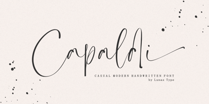 Introducing, Capaldi! Capaldi is a casual modern handwritten font. Capaldi comes with a lot of ligatures and ending swash that make your text is more charming and more expression. Capaldi brings natural element to your design, it's perfect for wedding, stationery, logos, social media quotes, branding identity, and many more.
 - Bromrose Sands Signature by Rillatype,
$15.00 Bromrose Sands Signature is a lovely signature font that comes with LOTS of ligatures that makes this font look natural. Bromrose Sands is perfect for quotes, logos, branding, magazines, wedding invitation, packaging, stationary, or any advertising purpose. To access the underline just type _+(number 1-8). Example: woodland_1 woodland_2 etc.
 - New Victoria by Gartype Studio,
$10.00 A modern blackletter typeface, designed by combining an old english style & modern style. It can be used for textbook, display text, headlines, logotype, and more. Within support by multilingual glyphs (characters), & lot of punctuations to support many people around the world with their unique languange and accent. Thank you very much.
 - Mordings JNL by Jeff Levine,
$29.00Mordings JNL is an odd-lot collection of images. These assorted dingbats are leftover art that never quite made it to one particular dingbat font category, but together comprise an eclectic assortment. Topics range from weather to vintage-style restaurant menu icons to decorative embellishments to an old-fashioned telephone dial. - Healthy Freak by Vozzy,
$10.00 Introducing original font named Healthy Freak. All available characters you can see at the screenshots. This font has two styles: Regular and Rough. Main feature is a lot of ligatures for both styles! This font will look good on any street styled designs like a poster, T-shirt, label, logo, etc.
 - Everleigh by Gleb Guralnyk,
$14.00 Everleigh is an elegant thin typeface inspired by antique old school fonts. It includes lots of ligatures and stylistic alternates helps to create an authentique and original lettering compositions. Also this font has multilingual support. Check out all available characters on the previews. Thank you and have a nice day!
 - Karmilla by Akufadhl,
$25.00 Karmilla is a Didone upright script styled typeface. Strong contrast between thick and thin lines. Presenting a luxurious and Feminine character and creating more elegant, classical design. With a wide range of Latin based language support and a lot of features such as Swash, Stylistic Set, Small Caps and more.
 - Arista 2.0 by Zetafonts,
$29.00 Arista is a soft round font, perfect for 2.0 logos and contemporary headlines. Arista 2.0 is the definitive release of Arista, with extra characters and corrected kerning. It includes a light version, a extrafilled version for 2.0 style fat borders, and an Alternate version with a lot of style changes.
 - Insigne Display by Gian Studio,
$15.00 Insigne Display A bold, modern and fun display font that lives up to its name. The way you can uniquely combine the different parts of this font makes it a lot of fun to use! Perfect for all purposes. , Suitable for magazine design, logo design, headlines, posters, packaging, cards etc. Enjoy!
 - FS Untitled Variable by Fontsmith,
$319.99Developer-friendly The studio has developed a wide array of weights for FS Untitled – 12 in all, in roman and italic – with the intention of meeting every on-screen need. All recognisably part of a family, each weight brings a different edge or personality to headline or body copy. There’s more. Type on screen has a tendency to fill in or blow so for each weight, there’s the choice of two marginally different versions, allowing designers and developers to go up or down a touch in weight. They’re free to use the font at any size on any background colour without fear of causing optical obstacles. And to make life even easier for developers, the 12 weight pairs have each been designated with a number from 100 (Thin) to 750 (Bold), corresponding to the system used to denote font weight in CSS code. Selecting a weight is always light work. Easy on the pixels ‘It’s a digital-first world,’ says Jason Smith, ‘and I wanted to make something that was really functional for digital brands’. FS Untitled was made for modern screens. Its shapes and proportions, x-height and cap height were modelled around the pixel grids of even low-resolution displays. So there are no angles in the A, V and W, just gently curving strokes that fit, not fight, with the pixels, and reduce the dependency on font hinting. Forms are simplified and modular – there are no spurs on the r or d, for example – and the space between the dot of the i and its stem is larger than usual. The result is a clearer, more legible typeface – functional but with bags of character. Screen beginnings FS Untitled got its start on the box. Its roots lie in Fontsmith’s creation of the typeface for Channel 4’s rebrand in 2005: the classic, quirky, edgy C4 headline font, with its rounded square shapes (inspired by the classic cartoon TV shape of a squidgy rectangle), and a toned-down version for use in text, captions and content graphics. The studio has built on the characteristics that made the original face so pixel-friendly: its blend of almost-flat horizontals and verticals with just enough openness and curve at the corners to keep the font looking friendly. The curves of the o, c and e are classic Fontsmith – typical of the dedication its designers puts into sculpting letterforms. Look out for… FS Untitled wouldn’t be a Fontsmith typeface if it didn’t have its quirks, some warranted, some wanton. There’s the rounded junction at the base of the E, for example, and the strong, solid contours of the punctuation marks and numerals. Notice, too, the distinctive, open shape of the A, V, W, X and Y, created by strokes that start off straight before curving into their diagonal path. Some would call the look bow-legged; we’d call it big-hearted. - FS Untitled by Fontsmith,
$80.00 Developer-friendly The studio has developed a wide array of weights for FS Untitled – 12 in all, in roman and italic – with the intention of meeting every on-screen need. All recognisably part of a family, each weight brings a different edge or personality to headline or body copy. There’s more. Type on screen has a tendency to fill in or blow so for each weight, there’s the choice of two marginally different versions, allowing designers and developers to go up or down a touch in weight. They’re free to use the font at any size on any background colour without fear of causing optical obstacles. And to make life even easier for developers, the 12 weight pairs have each been designated with a number from 100 (Thin) to 750 (Bold), corresponding to the system used to denote font weight in CSS code. Selecting a weight is always light work. Easy on the pixels ‘It’s a digital-first world,’ says Jason Smith, ‘and I wanted to make something that was really functional for digital brands’. FS Untitled was made for modern screens. Its shapes and proportions, x-height and cap height were modelled around the pixel grids of even low-resolution displays. So there are no angles in the A, V and W, just gently curving strokes that fit, not fight, with the pixels, and reduce the dependency on font hinting. Forms are simplified and modular – there are no spurs on the r or d, for example – and the space between the dot of the i and its stem is larger than usual. The result is a clearer, more legible typeface – functional but with bags of character. Screen beginnings FS Untitled got its start on the box. Its roots lie in Fontsmith’s creation of the typeface for Channel 4’s rebrand in 2005: the classic, quirky, edgy C4 headline font, with its rounded square shapes (inspired by the classic cartoon TV shape of a squidgy rectangle), and a toned-down version for use in text, captions and content graphics. The studio has built on the characteristics that made the original face so pixel-friendly: its blend of almost-flat horizontals and verticals with just enough openness and curve at the corners to keep the font looking friendly. The curves of the o, c and e are classic Fontsmith – typical of the dedication its designers puts into sculpting letterforms. Look out for… FS Untitled wouldn’t be a Fontsmith typeface if it didn’t have its quirks, some warranted, some wanton. There’s the rounded junction at the base of the E, for example, and the strong, solid contours of the punctuation marks and numerals. Notice, too, the distinctive, open shape of the A, V, W, X and Y, created by strokes that start off straight before curving into their diagonal path. Some would call the look bow-legged; we’d call it big-hearted.
 - Vendetta by Emigre,
$69.00 The famous roman type cut in Venice by Nicolas Jenson, and used in 1470 for his printing of the tract, De Evangelica Praeparatione, Eusebius, has usually been declared the seminal and definitive representative of a class of types known as Venetian Old Style. The Jenson type is thought to have been the primary model for types that immediately followed. Subsequent 15th-century Venetian Old Style types, cut by other punchcutters in Venice and elsewhere in Italy, are also worthy of study, but have been largely neglected by 20th-century type designers. There were many versions of Venetian Old Style types produced in the final quarter of the quattrocento. The exact number is unknown, but numerous printed examples survive, though the actual types, matrices, and punches are long gone. All these types are not, however, conspicuously Jensonian in character. Each shows a liberal amount of individuality, inconsistency, and eccentricity. My fascination with these historical types began in the 1970s and eventually led to the production of my first text typeface, Iowan Old Style (Bitstream, 1991). Sometime in the early 1990s, I started doodling letters for another Venetian typeface. The letters were pieced together from sections of circles and squares. The n, a standard lowercase control character in a text typeface, came first. Its most unusual feature was its head serif, a bisected quadrant of a circle. My aim was to see if its sharp beak would work with blunt, rectangular, foot serifs. Next, I wanted to see if I could construct a set of capital letters by following a similar design system. Rectangular serifs, or what we today call "slab serifs," were common in early roman printing types, particularly text types cut in Italy before 1500. Slab serifs are evident on both lowercase and uppercase characters in roman types of the Incunabula period, but they are seen mainly at the feet of the lowercase letters. The head serifs on lowercase letters of early roman types were usually angled. They were not arched, like mine. Oddly, there seems to be no actual historical precedent for my approach. Another characteristic of my arched serif is that the side opposite the arch is flat, not concave. Arched, concave serifs were used extensively in early italic types, a genre which first appeared more than a quarter century after roman types. Their forms followed humanistic cursive writing, common in Italy since before movable type was used there. Initially, italic characters were all lowercase, set with upright capitals (a practice I much admire and would like to see revived). Sloped italic capitals were not introduced until the middle of the sixteenth century, and they have very little to do with the evolution of humanist scripts. In contrast to the cursive writing on which italic types were based, formal book hands used by humanist scholars to transcribe classical texts served as a source of inspiration for the lowercase letters of the first roman types cut in Italy. While book hands were not as informal as cursive scripts, they still had features which could be said to be more calligraphic than geometric in detail. Over time, though, the copied vestiges of calligraphy virtually disappeared from roman fonts, and type became more rational. This profound change in the way type developed was also due in part to popular interest in the classical inscriptions of Roman antiquity. Imperial Roman letters, or majuscules, became models for the capital letters in nearly all early roman printing types. So it was, that the first letters in my typeface arose from pondering how shapes of lowercase letters and capital letters relate to one another in terms of classical ideals and geometric proportions, two pinnacles in a range of artistic notions which emerged during the Italian Renaissance. Indeed, such ideas are interesting to explore, but in the field of type design they often lead to dead ends. It is generally acknowledged, for instance, that pure geometry, as a strict approach to type design, has limitations. No roman alphabet, based solely on the circle and square, has ever been ideal for continuous reading. This much, I knew from the start. In the course of developing my typeface for text, innumerable compromises were made. Even though the finished letterforms retain a measure of geometric structure, they were modified again and again to improve their performance en masse. Each modification caused further deviation from my original scheme, and gave every font a slightly different direction. In the lower case letters especially, I made countless variations, and diverged significantly from my original plan. For example, not all the arcs remained radial, and they were designed to vary from font to font. Such variety added to the individuality of each style. The counters of many letters are described by intersecting arcs or angled facets, and the bowls are not round. In the capitals, angular bracketing was used practically everywhere stems and serifs meet, accentuating the terseness of the characters. As a result of all my tinkering, the entire family took on a kind of rich, familiar, coarseness - akin to roman types of the late 1400s. In his book, Printing Types D. B. Updike wrote: "Almost all Italian roman fonts in the last half of the fifteenth century had an air of "security" and generous ease extremely agreeable to the eye. Indeed, there is nothing better than fine Italian roman type in the whole history of typography." It does seem a shame that only in the 20th century have revivals of these beautiful types found acceptance in the English language. For four centuries (circa 1500 - circa 1900) Venetian Old Style faces were definitely not in favor in any living language. Recently, though, reinterpretations of early Italian printing types have been returning with a vengeance. The name Vendetta, which as an Italian sound I like, struck me as being a word that could be taken to signifiy a comeback of types designed in the Venetian style. In closing, I should add that a large measure of Vendetta's overall character comes from a synthesis of ideas, old and new. Hallmarks of roman type design from the Incunabula period are blended with contemporary concerns for the optimal display of letterforms on computer screens. Vendetta is thus not a historical revival. It is instead an indirect but personal digital homage to the roman types of punchcutters whose work was influenced by the example Jenson set in 1470. John Downer.
 - Gelato Script by Eclectotype,
$40.00 The original Gelato Script has been updated and improved, not once, but twice. This version is kept here for legacy and compatibility issues, but I would encourage new users to check out Gelato Luxe or Gelato Fresco instead. Gelato Script is a smooth-flowing typeface with an air of familiarity. Influenced by both formal scripts and mid-Twentieth Century hand lettering. The power of OpenType is used with precision in the Contextual Alternate feature to make sure letters connect seamlessly, t’s cross where they can and swashes don't crash into neighboring glyphs. 781 glyphs make up this font, which is capable of speaking in many different languages. Alternate forms are grouped into stylistic sets to make it easy to change the mood of the text. For example, ss01 makes droopable letters drop below the baseline to break it up a little if required. I recommend using it sparingly, one glyph at a time, but if you do enable it for a whole chunk of text, the clever OpenType programming ensures that it doesn't go overboard. Sets 2, 3 and 4 bring about alternate forms of S, s, B and Q. Set 5 changes AE and OE to some perhaps controversial Upper/lowercase ligatures. Engage ss06 for the underline feature. After a word, simply type two or more underscores and a line extends backwards under the word you just typed. Don't worry if you have to break for a descender, the OpenType programming will take care of making sure it connects properly to the preceding character. Sets 7 and 8 are for alternate ampersands, and ss09 swaps the script r for a regular shaped r. There are swash capitals available for most uppercase letters, and the OpenType programming makes sure there is room for them under or over the following letters. There’s also a good amount of ligatures thrown in. The localised forms feature can be set for Polish, where acutes get steeper and lslash takes on its script form; Dutch, where IJ and ij digraphs become cool ligatured combinations; and Romanian and Moldovan, where cedillas are subsituted for comma accents. The stylistic alternates feature groups together a few of the stylistic sets for users that can't get to them directly. Gelato Script is a highly usable, powerful typeface. Perfect for everything from food packaging to wedding invitations, sports team logos to magazine headings. Use it however you see fit. Just one thing - it’s not designed for all-caps settings, so avoid that at all costs!
 - Strange Alphabets by Typodermic,
$11.95 Come one, come all, and see the beauty of Strange Alphabets. Inspired by the gilded book covers of the late 1800s and the iconic Siouxsie & the Banshees band logo of the early 1980s, this narrow Arts & Crafts typeface will transport you to another world. In OpenType savvy applications, the first and last letter of a word will receive a small diamond ornament, giving your words a touch of elegance. And if that’s not enough for you, words starting with M will have a single diamond that splits into three, while words starting with O will automatically use a tall O. But, if you want to force a tall O in the middle of a word, simply use a zero. Oolong lovers, rejoice! Words that begin with double O’s will receive a pair of tall O’s, while a pair of O’s in the middle or at the end of a word will be replaced by a linked ring ligature. But that’s not all! Accessing OpenType stylistic alternates allows you to change the A and H crossbars into small rings and remove all the diamonds from the M. And don’t forget about the hyphen, en dash, and em dash, which are replaced with ring ornaments. And if you’re feeling extra fancy, a separate diamond ornament ◆ is included under Unicode 25C6. Don’t let all these fancy features intimidate you. Play with your application’s OpenType features and see what happens. And if you want to disable the automatic OpenType substitutions, simply turn off your application’s standard ligatures feature. Experience the beauty of Strange Alphabets for yourself and let your words take on a life of their own. Most Latin-based European writing systems are supported, including the following languages. Afaan Oromo, Afar, Afrikaans, Albanian, Alsatian, Aromanian, Aymara, Bashkir (Latin), Basque, Belarusian (Latin), Bemba, Bikol, Bosnian, Breton, Cape Verdean, Creole, Catalan, Cebuano, Chamorro, Chavacano, Chichewa, Crimean Tatar (Latin), Croatian, Czech, Danish, Dawan, Dholuo, Dutch, English, Estonian, Faroese, Fijian, Filipino, Finnish, French, Frisian, Friulian, Gagauz (Latin), Galician, Ganda, Genoese, German, Greenlandic, Guadeloupean Creole, Haitian Creole, Hawaiian, Hiligaynon, Hungarian, Icelandic, Ilocano, Indonesian, Irish, Italian, Jamaican, Kaqchikel, Karakalpak (Latin), Kashubian, Kikongo, Kinyarwanda, Kirundi, Kurdish (Latin), Latvian, Lithuanian, Lombard, Low Saxon, Luxembourgish, Maasai, Makhuwa, Malay, Maltese, Māori, Moldovan, Montenegrin, Ndebele, Neapolitan, Norwegian, Novial, Occitan, Ossetian (Latin), Papiamento, Piedmontese, Polish, Portuguese, Quechua, Rarotongan, Romanian, Romansh, Sami, Sango, Saramaccan, Sardinian, Scottish Gaelic, Serbian (Latin), Shona, Sicilian, Silesian, Slovak, Slovenian, Somali, Sorbian, Sotho, Spanish, Swahili, Swazi, Swedish, Tagalog, Tahitian, Tetum, Tongan, Tshiluba, Tsonga, Tswana, Tumbuka, Turkish, Turkmen (Latin), Tuvaluan, Uzbek (Latin), Venetian, Vepsian, Võro, Walloon, Waray-Waray, Wayuu, Welsh, Wolof, Xhosa, Yapese, Zapotec Zulu and Zuni.
 - Honfleur by Typodermic,
$11.95 Looking to add a touch of elegance and luxury to your message? Meet Honfleur, the typeface that’s guaranteed to take your design to the next level. Inspired by the beautiful lettering on an antique perfume poster, Honfleur boasts a stylish design that exudes sophistication and refinement. Its exceptionally wide alphabet is perfect for making a bold statement, and is sure to grab the attention of anyone who lays eyes on it. Whether you’re designing a high-end fashion brand, a luxury product, or just want to add a touch of class to your next project, Honfleur is the perfect choice. With its distinctive charm and luxurious feel, this typeface is sure to make a lasting impression and elevate your message to the next level. So why settle for an ordinary font when you can have the beauty and elegance of Honfleur? Try it out today and see for yourself just how much of a difference it can make in your designs. Most Latin-based European writing systems are supported, including the following languages. Afaan Oromo, Afar, Afrikaans, Albanian, Alsatian, Aromanian, Aymara, Bashkir (Latin), Basque, Belarusian (Latin), Bemba, Bikol, Bosnian, Breton, Cape Verdean, Creole, Catalan, Cebuano, Chamorro, Chavacano, Chichewa, Crimean Tatar (Latin), Croatian, Czech, Danish, Dawan, Dholuo, Dutch, English, Estonian, Faroese, Fijian, Filipino, Finnish, French, Frisian, Friulian, Gagauz (Latin), Galician, Ganda, Genoese, German, Greenlandic, Guadeloupean Creole, Haitian Creole, Hawaiian, Hiligaynon, Hungarian, Icelandic, Ilocano, Indonesian, Irish, Italian, Jamaican, Kaqchikel, Karakalpak (Latin), Kashubian, Kikongo, Kinyarwanda, Kirundi, Kurdish (Latin), Latvian, Lithuanian, Lombard, Low Saxon, Luxembourgish, Maasai, Makhuwa, Malay, Maltese, Māori, Moldovan, Montenegrin, Ndebele, Neapolitan, Norwegian, Novial, Occitan, Ossetian (Latin), Papiamento, Piedmontese, Polish, Portuguese, Quechua, Rarotongan, Romanian, Romansh, Sami, Sango, Saramaccan, Sardinian, Scottish Gaelic, Serbian (Latin), Shona, Sicilian, Silesian, Slovak, Slovenian, Somali, Sorbian, Sotho, Spanish, Swahili, Swazi, Swedish, Tagalog, Tahitian, Tetum, Tongan, Tshiluba, Tsonga, Tswana, Tumbuka, Turkish, Turkmen (Latin), Tuvaluan, Uzbek (Latin), Venetian, Vepsian, Võro, Walloon, Waray-Waray, Wayuu, Welsh, Wolof, Xhosa, Yapese, Zapotec Zulu and Zuni.
 - Cardigan by Typodermic,
$11.95 Have you been searching for the perfect font to add a touch of coziness and warmth to your designs? Look no further than Cardigan! This casual sans-serif typeface is the perfect choice for any project that requires a balance between informality and professionalism. With its straightforward and traditional letterforms, Cardigan is ideal for large amounts of text. Imagine curling up on the couch with a cup of tea and a knitting project, with Cardigan keeping you company as you dive into your latest pattern. The italics are particularly lovely, adding a naturalistic touch without being showy or over-the-top. And let’s not forget about the three available weights—Cardigan has you covered, no matter how bold or subtle you want your text to be. Whether you’re designing a cozy sweater pattern or a blog post about the latest knitting trends, Cardigan is the perfect font choice to add a touch of warmth and comfort to your project. Embrace the cozy, comforting feeling of Cardigan and let it become a staple in your font collection today! Most Latin-based European writing systems are supported, including the following languages. Afaan Oromo, Afar, Afrikaans, Albanian, Alsatian, Aromanian, Aymara, Bashkir (Latin), Basque, Belarusian (Latin), Bemba, Bikol, Bosnian, Breton, Cape Verdean, Creole, Catalan, Cebuano, Chamorro, Chavacano, Chichewa, Crimean Tatar (Latin), Croatian, Czech, Danish, Dawan, Dholuo, Dutch, English, Estonian, Faroese, Fijian, Filipino, Finnish, French, Frisian, Friulian, Gagauz (Latin), Galician, Ganda, Genoese, German, Greenlandic, Guadeloupean Creole, Haitian Creole, Hawaiian, Hiligaynon, Hungarian, Icelandic, Ilocano, Indonesian, Irish, Italian, Jamaican, Kaqchikel, Karakalpak (Latin), Kashubian, Kikongo, Kinyarwanda, Kirundi, Kurdish (Latin), Latvian, Lithuanian, Lombard, Low Saxon, Luxembourgish, Maasai, Makhuwa, Malay, Maltese, Māori, Moldovan, Montenegrin, Ndebele, Neapolitan, Norwegian, Novial, Occitan, Ossetian (Latin), Papiamento, Piedmontese, Polish, Portuguese, Quechua, Rarotongan, Romanian, Romansh, Sami, Sango, Saramaccan, Sardinian, Scottish Gaelic, Serbian (Latin), Shona, Sicilian, Silesian, Slovak, Slovenian, Somali, Sorbian, Sotho, Spanish, Swahili, Swazi, Swedish, Tagalog, Tahitian, Tetum, Tongan, Tshiluba, Tsonga, Tswana, Tumbuka, Turkish, Turkmen (Latin), Tuvaluan, Uzbek (Latin), Venetian, Vepsian, Võro, Walloon, Waray-Waray, Wayuu, Welsh, Wolof, Xhosa, Yapese, Zapotec Zulu and Zuni.
 - Sui Generis by Typodermic,
$11.95 Looking for a typeface that’s as unique as your personality? Look no further than Sui Generis, the rounded square sans-serif that’s unlike any other. With its technical letterforms and boxy curves, Sui Generis has an industrial character that’s all its own. It’s the kind of typeface that demands attention, without ever feeling pushy or obnoxious. In fact, its understated charm is part of what makes it so special. But don’t let its quirky personality fool you—Sui Generis is as practical as it is unique. With four weights, two widths, italics, and an outline style, it’s incredibly versatile and perfect for any project that requires a touch of character. So if you’re tired of bland, run-of-the-mill typefaces that all look the same, give Sui Generis a try. Its square letterforms and distinctive voice will make your design stand out from the crowd, and leave a lasting impression on anyone who sees it. Most Latin-based European writing systems are supported, including the following languages. Afaan Oromo, Afar, Afrikaans, Albanian, Alsatian, Aromanian, Aymara, Bashkir (Latin), Basque, Belarusian (Latin), Bemba, Bikol, Bosnian, Breton, Cape Verdean, Creole, Catalan, Cebuano, Chamorro, Chavacano, Chichewa, Crimean Tatar (Latin), Croatian, Czech, Danish, Dawan, Dholuo, Dutch, English, Estonian, Faroese, Fijian, Filipino, Finnish, French, Frisian, Friulian, Gagauz (Latin), Galician, Ganda, Genoese, German, Greenlandic, Guadeloupean Creole, Haitian Creole, Hawaiian, Hiligaynon, Hungarian, Icelandic, Ilocano, Indonesian, Irish, Italian, Jamaican, Kaqchikel, Karakalpak (Latin), Kashubian, Kikongo, Kinyarwanda, Kirundi, Kurdish (Latin), Latvian, Lithuanian, Lombard, Low Saxon, Luxembourgish, Maasai, Makhuwa, Malay, Maltese, Māori, Moldovan, Montenegrin, Ndebele, Neapolitan, Norwegian, Novial, Occitan, Ossetian (Latin), Papiamento, Piedmontese, Polish, Portuguese, Quechua, Rarotongan, Romanian, Romansh, Sami, Sango, Saramaccan, Sardinian, Scottish Gaelic, Serbian (Latin), Shona, Sicilian, Silesian, Slovak, Slovenian, Somali, Sorbian, Sotho, Spanish, Swahili, Swazi, Swedish, Tagalog, Tahitian, Tetum, Tongan, Tshiluba, Tsonga, Tswana, Tumbuka, Turkish, Turkmen (Latin), Tuvaluan, Uzbek (Latin), Venetian, Vepsian, Võro, Walloon, Waray-Waray, Wayuu, Welsh, Wolof, Xhosa, Yapese, Zapotec Zulu and Zuni.