10,000 search results
(0.026 seconds)
- Anton Charlote by Gloow Studio,
$16.00 Introducing Anton Charlote - A Display Retro Script Font. In creating this font, I just wanted to combine classic style with modern retro style, so be this font. Hope you like it. Inspired by some retro fonts that I made before. Anton Charlote is perfect for vintage and retro design, badge, logos,t-shirt, poster, branding, packaging, signage, book coverand so much more! Come with Opentype feature with a lot of alternates, its help you to make great lettering. This font is also support multi language.
 - Vin Sans Pro by Mint Type,
$35.00 Vin (translated from Ukrainian as “he”) is a superfamily consisting of three robust typefaces with pronounced vertical stems and rounded corners. All three typefaces feature very large x-height for even more expression and assertiveness. Vin Sans Pro is a quite narrow rigid sans-serif typeface with extra-large x-height and rounded corners. It is perfect for any kind of short copy with lots of attention guaranteed. Be sure to check other two typefaces of Vin superfamily: Vin Slab Pro and Vin Mono Pro .
 - Cartographer by Hipopotam Studio,
$25.00 Cartographer by Hipopotam Studio is a hand drawn serif typeface designed for our book Maps. Drawn with a 0.1 mm tip pen in a very small scale. It has only uppercase characters but each has alternate glyphs. It also has a lot of very useful features including multi-language support (with Cyrillic), discretionary ligatures, stylistic alternates, fractions, ordinals and contextual alternates that will automatically set alternate glyphs depending on frequency of appearance of the same character (even in web font but only in HTML5 browsers).
 - Violant by Eurotypo,
$60.00 Violant fonts are designed as a tribute to Queen Violant, wife of Jaume 1st, king of Aragon, a woman of strong character, who supported her husband in the conquest of Valencia in 1238. Probably, Violant read texts in Gothic letters, which at that time were subjected to a stylization process in Castile and Aragon. Violant family comes with 736 glyphs, with OpenType features, swashes for all glyphs, stylistics sets, stylistics alternates, a lot of ligatures and a generous set of ornaments to play with your texts.
 - DF Riga by Dutchfonts,
$33.00 DF Riga is a minimal bitmap typeface which works very well in small sizes both on your screen and on paper. But... if you want to express its deep beauty, use it in display sizes and the smell of ink is there. These typefaces (DF-A BIT, DF-Riga and DF-Dudok) owe their existence to the excellent letterpress printing of Hanneke Briër at the Grafisch Centrum Groningen. Beyond ‘the perfect’ there is a lot to get, it is made, you can see that.
 - 8 bit Darling by Norio Kanisawa,
$5.00 8bit darling is digital taste font. I think digital fonts are bitmap fonts generally, but dared to make digital fonts that are not bitmap fonts and made it. The name "8bit darling" borrowed a name from my favorite song. I made it consciously that it is a digital style but not so much inorganic. It contains hiragana, katakana, alphanumeric characters, some symbols. Horizontal writing only, vertical writing is not possible. Although it is slightly unique, I think choose a scene to use too much. I would be pleased if it could help you. <「エイトビットダーリン」紹介文> カクカクしたデジタル風のフォントです。 デジタル風のフォントといえばビットマップフォントかと一般的には思うのですが、敢えてビットマップフォントではないデジタル風のフォントを作りたいと思って作りました。 「エイトビットダーリン」という名前は私の好きな曲から名前を拝借しました。 デジタル風ではあるけれどもあまり無機質にならないように、と意識して作りました。 収録文字はひらがな、カタカナ、英数字、一部記号です。横書き専用、縦書きはできません。 ちょっと個性的ですがあまり使う場面を選ばないかと思います。 みなさまのお役に立てれば幸いです。 <スタイルカテゴリー> 角ゴシック
 - Text Tile by Tetradtype,
$25.00 TextTile is a system of heavy sans titling faces which can be utilized to carry a repeating chromatic pattern across words and letters. It stands apart from other chromatic faces, where layered effects typically interact only within each letter and do not carry through from one letter to another. The pattern repetition across letters of varying widths is achieved through OpenType substitution, using conditional alternates for each successive letter to allow for a seamless appearance across words, regardless of letter combinations. Though the pattern exists on a strict grid and the letters' widths and spacing must be highly regular in order to preserve the pattern repeat, the letterforms themselves are not rigid; rather, they appear organic, lively. The initial release includes patterns inspired by a classic buffalo plaid, separated into its horizontal and vertical components to maximize the creative possibilities for layering one-, two-, three-, and even four-color plaid patterns. Kits are available to produce the plaid pattern in detail—with overlapping diagonal hatching fully visible—or as a simplified version in which transparency can be used to simulate plaid or to create a checkered or striped effect. The TextTile family of fonts is a flexible canvas for mixing and matching a broad array of patterns to create a unique look. Check back for more pattern releases and take a look at the online specimen to see what is possible with the current offerings. Usage Notes For best results use an OpenType aware program. Enabling Contextual Alternates will ensure pattern alignment. For patterns that are made up of vertical stripes or columns using the Stylistic Alternate/Stylistic Set 1 will shift the columns. Stylistic Set 2 will change 1-0 into blocks of patterns.
 - Geometry Soft Pro by CheapProFonts,
$10.00 The Geometry Pro family has been designed to be the final word in purely geometric fonts, and this rounded “Soft” sub-family is the ultimate web 2.0 style font collection. Even though it is strictly geometric (as drawn with a compass and a ruler fixed to 90 and 45 degree angles) it is not slavishly modular: letters have differing widths, and the sidebearings, spacing and kerning has been finely adjusted to create smooth text. The Soft family contains three weights each with 6 variants: A is the basic form and the starting point B has more dynamic and modern shapes C has open and swirly shapes X is the serious text version Y has a very horizontal look Z is a collection of all the remaining more funky shapes Mix and match to your heart’s desire! Please enjoy the free “Bold N” version - this “notched” variant lets you test out the quality of the outlines and the language support. ALL fonts from CheapProFonts have very extensive language support: They contain some unusual diacritic letters (some of which are contained in the Latin Extended-B Unicode block) supporting: Cornish, Filipino (Tagalog), Guarani, Luxembourgian, Malagasy, Romanian, Ulithian and Welsh. They also contain all glyphs in the Latin Extended-A Unicode block (which among others cover the Central European and Baltic areas) supporting: Afrikaans, Belarusian (Lacinka), Bosnian, Catalan, Chichewa, Croatian, Czech, Dutch, Esperanto, Greenlandic, Hungarian, Kashubian, Kurdish (Kurmanji), Latvian, Lithuanian, Maltese, Maori, Polish, Saami (Inari), Saami (North), Serbian (latin), Slovak(ian), Slovene, Sorbian (Lower), Sorbian (Upper), Turkish and Turkmen. And they of course contain all the usual “western” glyphs supporting: Albanian, Basque, Breton, Chamorro, Danish, Estonian, Faroese, Finnish, French, Frisian, Galican, German, Icelandic, Indonesian, Irish (Gaelic), Italian, Northern Sotho, Norwegian, Occitan, Portuguese, Rhaeto-Romance, Sami (Lule), Sami (South), Scots (Gaelic), Spanish, Swedish, Tswana, Walloon and Yapese.
 - ChefScript by Andinistas,
$79.95 Chef Script is an experimental font designed by Carlos Fabian Camargo G. Its fantasy design contains 1463 glyphs to compose words, phrases and short messages on small and large sizes. The idea was born in a sketchbook that was perfected again by hand and achieving "non-neutral drawings" on tracing paper. With bezier digitization the empty and full parts of letters appeared with soft and eloquent curves as calligraphic result produces optimal readability. Chef Script combines warmth and good humor running in countless design applications such as labels and base plates, covers, posters, movie titles, seals and any printed design that needs an unusual typographic tool. In that sense, Chef Script is influenced by Speedball lettering manual (1957), Ross F. George. The illustrative nature of "ChefScript-complete" does not look anything like the traditional type design hierarchies. Therefore offers 7 hierarchical resource groups to design comfortable contexts flavored with illustration and typography: • ChefScript-Basic: Letters with horizontal and vertical thrifty proportions mimic an uninterrupted calligraphy brush made with flat tip. Thus its letters have ascenders and descenders strokes perpendicular to its base line and equal to the height of the lowercase. • ChefScript-Swashes: Letters expressive and unique flourishes to design highlighted words or phrases. • ChefScript-Caps: Uppercase with lowercase height give the impression of interrupted uppercase italics writing within what is written with uninterrupted lowercase letters producing strong contrast within a paragraph fragment. • ChefScript-Containers: Container drawings designed to exchange with infinite possibilities each order so that its inferior serve to store information written or drawn. • ChefScript-Dingbats: Pictograms that communicate: kitchen, chef, restaurant, food, etc. • ChefScript-Numbers: Bulky and useful numbers to highlight prices or figures containing points or dollar signs. • Chef Script-Words: Predesigned words with uninterrupted letters diagonally leveled highlighting various thoughts in writing.
 - Guhly by Ingo,
$35.00 A modern Sans Serif — prosaic, designed geometrically, beautiful in large sizes All the dimensions of the font are based on Factor 10. The general principle of construction leads to slim forms and nearly equally wide characters. So the font appears very solid but is actually difficult to decipher in longer texts. Along with the ”normal“ Guhly Regular there are also the two versions Guhly Light and Guhly Bold, whereas in each only the vertical strokes [Guhly Light] or horizontal [Guhly Bold] have been changed in strength. The result is a very individual decorative effect which slightly reflects old circus and western scripts. The lower case characters in the version Guhly Book are, therefore, optimized to be suitable for longer texts in smaller font sizes — because after all, sometimes you should read a bit more than just the headline… The design of a shampoo bottle stands behind the creation of this sans serif display font. Prominent, clearly constructed forms with circular arcs define its appearance. This is a font primarily designed for use with capital letters — for all sorts of advertising purposes, headlines and titles. But lower case letters also belong to a good functional font; so, of course, Guhly includes them and ligatures for the more ”critical“ letter combinations as well as stylistic alternates for the letters K (or k), V (v) and o. As a decorative “encore”, the Guhly family also contains the “normal” weight in two variants: on the one hand the Guhly Cutout – these are letters without counter, as if the letters were cut out and the internal surfaces fell out; and on the other hand the Guhly stencil – as the name suggests, a stencil font with the typical bars that give a stencil the necessary cohesion.
 - TT Cometus by TypeType,
$19.00 Dynamic, attractive and catchy - the new TypeType display font! Please note! If you need OTF versions of the fonts, just email us at commercial@typetype.org TT Cometus is an expressive typeface that captivates from the first time you read a text set in it. Despite its massiveness, the typeface is malleable and dynamic, like a comet piercing the space in order to achieve the only goal - to capture the attention of the viewer. TT Cometus is a slab serif whose strong serifs are serifed at the junctions with the vertical stroke to give the typeface a dynamic and modern character. Thanks to this solution, some elements of the font evoke associations with calligraphic works, while display elements remain stable thanks to massive serifs. The pointed endings of the letters c, y, e, t and noticeable inflows of arches and semi-ovals make the character of TT Cometus dynamic. The contrast between the thicknesses of the horizontal and vertical elements is small, but in the serifs, inflows, and letter endings, the contrast is pronounced. The nature of the font is balanced, and its friendliness is supported by the smoothness of shapes. Oriented towards the viewer, flowing yet massive and dynamic, TT Cometus is suitable for use in eye-catching projects. This is a display font that shows its character better in a large body size and can be used in printed materials or on the web. The font looks flawless in headlines and logos, and is suitable for use in branding. TT Cometus consists of 5 faces: 4 upright and one variable font. Each face has 568 glyphs. The font contains 18 OpenType features, including a large number of ligatures, sets of alternative characters for the ampersand and the letter g.
 - Scriptina Pro - 100% free

- Familiar Pro - 100% free

- Amerika Pro - 100% free

- Foobar Pro - 100% free

- HandVetica - 100% free

- Geometry Soft Pro Bold N - 100% free

- Arsenale Blue - 100% free

- Hermanz Titling by California Type Foundry,
$47.00 Hermanz™ Titling is inspired by the most majestic caps that Hermann Zapf ever drew. They are inscriptional caps, square caps, or “capitalis monumentalis”. These caps are some of the most beautiful letters made by one of the greatest talents of our time; so beautiful they deserve to be seen and appreciated by everyone. If you do any work for churches, wedding, funeral, anniversary, or other ceremonies, for the fine arts, exclusive clubs, or higher education—you will love how these letters make your brochures, pamphlets and announcements look. Hermanz Titling works for anything labeled "fine": fine dining, fine music, fine art (pamphlets, books, posters, cookbooks). It also fits well for religious topics: posters, events, websites, hymnals, for biblical; and ceremonies, religious or otherwise. Emotions It Can Communicate: • Importance • Timelessness • Special Event • Tradition • Reverence • Artistry • Beauty Released June 2021 on the Memorial of Hermann Zapf, as part of the California Type Foundry Memorial Series: Honoring the life and work of the great font designers. FONT STORY The Majestic Caps When I was on one of my visits to rare books rooms I found some large caps of Hermann Zapf, and I knew that I had to make a font inspired by these. I was surprised that no one had ever made them into a font. They were some of the most beautiful caps I had ever seen. These caps were surprisingly difficult to make. I thought it would take me a week or two; to get the detail and spirit right took significantly longer– but it was well worth the effort! When you print Hermanz Titling on a page, you will see what I mean. Even when printed digitally, it’s the closest thing to letterpress. You might even have some people thing it was printed by a traditional method with ink! (Note: Unless printed at very large sizes, this font is not recommended for actual letterpress, because the serifs are too thin.) If you do any work for churches, wedding, funeral, anniversary, or other ceremonies, for the fine arts, exclusive clubs, or higher education—you will love how these letters make your brochures, pamphlets and announcements look. Enjoy this breathtaking font, and may it help inspire people with your messages! –Dave Lawrence & the California Type Foundry
 - Marion by Typodermic,
$11.95 Step back in time with Marion, the transitional serif typeface that exudes a nineteenth-century flair. With its classic structure reminiscent of Century Roman, Marion stands out with a stroke treatment that’s closer to the timeless elegance of Baskerville. The inspiration for Marion comes from a diverse array of old metal typefaces, resulting in a design that’s uniquely historic and fascinating. One of the most distinctive features of Marion is the hammer claw shape of the serifs, adding a touch of industrial charm and a smokestack vibe. The font is available in Regular, Italic, Bold, and Bold Italic, allowing for a range of possibilities when it comes to design. With old-style numerals and standard f-ligatures, Marion offers the perfect balance between historical design and modern-day functionality. Additionally, it includes some eccentric discretionary ligatures and chirpy swash letters, adding a whimsical touch to your graphic design projects. Take your design to the next level with Marion. Its historically inspired design and unique features are sure to add a touch of elegance and sophistication to any project, making it the perfect choice for designers looking to create something truly remarkable. Most Latin-based European, Vietnamese, Greek, and most Cyrillic-based writing systems are supported, including the following languages. Afaan Oromo, Afar, Afrikaans, Albanian, Alsatian, Aromanian, Aymara, Azerbaijani, Bashkir, Bashkir (Latin), Basque, Belarusian, Belarusian (Latin), Bemba, Bikol, Bosnian, Breton, Bulgarian, Buryat, Cape Verdean, Creole, Catalan, Cebuano, Chamorro, Chavacano, Chichewa, Crimean Tatar (Latin), Croatian, Czech, Danish, Dawan, Dholuo, Dungan, Dutch, English, Estonian, Faroese, Fijian, Filipino, Finnish, French, Frisian, Friulian, Gagauz (Latin), Galician, Ganda, Genoese, German, Gikuyu, Greenlandic, Guadeloupean Creole, Haitian Creole, Hawaiian, Hiligaynon, Hungarian, Icelandic, Igbo, Ilocano, Indonesian, Irish, Italian, Jamaican, Kaingang, Khalkha, Kalmyk, Kanuri, Kaqchikel, Karakalpak (Latin), Kashubian, Kazakh, Kikongo, Kinyarwanda, Kirundi, Komi-Permyak, Kurdish, Kurdish (Latin), Kyrgyz, Latvian, Lithuanian, Lombard, Low Saxon, Luxembourgish, Maasai, Macedonian, Makhuwa, Malay, Maltese, Māori, Moldovan, Montenegrin, Nahuatl, Ndebele, Neapolitan, Norwegian, Novial, Occitan, Ossetian, Ossetian (Latin), Papiamento, Piedmontese, Polish, Portuguese, Quechua, Rarotongan, Romanian, Romansh, Russian, Rusyn, Sami, Sango, Saramaccan, Sardinian, Scottish Gaelic, Serbian, Serbian (Latin), Shona, Sicilian, Silesian, Slovak, Slovenian, Somali, Sorbian, Sotho, Spanish, Swahili, Swazi, Swedish, Tagalog, Tahitian, Tajik, Tatar, Tetum, Tongan, Tshiluba, Tsonga, Tswana, Tumbuka, Turkish, Turkmen (Latin), Tuvaluan, Ukrainian, Uzbek, Uzbek (Latin), Venda, Venetian, Vepsian, Vietnamese, Võro, Walloon, Waray-Waray, Wayuu, Welsh, Wolof, Xavante, Xhosa, Yapese, Zapotec, Zarma, Zazaki, Zulu and Zuni.
 - Ultraproxi by Typodermic,
$11.95 Looking for a typeface that conveys a technical and austere vibe without sacrificing design flexibility? Look no further than Ultraproxi, the cutting-edge typeface that draws inspiration from the high-speed computer printers of the mid-20th century. Designed with the precision and clarity required for high-speed printing, Ultraproxi captures the essence of the IBM 1403 chain printer, with its metal type slugs linked in a chain that whirled rapidly over an ink ribbon. The result is a typeface that conveys both speed and accuracy, perfect for modern design applications. But Ultraproxi is more than just a nostalgic homage to a bygone era of computing. Its semi-monospaced design is uniquely suited to the needs of modern graphic designers, allowing for a technical demeanor without the drawbacks of traditional monospaced typefaces. With six weights and italics, Ultraproxi offers unparalleled versatility and flexibility. Whether you’re designing a sleek and streamlined UI or a complex data visualization, Ultraproxi is the typeface of choice for designers who demand both style and substance. So why settle for a boring, generic typeface when you can have Ultraproxi? With its unique blend of technical precision and design flexibility, this typeface is sure to impress even the most discerning design enthusiasts. Most Latin-based European, Vietnamese, Greek, and most Cyrillic-based writing systems are supported, including the following languages. Afaan Oromo, Afar, Afrikaans, Albanian, Alsatian, Aromanian, Aymara, Azerbaijani, Bashkir, Bashkir (Latin), Basque, Belarusian, Belarusian (Latin), Bemba, Bikol, Bosnian, Breton, Bulgarian, Buryat, Cape Verdean, Creole, Catalan, Cebuano, Chamorro, Chavacano, Chichewa, Crimean Tatar (Latin), Croatian, Czech, Danish, Dawan, Dholuo, Dungan, Dutch, English, Estonian, Faroese, Fijian, Filipino, Finnish, French, Frisian, Friulian, Gagauz (Latin), Galician, Ganda, Genoese, German, Gikuyu, Greenlandic, Guadeloupean Creole, Haitian Creole, Hawaiian, Hiligaynon, Hungarian, Icelandic, Igbo, Ilocano, Indonesian, Irish, Italian, Jamaican, Kaingang, Khalkha, Kalmyk, Kanuri, Kaqchikel, Karakalpak (Latin), Kashubian, Kazakh, Kikongo, Kinyarwanda, Kirundi, Komi-Permyak, Kurdish, Kurdish (Latin), Kyrgyz, Latvian, Lithuanian, Lombard, Low Saxon, Luxembourgish, Maasai, Macedonian, Makhuwa, Malay, Maltese, Māori, Moldovan, Montenegrin, Nahuatl, Ndebele, Neapolitan, Norwegian, Novial, Occitan, Ossetian, Ossetian (Latin), Papiamento, Piedmontese, Polish, Portuguese, Quechua, Rarotongan, Romanian, Romansh, Russian, Rusyn, Sami, Sango, Saramaccan, Sardinian, Scottish Gaelic, Serbian, Serbian (Latin), Shona, Sicilian, Silesian, Slovak, Slovenian, Somali, Sorbian, Sotho, Spanish, Swahili, Swazi, Swedish, Tagalog, Tahitian, Tajik, Tatar, Tetum, Tongan, Tshiluba, Tsonga, Tswana, Tumbuka, Turkish, Turkmen (Latin), Tuvaluan, Ukrainian, Uzbek, Uzbek (Latin), Venda, Venetian, Vepsian, Vietnamese, Võro, Walloon, Waray-Waray, Wayuu, Welsh, Wolof, Xavante, Xhosa, Yapese, Zapotec, Zarma, Zazaki, Zulu and Zuni.
 - PF DIN Text by Parachute,
$79.00 The purpose of the original DIN 1451 standard was to lay down a style of lettering which is timeless and easily legible. Unfortunately, these early letters lacked elegance and were not properly designed for typographic applications. Ever since its first publication in the 1930’s, several type foundries adopted the original designs for digital photocomposition. By early 2000, it became apparent that the existing DIN-based fonts did not fulfil the ever-increasing demand for a diverse set of weights and additional support for non-Latin languages. Parachute® was set out to fill this gap by introducing the PF DIN series which has become ever since the most comprehensive and sophisticated set of DIN typefaces. It was based on the original standards but was specifically designed to fit typographic requirements. Its letterforms divert from the stiff geometric structure of the original and introduce instead elements which are familiar, softer and easier to read. The first set of fonts was completed in 2002 as a group of 3 families which included condensed and compressed versions. With its vast array of weights, the extended language support, but most of all its meticulous and elaborate design, it has proved itself valuable to numerous design agencies around the world. Ever since its first release, it has been used in diverse editorials, packaging, branding and advertising campaigns as well as a great number of websites. It was quoted by Publish magazine as being “an overkill series for complex corporate identity projects”. The whole PF DIN Text type system (with normal, condensed and compressed styles) includes 45 weights from Hairline to Extra Black including true-italics. Additionally, every font in the Pro series is powered by 270 very useful symbols for packaging, environmental graphics, signage, transportation, computing, fabric care. There are 2 versions to choose from: The PRO version is the most powerful. All weights support Latin, Cyrillic, Greek, Central/Eastern European, Romanian, Baltic and Turkish, with 20 advanced opentype features including small caps. The standard STD version is more economic. All weights support Latin, Central/Eastern European, Romanian, Baltic and Turkish, with 18 advanced opentype features including small caps. In 2010 Parachute® released 4 new families DIN Monospace, DIN Stencil, DIN Text Arabic and DIN Text Universal. All these are complemented by the popular DIN Display version. Altogether the Parachute DIN series is a set of 8 superfamilies with a total of 96 weights.
 - Aphrodite Slim by Typesenses,
$57.00 Aphrodite Slim Pro is not just a lighter version of its sister Aphrodite Pro. Aphrodite Slim Pro has duplicated the quantity of characters of its partner, and that means more than 500 new glyphs, reaching a total of more than 1000. More delicate and meticulous, Aphrodite Slim Pro is once more a new typography with deep calligraphic ideals: We immersed ourselves into the world of each calligraphy ductus and each calligraphy masters by studying from decoration to lettering books. This was the key for the logic of Aphrodite Slim’s behavior. The new concept of Aphrodite Slim Pro was to join diverse styles of calligraphy in one in order to achieve an autonomous expressiveness, in fact, this is what calligraphy aims to, and we agreed to bring those ideals to the world of typography: It is justifiable to be inspired in hundred-year-old calligraphies, but it is even better if the results you obtain have a plus. A personal plus. During the creation process we were wondering whether it was possible to mix certain strokes of such rigid styles as uncial, (Li·n’s favourite style), with strokes of the copperplate, (Sav’s favourite style), and also to take and mix cualities of cancelleresca cursiva, formata and moderna; finally giving our creation a roman-transition italic look. So Aphrodite Slim takes ideals and aspects from those formal styles, following its own logic though, and emphasizing the fact of being a decorative typography. Calligraphy masters of our past are who we are in debt with. They are the cause we have lovely letters now. They have been spontaneous at the moment of creation, what differs from the type-designers of nowadays, whose spontaneity is more limited. Digital faces that we are used to see these days are a result of long hours of optical adjustments, grids, macros and inspirations of other existing typography, but without personal contributions. Aphrodite Slim wants to refute this. Its mission is to rescue de spontaneity of the artesanal lettering in order to obtain unique words; those which only calligraphy masters of our past or lettering artists of our present could give us. We have worked hard to achieve this, making Aphrodite the most universal font we could: It was necessary to study the most common words, focalizing more in the ones referring to “sensitivity”, of four of the most spoken languages in the world. Aphrodite Slim has an enormous quantity of decorative characters and special ligatures for phrases and words in English, French, Spanish and German. (See English, Français, Español, Deutsch PDF in the gallery section). We promise there is no existing type that decorates/ligates glyphs and words like Aphrodite Slim does: It is the first time a font like this really considers its purpose. -The way glyphs are ligated is insane- : Aphrodite Slim rescues some ideals of persons like Jan van den Velde (Italian cancilleresca writing of XVI Century) who understands ascenders and descenders as possibilities to beautify the lines of writing with curved strokes that seem to be dancing above and below of the words. This master also creates ascenders and descenders even where they are not necessary, on letters that do not actually need them: Aphrodite Slim takes this ideal. The font counts with a wide range of glyphs that seem not to be satisfied with its more primitive form and prefer to extreme their parts to be decorative. It also existed masters of calligraphy like José de Casanova of XVII Century, who, with a magnificant skill and a really personal mark, had the particularity of ligating words that were actually separated with spaces. This is another innovative feature in Aphrodite Slim. An investigation of the most common beginnings and endings words of the English language was done. Having that feature activated (discretionary ligatures), common words will start to ligate or to be decorated even when they are separated by spaces. Impossible to forget Francesco Periccioli of XVII Century and our experience us designers to face with works of him: His letters, that today are included in the group of cancellerescas modernas, have been a direct inspiration to the oldstyle figures and historical forms variables in Aphrodite Slim. Giovanni Antonio Tagliente (XVI Century) and his particular way of making tails and diagonals longer than usual, qualities that our creation reflects too. Finally, our adventures in Biblioteca Nacional and Barrio San Telmo, Buenos Aires, were essential for us to make Aphrodite Slim more complete and interesting: Sav did an excellent work when studying how the decorative miscellanea and swirls of early XX century were. She also investigated what particularities made those roman titling characters look antique so she could rescue some ideals for the oldstyle figures and historical forms variables. This also leaded her to create the ornaments variable in Aphrodite Slim. We are really proud of presenting Aphrodite Slim Pro, a typography that was the result of days and nights of working hard, because we do love what we do; and we are glad we are living in a present that gives us the possibility to spread this kind of art, because that is the way we consider our job: Aphrodite Slim Pro is Art. Hope you can appreciate the enormous work this type has. Features. Aphrodite Slim Pro is the most complete variable. It includes more than 1000 glyphs. Thanks to the Open-Type programming, it counts with a easy way to change/alternate glyphs if the application in which the font is used supports this. The variables contained in Aphrodite Slim Pro are also offered separately. Aphrodite Slim Text: It is the variable for lines and paragraphs. Thus it is the least ornamental and the most accurate to achieve a satisfying legibility. It has the Standard Ligatures feature in order to improve the possible conflicts some glyphs could have by others. Aphrodite Slim Contextual: It is the one that makes emphasis in decorating. It has the particularity of ligating/decorating words of common use in English, French, Spanish and German. It also has the quality of ligating common beginnings and endings of the common words in English. Aphrodite Slim Stylistic: With similar features of Slim Contextual. It includes a set of decorative numbers for a display use. Aphrodite Slim Swash: This one has special beginnings and endings to decorate words. Aphrodite Slim Endings: It makes words look as a signature. Aphrodite Slim Historical: It adds an antique look to the written word. It also has the special historical ligature function. Aphrodite Slim Titling: This one is the most decorative. Its copperplate inspired ornaments give words a special color, in order to handle the quantity of decoration, it comes with the standard ligature feature, which has the most common ligatures plus others that make decorative swirls not to be conflictive. Aphrodite Slim Ornaments: A set of 52 ornaments. Aphrodite Slim Pro includes all this features plus the Stylistic Set 1; Stylistic Set 2 and the possibility of Slashed Zero. We recommend you to check out the gallery in order to see all these features in action.
 - Fenwick Outline Free - Unknown license

- Mak by Tkachenko design,
$21.00 Mak is a display font with a Ukrainian feeling inspired by Ukrainian music. This is a big update of the first free two styles of Mak (SemiBold High & Black High) that were created in 2019 and become widespread among free display fonts. The big update wasn't been only adding more weights and contrasts but also changing a lot of glyphs and adding new ones. Now Mak supports all Latin-based languages and European Cyrillic. Experiments with historical forms, contrasts, and daring shapes to create a new image of Ukrainian Cyrillic and Latin based on it.
 - Chroman by Larin Type Co,
$16.00 Chroma this is a modern and elegant typeface. It carries a bold weight and with it in highlight the main thing, make a title or logo and much more. It can also be more expressive and playful, thanks to the many alternates that are harmoniously combined in this font and make it more attractive and expressive. Try to change the alternatives, ligatures and you will get a lot of options for your project that will make it unique. This font is easy to use and has OpenType features.
 - Plastilin by ParaType,
$25.00 Plastilin type family of two weights obtained its name due to the soft, curved, stroke terminals of characters (J, K, L, R and others) and the little pointed serifs, as if extruded from stroke plastic mass. The character set has a lot of additional Latin and Cyrillic ligatures, as well as several alternate letter forms. Plastilin was designed for ParaType by Oleg Karpinsky in 2005. It is for use both in display setting and short text passages. In 2008 the author added two weights (Light and Black) and improved letterforms of some characters.
 - Atsuka Montreal by Grezline Studio,
$17.00 Atsuka Montreal is a display font family with elegance and luxury aesthetic. It's a perfect use for any fashion design project. This font is accompanied by signature script to make your creation be more appealing and beautiful. Atsuka Montreal font is also usable in a wide range of works such as logos, covers, posters, quotes, product packaging, merchandise, social media and much more! Feature : - A lot of Alternates - Multilingual Language - Works on PC & Mac - Simple installations - Accessible in the Adobe Illustrator, Adobe Photoshop, Adobe InDesign, even works on Microsoft Word.
 - Akira by IKIIKOWRK,
$19.00 Introducing Akira - Zenbrush Script, created by ikiiko. Calm brush script type, adapted from Japanese zen culture. Akira typeface uses firm lines with strong curves with lots of alternates & stylistic options to choose. This typeface is perfect for an elegant logo, poster design, beauty product, packaging product, community logo, magazine, quotes, or simply as a stylish text overlay to any background image. What's included? Uppercase & Lowercase Number & Punctuation Alternates & Stylistic Multilingual Support Enjoy our font and if you have any questions, you can contact us by email : ikiikowrk@gmail.com
 - Naive Line Sans by S&C Type,
$8.00 Naïve Line Sans is an unusual handwritten sans serif font designed by Fanny Coulez and Julien Saurin in Paris. Our goal was to draw a font with finely irregular lines that give a human and whimsical feeling. We designed five weights, finely balanced, to assure a good readability whatever the size. This font is part of our Naïve superfamily that contains lot of variations: Line, Inline, Serif, Sans Serif, and a special Art Deco one. Just click on our foundry name to see them all! We hope you will enjoy our work. Merci beaucoup!
 - Honey Dolista by Mega Type,
$19.00 Honey Dolista is an elegant serif look with lots of ligatures and alternative bindings that will make your presentation or logo stand out! Bring your brand to life and add a touch of elegance and style with the Honey Dolista font. customize it for your titles, logos, business cards, printed quotes, all kinds of invitations, cards, packaging and your website or social media branding. Features Include: -Uppercase & Lowercase -Swash, Ligature -Alternates Binders -Numbers & Symbols -Multi language Please contact us if you have any questions, we are happy to help you! Enjoy!
 - Mrs Lollipop by Hipopotam Studio,
$20.00 Mrs Lollipop is a hand drawn narrow typeface designed for one of our books. You can layer different styles over the background style to achieve lots of colorful effects. Check out the manual for details. Mrs Lollipop has upper and lowercase characters with up to three alternate glyphs. Build in OpenType Contextual Alternates feature will automatically set alternate glyphs depending on frequency of appearance of the same character (even in web font but only in HTML5 browsers). The script doesn’t throw random glyphs. It has lines, frames, hearts, stars, ladybird and two rabbits.
 - Mongka by madeDeduk,
$19.00 Masterfully designed to become a stylish and elegant, this font has the potential to bring each of your creative ideas to the highest level. Combine with ligatures and special alternative glyphs so you can create a lots with layouts and compositions. Mongka brings a touch of luxury and bespoke custom typography to logos, websites, social media quotes, wedding branding, and more. Whats Included? Uppercase & Lowercase Number & Symbol International Glyphs (Cyrillic & Greek) Multilingual support Alternative Ligature Thank you so much for checking out my shop, Hope you enjoy it.
 - LeakorLeach by Ingrimayne Type,
$9.95 An early drawing tablet was largely responsible for the LeakorLeach typefaces. They resemble hand lettering using cake icing or done with an ink pen that leaves lots of ink blobs or ink blots. The family has two widths, plain and condensed, and in addition to each having an oblique style, each also has a leftward-inclined style. There may not be many uses for a leftward-inclined typeface, but for those needing one, the LeakorLeach family offers two. The LeakorLeach typefaces are unlike any other faces from IngrimayneType.
 - Bogue Slab by Melvastype,
$29.00 Bogue is a slab serif type family of 8 weights and matching italics. Bogue Slab comes with a lots of stylistic alternates that makes it very versatile in various uses like logos, editorial design, branding, web design, package design and much more. You can use it to create short powerful phrases and headlines and also use it in longer text like lead paragraphs and body texts. So if you are looking for a versatile slab serif font you have found it! Bogue Slab is a slab serif version of Bogue
 - Hippie Vintage by Putracetol,
$22.00 Hippie Vintage’s bold, groovy, clean and unique with vintage fell. Hippie Vintage is very versatile sans font that works great with vintage themes. Hippie Vintage is a vintage sans serif font with beautiful ligatures, tons of alternative glyphs and multilingual support. Helps to create layout design in 60s or 70s design projects. Come with open type feature with a lot of alternates, its help you to make great lettering. Hippie Vintage best uses for heading headlines, cover, poster, logos, quotes, product packaging, merchandise, social media & greeting cards and many more.
 - Strata by Just My Type,
$25.00 Big, expansive and flat on top; that’s a land formation called a mesa. “Mesa” was the first name for Strata Bold Rounded Serif, but it turns out it’s someone else’s registered trademark; in any case, if you need a bold, extended mono-height font that’s great for logotype, you could, as we used to say in the Mid-West, do a whole lot worse. SBRS is the final generation of an evolution that started with Mesa begating Mesa Bold which begat Mesa Bold Rounded which culminated in this evolutionary superior product. Use it!
 - Paradise June by Putracetol,
$28.00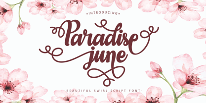 Paradise June is a beautiful swirl script font. This font is feminime, elegant, messy and modern. This font has a very beautiful swirl, perfect for use in wedding and invitation projects. Also very suitable for crafting or lettering. Paradise June perfect for wedding event, anniversary, birthday,greeting cards, logotype, branding, wedding invite and card, elegant logo, poster, packaging, stationery, website, and any other projects. Come with open type feature with a lot of alternates, its help you to make great lettering. This font is also support multi language.
 - Janges by Supfonts,
$18.00 This handwritten script has been attentively written, with gentle curves to produce a font thats completely distinctive and original. Perfect for adding a elegant and unique touch to your lettering projects and branding Also with their help, you can create a Wedding lettering or beautiful frame for your home. Or just use for your small business, book covers, stationery, marketing, magazines and more. --- TTF & OTF versions are available. A lot of Swashes Multilingual Support I hope you have oodles of fun using Janges script! Dmitriy --- Check out my blog: instagram.com/media.lab.co pinterest.com/dmitriychirkov7
 - Harbour Light by Cititype,
$19.00 Harbourligh is a monoline script font. designed for those of you who are needing a touch of clean monoline handwritten Font. Resembling the typical line of a casual rollerpen and equipped with a lot of stunning ligature make it more naturals, assertive and appear more stand out for modern brands. The swas line is a straight line at the beginning and end to emphasize a strong decision in the signature. this font is a great choice for digital signature, logo, book cover, web site, brand identity, wedding invitation, photography, movie title and other modern brand.


