10,000 search results
(0.05 seconds)
- Supporting Cast JNL by Jeff Levine,
$29.00 Supporting Cast JNL is a hybrid of similar designs for hand lettering found on title cards from two morality photoplays from 1936 dealing with drug abuse, "Cocaine Fiends" and "Marihuana" respectively. The films were produced with the hope of educating the public against the dangers of illicit drugs, but they have taken on a cult status because of the dated approach to the problem. Despite all this, it is the Deco-influenced hand lettering which is being celebrated in this font release, not the subject matter of the films.
 - Monkton by Club Type,
$36.99 The inspiration for this typeface family came from my childhood experiences at West Monkton, amidst an historic part of the South West of England. Studies of the original incised capitals of the Trajan column in Rome were analysed and polished for this modern version. The lower case letterforms and numerals were then created in sympathy, taking their proportions from the incised letters of local gravestones. Its name honours not only the area where the original alphabet was conceived and drawn, but also the people responsible for fostering my initial interest in letters.
 - Sagittarius by Hoefler & Co.,
$51.99 A typeface with lightly-worn futurism, Sagittarius is equally at home among the beauty and wellness aisles, or the coils of the warp core. The Sagittarius typeface was designed by Jonathan Hoefler in 2021. A decorative adaptation of Hoefler’s Peristyle typeface (2017), Sagittarius’s rounded corners and streamlined shapes recall the digital aesthetic of the first alphabets designed for machine reading, a style that survives as a cheeky Space Age invocation of futurism. Sagittarius was created for The Historical Dictionary of Science Fiction, where it first appeared in 2021. From the desk of the designer: Typeface designers spend a lot of time chasing down strange valences. We try to figure out what’s producing that whiff of Art Deco, or that vaguely militaristic air, or what’s making a once solemn typeface suddenly feel tongue-in-cheek. If we can identify the source of these qualities, we can cultivate them, and change the direction of the design; more often, we just extinguish them without mercy. Sometimes, we get the chance to follow a third path, which is how we arrived at Sagittarius. During the development of Peristyle, our family of compact, high-contrast sans serifs, I often found myself unwittingly humming space-age pop songs. Nothing about Peristyle’s chic and elegant letterforms suggested the deadpan romp of “The Planet Plan” by United Future Organization, let alone “Music To Watch Space Girls By” from the ill-advised (but delicious) Leonard Nimoy Presents Mr. Spock’s Music from Outer Space, but there they were. Something in the fonts was provoking an afterimage of the otherworldly, as if the typeface was sliding in and out of a parallel universe of high-tech spycraft and low-tech brawls with rubber-masked aliens. It might have had something to do with a new eyeglass prescription. But I liked the effect, and started thinking about creating an alternate, space-age version of the typeface, one with a little more funk, and a lot more fun. I wondered if softer edges, a measured dose of seventies retrofuturism, and some proper draftsmanship might produce a typeface not only suitable for sci-fi potboilers, but for more serious projects, too: why not a line of skin care products, a fitness system, a high-end digital camera, or a music festival? I put a pin in the idea, wondering if there’d ever be a project that called for equal parts sobriety and fantasy. And almost immediately, exactly such a project appeared. The Historical Dictionary of Science Fiction Jesse Sheidlower is a lexicographer, a former Editor at Large for the Oxford English Dictionary, and a longtime friend. He’s someone who takes equal pleasure in the words ‘usufructuary’ and ‘megaboss,’ and therefore a welcome collaborator for the typeface designer whose love of the Flemish baroque is matched by a fondness for alphabets made of logs. Jesse was preparing to launch The Historical Dictionary of Science Fiction, a comprehensive online resource dedicated to the terminology of the genre, whose combination of scholarship and joy was a perfect fit for the typeface I imagined. For linguists, there’d be well-researched citations to explain how the hitherto uninvented ‘force field’ and ‘warp speed’ came to enter the lexicon. For science fiction fans, there’d be definitive (and sometimes surprising) histories of the argot of Stars both Trek and Wars. And for everyone, there’d be the pleasure of discovering science fiction’s less enduring contributions, from ‘saucerman’ to ‘braintape,’ each ripe for a comeback. A moderated, crowdsourced project, the dictionary is now online and growing every day. You’ll find it dressed in three font families from H&Co: Whitney ScreenSmart for its text, Decimal for its navigational icons, and Sagittarius for its headlines — with some of the font’s more fantastical alternate characters turned on. The New Typeface Sagittarius is a typeface whose rounded corners and streamlined forms give it a romantically scientific voice. In the interest of versatility, its letterforms make only oblique references to specific technologies, helping the typeface remain open to interpretation. But for projects that need the full-throated voice of science fiction, a few sets of digital accessories are included, which designers can introduce at their own discretion. There are alternate letters with futuristic pedigrees, from the barless A popularized by Danne & Blackburn’s 1975 ‘worm’ logo for NASA, to a disconnected K recalling the 1968 RCA logo by Lippincott & Margulies. A collection of digitally-inspired symbols are included for decorative use, from the evocative MICR symbols of electronic banking, to the obligatory barcodes that forever haunt human–machine interactions. More widely applicable are the font’s arrows and manicules, and the automatic substitutions that resolve thirty-four awkward combinations of letters with streamlined ligatures. About the Name Sagittarius is one of thirteen constellations of the zodiac, and home to some of astronomy’s most inspiring discoveries. In 1977, a powerful radio signal originating in the Sagittarius constellation was considered by many to be the most compelling recorded evidence of extraterrestrial life. Thanks to an astronomer’s enthusiastically penned comment, the 72-second transmission became known as the Wow! signal, and it galvanized support for one of science’s most affecting projects, the Search for Extraterrestrial Intelligence (SETI). More recently, Sagittarius has been identified as the location of a staggering celestial discovery: a supermassive black hole, some 44 million kilometers in diameter, in the Galactic Center of the Milky Way. <
 - World Discovery by Mans Greback,
$69.00 World Discovery is a stunning calligraphy font that exudes a sense of beauty, romance, and exploration. The artistic swirls and slanted serifs come together to create a distinctive, high-quality, and exclusive typeface that will bring an antique charm to your designs. World Discovery has its origin in 15th-century discovery maps. Designer Mans Greback procured maps from the state library, and the exquisite penmanship and intricate details on the map, showcasing the venture of exploration and the grandeur of the Age of Discovery, sparked the unique and evocative letterforms that now make up the World Discovery font. The font offers an impressive array of 19 styles, including six distinctive main styles, their italic versions, as well as light, regular, and bold weights, as well as a Swash style for added flair. Combining the fonts gives you infinite possibilities to create a truly customized typographical artwork. The font is built with advanced OpenType functionality and has a guaranteed top-notch quality, containing stylistic and contextual alternates, ligatures, and more features; all to give you full control and customizability. It has extensive lingual support, covering all Latin-based languages, from Northern Europe to South Africa, from America to South-East Asia. It contains all characters and symbols you'll ever need, including all punctuation and numbers.
 - Winchester by Maulana Creative,
$22.00 Introducing Winchester Blackletter Vintage Winchester Blackletter Vintage is a handmade Modern Victorian handlettering, which is combining modern and classic typography with some awesome alternates. Yes we back to early 1800s, bring classic touch on this decade. Thanks for use this font. MaulanaCreative.
 - Pollyester by Maulana Creative,
$22.00 Introducing Winchester Blackletter Vintage Winchester Blackletter Vintage is a handmade Modern Victorian handlettering, which is combining modern and classic typography with some awesome alternates. Yes we back to early 1800s, bring classic touch on this decade. Thanks for use this font. MaulanaCreative.
 - Sicret Mono by Mans Greback,
$29.00 Sicret Mono is a monospaced and geometric typeface family. It was drawn by Måns Grebäck in 2020, and was created by following a strict mathematical pattern consisting of only two basic shapes, in four different combinations, set on a 2 by 3 grid. The resulting product is a font with a serious and solid character, with an official look while yet going towards sci-fi because of its digital nature. The family consists of nine weights: Thin, Extra Light, Light, Regular, Medium, Semi Bold, Bold, Extra Bold and Black. The range of weights makes it very adaptable, and all the weights works very well together to give a sentence or graphic tone and emphasization. As Sicret Mono is a font with over 850 glyphs, it is guaranteed to contain all characters you'll ever need, including all punctuation and numbers. It has a very extensive lingual support, covering Greek, Cyrillic, Hebrew as well as European and American languages.
 - Kaeswaii by insigne,
$29.99 Introducing Kaeswaii, a font that is ideal for anyone wishing to infuse their creations with a dash of inspiration and delight. It's ideal for producing fresh designs that will stand out thanks to its unique contrast and rounded serifs. It has a joyful feel because of its high x-height, and its playful serifs give it a funky touch. Kaeswaii has enough variety to help your project look better than the rest with forty-eight different styles. Select from nine weights and italics for the standard, condensed, and extended styles. It has rounded corners and a luscious texture and a squishy, gloopy vibe. Atarimae, the hint is to use Kaeswaii when you want to infuse your products with a dash of inspiration and delight. It has a happy feel with its high x-height and rounded serifs. It's ideal for producing fresh designs. Put a playful spin on your work with the unique personality of Kaeswaii's rounded terminals. Let Kaeswaii bring life to your ideas!
 - Black Diamond by Set Sail Studios,
$16.00 Black Diamond isn't your average brush font, it’s raw, edgy & bursting with attitude! Hand-painted with extra attention to quick-strokes and dry textures, Black Diamond is guaranteed to deliver a loud, proud & unashamed message - ideal for logos, handwritten quotes, product packaging, merchandise, advertising, social media & branding projects. Black Diamond comes as a single font packed full of great features. It contains a full set of lower & uppercase letters, a large range of punctuation, numerals, and multilingual support. The font also contains several ligatures and stylistic alternates for those who have opentype capable software. Lastly you can add some finishing touches to your work with the added bonus extras; Just type out any of the square-bracket characters { } [ ] on your keyboard for quick and easy access to 4 different swashes, and the arrow up ^ key to produce paint splatters. Huge Language Update; Black Diamond has now been updated to support Greek & Cyrillic alphabets.
 - Nafigat Script by stiplinestudios,
$13.00 Nafigat Script goes with Romantic and Modern Calligraphy, ready to give your design project with Fresh and Fabulous Style. This font have an 264 Standard Glyph + 408 Glyph Alternate in Open Type Standard Format. Perfect for wedding, branding and romantic invitation and Also Suitable for various purpose such as digital lettering, headings, logos, wedding invitation, t-shirt, letterhead, signage, lable, news, posters, badges, branding materials, t-shirt, print, business cards, quotes, logo, poster, and suitable for any graphic design project. Nafigat Script comes as a single font file packed full of great features. It contains a full set of lower & uppercase letters, a large range of punctuation, numerals, and multilingual support. The font also contains several swashes and stylistic alternates for those who have open type capable software (e.g. Photoshop/Illustrator).
 - TradaSans by Hoftype,
$49.00 TradaSans is a new addition in the range of Univers and Helvetica. It represents a fresh face in this ongoing strong category of sans serif typefaces. TradaSans slightly squarish tendency, and its technical and neutral look create an objective and factual appearance. TradaSans is an ideal typeface for universal use. It offers high reading qualities with longer text applications and its sophisticated design details make it a distinctive headline typeface. TradaSans consists of 20 well tuned weights and is well equipped for advanced typography. It comes in OpenType format with extended support for up to 80 languages. All weights contain small caps, ligatures, superior characters, proportional lining figures, tabular lining figures, proportional old style figures, lining old style figures, matching currency symbols, fraction- and scientific numerals, matching arrows and alternate characters.
 - Way Kambas by Redy Studio,
$17.00 Way Kambas – Modern Calligraphy Fonts Hello, I’m Way Kambas. I’m a modern calligraphy font with thin strokes and beautiful movements. Way Kambas is natural, stylish, and a perfect combination of traditional calligraphy and modern design. Combining thin strokes with beautiful movement, this font is built to bring any design project to life. You can use me for every design project as well (especially for wedding invitations, quote, greeting cards, and any romantic/love project). Way Kambas features: A full set of upper & lowercase characters Numbers & punctuation Ligatures Lowercase beginning swashes Lowercase ending swashes Some lowercase alternates PUA Encoded Characters – Fully accessible without additional design software. Feel free to give me a message if you have a problem or question. Thank you so much for taking the time to look at one of our products.
 - Trust Sans by Latinotype Mexico,
$29.00 Empathic • Contemporary • Versatile • Corporate A typeface specially designed for corporate identity. Trust Sans is a friendly typeface, with a flowing ductus and humanist features, specially created to help designers face everyday challenges. This font comes in a variety of weights—perfectly suited to establishing an effective typographic hierarchy—and contains an extensive character set, including small caps, different figure styles, case-sensitive forms, contextual and discretionary ligatures, etc. The family glyph set supports over 200 Latin-based languages. Trust Sans is composed of two complementary sub-families: a standard, formal font and an alternative, more casual, version. Each family comes in 6 weights, from Thin to Black, with matching true italics. All these characteristics make it an ideal typeface for a range of applications such as editorial design, immersive text, corporate identity, branding or packaging.
 - Parisine Std by Typofonderie,
$59.00 Ultra legible forceful sanserif in 32 fonts Parisine was born as official parisian métro signage typeface. This family of typefaces has become over years one of the symbols of Paris the Johnston for the London Underground or the Helvetica for the New York Subway. The Parisine was created to accompany travelers in their daily use: ultra-readable, friendly, human while the context is a priori hostile. Meanwhile, Parisine is now a workhorse and economical sanserif font family, highly legible, who can be considered as a more human alternative to the industrial-mechanical Din typeface family. More human, but not fancy: No strange “swashy” f, or cursive v, w etc. on the italics, to keep certain expected regularity, important for information design, signages, and any subjects where legibility, sobriety came first. Born as signage typeface family, the various widths and weights permit a wider range of applications. In editorial projects, the Compress version will enhances your headlines, banners, allowing ultra large settings on pages. The Narrow version will be useful as direct compagnon mixed to standard width version when the space is limited. The various Parisine typeface subfamilies Parisine is organised in various widths and subsets, from the original family Parisine, Parisine Gris featuring lighter versions of the usual weights and italics, Parisine Clair featuring extra light styles, to Parisine Sombre with his darker and extremly black weights as we can seen in Frutiger Black or Antique Olive Nord. Many years of adjustments were necessary to refine this complex family. Initially, Parisine was designed by Jean François Porchez in 1996 for Ratp to solely fulfil the unique needs of signage legibility. Parisine remain the official corporate typeface of the public transport in Paris, the worldwide capital for tourism, and now integral part of the French touch. Directly related, Parisine Office was initially created for Ratp’s internal and external communication, Parisine Office is available at Typofonderie too. Not connected with Ratp and public transports, Parisine Plus was created as an informal version of Parisine. Parisine: Introducing narrow and compressed families About Parisine Parisine helps Parisians catch the right bus Observateur du design star of 2007
 - Rosiana Script by Arterfak Project,
$24.00 Say hello to “Rosiana Script”. This font is bold, fun, and cheerful which visualizes slightly bouncy and elegant looks that are sure to bring your design projects to life. This font is designed with a fun, exciting, and dynamic shape, so it is perfect for use on headlines, storefronts, flyers, stickers, logotypes, storefronts, merchandise, quotes, and more! This font is the perfect choice for you. With so many unique options available, such as stylistic alternates, ligatures & multilingual support. This is the right style that will give your project a professional look and feel. Font featured : Uppercase Lowercase Numbers & symbols Stylistic alternates Stylistic set Ligatures Accented characters Thanks for supporting us!
 - Cherie Bomb by Great Scott,
$12.00 Cherie Bomb is a handmade brush font with a punk-rock feeling, but with personality and heart. It will allow you to create stunning hand-lettering quickly and easily. Cherie Bomb includes over 350 characters, uppercase and lowercase, basic punctuation, numerals and works great with a lot of international languages besides english.
 - Fictionalism by Haiku Monkey,
$10.00 Fictionalism is carefully handcrafted slab serif, slightly condensed to fit lots of beautiful text wherever you need. It's handwritten, but neat as a pin; it's tidy, but has a lively character that grabs attention in a friendly way. Use it for branding, posters, text, or a million and one other design applications.
 - Atta Weird by Kaer,
$21.00 Hello! Do you need a weird font for your lettering, invitations, or banners? Please try it. There are a lot of ligatures and multilingual glyphs. What you will get: * Uppercase (lowercase glyphs are same) * Multilingual support * Numbers and symbols If you have any questions or issues, please contact me: kaer.pro@gmail.com Best, Roman.
 - Quindelia by OCSstudio,
$17.00 Quindelia is a beautiful font with lots of love and affection in it, unique ligatures, smooth and elegant strokes, containing six alternatives in it. Quindelia is perfect for weddings, events, invitations, cards, quotes, displays, logos, blog sliders, special addresses, stamps, packaging, greeting cards, romance, etc. ** Thank you for downloading, hopefully it’s useful **
 - Clarinta by Putracetol,
$19.00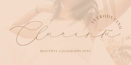 Clarinta, a beautiful script font. a lovely, elegant and sweet script font. Clarinta is perfect for styling logos, stationery, wedding event, invitation, quote, social media, websites and so much more! Come with Opentype feature with a lot of alternates, its help you to make great lettering.This font is also support multi language.
 - Brillscript by Brainware Graphic,
$12.00 Brillscript is a display script font. Comes with a lot of opentype features, Brillscript also supports multilingual covering Latin based language (Latin Extended-A) such as Bosnian, Catalan, Czech, Danish, German, English, Spanish, Estonian, Finnish, French, Irish, Croatian, Hungarian, Icelandic, Italian, Lithuanian, Latvian, Maltese, Dutch, Norwegian, Polish, Portuguese, Slovak, Slovenian, Albanian, Swedish, Turkish
 - Peristiwa Script by Attract Studio,
$14.00 Peristiwa Script is an elegant, full featured vintage inspired calligraphic script font with lots of alternative characters and OpenType features. Perfectly handwritten touch with a heavy right angle is perfect for logos, wedding invitations, modern websites, greeting cards and more! Font Pairing : Bethany Elingston Including: Alternates & Ligatures OpenType support Multilingual PUA encoded.
 - Frutiger Stones by Linotype,
$29.00In Adrian Frutiger, the discipline of a mathematically exact mind is joined with an unmistakable artistic sense. His independent work possesses the controllable language of letterforms. Personal and intensive, this work is the manifestation of his expressive will. Frutiger's precise sense of outline reveals itself two- or three-dimensionally in wood, stone, or bronze, on printing plates and in the form of reliefs. However, even his independent work can be understood as objectivized signs; in their symbolism, they are embedded in the fundamental questions of human existance. They might have developed in the spirit of playfulness, but their nature is always conceptual, directed towards a complex, yet harmonic, whole. Following function, form also necessarily follows the content of the language. The entire spiritual world becomes readable through letters. Essentially, Adrian Frutiger attempts to fathom the basic, central truth which defines our lives: change, growth, division - beginning and end. In a virtual synthesis, he seems to close the circle in which the world reflects itself in symbolic forms. Frutiger Stones is for Adrian Frutiger the example of his formal artistic sensibility par excellence. Searching for the fundamental elements in nature, he has discovered the pebble, rounded and polished over innumerable years by gently flowing water. And out of this, he has created his complete system, a ruralistic typeface of letters and symbols. It depicts animals and plants, as well as astrological and mythical signs. Because of its unique aura, Frutiger Stones is particularly well-suited to different purposes - in headlines and prominent pictograms, as symbol faces, illustrations, and more. - Linotype Clascon by Linotype,
$29.99Linotype Clascon is part of the Take Type Library, which features winners of Linotype’s International Digital Type Design Contest. Designed by the British artist Rachel Godfrey, the constructed forms of the capitals are reminiscent of sketches of many famous 16th century artists, Albrecht Dürer and Nicolas Jaugeon among them. This style emphasizes the mathematic construction of the letters, based on the circle, rectangle and triangle, but Clascon’s historical roots lie in Transitional and Modern Face styles. This font is particularly suited to very short texts, headlines and initials. - Acorde by Willerstorfer,
$95.00 Please note: Acorde webfonts are exclusively available at willerstorfer.com Acorde is a reliable workhorse for large, demanding design projects. It was designed to be perfectly suited to all different sizes, from small continuous text to large headlines and big signage. The typeface’s name is derived from ‘a’ ‘cor’porate ‘de’sign typeface, however Acorde is not only suitable for corporate design programmes but for information design and editorial design purposes as well. Acorde’s inception was in early 2005 as Stefan Willerstorfer’s final project in the Type and Media course at the Royal Academy of Art in The Hague (NL). It is a humanist sans serif with noticeable diagonal contrast and shows clear influences of the broad nib pen, especially in the Italics. Acorde’s characterful details give it a distinctive appearance in large sizes and contribute to its high legibility in small sizes. It comes in 14 styles – seven weights in Roman and Italic each. While the proportions of the Regular style were chosen to guarantee optimal legibility without being too space consuming, the heavier the weight gets the more suitable it is for headline purposes. The heavy weights are relatively narrower than the lighter ones, which gives them a strong appearance. The huge character set contains 925 glyphs per font and covers a vast range of latin-based languages. Various accented letters, small caps, eleven figure-sets, superscript and subscript are all included. OpenType features allow for a comfortable use of the large set. Acorde was honored with the 2010 Joseph Binder Bronze award for type design by DesignAustria.
 - RQND Pro V.2 by Tondi Republk,
$25.00 Introducing RQND Pro 2 - The Futuristic and Industrial Sans Serif Font Welcome to the world of RQND Pro 2, a cutting-edge sans serif font designed to elevate your designs to new heights. With its industrial aesthetic and futuristic appeal, this font is the perfect choice for projects seeking a bold and contemporary look. Key Features: 1,201 Glyphs: RQND Pro 2 boasts an extensive character set, offering you a vast array of design possibilities. Supports 123 Languages: No matter where your audience is, this font ensures that your message is conveyed clearly and effectively. 20 Font Styles: With 5 font weights and 5 font widths, RQND Pro 2 offers 20 unique styles to suit every creative vision. Expanded to Extra Condensed: Whether you need a spacious layout or a compact design, this font delivers unmatched versatility. 18 OpenType Features: Unlock the full potential of RQND Pro 2 with various OpenType features, including small caps, alternate characters, standard numerals, circled numerals, fractions, and more. All Caps Font: Embrace the power of uppercase letters with this font, enhancing the impact of your message. Full Character Set: From standard numerals to punctuation marks, mathematical symbols to special characters, RQND Pro 2 has everything you need for seamless communication. Latin and Cyrillic Support: Perfect for international projects, this font provides complete support for both Latin and Cyrillic languages. RQND Pro 2 empowers designers, creatives, and typographers to explore new design territories. Its sleek and modern appearance makes it ideal for tech branding, UI design, editorial projects, advertisements, web design, and more. Discover a font that combines sophistication with contemporary flair. Elevate your designs with RQND Pro 2 and leave a lasting impression on your audience. Explore the full range of styles and unleash your creativity today.
 - North Arrow Assortment by Gerald Gallo,
$20.00 North Arrow Assortment contains 47 north arrow designs ranging from simple to intricate.
 - Avenir Next Cyrillic by Linotype,
$49.00 The original Avenir typeface was designed by Adrian Frutiger in 1988, after years of having an interest in sans serif typefaces. The word Avenir means “future” in French and hints that the typeface owes some of its interpretation to Futura. But unlike Futura, Avenir is not purely geometric; it has vertical strokes that are thicker than the horizontals, an “o” that is not a perfect circle, and shortened ascenders. These nuances aid in legibility and give Avenir a harmonious and sensible appearance for both texts and headlines. In 2012, Akira Kobayashi worked alongside Avenir’s esteemed creator Adrian Frutiger to bring Avenir Next to life, as a new take on the classic Avenir. The goal of the project was to take a beautifully designed sans and update it so that its technical standards surpass the status quo, leaving us with a truly superior sans family. Since then, Monotype expanded the typeface to accommodate more languages. Akira’s deep familiarity with existing iterations of the Frutiger designs, along with his understanding of the design philosophy of the man himself, made him uniquely suited to lead the creation of different language fonts. Avenir Next World family, the most recent release from Monotype, is an expansive family of fonts that offers support for more than 150 languages and scripts that include Latin, Cyrillic, Greek, Hebrew, Arabic, Georgian, Armenian and Thai. Avenir Next World contains 10 weights, from UltraLight to Heavy. The respective 10 Italic styles do not support Arabic, Georgian and Thai, since Italic styles are unfamiliar in these scripts/languages. Separate Non-Latin products to support just the Arabic, Cyrillic, Georgian, Hebrew and Thai script are also available for those who do not need the full language support.
 - Avenir Next World by Linotype,
$149.00 The original Avenir typeface was designed by Adrian Frutiger in 1988, after years of having an interest in sans serif typefaces. The word Avenir means “future” in French and hints that the typeface owes some of its interpretation to Futura. But unlike Futura, Avenir is not purely geometric; it has vertical strokes that are thicker than the horizontals, an “o” that is not a perfect circle, and shortened ascenders. These nuances aid in legibility and give Avenir a harmonious and sensible appearance for both texts and headlines. In 2012, Akira Kobayashi worked alongside Avenir’s esteemed creator Adrian Frutiger to bring Avenir Next to life, as a new take on the classic Avenir. The goal of the project was to take a beautifully designed sans and update it so that its technical standards surpass the status quo, leaving us with a truly superior sans family. Since then, Monotype expanded the typeface to accommodate more languages. Akira’s deep familiarity with existing iterations of the Frutiger designs, along with his understanding of the design philosophy of the man himself, made him uniquely suited to lead the creation of different language fonts. Avenir Next World family, the most recent release from Monotype, is an expansive family of fonts that offers support for more than 150 languages and scripts that include Latin, Cyrillic, Greek, Hebrew, Arabic, Georgian, Armenian and Thai. Avenir Next World contains 10 weights, from UltraLight to Heavy. The respective 10 Italic styles do not support Arabic, Georgian and Thai, since Italic styles are unfamiliar in these scripts/languages. Separate Non-Latin products to support just the Arabic, Cyrillic, Georgian, Hebrew and Thai script are also available for those who do not need the full language support.
 - Avenir Next Hebrew by Linotype,
$79.00 The original Avenir typeface was designed by Adrian Frutiger in 1988, after years of having an interest in sans serif typefaces. The word Avenir means “future” in French and hints that the typeface owes some of its interpretation to Futura. But unlike Futura, Avenir is not purely geometric; it has vertical strokes that are thicker than the horizontals, an “o” that is not a perfect circle, and shortened ascenders. These nuances aid in legibility and give Avenir a harmonious and sensible appearance for both texts and headlines. In 2012, Akira Kobayashi worked alongside Avenir’s esteemed creator Adrian Frutiger to bring Avenir Next to life, as a new take on the classic Avenir. The goal of the project was to take a beautifully designed sans and update it so that its technical standards surpass the status quo, leaving us with a truly superior sans family. Since then, Monotype expanded the typeface to accommodate more languages. Akira’s deep familiarity with existing iterations of the Frutiger designs, along with his understanding of the design philosophy of the man himself, made him uniquely suited to lead the creation of different language fonts. Avenir Next World family, the most recent release from Monotype, is an expansive family of fonts that offers support for more than 150 languages and scripts that include Latin, Cyrillic, Greek, Hebrew, Arabic, Georgian, Armenian and Thai. Avenir Next World contains 10 weights, from UltraLight to Heavy. The respective 10 Italic styles do not support Arabic, Georgian and Thai, since Italic styles are unfamiliar in these scripts/languages. Separate Non-Latin products to support just the Arabic, Cyrillic, Georgian, Hebrew and Thai script are also available for those who do not need the full language support.
 - Popten Display by Saffatin.co,
$10.00 Popten is a modern minimalist design typeface with semi condensed conture and include alternative character also some ligature. It is inspired by hype and urban design, freestyle and brutalism. Popten typeface suited for anything lifestyle project with trend design. It was designed to be versatile, to blend in your design with light or dark through thin to black weights can add a lot of touch of personality.
 - Bellagium by Silverdav,
$18.00 Introducing “Bellagium font” is a serif font that is truly unique, with a more modern style and unique curves that add a special and glamorous feel to your designs. There are lots of alternates that you can use to make your designs more beautiful and charming, plus ligatures, of course, your designs will be more charming. If you have any questions, please contact us
 - Brain Squeeze by Hanoded,
$16.00 Brain Squeeze is a nice, fat, messy brush font. I made it with one of my late father in law’s prized Chinese brushes and my Chinese ink. If you look through my library, you will notice that I make a lot of fonts using these tools! Brain Squeeze will squeeze your Cabeza for some extra creativity, so what are you waiting for? Use it and have fun!
 - Wandita by Arttype7,
$10.00 We have a new product which we named Wandita. Wandita is a script font in an elegant signature style. Wandita was inspired by ancient signature writings with a touch of modern curves. It is very suitable for logos, weddings, magazines, name cards, invitations and more. If you are looking for a multi-lingual font with lots of Stylistic Alternates, Wandita is perfect for you.
 - Meloso by Rachel Kick,
$14.00 Meloso is an easygoing typeface. It has a playful and organic feel that has its own hand-drawn charm while still being incredibly legible due to its simple shapes and high x-height. It has the unique ability to stand alone as a title text or work in small paragraph form. It's the perfect way to bring the friendly feel of an "imperfect" and slightly rounded font into your next project. Meloso is a variable font with 6 set weights. If you're using a program that supports variable fonts, you'll be able to choose any point between the "Extra Thin" and "Extra Bold" weights to get the perfect thickness and adjust the italic to the angle you need. You can also use the standard OTF files to have the 6 set weights.
 - Sigmund Freud Typeface by Harald Geisler,
$29.00 “For those who regret what keyboards and touch screens have done to their penmanship, typographer Harald Geisler has an answer: Sigmund Freud.” — The Wall Street Journal Sigmund Freud was a neurologist who lived from 1856 to 1939. His research and studies led to the foundation of ‘Psychoanalysis’. When I first saw Freud’s century old letters, I was fascinated by the beauty of these historic manuscripts. It made me smile to imagine a person writing his or her shrink a letter set in Freud’s handwriting. I started to plan creating a font based on his manuscripts. I contacted the Sigmund Freud Museum Vienna and Freud Museum London. To start the creation I selected eight handwritten documents from the archive in Vienna – This selection of specimen was my orientation during the design process. The Samples were created between 1883 to 1938 and are of various character such as handwritten scientific papers, personal letters, notes and a telegram. A successful Kickstarter Campaign "The Sigmund Freud Typeface - A Letter to your Shrink" with over 1400 Backers enabled me to visit the archive in Vienna and study the original manuscripts of Sigmund Freud. After a year of preparation and design work, I finished four alphabets based on Freud’s handwriting. What are the different Versions PRO, Kurrent, #1, #2, #3 and #4 about? “This project gives people the convenience afforded by the computer while maintaining the romantic nostalgia, beauty, and character of letter writing with real handwriting.” — Daniel Vahab, The Huffington Post When you write with your hand, every letter looks a little different. When you write a text on your computer every letter looks exactly the same. In order to make type look like handwriting, I chose four different variations of each letter from Freud’s manuscripts, drew and stored them in the font. The font is then programmed to exchange letters while you are typing. This makes the rendered result on your screen or print look like unique handwriting. PRO While you are typing… the PRO Version actively combines all four alphabets and exchanges them automatically. Through this mechanism never the same two o’s will stand next to each other. With every touch a unique look is generated. This works in certain applications i.e. Word 2010(or newer), Pages, TextEdit, Editor(Pre-installed on Windows 7 or newer), InDesign, Illustrator… →Here you can see an animation of what this effect looks like in action. (Please Note: some applications like LibreOffice, OpenOffice do currently not support this feature. Date: December 2013) #1 #2 #3 and #4 The Sigmund Freud Typeface #1, #2, #3 and #4 each hold one individual lowercase alphabet based on Freud’s handwriting. Kurrent Most of Freud’s correspondence was written in German. Until the 1950′s a different handwriting was taught throughout German speaking countries (Switzerland, Austria, Germany). This style is called Kurrent. The name Kurrent and Cursive derive from the Latin word currere - to run, hurry - both styles were designed to write fast. As you can see in the samples above, Freud practiced both Kurrent and when writing english Cursive (Latin script or Joined-up). Kurrent has three significantly different letters (s,h,e). Use Kurrent to render the authentic look of an historic Sigmund Freud letter in German. Bundle On the Top of this page you can get all six fonts of the Sigmund Freud Typeface Family in a bundle. International Typeface All styles of the Sigmund Freud Typeface feature a wide range of accented letters so you can write to all your friends in Sweden (Bjørn) France (Chloé & Zoë), Ireland (Dáirine), Poland (Łucja), Germany (Jörg) and almost everywhere around the globe (Find a complete list in the tech specs). Usage recommendations I hope that this design will be valuable to you and most of all that you have fun with this typeface! 1. Point Size — To reproduce the size of Sigmund Freud’s handwriting adjust the type size between 18-24 point in your word processor. If you are using an imaging software like Photoshop set the resolution to 300dpi and adjust the point size between 18-24. 2. Line Spacing — Narrow the line hight until swashes of capital letters touch the baseline above. This also happens when you write a letter and gives the document a unique handwritten look. 3. Right Aligned — Freud had the habit to write towards the right edge of the page and start loosely on the left. Set your text alignment to ‘right’ to incorporate this dramatic expression also to your documents. What do other People say about the Sigmund Freud Typeface? “Wouldn’t you love to write a letter to your shrink using the Sigmund Freud typeface?” — Dorothy Tan, Design TAXI ''“JUST DON’T WRITE A LETTER TO YOUR MOTHER WITH IT… …until the reader looks a bit closer, and they see 70+ years of modern science weighing in on turn-of-the-century pop psychology."'' — Mark Willson, Fast Company “Doctor, what does it mean if you dream of creating a font of Freud’s handwriting?” — Ayun Halliday, Open Culture “…geekily romantic, at once artistic and scientific” — Edie Jarolim, Freud’s Butcher “…sympathisch” — Jürgen Siebert, Fontblog !WOW! Thank you for reading the complete font description! You are awesome! If you still have a question please contact me through MyFonts or my website haraldgeisler.com. Credits This project was made possible by the help of 1481 Backers on Kickstarter and the kind support of the Sigmund Freud Museum Vienna and the Freud Museum London. Thank you. All of Freud’s Manuscripts shown are © Sigmund Freud Museum Vienna. Poster Image: IN17 - Sigmund Freud, Germany 1932. © Freud Museum London. Flag Image: IN19 - Sigmund Freud 1930’s. © Freud Museum London.
 - Cold Daylight by Nathatype,
$25.00 Do you want to enhance your branding? Do you dream of getting playfu;, stylish, modern, and adventure font? What if we told you, you only need to change one element to engage and convert your clients? Cold Daylight-A Display Font Cold Daylight is a display font designed to bring your branding to life and add a touch of playfulness, cheerful, and style. We are hoping that through this font, you can maximize your designs! In turn, you’ll communicate the perfect idea to your audiences or clients. The best choice for branding projects, book/magazine cover, fashion designs, quotes, packaging, or even as a stylish text overlay to any background image. Our font always includes Multilingual Support to make your branding reach a global audience. Features: - Ligatures - Stylistic Sets - Swashes - PUA Encoded - Numerals and Punctuation Thank you for downloading premium fonts from Nathatype
 - Basel Neue by Isaco Type,
$30.00 Basel Neue is the complete redesign of BaselSans ITD font, the first typeface of Isaco Type foundry, launched in 2009. As with the predecessor version, Basel Neue is a legible and discrete typeface, a sans serif with thickness variation and humanistic touch. The family consists of 8 styles, 4 weights plus their respective italic versions. Download the “OT Features” pdf to know and take advantage of all font features as best as possible (in OpenType-savvy applications)! You can also view all symbols in the glyph panel of your program, or in Character Map tool (Win) or Character Viewer/Palette (Mac). 1) Basel Neue has ligatures strategically chosen. Herbert S. Zim, in the book “Codes and secret writing”, elected the most common letter pairs of English, that in the Basel Neue became discretionary ligatures. And, of course, it also has standard ligatures. 2) It’s a fun typeface. Basel Neue has a set of emoticons and fun symbols that can be activated by discretionary ligatures. Type “:-)” and a smileface appears. Type “8-)” and a smiley with glasses appears. Type “ ”, “ ” and “ ” and a telephone, star and heart appears. Or “ ”... and a graceful corresponding symbol will appear. 3) Basel Neue contains lots of useful glyphs and features. All versions have 12 recycling symbols, 7 to different types of plastic, and over 30 currency symbols. It also has fractions, old style-, lining-, tabular numbers and other OpenType features. 4) It has an organized and large character set. The fonts have extended character set to support CE, Baltic, Turkish as well as Western European languages. If you work with languages like Catalan, German, Croatian, Romanian, Dutch, Turkish, for example, the font will use the correct ligatures or characters used in these languages. 5) It’s rigorously tested. Basel Neue is available in OpenType PS e TT flavors and each version undergoes a battery of tests, with a systematic review of nodes, curves, spacing and internal data. This eliminates the possibility of errors in the font.
 - Boldiva by Graphicfresh,
$9.00 Looking for a way to add a touch of bold, retro charm to your designs that evoke the fun and creativity of the 70s, 80s, and 90s? Look no further than our collection of classic and modern fonts that are perfect for logos, posters, and all kinds of design projects, whether you're going for an old-school vibe or a fresh new twist on retro design. With our carefully curated selection of fonts, you'll have everything you need to create eye-catching and memorable designs that capture the essence of classic design from the past. Whether you're looking to add some vintage flair to a modern design, or you want to create a throwback look that's right at home in the 90s, our fonts are the perfect tool for the job. From bold, geometric designs that harken back to the 80s, to playful, colorful fonts that embody the fun-loving spirit of the 70s, our collection has something for everyone. And with our easy-to-use design tools and resources, you'll have everything you need to bring your creative vision to life in no time. So why wait? Start exploring our collection of classic and modern fonts today, and discover how easy it can be to create stunning logos, posters, and designs that are truly one-of-a-kind. Whether you're a seasoned designer or just starting out, our fonts are the perfect way to add a touch of old-school charm to any project.
 - Feminine Grace by Objectype,
$20.00 "Feminine Grace Font" by Candi Erwanto from Objectype Studio is a perfect blend of elegance and simplicity. With its neat and legible serif style, it's ideal for creating elegant and feminine wedding invitations and print materials. Bring beauty and sophistication to your designs with "Feminine Grace."