10,000 search results
(0.031 seconds)
- Etruscania by Beewest Studio,
$10.00 Etruscania font is base on Anchient Etruscan Alphabet. The Etruscan alphabet is an Ancient Italian alphabet used by the Etruscans, an ancient civilization of the central and northern lands, to write their language, from around 700 BC to around 100 AD. The Etruscan alphabet took inspiration from the Phoenician alphabet. The earliest known Etruscan abecedarium inscribed on an ivory wax tablet frame, measuring 8.8x5 cm, was found at Marsiliana near Grosseto, Tuscany in Italy. It dates from around 700 BC.
 - Getone by Robert Corseanschi,
$14.99 Getone is an exotic font, based on the Sereno font made by the same designer. It has a modern touch which makes it to stand out, all the glyphs are designed "out of the box" to combine each other in harmonious way. Getone is coming in ten styles : thin, ultra light, light, regular, bold and italics. Is ideally suited for advertising and packaging, festive occasions, editorial and publishing, logo, branding and creative industries, poster and billboards as well as web and screen design.
 - Doubleline Caps by URW Type Foundry,
$29.00 The basic idea for this headline typeface is to create strictly geometric letters, similar to script typeface, as far as possible in a single sweep, without setting them down. And similar to a typeface written with a quill, there is a thin and a thicker stroke. The upercase letters can also be used with the lowercase keys. The varied and unusual variety of forms in this typeface gives headlines, keywords and even short texts the attention they are looking for.
 - Sopran by Type Salon,
$33.00 The character of Sopran is expressed by long serifs that replace traditional drops. Contrast is distributed from monolinear in hairline and all the way to the extreme in the black style. Symbols and punctuation are drawn with monolinear strokes to give the typeface more playful typesetting. The long serifs allow for some interesting discretionary ligatures, like “fa” or “Ta”. With two stylistic sets the typeface enables different typesetting opportunities. Its characteristics should be expressed in headlines, larger texts, show posters, displays, signage etc.
 - Foro by Hoftype,
$39.00 Foro was designed in 2012 to be a slab serif with an appealing flow, warm, and less harsh than many slab serifs. It evinces an attachment to humanistic shapes, models and proportions. Foro’s demonstrated strength renders it excellent for texts, and its clear and distinct details are an advantage in display sizes. Foro comes in 16 styles and in OpenType format. All weights contain standard ligatures, proportional lining figures, tabular lining figures, proportional old style figures, lining old style figures, matching currency symbols, fraction- and scientific numerals and arrows. Foro supports Western European, Central and Eastern European languages.
 - Disruptor's Script by Piñata,
$15.00 Disruptor's Script is the alter ego of our previous project Gentlemen's Script. Unlike the Gentlemen's Script, the new font is an elegant rebel and defies traditions. The font is painted with a brush pen, which is especially noticeable in the characteristic shabbiness and different thicknesses of the strokes. While the Gentlemen's Script is an embodiment of a classic costume, dress shoes and an expensive watch, Disruptor's Script is a fashionable suit, sneakers, an iWatch and a tattoo that peeks from under the shirt. The font retained the incline, speed and overall sense of dynamics inherent in Gentlemen's Script, but got a bit more chaotic and unpredictable. This is especially noticeable in the newly added shabbiness, elongated extenders, a large number of contextual alternates and different ligatures. For some high-frequency letters (10 for the Latin alphabet and 10 for the Cyrillic alphabet), we painted alternative versions that are substituted in the word instead of the standard characters when following our preceding certain groups of letters. In addition, in the Disruptor's Script you can find functional ligatures, including some of the frequently occurring two- and three-letter combinations. All these solutions dilute the monotonous line of the set, add a bit of unpredictability to the font and a touch of chaos to inscriptions. To fully enjoy usage of the font, we recommend that you always keep the features contextual alternates (calt) and standard ligatures (liga) turned on. If you do not have access to applications that support OpenType features, it does not matter—even without these features you can use and enjoy our font!
 - Times New Roman Windows compatible by Monotype,In 1931, The Times of London commissioned a new text type design from Stanley Morison and the Monotype Corporation, after Morison had written an article criticizing The Times for being badly printed and typographically behind the times. The new design was supervised by Stanley Morison and drawn by Victor Lardent, an artist from the advertising department of The Times. Morison used an older typeface, Plantin, as the basis for his design, but made revisions for legibility and economy of space (always important concerns for newspapers). As the old type used by the newspaper had been called Times Old Roman," Morison's revision became "Times New Roman." The Times of London debuted the new typeface in October 1932, and after one year the design was released for commercial sale. The Times New Roman World Version is an extension of the original Times New Roman with several other scripts like with the Helvetica World fonts. It is part of the Windows Vista system. The following code pages are supported:1250 Latin 2: Eastern European 1251 Cyrillic 1253 Greek 1254 Turkish 1255 Hebrew 1256 Arabic Note: The Roman and Bold versions include the arabic scripts but they are not part in the corresponding italic versions. 1257 Windows Baltic 1258 Windows Vietnamese
- Hybi5 by Hybi-Types,
$12.50 The Hybi5 font family can be described as a “crossover” between Antiqua, Grotesque and Brushscript with characteristics from all of this genres. My aim was to design friendly and versatile fonts, which can be used for headlines or slogans as well as for some longer texts. To make the fonts useful for as many languages as possible, I added a lot of exotic accents. All styles contain the whole “Adobe Latin 3 (CE)” character set plus a few letters from “Adobe Latin 4”. A lot of ligatures prettify the look of the fonts. Alternate uppercase letters in the script style might do the same. If you are a professional designer, you will surely appreciate the thousands of kerning pairs within each style, which will make your work easier. I recommend to set Kerning to “metric” and spacing to “zero” in your layout app. Back in 2015 I worked on the first sketches of “Hybi5” using Adobe Illustrator. “Fontself Maker”, an extension for Illustrator, was used to convert the drawings into font-files. This tool can only create “OTF” font files. For this reason there are no “TTF” versions. It’s not the first font I have ever made, but the first to be distributed commercially.
 - VLNL DBXLZX by VetteLetters,
$9.00 DBXLZX was inspired by the logo of the ZX Spectrum home computer, released in 1982 by Sinclair Research. For many designers the 8-bit pixel grid of the ZX Spectrum was one of the first steps into the realm of digital design. DBXLZX was initially developed by DBXL into a three weight family for use on the Armind record label of world famous trance deejay Armin van Buuren.
 - Calligraphica by Monotype,
$49.00Calligraphica was designed because there are very few inline fonts, and even fewer inline calligraphic fonts. The original forms were written with a split pen in a single stroke. The minuscules have a rougher look and the capitals have a smoother shape to imitate hand written calligraphy with more formal, decorative initial caps. The Calligraphica family contains 6 fonts: Calligraphica Regular and Italic are the regular upright roman true italic version of the font. The ascenders on this font are a bit higher than the capital letters--this is standard for most fonts. Calligraphica LX Regular and Italic are similar to the first 2 fonts except their ascenders are longer and reach high above the capital letters--giving these fonts a taller appearance. Calligraphica SX Regular and Italic are similar to the first 2 fonts except their ascenders are shorter and are the same height as the capital letters--giving these fonts a shorter appearance. - Gill Sans Nova by Monotype,
$61.99 The Gill Sans® Nova typeface, by Monotype Studio designer George Ryan, expands the much-loved Gill Sans family from 18 to 43 fonts and features a coordinated range of roman and condensed designs. Several new display fonts are available, including a suite of six inline weights, shadowed outline fonts that were never digitized and Gill Sans Nova Deco that was previously withdrawn from the Monotype library. A variety of OpenType® features are supported that make it possible to include experimental characters from different points in Gill Sans’s long history, including pointed diagonals on ‘A’, ‘V’ and ‘W’ and alternatives for ‘b’, ‘d’, ‘p’ and ‘q.’ Proportional figures are also available as an alternative to the tabular designs. The Gill Sans Nova family has a large character set that supports Latin, Greek and Cyrillic languages. The display weights support Latin only. “Gill Sans was fast to strike a chord with people after its initial 1928 release and quickly became popular,” explains Ryan. “It’s been adapted for every publishing technology, from mechanical typesetting to digital imaging – always receiving the best treatment from Monotype in each iteration. This is especially true with all that we’ve added to the new series, while still retaining the familiarity of Gill Sans. My goal was to ensure clarity across digital environments, add missing weights, and bring more personality to the family with new display fonts, as well as Gill-inspired alternate characters.” The Gill Sans Nova typeface family is part of the new Eric Gill Series, drawing on Monotype's heritage to remaster and expand and revitalize Eric Gill’s body of work, with more weights, more characters and more languages to meet a wide range of design requirements. The Series also brings to life new elements inspired by some of Gill’s unreleased work, recently discovered in Monotype’s archive of original typeface drawings, designer correspondence and documents from the last century.
 - Alamia by Ani Dimitrova,
$29.00 The Alamia type family is a sans serif in 20 weights, ranging from Hair Line to Black with matching italics. Each style contains more than 900 glyphs. Alamia comes with an extended coverage of the Latin and Cyrillic Script. All weights of this family are equipped for complex, professional typography with OpenType Features including: Small Caps, Ligatures, Discretionary Ligatures, Superscript, Subscript, Tabular Figures, Old-Style Figures, Circled Figures, Arrows, Matching currency symbols and fraction.The construction of the characters combines clean grotesque style with modern, that gives the font an organic, warm and friendly touch. The Alamia font family is a perfect choice for body text, branding design, web design, editorial design and more.
 - Varese Soft by Tarallo Design,
$18.99 Varese is a geometric and modular typeface inspired by early 1900s European posters. It is heavy and excellent for display or large body text. The design of this font explores the boundaries between unity and variety in a playful rhythmic dance. Varese will give your content a warm, nostalgic, robust, and friendly tone. The lowercase is similar in form to the uppercase, yet many of the lowercase letters have interior spaces and several have some variations on the form. The lowercase also has two alternate glyph sets that are half size and align with cap height. One of the alternate glyph sets has an underline and the other set does not. Varese Soft has a sibling, Varese.
 - Thread Starter by Colllab Studio,
$19.00 "Hi there, thank you for passing by. Colllab Studio is here. We crafted best collection of typefaces in a variety of styles to keep you covered for any project that comes your way! Not being able to communicate trustworthiness, authority and professionalism? Is your brand lacking personality too? That’s where Thread Starter come in. Our fonts have been exclusively designed to communicate trustworthiness, authority, and professionalism. We are here to serve you with the right fonts to help your brand stand out. Use Thread Starter to communicate trustworthiness, authority and professionalism straight into your audience’s heads. Your ideal clients will love the unique and high perceived quality of your brand on its own merit. A Million Thanks www.colllabstudio.com
 - Ms Kitty NB by No Bodoni,
$35.00Some scribbles on a bar napkin, a note from a cute girl passed in history class, what is there to say but why not a typeface? Actually it's that late night, �let's get this typeface done� madness that causes these flights of fancy. Anything to relieve the boredom of doing all those kerning pairs. Or maybe it's sunspots? Ms Kitty is all uppercase letterforms so there are two versions of each letter, one in the cap position, another in the lowercase position. Besides the regular weight and bold, there�s a bolder and much bolder in the works. And perhaps there will be a "too bold to be believed" version. Depends on the sunspots. - Albollón by Salsipuedes,
$16.00 In the last years our society has change a lot. Nowadays cities and countries are no longer static territories with well-drawn borders and a population perfectly defined. Globalization is a fact and the best consequence of it is the mixture of races, ideas and cultures, and this is exactly what this typography aims to show. Albollón is at once a semi-serif and a semi-sans serif typeface; it is a mixture made with the best parts from both sides. This way is how I understand a healthy society and a healthy design too. Albollón is designed to work in all types of text, both long and shorts, big and small ones.
 - Minimal Nahidha by Attype Studio,
$19.00 Minimal Nahidha is a minimalist sans serif typeface with a casual and trendy outlook. Minimal Nahidha was built to balance the geometric qualities of a san-serif typeface with all the benefits of traditional serif fonts, like readability and personality. Minimal Nahidha comes in Regular and Slant version, each with its own unique set of characters & it has ligatures and stylistic alternates that make it easy to customize your designs. The fonts works best as display typefaces or as beautiful headline fonts, but can also be used in other ways to create stunning designs. Features : - Minimal Nahidha Family Font - Ligatures - Stylistic Alternates - Multilingual, US Roman, Latin 1 Support Hope you enjoy with our font! Attype Studio
 - Littera Plain by ABSTRKT,
$30.00Littera project is a modern interpretation of one of the most widespread sans serifs in USSR "TextBook font". It is not an exact revival, but an interpretation of its typographic feel executed in two different ways: Littera Plain and Littera Text. - Littera Text by ABSTRKT,
$30.00Littera project is a modern interpretation of one of the most widespread sans serifs in USSR "TextBook font". It is not an exact revival, but an interpretation of its typographic feel executed in two different ways: Littera Plain and Littera Text. - PEACECHILD - Unknown license

- CA 12c13c by Cape Arcona Type Foundry,
$28.00 CA 12C13C was designed by sticking letters together with tape. Use it when right angles are strictly forbidden!
 - Cynapse OT by Positype,
$29.00 Several years ago I was faced with a project that required very small type to be used in a directory. In general, there was a need for a lot of 'fine print'. Faced with this, all of the tests I was making with existing faces were producing too much bleed of the individual glyphs...Cynapse was born. It evolved into this pseduo-techy looking type that standardized and glorified the ink trap (the small, tiny allowances of white space that reduces the amount of ink hitting the page, and in effect, reducing the appearance of bleed). The results was promising. The new OT version contains additional OpenType features that include expanded ligature sets, fractions, 5 sets of numerals as well as small caps and Central European diacritics.
 - Devilish by Celebrity Fontz,
$24.99 Devilish is a digital revival of 2 decorative lettering sets. The uppercase letters are based on characters from the end of the 18th century, and the lowercase letters are based on characters from the 19th century. The letters are made up of light-hearted devilish figures engaged in playful and mischievous activities.
 - DXOldStandard Grotesk No2 by DXTypefoundry,
$25.00 The font DXOldStandardGroteskNo2 was developed on the basis of the Grotesk Condensed font, which was issued by Russian type foundry from the beginning of the 20th century.
 - Open Book ING by Ingrimayne Type,
$9.00 OpenBookING is a gimmick or novelty font that has letters on pages of a book. It is caps only and monospaced. The letters on the upper-case keys are on the left-handed pages of an open book and the letters on the lower-case keys are the same letters but on the right-handed pages of an open book. One could alternate upper and lower case keys to get letters on complete books, but the Opentype feature of contextual alternatives (calt) does this automatically. Several previous typefaces from IngrimayneType used the calt feature to alternate shapes that fit together in an interlocking pattern, such as alternating concave and convex shapes. OpenBookING uses the calt feature in a different way, to alternate two halves of a symmetrical shape. To provide two copies of numbers and common symbols, some non-alphabetical characters are unavailable because their slots were taken by the second form of the number or common symbol. If stylistic set one (ss01) is turned on, spaces are replaced with empty pages. This may leave you with unwanted spaces at the end of lines, and to eliminate them, turn off the feature (or change the font) for these spaces. The empty pages can be used in a layer to add color to the text. There is also a second set of empty pages with a filled page that can also be used in layers. (See poster for examples.) These pages are on the (logicalnot multiply) and (register divide) characters for the first set and on the (ordmasculine ellipsis) and (macron trademark) keys for the second set. Finally, OpenBookING has a large set of accented characters if anyone should need them. The letters used on the books were derived from the font Myhota-Bold. For a related typeface of letters on book covers, see NewLibrary. OpenBookING has limited uses and is priced accordingly.
 - Infusion by Andinistas,
$39.00 Infusion is a type family designed by CFCG & Fabio Godoy for andinistas.net. The creative process of Infusion evolved throughout a myriad of experiments supported by my font gluten This is why its expressivity comes from the addition and subtraction of its parts by mixing and combining, resulting in a great variety and new versatility of uppercase, lowercase, multiple and different numbers to be applied at the beginning, middle or end of the word. Infusion is used to write sentences in craft contexts that require organic graphic design, with meticulous imperfect look. Infusion offers typographic solutions out of the limits, or out of borders that divide the mechanics of the drawn by hand. Infusion has 6 decorative and legible fonts to write casual messages with organic, friendly and natural personality. Infusion “Script, Mix, Roman, Shadow, Extras, Dingbats” contain unconventional visually appealing ideas to work independently or in group in the design of logos, packaging, presentations, headlines or editorials.
 - Shentox by Emtype Foundry,
$69.00 During a visit to London in 2008 I fell in love with the square font used on the British car number plates. I was immediately inspired to start working on this font and have been developing it intermittently ever since. Several more trips to London and the project evolved before it finally took off and became Shentox. Despite the starting point being inspired by simple, everyday car plates, the font soon evolved into something fine and very rich in detail. Even though the square genre is very restrictive, Shentox is a highly legible contemporary font with a full range of weights, useable not only as a display family for headlines and posters, but as a distinct, clean font family for branding and general editorial use (Especially magazines). It has been carefully drawn paying extra attention to the details, high end finishes that makes Shentox a safe font for use in large scale work. For example, the curves of every individual corner have been adjusted character by character to avoid the common problems encountered with square fonts (Eg. darker corners between weights or a visually inconsistent radius between the Upper and Lowercases as a result of copy/paste). Shentox italic, which has a 12 degree slant, has been corrected to avoid distortion when slanted. The radius of the upper-right and lower-left corners are more pronounced, giving it a more fluid Italic feel. Shentox is available in Open Type format and includes ligatures, tabular figures, fractions, numerators, denominators, superiors and inferiors. It supports Central and Eastern European languages. This type family consists of 14 styles, 7 weights (Thin, UltraLight, Light, Regular, Medium, SemiBold and Bold) plus italics. Shentox PDF
 - Chlara Typeface by Krismagraph,
$17.00 Chlara is a Modern Ligature Serif Font. It's soft curves mixed with high contrast glyphs, give it a feminine and masculine quality. It comes with epic ligatures and alternates. Great in layout design for quotes or body copy, best used as a display for headings, logos, branding, magazines, product packaging and invitations. Accessible in the Adobe Illustrator, Adobe Photoshop, Adobe InDesign, even work on Microsoft Word. PUA Encoded Characters – Fully accessible without additional design software. Fonts include multilingual support Image used : All photographs/pictures/vector used in the preview are not included, they are intended for illustration purpose only. Feel free to follow, like and share. Thanks so much for checking out my shop! If you need a custom license or have questions, please email to: krismagraph@gmail.com
 - NorB Architect Pencil Condensed by NorFonts,
$35.00 NorB Architect Pencil Condensed fonts are the fruit from learning architectural lettering books so featuring 7 condensed weights going from Light to Extra Bold version. These Architectural fonts will add a beautiful architectural hand-lettering style to all your CAD project drawings. Architects have always wanted their CAD drawings to look more like they were drawn by hand, rather than by a CAD program. These AutoCAD fonts are the first step in bringing back that “artistic hand-drawn” feel to your CAD drawings or any graphic design project that can use true type fonts. They also can be used with any word processing program for text and display use, print and web projects, apps and ePub, Comics, graphic identities, branding, editorial, advertising, scrapbooking, cards and invitations … or even just for fun!
 - Rachidah Script by BBA Key,
$13.00 Rachidah Script is a new fresh and modern style with handmade calligraphy, decorative characters and dancing lineage! So wonderful for invitations, greeting cards, branding material, business cards, quotes, posters, and more !! Rachidah Script comes with 517glyphs. Alternate characters are divided into several Open Type features such as Swash, Stylistic Sets, Stylistic Alternate, Contextual Alternate. Open Type features and are accessible by using Open Type savvy programs such as Adobe Illustrator, Adobe InDesign, Adobe Photoshop Corel Draw X versions, and Microsoft Word. And this font has code PUA unicode (font with special code) so that all alternative characters can be easily accessed by craftsmen or designers. Rachidah Script Uppercase & lowercase International signature & symbol Punctuation Support & PUA number Unicode Style Style Alternative Style Style Range 1-13 Contextual Character Variations.
 - NorB ARCHITECT PENCIL by NorFonts,
$35.00 NorB Architect Pencil fonts are the fruit from learning architectural lettering books so featuring 7 weights going from Light to Extra Bold version. These Architectural fonts will add a beautiful architectural hand-lettering style to all your CAD project drawings. Architects have always wanted their CAD drawings to look more like they were drawn by hand, rather than by a CAD program. These AutoCAD fonts are the first step in bringing back that “artistic hand-drawn” feel to your CAD drawings or any graphic design project that can use true type fonts. They also can be used with any word processing program for text and display use, print and web projects, apps and ePub, Comics, graphic identities, branding, editorial, advertising, scrapbooking, cards and invitations … or even just for fun!
 - Botanique by PintassilgoPrints,
$29.00 Botanique is a hand-drawn typeface based on Schmalfette Bernhard Antiqua by Lucien Bernhard. The original face was released in 1912 by Flinsch Type Foundry, which was later acquired by Bauer. Schmalfette means ‘bold condensed’ in German and Botanique adds a charming roughness to these attributes, evoking an organic and somewhat retro mood. Its uppercase glyphs shine with adorned stylistic alternates and cool blooming swash versions for both initial and final forms, all cleverly programmed into OpenType font features. Botanique is a great pick for display purposes, branding, packaging, editorial design, poster work and many more. The original face counts more than one hundred years, but yet communicates quite well, you bet. Specially if loaded with some contemporary flair and smart features such as this one. Let it bloom.
 - Nurhalifa Script by BBA Key,
$11.00 Nurhalifa Script is a new fresh & modern script font, with decorative characters and dancing lineage! So wonderful for greeting cards, branding material, business cards, quotes, posters and more. Nurhalifa Script comes with 564 glyphs. Alternate characters are divided into several OpenType features such as Swash, Stylistic Sets, Stylistic Alternate, Contextual Alternate. Open Type features are accessible by using Open Type savvy programs such as Adobe Illustrator, Adobe InDesign, Adobe Photoshop Corel Draw X versions, and Microsoft Word. And this font has code PUA unicode (font with special code). So that all alternative characters can be easily accessed by craftsmen or designers. If you do not have programs that support OpenType features like Adobe Illustrator and CorelDraw X Versions, you can access all alternative flying machines using Font Book (Mac) or Character Map (Windows).
 - MVB Solano Gothic by MVB,
$39.00MVB Solano Gothic Bold was originally designed as a display face for the City of Albany, California (located on the San Francisco Bay facing the Golden Gate Bridge and bordering Berkeley). Named for the City’s main street, the typeface needed to work on signage in proximity to early 20th Century buildings, and in contemporary settings. Rather than creating a neutered design to cover all bases, Mark van Bronkhorst chose to develop a simple, strong, condensed face that would offer flexibility of style by providing both retro and more contemporary forms. Solano Gothic has since been expanded to a family offering five weights from Light to Bold. The basic fonts provide upper- and lowercase forms, with figures designed to harmonize within upper- and lowercase settings (the standard figures are not full cap height). The same figures are provided with Small Caps, and align to small cap height. For all-cap settings requiring figures and monetary symbols of full-cap height, there are the “Cap” fonts. An alternate tabular “1” is provided in all fonts so that both fitted and tabular settings of figures are possible (access to alternate characters subject to system or application support). - Tiverton by Adam Fathony,
$15.00 The idea behind this typefaces was to combine something retro and vintage with a style of this century. A reference from Vintage Typography, Art Deco, Neo Deco. With an improvised and create something in between those styling. Tiverton created in Serif, Sans-Serif and Script. Within 3 Style, it more helping and easier for create something without "thinking" the font compartment. Features of Sans Serif and Serif are comes with stylistic alternates and you can activated with Contextual Swash button on Adobe Illustrator or Adobe Photoshop, And Catchword such as the preview above, activated with underscore in the beginning and end of the letters, for example : _ the _ (underscore)the(underscore). Features of Tiverton Script are Ligatures, Contextual alternates, Contextual Swashes. no alternates. but Tiverton Script available with 2 Weight, Light and Regular. For a bonus, I create an Ornament Fonts. Special shout for the ornament fonts are for the borders. on the Number Character 0-9 are created for connected borders. for Beginning and end the lines you can press Shift on the Number Character. For example : type !2222@ on the text preview below and see on the Tiverton Ornament.
 - Scrolls A by Wiescher Design,
$39.50 Scrolls A are a set of pictorial scrolls like signs of the zodiac, animals, dishes, flowers, symbols, decorative and Americana. They are beginning of last century American. Your I-found-them-somewhere type-designer, Gert Wiescher
 - Rising Sun by Proportional Lime,
$25.95 This typeface was inspired by Gering and Remboldt's work during the late 1490s. Their printing concern, the Soleil d'or in Paris, was one of the printing business to engage in the use of blackletter printing, when the rest of the Parisian printers where using humanist influenced roman typefaces. This peculiar backwards trend was really one of the original examples of "retro", taking advantage of the desires of the more conservative northern Europe that had not yet embraced the newer roman types.
 - Jungoat by BonjourType,
$12.00 Give your designs an authentic handmade feel. The Jungoat font is perfect for stationery, logos, social media or just using the word background above. Featured fonts: Uppercase, Lowercase, Numbers, Symbols, Accents, Alternative Styles, Swash, and also supports multilingual Thank you!
 - Rateline by Essentials Studio,
$16.00 Introducing by Essentials Studio Proudly Present, Rateline Rateline Is a A Retro Font include 2 Style with 200+ Stylish alternate Rateline is perfect for product packaging, branding project, megazine, social media, wedding, or just used to express words above the background.
 - Smiling Animal by Tlatous Type,
$19.00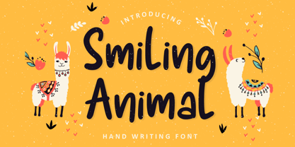 Introducing SMILING ANIMAL Font by Tlatoustype Smiling Animal is a Fun Modern Handdrawn Font. Smiling Animal is perfect for product packaging, branding project, magazine, social media, wedding, or just used to express words above the background. This font includes multilingual support.
