10,000 search results
(0.042 seconds)
- Cheva Display by Letteralle,
$24.00 Introducing, Cheva Display! a bold font with a touch of fine curves. Cheva Display brings vintage look as well as modern designs. With a variety of alternative letters and ligatures, it will make your text more unique and interesting. Cheva Display is a very versatile font, perfect for editorial projects, Logo design, Wedding, Clothing Branding, product packaging, magazine headers, or simply as a stylish text overlay to any background image. What's you get : - Full Uppercase & Lowercase Character. - Alternates & Ligatures. - Numeral, Punctuation, Multilingual Accents. Any Questions? Just Ask! I hope you enjoy! Letteralle Studios
 - Mirador by René Bieder,
$30.00 Mirador is a powerful neoclassical font family designed for various usages — ranging from editorial and corporate design to web, interaction and product design. It is a contemporary take on high contrast typefaces that have never gone out of style — defined by elegance, tradition and timelessness. Although Mirador seems to be a display font at first glance, its proportions and design reveal a powerful and characteristic workhorse when set in smaller sizes. Mirador comes in 10 weights with matching italics. It is equipped with ligatures, a large set of alternative glyphs and many more opentype features.
 - Lovelyn by Craft Supply Co,
$15.00 Lovelyn Font is an elegant serif font that offers a wide range of possibilities, especially for a lot of alternative. Lovelyn Font offers an attractive tool for producing elegant decorative lettering, for example, for book covers or for posters and packaging. You want to make a greeting card or a package design, or even a brand identity, craft design, any DIY project, book title, wedding font, pop vintage design, retro design or any purpose to make your art / design project look Elegant and Classy? Feel free to play with this font!
 - CamingoDos by Jan Fromm,
$45.00 CamingoDos is characterised by tight shapes, elliptical curves, subtle contrast and a strong, humanistic appearance: attributes that were all applied with particular care and attention for legibility. It comes in a wide range of seven weights from ExtraLight to Black which makes it perfectly suitable for editorial and corporate design. Furthermore it now has two additional related families: CamingoDos SemiCondensed and CamingoDos Condensed. CamingoDos comes with a Pro version that offers a rich set of expert typographic features like small caps, ligatures, stylistic alternates, different figure sets, arrows, fractions and ordinals.
 - Drittella by Calligraplay,
$9.00 Drittella is a frivolous and funky all-caps font perfect for posters and display purposes. It is particularly well suited to video games, with straight lines and asymmetrical angles. Created with design direction from my young son, it is equally appropriate for children's artwork, such as invitations, illustrations and cartoons. Drittella is available in both regular and outline styles, which can be used together to provide an option for emphasis. With a total of 345 glyphs, Drittella is multilingual, with numerous currency symbols, and a range of numerical symbols including subscripts, superscripts, fractions and arrows.
 - Bellisia by sizimon,
$18.00 Bellisia is a modern calligraphy font and perfect for logotype, website headers, fashion design, wedding card designs and more. It contains a full set of lower & uppercase letters, a large range of punctuation, numerals, and multi-lingual support. Multilingual support : Danish, Finnish,English, Spanish, Dutch, German, Icelandic, Italian, Norwegian, Portuguese, Indonesian, Swedish, Basque, Bosnian, Catalan Cornish, Croatian, Czech, Embu, Esperanto, Estonian, Faroese, Filipino, French, Galician, Hungarian, Irish, Malay, Maltese, Manx, Maori, Meru, Morisyen, North Ndebele, Bokmål, Norwegian Nynorsk, Nyankole, Oromo, Polish, Romansh, Serbian (Latin), Slovak, Slovenian, Swiss German
 - Combine by Andinistas,
$49.00 Combine, designed by Carlos Fabian Camargo G, is powerful and attractive, multi-layered chromatic type family that consists of 12 fonts, typographically grouped in two logics: “Script and Caps”, so that they could be colored separately or in group. Both designed with contrasting optical techniques and combinable at the same time. The unforgettable central idea of Combine was inspired by unique types of speedball letters designed by ancient artists in Canadian posters of shows and fairs in 1930. This is why its Typographical tools work independently or in group, resulting in highly polished designs that need fonts with coupled effusiveness. Their combined resources offer guaranteed distinguishing letters with shadow effects and worn, in order to help enhance their expressiveness. Combine is excellent in any project on paper or screen as it has more than 2100 glyphs and features of OpenType distributed strategically in fonts easy to use. SEE BELOW THE MAIN ADVANTAGES: • Combine Script & Shadow: It offers incredible case sensitive fluency and eloquence drawn with vertical cursive letters with ornamental non-stop excitement and complementation. It also has a variety of significant upward and downward, alternative strokes combined with its vintage ties that also give authenticity to their designs. • Combine Caps 1,2,3 & Shadow1,2: Guarantees you a colorful horizontal area of narrow case with 2 types of shadows, sound and other shade with diagonal stripes. Its geometric uniformity gives a friendly, open and subtle character by Typographic and special resources and visual properties coloring layers separately or in groups. In addition, its 2 layers of skeletal illuminations, adding internal lines and simultaneously contributing to play perfect confrontation and contrast with their geometric ideas and aesthetics for special attention. • Combine Words & Shadow: It can be used to design a perfect tone in each one of the 50 slogans written diagonally, making a brilliant feeling suggestive seductive style. Compatibility and flexibility works by monoline thin cursive strokes ideal for featured items with and without shade. Combine was selected at the Bienal Tipos Latinos 2016
 - Tomato by Canada Type,
$22.95Tomato is the digitization and quite elaborate expansion of an early 1970s Franklin Photolettering film type called Viola Flare. This typeface is an obvious child of funk, the audio-visual revolution that swept America and put an end to the art nouveau period we now associate with the hippy era. Funk is of course little more than jazz with a chorus and an emphatic beat. Nevertheless, it became the definition of cool in the 1970s, thanks to blaxploitation movies with excellent soundtracks like Shaft and Superfly. Funk began as a commercial audio experience, then later expanded its signature to cover everything, from design to fashion to the later birth of disco, which is really a further simplification of funk. Funk had very strong and unique typographical elements, particularly a kind of titling with an essentially western, wooden core that suddenly changed and flared in unexpected areas until a very individual brand was achieved. Everything that can be tacked on to the alphabet was used towards that individuality. Things like curls, swirls, swashes, ligatures were always plentiful in funk, sometimes giving the titling a specific gender, sometimes bulging, sometimes speeding, sometimes fading in the distance, sometimes doing nothing but crazily aligning with other design elements, but the result was always a fascinating creature that seemed to invariably want to dance and have fun. Tomato was built in exactly that spirit. The original film type certainly had enough swashes and curls to be an unmistakable funk font in itself, but our further expansion of it cements it and makes it the definite font for the genre. With as many as 12 different possibilities for some letters, the designer's choices for a titling set in Tomato are virtually limitless. The Postscript and True Type versions of Tomato come in five fonts, including two fonts for alternates, one font for ligatures, and one font for swashes. These are split into two affordable packages. The entire family package is also available at an even more affordable price, and includes complimentary Cyrillic, Greek, Turkish, and Central European versions of Tomato. A Tomato Pro OpenType version is also available. It is a single font that includes over 650 characters, glued together with extensive programming for convenience of use in OpenType-friendly applications, where you can watch the letters morph and dance as you push the buttons and change the options of your OT palette. Now you know which font will come to mind when someone says the word "funky". - Rocklay by Din Studio,
$29.00 Rocklay is a bold script font. With a classy and natural style, it brings beautiful typeface. Rocklay is best used for branding, logotype, and quotes. Features: - Multilingual Support - PUA Encoded - Numerals and Punctuation
 - Arapix by Anatoletype,
$69.00 Arapix is a 12 pixel high multilingual Latin-Arabic pixel font with incredible capabilities. The Arapix is an almost traditional Naskh. It is elegant and easy to read even in very small sizes. It includes almost every feature you would expect from a high range Naskh font. Its humanistic look and feel fit perfectly to its Latin counterpart. Arapix was originally designed for a web project that didn't see the light a few years back. It started with the idea of fitting both Latin and Arabic into a 12 pixel vertical grid. The latin glyphs fit properly within the vertical limits, but when it came to the arabic glyphs, it proved to be more challenging. Arabic letters with lower diacritic dots like the (Yeh-fina) or letters with accents above like the (Alef-Hamza-above) need much more space than any Latin letter. Add to this the fact that accents needs to be positioned above and below the glyphs. It is technically impossible to fit a (Yeh-fina-kasratan) or a (Alef-Hamza-above-shadda-damma) into 12 pixels. Initially the accents were dropped and not included in the design. Although it seemed impossible at the start, Sylvain found a solution in the end, including as many contextual alternates and contextual kerning as needed to avoid every collision between letters and diacritics, letters and accents, and diacritics and accents. The contextual kerning was added to achieve an even letter and word spacing in longer text. Arapix is amazingly legible in small size on screen and in print. On the other hand, it also works perfectly as display titling font due to its unique and contemporary pixel approach. It can be used for screens with very low resolution as well as for high resolution screens and prints. The new Arapix comes with various new features and new glyphs including Persian and Urdu letters, stylistic set, old style figures, contextual kerning, contextual alternates and a few icons too. Enjoy the new Arapix and have fun with it.
 - Romance Story by Runsell Type,
$9.00 Romance Story is a classy handwriting font with a distinctive curve, inside with some interesting features that are perfect for an authentic-style project. Romance Story is perfectly suited to signature, stationery, logo, typography quotes, magazine or book cover, website header, clothing, branding, packaging design and more. A handwritten script font containing upper and lowercase characters, numerals and a large range of punctuation. Romance Story Includes: - Basic Character ( Uppercase and Lowercase, Numerals, Symbol and punctuation ) - Multilingual support - Ligatures - PUA Encoded - This font including alternate glyph. To access the alternate glyphs, you need a program that supports OpenType features such as Adobe Illustrator CS, Adobe Photoshop CC, Adobe Indesign and Corel Draw. How to get access alternate glyphs with designing software to open type fonts check this link : http: //adobe.ly/1m1fn4Y
 - Angellyne by Haksen,
$13.00 Angelline Script Font! If you are needing a touch of casual chic calligraphy for your designs, this font was created for you! Angellyne was built with OpenType features and includes beginning and ending swashes, alternate characters for both lowercase and uppercase letters, loads of different swash alternates for lowercase letters, numbers, punctuation, alternates, ligatures and it also supports other languages :) with many glyphs! Accessing the swashes / opentype features / glyphs: This font works best in a program that supports OpenType features such as Adobe Indesign, Adobe Illustrator CS, or Adobe Photoshop CC. You can access the swashes and alternates from the 'Glyphs Panel' in these programs. More Questions? Here are some (potential) answers! You are not permitted to resell this font in any way. Multilingual Support is included for Western European Languages Also, the sans-serif font used in the preview images is Gotham :) Cheers!
 - Coletta Davis by Aqeela Studio,
$15.00 Coletta Davis is an elegant and flowing handwritten font. This is coded with PUA which means you can access all glyphs and swashes easily! It features varied base lines, fine lines, beautiful flying machines and amazing alternatives. It maintains the influence of classy calligraphy while feeling contemporary and fresh. Fall in love with this font and take your project to the highest level! You need a program that supports OpenType features such as Adobe Illustrator CS, Adobe Indesign & CorelDraw X6-X7, Microsoft Word 2010 or later versions. Coletta Davis is coded with Unicode PUA, which allows full access to all additional characters without having special design software. Mac users can use the Font Book, and Windows users can use the Character Map to view and copy one of the additional characters to paste into your favorite text editor / application. Thank you and happy designing :) Enjoy!
 - Trevor by TypeTogether,
$36.80 Teo Tuominen’s Trevor took its first breath as a revival of an 18th century antiqua, but culminated in an entirely new and good-natured family. Trevor is an affable slab serif in nature: both heavy and kind. Known for their familiarity and their dark colour, the terminals of slab serifs put additional weight along the line to maintain an inky presence. Their clunky forms reveal slight immaturity and arouse the reader’s sympathy for the subject at hand. Trevor connects with others by consciously riding the line between being personal and commanding. One goal with Trevor was to pair the robust nature of a low contrast slab serif with more sophisticated elements, such as the ball terminals. So wherever one looks in Trevor, rounded corners rule the day, softening the overall appearance by mimicking ink spread made by old metal type. The easygoing look is tempered by very few inktraps and sharp corners, mostly to the inside of characters and in acute angles. Whatever Trevor is paired with, it has an altruistic outlook in that it sees the best in others. It’s the neighbourly type family — the neighbour you actually want. Trevor’s almost monolinear weight and high x-height give it a typewriter look in the extralight and light weights, but the whole family was made to work with many other font styles, design work, and information structures. It certainly finds its home in packaging and advertising, its sturdy verticality and narrowness fit the needs of headlines and intro text, and its seven weights are primed for plays and involved text needing many layers of distinction. The black weight is treated like a separate display style with altered ball terminals and serifs to capitalise on the added heft. Trevor’s seven roman weights cover the Latin A Extended glyph set to bring its kindly and commanding outlook to your projects. Along with alternate version of the ‘R’ in the black weight, its OpenType features include both tabular and proportional lining and oldstyle figures, ligatures, and fractions. The complete Trevor family, along with our entire catalogue, has been optimised for today’s varied screen uses.
 - Vestigia by Rodrigo Navarro Bolado,
$32.00 Vestigio m. Ing. & Fr. vestige: a trace, mark or visible sign left by something as an ancient city in a condition or practice vanished or lost. Vestigia is born by lost pieces of other typography, being then, Garbancera's descendant. It evolved to be seen in big point sizes and compete with other fierce competitors, while retaining some features of it ancient predecessor, navigates a gothic fraktur experimental style, existing between legible and illegible reading.
 - FF Nort by FontFont,
$72.99 FF Nort™ has all the design attributes that make for an exceptionally versatile print and web typeface – and it benefits from a distinct personality. Equally at home in long-form text copy or billboard size headlines, the family knows few boundaries. There is also a handcrafted neo-grotesque quality to the design, giving FF Nort a friendly mien and separating it from other industrial strength sans serif typefaces. Terminals are clipped at 90° angles to the stroke and counters are slightly condensed, saving space with no loss of legibility. The light weights have a subtle elegance, while the bold are commanding. All eight weights, and their italic companions, enjoy a large character set, with support for most Central and several Eastern European languages – including Cyrillic and Greek. Drawn by Jörg Hemker, the inspiration for FF Nort came from Transport, the typeface designed for Britain’s highway signage. Transport is formal, intellectual, and a model for modern street signage, but it was not intended for small sizes or continuous reading. Hemker took the basic structure of Transport and rebuilt it into a design that’s perfect for a wide range of contemporary hardcopy and digital imaging projects.
 - GDR Traffic Symbols by TypoGraphicDesign,
$9.00 The typeface GDR Traffic Symbols is designed from 2021 for the font foundry Typo Graphic Design by Manuel Viergutz. The rough dingbat display typeface is inspired by the past and the future. 306 glyphs / decorative extras like icons, arrows, dingbats, emojis, symbols, geometric shapes, catchwords, decorative ligatures (type the word #LOVE for ❤ or #SMILE for ☺ as OpenType-Feature dlig) and stylistic alternates (5 stylistic sets). For use in logos, magazines, posters, advertisement plus as webfont for decorative headlines. The font works best for display size. Have fun with this font & use the DEMO-FONT (with reduced glyph-set) ■ Font Name: GDR Traffic Smybols ■ Font Styles: 1 Icons + DEMO (with reduced glyph-set) ■ Font Category: Display for headline size ■ Glyph Set: 306 glyphs / decorative extras like arrows, dingbats, emojis, symbols ■ Design Date: 2021 ■ Type Designer: Manuel Viergutz
 - Typer Pro by (v) design,
$25.00 Typer Pro (formerly Consul Typewriter Pro) is a modern OpenType font family reviving the look of old typewriters. Its carefully converted forms are detailed enough even for high pointsizes while keeping a reasonable number of outline points. Typer Pro comes in two variants: Typer Pro Mono is strictly monospaced (all characters occupy the same amount of horizontal space – this way old typewriters usually operated). However, sometimes a more even appearance may be desirable. Therefore, Typer Pro Text has been proportionally altered for a more pleasant and balanced look. Moreover, it is possible to achieve both proportional and monospaced look in both families via Stylistic Sets. You can choose from four different weights in each family and pick characters from its extensive glyph set. Typer also contains a number of Stylistic alternates, randomly replaced alternative letters to avoid the repetition of letters in a word. Typer Pro is a versatile typeface and is perfectly legible even at small sizes and on-screen. When printed, it looks best at its original size around 11–12 pt. Typer supports many OpenType features and offers great multilingual support for most of Latin-based languages. Feel free to download the detailed PDF Specimen.
 - Waltrach by Mokatype Studio,
$25.00Hello Introducing, Waltrach - Authentic Serif Font is an elegant and unique font that uses ligatures to smoothly link letters. Perfect for adding a unique twist to word-mark logos, monograms, or pull quotes.Waltrach has 28 Alternates and 3 ligatures as well making it super fantastic. Ligature can be turned off if required standard writing needs. What's Included : Standard glyphs Ligatures Alternates Web Font International Accent Works on PC & Mac Simple installations Accessible in Adobe Illustrator, Adobe Photoshop, Adobe InDesign, even work on Microsoft Word. PUA Encoded Characters - Fully accessible without additional design software. Fonts include multilingual support Image used: All photographs/pictures/vectors used in the preview are not included, they are intended for illustration purposes only. - Magiesta by Mokatype Studio,
$20.00Hello Introducing, Magiesta - Elegant Display Sans Serif is a unique font that uses ligatures to smoothly link letters. Perfect for adding a unique twist to word-mark logos, monograms, or pull quotes. Magiesta has 7 ligatures making it super fantastic. Ligature can be turned off if required standard writing needs. What's Included : Standard glyphs Ligatures Web Font International Accent Works on PC & Mac Simple installations Accessible in Adobe Illustrator, Adobe Photoshop, Adobe InDesign, even work on Microsoft Word. PUA Encoded Characters - Fully accessible without additional design software. Fonts include multilingual support Image used: All photographs/pictures/vectors used in the preview are not included, they are intended for illustration purposes only. Thank You - Belgietta by Mokatype Studio,
$25.00 Belgietta - Ligature Display Serif is an elegant and unique font that uses ligatures to smoothly link letters. Perfect for adding a unique twist to word-mark logos, monograms, or pull quotes. Belgietta - Ligature has 13 ligatures & 20 Alternate as well making it super fantastic. Ligature can be turned off if required standard writing needs. What's Included : Standard glyphs Ligatures Alternates International Accent Works on PC & Mac Simple installations Accessible in Adobe Illustrator, Adobe Photoshop, Adobe InDesign, even work on Microsoft Word. PUA Encoded Characters - Fully accessible without additional design software. Fonts include multilingual support Image used: All photographs/pictures/vectors used in the preview are not included, they are intended for illustration purposes only.
 - News Gothic SB Vietnam by Scangraphic Digital Type Collection,
$26.00 This version of News Gothic contains the Vietnamese character set. Since the release of these fonts most typefaces in the Scangraphic Type Collection appear in two versions. One is designed specifically for headline typesetting (SH: Scangraphic Headline Types) and one specifically for text typesetting (SB Scangraphic Body Types). The most obvious differentiation can be found in the spacing. That of the Body Types is adjusted for readability. That of the Headline Types is decidedly more narrow in order to do justice to the requirements of headline typesetting. The kerning tables, as well, have been individualized for each of these type varieties. In addition to the adjustment of spacing, there are also adjustments in the design. For the Body Types, fine spaces were created which prevented the smear effect on acute angles in small type sizes. For a number of Body Types, hairlines and serifs were thickened or the whole typeface was adjusted to meet the optical requirements for setting type in small sizes. For the German lower-case diacritical marks, all Headline Types complements contain alternative integrated accents which allow the compact setting of lower-case headlines.
 - Greenalyzed by PizzaDude.dk,
$17.00 Greenalyzed is a made up word is a font that could set your mind to something handmade and eco friendly. The letters are clumsy and childish naive, but really fun and legible. Comes in 3 different versions: Regular, Rough and Stitch. The Stitch version is good as a top or shadow layer. I also added multilingual support and "jumpy" ligature substitutions for the most common double letters. Enjoy!
 - MM Cruella by MM Fonts,
$39.00 MM Cruella is a monolinear display typeface well suited for magazines headlines, posters, catalogs, branding and packaging. The round, large counters combined with the rounded terminals gives it a very fluid look and a warm character while the straight lines establishes a nice rhythm. It comes in 5 weighs and is loaded with discretionary ligatures and contextual alternates that will give your next project a very distinctive look.
 - Homeward Bound by Hanoded,
$15.00 Homeward Bound is a fat, grungy slab serif font - all handmade and inspired by a well known 1934 font. Together with sidekick Homeward Bound II, this baby will lighten up your day, bring you your newspaper and do your dishes to boot. Well, that may not be an accurate description of Homeward Bound’s abilities, but I am sure it will make your work stand out, giving it that ‘handmade eroded vintage’ look.
 - Calling Code by Dharma Type,
$- Calling Code — very nice monospaced font — 1. is a monospaced font family for coding and tabular layout. 2. simply consists of 4 style, Regular, Italic, Bold and Bold Italic. 3. is ready in both OpenType and TrueType formats. 4. has slightly condensed width for more useful space. 5. has good distinguishability and legibility and cute curly tails. 6. brings a fresh sensitivity to boring old existing monospaced fonts. You can try Regular style for free.
 - Masifa Rounded by Hurufatfont,
$19.00 Masifa Rounded has compact, simple, functional and neutral body structure. It has 5 widths from Normal to Ultra Condensed. Each width includes 9 weights from Hairline to Black and their matching italics. Also, every weight includes rich OpenType Features like Small Caps and custom number styles. Due to its large family, it is ideal for a wide range of usage from large-scale designs to small product labels. Masifa Rounded updated on September 25, 2021.
 - Fabulous Sunday by Balpirick,
$15.00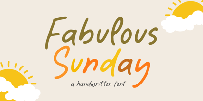 Fabulous Sunday is a Handwritten font that's perfect for adding a personal touch to your design projects! With its natural, organic feel and unique character. Crafted with care and attention to detail, this font is incredibly versatile and can be used for a range of design projects, including logos, branding, invitations, and more. Its modern, handwritten style gives it a unique character that's sure to make an impact. - also multilingual support Thank you!
 - Happy Sparkle by Letterhend,
$15.00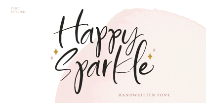 Introducing, Happy sparkle! a happy handwritten font that will bring your design into a happy and fun mood. this font is perfect for branding, packaging, logotype, headline, wedding invitation, etc. Features : - uppercase & lowercase - numbers and punctuation - multilingual - alternates and ligatures - swash - PUA encoded We highly recommend using a program that supports OpenType features and Glyphs panels like many of Adobe apps and Corel Draw, so you can see and access all Glyph variations.
 - Shareef by Olivetype,
$18.00 Introducing Shareef, a stylish signature script font. Suitable for logo and branding design, Shareef is a unique typeface that can bring character to any project. Its organic and flowing curves lend an air of sophistication, while its subtle texture gives it a handmade aesthetic that can add elegance and personality to your designs. Features : Basic Latin Uppercase and Lowercase Numbers, symbols, and punctuations Under Swashes, alternate letters, & ligatures Multilingual Support. Thank You
 - Holymore by Letterhend,
$19.00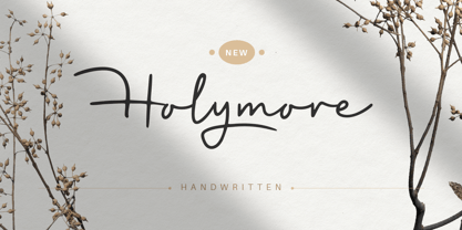 Introducing, Holymore! a handwritten font that will bring your design into a natural looking with its handwritten touch. this font is perfect for branding, packaging, logotype, headline, wedding invitation, etc. Features : uppercase & lowercase numbers and punctuation multilingual alternates and ligatures swash PUA encoded We highly recommend using a program that supports OpenType features and Glyphs panels like many of Adobe apps and Corel Draw, so you can see and access all Glyph variations.
 - Flower Hill by Olivetype,
$18.00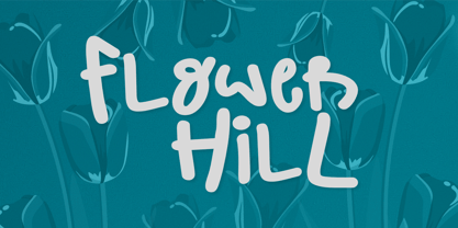 Introducing Flower Hill, a fun and quirky display font! With its vibrant and playful design, Flower Hill will instantly bring a touch of fun to any project. Whether you're designing a party invitation or creating social media graphics, this font can adapt to any theme or style effortlessly. Flower Hill Font features : Standard Latin Numbers, symbols, and punctuations Multilingual Support. Fully accessible without additional design software Simple Installations Works on PC & Mac Thank You.
 - Squid Ninja by Epiclinez,
$18.00 Squid Ninja is a bold, fun display font with unique characters and playful vibes. It's a good choice for creating exciting logotypes, eye-catching headlines, catchy titles, and more. Squid Ninja offers a wide range of possibilities to make your work look dynamic and more enjoyable. Squid Ninja font includes : Basic Latin Uppercase and Lowercase Numbers, symbols, and punctuations Multilingual Support. Simple Installations & Works on PC & Mac Thank You and happy designing!
 - JHC Audemars by Jehoo Creative,
$20.00 Presenting JHC Audemars, an impeccably crafted condensed serif font exuding a resolute and refined character. Distinguished by its unique inverted letter shapes, this font embraces an avant-garde aesthetic. Boasting a comprehensive range of weights from Thin to Black, along with an elegant italic style, JHC Audemars ensures versatile application in various design contexts. Ideal for sophisticated branding and editorial endeavors, this font effortlessly merges strength with sophistication, delivering a commanding and memorable typographic presence.
 - Gladian by Romie Creative,
$15.00 Gladian Script, a new & modern script with handcrafted calligraphy styles, decorative characters and dancing baselines! So beautiful in invitations like greeting cards, branding materials, business cards, quotes, posters and more !! Gladian Script is equipped with 144 glyphs. Alternative characters are divided into several Open Type features such as Swash, Stylistic Sets, Stylistic Alternates, Contextual Alternates, and Ligature. The Open Type feature can be accessed using Open Type savvy programs such as Adobe Illustrator, Adobe InDesign, Adobe Photoshop Corel Draw X version, and Microsoft Word. And this Font has provided PUA unicode (custom coded font). so that all stunt characters can be easily fully accessed by a craftsman or designer.
 - Wilona by BBA Key,
$8.00 Wilona Script New fresh & modern style with handmade calligraphy, decorative characters and dancing lineage! So wonderful are invitations like greeting cards, branding material, business cards, quotes, posters, and more !! Wilona Script The comes with 883 glyphs. Alternate characters are divided into several Open Type features such as Swash, Stylistic Sets, Stylistic Alternate, Contextual Alternate. Open Type features are accessible by using Open Type savvy programs such as Adobe Illustrator, Adobe InDesign, Adobe Photoshop Corel Draw X versions, and Microsoft Word. And this font has code PUA unicode (font with special code). So that all alternative characters can be easily accessed by craftsmen or designers.
 - Aramus by Hackberry Font Foundry,
$24.95 Aramus is a new serif font in my continuing objective of designing book fonts that I can really use. In many ways, Aramus is a very different direction for me. It comes from a scan of an old display face that has been radically modified to a much smaller x-height than I have been using lately, plus taller ascenders. Many of the characters needed a lot of correction to bring them into my taste. In general, I have decided that many of my fonts create a type color that is too dense. Aramus is an attempt to get away from that look. Although Amitale has been a very successful book family and excellent to work with, I find I still need something more open with a lighter color. Aramus is the first look at the new direction. The original hand-cut serifs vary a lot, different for almost every character. This gives a little looseness and helps the lightness I am looking for. It will be interesting to see where this all goes. This is a normal serif for me in that it has caps, lowercase, small caps with the appropriate figures for each case. This font has all the OpenType features in the set for 2009. I didn't bother with the CE accents (though I can add them upon request. They will be in the final new book family). There are several ligatures for your fun and enjoyment: bb gg ff fi fl ffi ffl ffy fj ft tt ty Wh Th and more. Like all of my fonts, there are: caps, lowercase, small caps, proportional lining figures, proportional oldstyle figures, & small cap figures, plus numerators, denominators, superiors, inferiors, and a complete set of ordinals 1st through infinity. Enjoy!
 - Geometria by Brownfox,
$44.99 Although geometric Sans Serifs have been in vogue for nearly a century, they have never been as ubiquitous. It is not improbable that the old adage would be phrased: “When in doubt, set it in geometric sans”, had it been composed today. Have we not had enough? We think, not. Postmodern times demand a variety of expressions. The vision behind Geometria was to revisit the perennial favorite to lend subtle individuality to its tried and true forms. Geometria stands out in the crowd of similar fonts thanks to its complicated nature. It combines dynamic elements with a certain degree of stability. A slightly higher waistline of the capitals contributes to their distinctive appearance. If the upper case refers to the American grotesques of the 19th century, the lower case tends toward the forms of the Renaissance in its proportions. Geometria is a typeface of clean shapes that is well-suited for continuous reading, and it sets remarkably well. At the same time, it can be friendly, even flirtatious. Its distinct personality combines seeming opposites. At times it may appear serious, at times playful. On occasion, it may be deliberate, other times dynamic. It could seem rigid, then elegant. It is a typeface that could be perceived either as cutting-edge, or as nostalgic. A careful and discerning typographer will bring out and emphasize those aspects of its multifaceted personality that are needed to solve the problem at hand. Geometria consists of 24 fonts — eight weights with matching italics and narrow styles. The font includes multiple sets of figures and currency signs, alternate glyphs, a variety of experimental ligatures, and punctuation marks for the two cases. The 835 glyphs support 72 languages. Granshan 2013 award.
 - Libertat by Elyas Beria,
$9.00 In a not-too-distant future, humanity was ruled by a powerful, technologically advanced empire known as the Synod. The Synod controlled all forms of communication, and through this, they controlled the minds of the people. But a small group of rebels, known as the Resistance, had managed to evade the Synod's surveillance and formed a secret underground movement. They were determined to overthrow the Synod and restore freedom to the people. One of the Resistance's key members was a young artist named Trystån. He had a unique talent for creating powerful, visually striking posters that captured the spirit of the Resistance's message and spread it to the masses. Trystån had just completed a new poster, one that would be critical to the Resistance's plans. It depicted a single, outstretched hand holding a traditional Kimarii laser staff, with the words "Libertat!" emblazoned across the top. The poster featured a striking and powerful font that perfectly captured the spirit of the Resistance's message. The font was a combination of bold lines, elegant confident curves, and strong angles, giving it a sense of strength and determination. The lettering was large and prominent, filling up much of the poster, making it hard to miss. The letters seemed to be almost carved into the surface, giving the impression of something that was permanent and unshakable. The font was colored in dark shades, and was a sans serif typeface, that gives the message a very modern and current feel yet also feels vintage and retro, connecting the present with the struggles of the past. And with multilingual support, the typeface ensured that the message of the Resistance could be disseminated in every language on the planet. The background was minimalistic and in contrast, with a neutral palette, with just a hint of a sand-like color, representing the harsh conditions of the land that the people were fighting for their rights. The focus was all on the lettering, and how it conveyed the message. The poster was indeed a moving piece of graphic design, with its strong, striking font, and powerful imagery. It was clear that Trystån had put a lot of thought and care into its design. The poster, he hoped, would connect with people on an emotional level and inspire them to rise up against the oppression of the Synod Empire. The poster was set to be distributed at a major rally in the capital, where the Resistance was hoping to gain the support of thousands of citizens. But the Synod was not about to let this happen. They had long suspected the existence of the Resistance and had been working to infiltrate their ranks and discover their plans. The night before the rally, the Synod launched a surprise raid on the Resistance's hideout, capturing Trystån and several other members of the Resistance. Trystån was thrown into sand pits and interrogated by the Synod's top agents. They wanted to know everything about the Resistance's plans, including the details of the poster and the rally. Trystån, knowing the importance of the poster, refused to give in, even under the harshest of conditions. Meanwhile, the rally was drawing near, and the Resistance was desperate to get the poster out to the public. They knew that it was their only hope of gaining the support they needed to overthrow the Synod. They came up with a plan to smuggle the poster out of the hideout, but it would be a risky endeavor. As the rally began, the Resistance made their move, slipping the poster into the hands of the crowd. Trystån's poster had made a big impact in the rallies, and soon it became the symbol of hope for the resistance, and the visual representation of their struggle for freedom. The poster had become the catalyst for the revolution, and it would be remembered for many years to come as the symbol of the fight for freedom and democracy. The image of the outstretched hand holding the Kimarii laser staff struck a chord with the people, and they began to rise up against the Synod's oppression. Trystån, still locked away in the sand pits behind a stasis feild, could only imagine the scene unfolding outside. But he knew that his work had helped to spark a revolution, and he felt a sense of pride and accomplishment. The Resistance, with the help of the rally, was able to overthrow the empire, and Trystån was released, celebrated as a hero and hailed as the artist who helped to bring about the new era of freedom and democracy. The poster Trystån had designed had become the symbol of a new era, and it would hang in museums and public places as a reminder of the power of resistance and art, in the face of oppression. Features: regular and light weights numbers and punctuation multilingual characters
 - Rockwell by Monotype,
$40.99 Whether you call them slab serif, square serif, or Egyptian, you know them when you see them – sturdy, nearly monoweight designs with blunt, straight-edged serifs and a no-nonsense attitude. The Rockwell® Nova family is a fine example of this appealing and eminently usable type style. This is a design that is both robust and adaptable. Marked by the flat top-serifs on the cap A, unusual Q tail and high-legibility two-storied lowercase a, Rockwell has a bit of handmade charm that distinguishes it from the cool, more modern interpretations of the slab serif style. The family is excellent for branding, headlines and other display uses. The simple shapes and hearty serifs also make it a good choice for short blocks of textual content in both print and on-screen environments. The light and bold weights are perfect for setting blocks of text copy, while the extra bold and condensed designs bring authority to display copy. Throw in a little color, and you amp up Rockwell’s messaging power. The regular and italic designs perform handsomely, in the most modest of screen resolutions. With four weights of normal proportions, each with a complementary italic, and three condensed designs, two with italics, the family is a commanding and versatile graphic communicator. Rockwell’s large x-height, simple character shapes and open counters, make for an exceptionally legible design. It should not, however, be set so tight that its serifs touch, as this will erode legibility and impair readability. A benefit to Rockwell’s slab serifs, however, is that the design combines beautifully with both sans serif typefaces and a variety of serif designs. Rockwell OpenType® Pro fonts have an extended character set supporting Greek, Cyrillic, most Central European and many Eastern European languages, in addition to providing for the automatic insertion of ligatures and fractions. Looking for its perfect pairing? Look no further than ITC Berkeley Old Style, Between™, ITC Franklin Gothic®, Harmonia Sans™, Metro® Nova or Frutiger® Serif.