10,000 search results
(0.096 seconds)
- Ekamai by Eclectotype,
$40.00 This is Ekamai, named after the district of Bangkok I lived in. It is based on Quinella, and was supposed to be a quick and easy reworking of that font into a "tight-not-touching" (rather than overlapping) version. As is often the case with quick and easy things, it turned out to be neither, and the vast majority of glyphs needed to be completely overhauled to fit the new system. This face is deliciously plump face, with lovingly rendered curves and just the right amount of cuteness; perfect for food packaging (of the sweeter variety probably!), logos, magazine headlines and the like. It performs admirably in all caps settings. The numerals are expressive hybrid figures (somewhere between lining and oldstyle). The overall feel is friendly and soft, without being overtly saccharine. Ekamai is equipped with subtle contextual alternates (which I'd recommend leaving on) to help with the tight fit, a handful of discretionary ligatures if that's your thing, and a case feature for all caps settings. The stylistic alternates and stylistic set 1 features simply change the # glyph to an attractive numero. Automatic fractions are included along with wide-ranging language support.
 - Geographica by Three Islands Press,
$29.00 Thomas Jefferys (ca. 1710–1771) was the best-known map maker in 18th-century England, chiefly because he won (and hyped) the title “Geographer to King George III.” Jefferys was really more an engraver/publisher than a geographer, since he mostly relied on the cartographic materials of others. Still, his maps of the North American colonies were well known. Geographica is a legible, four-style serif family modeled after the neat hand-lettered place names and peripheral text on Jefferys’s maps. With its long serifs, tall x-height, and robust curves, Geographica somehow combines classic elegance with a whiff of coastline and sea. The italic styles have the slant and warmth of the hand-drawn source materials. And the typeface comes with a slew of distinctive map-based ornaments—including compass wheels and sailing ships. This evocative serif works well in both display situations and long blocks of text, whether on paper or screen. OpenType features include small capitals, numerous ligatures, and two stylistic sets of titling caps. Geographica offers full support for Central and Eastern European languages—more than 1,200 glyphs in all.
 - Eragu by Twinletter,
$15.00 ERAGU is a display typeface that is unlike any other, both in terms of shape and the impression it gives when used in words or sentences. It also has a new and unusual appearance that makes it truly unique and quirky. All of your projects will be unique in the market if you use this font; it will pique the interest of everyone who sees it, and it will be simple to remember every message you will convey to the audience because, in just a few seconds, everyone will be interested in the appearance of your project if you use this font. Logotypes, food banners, branding, brochure, posters, movie titles, book titles, quotes, and more may all benefit from this font. Of course, using this font in your various design projects will make them excellent and outstanding; many viewers are drawn to the striking and unusual graphic display. Start utilizing this typeface in your projects to make them stand out.
 - Horror Graffiti Cholo by Biroakakarati,
$10.99 This handwritten font is inspired by the cholo calligraphy of graffiti artists. It has a scary design, which is suitable for horor film posters and at the same time for signs and tattoo designs. It has an original style an effect font also available in a color version with drops of blood or paint to give a more lively touch. Try using it for your halloween party invitations or for your tattoo designs, for scary greeting cards. I used the word "Cholo" because this lettering in inspired by cholo-graffiti culture in Los Angeles in 70's years. The one of the best rappresent is Charles "Chaz" Bojorquez the father of cholo-lettering. Cholo because i think that in 70's in Los Angeles neighborhoods where graffiti-culture grow up there was a persons whit a mixed multicultural connexion and Chaz is one of them. Cholo-graffiti or Cholo-lettering is a specifing style o lettering. I think this is a good keyword for this lettering.
 - Floro by Andinistas,
$29.95 Floro is a typographic family with 3 members designed by Carlos Fabian Camargo. Its idea combines medieval ideas, grotesque, stencil and grunge for T-shirts, stickers, advertising material design. More specifically the concept of Floro join several DNAís coordinating X height, ascendant, descendant and wide, in which proportions and adaptive optics were determined to inject great visual impact when composing titles. Its forms and counter forms have imperfections controlled with vitality and consistency. Floro is useful for ranking words and phrases with corroded edges and creases between the lines of his letters. In that vein, Floro refers to improvised design, deletion and copying. For that reason, its determinants seem stencil patterns that attract the attention of the reader. Its inaccurate decisions were planned that way, in which the type of contrast seems made with a flat tip and the amount of contrast between thick and thin is medium. Its sizes, regular and italic shine by their systematic wear and terminations sometimes in pointed forms resembling medieval darkness. In short, we can say that Floro comes from the miscegenation of Gothic calligraphy texture, foundational calligraphy and some refinements of gothic writings with italic sans-serif ideas of late 19th century. Even with the blur appearance, floro has ideal proportions to pile for horizontal and vertical areas when composing titles with striking looks and robust. And finally, floro dingbats are related shields and stamps, to accompany the written resulting useful at the level of visual support and hierarchical.
 - Gene Condensed JNL by Jeff Levine,
$29.00 Gene Gable is known to many graphic artists from his on-line column 'Scanning Around with Gene', which was on the Creative Pro website for a number of years, covering a variety of topics ranging from printing techniques to paper ephemera; water applied decals to lettering stencils. Gene has also been a great help in providing vintage source material to Jeff Levine, which resulted in many additional font designs. It seems only fitting that he should be bestowed with his own-named font as well. Gene Condensed JNL is offered in both regular and oblique versions.
 - Kallem by Khaiuns,
$16.00 Kallem is a stylish modern Calligraphy font with magical pressure. i hope this font perfect for creating signature logos and watermarks for photography studio or wedding invitation, best for initial or branding logo signature. Kallem includes full set of gorgeous uppercase and lowercase letters, numerals, a large range of punctuation and 61 ligatures. All lowercase letters include ending swashes, giving realistic hand-lettered style In order to use the beautiful swashes, you need a program that supports OpenType features such as Adobe Illustrator CS, Adobe Photoshop CC, Adobe Indesign and Corel Draw. Thanks for use this font ~ Khaiuns
 - Quality Times by Gilar Studio,
$16.00 Quality Times is a stylish modern calligraphy font with casual chic flair. It is perfect for branding, wedding invites and cards, and maybe for red wine label. Quality Times includes full set of gorgeous uppercase and lowercase letters, numerals, a large range of punctuation and ligatures. All lowercase letters include beginning and ending swashes, giving realistic hand-lettered style. What you get, darling? In order to use the beautiful swashes, you need a program that supports OpenType features such as Adobe Illustrator CS, Adobe Photoshop CC, Adobe Indesign and Corel Draw. Check my other Font here : https://gilarstudio.com/
 - Magehand by Typia Nesia,
$28.00 Magehand an excellent font for modern hand lettering logo or headline/display designs. Suitable for any design needs : logo, branding, modern advertising design, logos, poster quote, book / cover Title, editorial design, card, custom mug, pillow, t-shirts, and any hand-lettered needs. WHAT YOU GET - Magehand (.ttf + .otf) comes with upper and lowercase Standard Characters, Punctuation, Numerals. And other Glyphs variation of the OpenType features such as Standard Ligature, Discretionary Ligatures, Stylistic Alternate and Stylistic Set (ss01 - ss18). - PUA Encode Characters, fully accessible without additional design software. - Includes a range of multilingual characters. Typia Nesia Std
 - Forenight by Flawlessandco,
$9.00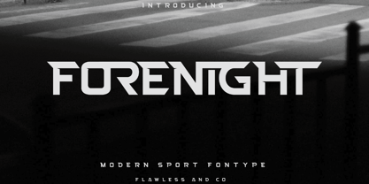 Introducing "Forenight" - a dynamic and modern sport font designed to capture the spirit of athleticism and energy. With its bold and sleek letterforms, Forenight brings a sense of power and movement to your sports-related designs. There's some connected letters and some alternates that suitable for any graphic designs such as branding materials, t-shirt, print, business cards, logo, poster, t-shirt, photography, quotes .etc This font support for some multilingual. Also contains uppercase A-Z and lowercase a-z, alternate character, numbers 0-9, and some punctuation. If you need help, just write me! Thanks so much for checking out my shop!
 - Boldy by Larin Type Co,
$18.00 BOLDY This is a stunning display serif font, it includes alternates for lowercase, as well as ligatures for lowercase. This multi-purpose font captures a huge range for the design and creation of your project. Laro will perfectly cope with a variety of tasks and will always look stylish and modern. With it, you can create logos, labels, advertising, packaging, branding, book covers and magazines, cosmetics, banners, posters, headings, descriptions, stationery, advertising and much more. Full alphabet with Uppercase and Lowercase A-z Numbers, fractions Punctuation and symbols Alternates for Lowercase Ligatures for Lowercase Multilingual support
 - Browellay Synthya by Arterfak Project,
$19.00 Introducing Browellay Synthya, an expressive, classy, and elegant signature font that will bring joy to your designs! Designed with bolder strokes to make it stand out as a display font. This font is perfect for showcasing your personal touch as it captures the natural beauty of handwriting. Let your creativity shine with Browellay Synthya in projects like posters, flyers, quotes, apparel, logotypes, fashion, branding, motion graphics, invitations, weddings, and much more! Browellay Synthya features: Uppercase letters Lowercase letters Numbers and punctuation marks Symbols Stylistic alternates Ligatures Multilingual support Elevate your designs to new levels of sophistication with Browellay Synthya!
 - Krong by Joelmaker,
$18.00 Krong is a set of font family, modern Geometric in which there are several combinations of unique style sets, so ready to help you to make your designs look elegant. Krong Each contains nine weights ranging from Thin to ExtraBold, all with companion italics. The font includes more than 819 glyphs, covering all European languages written in Latin script. Krong OpenType features: Stylistic Alternates, Sylistic Set, Standard Ligatures, Discretionary Ligatures for lowercase and uppercase, Case Sensitive Forms, Arrows, Circled and Black Circled Figures, Proportional Old Style figures, Tabular Lining figures, Slashed Zero, Fractions, Superscript and Subscript figures.
 - Women Frame by Wildan Type,
$11.00 Women Frame is a modern calligraphy font with sweet pressure. i hope this font perfect for creating signature logos and watermarks for photography studio or wedding invitation. I made it with love and magic!! Women Frame includes full set of beautifull hand lettered uppercase and lowercase letters, numerals, a large range of punctuation and ligatures. All lowercase letters include beginning and ending swashes. In order to use the beautiful swashes, you need a program that supports OpenType features such as Adobe Illustrator CS, Adobe Photoshop CC, Adobe Indesign and Corel Draw. if you have questions, please provide a short message to us
 - Contane by Hoftype,
$49.00 Contane is a new font with a classical character. It is high-contrasted and nobel in appearance, but still objective and clean. It is predestined for headlines, editorials and small text applications. All Italic weights also contain Swash Capitals for especially fancy occasions. Contane supports up to 80 languages and it’s OpenType format allows a wide range of typographic applications. 20 styles offer fine graduation of the weights. All weights contain small caps, ligatures, superior characters, proportional lining figures, tabular lining figures, proportional old style figures, lining old style figures, matching currency symbols, fraction- and scientific numerals, matching arrows and alternate characters.
 - Riga by Ludwig Type,
$45.00 Riga is a space-saving and legible typeface designed to work equally well on paper and on the computer screen. Its personality is clear and practical, yet warm and polite. Riga is suitable for a wide range of typography such as editorial, websites, packaging and corporate design. Economical proportions, high x-height and open letter forms guarantee good performance in narrow columns and tight headlines. Riga is exceptionally readable at small point sizes and elegant at larger ones. Riga comes in 18 styles and weights and contains a large number of OpenType features. For small sizes on screen Riga Screen is also available.
 - Fadello by Cooldesignlab,
$15.00 Fadello is a handwritten signature script with a natural & stylish flow, perfectly suited to signatures, stationery, logos, typography quotes, magazine or book covers, website headers, clothing, branding, packaging design and more. A handwritten script font containing upper and lowercase characters, numerals and a large range of punctuation. Fadello is a must-have signature script that has a diverse set of alternates that will surely be used many times over in various projects in the future. This collection fills a void and separates itself from other scripts available. If you have any questions, don't hesitate to contact me by Gmail: Cooldesignlab@gmail.com.
 - Lomo by Linotype,
$29.99Lomo, PLC is a Russian optical manufacturer, whose cameras have built up an international cult following since 1992. Swiss designer Fidel Peugeot recently tapped into this phenomenon, creating an astounding series of pixel fonts for use in a variety of applications-from websites to mobile phone displays. Now available as a single family from Linotype, Lomo's versatility extends itself across 37 various faces. Whether on screen or online, Lomo's different weights deliver great legibility at low resolutions. Additionally, the amazing breadth of this family allows these pixilated faces to crossover into print, bringing a contemporary technology feeling to your more traditional pieces, too. Worth experimenting with is the Lomo Wall series, of which 14 of the Lomo family's 37 fonts belong to. In graphics applications like Adobe's PhotoShop of Illustrator, the Lomo Wall fonts may be layered over top of one another in various combinations. For example, Lomo Wall Chart 50 could be colored red, and layered behind Lomo Wall Pixel 50. The text in Lomo Wall Pixel 50 would then looked like it had been painted over top of a brick wall. With 14 fonts, and millions of colors in your application's color palette to choose from, the combination possibilities for this layering technique are endless! (If you really like this layering feature, check out what Karin Huschka, another Linotype designer, did with her Chineze Dragon family.) Convinced? Give the unlimited possibilities of Lomo a spin today! The entire Lomo family is part of the Take Type 5 collection, from Linotype." - Pardone by Redy Studio,
$17.00 Pardone – Luxury Signature Font Introducing Pardone – A new signature font with a natural and luxury feel that works best for signature logos. Pardone is a premium and elegant font that features a natural rhythm and looks great in any type of design. Pardone includes a full set of gorgeous uppercase and lowercase letters, numerals, a large range of punctuation, 68 ligatures, and alternates. Every single letter has been carefully crafted to make your text looks unique, this typeface is designed to look a perfect fit for signatures, branding, logos, and pretty much anything with Pardone. Pardone features: A full set of upper & lowercase characters Numbers & punctuation 68 Gorgeous ligatures Lowercase alternates Lowercase ending swashes PUA Encoded Characters – Fully accessible without additional design software. Feel free to give me a message if you have a problem or question. Thank you so much for taking the time to look at one of our products.
 - Betterside by Typestory,
$10.00 Betterside is a sweet and cursive handwritten font. This gentle font will look gorgeous on a variety of design ideas. It will add a joyful and romantic touch to each of your projects! The font is perfect for greeting cards, branding, business cards, quotes, posters, stickers, blogs, logos, weddings, signage, packaging, birth announcements, photo overlays, wall art, quotes, printed materials, bags, t-shirts and more. . . ! What’s Included : Web Font Ton of glyphs Ligature, Alternate & Swashes Works on PC & Mac Simple installations Accessible in the Adobe Illustrator, Adobe Photoshop, Adobe InDesign, even work on Microsoft Word. PUA Encoded Characters – Fully accessible without additional design software. Thank you for your purchase! That’s it !! Have fun using our font 🙂
 - Savage Sword by Comicraft,
$29.00 Mother of Mitra, Crom’s Devils and other Savage WORDS! The only thing better than one dead Pict is TWO! Or THREE! Or FOUR! And what better than this SAVAGE font to sound the sword strokes of a BARBARIAN BORN?! Hack! Slice! Cut your fiendish foes into pieces with Comicraft’s SAVAGE SWORD and tell your SAVAGE TALES to all and sundry and even those you’ve sundered! BE AWARE! Handle with care and keep some neosporin or other antibacterial cream at hand -- being Savage and filled with Berserker Rage may result in unintended wounds to yourself and your kinsmen. Savage Sword features two sets of automatically alternating uppercase characters, plus support for Western & Central Europe and Vietnamese.
 - Coax by Up Up Creative,
$16.00 Coax is a cool sans serif display font with high-end details like oblique stressed round letters and a sprinkling of asymmetrical geometric serifs. Coax is destined for your next branding, advertising, or editorial design project. Also Great for headlines, monograms, logos, wedding invitations, and more. Coax includes approximately 530 glyphs, including 42 standard and discretionary ligatures. OpenType features include a smattering of character variants and multilingual support (including multiple currency symbols). The OpenType features can be very easily accessed by using OpenType-savvy programs such as Adobe Illustrator and Adobe InDesign. (To access these awesome features in Microsoft Word, you'll need to get comfortable with the advanced tab of Word's font menu.)
 - Whimsical Musical by Harald Geisler,
$34.56 Whimsical Musical is a vivid, hand drawn font with 405 alternate letters, all caps. Developed from a lighthearted drawing in my sketchbook saying the German word “MUSIK” cheerfully over and over in twenty vivid variations. Next to it was the date “6th April 2007”. This initial idea has burst into a font that is full of surprises and whimsical turns. It is dynamically suggestive, like music, and humorously chaotic, as in Dada. Each uppercase letter is enriched with ten stylistic alternates (OpenType stylistic sets) to create a heap of playful variations amounting to a mountain of possibilities. Recommended for display usage: gonzo headlines, fantastical picturesque covers, extravagant quirky flyers, chichi posters, individual labels and fun logos.
 - Andulka by Storm Type Foundry,
$44.00A universal typeface for books, magazines and newspapers must be economizing, quiet, strong in drawing, but original and peaceful at the same time. Type "for all weather" must resist also many difficulties of printing on different surfaces. Therefore, the basic design "Text" is slightly darker and legible from 6 point size even in a dim light, whereas "Book" reduces the effect of running ink and saves toner cartridge. In offices of smaller companies these lighter fonts are welcomed as toner-savers. Andulka also need less space on the page than other text typefaces and saves paper too. Medium and Bold designs keep the original grace, changing its weight only in shadows. Italics may remind humanistic inspiration and forcing the horizontal of x-height with robust horizontal serifs, whereas Roman lower case maintains the baseline. Basic numerals are non-aligning proportional, but there are available upper case figures as well as special numerals drawn for the same height as small caps, which is just about a hairline above the x-height. The characteristic feature of Andulka is a squinted eye in letters 'a', 'c', 'f', 'r', 's', 'k', and softened diagonals through all characters in family. Diagonals were always disturbing and gripping attention extensively. Serifs are stressed trapezoids reminding small beaks at curved endings, descenders 'j' and 'y' may evoke tail feathers of budgerigar. Andulka [budgerigar] sings lovely and is everyday quiet companion. The whole family consists of 24 separate fonts for graphic studio, office or home. - Brakoda by IbraCreative,
$17.00 Brakoda is a delightful sans-serif typeface that effortlessly combines playfulness with a clean and modern aesthetic. Its lively and quirky letterforms exude a sense of fun, making it a perfect choice for projects that aim to capture a youthful and dynamic spirit. With a balanced blend of rounded curves and straight lines, Brakoda maintains readability while infusing a sense of whimsy, making it a versatile choice for a wide range of design applications, from branding and headlines to digital interfaces and creative marketing materials.
 - Gerard Display by Rafael Jordan,
$25.00 Clean, elegant & flexible… Gerard Display is a beautiful rational typeface, a Scotch Roman dressed up as a high-contrasted Didot for this optical size. Its 6 weights and 6 widths made it adaptable and versatile with 36 fonts, from a solid “Compressed Regular” to a broader “ExtraExpanded Heavy” without losing a bit of grace. Gerard Display counts on an extended character set that covers a wide range of Latin languages and a lot of features (as stylistic sets, local forms, or a complete set of figures).
 - Stash by J Foundry,
$30.00 Your Stash of fonts for that custom hand-lettered look. Stash comes in two styles; a clean modern and a worn vintage look, each in five weights. Stash features hundreds of alternates to make every setting look crafted and unique. The fonts are programmed with a smart set of contextual alternates that handle initial and final forms, as well as a few connecting pairs, making each word look polished. Tails and underlines round out the character set. With Stash you can craft solid logotypes with a unique look, set posters and ads, and even run longer lines of copy on packaging. Pick it up for your next craft beer label, chocolate pack, café logo, or good old social media posts!
 - Ongunkan Linear B Syllabary by Runic World Tamgacı,
$100.00 This font is based on the Latin-based font for Linear B syllable writing. It contains all the characters. To see some full characters, you can use Turkish characters by selecting the font from the add character section of the word program. Linear B was a syllabic script that was used for writing in Mycenaean Greek, the earliest attested form of Greek. The script predates the Greek alphabet by several centuries. The oldest Mycenaean writing dates to about 1400 BC. It is descended from the older Linear A, an undeciphered earlier script used for writing the Minoan language, as is the later Cypriot syllabary, which also recorded Greek. Linear B, found mainly in the palace archives at Knossos, Cydonia, Pylos, Thebes and Mycenae, disappeared with the fall of Mycenaean civilization during the Late Bronze Age collapse. The succeeding period, known as the Greek Dark Ages, provides no evidence of the use of writing. Linear B, deciphered by English architect and self-taught linguist Michael Ventris based on the research of American classicist Alice Kober[5] is the only Bronze Age Aegean script to have thus far been deciphered.
 - Miraikato Script by Mans Greback,
$49.00 Miraikato Script is a rustic handwriting typeface. As a cute brush writing, its naive and happy movements brings out the optimism and genuineness in any project. It has the flow and elegance of a formal font, while maintaining the youthful enjoyment of a real handwritten text. The Miraikato Script family is provided in six styles: The weights Thin, Regular and Bold, plus each weight as Italic. The font is built with advanced OpenType functionality and has a guaranteed top-notch quality, containing stylistic and contextual alternates, ligatures and more features; all to give you full control and customizability. It has extensive lingual support, covering all Latin-based languages, from North Europe to South Africa, from America to South-East Asia. It contains all characters and symbols you'll ever need, including all punctuation and numbers.
 - Mondany by Prestigetype Studio,
$15.00 The beauty of visual brand identity can direct people's perspective and shows the value of the brand. Hence we try to bring beauty to our font that one may forge harmony for the audience. Introducing, Mondany, the (grand, divine, elegant, beautiful, etc.) monoline script font. With the neat curve glyph, Mondany is perfect for branding purposes such as logo, label, title, headline, social media, business card, quotes, and others. Mondany includes: numbers and punctuation multilingual ligatures alternates swash opentype features We highly recommend using a program that supports OpenType features and Glyphs panels like many Adobe apps and Corel Draw so you can see and access all Glyph variations. We hope you enjoy our font - please do let us know by emailing us at info@prestigetype.com or prestigetypestudio@gmail.com if you need something!
 - Amariya by Monotype,
$40.99 Designed by Nadine Chahine, the Amariya™ typeface family is intended for long form, on-screen textual content. It supports the Arabic, Persian and Urdu languages. The design is consistent with traditional text typeface models popular in the Middle East, but has a lower level of stroke contrast optimized for on-screen reading. The family is available in nine weights ranging from a light hairline to a very bold black. The middle weights are intended for setting text copy while the extreme hairline and black designs are best suited for headlines, sub heads and similar applications. The Amariya family can be used for numerous projects from branding to blogs, in a variety of interactive design environments on both large and small screens. The fonts include the ITC Charter design by Matthew Carter as a Latin companion.
 - Contenu by Hackberry Font Foundry,
$24.95 Because Contenu is designed for text use, it is spaced for body copy in the 9-12 point range. That is far too much spacing for heads, subheads, and the like. So I made the display version of Contenu Book to use for headers. In the process of tightening the spacing at the very large sizes, I also made some minor modifications to the glyph shapes to make this version a little more elegant. Contenu Opentype has two Opentype families for print design. Contenu Book has five fonts: Regular, Italic, Bold, Bold Italic, and Display. Contenu has Medium, Medium Italic, Black, and Black Italic. The name is French for content and this is what the family is designed for: text, body copy, and book layout. If it has a style, it is a modern take on oldstyle serif font using Jenson as a mask. There are no plans for display versions of the bolder weights or the italics. If you want them, use Contenu Medium, Book Bold, Contenu Black, or any of the four italics and tighten the tracking.
 - Contenu Book by Hackberry Font Foundry,
$24.95Because Contenu is designed for text use, it is spaced for body copy in the 9-12 point range. That is far too much spacing for heads, subheads, and the like. So I made the display version of Contenu Book to use for headers. In the process of tightening the spacing at the very large sizes, I also made some minor modifications to the glyph shapes to make this version a little more elegant. Contenu Opentype has two Opentype families for print design. Contenu Book has five fonts: Regular, Italic, Bold, Bold Italic, and Display. Contenu has Medium, Medium Italic, Black, and Black Italic. The name is French for content and this is what the family is designed for: text, body copy, and book layout. If it has a style, it is a modern take on oldstyle serif font using Jenson as a mask. There are no plans for display versions of the bolder weights or the italics. If you want them, use Contenu Medium, Book Bold, Contenu Black, or any of the four italics and tighten the tracking. - Sol Pro by Canada Type,
$29.95 Based on the classic Sol design by Marty Goldstein and C.B. Smith, published by VGC in 1973, Sol Pro goes above and beyond the call of revival/retooling to include plenty of optical improvements to the original design, more weights, italics, small caps, biform shapes, alternates, and extended language support. This particular design is one of the more prominent forefathers and strong influencers of the soft, streamlined aesthetic that has been going strong in branding and geometric design for more than 40 years now. It cuts all links to melancholy and classic empire shapes, and introduces smooth contrast modulation that communicates sleek, adaptable youth, confidence, knowledge, and modern hi-tech presence. This is not your grandfather's Eurostile. This is your offspring's global hope, optimism, and total awareness. Sol Pro's extended character set and range of weights and widths makes it quite suitable for applications of all sizes, from small collateral to product branding and massive marketing campaigns. The Sol Pro complete family comes in 20 fonts, each containing over 520 characters. Available in single fonts or value-maximizing packages.
 - Rodley by Fettle Foundry,
$10.00 Rodley is a geometric sans-serif typeface and a ground-up redrawing of Bairne – the first ever typeface from Fettle Foundry – with a completely new character set that closer resembles the original vision for the typeface. The changes are so substantial that Rodley has taken on a life of its own, becoming a brand new typeface. Inspired by low-contrast Swiss and Modernist grotesque typefaces, with the addition of characterful geometric shapes, Rodley aims to be a more disruptive choice for brands, while retaining the appeal of those popular styles. Based upon a Latin S character set with additional glyphs, Rodley supports many latin-based languages, with a focus on pan-European and South American languages. Thorough kerning has been applied to uppercase/lowercase, uppercase/uppercase, lowercase/lowercase and CamelCase character combinations, with thorough attention paid to an incredibly large number of diacritical combinations. Available in 5 weights, from thin to bold, with matching italics, Rodley has been designed with a wide range of uses and sizes in mind.
 - Corporative Sans by Latinotype,
$26.00 Corporative Sans typeface is developed by Latinotype Team. Corporative Sans is the new version of Corporative. This font has a marked personality and distinctive traits, what makes it suitable to be used at large text sizes. Since it is a condensed font, it can also be used in smaller sizes. Corporative comes with the Latinotype’s standard set of 350 characters, making it possible to use the font in 128 different languages. Corporative provides users with a wide range of characters, weights and widths for every project. By combining different variants, designers can achieve the best results. The family consists of 64 fonts: a basic family that includes 8 weights plus italics, an alternative family of 8 weights with matching italics and 2 condensed families, one regular and one alternative, both with italics. Latinotype has added new faces to its team. Latinotype Team now comprises: Rodrigo Fuenzalida, César Araya, Bruno Jara, Luciano Vergara and Daniel Hernández. Corporative was created by Latinotype Team and developed by Javier Quintana, Rodrigo Fuenzalida and César Araya, under the supervision of Luciano Vergara and Daniel Hernández.
 - Karoline by Gilar Studio,
$16.00 Karoline is a lovely script font with beginning and ending swashes, 31 ligatures that add more beautiful and aesthetic fonts to perfect your extraordinary project. Karoline is a lovely script with handwritten, sophisticated flows. It is perfect for branding, wedding invites, and other romantic projects. "Karoline" includes a full set of uppercase and lowercase letters, multilingual symbols, Alternate,numerals, punctuation and ligatures. Also it includes: -short lowercase beginning and ending swashes which serve to connect two words or letters (This is so perfect for invitations, monograms) All of features and special characters of this font are included in one file. So it is easy to accessed by using program or software that support the opentype like Adobe Illustrator, Adobe Photosop, and Adobe Indesign). This font also very easy to use because compatible for all software even for non-opentype supported.so it would be perfect for all types of printing techniques+you can do embroidery, laser-cut, gold foil, etc. You can mix and match with Opentype feature: Ekstras 31 ligature More than 540 of glyphs Alternates Stylistic sets from ss01 to ss04 If you don't have a program that supports OpenType features such as Adobe Illustrator and CorelDraw X Versions, you can access all the alternate glyphs using Font Book (Mac) or Character Map (Windows). To Access Alternate Characters Click The Link Below: Adobe illustrator CS https://www.youtube.com/watch?v=geL0Ye02Ryk Adobe illustrator CC https://www.youtube.com/watch?v=V25yiUh8BcE Ms Word https://www.youtube.com/watch?v=HxkhZiCuwEw Coreldraw X7 https://www.youtube.com/watch?v=UBVsufJjons Adobe Photoshop CC https://www.youtube.com/watch?v=BYKXl58AdNY Indesign CS https://www.youtube.com/watch?v=HgZTCxKG14Q Check my other Font here : https://gilarstudio.com/ Thanks and happy designing :-)
 - Insider by Characters Font Foundry,
$25.00 Insider is a warm & legible grotesque. It’s custom made for Insider Consulting in Düsseldorf, Germany. It’s highly legible in small sizes because of the basic proportions and the balanced inner forms. It’s optimized for setting longer texts, but also works very well in headlines and leads. The fonts contain loads of OpenType features to spice up your design. The matching Stencil font is very suited for creative designs. The Stencil Regular has the same dimensions as the Insider Regular, so you can mix them without hassle. The font family has real italics and not just mathematically slanted romans. The dynamic cursive shapes root in handwriting. With 9 styles (5 weights + 4 italics), the family is very versatile and can be used for designs with a complex typographical hierarchy.
 - Lakone by Locomotype,
$20.00 Lakone is a modern serif font that brings a touch of sophistication to your designs. With its narrow character and sleek aesthetics, Lakone is the perfect choice for titles and headlines that demand attention. But Lakone offers more than just good looks. With its extensive set of Opentype features, including dozens of ligatures, swashes, and alternatives, this font empowers you to unleash your creativity and elevate your typography game. These features provide you with endless possibilities to customize your designs and add that extra touch of elegance. Stand out from the crowd with Lakone. Whether you're designing a magazine cover, a logo, or a website, this font will captivate your audience and leave a lasting impression. Don't settle for ordinary typography when you can have the allure and versatility of Lakone. Get ready to elevate your design projects and make a bold statement with this modern serif font.
 - Maestro by Canada Type,
$24.95 Out of a lifelong inner struggle, Philip Bouwsma unleashes a masterpiece that reconciles classic calligraphy with type in a way never before attempted. Maestro takes its cue from the Italian chancery cursive of the early sixteenth century. By this time type ruled the publishing world, but official court documents were still presented in calligraphy, in a new formal style of the high Renaissance that was integrated with Roman letters and matched the refined order of type. The copybooks of Arrighi and others, printed from engraved wood blocks, spread the Italian cancellaresca across Europe, but the medium was too clumsy and the size too small to show what was really happening in the stroke. Arrighi and others also made metal fonts that pushed type in the direction of calligraphy, but again the medium did not support the superb artistry of these masters or sustain the vitality in their work. As the elegant sensitive moving stroke of the broad pen was reduced to a static outline, the human quality, the variety and the excitement of a living act were lost. Because the high level of skill could not be reproduced, the broad pen was largely replaced by the pointed tool. The modern italic handwriting revival is based on a simplified model and does not approach the level of this formal calligraphy with its relationship to the Roman forms. Maestro is the font that Arrighi and his colleagues would have made if they had had digital technology. Like the calligraphic system of the papal chancery on which it is modelled, it was not drawn as a single finished alphabet, but evolved from a confluence of script and Roman; the script is formalized by the Roman to stand proudly in a world of type. Maestro came together on screen over the course of several years, through many versions ranging widely in style, formality, width, slant, weight and other parameters. On one end of the spectrum, looking back to tradition it embodies the formal harmony of the Roman capitals and the minuscule which became the lower case. On the other it is a flowing script letter drawing on the spirit of later pointed pen and engravers scripts. As its original designers intended, it works with simple Roman capitals and serifs or swash capitals and baroque flourishes. The broad pen supplies weight and substance to the stroke which carries energy through tension in balanced s-curves. Above all it is meant to convey the life and motion of formal calligraphy as a worthy counterbalance to the stolid gravity of metal type. The Maestro family consists of forty fonts distributed over two weights. The OpenType version compresses the family considerably down to two fonts, regular and bold, each containing the entire character set of twenty fonts, for a total of more than 3350 characters per font. These include a wide variety of stylistic alternates, ligatures, beginning and ending letters, flourishes, borders, rules, and other extras. The Pro version also includes extended linguistic support for Latin-based scripts (Western, Central and Eastern European, Baltic, Turkish, Welsh/Celtic, Maltese) as well as Greek. For more thoughts on Maestro, its background and character sets, please read the PDF accompanying the family.