10,000 search results
(0.036 seconds)
- Clementine by Okaycat,
$24.50Clementine, from Okaycat, is a font designed to be expressive. First, we wanted Clementine to be uplifting, friendly and warm. Secondly, we wanted it to be familiar, but neither staid nor boring. To make Clementine more warm and friendly, 90 degree corners and cubic forms were not allowed. All straight edges are either subtly curved or lightly tapered (with the small exception of the serif foundations, to create a secure base). To add an uplifting feel, all tapering flows towards the apex of the forms and the ascenders were allowed extra rising freedom above the capital height, similar to the effect intended in the architecture of old European churches -- to point all elements gently upwards towards heaven. To keep Clementine familiar, traditional type setting shapes were used throughout the font. To avoid the usual coldness of typical typewritten fonts, all forms were opened up, calligraphic touches were introduced, and any unnecessary serif elements were omitted. The result is a look that brings a touch of nostalgia or a "retro" feel. Clementine is highly appropriate anywhere a soft and friendly feel is desired. Can work well as a body text, or as ad copy. Clementine is extended, containing the full West European diacritics & a full set of ligatures, making it suitable for multilingual environments & publications. - ADD by Sea Types,
$20.00 A minimalist typography for short texts and individual words.
 - Vintage Genial Variables by Typeskets,
$25.00 Introducing Vintage Genial, a captivating vintage script font that brings depth and dimension to your designs with its extrude version. This font family and variable package offers a timeless charm and retro-inspired style, perfect for creating visually striking and nostalgic designs. Vintage Genial's extrude version adds a three-dimensional effect to the classic script font, creating a visually stunning illusion of depth. This variant enhances the elegance and character of the original script styles, giving your design a distinctive and captivating aesthetic. Customize each variant of Vintage Genial using the variable font feature to align with your brand identity. Adjust the thickness or width of the letters to create a unique look that sets your design visual Elevate your visual design with Vintage Genial's vintage script font and its extrude version. Experience the captivating allure of this font and give your designs a mesmerizing vintage aesthetic.
 - Abruzzo by Fenotype,
$25.00 Forte e gentile, “strong and kind” is the motto of Abruzzo region located in central Italy on the Adriatic coast. As the region it’s named after, Abruzzo typeface is strong yet inviting with its sharp angular serifs and smooth transitions. Abruzzo is a display typeface with high contrast, large x-height and plenty of character. Abruzzo is equipped several OpenType features: Standard ligatures that take care of the collisions between f and other tall lowercase characters, and for more fun there is over 40 Discretionary ligatures including st, ch and plenty of more unconventional character combinations, such as fy, fr, rw, vi, and so on. See the full range in the specimen poster. On top of that Abruzzo has over 70 variants for the standard characters set in Swash, Stylistic and Titling Alternates. Abruzzo best used in stylish headlines, advertising, packages or as a logotype.
 - SAQTAH by Twinletter,
$17.00 Welcome to the world of Saqtah! A display font with a superhero style that will bring strength and courage to your projects. Whether you’re working on a film, game, or design with a strong and bold theme, Saqtah is the perfect solution for you. With a stunning appearance, Saqtah will be the main highlight in every design. Each letter is filled with strength and thickness, creating a powerful and impressive look. However, the advantages of Saqtah do not stop there. This font is also equipped with special features. Alternate ligatures and characters allow you to create unique and creative typographical combinations, providing endless possibilities for the expression of your designs. Apart from that, Saqtah also supports multiple languages, so that your message can be well received by audiences from various countries. Make Saqtah your choice and give your project a hero touch. With the strength and boldness that this font has, you can create a bold and unforgettable look, captivating the heart and eye of every viewer. With its special features, Saqtah provides unlimited flexibility and creativity. Let’s be creative and bring an awesome impression with Saqtah in your project. What’s Included : File font All glyphs Iso Latin 1 Alternate, Ligature Simple installations We highly recommend using a program that supports OpenType features and Glyphs panels like many Adobe apps and Corel Draw so that you can see and access all Glyph variations. PUA Encoded Characters – Fully accessible without additional design software. Fonts include Multilingual support
 - Nameplate JNL by Jeff Levine,
$29.00 Two attractive cast metal door signs reading "Men" and "Ladies" from back in the Art Deco era inspired the idea for Nameplate JNL. The left parenthesis key starts the border decoration, and the right parenthesis key closes it off. Nameplate JNL has just a basic A-Z and numeral set; the letters "floating" within the parallel lines of the border to form complete nameplates, apartment numbers or any similarly encased words. A period, comma, apostrophe and dash are on their respective keys. A small blank space is on the left bracket key, a medium space is on the right bracket key and a large space is on the left brace key. There is a small, complete frame on the right brace key. For names such as "MacDonald" or "McIntyre", the small "ac" is on the colon key and the small "c" is on the semicolon key. No kerning has been applied in order to give the type more of an antique, "mechanically assembled" look.
 - Soft Serve by Sentinel Type,
$24.90Looking like happy frosting on a cupcake at a twiddle bug party, this bouncy food entry from Canadian designer Haley Fiege turns the original Jellybrush type into organic happiness you can spread on pancakes, ice-cream, sorbets, sauces and condements, oh peanut butter! Yeah, all kinds of sandwich fillings. Anything really. What else? People who own rubber factories. Anybody in the food business, like green grocers or your local bakery. Thrift stores. Falling somewhere between cushions and cat food, this flexible and inviting letter mixes simplicity with organic character and humor for a wide range of uses. Soft Serve’s compact cursive forms and bouncy friendliness draw on artbrush scripts and the typo-italic model of Renaissance Vatican scribe Ludovico Arrighi. A versatile workhorse ideal for: * Dairy & beverage * Sweets & soft drink * Five minute food & sauces * Pet food & accessories * Bathroom & kitchen * Cushions, pillows, rubber & swimming pool, etc. - Moderately by Alex Jacque,
$35.00 Introducing Moderately, a chunky and friendly typeface that makes a bold statement. This high-impact font is specifically crafted for designers seeking a display typeface with presence, perfect for applications where large, expressive type is a must. The defining features of Moderately include a generous x-height, soft curves, and tight spacing, ensuring a punchy and fresh aesthetic. Moderately is a deliberate departure from your contemporary sans with nary a straight line to see, embracing the organic and dynamic qualities reminiscent of blocky Art Nouveau typefaces, notably inspired by the works of Alfred Roller. While drawing influence from psychedelic / Art Nouveau revival typefaces of the 1960s, Moderately strikes a contemporary balance, delivering a design that is both impactful and approachable. Each glyph in Moderately attempts to maximize its space within the em square, incorporating slim carve outs for counters and apertures. The name "Moderately" adds a touch of irony, as this typeface is anything but plain – it exudes affable confidence and subtle flair. Created with versatility in mind, Moderately offers broad support for Latin-based languages, ensuring its adaptability for a wide range of creative projects.
 - Neutraface Text by House Industries,
$33.00 Although better known for his residential buildings, Richard Neutra’s commercial projects nevertheless resonate the same holistic ecology—unity with the surrounding landscape and uncompromising functionalism. His attention to detail even extended to the selection of signage for his buildings. It is no wonder that Neutra specified lettering that was open and unobtrusive, the same characteristics which typified his progressive architecture. House Industries brings the same linear geometry to Neutraface without sacrificing an unmistakably warm and human feel. FEATURES AUTOMATIC SMALL CAPS: If you specify “Small Caps”, InDesign and Photoshop will automatically substitute the true small caps charac- ters as well as the corresponding figures and punctuation for any lowercase characters. NEUTRAFACE TEXT ALTERNATES: Neutraface Text contains several stylistic alternate characters. LIGATURES: This feature is on by default. It will substitute a long list of “f” and “t” ligatures. For example, open InDesign or Photoshop and type “ff” or “tt”. Like all good subversives, House Industries hides in plain sight while amplifying the look, feel and style of the world’s most interesting brands, products and people. Based in Delaware, visually influencing the world.
 - Zekat by Twinletter,
$15.00 Introducing Zekat Arabic font. This premium Arabic style font is a great way to bring a new level of luxury to your designs. Whether you’re creating a logo for your website, magazine cover, packaging project, or other design work, our fonts are perfect for you. Our collection includes a wide variety of fonts from traditional to modern, with many different styles in between.
 - Stardelle by Letterhanna Studio,
$19.00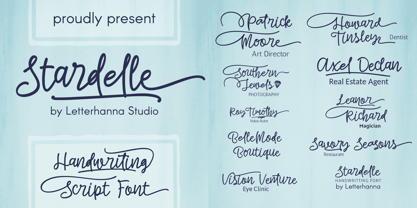 "Introducing 'Stardelle,' a bold and beautifully handcrafted font that adds a touch of elegance to your designs. With its flowing lines and abundant swashes, 'Stardelle' exudes charm and sophistication. This handwritten font is perfect for adding a personal and artistic flair to invitations, posters, branding, and more. Let 'Stardelle' illuminate your creativity and bring a touch of magic to your projects."
 - Holand Century by Fargun Studio,
$19.00 Holand Century is classified as a contemporary display grotesque font. It features sharp and dynamic strokes, a strong contrast between thick and thin lines, and delicate pointed grotesque elements. Its extensive set of styles, versatile usage, and support for various languages make it a valuable tool for designers looking to create clean, elegant, and visually striking typography for a wide range of applications.
 - Makwus by Twinletter,
$15.00 Introducing our newest font called Makwus, one of our newest premium fonts based on Arabic style. This elegant font has a targeted audience and is perfect for personal and professional projects, from social media ads to business cards to your logo and project headers. This Makwus font designed by experienced typographers can bring a beautiful new level of luxury to your designs.
 - MGN Larusso by Morgana Studio,
$18.00 MGN Larusso is a mixed-width sans font produced by Morgana Studio. It features a unique design that combines both regular and condensed letterforms to create a visually interesting and versatile typeface. With its modern and distinctive appearance, MGN Larusso is a great choice for a wide range of design projects, adding a touch of sophistication and style to your work.
 - Gellatick by Ardian Nuvianto,
$23.00 Gellatick is a charming and whimsical script font that brings a delightful handwritten feel to any design. With its playful curves and bouncy letterforms, this font is perfect for adding a touch of joy and friendliness to your projects. Whether you're designing greeting cards, invitations, or social media graphics, Gellatick will infuse your creations with a sense of warmth and personality.
 - Argumend by Ayca Atalay,
$29.00 Argumend | A Humanistic Slab Serif Typeface Argumend is a versatile slab serif typeface with a wide range of Opentype features. Create strong and eye catching headlines with its upper case ligatures or make use of its many weights and true italics to create mindful body copy; either way, Argumend is rich with typographic options to help create attention worthy text.
 - Zenaida by Hanken Design Co.,
$30.00 Zenaida is a distinctive display serif font adorned with stylized serifs, evoking a floral essence. Its graceful, flowing ligatures and stylistic alternates add an organic touch to text. Featuring a range of styles including Regular, Medium, Bold, ExtraBold, and an additional semibold weight, Zenaida offers versatility across various design applications, providing a diverse set of options to infuse character and distinction into projects.
 - Suprema by Artegra,
$29.00 Suprema is a modern sans serif family that will bring supreme geometric perfection to any piece of typography. It has 7 weights with matching true italics. When it comes to Opentype it has lots of features such as tabular lining, proportional oldstyle, tabular oldstyle, ligatures, superscript, subscript, fractions and language localisations for languages such as Polish, Dutch, Romanian, Moldovian and Catalan.
 - Walbaum by Monotype,
$50.99 First designed in the early 1800s, Walbaum never achieved the audience or acclaim it deserved – despite its easy elegance, and sophisticated persona. It’s been fully restored for this expansive family, which includes 32 weights including ornaments and two decorative cuts. Walbaum offers the kind of warmth that’s missing from comparable typefaces such as Bodoni or Didot, feeling effortlessly approachable and legible. Monotype team Carl Crossgrove, Charles Nix and Juan Villanueva have adhered to designer Justus Erich Walbaum’s original intentions, also incorporating work by the designer’s son into some of its more extreme display weights – pushing the possibilities of Walbaum without compromising on its spirit. Text weights work well for the demands of digital environments, while decorative and display weights offer more dramatic, sculptural forms. Unusually, the family also includes a generous range of ornaments. From massive billboards, to micro-type on e-readers, Walbaum has it covered. The family is available as OpenType OTF font format, and includes over 600 glyphs with OpenType typographic features including small capitals, old style and lining figures, proportional and tabular figures, fractions and ligatures. Featured in: Best Fonts for Logos
 - Dragon Drop by Elemeno,
$25.00Thick, wide and medieval, Dragon Drop would feel at home in Arthurian times. The name is an obvious play on words that the designer saved for a long time before creating the right font to use with it. Looks best at larger sizes. - Fadista by Alex Beck,
$19.99 Fadista is an eccentric experimental typeface, inspired by the Portuguese fado music and letterings by the artist Stuart Carvalhais (1887–1961), created throughout the 1920ies and 1930ies. A strong and clean presence with a touch of quirky gives the typeface its overall character. Fadista includes various OpenType features that allow tailoring the type to custom needs, encouraging graphical exploration. Fadista is the result of meticulous research, graphic reinterpretation and systematization of the glyph palette, taking into account modern font standards. Balancing between a historic heritage and „hipster“ contemporary looks, Fadista represents a discourse about aesthetics, trends and currentness in graphic design. The stylistic variations of the glyphs in fadista work in an additive fashion, rather than completely altering the look of the typeface. This means that a basic framework of glyphs remains unaltered, while certain subgroups of characters are affected by the style choices. Through this behavior, stylesets in fadista work as a switch for the type of contrast you’d like entwined in the overall look of the typeface. Other unique features include stylistic alternates for specific glyph combinations, ligatures that allow internal character spacing and tiny diacritics that flow within cap height along normal height glyphs. Please note the lowercase characters within Fadista are uppercase alternates. Math operators are fully supported, as well as a wide range of symbols and punctuation. Supported Languages: Albanian, Danish, Dutch, English, Finnish, French, German, Icelandic, Italian, Malagasy, Norwegian, Portuguese, Romansh, Spanish, Swedish and Turkish. For further language support don‘t hesitate to get in touch. Fadista was awarded the Art Directors Club Bronze in the junior competition 2014 and the DDC Award 2014 in the category "Future“.
 - Vendetta by Emigre,
$69.00 The famous roman type cut in Venice by Nicolas Jenson, and used in 1470 for his printing of the tract, De Evangelica Praeparatione, Eusebius, has usually been declared the seminal and definitive representative of a class of types known as Venetian Old Style. The Jenson type is thought to have been the primary model for types that immediately followed. Subsequent 15th-century Venetian Old Style types, cut by other punchcutters in Venice and elsewhere in Italy, are also worthy of study, but have been largely neglected by 20th-century type designers. There were many versions of Venetian Old Style types produced in the final quarter of the quattrocento. The exact number is unknown, but numerous printed examples survive, though the actual types, matrices, and punches are long gone. All these types are not, however, conspicuously Jensonian in character. Each shows a liberal amount of individuality, inconsistency, and eccentricity. My fascination with these historical types began in the 1970s and eventually led to the production of my first text typeface, Iowan Old Style (Bitstream, 1991). Sometime in the early 1990s, I started doodling letters for another Venetian typeface. The letters were pieced together from sections of circles and squares. The n, a standard lowercase control character in a text typeface, came first. Its most unusual feature was its head serif, a bisected quadrant of a circle. My aim was to see if its sharp beak would work with blunt, rectangular, foot serifs. Next, I wanted to see if I could construct a set of capital letters by following a similar design system. Rectangular serifs, or what we today call "slab serifs," were common in early roman printing types, particularly text types cut in Italy before 1500. Slab serifs are evident on both lowercase and uppercase characters in roman types of the Incunabula period, but they are seen mainly at the feet of the lowercase letters. The head serifs on lowercase letters of early roman types were usually angled. They were not arched, like mine. Oddly, there seems to be no actual historical precedent for my approach. Another characteristic of my arched serif is that the side opposite the arch is flat, not concave. Arched, concave serifs were used extensively in early italic types, a genre which first appeared more than a quarter century after roman types. Their forms followed humanistic cursive writing, common in Italy since before movable type was used there. Initially, italic characters were all lowercase, set with upright capitals (a practice I much admire and would like to see revived). Sloped italic capitals were not introduced until the middle of the sixteenth century, and they have very little to do with the evolution of humanist scripts. In contrast to the cursive writing on which italic types were based, formal book hands used by humanist scholars to transcribe classical texts served as a source of inspiration for the lowercase letters of the first roman types cut in Italy. While book hands were not as informal as cursive scripts, they still had features which could be said to be more calligraphic than geometric in detail. Over time, though, the copied vestiges of calligraphy virtually disappeared from roman fonts, and type became more rational. This profound change in the way type developed was also due in part to popular interest in the classical inscriptions of Roman antiquity. Imperial Roman letters, or majuscules, became models for the capital letters in nearly all early roman printing types. So it was, that the first letters in my typeface arose from pondering how shapes of lowercase letters and capital letters relate to one another in terms of classical ideals and geometric proportions, two pinnacles in a range of artistic notions which emerged during the Italian Renaissance. Indeed, such ideas are interesting to explore, but in the field of type design they often lead to dead ends. It is generally acknowledged, for instance, that pure geometry, as a strict approach to type design, has limitations. No roman alphabet, based solely on the circle and square, has ever been ideal for continuous reading. This much, I knew from the start. In the course of developing my typeface for text, innumerable compromises were made. Even though the finished letterforms retain a measure of geometric structure, they were modified again and again to improve their performance en masse. Each modification caused further deviation from my original scheme, and gave every font a slightly different direction. In the lower case letters especially, I made countless variations, and diverged significantly from my original plan. For example, not all the arcs remained radial, and they were designed to vary from font to font. Such variety added to the individuality of each style. The counters of many letters are described by intersecting arcs or angled facets, and the bowls are not round. In the capitals, angular bracketing was used practically everywhere stems and serifs meet, accentuating the terseness of the characters. As a result of all my tinkering, the entire family took on a kind of rich, familiar, coarseness - akin to roman types of the late 1400s. In his book, Printing Types D. B. Updike wrote: "Almost all Italian roman fonts in the last half of the fifteenth century had an air of "security" and generous ease extremely agreeable to the eye. Indeed, there is nothing better than fine Italian roman type in the whole history of typography." It does seem a shame that only in the 20th century have revivals of these beautiful types found acceptance in the English language. For four centuries (circa 1500 - circa 1900) Venetian Old Style faces were definitely not in favor in any living language. Recently, though, reinterpretations of early Italian printing types have been returning with a vengeance. The name Vendetta, which as an Italian sound I like, struck me as being a word that could be taken to signifiy a comeback of types designed in the Venetian style. In closing, I should add that a large measure of Vendetta's overall character comes from a synthesis of ideas, old and new. Hallmarks of roman type design from the Incunabula period are blended with contemporary concerns for the optimal display of letterforms on computer screens. Vendetta is thus not a historical revival. It is instead an indirect but personal digital homage to the roman types of punchcutters whose work was influenced by the example Jenson set in 1470. John Downer.
 - Glamela Script by Gatype,
$10.00 Glamela Script Script Modern Calligraphy, the newest you can get now! With an updated hand calligraphy model with special glyphs that have been given a combination of fantasy and handwritten ink. This font will look beautiful on all designs, Wedding designs, branding materials, blog titles, quotes and invitations, business cards. Open Type includes: - Alternative Style - Set style To enable the OpenType Stylistic alternative, you need a program that supports OpenType features such as Adobe Illustrator CS, Adobe Indesign & CorelDraw X6-X7, Microsoft Word 2010 or later. There are additional ways to access the alternative/swash, using the Character Map (Windows), Nexus Font (Windows), Font Book (Mac) or a software program such as PopChar (for Mac and Window).
 - Babetta by Viktor Nübel Type Design,
$- Babetta is a display typeface that comes with some decorative typographical features. Alongside a set of arrows and flower icons, it also includes an alternative ›E‹, some special diacritic marks, a wavy ›S‹ and a series of ligatures. It features 5 weights, a special ›Neon‹ version and supports a wide range of Latin languages. This typographical tool box provides a large and playful variety of options for headlines and logotypes. Babetta supports Latin and Cyrillic languages. The initial inspiration for Babetta was an illuminated vintage shop sign—that of a famous bookstore in Berlin called Karl-Marx-Buchhandlung that dates back to the days of East Germany. During the course of the design process, this slightly shabby historical original was kissed by an Italian Art Deco beauty and has blossomed into a new typeface with its own special charm. The aim was not to preserve the original lettering, but to use it as a starting point for typographical exploration.
 - Donnerstag by insigne,
$22.00 Donnerstag is an extended slab serif and a new companion to insigne's Montag, Dienstag and Mittwoch typefaces. Donnerstag conveys power and personality with its strong slab letterforms and ball terminals. Donnerstag's seven different weights give it a great deal of versatility, from its beefy and masculine black weight to the delicate and feminine hairline. Because of Donnerstag's width, this typeface is best used for logotypes, headlines or short blocks of text. Donnerstag includes many useful OpenType features, including a set of upright italic swash alternates, ligatures, small caps, fractions and old style figures, alternates for the ball terminals and simplified characters for titling. OpenType-capable applications such as the Adobe suite or Quark can take full advantage of automatically replacing ligatures and alternates. This family also includes the glyphs to support a wide range of latin based languages. For complementary companions, be sure to check out the rest of the typeface super family, also available from insigne.
 - Mercurial by Grype,
$16.00 Geometric/Technical style logotypes have been developed for car chrome labels since the early 1980’s, but automobile companies don't monopolize the style by any means. During the 80’s and 90’s, a lot of these logos leaned towards the geometric sans styles and the swiss styling of fonts like Handel Gothic, while playing with varying degrees of squared rounds and varying expanded widths per logotype. Mercurial has this flavor, but it wasn’t derived from logotypes. Instead, it began as a digitization of a film typeface from LetterGraphics in the early 70's known as "Sam". It visual ties to this genre of automotive logotypes and fonts like Handel Gothic lend a familiarity to it, yet it has an identity all its own. As with so many automotive logotypes, this singular style film typeface, lacked an expansive family which shows off all potential the logotypes have and what they "could" be and do. And that's where we come in. What originally began as this family’s Regular Width - Bold Style has been expanded into a collection of 3 Width Families, each containing 5 Weights. Here’s what’s included with the Mercurial Complete bundle: 396 glyphs per style - including Capitals, Lowercase, Numerals, Punctuation and an extensive character set that covers multilingual support of latin based languages. (see the final poster graphics for a preview of the characters included) 3 widths in the collection: Narrow, Regular, & Wide 5 weights in each width family: Light, Book, Regular, Medium & Bold. Here’s why the Mercurial Family is for you: - You’re in need of stylish sans font family with a range of widths and weights. - You’re love those 80’s automotive logos, but want more range of use. - You’re looking for an alternative to Handel Gothic. - You’re looking for a clean techno typeface for your rave poster designs. - You just like to collect quality fonts to add to your design arsenal.
 - Main Feature JNL by Jeff Levine,
$29.00 Main Feature JNL is patterned after the plastic letters found on theater marquees. As an extra bonus, the | (bar) key has the phrase "double feature", the ^ (ascii circumflex) has the word "and" and the ~ (ascii tilde) has the phrase "with" for anyone doing a theater marquee mock-up.
 - Simplemind by Balpirick,
$15.00 Simplemind is a modern handwritten font. Simplemind is perfect for product packaging, branding project, magazines, social media, weddings, or just used to express words above the background. It includes multi-lingual support.
 - Cutie Biscuit by Balpirick,
$15.00 Cutie Biscuit is perfect for product packaging, branding project, magazine, social media, wedding, or just used to express words above the background. This font includes TTF, Cutie Biscuit also has multilingual support.
 - Zawya Pro Arabic by Protype,
$50.00 The family has 24 weights, ranging from Thin to Black in Normal, Condensed and Wide styles. It is ideally suited for advertising and packaging, editorial and publishing, logo, branding and creative industries, poster, and billboards, small text, wayfinding, and signage as well as web and screen design. Zawya Pro provides advanced support with features such as case-sensitive forms, fractions, super- and subscript characters, and stylistic alternates. It comes with a complete range of letters for Arabic and English with Arabic and Latin digits. As well as Latin-based languages, the typeface family also partly supports the Arabic, Urdu and Persian and more than 30 writing systems such as ( Afrikaans - Albanian - Catalan - Croatian - Czech - Danish - Dutch - English - Estonian - Finnish - French - German - Hungarian - Icelandic - Italian - Latvian Lithuanian - Maltese - Norwegian - Polish - Portuguese - Romanian - Slovak - Slovenian - Spanish - Swedish - Turkish Zulu - العربية Arabic - Urdu الفارسية - الأوردو Persian). In includes OpenType features for Arabic and English: Stylistic set 01 and 02 Numerator & denominator Fractions Ordinals Superscript standard ligatures discretionary ligatures Case Sensitive
 - Last Date JNL by Jeff Levine,
$29.00 A typographic conundrum presented itself with the hand lettered title on the cover of the 1919 song "I Am Always Building Castles in the Air". The capitalized portion ["Castles in the Air"] was a hybrid mix of a few Art Nouveau-influenced rounded letters, yet along with this were squared letters with rounded corners (reflecting the upcoming Art Deco movement to take place in about another decade). As a complete alphabet, it didnít mix as well as in those few short words. What to do? It was decided to go with the squared look and save the rounder characters for a future project. The end result became Last Date JNL; available in both regular and oblique versions.
 - Menara by Hazztype,
$20.00 Menara is a captivating vintage serif font that effortlessly blends elegance and charm with a touch of nostalgia. This condensed typeface showcases the beauty of traditional letterforms, infused with a contemporary twist. Its italic variant adds a dash of dynamic flair, creating a truly versatile font that is perfect for both classic and modern design projects. With its refined and sleek appearance, Menara exudes a sense of sophistication and refinement. The condensed letterforms allow for maximum impact, making it ideal for headlines, titles, and branding materials. Whether you're designing a vintage-inspired logo, packaging, or editorial layouts, Menara delivers a timeless aesthetic that commands attention. The italic style of Menara introduces a subtle sense of motion and playfulness to the font. It adds an expressive quality that can bring emphasis and character to your designs. Perfect for adding an extra touch of elegance to wedding invitations, book covers, or product labels, the italic variant of Menara lends a unique personality to your typography.
 - Cohort by insigne,
$22.00 Cohort is a strong and crisp geometric sans serif. Cohort uses a rounded rectangle as its central motif. Although the geometric design is minimalistic, Cohort has a variety of unique letterforms that keep the design from being too predictable and maintains a bit of beautiful nuance with plenty of legibility. Cohort's six different weights give it a great deal of versatility, from its sharp and potent black weight to the fresh and razor sharp thin. Cohort can be used for logotypes, headlines or short blocks of text. Cohort includes many useful OpenType features, including a set of upright italic swash alternates, ligatures, small caps, fractions and old style figures, sharper and more unique counterforms and simplified characters for titling. OpenType-capable applications such as the Adobe suite or Quark can take full advantage of automatically replacing ligatures and alternates. This family also includes the glyphs to support a wide range of latin based languages.
 - Revla Sans Text by Eclectotype,
$30.00 Fun. Fun isn't it? But sometimes you can have too much fun, and things can get out of hand. Revla Sans is, in certain situations, too much fun. So, without further ado, let me introduce the straight man to Revla Sans's buffoon - Revla Sans Text. It represents a complete overhaul of Revla Sans. The bounciness has been removed and details reined in, all for the purpose of optimizing the fonts for use in longer runs of text. 'Text' is perhaps a strong word here; you're not going to be setting novels in this typeface. It still retains the charm of the original, and could well be used in display settings. Think of it like this - Revla Sans would be a great choice for the logo and branding of a board game, no? Revla Sans Text, then, would be good for setting the instructions, or body copy on the website. Revla Sans Text is not as feature-rich as Revla Sans, and is priced accordingly. Enjoy!
 - Metal Cry by Fabulous Rice,
$25.00 Metal Cry is a font family that was inspired by countless hours spent playing video games, watching old movies or reading comic books. And even more hours closely analysing the design of all these things. The art of creating beautiful letters has slowly declined with the rise of the digital age and its solid-colour, 2D fonts. And most of the time, the care given to typography in cultural products just isn't what it used to be anymore. This was the inspiration for Metal Cry, a family of 4 layerable fonts that can bring a feeling of depth to its letters, and offers endless possible combinations. Metal Cry Outlands is the basic shape of all the characters, it can be used as the bright side of the bevel. Metal Cry Front is the inline border font that can be used as the front side of the bevel. Metal Cry Shadow can be used as the dark side of the bevel. Metal Cry Depth can be used to flash out the inside shape of the letter. But of course, any font can be combined with any other font(s) to obtain various results. The planets in the above visuals are courtesy of 3D artist Thomas Veyrat / veyratom.com
 - Soprani Variable by insigne,
$129.99 "Step into a world where the 1920s meet the future with Soprani—a typeface that seamlessly blends vintage charm and modern sophistication. Drawing inspiration from a distinctive plaque unearthed in New Zealand, Soprani showcases serifs that flare and shimmer, capturing the essence of art nouveau and arts & crafts in a contemporary light. Dive into its rich OpenType features, granting designers unparalleled flexibility to bring their visions to life. Its condensed yet elegant letterforms are the perfect fit for everything from artful table books and stylish menus to dynamic media showcases in TV and film. Spanning from the graceful subtlety of its thin variant to the undeniable boldness of the black, Soprani is diverse and dynamic. Soprani isn't just a typeface—it's a revolution in design. Production assistance by Lucas Azevedo and ikern.
 - Elise by Context,
$12.00 Elise is a sweet natured, layered display typeface, with a few layers but a wealth of options. From the feminine to the fun to the nostalgic, Elise is a capable and personable set. Best used BIG and with color, you’ll always find an occasion for Elise’s charm. To use this typeface, once you have your copy in place in the design program of your choice, copy your text block and paste it directly on top of your existing text block. Set this new text block to a different Elise layer and voila! You’ll already start to see some interesting effects take place. In some cases, different effects are achieved by bringing The Elise Ribbed layer to the front or to the back. Also available is a free ornament set to get you started.
 - DIN Next Stencil by Monotype,
$56.99 The DIN Next™ Stencil suite of designs is DIN with an attitude. It’s even more industrial strength than the original. DIN Next Stencil’s seven roman weights are perfect for projects that require a mechanized, military, or commercial vibe. If you’re looking to create commanding display typography, be it in advertising, apparel, packaging, posters, signage, wayfinding – or crash dummy name tags, DIN Next Stencil can be the perfect typographic enhancement. Based on Akira Kobayshi’s DIN Next with stenciling by Sabina Chipară, the wide range of weights and large complement of diacritical and international characters – including those for Cyrillic and Greek – further expand the design’s capabilities. The DIN Next Stencil fonts are powerful tools in their own right – and provide a distinctive supplement to the DIN Next typographic palette.
 - Rethink by Viktor Nübel Type Design,
$35.00 The robust and contemporary sans-serif typeface Rethink, comes with strong characteristics. The typeface is made for work in text as well as in display. It features nine weights in two styles, including Small Caps, a set of contemporary OpenType functions, multiple figure sets and a rich language support. Rethinks main characteristics are the non-straight stroke endings and a slope that might come in an unexpected direction. It brings a bit of movement to the baseline and some attraction to the shapes in bigger sizes. These details are designed to ‘disappear’ in smaller sizes and to not disturb a reading process. Rethink was designed with the idea to help spreading bold ideas ond strong opinions, to support the work of activists in contemporary movements, to design statements with impact and meaningfulness.
 - Palatino Sans Arabic by Linotype,
$155.99Palatino Sans Arabic is a collaboration between Lebanese designer Nadine Chahine and Prof. Hermann Zapf. The design is a low-contrast companion to the award winning Palatino Arabic and comes in both regular and bold weights. It is designed for use in print in both large and small sizes, and brings into Arabic the informal and friendly appearance of Palatino Sans. The counters are wide open to allow for better readability in small sizes as well as to maintain an open and friendly appearance. The font has 1091 glyphs and includes a large number of extra ligatures and stylistic alternates as well as the basic Latin part of Palatino Sans and support for Arabic, Persian, and Urdu. It also includes proportional and tabular numerals for the supported languages.