10,000 search results
(0.033 seconds)
- Lovebright by Set Sail Studios,
$16.00 Lovebright is an expressive, untamed handwritten font, with exaggerated descenders and loops. It’s an engaging and charming choice for signature style logos, personable branding, display text, handwritten quotes & letters, and blog/social media posts. Lovebright includes a full alternate set of upper & lowercase characters, included as it’s own separate fonts. Use the alternate characters for a different text layout, or mix with the regular version to avoid repeating letters and recreate naturally inconsistent handwriting. Lovebright also includes 22 ligatures, these double letter combinations will help letters connect and flow more naturally. The ligatures will automatically generate when using the Lovebright fonts with most software. Please get in touch if you need any help with these. The Lovebright fonts contain language support for; English, French, Italian, Spanish, Portuguese, German, Swedish, Norwegian, Danish, Dutch, Finnish, Indonesian, Malay, Hungarian, Polish, Croatian, Turkish, Romanian, Czech, Latvian, Lithuanian, Slovak, Slovenian.
 - Centrio Typeface by Joelmaker,
$20.00 *About the Product* **Centrio Typeface** Retro with an artistic touch elegant modern yet vintage the as well as a unique blend of ligatures a letter, so that the authors compose it with a and little swirly embedding, so that a modern font is formed and ready to make a statement by adding elegant and unique flair to your next design project. **Centrio Typeface** can be used for various purposes such as Magazine Title, Poster, Logo, T-Shirt, Sub Title, Business cards, Magazines, Book Covers, Wedding Invitations,Templates Instagram Story Post, Greeting Cards, Quotes, etc. These letters are embedded into the font file and easily accessible in programs such as photoshop and illustrator. You can access these in more basic design programs but you will need to use your character map or font book Come on..let's style and pamper your next design with **Centrio Typeface**
 - KillJoy by Comicraft,
$19.00 S P O I L E R A L E R T ! We don't want to be a drag, a wet blanket or a spoilsport, but we're here to tell you that everything before “but” is bulls*it! Yep, if you're a merrymaker, a carouser, a jester, a reveler or a live wire, we're here to poop your party with our latest knicker-twister, KILLJOY! Call us cynics, call us crabs, grouches, grumpy old men, sourpusses or bores, but we're the kind of Killjoys who just have to make some noise... sound effects (sic) everybody, so listen up even if you can't handle the truth... and here’s OUR truth; Keep Calm and be a Fabulous Killjoy! Yes, it’s easy to be mean -- but why should anybody else have all the fun? Or all the fonts?
 - Colaneira by Forberas Club,
$16.00 Colaneira is handwritten font. Will be nice if you application this font for cute, special moment, beauty, tees, simple word quotes, wedding party, invitation.
 - Degaule by Forberas Club,
$16.00 Degaule is handwritten font. Will be nice if you application this font for cute, special moment, beauty, tees, simple word quotes, wedding party, invitation.
 - Ruman by Juraj Chrastina,
$29.00 Ruman is a display typeface suitable for logotypes and posters. It’s a very simple origami font and short words look almost like abstract pictures.
 - ITC Oldbook by ITC,
$29.99For some time, Eric de Berranger had wanted to create a distressed typeface design - one that gave the appearance of antique printing and showed signs of wear, yet was still highly readable. He was busy designing a new face called Maxime, when an idea struck: I realized that I could use these lettershapes as the basis for my antique typeface," he says. The two faces ended up being designed in tandem. While ITC Oldbook clearly captures the flavor of aged, uneven and imperfect printing, it also meets de Berranger's goal of being exceptionally readable in text sizes. Beginning with well-drawn characters was the key, and these were carefully modeled into the distressed forms. "The process was more difficult than I originally thought," says de Berranger. "The antique letters had to be tested and modified several times to work correctly." ITC Oldbook elegantly simulates antique printing in both text and display sizes. And while stroke weights are uneven and curves are irregular, the design has remarkably even color when set in blocks of text copy. Add to this the design's inherent legibility, and ITC Oldbook acquires a range far beyond replication of things old; it's suitable for any project that calls for warm and weathered typography. ITC Oldbook is available in roman and bold weights with complementary italic designs. Small caps, old style figures and a suite of alternate characters and ornaments provide additional flexibility and personality to the design." - Zira by Artcity,
$10.00 Zira is a playful hand-drawn font family designed by Daniel Bak (Artcity). It is available in three handy weights: regular, bold and screaming. It contains international language accent marks and diacriticals, including Greek and Cyrillic. Zira can be considered as smoothed serif version of Cornelius font. Zira as Cornelius as well is a chimpanzee character in the novel and movie series Planet of the Apes. Dr. Zira is a chimpanzee psychologist and veterinarian, who specializes in the study of humans, in the novel and subsequent movie series Planet of the Apes. Zira was played in the first three Apes movies by actress Kim Hunter. Unique among the Apes characters, Zira has blue eyes. Zira is the fiancée (later wife) of Cornelius, and both are ultimately responsible to the Minister of Science, Dr. Zaius. Zira's character and role are essentially the same in both the novel and the movies, though some story details differ. Her work in each involves both working with humans under laboratory conditions (e.g. learning and behavioural experiments), and working on them physically (lobotomy and other brain surgeries, vivisection, physical endurance and tolerance experiments, and subsequent autopsies). Zira is an outspoken liberal by nature, deploring war and militancy (and despising the gorillas, who seem to make both a way of life), and eager to seek and develop intelligence anywhere it can be found. Zira literally stands for her principles - or refuses to stand, as the case may be.
 - Bolívar by César Puertas,
$39.95 Bolívar is a contemporary display typeface inspired in the handwriting of one of the most prominent personalities of the Latin American 19th century: Simón Bolívar, “the liberator". The typeface intends to capture the passion of handwritten letterforms and to translate it into type. Among the characteristics that best contribute to its strong personality, are the impressive length of ascenders and descenders as well as the more than 45 degrees of slant. Bolívar mimics certain aspects of handwriting such as the slightly different baseline for each letter and ink clogs in the counters of some letters. Use Bolívar whenever you need to add passion to a piece of text, from logos or single words to sentences and captions.
 - Green Fairy by Maria Montes,
$39.00 Green Fairy is a chromatic font family highly ornamented for display purposes. Green Fairy’s characters have been specifically designed to accommodate its loops and ornaments following a modern typeface structure. Green Fairy has four chromatic weights: 1. Green Fairy Outline 2. Green Fairy Dots 3. Green Fairy Stencil 4. Green Fairy Full The outline weight has been created as the base or structure for the other weights. You can combine these weights as well as add colours to obtain multiple effects and type styles. Green Fairy has also three combined weights (combos) to simplify your work flow, for these occasions when you only want to use one single colour in your font: 5. Green Fairy Dots Combo 6. Green Fairy Stencil Combo 7. Green Fairy Full Combo GREEN FAIRY ORIGINS The origin of this typeface is the lettering I designed in October 2015 as part of my illustrated cocktail artwork called “Absinthe. La Fée Verte (The Green Fairy)”. Originally, this lettering only featured eight letters “AB·SINTHE” vector drawn in Illustrator. Right after creating the full-colour artwork, I designed a fountain-letterpress print version of it, in collaboration with Ladies of Letters, A.K.A. Carla Hackett and Amy Constable from Saint Gertrude Fine Printing. At the beginning of 2016 –and thanks to the project @36daysoftype– I found the motivation, and most importantly the deadline, to draw the rest of the twenty-six letters of the uppercase alphabet using Illustrator. I started 2017 having my first two calligraphy courses sold out, so I took this amazing opportunity to devote myself to Green Fairy for a few months. In February 2017, I purchased the font software Glyphs and I started to re-draw all twenty-six letters of the uppercase alphabet again. PRODUCTION PROCESS Green Fairy started being one weight, but quickly turned into a layered/chromatic font. Things were going more or less fine till I arrived to the Dots weight: 1) I started drawing squares following a grid; 2) Then, the squares turned into diamonds following the same grid; 3) Then, the grid wasn’t working so well on the round letters so I tried randomising the position of the diamonds but it didn’t work; 4) So I went back to the grid, and this time scaled down the size of the diamonds creating a visual half-tone effect. I spent over four weeks working on the Dots weight and I felt like I was in the middle of a very long tunnel and I couldn’t see the light at the end. I encountered many other problems along the way but by June 2017, I felt I was back on track again. I kept working, tweaking, re-drawing and re-adjusting, and then the diacritics came on board… And then more re-drawing, re-tweaking, re-adjusting and then numbers… And then spacing, symbols, and currencies… And then more spacing, kerning, contextual kerning for triplets… In September 2017 I told myself “that’s it, I’m going to finish it now!” But guess what? More re-tweaking, testing, hinting, testing, rendering, testing… For those of you not familiarized with typeface design, it is extremely time consuming and it requires a lot of hard work, focus and determination. This project could not have been possible without the help of these generous professionals: Jose Manuel Urós, typeface designer based in Barcelona and my teacher twice in the past; Jamie Clarke, freelance letterer and typeface designer who has released a couple of chromatic fonts recently; Troy Leinster, Australian full-time typeface designer living and working in New York City; Noe Blanco, full-time typeface designer and hinting specialist based in Catalonia; And Nicole Phillips, typographer currently relocating from Australia to New Zealand. To all of you: THANK YOU VERY MUCH!
 - Shiny Ink Display by Lloyd David Designs,
$14.99 Hi there, thanks for looking at my first typeface. It began as one of my original sketches back in 2019 as a freelance graphic designer trying to create unique letterforms that I could use for posters or websites with other possible use cases in mind for commercial use. The sketches were then passed on to and worked on with Vladimir Tsagolov who has more experience in creating professional typefaces, the experience for me was invaluable, and I have many more typefaces I'm now working on. Shiny Ink Display is a collection of hand drawn fonts based on the flow of reflective viscous ink with 7 styles, some styles can be interchangeable and used on top of each other. For example, Shiny Ink Display Plain, can be used with Shiny Ink Display Plain Lined to create shadows underneath it, at angles not available with the Shadow styles you'll see in the font collection. Shiny Ink Display has various use cases, maybe even infinite, but more specifically for posters or websites with large text, though it bodes quite well at smaller sizes, and is visually appealing to its viewers as long as it's at a legible font size. When it comes to font pairing, Shiny Ink Display works especially well with Monospace and sans-serif fonts. You can check the poster examples on this page to help you imagine what you could do with the font styles. I also had in mind manufactured products, but I could leave that to you to create your ideas with the available font styles. In regards to languages or typing on a keyboard, most of the English/European latin or cyrillic language keys are supported, so you'll have lots of glyph characters to play with for a number of ideas you may have. All the best with your projects using my fonts, if there are any issues, don't hesitate to contact me for support: lloyddaviddesigns.co.uk - Lloyd David
 - Madison Street by Studioways,
$40.00 Madison Street is a font family with 8 fabulously fun typefaces! Eliza Gwendalyn & Jim Lyles of Studioways have teamed up with Spencerian calligrapher Elaina DeBoard to create a classic pointed pen calligraphy font. From its ornamental monograms, to its variety of complimentary text styles, and to its Madison Street Pro, with its elegant stylistic swashes and OpenType goodies, there is a font for every designer. Enjoy the sleek Madison Street Sans, Serif or Script, paired with the Ornaments font, complete with ornate monograms, or use each typeface on its own! Madison Street Pro has all the OpenType bells and whistles. The Ligature feature automatically substitutes beginning and ending letterforms, as well as 100 ligatures. Turn on the Swash feature for elegantly sweeping swash lowercase forms. Enable Stylistic Alternates for even more variations. There are also 10 Style Sets to chose from. And many more OT features! Madison Street is a basic version of the Pro font, intended for users who do not have OpenType savvy applications. Madison Street Stylistic is also a basic version of the Pro font, intended for users who do not have OpenType savvy applications. It has stylistically different ascenders and descenders. Madison Street Swash is intended to be used with the basic fonts, Madison Street and Madison Street Stylistic. It has lowercase beginning and ending swash glyphs and cannot be used to set text by itself. Madison Street Sans, Serif, and Script are text fonts modeled after the handwriting of Elaina. They are intended to be complimentary to any of the script fonts. However, you'll need to set them at a smaller point size (about 1/3 the size) in order to get the preferred scale and weight. Finally, the hairline weight of the Madison Street script fonts is very thin, and at small sizes up to 40 pt, you may notice some breaking up when printing to desktop printers. To remedy this, we recommend outline stroking the text a small amount (.1 -.3 value). this should improve the output without adding to much weight overall.
 - Hiatus by Stephen Rapp,
$59.00 Hiatus bridges the gap between formal scripts used for invitations and more classic settings and casual scripts that exude a warmer tone. Like many formal scripts, Hiatus is fully connecting. Its low body height combined with generous letterspacing adds an elegant profile to lines of text. Like casual scripts, Hiatus has a warm, hand-lettered appearance with great rhythm. Solid in structure; Hiatus also sets well at smaller sizes. Type enthusiasts will enjoy the variety of options. For optimal text flow, both letters and ligatures have alternate versions programmed to come in at the appropriate place for both beginnings and endings as well as in various contextual settings. In addition, there are variations and flourished versions of almost every letter and ligature. Some ligatures have as many as 12 variations. Also included are fractions, a set of old-style numbers, and a set of ornamental flourishes. Hiatus is a unique contemporary script with the strength of a time-tested classic. Please note that this version supports a wider range of languages compared with the lower-priced version available through other channels.
 - Story Tales by Resistenza,
$39.00 A fairy tale, is a folklore genre that takes the form of a short story. Story tale, is a new type family for wonderous, romantic, magical and playful narratives brought to you by Resitenza. The 1970s were wild and whimsical times. Book covers from this time were iconic, innovative and enduring; bold colour and stylised pattern dominated. Story Tales forms were inspired by 70s books covers, and aims to encapsulate the zeitgeist of the time, but the typeface is by no means constrained to revivals of this era. There are nods to 60's flower power & psychedelia, chromatic type and decorative queues from the 1800s and the spirit of post-war era children's almanacks. It is also perfectly suited to inspiring curiosity, imagination and fantasy in today's audiences. Each of Story Tales 8 styles (4 upright and 4 italics) stack on top of one another giving the designer broad aesthetic range. This layering of styles and the ornamental illumination allows striking multi-coloured typography for your book covers, editorial and poster designs.
 - ITC Simran by ITC,
$29.99ITC Simran was created by the London designer Satwinder Sehmi in 1998. The Indian influence is recognizable at first glance and lends the font an exotic feel - at least to the western eye. Sehmi borrowed forms and feelings from northern Indian writing systems for this typeface. Both the upper and lowercase letters make use of the same lowercase forms, but the upperacse letters have the addition of a horizontal bar running over them at the ascender height. This feature is directly reminiscent of writing systems in northern India, and is ITC Simran's most distinguishing characteristic. But there were other influences as well: Sehmi was also inspired by uncial forms when designing this typeface. ITC Simran exhibits the typical look of writing with a broad-tipped pen, with its strong strokes, as well as characteristic letter forms, for example, the a or h. ITC Simran is a fascinating and harmonious symbiosis of a variety of influences from different cultures. This font is best used for headlines and short texts in point sizes of 12 and larger. - Burpology by Typodermic,
$11.95 Hey, cats and kittens! Dig this groovy font we got for ya—Burpology! It’s the perfect typeface for all your cartoon headline needs. With its heavy weight, small counters, and tight spacing, you’ll be making a visual footprint that’ll knock ’em out! And that’s not all, daddy-o! Burpology comes equipped with automatic shuffling of three letter and numeric variations in OpenType-savvy apps, giving your words that cool, hand-drawn vibe. It’s like having your very own in-house cartoonist! So, if you want to add some serious pow and pizzazz to your headlines, just hit up your application’s contextual alternates or standard ligatures option and watch the magic happen. Don’t be a square, man—get Burpology and let your words do the talkin’! Most Latin-based European writing systems are supported, including the following languages. Afaan Oromo, Afar, Afrikaans, Albanian, Alsatian, Aromanian, Aymara, Bashkir (Latin), Basque, Belarusian (Latin), Bemba, Bikol, Bosnian, Breton, Cape Verdean, Creole, Catalan, Cebuano, Chamorro, Chavacano, Chichewa, Crimean Tatar (Latin), Croatian, Czech, Danish, Dawan, Dholuo, Dutch, English, Estonian, Faroese, Fijian, Filipino, Finnish, French, Frisian, Friulian, Gagauz (Latin), Galician, Ganda, Genoese, German, Greenlandic, Guadeloupean Creole, Haitian Creole, Hawaiian, Hiligaynon, Hungarian, Icelandic, Ilocano, Indonesian, Irish, Italian, Jamaican, Kaqchikel, Karakalpak (Latin), Kashubian, Kikongo, Kinyarwanda, Kirundi, Kurdish (Latin), Latvian, Lithuanian, Lombard, Low Saxon, Luxembourgish, Maasai, Makhuwa, Malay, Maltese, Maori, Moldovan, Montenegrin, Ndebele, Neapolitan, Norwegian, Novial, Occitan, Ossetian (Latin), Papiamento, Piedmontese, Polish, Portuguese, Quechua, Rarotongan, Romanian, Romansh, Sami, Sango, Saramaccan, Sardinian, Scottish Gaelic, Serbian (Latin), Shona, Sicilian, Silesian, Slovak, Slovenian, Somali, Sorbian, Sotho, Spanish, Swahili, Swazi, Swedish, Tagalog, Tahitian, Tetum, Tongan, Tshiluba, Tsonga, Tswana, Tumbuka, Turkish, Turkmen (Latin), Tuvaluan, Uzbek (Latin), Venetian, Vepsian, Võro, Walloon, Waray-Waray, Wayuu, Welsh, Wolof, Xhosa, Yapese, Zapotec Zulu and Zuni.
 - the King & Queen font - Unknown license

- Linotype Xmas Pi by Linotype,
$40.99You need traditional christmas symbols to illustrate your text? How about using these historic designs that had been used in good old typography. xmas is not too far and always comes in winter time. Happy Xmas. - Starge by Mans Greback,
$59.00 Starge is a professional hand-drawn typeface. It works perfectly for a crafty project where a functional font is required. The font supports all Latin-based European languages, contains numbers and all symbols you'll ever need.
 - Pumpkinos Horror by Sipanji21,
$12.00 Pumpkinos is an incredibly unique horror display font. Add this font to your favorite Halloween themed ideas and notice how it makes them come alive. Pumpkinos is perfect for posters, packaging, banners, advertising, apparel, and more.
 - Canadian Animals by Okaycat,
$29.50 Canadian Animals is a picture font with highly detailed illustrations drawn by hand. Comes in outline and silhouettes, it is easy to colour in photoshop. These detailed vector illustrations will help you create your ultimate design.
 - Unpretentious JNL by Jeff Levine,
$29.00 Simple, unassuming, yet fully functional in all sign, poster and headline applications is Unpretentious JNL and its oblique counterpart. Where plain, bold titling is necessary, this typeface will draw attention to the message with minimum effort.
 - PIXymbols Gridmaker by Page Studio Graphics,
$20.00Print quad paper and cross-stich chart grids, as large as your printer will allow. These blank grids are in sizes to match four fabric thread counts, plus 1/10", 1/8", and 1/2" grids. - Blood Scratch by Creaditive Design,
$12.00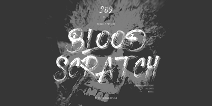 Blood Scratch is a creepy and brushed display font. It is perfectly suitable for any Halloween-related project or crafty idea, creepy film project and horror themes will be nice! The only limit is your imagination.
 - LUELLA by Cultivated Mind,
$29.00 Luella is an elegant, hand drawn vintage inspired font by Cultivated Mind. Luella has been carefully crafted and comes in three weights (Regular/Bold/Black). This font works perfectly with the Luella frames and ornaments sets.
 - Crossell by Emboss,
$35.00 Crossell is a display typeface inspired by linoleum cuts and old comic strips. It comes in three weights and can be purchased solo or as a family. Take it home and give it a spin today.
 - Allora by Etewut,
$30.00 Allora is a serif based typeface with three font styles: regular, display, hair and double. Mix them as you want: integrate Allora to your website, create mobile app or just make an awesome print. Enjoy it!
 - PIXymbols Signet Classic by Page Studio Graphics,
$29.00A font package to generate traditional three-letter monogram designs, or a single initial. Includes 29 borders, each accessed by a single keystroke on the computer keyboard. The borders will automatically line up with the initials. - Iron Lake by Alphabet Agency,
$15.00 Iron Lake is inspired by the pioneer era. The font has a decorative slab serif that really gives the font its vintage western look. The font works great for vintage, western, country, outdoors and rural themes.
 - P22 Snowflakes by P22 Type Foundry,
$24.95 P22 Snowflakes takes the DNA from many P22 fonts and ornaments and presents them in a geometric crystalline remix as snowflakes. No two are alike and these are also very different from any other snowflake font.
 - Encrypto by Ronin Design,
$15.00 Encrypto is a modern typeface featuring begining and ending alternates. Designed for modern project themes, this font is perfect for game/app designs, logo designs, posters or pretty much anything else that requires a unique touch.
 - Wavely JNL by Jeff Levine,
$29.00Wavely JNL is a font that could have been made by a child or a nervous writer. Squiggly, handmade lines form the characters and this font can also be used for spooky or horror-oriented themes. - Jealous Punk by Bogstav,
$15.00 Here's a font that would love to play with your designs! Especially the ones where kids toys or packaging is involved - but feel free to play around with the 5 different versions with your other designs!
 - SL Che by Sudtipos,
$29.00SL Che is a homage to Ernesto Guevara de la Serna, “El Che”, who lived between 1928 and 1967. El Che turned into an universal icon through a memorable photograph which was reproduced and multiplied to the infinite. It was that way he became a synonymous of resistance, revolution and change for lots of generations. That "Che" comes back today by the hand of the genial Jorge Alderete, who designed heroic, laughing and cool variations of that popular first icon. SL Che unfolds like a fan of thousands of "Che", in a development plenty of metaphors. SL Che abridges a sum of original iconographic illustrations in True Type format, which masterly synthesizes the most important themes of the grand genius of the literature. SL Che takes part of the "Icons of Icons" Gallery, developed by SinergiaLab for Sudtipos - ITC Pino by ITC,
$29.99The ITC Pino™ typeface family is Slobodan Jelesijevic’s second suite of commercial fonts. Although a small family of three weights, it is remarkably versatile. Like many typefaces, Pino grew out of a desire for a particular kind of design. Jelesijevic was creating a series of illustrations for a children’s magazine and needed a typeface that was lighthearted, legible and would complement his illustrative style. Unable to find exactly what he needed, he decided to make his own font. “I spent the better part of a day looking for just the right typeface,” he recalls. “Of course, the hard part was finding something that would harmonize perfectly with my drawings. A custom font was not part of the project brief or budget, but I thought that perhaps I could use it again.” The regular weight of Pino became the solution to Jelesijevic’s problem. Jelesijevic did use the font again, but quickly realized that the single weight needed companion designs. Pino Bold and Black followed in quick succession. Before licensing the designs to ITC, the three-weight family provided headlines, book cover titles and even short blocks of text copy in several of Jelesijevic’s design projects. Born in Gornji Milanovac, Serbia, in 1951, Jelesijevic graduated with a degree in graphic communication and lettering from the Faculty of Applied Arts in the University of Arts in Belgrade. Currently, in addition to typeface design, he is sought out as a graphic designer and illustrator. When not working on design projects, he teaches graphic communications at the Faculty of Art in the University of Niš, Serbia. Pino is a stressed sans of slightly condensed proportions. Pino’s generous x-height, clearly defined counters and distinctive character shapes enable it to fulfill a wide variety of typographic applications. Friendly without being sanguine, the Pino type family will communicate with charm and vitality. - Karimshine by Nathatype,
$29.00 Introducing Karimshine, a captivating display font that seamlessly merges the artistry of Arabic script with modern design principles. Karimshine draws its inspiration from the graceful curves and strokes of Arabic calligraphy. It captures the essence of this artistic tradition, infusing each character with the timeless beauty of Arabic writing. The font retains the integrity of Arabic script while prioritizing readability through consistent proportions and low contrast. In addition, enjoy the features here. Karimshine fits in headlines, logos, posters, flyers, branding materials, print media, editorial layouts, and many more designs. Find out more ways to use this font by taking a look at the font preview.
 - P22 Cezanne by P22 Type Foundry,
$79.94 This font set, created for the Philadelphia Museum of Art, celebrates the work of influential French artist Paul Cézanne. P22’s Cezanne font allows you to beautify your documents with a faithful rendition of the artist’s handwriting, while Cezanne Sketches recreates a variety of imagery from the artist’s work. Cezanne Pro includes full western and central European character sets and Cyrillic for typesetting in dozens of languages. It features several types of numerals, ligatures, snap-on swashes, and word glyphs. The Pro version includes over 1,200 glyphs and “smart features” that will automatically substitute letter combination's to create an even more natural handwriting effect than was possible with Cezanne Regular.
 - Delikaat by Cubo Fonts,
$19.00 Delikaat is made up of thin & thick strokes - a version of Cubo Font's former Delicate. Most cursive fonts intend to create the look and feel of real handwriting: many letters have a specific drawing, following other letters that come before and after, or its position at the beginning or at the end of the word. “Delicate” resolved that problem thanks to the OpenType technology, and offers many discretionary ligatures (group of pre-drawn letters), adapted to numerous combinations. Therefore, it’s not only a decorative and calligraphic writing, but also a fluent and energetically one. In order to make the most of it, please activate your software’s OpenType features.
 - Crafter Pieces by Putracetol,
$28.00 Crafter Pieces - Multi-Style Font is a truly unique font that offers multiple styles within a single typeface. With a total of 8 different styles accessible through alternate characters, this font provides versatility and creative options for various design applications. From super bold and stencil to thin, slab, serif, sans-serif, sport, and postage stamp styles, Crafter Pieces is a font that can be applied to any design and suit any theme or style. Each style can stand on its own or be combined with others, making it a perfect choice for branding, logos, posters, quotes, books, magazines, headlines, and more. The versatility of Crafter Pieces is truly exceptional, as it allows you to experiment with different styles within a single font. The availability of 8 distinct styles in one typeface opens up a world of possibilities for your creative projects. Whether you need a super bold look for a striking poster, a stencil style for an edgy branding design, or a thin font for an elegant quote, Crafter Pieces has it all. With Crafter Pieces - Multi-Style Font, your design possibilities are endless. Whether you're working on a modern or vintage theme, an edgy or elegant concept, this font will be your go-to choice, offering a wide range of styles to suit every project and creative vision.
 - Linex Sans by Monotype,
$29.99Linex Sweet was designed by Albert Boton in the late 1990s. It's a smallish family of three weights; the middle weight has an italic companion face. With its soft corners and slightly quirky head-serifs, Linex Sweet is a friendly design that sees much use. Several years later, Boton began sketching a new design, based on the original Linex Sweet but with a little more authority and grace. Linex Sans is the result. A mix of crisp angles and soft shapes, this new addition to the extended Linex family is both inviting and elegant. The subtle calligraphic overtones distinguish the design from more traditional sans serif designs. A three-weight family with a complementary italic for the Regular weight, Linex Sans is a versatile communications tool in both text and display sizes. It offers that mix of sophistication and joie de vivre that characterizes the designs of Albert Boton. Boton began his professional career as a carpenter. Fortunately for designers and typographers, he quickly turned from pounding nails to hammering out graphic design and constructing great letterforms as a profession. In his long career, he has created hundreds of distinctive, highly useful and award-winning designs. And even though he is now retired from active business, Boton continues to create fresh, new typeface designs. Add Linex Sans to the list.
