10,000 search results
(0.025 seconds)
- Bring Love by Stripes Studio,
$20.00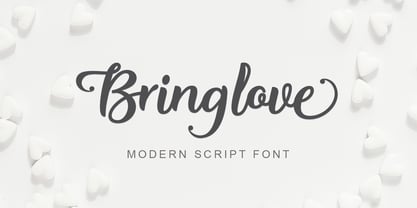 Hi, Introducing the latest styles Bring love with the kind of modern hand scratches, I hope you are interested in this font, if you want to use for your work this font can be used easily and simply because there are a lot of features in it to contain a complete set of letters lower and uppercase letters, assorted punctuation, numbers, and multilingual support. font also contains several ligatures and alternate style Stylistic.
 - Bostary Brush by Stripes Studio,
$20.00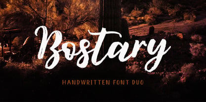 Hi, Introducing the latest styles Bostary Brush with the kind of modern hand scratches, I hope you are interested in this font, if you want to use for your work this font can be used easily and simply because there are a lot of features in it to contain a complete set of letters lower and uppercase letters, assorted punctuation, numbers, and multilingual support. font also contains several ligatures and alternate style Stylistic.
 - Kelysia Brush by Stripes Studio,
$20.00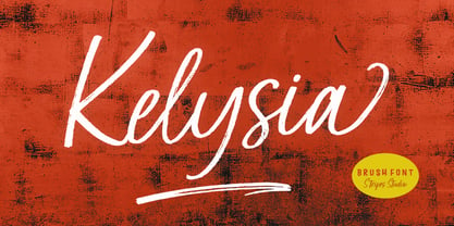 Hi, Introducing the latest styles Kelysia Brush with the kind of modern hand scratches, I hope you are interested in this font, if you want to use for your work this font can be used easily and simply because there are a lot of features in it to contain a complete set of letters lower and uppercase letters, assorted punctuation, numbers, and multilingual support. font also contains several ligatures and alternate style Stylistic.
 - Molynia Script by Stripes Studio,
$20.00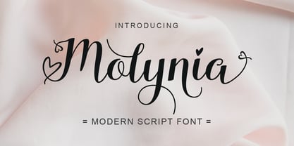 Hi, Introducing the latest styles Molynia Script with the kind of modern hand scratches, I hope you are interested in this font, if you want to use for your work this font can be used easily and simply because there are a lot of features in it to contain a complete set of letters lower and uppercase letters, assorted punctuation, numbers, and multilingual support. font also contains several ligatures and alternate style Stylistic.
 - Marons and Glance by Jehansyah,
$15.00 Marons and Glance This is a very charming and elegant font, very beautiful to look at and displays the impression of endless luxury, very suitable for all types of designs that want to display the impression of deep beauty. there are several characters that you can use, and combine them, very easy to use can be accessed with the glyph you are using include: numeric punctuation latin Alternate Thank you very Much
 - Bortane Brush by Stripes Studio,
$20.00 Hi, Introducing the latest styles Bortane Brush with the kind of modern hand scratches, I hope you are interested in this font, if you want to use for your work this font can be used easily and simply because there are a lot of features in it to contain a complete set of letters lower and uppercase letters, assorted punctuation, numbers, and multilingual support. font also contains several ligatures and alternate style Stylistic.
 - Chelson Brush by Stripes Studio,
$20.00 Hi, Introducing the latest styles Chelson Brush with the kind of modern hand scratches, I hope you are interested in this font, if you want to use for your work this font can be used easily and simply because there are a lot of features in it to contain a complete set of letters lower and uppercase letters, assorted punctuation, numbers, and multilingual support. font also contains several ligatures and alternate style Stylistic.
 - Hello Yasmin by Stripes Studio,
$20.00 Hi, Introducing the latest styles Hello Yasmin with the kind of modern hand scratches, I hope you are interested in this font, if you want to use for your work this font can be used easily and simply because there are a lot of features in it to contain a complete set of letters lower and uppercase letters, assorted punctuation, numbers, and multilingual support. font also contains several ligatures and alternate style Stylistic.
 - Love Style by Stripes Studio,
$20.00 Hi, Introducing the latest styles Love Style with the kind of modern hand scratches, I hope you are interested in this font, if you want to use for your work this font can be used easily and simply because there are a lot of features in it to contain a complete set of letters lower and uppercase letters, assorted punctuation, numbers, and multilingual support. font also contains several ligatures and alternate style Stylistic.
 - Beach Rock by Stripes Studio,
$20.00 Hi, Introducing the latest styles Beach Rock with the kind of modern hand scratches, I hope you are interested in this font, if you want to use for your work this font can be used easily and simply because there are a lot of features in it to contain a complete set of letters lower and uppercase letters, assorted punctuation, numbers, and multilingual support. font also contains several ligatures and alternate style Stylistic.
 - Midsole by Grype,
$16.00 Geometric/Technical style logotypes have been developed for car chrome labels since the early 1980’s, but automobile companies don't monopolize the style by any means. Shoe companies have a foothold in the geometric sans serif styles as well, and range from straightforward to full of techno styled play. Nonetheless, these logotypes all lack an expansive family which shows off all the logotypes are and what they "could" be and do. And that's where we come in. The Midsole Family finds its origin of inspiration in the CONVERSE shoe company logo, or an older version fo their logo, and from there expanded it into a 40 font family of weights, widths, and obliques. Midsole pays homage to the styling of the earlier logotype, including unicase variations to match the original look, while further evolving beyond the brand inspiration to yield a family that pulls on modern and historical styles. It adopts a sturdy yet approachable and recognizable style with its uniform stroke forms and curves, and goes on to include a lowercase, numerals, and a comprehensive range of weights, creating a straightforward, uncompromising collection of typefaces that lend a solid foundation and a broad range of expression for designers. Here’s what’s included with the Midsole Family bundle: 489 glyphs per style - including Capitals, Lowercase, Numerals, Punctuation and an extensive character set that covers multilingual support of latin based languages. (see the 10th graphic for a preview of the characters included) Stylistic Alternates - alternate characters and unicase variants for a less standardized text look. 4 weights in the family: Light, Regular, Medium & Bold. 4 obliques in the family, one for each weight: Light, Regular, Medium & Bold. Here’s why the Midsole Family is for you: - You’re in need of stylish sans font family with a range of weights and obliques. - You’re love that older CONVERSE letter styling, and want to design anything within that genre. - You’re looking for an alternative to Eurostile & Handel Gothic. - You’re looking for a clean techno typeface for your rave poster designs. - You just like to collect quality fonts to add to your design arsenal.
 - EasyPeasyLemonSqueezy by lgtm,
$25.00 There is an addiction to symmetry. When I draw, when I write, when I take pictures, when I design. So in this font. Best use in Headlines.
 - Newbery Sans Pro by Sudtipos,
$49.00 Newbery Sans is a new contrasted sans serif designed by Alejandro Paul and the Sudtipos team. As Paul has lately found inspiration from different German instructional books, Newbery Sans finds its initial inspirations from the lettering work of E. Nerdinger and invokes the spirit of German designs but is imbued with personality all its own. The idea was to make the letterforms more usable and suitable for everything from corporate branding to editorial. It is an elegant, functional family with contemporary detail that will effortlessly meet the demands of the screen and printed page. From a condensed thin to an expanded black, Newbery Sans provides a usable workhorse system of three widths and seven weights, each with the original design of real italics, a selection of alternate glyphs and a complete set of small caps. Each weight is professionally crafted and includes extended Latin support for Central, East and Western Europe languages. The font’s name nods to its imagined uses in airports and street signage: Jorge Newbery was one of the first Latin American aircraft pilots, Newbery is the street where I live and it is also the name of Buenos Aires’s local airport.
 - Ongunkan Varna Vinca by Runic World Tamgacı,
$50.00 The Vinča script is a cache of symbols found belonging to the Vinča culture of the central Balkans over 7000 years ago. The symbols have been a topic of debate amongst historians. The Tărtăria tablets are three tablets discovered in 1961 in the village of Tărtăria(Hungarian: Alsótatárlaka). This is about 30 km (19 mi) from Alba Iulia in Romania.The tablets, dated to around 5300 BC, have symbols inclay: the Vinča symbols. Some claim they are a yet undeciphered language. If this is so, they would be the earliest known form of writing. In 1908 similar symbols were found during excavations, by Miloje Vasić (1869–1956) in Vinča. This is a suburb of Belgrade (Serbia), some 300 km from Turdaș. Later, more were found in another part of Belgrade. Since 1875 over one hundred and fifty Vinča sites have been found in Serbia alone. Many, including Vinča itself, have not been fully excavated. The culture of the whole area is called the Vinča culture. Although some of these symbols look exactly the same as some letters in Etruscan, Greek, and Aramaic, they are generally regarded as a an original, independent development.
 - Visine FF by Koral Creative,
$32.00 Visine FF is a typeface that aims to question the geographical borders that in so many ways can define people's lives. It was developed with the experience of advertising and commercial use in mind. The name Visine can be translated most simply as HEIGHTS. Visine FF was developed out of the necessity to make the most of the space on the visual format. With the tall arches and narrow bodies with exceptional, easy-to-read features, Visine FF aims to complement visual languages in many linguistic regions. Visine FF was developed in the Balkans, where Cyrillic, Latin and Glagolitic were the three historical writing systems used in the former Yugoslavia to denote cultural, ethnic, religious and political identities. Today, the languages of the Western Balkans are so similar that they can easily be called dialects, although they are written in different scripts. This is the result of their coexistence and parallel evolutions, which gave a rise to the common traits. This font family celebrates all the languages and scripts of the Western Balkans and is a labour of love. Love of design, love of language and the human need to communicate across borders, cultures and identities.
 - P22 Vienna by P22 Type Foundry,
$24.95 The Vienna Workshop (Wiener Werkstätte) produced a tremendous variety of art from the turn of the century until the beginning of World War II. This set, which includes three typefaces and a collection of graphic extras, draws on both the Art Nouveau and Expressionist traditions of the Workshop.
 - Polyspring by PintassilgoPrints,
$29.00 Polyspring is a handcrafted serif display font, with a cool flowery flair. It was hand-drawn based on Italia Condensed typeface from Keystone Foundry from circa 1906. Loaded with stylish ornaments and flourishing alternates for all its letters and numbers, this font is a terrific toolbox for display purposes. Yet, it has the superpower of changing the first and last letters in words to its germinated alternates at the click of a button, thanks to the smart OpenType programming. Please note that this feature will only work in OpenType savvy applications. Check it performing live on the sample text below: just click on the Advanced Typography option, located next to the sample colors options (look for an icon showing “ff”), and check the option “swash”. Very cool, isn't it? Happy blooming!
 - Portland by Fenotype,
$25.00 Made you look? There’s a peculiar feel to the letters – achieved by the reversed contrast. Perfectly legible yet there’s something about the characters that makes them stand out. As Viktor Shklovsky once coined, ”Habitualization devours objects” – the everyday world becomes invisible until we are forced to see it otherwise. The Portland font family is a tool of choice when you want to effortlessly make your designs stand out.
 - Fancyou by Asenbayu,
$15.00 Fancyou is a classy vintage-inspired serif typeface with modern proportions consisting of 8 styles. Fancyou fonts are characterized by sharp serifs that bring a fashionable feel. You can use these fonts in modern vintage designs. These fonts are perfect for many projects such as logos, branding identity, magazines, business cards, posters, websites and many more. Fancyou fonts feature: Kerning, Ligature Style, Alternative Style, Numeral, Symbol and Multiple Languages Supported
 - Natalya by insigne,
$24.99 Natalya is a flashy and rhythmic script. The script has more space between characters than most for better legibility, and the basis point for the ornate swirls is the golden ratio. This makes for an especially harmonious typeface with timeless appeal. The typeface includes three alternates with variations of the ascenders and descenders. All three fonts include OpenType ligatures, oldstyle figures and ending swashes for an even more elaborate appearance.
 - Mariage by Linotype,
$40.99Morris Fuller Benton, the principal designer of the American Type Founders, designed Mariage in 1901. Mariage, which has been sold under a plethora of different names during the last century, is a blackletter typeface belonging to the Old English category. The term blackletter refers to typefaces that stem out of the historical printing traditions of northern Europe. These letters, called gebrochene Schriften, or "broken type" in German, are normally elaborately bent and distorted. Their forms often print large amounts of ink upon the page, creating text that leaves a heavy, black impression. The Old English style is a subset of blackletter type that dates back to 1498, when Wynken de Worde introduced textura style printing to England. Continental printers had been printing with textura style letters since Gutenberg's invention of the printing press fifty years earlier. Italian printers stopped using them around 1470. For northern Europeans, texturas remained the most popular form of typeface design until the invention of the fraktur style in Nuremberg. Mariage is heavily classicized sort of Old English type. During the Victorian era, designers admired the Middle Ages for its chivalric, community-based values and its pre-industrial lifestyle. Yet they also found the basic medieval textura letterform too difficult to read by present standards. They desired to modernize this old style. Today, this sort of update is often referred to not as "modernization" but as classicism. Benton's design for ATF builds upon earlier Victorian classicist interpretations of Old English/textura letters. For an example of what these Victorian designs looked like, check out the popular 1990 revival of the genre, Old English . Old English style types often appear drastically different from other blackletters. For contrast, compare Mariage to a classical German fraktur design, Fette Fraktur , a schwabacher style face, or the popular early 20th Century calligraphic gothic from Linotype, Wilhelm Klingspor Gotisch . Especially in the United States, classicist Old English typefaces are thought to espouse tradition and journalistic integrity. These features, together with the inherent, complex beauty of Mariage's forms, make this typeface a perfect choice for certificates, awards, and newsletter mastheads. - Fence Post JNL by Jeff Levine,
$29.00 The inspiration for Fence Post JNL comes out of an early 1900s manual for sign writing. A number of changes were made to make the design more aesthetically pleasing, but it retains its novelty effect of evoking the look of wooden fence posts or Western-themed typography.
 - Cash Point Mono by Matthias Luh,
$2.00 A very straight, geometric font which reminds me of the font on a display of a cash desk. Like most of the fonts at these display, this font is made up of a 6x10 matrix (capitals: 5x7). Hint: Insert Æ or ∂ to create a filled character (6x10).
 - PR Scrolls 05 by PR Fonts,
$10.05 Inspired by food labels, signs and coats of arms, PR Scrolls is a collection of images which can be used for framing text in contexts where antiquity, craftsmanship, or traditional quality are conveyed. Most of the glyphs are presented in a range of four or more widths.
 - I Heart It by Joanne Marie,
$40.00 Welcome to swash heaven! Since it’s been a few years that I made the very first heart swash font (featherly), I thought its time to create a new one and boy, this is massive! Made with love, I Heart It has over 2600 glyphs, is extremely smooth and is packed full of romance. There are 25 different swashes which connect to, not only, the lowercase alphabet but also on the left of the uppercase letters and the ligatures too. That’s not all! I’ve added 26 ornaments which will come in very handy for that additional touch of elegance and creativity in your designs. It’s all about the love, making this beautiful script font perfect for wedding stationery, engagements, and baby, family and friends orientated themes. Not only that - it can be used for logos, tattoos, delicious food and drink, mugs, clothing, the list is endless! They say that love conquers all and I Heart It will go a long way in expressing that through it’s illustrative design versatility, making it the perfect addition to your font collection. Once you’ve used it you’ll wonder how you’ve ever managed without it!
 - Botaky by Alit Design,
$9.00 Introducing BOTAKY Romellast fontduo Unique and fantastic duo fonts combined or they stand alone. BOTAKY font family which consists of 10 families, from Thin to Black style. The funky, swaying font creates a unique design and is sure to take the eye off the design target audience. Apart from being unique, the BOTAKY font also has a luxury simple character that makes the design charming. The Romellast font is a signature script that has cool strokes. The line shape from Romellast is inspired by the brushes on Instagram when creating stories. This brush is very cool and is often used by netizens who are not designers or designers. In addition, Romellast has an altenate ligature that looks natural and not stiff. There are 2 styles of the Romellast font, namely the Thin style which is thinner and the regular style which is thicker, so you have several options to suit your taste. Combining the two BOTAKY and Romellast fonts will create a design that is charming, unique, elegant and cool. you can see from the design preview. These two fonts are perfect for designs with the concept of elegant, luxury, romance, fashion and so on.
 - Sottalica by Mightype,
$17.00 Sottalica Script is a modern calligraphy font with the current handwriting style, this font is perfect for branding, wedding invites, magazines, mugs, business cards, quotes, posters, and more, you can try first if you want to buy this font. Sottalica Script is equipped with 315 glyphs. and by having many of these glyphs there will be able to choose the letters according to your likes, lots of variations and options for each letter, so you can customize on your design choices. with pleasure and happiness, in this font package you will get: Sottalica Script OTF to use a variety of flying machines, you need a program that supports OpenType features such as Adobe Photoshop Cs / Adobe Photoshop CC, Adobe Illustrator CS / Adobe Illustrator CC, Adobe Indesign and Corel Draw and many more programs that support OpenType. If you do not have a program that supports OpenType, you can access all the alternate glyphs using Font Book (Mac) or Character Map (Windows) if you have any question, do not hesitate to contact me by email mightype89@gmail.com Thanks and happy designing :-) Thank You for purchase!
 - LunchBox by Kimmy Design,
$25.00 LunchBox is a uniquely hand-drawn typeface that gives infinite customizable options and a fully authentic look. Using Lunchbox’s OpenType features gives access to over 1,500 different characters. Contextual alternatives give each letter 4 different character styles, all cycling through each other to ensure that no two letters ever show up together. There is also a custom set of small caps, each with 4 style variations as well. Stylistic alternatives give an extra hand-drawn flourish, loop and slight variation, also with 4 different styles per letter. Discretionary ligatures pertain to both regular all caps Lunchbox as well as stylistic alternatives. It takes special letters and gives a unique interaction with the characters around them, giving your design a unique and personalized look. Swashes also have four style variations to both the regular and stylistic alternatives, as well as lowercase letters with ascenders and descenders. All of these options are available in Light, Regular and Bold and can be purchased with Lunchbox Ornaments for an extra element. If you do not use Opentype but are using a program that includes a full glyph panel, you will be able to access each of the style variations you want. Enjoy!
 - Rodia by Monotype,
$25.00 Rodia is an Oddball Geometric Sans Typeface consisting of nine weights in both roman and oblique. It’s a geometric sans with a twist that’s perfect for branding and identity projects – it will also give your body text a unique voice. Inspiration came from the iconic “RADIO” signage that was once in place at 5041, Pico Boulevard, Los Angeles in 1985 (documented at https://tinyurl.com/y2krt2ox). With its distinctive leg, the /R/ provides a personality trait to define the style of the character set. You can clearly see how this characteristic separates Rodia from other geometric sans families – the /k/v/w/x/y/K/R/V/W/X/Y/ glyphs all display the distinctive ‘feet’ and ‘hands’ as terminals to legs and arms. Then there is the /A/ with its triangular crossbar – this triangular motif has been used to embellish alternates in Stylistic Set 1 for /A/E/F/G/H/Q/S/ glyphs. These will add another layer of versatility for your typographic projects. Rodia features an extensive character set covering all Latin European languages. Key features: 9 weights in Roman and Oblique Full European character set (Latin only) 400+ glyphs per font.
 - Fleuron Labels by Wiescher Design,
$39.50Fleurons are embellishments and here is my seventh set. This time I give you all kind of different labels. Your labeled designer Gert Wiescher - Hot Script by Lián Types,
$49.00 Say hello to another of my hot and trendy scripts, Hot Script! I got the inspiration for this one in the world of sign painters. My neighbourhood, and more specifically the avenue were I live, is very well known for its ''parrillas'': For those who don't know what this means, well, it may be better to live the experience rather than reading these lines. Villa Urquiza is full of restaurants with an argentinian flavour, with a ''gauchezco'' feel. Here you can taste some of the best ''asados'' in the entire world. Ok, this made me hungry, let's go back to type: These amazing venues still mantain genuine elements from the past, and try to preserve the beauty of the handcrafted. Parrillas of Buenos Aires have all their walls, windows and doors lettered with chalk or paint. I've always wanted to make a font out of that, and Hot Script is my first attempt. I believe the results are great! Hot Script follows some rules of the flat brush (see terminals, and tails especially in caps) but its contrast of thicks and thins was manually altered to make the font better for a wider range of uses. Although the sexy curves and versatility of Hot seemed to be enough, I decided to spice it a little more by creating some layers for it: Hot Script Shine Solo or Hot Script Shades Solo combined with Hot Script will give outstanding results. (Look for them combined in the posters above and dare to deny it!) Go make your project more savory! This font is Hot, hot, hot!
 - Flirt by Canada Type,
$25.00It's a very happy day when we stumble upon beautiful alphabets that were never digitized. It is even a happier day when the beautiful alphabet finds its way to us through friends and people who like our work. Some two months ago, the forms of this gorgeous font were pointed to us by a friend who saw it in an old Dover Publications specimen book showcasing historical alphabets. It was there under the name Vanessa, with nothing else to go by. We looked and researched for further information but found nothing else. So this gem comes to you like a coal that winked its way out of the ashes because it wanted to shine again. Flirt is very authentic art deco with a noticeable element of artistic pride, swashy delicate majuscules and very aristocratic, fashionable and flirty minuscules. The majuscules can be used as every other capitals usually are, or as initial caps. The minuscules can very nicely stand on their own quite independently from the caps whenever desired. These letters are quite similar to the hand lettering used on of the kind of theater posters, specifically burlesque and opera entertainment, which are now considered very retro-chic and fashionable to see hanging on walls in home or office. The initial specimen we worked from showed a single basic art deco alphabet with numerals which seemed as they belonged to another font. That alphabet became the base Flirt font, the numerals were redrawn to fit much better with the minuscules, and the character set was greatly expanded to include punctuation, accented characters, and many many alternates, especially for the majuscules. Majuscules with a descending right vertical stroke were a common artistic touch in the high days of theater posters, so we thought they would be great additions to the character set. These alternates can be found all over the font. So to maximize the design fun, have a character map or glyphs palette handy when you use Flirt. After the base font was finished, we thought it would be a good idea to give it a bold treatment unlike anything seen out there, and the farthest thing from the mechanical bolds seen everywhere now. This bolding treatment consisted of thickening the lowercase's vertical strokes inwards, but leaving the horizontal stroke weight as is, and thickening only the thicker vertical strokes of the uppercase. The result is quite the visual feat. We encourage you to test both the regular and bold weights and see for yourself. - Black Wizard by Mans Greback,
$59.00 Black Wizard is a bold and funky sans-serif font that is perfect for adding a touch of playfulness to your designs. With its wobbly and uneven letters, Black Wizard exudes a playful and cartoonish quality that is sure to make your project stand out. This font is ideal for Halloween-themed designs, as its bold and scary appearance can add an extra element of spookiness to your work. But it's not all frights and scares - the funny and lighthearted nature of Black Wizard also bring a touch of humor. Black Wizard comes in four styles: Regular, Italic, Straight, and Straight Italic, giving you plenty of options to choose from for your design needs. Additionally, a Symbols font is included with various Halloween-themed symbols that can be added to your text to enhance the spooky vibe. Use the character ¤ anywhere in a word to make a Halloween symbol. Example: Scare¤Crow. To add different symbols like ghosts and bats, use multiple ¤ characters. Example: Dark¤¤¤Night. The font is built with advanced OpenType functionality and has a guaranteed top-notch quality, containing stylistic and contextual alternates, ligatures and more features; all to give you full control and customizability. It has extensive lingual support, covering all Latin-based languages, from Northern Europe to South Africa, from America to South-East Asia. It contains all characters and symbols you'll ever need, including all punctuation and numbers.
 - Linotype Mega by Linotype,
$29.00Linotype Mega is part of the Take Type Library, chosen from the entries of the Linotype-sponsored International Digital Type Design Contests of 1994 and 1997. The fun schrift of German designer Till F. Teenck is available in three weights whose names are word plays in themselves. Mega in (which we hope the font will be) contains relatively light, somewhat irregularly-drawn characters which look as though they were printed by hand and the characters are set rather far apart from each other. This weight is good for short and middle length texts in point sizes of 10 and larger. Mega normal is anything but. The characters are the outline forms of Mega in and their larger width reduces the distance between them. This weight is generally a headline font. Mega out is a very heavy weight and is the filled-in version of Mega normal. The characters flow into each other and look almost like silhouettes. The reduced legibility makes this font suitable exclusively for headlines in larger point sizes. - Beret by Linotype,
$29.99Brazilian designer Eduardo Omine designed his Beret family of typefaces in an attempt to create a warm counterpart to the clean, minimalist sans serif of the 20th Century. The most individual characteristics of Beret are the terminals at the ends of its vertical strokes. They are slightly bent", simulating a subtle flare. Like many classic sans-serif typefaces (e.g., the original Syntax and Univers), this family does not include true (calligraphic) italics. Instead, a masterful set of obliques has been created. As Stanley Morison articulated in the early 1920s and 30s, these slanted versions of the regular "roman" faces may even work better when one wishes to emphasize certain words or passages within a text. The Beret family of typefaces is suitable for numerous applications, in both text and display sizes. The following nine fonts make up the family's design: Beret Light, Beret Light Italic, Beret Book, Beret Book Italic, Beret Regular, Beret Medium, Beret Medium Italic, Beret Bold, and Beret Bold Italic. Beret was awarded an Honorable Mention in the 2003 International Type Design Contest, sponsored by the Linotype GmbH." - HMS Gilbert by Fenotype,
$35.00 HMS Gilbert is a hand drawn collection of fonts designed to play perfectly together. HMS Gilbert contains seven different fonts, five of which also have texturised versions of them. In addition to fonts there is also Catchwords and Ornaments -sets of nice extras that help you to complete your designs with a coherent look. Most of the fonts are equipped with OpenType features such as Swash, Stylistic Alternates and Automatic Ligatures to help you to achieve more custom and “hand made” look.
 - Crox by NumidiaType,
$25.00 Crox™ is a sans-serif professional typeface inspired by crude geometry, creativity, and art. In the font family, there are 19 styles, including upright and italic, It is constructed of big lowercase letters with a maximum x-height for excellent optical reading. English letters are supported as a numerator and denominator set, this feature may aid in the creation of fractions using letters and numbers, as well as for sophisticated scripting and various scientific fractions forms. All weights support over 25 professional OpenType features within each style, with extensive coverage of western languages. These features were originally planned for personal and professional use, including multi-alternative characters in Styles: 1, 2, 4, 10, 11. Operational styles 6, 7 are enhanced with some scientific forms, to write the fit derived (SI units' expressions). Otherwise, it supports a wide range of professional factory pricing styles for business and marketing, as well as retail pricing styles in Sets 5, 8, and 9, with ligatures, old-style numerals, ordinals, swashes... Crox™ is enhanced with a poster weight like the fantastical type to fulfill your creative needs in three styles: poster, poster oblique, and poster italic for ADS and web design, branding, or product design. Glyphs: More than 970 glyphs, including those accessible with OpenType features. Powerful OpenType features: Standard Ligature, Alternate access, Automatic ordinals (English, French...), Case sensitive, localized forms, Numerator set, Denominator set, Subscript, Superscript, Swash, Stylistic alternate, Styles 1,2,3,4,5(Pricing style 1), 6(Derived Units),7(Advanced Fractions for Scientific units, Derived Units Vulgar Form), Set 8 (Pricing Style 2), Set (Pricing Style 3), Proportional Old-style, Tabular Old-style, Proportional Lining, Tabular Lining, Zero with slash, Fractions (Default, Automatic). Suitable for: logo and modern branding, web design, packaging, Product packaging, Articles, scientific document, Product user guides, multiple works in the Media, Design, ADS... Specimen Crox™ is a trademark of Yassine Abdi.
 - Evita by ITC,
$29.99Gérard Mariscalchi is a self-made designer. Born in Southern France of a Spanish mother and an Italian father, he has worked as a mechanic, salesman, pilot, college teacher – even a poet (with poetry being the worst-paying of these professions, he reports.) “Throughout all this, the backbone of my career has always been design,” Mariscalchi says. “I’ve been drawing since I was five, but it wasn’t until I was twenty-four that I learned that my hobby could also help me earn a living.” It was about this same time that Mariscalchi fell in love with type. He studied the designs of masters like Excoffon, Usherwood and Frutiger, as well as the work of calligraphers and type designers such as Plantin, Cochin and Dürer. With such an eclectic background, it’s no surprise that Mariscalchi’s typeface designs are inspired by many sources. Baylac and Evita reflect the style of the art nouveau and art deco periods, while Marnie was created as an homage to the great Lithuanian calligrapher Villu Toots. However, the touch of French elegance and distinction Mariscalchi brings to his work is all his own. Baylac Who says thirteen is an unlucky number? Three capitals and ten lowercase letters from a poster by L. Baylac, a relatively obscure Art Nouveau designer, served as the foundation for this typeface. The finished design has lush curves that give the face drama without diminishing its versatility. On the practical side, Baylac’s condensed proportions make it perfect for those situations where there’s a lot to say and not much room in which to say it Evita Mariscalchi based the design of Evita on hand lettering he found in a restaurant menu, and considers this typeface one of his most difficult design challenges. “The main problem was to render the big weight difference between the thin and the thick strokes without creating printing problems at small point sizes,” he says. Unlike most scripts, Evita is upright, with the design characteristics of a serif typeface. Mariscalchi named the face for a close friend. The end result is a charming design that is light, airy, and slightly sassy. Marnie Based on Art Nouveau calligraphic lettering, Marnie is elegant, inviting, and absolutely charming. Mariscalchi paid special attention to letter shapes and proportions to guarantee high levels of character legibility. He also kept weight transition in character strokes to modest levels, enabling the face to be used at relatively small sizes – an unusual asset for a formal script. Marnie’s capital letters are expansive designs with flowing swash strokes that wrap affectionately around adjoining lowercase letters. The design easily captures the spontaneous qualities of hand-rendered brush lettering. - Baylac by ITC,
$29.99Gérard Mariscalchi is a self-made designer. Born in Southern France of a Spanish mother and an Italian father, he has worked as a mechanic, salesman, pilot, college teacher – even a poet (with poetry being the worst-paying of these professions, he reports.) “Throughout all this, the backbone of my career has always been design,” Mariscalchi says. “I’ve been drawing since I was five, but it wasn’t until I was twenty-four that I learned that my hobby could also help me earn a living.” It was about this same time that Mariscalchi fell in love with type. He studied the designs of masters like Excoffon, Usherwood and Frutiger, as well as the work of calligraphers and type designers such as Plantin, Cochin and Dürer. With such an eclectic background, it’s no surprise that Mariscalchi’s typeface designs are inspired by many sources. Baylac and Evita reflect the style of the art nouveau and art deco periods, while Marnie was created as an homage to the great Lithuanian calligrapher Villu Toots. However, the touch of French elegance and distinction Mariscalchi brings to his work is all his own. Baylac Who says thirteen is an unlucky number? Three capitals and ten lowercase letters from a poster by L. Baylac, a relatively obscure Art Nouveau designer, served as the foundation for this typeface. The finished design has lush curves that give the face drama without diminishing its versatility. On the practical side, Baylac’s condensed proportions make it perfect for those situations where there’s a lot to say and not much room in which to say it Evita Mariscalchi based the design of Evita on hand lettering he found in a restaurant menu, and considers this typeface one of his most difficult design challenges. “The main problem was to render the big weight difference between the thin and the thick strokes without creating printing problems at small point sizes,” he says. Unlike most scripts, Evita is upright, with the design characteristics of a serif typeface. Mariscalchi named the face for a close friend. The end result is a charming design that is light, airy, and slightly sassy. Marnie Based on Art Nouveau calligraphic lettering, Marnie is elegant, inviting, and absolutely charming. Mariscalchi paid special attention to letter shapes and proportions to guarantee high levels of character legibility. He also kept weight transition in character strokes to modest levels, enabling the face to be used at relatively small sizes – an unusual asset for a formal script. Marnie’s capital letters are expansive designs with flowing swash strokes that wrap affectionately around adjoining lowercase letters. The design easily captures the spontaneous qualities of hand-rendered brush lettering. - Marnie by ITC,
$29.99Gérard Mariscalchi is a self-made designer. Born in Southern France of a Spanish mother and an Italian father, he has worked as a mechanic, salesman, pilot, college teacher – even a poet (with poetry being the worst-paying of these professions, he reports.) “Throughout all this, the backbone of my career has always been design,” Mariscalchi says. “I’ve been drawing since I was five, but it wasn’t until I was twenty-four that I learned that my hobby could also help me earn a living.” It was about this same time that Mariscalchi fell in love with type. He studied the designs of masters like Excoffon, Usherwood and Frutiger, as well as the work of calligraphers and type designers such as Plantin, Cochin and Dürer. With such an eclectic background, it’s no surprise that Mariscalchi’s typeface designs are inspired by many sources. Baylac and Evita reflect the style of the art nouveau and art deco periods, while Marnie was created as an homage to the great Lithuanian calligrapher Villu Toots. However, the touch of French elegance and distinction Mariscalchi brings to his work is all his own. Baylac Who says thirteen is an unlucky number? Three capitals and ten lowercase letters from a poster by L. Baylac, a relatively obscure Art Nouveau designer, served as the foundation for this typeface. The finished design has lush curves that give the face drama without diminishing its versatility. On the practical side, Baylac’s condensed proportions make it perfect for those situations where there’s a lot to say and not much room in which to say it Evita Mariscalchi based the design of Evita on hand lettering he found in a restaurant menu, and considers this typeface one of his most difficult design challenges. “The main problem was to render the big weight difference between the thin and the thick strokes without creating printing problems at small point sizes,” he says. Unlike most scripts, Evita is upright, with the design characteristics of a serif typeface. Mariscalchi named the face for a close friend. The end result is a charming design that is light, airy, and slightly sassy. Marnie Based on Art Nouveau calligraphic lettering, Marnie is elegant, inviting, and absolutely charming. Mariscalchi paid special attention to letter shapes and proportions to guarantee high levels of character legibility. He also kept weight transition in character strokes to modest levels, enabling the face to be used at relatively small sizes – an unusual asset for a formal script. Marnie’s capital letters are expansive designs with flowing swash strokes that wrap affectionately around adjoining lowercase letters. The design easily captures the spontaneous qualities of hand-rendered brush lettering.