10,000 search results
(0.031 seconds)
- Rugsnatcher by PizzaDude.dk,
$20.00 Step into the future with this retro computer video game font! Get that 80'ies feeling with shoot 'em up games and mazes full of deadly robots - just waiting to zap you with their lazers! Rugsnatcher comes with a sci-fi loadful of ligatures, that curl and swirl ... right into outer space! Play around with UPPERCASE and lowercase to change how the letters play!
 - Gorgone by Letterhend,
$14.00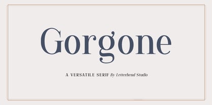 Gorgone, a versatile serif that brings the luxury feel. Gorgone is suitable for headlines, logotypes, apparel, invitations, branding, packaging, advertising and more. This typeface is comes in uppercase, lowercase, punctuations, symbols & numerals, stylistic set alternate, ligatures, and also multi-lingual support and is already PUA encoded.
 - Boldoni by Forte Type,
$4.90 Boldoni is like a caricature: it brings with itself exaggerated elements of the modern typefaces, that has as main names Giambattista Bodoni and François-Ambroise Didot. Boldoni takes to the limit its width and serifs, causing a ultra fat type feeling, and its styles causes a monochromatic effect that remember the colors Black, Gray and White. Boldoni is good for titles, initials, drop caps, lettering, posters and vertical writing.
 - Chakie by Garisman Studio,
$20.00 Just call me CHAKIE. I'm born from the old natural brush chalk look from the 60's and 70's. Use meto create very bold and strong design! Great for posters, t-shirt designs, branding, packaging, labels, and more. Bring back me to the 60's brother! :D And why you must grab me? - Simple installation - Support for 23 languages (WOW!) - Compatible with MAC or PC - PUA encoded - Lots of fun!
 - Capires by Craft Supply Co,
$20.00 Capires - Art Deco Font is a captivating fusion of two iconic art movements, Art Deco and Art Nouveau, blended into a contemporary typeface that pays homage to the rich artistic heritage of both styles. This font beautifully combines the geometric precision of Art Deco with the intricate, organic motifs of Art Nouveau, resulting in a harmonious masterpiece of design. Capires is the perfect choice for projects that demand a unique and mesmerizing synthesis of these two influential art movements. Whether you're working on branding, packaging, or editorial design, Capires brings a sense of timeless elegance and artistic richness to your work. With Capires, your designs seamlessly bridge the gap between past and present, making it an exceptional choice for projects that seek to capture the essence of both Art Deco's geometric refinement and Art Nouveau's flowing, ornamental beauty. This font transforms your creations into an elegant and visually captivating experience, where tradition meets modernity in a harmonious embrace.
 - Avenir Next Thai by Linotype,
$79.00 Avenir Next Pro is a new take on a classic face—it’s the result of a project whose goal was to take a beautifully designed sans and update it so that its technical standards surpass the status quo, leaving us with a truly superior sans family. This family is not only an update though; in fact it is the expansion of the original concept that takes the Avenir Next design to the next level. In addition to the standard styles ranging from ultralight to heavy, this 32-font collection offers condensed faces that rival any other sans on the market in on and off—screen readability at any size alongside heavy weights that would make excellent display faces in their own right and have the ability to pair well with so many contemporary serif body types. Overall, the family’s design is clean, straightforward and works brilliantly for blocks of copy and headlines alike. Akira Kobayashi worked alongside Avenir’s esteemed creator Adrian Frutiger to bring Avenir Next Pro to life. It was Akira’s ability to bring his own finesse and ideas for expansion into the project while remaining true to Frutiger’s original intent, that makes this not just a modern typeface, but one ahead of its time. Avenir Next Variables are font files which are featuring two axis, weight and width. They have a preset instance from UltraLight to Heavy and Condensed to Roman width. The preset instances are: Condensed UltraLight, Condensed UltraLight Italic, Condensed Thin, Condensed Thin Italic, Condensed Light, Condensed Light Italic, Condensed, Condensed Italic, Condensed Demi, Condensed Demi Italic, Condensed Medium, Condensed Medium Italic, Condensed Bold, Condensed Bold Italic, Condensed Heavy, Condensed Heavy Italic, UltraLight, UltraLight Italic, Thin, Thin Italic, Light, Light Italic, Regular, Italic, Demi, Demi Italic, Medium, Medium Italic, Bold, Bold Italic, Heavy, Heavy Italic.
 - Avenir Next Rounded by Linotype,
$42.99Avenir Next Pro is a new take on a classic face—it’s the result of a project whose goal was to take a beautifully designed sans and update it so that its technical standards surpass the status quo, leaving us with a truly superior sans family. This family is not only an update though; in fact it is the expansion of the original concept that takes the Avenir Next design to the next level. In addition to the standard styles ranging from ultralight to heavy, this 32-font collection offers condensed faces that rival any other sans on the market in on and off—screen readability at any size alongside heavy weights that would make excellent display faces in their own right and have the ability to pair well with so many contemporary serif body types. Overall, the family’s design is clean, straightforward and works brilliantly for blocks of copy and headlines alike. Akira Kobayashi worked alongside Avenir’s esteemed creator Adrian Frutiger to bring Avenir Next Pro to life. It was Akira’s ability to bring his own finesse and ideas for expansion into the project while remaining true to Frutiger’s original intent, that makes this not just a modern typeface, but one ahead of its time. Avenir Next Variables are font files which are featuring two axis, weight and width. They have a preset instance from UltraLight to Heavy and Condensed to Roman width. The preset instances are: Condensed UltraLight, Condensed UltraLight Italic, Condensed Thin, Condensed Thin Italic, Condensed Light, Condensed Light Italic, Condensed, Condensed Italic, Condensed Demi, Condensed Demi Italic, Condensed Medium, Condensed Medium Italic, Condensed Bold, Condensed Bold Italic, Condensed Heavy, Condensed Heavy Italic, UltraLight, UltraLight Italic, Thin, Thin Italic, Light, Light Italic, Regular, Italic, Demi, Demi Italic, Medium, Medium Italic, Bold, Bold Italic, Heavy, Heavy Italic. - Joyful Turkey by Putracetol,
$16.00 Joyful Turkey - Display Thanksgiving Font is a charming and playful typeface designed to embrace the spirit of Thanksgiving. Its quirky and rounded characters add an element of fun and warmth to your designs, making it the perfect choice for projects that celebrate this special holiday. This font includes seven delightful decorative variations with Thanksgiving-themed elements such as turkey, pumpkin, pie, leaves, and more. Ideal for Thanksgiving-themed designs, including invitation cards, birthday invites with a Thanksgiving theme, party decorations, logos, stickers, clothing, packaging, children's books, magazines, and more, Joyful Turkey brings a delightful and heartwarming touch to your creative projects. With its whimsical and cheerful style, this font captures the essence of gratitude and celebration, making it an ideal choice for designs that reflect the Thanksgiving spirit.
 - Joe Mad by Comicraft,
$39.00 When Joe Madureira saw the custom font we'd created for Jim Lee, he called us up immediately and uttered the immortal words... "I Want One!" We were, of course, only too happy to oblige. Now, this very font, based upon Joe's own handwriting, is available. Think about it, where else can you get a World Famous Comic Book Artist like Joe Madureira to work for you for under a hundred bucks?
 - Makwus by Twinletter,
$15.00 Introducing our newest font called Makwus, one of our newest premium fonts based on Arabic style. This elegant font has a targeted audience and is perfect for personal and professional projects, from social media ads to business cards to your logo and project headers. This Makwus font designed by experienced typographers can bring a beautiful new level of luxury to your designs.
 - Umkhonto by Scholtz Fonts,
$19.00 Umkhonto is the Zulu word for SPEAR, the traditional weapon of war that the Zulus used. The sharp points of the letters face upwards and represent the sharp points of the dangerous spears. The font includes a full 256 character set: all upper and lower case letters, as well as all numerals and punctuation. It also includes the most commonly used characters used in non-English European languages such as Spanish, French, German and Portuguese. The numerals are mono-spaced so that they will line up correctly in columns of figures. The letters of the alphabet are spaced according to their width and are carefully kerned.
 - Marginal Notes SRF by Stella Roberts Fonts,
$25.00 Marginal Notes SRF is from the creative pen of Ray Larabie whose Typodermic foundry graces MyFonts.com. Designed to emulate the look of handwritten words using a felt tip pen, this font can be perfectly applied to any project where notations, subtext, memos or other forms of personalization with a human touch is required. The net profits from my font sales help defer medical expenses for my siblings, who both suffer with Cystic Fibrosis and diabetes. Thank you.
 - Hiragino Sans by SCREEN Graphic Solutions,
$210.00 Mindful that Hiragino Sans (Kaku Gothic) would be used in conjunction with Hiragino Serif (Mincho), SCREEN developed a font that anticipated today’s world where most people do their reading on displays and yet still has an orthodox letterform that does not blur when printed on paper. In short, our goal with this font was to create a new concept that responds to the demands of today’s times. This font offers weight variations from W0 to W9 and is extremely versatile. This makes it well-suited to all visual expression media including paper, metallic textures, resins, cloth, television, movies, broadcasting, websites, and electronic displays. One of the design’s strongpoints is that it elides serif on the right side of each stroke, thus delivering more spacious counters and a comfortable appearance. Thanks to this, the typeface not only delivers a contemporary, lively impression same as Latin sans serif typefaces, but also heightens the natural continuity and readability of text whether it is set vertically or horizontally. As a result, it makes it possible to bring a strong appealing power to text. Without a doubt, this is typeface that above else embodies the role of Sans Serif.
 - Flefixx by Sun Young Oh,
$54.00 Flefixx is a typeface designed to support a project "Flefixx", an idiosyncratic visual language and typeface system that unfolds narratives based on common combinations of letters. In this visual language, just as individual letters come together like puzzle pieces to form different meanings or words based on combinations, the typeface is also constructed from fragmentary elements, each playing a distinct role as if they are individual pieces. The intentional exposure of the intersections of these fragments emphasizes the typeface's creation through interconnected elements. Furthermore, diacritics and dots are strategically positioned as ornaments, enhancing their presence within the gaps between letters. This concept aligns with the theme of composition and connectivity among fragments, allowing strong rhythmic patterns to emerge as letters and symbols blend in a paragraph. Additionally, the prominent and bold punctuation marks serve to provide pauses and clarity within sentences that incorporate both letters and the visual language. They contribute to articulating sentence structure amidst the dynamic flow of sentences with combined characters and visuals.
 - FF DIN Round by FontFont,
$93.99 This welcome addition to FontFont’s most popular family brings a softness to FF DIN’s simplicity and industrial sterility. FF DIN Round is more than a “search-and-replace” rounded version of its predecessor. Albert-Jan Pool and his team redrew each letterform to maintain the structure of the original. This ensures FF DIN and FF DIN Round will work well together in logos, slogans, price tags, etc. as compatible parts of advertising campaigns and corporate identities. FF DIN Round is not only a good companion to FF DIN, its smooth and friendly curves make it work on its own for branding strategies for family cars, bikes, household appliances, sportswear, shoes, or medical products. It’s also very legible on screen. This FontFont is a member of the FF DIN super family, which also includes FF DIN.
 - Boola Boola NF by Nick's Fonts,
$10.00This typeface is a new and improved (really!) version of one of my most popular freeware fonts, Team Spirit, which has made appearances in the Tank McNamara comic strip and on Blue Collar TV. Add the “nose” at the front with an open parenthesis -(- and add the tail with a close parenthesis -). To continue the bar beneath between words, use the _underscore in place of a space. No math operators and limited punctuation, but complete accented characters for the Unicode 1252 (Latin) and Unicode 1250 (Central European) character sets, with localization for Romanian and Moldovan. - Genzi Street Graffiti by Sipanji21,
$17.00 Genzi Street is a monoline graffiti font with natural street handwritten accents. This font is perfect for a wide range of design projects with an urban or street theme. With its edgy and raw style, Genzi Street brings an authentic street vibe to your typography. Whether you're working on urban branding, streetwear designs, or any other project that requires a gritty and dynamic look, this font will add a touch of urban flair and make your designs stand out. Unleash your creativity and embrace the urban energy with Genzi Street font.
 - Phoenix Disaster Graffiti by Sipanji21,
$17.00 Phoenix Disaster is a monoline graffiti font with natural street handwritten accents. This font is perfect for a wide range of design projects with an urban or street theme. With its edgy and raw style, Phoenix Disaster brings an authentic street vibe to your typography. Whether you're working on urban branding, streetwear designs, or any other project that requires a gritty and dynamic look, this font will add a touch of urban flair and make your designs stand out. Unleash your creativity and embrace the urban energy with Phoenix Disaster font.
 - Bervina by Balevgraph Studio,
$12.00 Bervina is an elegant and delicate serif font. It looks beautiful on a variety of designs requiring a personalized style, such as wedding invitations, thank you cards, weddings, greeting cards, logos and so on. Bring your projects to the highest levels! Features: Multilingual Ligatures Alternates PUA encoded Files Included: Bervina Regular ttf Bervina Italic ttf
 - Amenable by Twinletter,
$12.00 Our latest fonts that save beauty in every word order you write with this font. made by paying attention to detailed geometric and paying attention to the perspective of the eye when reading the text using this font, so we made this font design to appear harmonious and comfortable to read. use this font to create a perfect design. This font is very suitable as text with displays for various kinds of branding, advertisements, posters, banners, packaging, news headlines, magazines, websites, logo design, banners, social media design and of course you can use a lot more.
 - Tecna Dark Up Triangle BNF by Descarflex,
$30.00 The Tecn@ Dark&Light Triangle Background Nomenclature Font family is differentiated by the direction of the triangle tip in the 4 cardinal points. The family were designed to head, enumerate, indicate or highlight writings or design plans, for this reason, the characters are available only in capital letters and some signs or symbols that can serve such purposes. A triangle or empty character is included so that the user can use it overlaying any character of his choice or to be used alone. What is Lorem Ipsum? Lorem Ipsum is simply dummy text of the printing and typesetting industry. Lorem Ipsum has been the industry's standard dummy text ever since the 1500s, when an unknown printer took a galley of type and scrambled it to make a type specimen book. It has survived not only five centuries, but also the leap into electronic typesetting, remaining essentially unchanged. It was popularised in the 1960s with the release of Letraset sheets containing Lorem Ipsum passages, and more recently with desktop publishing software like Aldus PageMaker including versions of Lorem Ipsum. Why do we use it? It is a long established fact that a reader will be distracted by the readable content of a page when looking at its layout. The point of using Lorem Ipsum is that it has a more-or-less normal distribution of letters, as opposed to using 'Content here, content here', making it look like readable English. Many desktop publishing packages and web page editors now use Lorem Ipsum as their default model text, and a search for 'lorem ipsum' will uncover many web sites still in their infancy. Various versions have evolved over the years, sometimes by accident, sometimes on purpose (injected humour and the like). Where does it come from? Contrary to popular belief, Lorem Ipsum is not simply random text. It has roots in a piece of classical Latin literature from 45 BC, making it over 2000 years old. Richard McClintock, a Latin professor at Hampden-Sydney College in Virginia, looked up one of the more obscure Latin words, consectetur, from a Lorem Ipsum passage, and going through the cites of the word in classical literature, discovered the undoubtable source. Lorem Ipsum comes from sections 1.10.32 and 1.10.33 of "de Finibus Bonorum et Malorum" (The Extremes of Good and Evil) by Cicero, written in 45 BC. This book is a treatise on the theory of ethics, very popular during the Renaissance. The first line of Lorem Ipsum, "Lorem ipsum dolor sit amet..", comes from a line in section 1.10.32. The standard chunk of Lorem Ipsum used since the 1500s is reproduced below for those interested. Sections 1.10.32 and 1.10.33 from "de Finibus Bonorum et Malorum" by Cicero are also reproduced in their exact original form, accompanied by English versions from the 1914 translation by H. Rackham. Where can I get some? There are many variations of passages of Lorem Ipsum available, but the majority have suffered alteration in some form, by injected humour, or randomised words which don't look even slightly believable. If you are going to use a passage of Lorem Ipsum, you need to be sure there isn't anything embarrassing hidden in the middle of text. All the Lorem Ipsum generators on the Internet tend to repeat predefined chunks as necessary, making this the first true generator on the Internet. It uses a dictionary of over 200 Latin words, combined with a handful of model sentence structures, to generate Lorem Ipsum which looks reasonable. The generated Lorem Ipsum is therefore always free from repetition, injected humour, or non-characteristic words etc.
 - Fox Smiley by Fox7,
$12.00 Fox Smiley Font is a playful and vibrant font that exudes a sense of fun and friendliness. It's perfect for anyone looking to add a touch of cheer to their projects, whether it be for children's materials, blog posts, logos, branding, or advertisements. With its cute and informal feel, Fox Smiley Font is sure to capture the attention of your audience and bring a smile to their faces.
 - Village Green JNL by Jeff Levine,
$29.00 Village Green JNL is based upon a font called “Giraffe Extended” from the 1892 edition of the MacKellar, Smiths & Jordan type specimen book, and is available in both regular and oblique versions. Its Art Nouveau styling can also fit well with 1960s counter-culture revival projects. According to Wikipedia “A village green is a common open area within a village or other settlement. Historically, a village green was common grassland with a pond for watering cattle and other stock, often at the edge of a rural settlement, used for gathering cattle to bring them later on to a common land for grazing. Later, planned greens were built into the centres of villages.”
 - Brittes by Eurotypo,
$60.00 Brittes is a fontface inspired in a formally English round hand, also called anglaise or Copperplate script. The calligraphy was the dominant style among 18th-century writing masters, whose copybooks were splendidly printed from models engraved on copper. In the mid-1800's, the Spencerian form of penmanship became a standard. An elegant handwriting was much prized. Today, in our computer age, a fine, beautiful, and legible handwriting brings a warm personal touch to your graphic design and visual communications projects. This font comes with three different kinds of capitals, regular and swashes to choose from, a full set of stylistic alternates, standard and discretional ligatures. Old style numerals ornaments and tails.
 - Dupla by Tipo Pèpel,
$22.00 When Dupla was designed, its DNA shown the best of the typographic heritage from the XIX century types, the oldest san serif known, also named as “Grotesk”, a soft synonym for bizarre, unnatural weird. XIX century Germans' eyes were surprised, astonished by the formal strangeness that provoked the mutilation of the well known serifed types. But the skeleton and DNA are barely perceptible, an invisible part of the nature of objects. We are interested in the epidermis, the outer, the visible, which directly speak to the eyes, and Dupla tells us with overwhelming presence, that is a formal, traditional type, covered with a childlike sweetness, with slight curves, epidermic, sweetening even ink’s traps up. Frutiger said that Latin alphabet letter’s minimum skeleton is like a lock where you should fit all the letters you see, but that skeleton allows many skins. We use a different skin for every specific use. And Dupla’s skin points to how generous, how friendly it is; the sweetness of the big and good-natured. They do not feel very comfortable in low-cost airplanes company’s seats, but in the proper location with enough room, they'll fill the atmosphere with kindness. Do not ask for narrow columns, or terse captions in squalid sizes; do not ask for ridiculous “small print” in dark contracts where «The party of the first part shall be known in this contract as the party of the first part …» That’s not for Dupla. Large headlines, generous width columns to cover, rude pullquotes half-breaking columns, loud exclamations, great sizes, with black weights. It’s in the insultingly generous, almost obscene use where Dupla is felt. And if you consider this a obscene, gargantuan, typographical feast, Dupla brings you everything to demonstrate that quantity does not mean less quality. Multi-language support, Latin plus full coverage, complete sets of small caps, fractions, old numerals, modern, tabular, bonds and all the “gourmet” paraphernalia that Patau has accustomed us, after many years of work. If you want to be obscene and pass the censorship, use Dupla. Hedonism is just a venial sin.
 - Casablanca by Red Rooster Collection,
$45.00Casablanca is a decorative sans serif font family. It was designed and produced in 1997 by Steve Jackaman (International TypeFounders). Jackaman loosely based the designs on the Carlos Winkow typeface ‘Electra’ from the Spanish foundry, Nacional, circa early 1940’s. Casablanca has a clean, Art Deco, jazz, and/or noir film feel. It sets nicely at any size, and brings an air of bold mystery to the projects it is applied in. - Blackberry by Los Andes,
$25.00 Blackberry is a display typographical family inspired on the design of vintage packaging, old fashion ads and show business marketing campaigns. This font brings back Woodtype characteristics such as angular serifs, and light and diagonal curves, which make it a fresh and current proposal for contemporary design needs. Blackberry has a dynamic system of layers that include 3D extrusions, shadows, outline and inline graphics, as well as a series of dingbats and flags. The system is supported for over 200 Latin-based languages. In total, the 10 Blackberry fonts provide a wide array of combinations and possibilities for high impact graphics, such as labels, packaging, posters, branding, record and movie covers, among others.
 - Bitelover by Mercurial,
$10.00 Bitelover is an enchanting font duo brush script typeface with sans serif. clad in an exquisite accents, casual-chic, perfect for you who want a perfect and fabulous font! Suitable for many design projects such as logo design, branding, packaging, blog graphics, stylizing quotes, wedding stationery, art prints, collateral design, packaging, social media, and so on. I’ve truly enjoyed the process of creating this font collection and hope that it will bring some magic into your projects! Whats i get? Bitelover. OTF Bitelover Sans. OTF Whats Includes: Uppercase and Lowercase, Numbers and punctuation, Stylistic Alternate, Discretionary Ligatures, Multilingual Languages Support, Symbols and more. It's highly recommended to use it in opentype capable software - there are plenty out there nowadays as technology catches up with design. The Open Type features can be accessed by using Open Type savvy programs such as Adobe Illustrator, Adobe InDesign, Adobe Photoshop Corel Draw X version, And Microsoft Word. And this Font has given PUA unicode (specially coded fonts). so that all the alternate characters can easily be accessed in full by a craftsman or designer and also equipped with Multilingual support. So, let's get it! Thanks and enjoy your day ...!. :)
 - Troika by ArtyType,
$24.00 Naming this typeface Troika, the Russian word meaning "group of three", seemed apt because the starting point in this design process was a three sided letter 'O'. This triangular type styling became a template guide for the rest of the character set. Troika is a highly distinctive, ultra modern typeface with idiosyncratic letterforms that make for striking headlines, particularly at large display sizes. Challenging, futuristic and experimental, always unique, and with caps as characterful as the lower case. Troika being derived from the French 'Triangle' and the Latin 'Triangulus' it seemed only fitting to design three weights: Light, Medium & Bold.
 - Populaire by PintassilgoPrints,
$29.00 Populaire is a hand-drawn font that mimics true handcrafted lettering. Counting 4 glyphs for each letter, the laborious kerning table ensures that the glyphs are really exchangeable. Yet, there’s a cool set of ornaments and a kind-of-magic OpenType feature. When the Populaire font is used in OpenType-savvy applications, its Contextual Alternates feature produce a striking random-like effect on glyphs distribution, achieved by cycling through alternates. When not using the Contextual Alternates feature, you can still pick the alternates in the Glyphs palette or use the alternates available from the keyboard upper and lower case.. Inspired by the electrifying posters from May 1968 by Atelier Populaire, this dynamic font is flexible enough to bring freshness and energy to a wide range of design applications. Used in the titles for the 2012 movie Life of Pi.
 - Space Captain by Patria Ari,
$15.00Space Captain is a modern all caps font with uniquely sharp and geometric shapes. Alternative wing shapes in the left and right in alphabet included in stylistic alternates. This font perfect for logotype such as technology, construction, automotive, heavyweight, etc. - Unava by Myristica,
$15.00 The font is inspired by the history of the native land - a city that blossoms on a high mountain, surrounded by the blue ribbon of the Unava River. The swift rapidity of the river, the important slow flow of its reservoirs, golden beaches and steep banks of which remember the glorious times of Cossack glory. Times when bright flags flew over the Cossack army, which swiftly swept the green meadows with lightning cavalry, and dusty paths under the scorching sun. To go out to defend their homes, to cross the cold steel of ringing sabers with the enemy, and, bravely going into battle, to fight back the invaders. The font combines the straight lines of sharp steel sweeps, the broken lines of jousting blows, and the refinement of the accent of undulating flag lines.
 - Cunaeus by George Tulloch,
$21.00 Cunaeus is intended primarily for use in running text. It brings together the types of two renowned sixteenth-century punchcutters: the roman is an interpretation of a pica font cut by Ameet Tavernier (c.1522–1570), and the italic that of a pica font of Robert Granjon (1513–1589/90). Granjon’s italics have inspired a number of revivals in the past, but usually of his more slanted styles; the present digitization features the lesser slant of his so-called ‘droit’ style typical of the mid 1560s. Cunaeus provides wide support for west, central, and east European languages that use the roman alphabet. Among its OpenType features are ligatures, small caps, several sets of numerals, contextual alternates, intelligent implementation of long ‘s’, and fractions. For more detail, please see the pdf available in the Gallery.
 - MardiParty AOE by Astigmatic,
$19.95 MardiParty is a totally wild latin typestyle with inlines that grow out of it. Inspired by hand-lettering from a 1950's Haiti travel brochure, where the original lettering was just the word "Haiti", this font proved a fun challenge to flesh out. The end result, a funktastical tribute to its origins, perfect for any celebration themed invitations, logotypes, or outlandish branding.
 - Infilto by PizzaDude.dk,
$20.00Infilto is a scribbled font, simulating hasty written letters. Comes with loads of ligatures for both double letters/numbers and the most common letter combinations... You will need to use OpenType supporting applications to use the autoligatures. - Pink by ITC,
$29.00Pink is the work of British designer Timothy Donaldson, a sans serif in a style typical of the 1990s. Capitals are slightly condensed and feature unusual variations in stroke widths and the lowercase has an even more irregular stroke pattern, yet an even texture is produced when used in word settings. - Sauna Mono Pro by Underware,
$50.00 Sauna Mono Pro is a monospaced typeface with an unusual amount of personality. Monospaced fonts are supposed to be bland, universal, clean and smooth, right? Well, Sauna Mono is everything except that. It has the same touch of curves and warmness as the other existing fonts. Sauna Mono comes in 4 styles: Regular, Italic, Bold and Bold Italic. Sauna Mono belongs to the Sauna Pro family, a set of text and display fonts accompanied by multi-coloured dingbat fonts. Sauna Mono brings the total amount of fonts of the complete Sauna family to 15 styles all together. Comes with Underware’s Latin Plus character set with a support for 219 languages.
 - Wilko by Device,
$39.00 Wilko is the carnival barker of typefaces. Bold, impactful yet friendly, with two decorative variants. No frills, no corners, no messing. When you want to say it loud and clear.
 - Death Mohawk by Mans Greback,
$69.00 Death Mohawk is a rough metal font. This Korn/Slipknot style typeface with is distressed letterforms is optimized for a musical logotype. Its eroded and destroyed edges gives it a heavy and grungy look. Use parenthesis symbols ( ) [ ] { } < > to make wings around any word. Example: [Heavy Metal] Use % after any letter to make it symmetric. Example: MayheM% or Roxo%R% The font is built with advanced OpenType functionality and has a guaranteed top-notch quality, containing stylistic and contextual alternates, ligatures and more features; all to give you full control and customizability. It has extensive lingual support, covering all Latin-based languages, from Northern Europe to South Africa, from America to South-East Asia. It contains all characters and symbols you'll ever need, including all punctuation and numbers.
 - Vinyle by Lián Types,
$37.00 Bold, rounded and super cool. Those are the attributes of my latest font “Vinyle”, french for vinyl. In this epoque where all fields of Design are giving a lot of importance and attention to Typography and Lettering, I felt it was my duty to contribute with something that could really stand alone and ‘say something else’ that just words to be read. I've found that lately in the world, regarding a finished piece of design, the role of Typography (and of letters in general) went from being secondary, (like a minor player or a supporting actor) to the most important one. People are starting to understand the beauty of a well-done letter: they want their storefronts with unique scripts, they want to drink coffee surrounded by lettered blackboards, they want to buy books with astonishing covers with swashes ‘por doquier’. I'm more than happy to be alive in a present where even the most unimaginable friends of mine, (who couldn't spot differences between comic sans and helvetica before) are now conscious of the importance of a letter, or let’s say: Of the ‘voice’ of Typography. With Vinyle I tried to make a font with power. Following the nowadays trend of, let me say, “the vintage sans renaissance”. This time I put my brushes and nibs aside and experimented with something new. It wasn't easy, if you will pardon, for me to see swashes all over the place withouth the classic calligraphic ‘thick and thins’, but with after some weeks of work I started to love them. Like I already showed you in other creations (1) let me finish with the phrase: GEOMETRY IS SEXY! TIPS Vinyle has a lot of attitude, it shouts “here I am!” it really can ‘design an entire piece’ for you with just a word or two: It was designed with a 10 degree slant on purpose so the user may rotate it (like on the posters) that amount of degrees in order to see better results. Use Vinyle with the ‘fi’ standard ligatures activates for better kerning and ligatures! NOTES (1) See my font Selfie , the ‘little sister’ of Vinyle.