10,000 search results
(0.043 seconds)
- Mencken Std by Typofonderie,
$59.00 An American Scotch remixed in 27 fonts Mencken has twenty seven styles, divided into three widths, three optical sizes, romans and italics. Generally, optical size typeface families belong to a same common construction. It falls into the same category of type classification, while presenting different x-heights or contrasts. Mencken is unique because it is designed according to different axis and optical sizes. Firstly, Mencken Text is a low-contrast transitional typeface, designed on an oblique axis, asserting horizontal with featuring open counters. Its capitals follow Didots to better harmonize the rest of the family. On the other side of the spectrum, Mencken Head (and narrow variations) is designed on a vertical axis, high contrast, in a contemporary Didot style. The Mencken is therefore a typeface answering to different sorts of uses, whose design is different according to its uses: from oblique axis in small size to vertical axis in large sizes. Vertical proportions (x-height, capitals height, etc.) were calibrated to be compatible with many Typofonderie typeface families. Lucie Lacava and I followed the idea launched by Matthew Carter few years ago for some of his typefaces intended for publications. From Baltimore Sun’s project to Typofonderie’s Mencken It is a bespoke typeface for American newspaper The Baltimore Sun started at the end of 2004 which marks the beginning of this project. The story started with a simple email exchange with Lucie Lacava then in charge of redesigning the American East Coast newspaper. As usual, she was looking for new typeface options in order to distinguish the redesign that she had started. At the time of its implementation, a survey of the newspaper’s readers has revealed that its previous typeface, drawn in the mid-1990s, was unsatisfactory. The Mencken was well received, some reader responses was particularly enjoyable: “It’s easier to read with the new type even though the type is designed by a French.” Why it is called Mencken? The name Mencken is a tribute to H. L. Mencken’s journalistic contributions to The Sun. According to the London Daily Mail, Mencken ventured beyond the typewriter into the world of typography. Because he felt Americans did not recognize irony when they read it, he proposed the creation of a special typeface to be called Ironics, with the text slanting in the opposite direction from italic types, to indicate the author’s humour. Affirming his irreverence, the Mencken typeface does not offer these typographic gadgets. Henry Louis Mencken (1880 — 1956) was an American journalist, satirist, cultural critic and scholar of American English. Known as the “Sage of Baltimore”, he is regarded as one of the most influential American writers and prose stylists of the first half of the twentieth century. He commented widely on the social scene, literature, music, prominent politicians and contemporary movements. Creative Review Type Annual 2006 Tokyo TDC 2018
 - Prestiggio by Rekord,
$39.00 With the very high contrast, elegant proportions, many alternate glyphs and ligature overload, Prestiggio is an instant fashionizer. Prestiggio ships with 95 discretionary ligatures (uppercase and lowercase), alternate characters, old-style figures, pictograms, arrows, prebuilt words and support for 85 Latin-based languages. The characters can be replaced automatically with the stylistic sets function, but you will get the best results using the glyphs palette. Recommended for editorial, book, poster and packaging use.
 - Webster by Solotype,
$19.95An ideal face for blocks of copy when you want them to look old. Very readable. Another faithful rendition of the original from the Keystone foundry. Actually several foundries worldwide offered this font. - Volaroid by Din Studio,
$22.00 Introducing Volaroid font duo , simply font with modern and vintage style combination. This will bring a modern and vintage atmosphere together. Minimalist design for your best project. Volaroid font best use for logotype, branding, and t-shirt printing. Whats included? : - volaroid script - volaroid sans Volaroid feature : - Swash (A-Z,a-z) - SS 1 (A-Z,a-z) - SS 2 (a-z) - SS 3 (a-z) - SS 4 (a-z) - S.Alt 1&2 (b,d,h,k,l,t) - PUA encoded - Multilingual Support. --- Notes = Every swash, stylishtic set and alternates have include in Volaroid Script (ttf.otf,woff) I hope this font can meet your design needs. Feel free to contact me in the message or direct email donis4design@gmail.com.
 - Osovec by Dima Pole,
$27.00 This font is dedicated to the glory of the human spirit and honor. Osovec is a fortress of World War I. On the 6 August 1915, the defenders of the fortress, the Russian soldiers, against whom the enemy had used poison gas; though half-dead, were able to rise to the counter. Thus it was that 60 Russian soldiers routed the 2 thousand strong enemy army. This heroic episode has gone down in history as"Attack of the dead". The font contains more than 700 glyphs, support for all 104 European languages, all Slavic languages, a variety of OT features, including ligatures, old numerals, alternatives, ordinals, and many others.
 - Albertus Nova by Monotype,
$50.99 Albertus® Nova is a faithful digital revival of Berthold Wolpe’s earlier design of Albertus and is one of the five designs in The Wolpe Collection of typefaces. This new design enlarges the typeface set from its previous two weights into a robust set of five ranging from thin to black, all with extended language support including Cyrillic and Greek. Berthold Wolpe began working on Albertus in 1932, at the encouragement of Stanley Morison. Morison saw an example of Wolpe’s engraved lettering and liked it so much that he commissioned a typeface based on the design. Since then, the original Albertus typeface has been used on book covers, in branding, on signs and in video games.
 - Parisine Plus Std by Typofonderie,
$59.00 A playfull fancy sanserif typeface in 16 fonts Parisine Plus was designed in 1999 as an informal version of Parisine. A reaction to the subjective functionalism of Parisine. In fact, when Parisine try to express neutrality (a typeface is never neutral), Parisine Plus has fun with contrasts and not-so-obvious additions for a sans family. Parisine Plus is a precursor in the way it offers many ligatures and strange forms we generally find more in serif typefaces families that express historical connotations. The various Parisine Plus typeface subfamilies Parisine Plus is organised in various weight subsets, from the original family Parisine Plus (4 compatible fonts), Parisine Plus Gris featuring lighter versions of the usual Regular and Bold (4 compatible fonts), Parisine Plus Claire featuring extra light weights (4 compatible fonts), to Parisine Plus Sombre with his darker and extremly black weights as we can seen in Frutiger Black or Antique Olive Nord (4 compatible fonts). About Parisine Parisine helps Parisians catch the right bus Parisine Plus and its fancy type effects Observateur du design star of 2007
 - Dezaru Faux by Twinletter,
$15.00 DEZARU is a fictitious Japanese display font created by combining Japanese letters with well-known and understood san serif fonts from throughout the world. Imagine all promotional materials can be understood and understood by all audiences in various parts of the world, your message will reach the hearts of the audience, and your brand will be very easy to remember by many people because the display of this font is contemporary and different from the others. Logotypes, food banners, branding, brochure, posters, movie titles, book titles, quotes, and more may all benefit from this font. Of course, using this font in your various design projects will make them excellent and outstanding; many viewers are drawn to the striking and unusual graphic display. Start utilizing this typeface in your projects to make them stand out.
 - Hazel Script by Eclectotype,
$40.00 The design process of this font was rudely interrupted on August 11th, 2015, when my first child, Hazel, was born. Thinking up names for fonts can be tricky, as can thinking up names for babies, so when the font was finally finished, it seemed like a good idea to kill two birds with one stone, and here it is: Hazel Script. Hazel Script is a finely crafted, elegant, connecting script. I wanted to make something unique, and to this end, the contrast in the face is not based on any ductal logic, or the writing of some imagined tool. The thick parts of glyphs are purely aesthetic devices, placed to give the otherwise monoline font an interesting rhythm. The over-sized upper case letters follow a mid-century lettering skeleton, and swash forms can be used judiciously to add spice to the text. Hazel Script works "out of the box" but to really get the best out of it, use OpenType-savvy programs to unlock a world of swashes, alternates, ligatures and the like. In detail, the features are as follows: Swash - alternate forms for many glyphs Stylistic Sets - 1: script r, 2: alternate s, 3: script z, 4 and 5: more swash options, 4,5,6 and 7: access to alternate ampersands (the font boasts six to choose from!), 8: connecting forms for K, L, R, X and Z. Localised forms - ij digraphs for Dutch, and a script lslash for Polish. Standard ligatures - a mixture of ligatures, including the 'percent off' (just type "% off") and a heart that connects to the ends of words (type "<3") Automatic fractions Ordinals - a and o for Spanish etc. but also s,t,r,d,h and n for English 1st 2nd and 3rd etc. Contextual alternates - automatically places special start and end glyphs where necessary. Hazel Script would look great in glossy magazines set large, or would make a slightly unorthodox choice for wedding stationery, birth announcements, letterheads...
 - 1483 Rotunda Lyon by GLC,
$38.00 Towards the end of the 1400s, in Lyon (France), was living Barthélémy Buyer, descendant of a rich family of merchants. In the end of 1472, he engaged a typographist from Liège (Belgium): Guillaume Le Roy. The first book stemming from their print shop was the Compendium breve ( by Pope Innocent III.) using Blackletter “textura”. Many books followed, most often illustrated with wood carving. In 1483, to print a French translated “Eneide”, they used a venetian “Rotunda” blackletter. Our font was inspired by this “Rotunda” set, with historical forms and ligatures enriched with accented letters and other characters not existing in the original.
 - Koorkin by Monotype,
$29.99 “I originally drew the primary characters with a felt tip marker, scanned them and then proceeded to noodle on the computer,” says George Ryan of his new typeface, Koorkin. “Over the years, I’ve designed many original typefaces, but Koorkin has become one of my favorites. I’ve worked on hundreds of highly structured text faces. For the most part, the roots of all of them can be found in the handwritten letterforms we learn as children. I enjoy going back to these shapes whenever the opportunity presents itself. ”The happy result of Ryan‘s felt tip marker sketches and his love of simple letterforms is a new family of upright and italic scripts in medium and bold weights.
 - Spathe Pro by DBSV,
$10.00 About family “SpathePro” Spathe(Sword) the guy… There are many versions of the expression spathe, some of them are: A guy who says things by name we say is a sword, is correct in explaining a situation or an event. Sometimes we say again that a woman is beautiful and has a body like a sword!! It is one of the four versions of the pack of cards for example "ace sword". We also say of someone that he won a case with his sword (his sword), with transparency and knowledge of the case. It is also one of the oldest weapons used by humans in wars, sometimes used by the defendants to resolve their differences or for reasons of honor. While even today it is an Olympic game as fencing. This is a font as sharp as a swordfish… This series is composed and includes ten fonts with 630 glyphs each, with true italics, true Sloping and supports of course: Latin, Greek & Cyrillic.
 - Beneta by Linotype,
$29.99Karlgeorg Hoefer designed Beneta in 1991, inspired by the Littera beneventana, the script of the Benedictine scribes from the 10th to the 12th century. During this time, scribes began to use wider pens and set them at a 45 degree angle to the paper, which caused their scripts to have radical stroke contrasts. This script was mainly used for books and certificates but disappeared by the end of the 13th century. Beneta revives the characteristics of this historic script, changing a line of text into an almost ornamental space. Beneta should be used in middle to larger point sizes for shorter texts and headlines. - FS Aldrin by Fontsmith,
$80.00 Elegant and round Having harboured a desire for a rounded font within the Fontsmith library for some time, Phil Garnham recognised that FS Emeric offered the perfect skeleton around which to design it. Most new rounded fonts rely on scripts or other in-app automation to form their characters. For all their warmth and approachability, they too often conjure images of jelly sweets and sausages. Not so FS Aldrin, where every curve and transition has been crafted by hand, giving a distinctive look and elegant feel. Design highlights FS Aldrin enjoys wide-open ‘lunar’ counters and soft, tube-like terminals. These improve legibility, especially on backlit signage and screens. The open proportions and circular strokes are juxtaposed against a more serious technical aspect that exists within each counter shape. The lighter weights feel precise and efficient, perfect for notes on blueprints or technical drawings. The heavy weights are equally crafted but more playful by their rotund nature, and are perfect for strong headlines or packaging projects. UI icons A suite of 268 icons complement the typeface beautifully and extend the design language in all directions. They cover a range of commonly used applications and themes ranging from ecommerce to weather, and also serve as a solid starting point for a bespoke brand icon set or UI. In addition, born of FS Aldrin’s astronomical theme and playful nature is a special collection of space-themed icons, including rockets, shuttles and lunar modules (hint: if you type the word BUZZ with ligatures enabled, an astronaut appears). Earth to Buzz Buzz Aldrin was the pilot of Apollo 11’s lunar module, the one that put man on The Moon for the very first time. Early on in the project’s life, FS Aldrin emerged as the ideal hook on which to hang the font’s space helmet (hardly surprising given Phil’s fascination with space travel and astronomy). An approach was made to Buzz’s management to see if he would sanction the association. Not only was the great man himself happy to see his name on a typeface, he also asked to use it in his upcoming keynote talks, book launches and online projects.
 - BD Megatoya by Balibilly Design,
$25.00 Overview of BD Megatoya Consists of 41 fonts, including nine upright, nine italics, nine extended, nine extended italics, all in nine weights from thin to black. 4 outline version in black weight. 1 variable with three axes (weight, width, slant). 1,470 glyphs in each font. Opentype features include small caps, stylistic alternates, ligatures, complete numeral figures, ordinal, case-sensitive forms. language support: Western European, Central European, and Southeastern European. About BD Megatoya Taking a geometric sans serif approach, we designed the letterform with details on round characters to pursue harmony and leave a slightly boxy feel to the extended style. The stylistic alternate is one of our concentrations to make them versatile yet still preserve consistency in stem and metrics to provide good readability in small text. Overall, the various treatments for each character will encourage each other to dynamic colours, flexible, and functional impressions in their application. Slicing edges The edge of the letter slice in 45 degrees will give the impression of a sparkle of light when you look at them for the first 2 seconds (our experience). This is what we did a few years ago when working on automotive branding. The word-mark logotype with slicing form gives an exclusive and different impression from its crowds. If you agree with us, does BD Megatoya deserve to be called a problem solver in branding projects? Jump over to .ss07, .ss08, .ss09, and .ss10 to find them! The Features BD Megatoya font family includes 41 great fonts in nine weights, an extended character set of over 1400 glyphs, multilingual support such as Southeastern Europe, Central Europe, Western Europe. Also advanced & useful open-type features: case-sensitive forms, small caps, standard and discretionary ligatures, stylistic alternates, ordinals, fractions, numerator, denominator, superscript, subscript, circled number, slashed zero, old-style figure, tabular and lining figure. Use BD Megatoya BD Megatoya is very suitable for branding projects and many designs purpose like advertising, posters, invitations, branding, logos, magazines, merchandise, presentations, etc. It's a FREE Get one weight from the BD Megayoya family for Free! Apply to your amazing projects and enlarge your creative tools by adding the complete BD Megatoya family to your font library.
 - Enocenta by insigne,
$22.00 Enocenta is fully featured script face. Like a wild, untamed beauty in the moonlight, Enocentaís flowing calligraphy dances across the page. This contemporary typeface is not slavishly devoted to convention, and instead it defies it repeatedly. The face has bit more character than most high contrast script faces and attracts your readers eye. This spicy and flavorful collaboration between Jeremy Dooley and Cecilia Marina Pezoa. Enocenta is a five weight script typeface that offers a variety of options for you to design beautiful things. Enocenta is friendly and warm, and it's hairline weight is simple and clean while its bold is strong and draws attention. Its contemporary appearance is right home on the web or wherever your canvas may be, whether that is packaging, magazines and invitations. It's also a fantastic choice for branding and can be quickly converted into a distinctive logo when applying its options to customize the look and feel so the brand is unique. Enocenta is packed with alternates, swashes, ligatures, and also other techy perks. To discover its complete feature set, please use it with software that supports OpenType options for sophisticated typography. There are a number of purchase options for the face. The Pro fonts are loaded with the full set of alternates, ligatures and ornaments. The Standard types are contain no decorative alternates but are an affordable starting point for designers that don't need the full features.
 - Scorpio by Fine Fonts,
$25.00 Scorpio is a font based on lettering Michael Harvey drew for the card “The Sign of The Nudge” which was designed in collaboration with the concrete poet, Ian Hamilton Finlay. The purpose of the card was to prompt those owing monies to IHF, into paying promptly. Michael also used it on some of the many book jackets he designed. As such, it is a condensed design necessary to enable a lot of text to be fitted with a restricted space. Scorpio has both style and verve. It was designed to attract the attention of potential purchasers browsing the shelfs in bookshops. In fulfilling this rôle, it succeeded admirably. In all these respects, it is unquestionably a unique Michael Harvey design. When Michael died in 2013, this font existed as a drawing of the basic upper and lower case letterforms plus numerals. Andy Benedek’s contribution to Scorpio was to digitise the existing letterforms and then create the remaining characters necessary for a modern font.
 - Lady Slippers by Studioways,
$40.00 This is Lady Slippers, a delicate and beautiful typeface resembling one of Eliza Gwendalyn’s popular modern calligraphic styles! She is the full blown version with many OpenType bells and whistles such as, swashes, ligatures, discretionary ligatures and stylistic alternates. Enabling them makes it possible to create beautiful and seemingly hand-written calligraphy designs. Then there’s Lady Slippers Basic, Lady Slippers Loops, and Lady Slippers Align. These fonts are toned down versions of Lady Slippers. Still beautiful and delicate handwritten script typefaces, they are meant for users who don't require all of OpenType goodies. Each of these fonts support some basic OT features, like fractions, superiors, and ordinals. In an interesting twist, we have redrawn the lowercase in Lady Slippers Align to align on the baseline, giving Lady Slippers a more traditional calligraphic appeal. Finally, Lady Slippers Ornament is offered as a companion for any font in the Lady Slippers family. It contains decorative ornaments, crests and other hand drawn elements, as well as a set of figures, minimal punctuation, and some catchwords useful for invitations and bridal pieces. The package includes a key map so finding the ornaments is made easy. All the glyphs are accessible from any standard keyboard. You can purchase the fonts separately, or one of the discounted bundles we've put together, Lady Slippers 4 Pack (includes Basic, Loops, Align and Ornaments) or the Lady Slippers & Ornaments pack.
 - Crocante by PintassilgoPrints,
$24.00 Crocante is an energetic and good-humored display font. Although being an all caps alphabet, it counts two versions for each letter, easily accessed through keyboard upper and lower keys. These slightly different letterforms will bring spontaneity and vitality to your designs. Crunching noises guaranteed!
 - Palmergia by Ditatype,
$29.00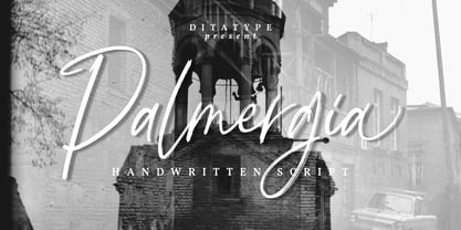 Palmergia is a modern handwritten font. With a classy and natural handwritten style, it brings a classy and chic typeface. Palmergia is best used for branding, logotype, and quotes. Includes: - Palmergia (OTF) Features: - Beautiful Ligatures - Stylistics Set - PUA Encoded - Multilingual Support - Numerals and Punctuation
 - Redmayne by Rillatype,
$15.00 Introducing, my latest font Redmayne! Redmayne is a display font with bold and strong feels that will bring big and strong feel to your design and make your design pop eyecatching even more! Redmayne is perfect for branding, packaging, logo design, headline, and many more.
 - Chalk Brush by Ditatype,
$29.00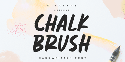 Chalk Brush is a Chalk brush font. With a playful and natural handwritten style, it brings a classy and chic typeface. Chalk Brush is best used for weddings, branding, logotype, and quotes. Includes: - Chalk Brush (OTF) Features: - PUA Encoded - Multilingual Support - Numerals and Punctuation
 - Hi TV by Yebhu,
$15.00 Hi TV is an good-humored and energetic display font. Although being an all caps alphabet, it counts two versions for a letter, easily accessed choose uppercase or lowercase. These slightly different letterforms will bring spontaneity and vitality to your designs. Crunching noises guaranteed!
 - Slash Signature by Din Studio,
$29.00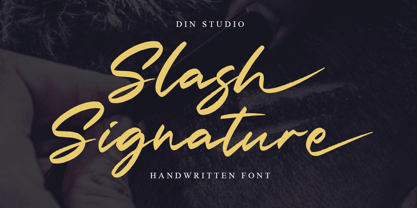 Slash Signature is a modern handwritten font. With a classy and natural handwritten style, it brings a classy and beautiful typeface. Slash signature is best used for branding, logotype, and quotes. Includes: - Slash Signature (OTF) Features: - Multilingual Support - Stylistics Set - PUA Encoded - Numerals and Punctuation
 - Pitchey Bloom by Din Studio,
$29.00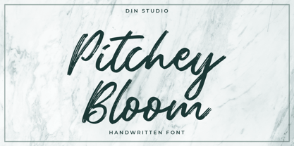 Pitchey Bloom is a modern handwritten font. With a classy and natural handwritten style, it brings a classy and beautiful typeface. Pitchey Bloom is best used for branding, logotype, and quotes. Includes: - Pitchey Bloom (OTF) Features: - Multilingual Support - Stylistics Set - PUA Encoded - Numerals and Punctuation
 - Mr Eaves Modern by Emigre,
$59.00 Mr Eaves is the often requested and finally finished sans-serif companion to Mrs Eaves, one of Emigre’s classic typeface designs. Created by Zuzana Licko, this 2009 addition to the Emigre Type Library expands the versatility of the original Mrs Eaves with two complimentary families: Mr Eaves Sans and Mr Eaves Modern. Mr Eaves was based on the proportions of Mrs Eaves, but Licko took some liberty with its design. One of the main concerns was to avoid creating a typeface that looked like it simply had its serifs cut off. And while it matches Mrs Eaves in weight, color, and armature, Mr Eaves stands as its own typeface with many unique characteristics. The Sans version relates most directly to the original serif version, noticeably in the roman lower case letters a, e, and g, as well as in subtle details such as the angled lead in strokes, the counter forms of the b, d, p, and q, and the flared leg of the capital R, the tail of the Q. The distinctly loose-fitting letter spacing of Mrs Eaves was applied also to the Sans version. This, together with generous built-in line spacing due to a small x-height and extended ascenders and descenders, renders the same kind of lightness and airiness when setting text that is so characteristic of Mrs Eaves. Deviations from the original Mrs Eaves are evident in the overall decrease of contrast, as well as in details such as the flag and tail of the f and j, and the finial of the t, which were shortened to maintain a cleaner, sans serif look. And the lower case c had to be balanced out differently after it lost its top ball terminal. And with the loss of serifs, Mr Eaves set width is slightly narrower. Mr Eaves Italic also carries over many forms from its Mrs Eaves model, most notably the v, w, and z, which are unusually flamboyant for a sans italic design. It also utilizes lead in and terminal tails that are reminiscent of the serif italic. The biggest departure here is the width of the characters. The extra narrow gauge and delicate features seemed more appropriate for the Serif than the Sans. To allow for a comfortable fit, Mr Eaves Italic has a more robust design and wider character width. Meanwhile, the Modern family provides an overall less humanistic look, with simpler and more geometric-looking shapes, most noticeably in the squared-off terminals and symmetric lower case counters. This family has moved furthest from its roots, yet still contains some of Mrs Eaves’ DNA. The Modern Italic is free of tails, and overall the Modern exhibits more repetition of forms, projecting a cleaner look. This provides stronger differentiation from the serif version whenever a more contrasting look is desired. Each version (Sans and Modern) contains its own set of alternates providing unique options for applications such as headlines, word logos, letterheads, pull quotes, and other short text settings. Both the Sans and Modern come in six weights. The simpler forms of a sans-serif provide the opportunity of more weights than do serif letter forms, which are more complex in structure, making it difficult to accommodate additional weight without distortions. Regular and Bold match the original Mrs Eaves weights, while the Heavy provides an additional weight for extra emphasis.
 - Mr Eaves Sans by Emigre,
$59.00 Mr Eaves is the sans-serif companion to Mrs Eaves, one of Emigre’s classic typeface designs. Created by Zuzana Licko, this 2009 addition to the Emigre Type Library expands the versatility of the original Mrs Eaves with two complementary families: Mr Eaves Sans and Mr Eaves Modern. Mr Eaves was based on the proportions of Mrs Eaves, but Licko took some liberty with its design. One of the main concerns was to avoid creating a typeface that looked like it simply had its serifs cut off. And while it matches Mrs Eaves in weight, color, and armature, Mr Eaves stands as its own typeface with many unique characteristics. The Sans version relates most directly to the original serif version, noticeably in the roman lower case letters a, e, and g, as well as in subtle details such as the angled lead in strokes, the counter forms of the b, d, p, and q, and the flared leg of the capital R, the tail of the Q. The distinctly loose-fitting letter spacing of Mrs Eaves was applied also to the Sans version. This, together with generous built-in line spacing due to a small x-height and extended ascenders and descenders, renders the same kind of lightness and airiness when setting text that is so characteristic of Mrs Eaves. Deviations from the original Mrs Eaves are evident in the overall decrease of contrast, as well as in details such as the flag and tail of the f and j, and the finial of the t, which were shortened to maintain a cleaner, sans serif look. And the lower case c had to be balanced out differently after it lost its top ball terminal. And with the loss of serifs, Mr Eaves set width is slightly narrower. Mr Eaves Italic also carries over many forms from its Mrs Eaves model, most notably the v, w, and z, which are unusually flamboyant for a sans italic design. It also utilizes lead in and terminal tails that are reminiscent of the serif italic. The biggest departure here is the width of the characters. The extra narrow gauge and delicate features seemed more appropriate for the Serif than the Sans. To allow for a comfortable fit, Mr Eaves Italic has a more robust design and wider character width. Meanwhile, the Modern family provides an overall less humanistic look, with simpler and more geometric-looking shapes, most noticeably in the squared-off terminals and symmetric lower case counters. This family has moved furthest from its roots, yet still contains some of Mrs Eaves' DNA. The Modern Italic is free of tails, and overall the Modern exhibits more repetition of forms, projecting a cleaner look. This provides stronger differentiation from the serif version whenever a more contrasting look is desired. Each version (Sans and Modern) contains its own set of alternates providing unique options for applications such as headlines, word logos, letterheads, pull quotes, and other short text settings. Both the Sans and Modern come in three weights. The simpler forms of a sans-serif provide the opportunity of more weights than do serif letter forms, which are more complex in structure, making it difficult to accommodate additional weight without distortions. Regular and Bold match the original Mrs Eaves weights, while the Heavy provides an additional weight for extra emphasis.
 - Canger staong by ryan creative,
$10.00 Introducing the Canger staong font which has a unique looking design. This font has curved joints like pipes. You can use Canger staong in modern and contemporary designs, and are suitable for use in various media such as stickers, posters, covers, typography and other digital media. -Uppercase. -Foreign Support, Numbers and Punctuation. -Alternates & ligatures -Simple installation. -Accessible in Adobe Illustrator, Adobe Photoshop. Adobe InDesign, it even works in Microsoft Word.
 - Rosallia GT by Gartype Studio,
$15.00 Know that love can be expressed without words? yes true love can be expressed through visual font must therefore called Rosallia GT was born to express your feelings and visualized according to the needs. Rosallia GT also comes with a swash to add a nice finishing touch This font is suitable for needs such as signature, decorating, writing in blogging website, up to poster poster to increase your sales
 - Brendria Signature by Rometheme,
$22.00 Brendria – Signature is a handwritten signature script font, this font looks classy, luxury, elegant, romantic, wedding, lovely, girly and awesome. Highlights: Standard glyphs (Uppercase, Lowercase, Numeral & Punctuation) Work on PC or Mac PUA Encoded Support Fonts include multilingual support for; ä ö ü Ä Ö Ü ß ¿ ¡ No special software is required, The fonts can be opened and used in Adobe Illustrator, Adobe Photoshop, Adobe InDesign, even work on Microsoft Word.
 - Serapion by Storm Type Foundry,
$39.00Another variation on the Renaissance-Baroque Roman face, it extends the selection of text type faces. In comparison with Jannon, the contrast within the letters has been enhanced. The dynamic elements of the Renaissance Roman face have been strengthened in a way which is illustrated best in the letters "a", "b" and "s". These letters contain, in condensed form, the principle of this type face - in round shapes the dark stroke invariably has a round finial at one end and a sharp one at the other. Another typical feature is the lower-case "g"; the upper part of this letter consists of two geometrically exact circles, the inner of which, a negative one, is immersed down on the right, upright to the direction of the lower loop and the upright knob. The vertical strokes slightly splay out upwards. Some details of the upper-case letters may seem to be too daring, but they are less apparent in the text sizes. It has to be admitted that typographers tend to draw letters in exaggerated sizes, as a result of which they stick to details. Serapion Italic are italics inspired partly by the Renaissance Cancelleresca. This is obvious from the drop-shaped finials of its lower-case descenders. The type face is suitable for illustrated books, art posters and short texts. It has a rather ugly name - after St. Serapion. - URW Geometric Extended by URW Type Foundry,
$35.99 URW Geometric Extended is the matching complement for the URW Geometric, including 20 additional extended styles. URW Geometric is a sans serif typeface inspired by the German geometric typefaces of the 1920s but designed for modern usability. The character shapes have optimized proportions and an improved balance, the x-height is increased, ascenders and descenders are decreased. Special glyphs, which are often designed afterwards for the original geometric typefaces from the 1920s, are perfectly integrated in the URW Geometric. These design characteristics increase the usability and legibility tremendously. With its 10 weights ranging from Thin to Black, plus 10 additional oblique styles, it has a great versatility in mind. The extreme light styles shine bright in large sizes, the middle weights are perfect for body copy and the bolder variants for the use of emphasis information or bring a strong impact to headlines and information. The optically balanced styles are designed to work in perfect harmony together. URW Geometric is functional, strong, simple and harmonized in form, and at a glance appears as a modern variant of its predecessors. Apart from the basic characters the design has an extra focus on the special glyphs. These are designed for today’s needs. For example: the email glyph looks modern and unique, including a perfectly balanced spacing. The number sign, in modern use called “hashtag”, is space saving and optically balanced for body text. Additionally, various extra and alternate glyphs are designed to provide a friendly usability. Including a wide Latin language support and character sets, URW Geometric is perfectly designed for today’s requirements.
 - Onick by Wordshape,
$- While researching the history of Onitsuka Tiger's branding and graphic design, I came across an odd, yet highly appealing piece of custom lettering on the company's ONICK ski boots from the 1970s. Reminiscent of aspects of the typeface Black-Out by Eli Carrico (released by my type foundry Wordshape), yet vertically compressed with razor-sliced counters and odd stencil element that makes up one of the legs of the "K", the ONICK lettering is a potential source for an intriguing modular font. I immediately thought of Ryoichi Tsunekawa as a potential collaborator to bring this piece of lettering to full-fledged life in the contemporary context. Based in Nagoya, Tsunekawa runs an independent type foundry called Dharma Type, including three specialized foundry sub-labels: Flat-It, devoted to display lettering; Prop-A-Ganda, a series of fonts inspired by and based on retro propaganda posters, movie posters, retail sign lettering & advertisements in the early 20th century; and Holiday Type, a series of decorative and retro scripts for holiday use. The past year has seen a flurry of notice of his work abroad, having been featured in both MyFonts' "Creative Characters" and YouWorkForThem's newsletter. As the work of most Japanese type designers is almost wholly unnoticed abroad, for Tsunekawa to be interviewed by two of the most popular type distribution companies in the world is definitely something beyond the norm. Perhaps it is because he works independently, or perhaps it is due to the charm and friendliness with which his typefaces are infused. Either way, this attention is both welcome and appreciated. Beyond mere charm, Tsunekawa's work is nuanced, detailed, and accessible due to its high level of finish. His fonts stand apart from his contemporaries in Latin typeface design in Japan due to his fascination with pop, vernacular and historical lettering from "non-pure" sources- whereas type designers like Kunihiko Okano and Akira Kobayashi have spent years analyzing the essence of Western letterform construction and unlocking the essence of Latin forms, Tsunekawa views surface and the awkward nature of his sources as being of value, as well. His irreverence for the formal doctrines of history imbue his typeface designs with a rugged inventiveness that would be missed by most- glyphs without source designs are guessed at and approximated, often in a manner wildly divergent from what Western eyes would assume. It is in these moments that I find sheer delight in Tsunekawa’s work and what make me most pleased to invite him aboard Neojaponisme and Onitsuka Tiger’s type development project. His assorted typefaces show an eclecticism in finish and as holistic systems- Tsunekawa's return email to me about the proposed type project showed a digital sketch of how a completed typeface family from the source lettering might look, rendered with an effortlessness and dedication to detail that belies a skilled craftsperson. Further development showed Tsunekawa’s rigor- the typeface in development rapidly featured glyphs ignored by many: a full set of fractions, Eastern European diacritics and accents, superior and inferior numerals, alternate characters, and custom ligatures - all designed with regulated, detailed spacing. ONICK is a typeface Tsunekawa should be proud of- an homage to a moment in history rendered in the absolute best fashion. We are proud to present it to the world! --Ian Lynam
 - Esencia by CastleType,
$59.00 Esencia, a CastleType original, was inspired by a Spanish stock certificate from 1941 with 11 beautiful art deco style letters for the words "PERFUMES y ESENCIAS". Slender, elegant, with a Spanish flare. Uppercase only with numerals and punctuation. Supports all European languages that use the Latin alphabet, as well as modern Greek and most languages that use the Cyrillic alphabet. Includes alternate E, F, and S.
 - Gerdingan by Twinletter,
$14.00 Introducing our newest Font, the name Gerdingan fonts are made with a script model that is intended to write beautiful names, and beautiful words and sentences of course with typography harmony. This font also offers beautiful abstract typography harmony for a wide variety of design projects, including natural handwriting in digital form for designs, quote designs, for social media business designs, advertisements, trademarks, promotional banners, posts, posters, signatures, and all designs require handwriting or whatever design you want. This font is equipped with uppercase, lowercase, numbers, punctuation marks, swhases and several variations on each character including multi-language. ================================================== This font is best suited for open type friendly applications. How to get alternative glyphs from open type fonts: http://adobe.ly/1m1fn4Y PUA Character Code - Fully accessible without additional design software. do not hesitate anymore start using this font. and Feel free to send any message you want to convey.
 - Hearts Love Smile by TypoGraphicDesign,
$9.00 The typeface Hearts Love Smile (All We Need Is LOVE) is designed in 2018–2021 for the font foundry Typo Graphic Design by Manuel Viergutz. A font-collection from rough hand-printed old wood letters, rubber-stamps and plastic stamps till clean vectors, photos … 302 glyphs of LOVE. Decorative extras like icons, arrows, dingbats, emojis, symbols, decorative ligatures (type the word LOVE for ♥ or SMILE for ☻ as OpenType-Feature dlig). For use in logos, magazines, posters, advertisement and packaging plus as webfont for decorative headlines. The font works best for display size. Have fun with this font & use the DEMO-FONT (with reduced glyph-set) FOR FREE! ■ Font Name: Hearts Love Smile ■ Font Styles: 1 Icons + DEMO (with reduced glyph-set) ■ Font Category: Display for headline size ■ Glyph Set: 302 glyphs / decorative extras like arrows, dingbats, emojis, symbols ■ Design Date: 2021 ■ Type Designer: Manuel Viergutz
 - Bright Gabbemy Cyr Gr by Ira Dvilyuk,
$20.00 The Bright Gabbemy Cyrillic Greek is handwritten monoline signature script font and additional symbols font with extras. It is the font pair with will be the best option for branding, logos, wedding invitations, social media, packaging, business cards, DIY projects, social media, and many others. Bright Gabbemy Symbols is the font with 36 lovely hand-drawn flourishes and illustrations. Bright Gabbemy Cyrillic script font contains the Cyrillic and Greek glyphs too. Bright Gabbemy script Latin part contains a full set of uppercase letters and 2 full sets of lowercase letters, (standard, and final forms with flourishes or teils. To make a needed form just type a letter with a number such as a1, b1, c1...after that select the word and apply the Open Type Features in programs such as Adobe Illustrator, Photoshop, and others) And 53 ligatures - which can be used to create a handwritten calligraphy look. The Cyrillic part of the font contains uppercase letters and 2 full sets of lowercase letters, (standard, initial and final form. To make a needed form just type a letter with a number such as a1, б1 в1... After that select the word and apply the Open Type Features in programmes such as Adobe Illustrator, Photoshop, and others) Bright Gabbemy Symbols is a font with over 36 hand-drawn elements, floral illustrations, and swashes and can help to make your design unique and matchless. Combine and merge swashes and illustrations to create your own designs and make borders, frames, dividers, logos, and more (just use A-Z or a-z and 0-9 keys in the included Bright Gabbemy Symbols font). A different symbol is assigned to each uppercase or lowercase standard character, so you do not need graphics software, just type the letter you need. Multilingual Support for 33 languages: Latin glyphs for Afrikaans, Albanian, Basque, Bosnian, Catalan, Danish, Dutch, English, Estonian, Faroese, Filipino, Finnish, French, Galician, Greek, Indonesian, Irish, Italian, Malay, Norwegian Bokmål, Portuguese, Slovenian, Spanish, Swahili, Swedish, Turkish, Welsh, Zulu. And Cyrillic glyphs support Russian, Belorussian, Bulgarian, Ukrainian, and Kazakh languages.
 - Koelle Ornaments by insigne,
$21.99The Koelle Ornaments series is based on the etchings of Chris Koelle of Portland Studios. This is the second collaboration between insigne and Portland Studios; the first yielded the inky and active script Blue Goblet. Chris has a unique style where he "frames" his work with small icons related to the story or subject. These are now available as Koelle ornaments. Koelle Ornaments have a gritty, used appearance, and have a late 70's stylistic feel to them. There are 145 highly detailed illustrations in the entire pack, separated into four different fonts. These illustrations can be resized without any loss of quality, and can be easily converted to outlines and modified. Some of the ornaments have a Christian theme, while others are more generic. To view what ornaments are available and the keys they map to, please view the sample .pdf. The sample .pdf is an excellent reference guide, and we encourage you to print it out to quickly refer to your favorite ornaments. - Austin Pen by Three Islands Press,
$29.00 Empresario Stephen F. Austin (1793-1836) is considered by many the “Father of Texas” for leading the first Anglo-American colony into the then-Mexican territory back in the 1820s. A few years later, while on a diplomatic mission to Mexico City, Austin was arrested on suspicion of plotting Texas independence and imprisoned for virtually all of 1834. During this time he kept a secret diary of his thoughts and musings—much of it written in Spanish. Austin Pen is my interpretation of Austin’s scribblings in this miniature prison journal (now in the collection of the wonderful Dolph Briscoe Center for American History, in the Texas city that bears his name). The little leather-bound book is filled with notes in ink and pencil—some of the faded penciled pages traced in ink years later by Austin’s nephew Moses Bryan. A genuine replication of 19th century cursive, Austin Pen has two styles: a fine regular weight, along with a bold style that replicates passages written with an over-inked pen. Each is legible and evocative of commonplace American penmanship of two centuries ago.
 - Antoge by Twinletter,
$12.00 Antoge is a handwritten script font with a pretty and cute feel but is still beautiful and elegant to use. This font has its own charm for you to use as a title, write names, words and sentences which of course look good and charming, and certainly this font is not only limited to that purpose but is also very special for every need of your project, be it a project. formal and non-formal, this font is still beautiful and elegant. Start creating incredible designs with this font! This captivating font also offers harmoniously beautiful abstract typography for a wide variety of design projects, including digital natural handwriting for designs, design quotes, for social media business designs, advertisements, trademarks, food and beverage promotion banners, text, posters, a signature. , and all designs require handwriting or whatever design you want. What's Included: Font file Standard glyph Binder Works on PC & Mac Simple installation It can be accessed in Adobe Illustrator, Adobe Photoshop, Adobe InDesign, and even works in Microsoft Word. PUA Encoded Characters - Fully accessible without additional design software. Fonts include multilingual support for; Afrikaans, Albanian, Croatian, Czech, Danish, Dutch, English, Estonian, Finnish, French, German, Hungarian, Italian, Norwegian, Polish, Portuguese, Slovak, Slovenian, Spanish, Swedish