10,000 search results
(0.037 seconds)
- Menhart by Monotype,
$29.99Czech designer Oldrich Menhart (1897-1962) devoted his life to making letters. He was a calligrapher, lettering artist, and typeface designer with over twenty faces to his credit. The Monotype typeface, Menhart, was the second of his designs. Menhart began work on the design in the early 1930s and turned over his final artwork to the Monotype Drawing Office in 1934. The first size cut was 14 Didot (Didot points are the traditional European system of type measure, and are roughly equivalent to the point system commonly used by today's digital fonts). The 14D font was followed by 18D and 24D, indicating that the design was considered most suitable for display work. However, a 10D size was later cut from the same master drawings at the request of a Monotype customer. Menhart's design was light and open, with an even color and a slight squareness" to its round shapes. Because the Czech alphabet has 15 accented letters, Menhart included these diacritics as an integral part of his design, not as an afterthought. As a result, accented copy set in Menhart has a cohesive quality rarely seen in other typefaces. Monotype's new digital release of Menhart is the first revival since the hot metal fonts were cut. Menhart Display is based on the original Monotype drawings, while a slightly heavier, re-spaced version has been created for text sizes. Both versions offer the full capabilities of the OpenType format, such as the automatic insertion of old style figures, ligatures and small caps. In addition to English, the extended character set supports most Central European and many Eastern European languages. One of Menhart's lifelong goals was to share the richness of his Czech culture by drawing typefaces that uniquely served Czechoslovakia literature. In his words: "I believe that a Czech style of type comes above all from the spirit in which it was designed, which gives it its 'signature,' and not so much from decorative composition, and even less from the geographic location of its creation." The typeface Menhart is a tribute to his values. Now, Menhart Pro and Menhart Display Pro capture the unique personality of this timeless design while greatly extending its range of use. " - Stinger by Zetafonts,
$39.00 Since their first appearance as Italians on the pages of the 1821 William Caslon type specimens, reverse contrast typefaces have been typography's best loved quirky outcasts. Subverting the traditional relationship between thick verticals and thin horizontals made them perfect for eye-catching advertisements. The unexpected contrasts and the thick slabs produced by reverse-contrast serifs became ubiquitous in period posters, and synonymous with wild west and circus iconography. In designing Stinger, the Zetafonts design team composed by Maria Chiara Fantini, Andrea Tartarelli and Francesco Canovaro and orchestrated by Cosimo Lorenzo Pancini decided to marry this subversive tradition with the workhorse approach of modernist sans serif typefaces like Univers, developing a super-family with four widths, each in five different weights, from thin to heavy. This gives the designer a full range of options for type setting, with the Normal and Fit widths providing two different text-sized alternatives, the wide width adding display and titling options and the Slim ready to deal with the space-saving necessities of extremely long texts. True italics have been added developed for all weights and variants, bringing the Stinger family to a total of 40 fonts, with a latin extended + Russian Cyrillic character set covering over 200 languages, and open type features including positional numbers, stylistic sets and alternate forms. In the crowded panorama of contemporary grotesque typefaces, all aiming to stark geometric perfection, Stinger stands out with its bold choices and strong personality. From the calligraphy-inspired terminals in the thin weights to the logo-ready sculptural approach in the heavy weights, each variant manages to look striking without forgetting the readability and flexibility lessons of modern reverse-contrast classics like those designed by Excoffon or Novarese. A variable version is included with the full family, allowing maximum flexibility and control for the designer over the wide range of expression capabilities of the Stinger super family.
 - Tavern by FontMesa,
$25.00 Tavern is a super font family based on our Algerian Mesa design, with Tavern we've greatly expanded the usability by creating light and bold weights plus all new for 2020 with the introduction of extra bold and black weights Tavern is now a five weight family. The addition of the bold weight made it possible to go further with the design by adding open faced shadowed, outline and fill versions. Please note, the fill fonts are aligned to go with the open faced versions, they may work with the outline versions, however you will have to apply them one letter at a time. The Tavern Fill fonts may also be used a stand alone font, however, the spacing is much wider than the regular solid black weights of Tavern. In the old days of printing, fill fonts rarely lined up perfect with the open or outline font, this created a misprinted look that's much in style today. To create that misprinted look using two different colors, try layering the outline fonts offset over the top of the solid black versions. Next we come to the small caps and X versions, for a font that's mostly seen used in all caps we felt a small caps would come in handy. The X in Tavern X stands for higher X-height, we've taken our standard lowercase and raised it for greater visibility in small text and for signage where you want the look of a lowercase but it needs to be readable from the street. In August of 2016 I started the project of expanding this font into more weights after seeing the font in use where someone tried creating a bold version by adding a stroke fill around the letters. The result didn't look very good, the stroke fill also caused the shadow line to merge with the serifs on some letters. This lead me to experiment to see if a new bold weight was possible for this font and I'm pleased to say that it was. After the bold weight was finished I decided to type the regular and bold weights together in a first word thin second word bold combination, however the weight difference between the two wasn't enough contrast. This lead me to wonder if a lighter weight was possible for this font, as you can see yes it was, so now for the first time in the history of this old 1908 type design you can type a first word thin second word bold combination. So why the name change from Algerian to Tavern? Since the original font was designed in England by the Stephenson Blake type foundry I decided to give this font a name that reminded you of the country it came from, however, there were other more technical reasons. During the creation of the bold weight the engraved shadow line was sticking out too far horizontally on the bottom right of the serifs dramatically throwing the whole font off balance. The original font encountered this problem on the uppercase E, L and Z, their solution was a diagonal cut corner which was now needed across any glyph in the new bold weight with a serif on the bottom right side. In order to make the light and regular weights blend well with the bold weight diagonal cut offs were needed and added as well. This changed the look of the font from the original and why I decided to change the name, additional concerns were, if you're designing a period piece where the font needs to be authentic then this font would be too new. Regular vs. Alt version? The alternate version came about after seeing the regular version used as a logo and secondary text on a major product label. I felt that some of the features of the regular version didn't look good as smaller secondary text, this gave me the idea to create an alternate version that would work well for secondary text in an advertising layout. But don't stop there, the alternate version can be used as a logo too and feel free to exchange letters between both regular and alternate versions. Where are the original alternates from Algerian? Original alternates from Algerian are built into the regular versions of Tavern plus new alternates have been created. We're excited to introduce, for the first time, all new swash capitals for this classic font, you're going to love the way they look in your ad layout, sign or logo. The best way to access alternate letters in Tavern is with the glyph map in Adobe Illustrator and Adobe InDesign products, from Adobe Illustrator you can copy and paste into Photoshop as a smart object and take advantage of all the text layer style features Photoshop has to offer. There may be third party character maps available for accessing alternate glyphs but we can't advise you in that area. I know what you're thinking, will there be a Tavern Condensed? It takes a lot of hours to produce a large font family such as this, a future condensed version will depend on how popular this standard version is. If you love Tavern we're happy to introduce the first weathered edge version of this font called Bay Tavern available in February 2020.
 - Shard by Device,
$39.00 Shard was originally commissioned for Nickelodeon’s 3D reboot of the Teenage Mutant Ninja Turtles franchise. It complemented the show’s new angular logo, which Rian Hughes also designed. There are alternative versions of many letters available in the upper and lower case keys, and a selection of around 90 ligatures that automatically substitute themselves in running text to give a tight, interlocked fit.
 - Christmas Blink by Jolicia Type,
$25.00 Introducing Christmas Blink, the perfect festive font to add a touch of holiday magic to your designs! This whimsical and joyful typeface is specially crafted to bring the spirit of Christmas to life in your creative projects. "Christmas Blink" is more than just a font, it's a journey into a playful wonderland of letters adorned with festive charm. Each character sparkles with a unique personality, making your text come alive with the joyful spirit of the season. The font's playful elegance ensures that it's perfect for a wide range of Christmas-themed designs. This font comes equipped with charming variations for select characters, allowing you to customize your text and add a personal touch to your designs. Experiment with alternate styles to create truly unique and eye-catching compositions.
 - Kalinda Script by Rillatype,
$19.00 Discover the allure of Kalinda Elegant Script Font. Unlock a world of exquisite design possibilities. Immerse yourself in its elegance and luxurious vibe perfect, for elevating your design projects to heights. Whether you're crafting enchanting wedding invitations that ooze sophistication or adding a touch of opulence to branding, packaging, posters or signage Kalinda is your go to choice. With its extensive range of OpenType features, like ligatures and swashes this crafted script font empowers you to infuse your designs with timeless beauty effortlessly. Embrace the artistry of Kalindas styled characters. Watch as your creative vision comes alive capturing hearts and inspiring minds.
 - Calligraphic Ornaments by ITC,
$29.99English designer Richard Bradley created the Calligraphic Ornaments symbol font for ITC in the 1990s. Drawn in a lively traditional style similar to fine calligraphy, this font's characters set the perfect holiday spirit with little teddy bears, a Santa Claus, ringing bells, holly leaves, and other charms. - Little King Owl by Letter Art Studio,
$14.00 Little King Owl is a simple and interesting handwritten font. Its friendly feel makes this font incredibly versatile, fitting a wide range of contexts. It looks stunning on thank you cards, quotes, greeting cards, logos, business cards and every other design which needs of a art. Add it to your creative ideas and notice how it makes them stand out!
 - Pisang by Hanoded,
$15.00 Pisang means banana in Malay and Bahasa Indonesia. It is a tall, narrow and very clear font, ideal for books, recipes, food labeling and posters. It comes with a full range of diacritics and some interesting alternates for the closed glyphs as well.
 - Zamroot by Evo Studio,
$16.00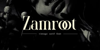 Zamroot a distinct and unique serif font. It feels playfully nostalgic and delivers an incredible vintage aesthetic. Zamroot will elevate a wide range of design projects to the highest level, be it branding, headings, wedding designs, invitations, signatures, logos, labels, and much more!
 - Linotype Pegathlon by Linotype,
$29.99Linotype Pegathlon is an unusual, eye-catching typeface, perfect for headlines and short texts. The bold strokes have a mystical, Asian touch and allow a large range of applications. Whether a text should look exotic or esoteric, Linotype Pegathlon is an excellent choice. - Rafter by Vertigo,
$18.00 Rafter is a new, sans font family, with modern, narrow line, graphically attractive with both upper and lower case letters. Spaced and mastered for optimal readability, Rafter plays well in a wide range of projects and applications. The typeface provides multilingual support.
 - Button Grinder by FHFont,
$19.00 Button Grinder is display font with handwritten dry brush style, ispired by halloween event and grunge rock style, with opentype feature include of the font. Suitable for design, element design, wedding, event, t-shirt, logo, badges, sticker, and awesome work. Caps Only Fonts.
 - Notably Absent by Ali Hamidi,
$10.00 Notably Absent is a cool and fun styled display font. It will elevate a wide range of crafting ideas, from cards, to branding, labels and much more. Add it confidently to your favorite creations and let yourself be amazed by the outcome generated.
 - Murisa Mondriana by Murisa Studio,
$10.00 Mondriana is a cool and modern looking sans serif font. It will elevate a wide range of crafting ideas, from cards, to branding, labels and much more. Add it confidently to your favorite creations and let yourself be amazed by the outcome generated.
 - Aterline by AEN Creative Studio,
$15.00 Aterline is a simple but elegant slab serif font family. It will elevate a wide range of crafting ideas, from cards to branding, labels, and much more. Add it confidently to your favorite creations and let yourself be amazed by the outcome generated.
 - Jumping Squid Graffiti by Sipanji21,
$16.00 Jumping Squid is a Handwritten font with a Natural monoline graffiti style, perfect for your awesome urban designs. It will elevate a wide range of design projects to the highest levels, be it branding, headings, designs, invitations, signatures, logos, labels, and much more!
 - Vandal Zoy Graffiti by Sipanji21,
$18.00 Vandal Zoy is a Thick font with a graffiti style and bubble looks. It will elevate a wide range of design projects to the highest level, be it branding, headings, wedding designs, invitations, signatures, logotype, wall art illustration, apparel, labels, and much more!
 - Dupont Gothic by Hexagon Foundry,
$19.00 Dupont Gothic is a sleek and contemporary sans-serif font that embodies elegance, clarity, and modernity. With its clean lines, balanced proportions, and distinctive character, Dupont Gothic is a versatile typeface that can be used in many ways. The simplicity of Dupont Gothic lends itself to a wide range of applications. Whether used for headlines, body text, or branding, this font possesses a quality to effortlessly adapt to different design contexts. The font comes in 10 weights with matching oblique characters, 2 widths, and 2 style sets that ensure the endless combinations and possibilities.
 - Corbel by Microsoft Corporation,
$49.99OpenType Layout features: Smallcaps, stylistic alternates, localized forms, standard ligatures, uppercase-sensitive forms and spacing, oldstyle figures, lining figures, smallcap figures, arbitrary fractions, superscript, subscript. Corbel is designed to give an uncluttered and clean appearance on screen. The letter forms are open with soft, flowing curves. It is legible, clear, and functional at small sizes. At larger sizes, the detailing and style of the shapes is more apparent, resulting in a modern sans serif type with a wide range of possible uses. This font is suitable for business documents, email, web design. - Ryman Gothic by W Type Foundry,
$25.00 Ryman Gothic is inspired by American Wood Types and Gothic Typefaces, mainly in the work of Edwin Allen and Morris Fuller Benton. The result is a hybrid combining gothic proportions with the contrast of wood types. While drawing consonants guided by gothic proportions, vowels were designed slightly wider, making them not only more legible when it comes to long text designs, but also more attractive. Ryman Gothic comes in 8 weights plus its matching italics, ranging from Thin to Heavy. Each weight includes extended language support (Latin + Cyrillic + Greek), ligatures, arrows and more.
 - Oscar Bravo by Studio K,
$35.00 This font family was inspired by a visit to the Duxford Air Museum just outside of Cambridge, UK, where the whole history of aviation is represented in a series of exhibits ranging from early prop planes to supersonic jetliners. A common feature is the clipped, blockletter painted on the wing or fuselage of each aircraft, my interpretation of which I present here. To add an original touch each letter incorporates its designation in the NATO phonetic alphabet. In response to popular demand this font is now available in 'Scotch' and 'Irish' versions. If you take your whiskey with an 'e' choose Oscar Bravo Whiskey. If you prefer it neat, choose Oscar Bravo. And no, I am not going to bring out an Oscar Bravo Bourbon version! For variations on this font family see also Alma Mater.
 - Harlean by Laura Worthington,
$35.00 Harlean is lively and exciting with eccentric letterforms that vary in axis, baseline, and height, a tribute to Harlean’s flexible-nib pen origins. Its curving strokes speak of free-spirited adventure and jazz-inflected, improvisational style. Harlean’s hand-lettered appearance is fashioned from the savvy use of contextual alternates. Easily customize your words with swashes and alternate forms to express your creativity, then complement your layout with ornaments, borders, and corner elements. See what’s included! http://bit.ly/2cjNavf *NOTE* Basic versions DO NOT include swashes, alternates or ornaments This font has been specially coded for access of all the swashes, alternates and ornaments without the need for professional design software! Info and instructions here: http://lauraworthingtontype.com/faqs/
 - Mellow Morning by Set Sail Studios,
$18.00 Inject some irresistible fun into your designs with the Mellow Morning Font Duo! This playful font duo consists of a fast flowing signature script, and a charming small caps font as the perfect companion. But that's not all - also included is a bonus doodle font containing 45 hand-drawn doodles - designed to add an eye catching, hand-made appeal to your Mellow Morning fonts. The Mellow Morning Family includes; Mellow Morning Script • A clean, free-flowing handwritten signature font containing upper & lowercase characters, numerals, and a large range of punctuation. Mellow Morning Script Alt • This is a second version of Mellow Morning Script, with a completely new set of both upper and lowercase characters. If you wanted to avoid letters looking the same each time to recreate a custom-made style, or try a different word shape, simply switch to this font for an additional layout option. Mellow Morning Small Caps • A clean, charming handwritten all-caps font. Contains 2 sets of a-z letters, simply switch between upper and lowercase to toggle between both sets. Also includes 8 stylised letters for extra flair, accessible via a Glyphs panel or by switching on Stylistic Alternates. Mellow Morning Small Caps Italic • An italicised version of Mellow Morning Small Caps, which can be used for a more fast-hand flow to your text. Mellow Morning Doodles • A set of 45 doodles designed to pair with the Script & Small Caps fonts. Simply install this as it's own font, and type any A-Z or a-s character to generate each doodle. Language Support • All Mellow Morning fonts support the following languages; English, French, Italian, Spanish, Portuguese, German, Swedish, Norwegian, Danish, Dutch, Finnish, Indonesian, Malay, Hungarian, Polish, Croatian, Turkish, Romanian, Czech, Latvian, Lithuanian, Slovak, Slovenian
 - Rickslord by Nathatype,
$29.00 Rickslord is an uppercase display font that transports you back in the early 20th century. Some characters show high contrast between thick and thin strokes, creating a dramatic visual impact, while others maintain a more consistent weight for a balanced appearance. This blend of contrasts adds an unexpected dynamic quality to the text, making every word a work of art. Beautiful ornaments are included as a bonus. Rickslord fits in headlines, logos, branding materials, and many more.
 - Mollies by ErlosDesign,
$10.00 Mollies is an elegant and luxurious sans serif font. Trendy and stylish, this font will elevate each of your creations. Mollies is PUA encoded which means you can access all of the glyphs and swashes with ease! The file you will get is: • Works on PC & Mac • Simple installation • Can be accessed in Adobe Illustrator, Adobe Photoshop, Adobe InDesign, and even works in Microsoft Word. • Encoded PUA Character - Can be accessed completely without additional design software. Enjoy!
 - Play Toon by Twinletter,
$14.00 Playtoon is a playful display typeface that may be used for a variety of projects. Each letter in this typeface has been specifically created to emphasize a fun, distinctive, and distinct personality. also in a unique pattern on each letter, greatly enhancing the uniqueness and enjoyment of your project. Of course, this typeface is appropriate for a wide range of creative applications, including game covers, titles, book covers, outdoor events, posters, banners, promotional material, movie titles, YouTube covers and thumbnails, children’s games, cartoon projects, and other unique projects.
 - Yorklyn Stencil by House Industries,
$33.00 Yorklyn Stencil includes three fonts, each optimized for use at different size ranges. Grande has greater contrast and more delicate breaks designed to be used at larger sizes where finer details are more conspicuous. Medium and Petite are intended for smaller sizes where the breaks and contours must be more resilient. We embedded several OpenType layout features, including traditional fractions and nut fractions. We extensively tested Yorklyn Stencil in what might be the broadest range of media and conditions in the annals of Northwestern Delaware typefounding history. From the ceramic kilns of Heath Ceramics to our studio’s stucco facade, Yorklyn Stencil’s robust curves and deceptively delicate breaks will withstand a wide variety of harsh conditions with unprecedented aplomb. Whether you’re hand cutting a stencil to buzz your bespoke restaurant bar stools or simply looking for a practical yet illustrative display font, Yorklyn Stencil’s elegant efficacy will enhance any creative composition. Like all good subversives, House Industries hides in plain sight while amplifying the look, feel and style of the world’s most interesting brands, products and people. Based in Delaware, visually influencing the world.
 - Empty Streets by PizzaDude.dk,
$15.00 Empty Streets is a brush made font with loads of attitude!
 - Bremoleaf by Alit Design,
$22.00 Introducing "Bremoleaf" - The Nature-Inspired Font 🌿 Embrace the beauty of nature with "Bremoleaf," a unique and versatile font that seamlessly blends the organic elegance of leaves with a harmonious mix of sans serif and script elements. This exquisite typeface is more than just a font; it's a work of art that brings the enchantment of nature to your creative projects. 🌱 The "Bremoleaf" font is a perfect choice for those who seek a harmonious fusion of two distinct typographic styles. It effortlessly combines the sleek and modern characteristics of sans serif letters with the flowing, graceful curves of an elegant script. This harmonious pairing creates a visually captivating and versatile typeface that suits a wide range of design needs. 🌿 With dynamic ligatures and an extensive selection of alternates, "Bremoleaf" offers endless possibilities to express your creativity. These ligatures and alternatives seamlessly flow, enhancing the readability and aesthetic appeal of your text. Whether you're designing a logo, a wedding invitation, a branding project, or any other creative endeavor, "Bremoleaf" has you covered. ✨ "Bremoleaf" boasts a wide range of characters and symbols, providing support for a staggering 708 characters. This inclusive font enables you to create content in various languages and styles with ease. Plus, it includes PUA (Private Use Area) Unicode, ensuring that you can access all its special characters and unique features effortlessly. 🌍 "Bremoleaf" is not bound by language or borders. It offers comprehensive multilingual support, making it the perfect choice for projects that target global audiences. From English to Spanish, French to Vietnamse, this font will help you convey your message beautifully and effectively. Experience the enchantment of "Bremoleaf" and elevate your design projects to new heights. This nature-inspired font brings the organic beauty of leaves to your creations, offering an irresistible combination of style and functionality. With "Bremoleaf," your designs will flourish like never before.
 - Umba Sans by TypeThis!Studio,
$29.00 UMBA Sans is a contemporary typeface designed by Anita Jürgeleit. The wide shaped curves show a new aesthetic appeal in an unexpected pleasant way. Umba Sans fulfills your corporate design needs as well as your editorial demands and helps to push your design to the next level. Thirty styles from thin to bold and matching italics - as well as small caps and alternates - help you create a contemporary design. Umba Sans provides a wide range of variations. Your design may have many faces but it all matches together. Separate styles for alternate and small caps will show up in your font menu, making sure that you stay aware of the wide range of possibilities your new favourite typeface provides. If you like our fonts, you might want to sign up at: www.typethis.studio
 - Zoxi by Up Up Creative,
$29.00 Introducing Zoxi, an elegant, full-featured script font with subtle dip-pen calligraphy texture and tons of OpenType features. Hand-lettered with delicate thin strokes and more substantial thick strokes, Zoxi is particularly well-suited to invitations, branding, and editorial design. Zoxi comes with more than 1000 glyphs! Specific OpenType features include contextual alternates, stylistic alternates, initial and final forms, multiple alternate glyphs for many letters (accessed through the glyphs panel), multilingual support (including multiple currency symbols), 158 standard and discretionary ligatures, standard numbers, and TEN ampersand styles. Zoxi also includes wordart for fourteen common invitation-related words and a set of full-scale ordinals (both accessed through the glyphs panel). The OpenType features can be very easily accessed by using OpenType-savvy programs such as Adobe Illustrator and Adobe InDesign. (To access these awesome features in Microsoft Word, you'll need to get comfortable with the advanced tab of Word's font menu. If you need help with this, ask me!)
 - Floki by LetterMaker,
$39.90 Floki is a contemporary condensed sans serif with sixteen styles ranging from extralight to extrabold and accompanying italics. The amount of styles, condensed proportions and large character set make Floki suitable for various uses such as infographics, packaging, branding, advertising and editorial design. Floki’s aesthetics are distinctly modern and they have a hint of softness which comes from sublty curving the diagonal strokes in letters such as A and V. This feature really shines when you set text in tightly set caps as big as possible. Stylistically Floki leans more to the humanist sans serif but it has a flavour of geometry in its shapes as well. The result of this combination of features is a highly usable typeface with a clear voice of it's own. All styles feature small caps and multiple sets on numerals including lining figures, old style figures, tabular figures, small cap figures, numerators, denominators, superiors, inferiors and fractions. Floki has latin extended character set making it well suited for multilingual typography.
 - Rabie by Ethar Elaagib,
$29.00 Rabie is a cute, bubbly handwritten typeface that makes your design projects look friendlier, thanks to its curviness and cuteness. With over 300 ligatures, Rabie has the look of a truly handcrafted typeface with naturally flowing letters. Rabie comes as a variable font, ranging from extralight to extrabold weights, to help you customize the look as needed. Rabie is full of love, hugs and cuddles. This playful typeface has an inviting vibe that suits a variety of design projects from branding design and logos, to children's books and stationery.
 - Ragged Write NF by Nick's Fonts,
$10.00This rugged rascal is based on at old ATF “original” design called “Hearst” (although Frederic Goudy claimed it was a pirated version of one of his designs). Its commanding, rough-hewn character makes it suitable for headlines, but its large x-height makes it practical for subheads as well. Available in roman and italic versions. Both versions of this font include the complete Unicode 1252 Latin and Unicode 1250 Central European character sets. - Metal Thorn by Alit Design,
$22.00 Introducing "Metal Thorn" – a font that seamlessly blends the raw power of metal with the edgy intensity of thorns, all wrapped up in a cutting-edge cyber aesthetic. This font is a manifestation of metal brutalism, designed to make a bold statement with its fierce and avant-garde personality. Metal Brutalism Concept: Inspired by the industrial strength and unapologetic nature of metal, Metal Thorn embodies the essence of brutalism, creating a visual impact that is both commanding and unyielding. Fierce Thorn Design: The thorn elements within the font give it a sharp and aggressive edge, adding an extra layer of intensity. Each character is crafted with precision, making Metal Thorn a formidable choice for those who seek to convey strength and determination through typography. Modern Cyber Feel: Infusing a touch of cyber aesthetics, Metal Thorn transcends traditional boundaries. Its sleek and futuristic design elements make it perfect for projects that demand a contemporary, cutting-edge vibe. Extensive Glyph Set: With a generous set of 1014 characters, Metal Thorn ensures versatility and flexibility in your design projects. From standard Latin characters to multilingual support, this font caters to a wide range of creative needs. Alternate and Ligature Support: Unlock even more design possibilities with alternate characters and ligatures. Metal Thorn allows you to experiment with different letterforms, providing options for a customized and dynamic typographic experience. Multilingual Support: Metal Thorn breaks language barriers, offering comprehensive multilingual support. Communicate your message globally with ease, as this font accommodates a diverse range of languages. Whether you're working on a poster, branding, digital art, or any other creative endeavor, Metal Thorn is your go-to choice for a font that demands attention. Elevate your designs with the raw energy of metal, the fierceness of thorns, and the modern sophistication of cyber aesthetics – all encapsulated in the captivating Metal Thorn font.
 - Primitivus by PizzaDude.dk,
$18.00 It all started with making of a simple all-caps font. I drew the whole alphabet, numbers all else needed - but something wasn't quite right...the lettershapes were fine, but quite boring. Then I took a drastic decision: I started all over again ... meaning, I printed the whole thing, messed it up using a wet cloth and wrinkled the paper - then scanned it all again, and imported all the graphics yet again. A lot of work, yes - but personally I think it was worth it! But anyway, that's the story of how Primitivus was made ... well, almost, but not quite ... but that's another story! Use Primitivus for anything that needs that special kind of look were handdrawn letters meets grunge! Play around with the 4 different versions of each letter to make your text look even more random and natural!
 - Gill Sans MT by Monotype,
$45.99 Gill Sans is a humanistic sans serif family that, while is considered by many to be quintessentially British in tone and concept, has been used in virtually every country and in nearly every application imaginable. Gill Sans has reached this level of near-ubiquity for one simple—and very good—reason: it is an exceptionally distinctive design with a potential range of use that is almost limitless. This toolkit family includes a wide range of styles including the standards such as Light—which is open and elegant—and a Regular that, with its flat-bottomed d, flat-topped p and q and triangular-topped t, has a more compact and muscular appearance. Its Bold styles tend to echo the softer, more open style of the light while the extra bold and ultra bold have their own vivid personalities, but each of them would make for an eye-catching headline. Take into account the family’s many weights, including condensed and extra condensed designs, and extended language support and you have yourself a tool you’ll be thrilled to return to, time and again. Gill Sans was designed by Eric Gill: a versatile, brilliant, and prolifically successful designer of the early part of the last century. One of the main reasons for the enduring success of his namesake design is that it is based on Roman character shapes and proportions, making it unlike virtually any other sans serif out there. Gill also worked his own warmth and humanity into his design, resulting in a typeface in which each weight retains a distinct personality of its own. Pair with serif fonts like Gill's own Joanna; or more modern offerings like Frutiger® Serif, Malabar™, Syntax® Serif, FF Scala®, or DIN Next™ Slab.
 - Gernsheim by Brenners Template,
$19.00 Gernsheim is a semi condensed display sans serif font family. This font family has been created for use in headlines and logo display fitted on showcase screen. 9 weights and 18 font styles make up the initial release. To increase the adoption of a wide range of display fonts, the individual glyphs' handle fluctuations were subtly applied. The compromise of disproportion between straight lines and curves improves glyphs autonomy and relieves tension. And by applying rounded corner effects to each style, it presents the reader with softness and comfort. It is designed so that the rebellious disproportion created by heavy styles transition to flat and classy tenderness as the thin style approaches. Try the uniqueness and excitement of individual styles for yourself
 - Arboria by Type-Ø-Tones,
$60.00 Arboria has been a long-term project. Starting with the commission of a custom ‘architect’ font, this typeface has been changing over the years to its current form, which is its public debut. The source is named after the capital of planet Mongo, a futuristic city with art decó influences in their buildings. Arboria maintains that tension but is influenced by all elements of concern to his author. The result is a hybrid Grotesque with nods to the XXII century. Arboria family consists of six weights and matching italics, aside from many characters (it covers Latin and CE languages), the wide range OpenType features allows Arboria to perform great as a text and as a display typeface. Please check the ‘Read me’ file for more specifications.