10,000 search results
(0.155 seconds)
- Ghimli by Anonymous Typedesigners,
$40.00 Ghimli Antique was created using the ping-pong method, based on the graphic idea of Artem Rulev and the participation of Vladimir Anosov in the future. Then we sent the font file to each other, adding something of our own and making corrections, and so on many times. Ghimli Antique has already managed to get 2nd place in the Granshan competition in the Cyrillic section. The name was obtained by combining the name of the dwarf Gimli and Studio Ghibli. The font is quite evil, incredibly dense, bold. It looks like when the dwarves closed ranks and go to defend their lands from the invasion of the orcs. Suitable for short word design, logo creation, menu layout and use in movies about gnomes and anything fantastic.
 - FF ThreeSix by FontFont,
$62.99 British type designers Paul McNeil and Hamish Muir created this display FontFont in 2012. The family has 52 weights, ranging from 018 Thin to 144 Black and is ideally suited for logo, branding and creative industries, music and nightlife as well as poster and billboards. FF ThreeSix provides advanced typographical support with features such as ligatures. It comes with tabular lining and proportional lining figures. FF ThreeSix received several awards: the ISTD Premier award in 2011 and the ISTD Certificate of Excellence award in 2011. The typeface was also selected as one of Typographica’s favorite typefaces of 2012.
 - Bocfer by Brenners Template,
$19.00 Designed by Ryul Davidson, this typeface is a special style for designers who prefer a sense of space and differentiation in the layout system. It applies a design concept that continues the modern and contemporary grotesque lineage. And, It adopts a somewhat low x-height system and has a classic and sophisticated balance. As the height of lowercase letters is lowered, more differentiated and rhythmic typography can be realized, and it showcases a wide range of coverage from offline publishing to display areas. The elaborately optimized kerning system is a good choice for designers who prefer more professional logos and editorial designs.
 - Retail Shop JNL by Jeff Levine,
$29.00 Vintage New York neon signage alongside the landmark Dubrow's Cafeteria [probably circa the 1940s] of the words "retail shop" inspired the namesake digital type design. Retail Shop JNL is a bold and somewhat eccentric Art Deco font with varying widths and unusual character forms available in both regular and oblique versions.
 - Mintely by Din Studio,
$29.00 Mintely is a sophisticated and versatile serif font family designed to elevate your typography to new heights of elegance and legibility. With its 6 style variations and 8 weight options, this font offers an extensive array of choices to suit a wide range of design projects. This family combines classic and modern elements, resulting in a timeless design that can adapt to various design contexts. The 6 style variations in this serif provide you with a variety of typographic options, allowing you to experiment with different looks and moods. Whether you need a sleek and minimalistic appearance or a more decorative and ornate style, Mintely has you covered. Additionally, the 8 weight options in Mintely offer a wide range of possibilities in terms of contrast and emphasis. From thin and elegant weights to bold and impactful variations, this font family ensures that you can effortlessly find the perfect weight for your specific design needs. Because of its legibility you can use this font in a variation of text sizes. Enjoy the available features here. Features: Multilingual Supports PUA Encoded Numerals and Punctuations Mintely fits in headlines, logos, posters, flyers, invitations, branding materials, print media, editorial layouts, headers, and any many more. Find out more ways to use this font by taking a look at the font preview. Thanks for purchasing our fonts. Hopefully, you have a great time using our font. Feel free to contact us anytime for further information or when you have trouble with the font. Thanks a lot and happy designing.
 - Blugie by Cititype,
$12.00 Blugie is a tasty new font for all of your fun projects! It's a mixed-case font (uppercase and lowercase are all the same height) so you can mix and match letters within a word.
 - FM Easter Pro by The Fontmaker,
$24.00 FM Easter Pro consists of 26 hand-lettered Easter greetings like Happy Easter, Easter Joy, Easter Greetings etc. All the words and phrases are original and handwritten - a high quality calligraphy for your holiday projects.
 - Work In Progress by StereoType Fonts,
$39.00 Work In Progress is a smooth script font with a very specific style of connected curves. It brings a unique curly style with the possibility to create dynamic dancing words with it's ligatures and alternates.
 - Soothsayer by Comicraft,
$39.00 A soft spoken sorceress whispers sweet somethings in your shell-like ear. Her words excite and enthrall, tantalize and tease, they soothe and seduce, stimulate and sustain you, they awaken and arouse you, they entice and engorge you, they -- oh, I'm sorry, what was I supposed to be saying? Oh yeah, from the pages of DC Comics' Vertigo title, THE WITCHING HOUR, and Joe Kelly and Chris Bachalo's STEAMPUNK, Comicraft is happy to make available one of our most requested fonts... Hey, what happened to that cute girl with the white hair? And, Hey, Where's my wallet?!?
 - HWT Arabesque by Hamilton Wood Type Collection,
$24.95 A long lost Art Nouveau wood type from the Hamilton Museum Collection evokes the excesses of Victorian design and the equally quirky 1960s Psychedelic era revival of the Victorian type styles. Free flowing organic designs that flourished with Art Nouveau in the late 1800s were directly referenced and further distorted with with phototype in the late 1960s. This design, known as Arabesque, was produced by the Morgans & Wilcox Co. and the Wm. Page Co. as almost identical designs. Both manufacturers were acquired by Hamilton and offered briefly by Hamilton as design #618. This curious wood type defies most of the basic tenets of type design and what comes to mind when one thinks "wood type". Many characters have a lively eccentricity that were all left true to the original design. Additional characters were designed to fill out the standard range of characters found in digital fonts. This font includes over 280 characters for full unicode support of Western and Central European Latin characters.
 - Larks Tongues by Hanoded,
$15.00 Larks' Tongues in Aspic is the fifth studio album (released in 1973) by the English progressive rock group King Crimson. I have always liked this name, as it reminded me of old stories in which witches threw all kinds of weird ingredients (larks’ tongues, bat wings and petrified dragon dung) into a big cauldron. When I created this font, it looked like the writing in an old book of spells, so I just had to call it Larks’ Tongues. Larks’ Tongues is a very lively headline font which would look good on (children’s) book covers, posters and product packaging. So, if you are about to write a book about witches, want to throw a halloween party or want to market your Larks’ Tongues in Aspic, then by all means, use this font! Comes with a magical amount of diacritics.
 - Hybrea by Typodermic,
$11.95 Welcome to the future of typography with Hybrea, the neoteric sans-serif typeface inspired by the sleek and futuristic designs found in automotive and aerospace industries. This font is designed to elevate your brand, giving your phrases an air of sophistication and high-tech wonderment. Hybrea’s clean, crisp lines bend unexpectedly, creating a sense of originality that is sure to make your brand stand out from the rest. Whether you’re designing a website, creating marketing materials, or even just crafting a simple social media post, Hybrea is the typeface you need to take your brand to the next level. With seven distinct weights, ranging from light to bold, and italics for each, you can easily tailor words to suit your specific needs. Plus, if you’re looking to add an extra bit of edge to your design, Hybrea even comes with a greasy stencil font, perfect for creating that rough and rugged look. Designed with a clean future in mind, this typeface is perfect for brands looking to make a positive impact on the world. So why wait? Try Hybrea today and take the first step towards a brighter, more sustainable future. Most Latin-based European writing systems are supported, including the following languages. Afaan Oromo, Afar, Afrikaans, Albanian, Alsatian, Aromanian, Aymara, Bashkir (Latin), Basque, Belarusian (Latin), Bemba, Bikol, Bosnian, Breton, Cape Verdean, Creole, Catalan, Cebuano, Chamorro, Chavacano, Chichewa, Crimean Tatar (Latin), Croatian, Czech, Danish, Dawan, Dholuo, Dutch, English, Estonian, Faroese, Fijian, Filipino, Finnish, French, Frisian, Friulian, Gagauz (Latin), Galician, Ganda, Genoese, German, Greenlandic, Guadeloupean Creole, Haitian Creole, Hawaiian, Hiligaynon, Hungarian, Icelandic, Ilocano, Indonesian, Irish, Italian, Jamaican, Kaqchikel, Karakalpak (Latin), Kashubian, Kikongo, Kinyarwanda, Kirundi, Kurdish (Latin), Latvian, Lithuanian, Lombard, Low Saxon, Luxembourgish, Maasai, Makhuwa, Malay, Maltese, Māori, Moldovan, Montenegrin, Ndebele, Neapolitan, Norwegian, Novial, Occitan, Ossetian (Latin), Papiamento, Piedmontese, Polish, Portuguese, Quechua, Rarotongan, Romanian, Romansh, Sami, Sango, Saramaccan, Sardinian, Scottish Gaelic, Serbian (Latin), Shona, Sicilian, Silesian, Slovak, Slovenian, Somali, Sorbian, Sotho, Spanish, Swahili, Swazi, Swedish, Tagalog, Tahitian, Tetum, Tongan, Tshiluba, Tsonga, Tswana, Tumbuka, Turkish, Turkmen (Latin), Tuvaluan, Uzbek (Latin), Venetian, Vepsian, Võro, Walloon, Waray-Waray, Wayuu, Welsh, Wolof, Xhosa, Yapese, Zapotec Zulu and Zuni.
 - Minute by PintassilgoPrints,
$24.31 Minute is a handwritten font with 2 glyphs for each upper and lower– case letters as well as 2 glyphs for each digit, for a natural hand-done look. There are yet clever stylistic alternates that can instantly surround the word with lines that look somewhat like a shining or blinking effect: just put the desired word between parenthesis and turn on the Stylistic Alternates feature. Or manually pick the glyphs, if you prefer. Everything will look great in this Minute! You bet!
 - Segnieur Serif Display by Paavola Type Studio,
$30.00 Segnieur Serif is a high-contrast serif typeface leaning to the strong dutch typography tradition. Segnieur is family of 5 weights with italics suitable for a wide range of application. Segnieurs' OpenType features includes variety of ligatures, upright numerals and more. Segnieur supports over 200 latin based languages spoken in 212 different countries.
 - Conture Script by Mans Greback,
$59.00 Conture Script is a classic script typeface with a thin contour. This high-quality font is drawn and created by Måns Grebäck during 2017. With its hundreds of glyphs, Conture Script supports a very wide range of languages.
 - Clever by 1871 Project,
$9.00 Introducing Clever, our first serif family! Featuring 5 weights making it super versatile for almost any project! I started creating this at the beginning of quarantine and just recently finished up! Clever is inspired by timeless packaging from a forgotten era. It has a beautiful range of stylistic alternates with unique characters making it a powerhouse for logos, headlines, posters, shirts, you name it! More ligatures/alternates on the way in the coming weeks/months! What do you get? Clever in 5 weights 109 Alternates + 27 Ligatures
 - Sassoon Sans by Sassoon-Williams,
$48.00 A more mature font retaining the clarity of the Sassoon typefaces that accentuate word shape, while omitting the exit strokes. A more legible alternative to standard Sans serif typefaces - superb on the screen. Many alternative letters are included in each font. A typeface designed with the computer screen in mind. It retains maximum legibility even in the most unusual layout - ideal for multi media uses and giving unimagined clarity to menus and navigational aids. Avoid eyestrain with a typeface that accentuates word shape as well as the identity of individual letters. Legible in print at tiny point sizes so ideal for captions. Ideal for older pupils, perhaps at Secondary school, or adults, who no longer require ‘exit strokes’ to clump the letters together. Free to download resources: How to access Stylistic Sets of alternative letters in these fonts
 - Millenium Pro by TypoStudio Pro,
$29.00 In designing the Millenium® typeface, Patrice Provost was inspired by great typographers in the great French typographic tradition to create a unique and modern variable font. His goal was to reinterpret the mid-20th century sans serif style in a variable typeface that will conform to the need of the 21st century. He succeeded with mastery in drawing large characters. In doing so, patrice provost added an exceptional dimension to the design of this typeface, a graphic personality that evolves over the styles. The attention to detail brought to each letter, each accent, each diacritic, make this font a solid tool for all Western graphic designers and layout artists. With more than 1000 glyphs per style, Millenium® can be used in more than 210 countries. With its 13 styles drawn in Classical Roman style, in Italics and in condensed Millenium® provides designers from all walks of life with a fantastic tool to bring novelty and class to your creations. Ideal for signage, Millenium, thanks to its "wide case", is also widely used for posters. It is also a gold mine for creating logos for dynamic tech start-ups. The Millenium family is made up of designs with progressive weight changes. it is very extensive. It ranges from "Super Thin" to "Extra Black". Unique in the world, its thinness makes it possible to design a very light style even to print on posters and other large formats. Designed from the outset as a variable typeface, Millenium offers a range of 900 possible variations and an infinity of creations...
 - FS Olivia Paneuropean by Fontsmith,
$90.00Antwerp On a visit to Belgium and the Netherlands while still an MA student at Reading University, Eleni Beveratou made some important discoveries. First, there was the letter ‘g’ from the Didot family seen at Plantin Moretus Museum in Antwerp, which seemed “almost like a mistake”. Then there were strange details such as the serifs on the “l”, “h”, “k”, “b” and “d” in Egmont Cursive and other typefaces by Sjoerk Hendrik de Roos, found in volumes of poetry she picked up from a chaotic bookshop in Amsterdam. These were characters that stood out from the text but seemed to blend harmoniously with the rest of the letters. “And there it was, the spark. I decided to design a typeface that would capture the details of the process of writing.” A guiding hand Eleni shared her initial thoughts with Phil Garnham and Jason Smith. They liked what they saw in her tentative first sketches, and gave her the chance to develop her ideas further. Phil, in particular, provided valuable input as FS Olivia took shape. Eleni’s main influence – the handwritten – would give the font its character. “When creating a typeface,” says Eleni, “it’s fair to say that it reflects some of the designer’s personality. And that’s certainly the case with FS Olivia. “Although technology is part of my everyday life. I am a great admirer of traditional graphic design where you can touch and feel paper and ink.” Irregular “What I particularly like,” says Eleni, “is that a printed item can develop its own personality sometimes as a result of imperfections in the print. “FS Olivia has some of these characteristics as it’s inspired by handwriting, and yet it also includes some very modern features.” Feminine and fascinating, FS Olivia captures the expressive twists and turns of (the poet’s?) pen on paper, with low junctions, deep top serifs and semi-rounded edges. Round outstrokes contrast with the rough corners of the instroke, while strong diagonals and inclined serifs create a richly textured pattern. Polytonic It’s only fitting that there should be a version of this poetic font for one of the birthplaces of poetry and song. Eleni, who hails from Athens, developed an extensive range of glyphs that could be used for the Greek language, in both modern and ancient texts. For the latter, there is a version of Olivia for displaying polytonic Greek (a system that utilises a range of accents and “breathings”), which brings the 21st century technology of OpenType to the presentation of poetic texts from Ancient Greece. Just think what Homer could have done with that. - FS Olivia by Fontsmith,
$70.00 Antwerp On a visit to Belgium and the Netherlands while still an MA student at Reading University, Eleni Beveratou made some important discoveries. First, there was the letter ‘g’ from the Didot family seen at Plantin Moretus Museum in Antwerp, which seemed “almost like a mistake”. Then there were strange details such as the serifs on the “l”, “h”, “k”, “b” and “d” in Egmont Cursive and other typefaces by Sjoerk Hendrik de Roos, found in volumes of poetry she picked up from a chaotic bookshop in Amsterdam. These were characters that stood out from the text but seemed to blend harmoniously with the rest of the letters. “And there it was, the spark. I decided to design a typeface that would capture the details of the process of writing.” A guiding hand Eleni shared her initial thoughts with Phil Garnham and Jason Smith. They liked what they saw in her tentative first sketches, and gave her the chance to develop her ideas further. Phil, in particular, provided valuable input as FS Olivia took shape. Eleni’s main influence – the handwritten – would give the font its character. “When creating a typeface,” says Eleni, “it’s fair to say that it reflects some of the designer’s personality. And that’s certainly the case with FS Olivia. “Although technology is part of my everyday life. I am a great admirer of traditional graphic design where you can touch and feel paper and ink.” Irregular “What I particularly like,” says Eleni, “is that a printed item can develop its own personality sometimes as a result of imperfections in the print. “FS Olivia has some of these characteristics as it’s inspired by handwriting, and yet it also includes some very modern features.” Feminine and fascinating, FS Olivia captures the expressive twists and turns of (the poet’s?) pen on paper, with low junctions, deep top serifs and semi-rounded edges. Round outstrokes contrast with the rough corners of the instroke, while strong diagonals and inclined serifs create a richly textured pattern. Polytonic It’s only fitting that there should be a version of this poetic font for one of the birthplaces of poetry and song. Eleni, who hails from Athens, developed an extensive range of glyphs that could be used for the Greek language, in both modern and ancient texts. For the latter, there is a version of Olivia for displaying polytonic Greek (a system that utilises a range of accents and “breathings”), which brings the 21st century technology of OpenType to the presentation of poetic texts from Ancient Greece. Just think what Homer could have done with that.
 - ITC Juanita by ITC,
$29.99 ITC Juanita is the work of Argentinian-born designer Luis Siquot and was inspired by a text set only with woodcuts which he was reading during a long international flight. ITC Juanita is a series of six distinct typefaces which Siquot sees as a personal reinterpretation of designs that originated in the 1930s and 40s and were still popular during his childhood in the 1950s. For me, Juanita is like a toy, charming, expressive, and also dramatic," says Siquot. The ITC Juanita series offers designers a range of variations based on similar structures, each variation with its own look."
 - Bonbon by Fenotype,
$35.00 Bonbon is a delicious script family of three weights. With the total number of over 850 glyphs per font Bonbon is loaded with alternates: there are at least four alternates for each letter. Turn on Swash, Contextual, Stylistic or Titling Alternates to easily access the variants in any Open Type savvy program or manually select them from Glyph palette. Turn on Small Caps to activate a complete set of clear yet lively capital letters designed to go with the font. For the best results, combine Bonbon with Bonbon Ornaments, a set of 180 swooshes, swashes, ornaments and pictograms to complete your designs.
 - Iki Mono by CAST,
$45.00 Iki Mono is a multifaceted monospaced typeface designed for publishing and coding. Its sans serif structure displays some letterforms (as well as a degree of contrast) that are reminiscent of 19th-century grotesques, while in the non-oblique versions the letters have been very slightly slanted leftwards. Like typewriter typefaces Iki Mono has to cope with the limitations of a width system that forces shapes into a specific space. This extensive type family of forty weights and styles – from Compressed Thin to ExtraExpanded Bold, including their slanted versions – takes its name ‘Iki’ from the Japanese word for breath.
 - Lemon Flush by PizzaDude.dk,
$15.00 According to my own knowledge, and the info found around the internet, lemons are good for your health. Not only do I care about my health, I also care for a good dessert! :) And this is where the lemon enters the the arena! I love the sweet and sour taste of the lemon - I love it in drinks (hot or cold) in ice creams, cakes, sweets ... you name it! I just had to name this font something with the word "lemon" in it, because I find it mouth watering! :)
 - Accent Graphic by G-Type,
$46.00 Accent Graphic was developed as the corporate typeface for a London design consultancy in 1997. The starting point was the word ‘accent’ in lower case. It is essentially a sans typeface with the thick/thin contrast of a serif and is the only family in the G-Type collection that was designed for a client.
 - Tall Skinny Condensed by Outside the Line,
$19.00 This is the tallest, skinniest, most condensed, non serif font I know of. I designed this because I felt a serious need for that one big, thin word to fit in a narrow space. It is great for ‘SALE!’ in a one column ad. Also is a life saver for several long words in a narrow space like Merry Christmas... If you need a full character set take a look at the new Ultra Condensed 3 font family. Ultra Condensed was based on Tall Skinny Condensed with some changes and a full character set. Ultra Condensed Lettered is a hand lettered version and Ultra Condensed Line is a lighter hand drawn version
 - Michael Sheikh by Silverdav,
$18.00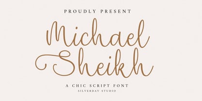 Introducing the “Michael Sheikh” font, a playful and unique handwriting typeface designed to infuse your projects with a touch of whimsy and character. This font offers a delightful collection of alternate characters, providing you with endless creative possibilities. With “Michael Sheikh,” you can effortlessly add and charming touch to your designs. Its handcrafted style lends authenticity and warmth, making it perfect for a wide range of applications, from invitations to branding and beyond.
 - Swaziland by Get Studio,
$15.00 Introducing... Swaziland Modern Calligraphy Font! For those of you who are needing a touch of elegance and modernity for your designs. This font is particularly well-suited to create the most lovely wedding designs, invitations, mood board, social-media template or for your editorial design needs. Swaziland comes with more than 430 glyphs, includes beginning and ending swashes, alternate swash characters, uppercase and lowercase letters, numerals, and a large range of punctuation.
 - Robotik by ITC,
$29.99The extremely narrow Robotik was created by the British typeface designer David Quai and appeared with ITC in 1989. The figures are robust and strong and form tightly packed, bar-like lines. The characters' slim, narrow and angular forms suggest mechanical exactness and cool distance. The similarity of the forms are also reminiscent of machinery and the letters form chains of words. The form principle shows parallels with the constructivism of Moscow after the First World War. Robotik is best used for headlines in large point sizes. - Crazy Party by Sarid Ezra,
$15.00 Crazy Party is a quirky handmade font that will make all your project more unique and handy. This font also including a unique lowercase and uppercase with very different weight. Combining the uppercase and lowercase in one word will make your project even more stunning. You can use this font for quotes, your cover book or playing with words in your instagram post. This font also support multilingual!
 - Shirleya Script by ijemrockart,
$13.00 Introducing Shirleya Script with a handmade calligraphy style, decorative characters and a dancing baseline! So beautiful on invitation like greeting cards, branding materials, business cards, quotes, posters, and more!! Shirleya Script come with 300+ glyphs. The alternative characters were divided into several Open Type features such as Swash, Stylistic Sets, Stylistic Alternates, and Ligature. The Open Type features can be accessed by using Open Type savvy programs such as Adobe Illustrator, Adobe InDesign, Adobe Photoshop Corel Draw X version, And Microsoft Word. And this Font has given PUA unicode (specially coded fonts). so that all the alternate characters can easily be accessed in full by a craftsman or designer. Shirleya Script Features : Uppercase & Lowercase International Languange & Symbols Support Punctuation & Number PUA Unicode Range Standard Ligatures Discretionary Ligatures Stylistic Alternates Stylistic Set 01-07: Shirleya Script.OTF Shirleya Script.TTF, Thank you,
 - Melinda Script by Amarlettering,
$15.00 Melinda Script a new fresh & modern script with a handmade calligraphy style, decorative characters and a dancing baseline! So beautiful on invitation like greeting cards, branding materials, business cards, quotes, posters, and more! Melinda Script come with 480+ glyphs. The alternative characters were divided into several OpenType features such as Swash, Stylistic Sets, Stylistic Alternates, Contextual Alternates. The OpenType features can be accessed by using OpenType savvy programs such as Adobe Illustrator, Adobe InDesign, Adobe Photoshop Corel Draw X version, And Microsoft Word. And this Font has given PUA unicode (specially coded fonts). so that all the alternate characters can easily be accessed in full by a craftsman or designer. Melinda Script : Uppercase & Lowercase International Language & Symbols Support Punctuation & Number PUA Unicode Range Standard Stylistic Alternates Stylistic Set 1-19 Character Variant Contextual. Thank You for purchase!
 - Ferdian Signature by ijemrockart,
$15.00 Ferdian Signature is a new, fresh and modern script with a handmade calligraphy style, decorative characters and a dancing baseline! It is so beautiful on invitations, greeting cards, branding materials, business cards, quotes, posters, and more! Ferdian Signature come with 300 glyphs+. The alternative characters were divided into several Open Type features such as Swash, Stylistic Sets, Stylistic Alternates, and Ligature. The Open Type features can be accessed by using Open Type savvy programs such as Adobe Illustrator, Adobe InDesign, Adobe Photoshop Corel Draw X version, And Microsoft Word. And this font has given PUA unicode (specially coded fonts). so that all the alternate characters can easily be accessed in full by a craftsman or designer. Ferdian Signature Features: Uppercase & Lowercase International Language & Symbols Support Punctuation & Number PUA Unicode Range Standard Ligatures Discretionary Ligatures Stylistic Alternates Stylistic Set 01-02
 - Palmona Plus by Ingo,
$46.00 A rustic black letter from the 1930ies — with stylistic alternates. The high degree of abstraction of this typeface allows it to appear modern, even though its shapes clearly show an origin from Fraktur and Gothic. The letters present the effect of woodcarving or silhouette cuttings as they are defined exclusively with straight lines and sharp corners. By doing without any bowls, the typeface becomes a stylistic entity with a decorative effect. Palmona is especially appealing in combination with bold illustrations. Some of the characters of Palmona are available in one or more alternate forms which can be accessed manually or automatically. Use of these alternates is most easily operated with OpenType-Functions Standard-Ligatures and Discretional Ligatures in the user program. With Standard Ligatures activated, problematic letter compositions are substituted with appropriate ligatures. Likewise, in certain letter combinations the alternates are inserted. The Discretional Ligatures include additional alternatives. Configuration of the characters of the Palmona font is according to Unicode ISO 8859-1 (Latin1). Consequently all characters for all European languages with Latin type are covered — including Turkish, the Baltic languages, East European and Scandinavian languages. Congruent with the time of its origin and typical for black letter typefaces, Palmona also includes a long s as well as — uncommon but definitely reasonable — a capital ß. Both characters are automatically applied with the activation of Discretional Ligatures, and the associated ligatures appear automatically as well. When using ”long s,“ you must ensure the correct use of the rules for the Fraktur font: ”round s“ is always at the end of the word, also in compound words. For those of you who want to be even more correct, read the corresponding >> article in Wikipedia.
 - Makika Sun by Andinistas,
$39.00 Makika Sun enhances the handwritten expressive possibilities of an architect mom and a graphic designer dad in Bogotá, Colombia. In other words, it is a versatile handwritten font family designed for writing short messages in children's contexts. Makika Sun shines for its conceptualization and logic, combining ideas from the American calligrapher Austin Norman Palmer and the Italian calligrapher Ludovico degli Arrighi. Makika Sun, a creative font family specializing in titles and paragraphs for children's books, emerged in 2009 and has developed over the years. Its essence lies in the simplicity of handwriting. In 2023, Makika Sun was applied in the book "Secret Files Tardigrades 1" for children ages 5-6 on Amazon from MyMicroSchool. The main goal of Makika Sun is to emulate handwriting that is legible and accessible to everyone. Makika Sun stands out for its readability and uncomplicated, artisanal style. It offers four typographic styles that simulate different calibers of markers: thick tip (Makika Sun Black), medium tip (Makika Sun Bold), normal tip (Makika Sun Regular) and Makika Sun Dingbats, a set of arrows and figures perfect to enrich your writing. . In short, Makika Sun's versatility and stylistic uniformity make it easy to create writing in various typographic settings. Its typographic heart communicates harmony in messages meticulously designed for spontaneous contexts that require high readability. Makika Sun offers a dynamic range of styles in 4 fonts notable for their outstanding performance in the field of children's book design and the creation of playful brand identities.
 - JAF Domus Titling by Just Another Foundry,
$42.00 JAF Domus Titling is a rounded typeface with classical Roman proportions. It is unique in that it was designed as an all-caps sans from the beginning. The fonts range from Extralight to Extrabold and include a large number of accented characters as well as small caps and alternates.
 - VLNL Bint by VetteLetters,
$35.00 Kornelis de Vries, a headmaster from the Dutch province of Friesland, cultivated new potato breeds that he named after pupils in his school. In the early 1900s he came up with the tasty Bintje (a Frisian girl’s name) and it became a big success – in Belgium and France it has remained the most popular potato for french fries to this day, more than a century since its introduction. Donald Roos took 10 kilos of fresh Bintje potatoes and cut the Bint typeface by hand with a short, sharp knife. He then inked each character once and printed it twice; the second, lighter printing is accommodated in the lower case alphabet. The Bint family offers a script to make the letters bounce up and down the baseline; with OpenType functionality the font randomly chooses each character from the upper- or lowercase alphabet. ‘Tabular lining figures’ will activate a series of negative numerals in boxes; ‘Discretionary ligatures’ activates specially designed letter combinations like ‘www’ as well as arrows and stars. Bint has a distinct, slightly rough handmade appearance, making it useful for a wide range of designs.
 - Mattiface by Balpirick,
$15.00 Mattiface is a modern handwritten font, perfect for both formal and non-formal designs. This versatility will appeal to a wide range of crafty ideas, from letterheads and titles, to stationery.
 - Merc by Canada Type,
$24.95 Merc is a four-letter word that stops just one y short of Mercy. Merc is also the standard street abbreviation for mercenary, or a soldier for hire. Now that the global security business has become a two hundred billion dollar industry, we thought you would like to have your very own affordable merc. Knew you'd be pleased. Merc is based on an all-cap metal face called Agitator, designed by Wolfgang Eickhoff and published by Typoart in 1960. The rough brush letters look like they were made by someone who is capable of elegance but has no time for it. These are letters that live to catch the eyes and warn them loudly: Doom is here, and if you want it screamed out, this Merc is at your service. This font contains more than 460 glyphs, which means quite a few stylistic alternates and support for the majority of Latin languages.
 - Manuel by profonts,
$51.99 Manuel, a simple, almost mathematically constructed typeface, includes stylistic alternates for a number of upper case characters. This comes in very helpful when designing logo letterings. Manuel(a) is a very charming, self-confident und exciting typeface design. The idea was to try to apply a given design criteria (also see Volker Schnebel's Marita and Martin fonts) to every single character. In other words, start with a character and develop all of the others from it. This is quite easy for some characters but extremely difficult for others. This process generates creativity and the characters move away from the initial constructed sketch. Together in a typeface, the individual characters are now all of a piece and character.