10,000 search results
(0.036 seconds)
- Film P2 by Fontsphere,
$12.00 Film-P2 is an Ultra Condensed sans serif display typeface designed by Bartosz Panek. It is the follower of the geometric 'Film Poster' (https://www.myfonts.com/fonts/fontsphere/film-poster/) which was inspired by futuristic movie posters. In Film-P2, the letter design is more neutral, the font is more versatile, but no less expressive, which was one of the assumptions of the project. This allows many different application possibilities. In titles, headings, longer text compositions, bold and custom juxtapositions, and in many different formats. The differences in the width of the letters in the narrow, regular, wide versions are not significant, they are fairly balanced, but they give a lot of variation depending on the method of application and design characteristics, e.g. text size, background type, etc. The entire Film-P2 family offers many creative possibilities in graphic design, branding, printing and website design. Each font include multilingual support, numerals and a large range of special characters.
 - Chayton by Jorsetype,
$16.00 Chayton is the font style handmade dancing and then live trace to have unique, the writing style is very natural. Chayton works great in any branding, logos, magazines, films. The different weights give you a full range of whole hosts of applications, while the outlined fonts give a real modern feel to any project. Chayton also comes with extra Extruded and Outline Font versions. as a function to create an extrusion effect for this font. The Features of this fonts is; Standart ligatures, Stylistic Alternates, Stylistic sets, PUA Unicode (Private Use Areas), OpenType features can be accessed by using OpenType smart programs such as Adobe Photo Shop, Adobe Illustrator, Adobe Indesign, Corel Draw and Microsoft Office.. can also be accessed through the character map.
 - Bejo by Twinletter,
$15.00 BEJO is a display font in the Japanese style, with each letter having its own individual personality. This font is appropriate for a wide range of project demands, particularly those involving Asian features. By utilizing this typeface, you will create a project with a gorgeous, original, and elegant appearance that will be remembered by many people. Logotypes, food banners, branding, brochure, posters, movie titles, book titles, quotes, and more may all benefit from this font. Of course, using this font in your various design projects will make them excellent and outstanding; many viewers are drawn to the striking and unusual graphic display. Start utilizing this typeface in your projects to make them stand out.
 - Flagellum Dei by Hanoded,
$20.00 Flagellum Dei is Latin for ‘The Scourge of God’. It is a title given by later generations to Attila the Hun (406-453 C.E.). Flagellum Dei is also a rather scary font, which I made with the use of a stiff brush and some China ink. Of course you could use this quite versatile font to scare the bejesus out of your friends, but I’d much rather see it used on book covers, posters and album artwork. Flagellum Dei comes with a horde of diacritics.
 - Belhampton by Greater Albion Typefounders,
$18.00 Belhampton is a lively display family, full of the spirit of the Edwardian era. Six typefaces are offered: regular, bold, light, oblique, embossed and outline. All include an extensive range of stylistic alternates and discretionary ligatures, as well as lining and old-style numerals. Belhampton is ideal for poster and display work, or just the thing for any piece of Belle Epoque design.
 - Yaty by Mans Greback,
$59.00 Yaty is a relaxed and spontaneous script font. With its long descenders, bold capital letters and genuine style, this typeface fits perfectly for a down-to-earth logo or headline, emitting familiarity and friendliness. The font contains ligatures and support for an extensive range of world-wide languages.
 - Hergon Grotesk by Katatrad,
$29.00 Straightforward tone resulting in a modernist, Hergon Grotesk is a family of modern sans-serif. This Typeface is characterized by Neo-Grotesque which gives it a strong character, perfectly suited for any visual communication application. The family has 10 fonts ranging from thin to extrabold with matching italics.
 - Ambule BT by Bitstream,
$50.99Huxley Vertical meets Peignot in this stylized cap/lowercase hybrid design called Ambule. French designer Julien Janiszewski has created a clean, straightforward design that is strikingly effective in both text and display settings. Ambule Oblique and Ambule Outline complete the typeface family, extending its range of possible uses. - Vast by ParaType,
$30.00 Vast is a variable sans serif with a range of styles from thin to black and from normal to extra wide. This versatile font family of both of a serious and friendly nature can be used for various purposes, such as text, logos, headings, and branding. Vast was designed by Manvel Shmavonyan with the assistance of Alexander Lubovenko and released by Paratype in 2021.
 - Barricada by Sudtipos,
$49.00 Barricada is a loud-voiced typeface with small counters that gives an interesting strong weight. Moreover, it has a solid structure providing strength. Its curved serifs and swashes give a touch of softness and make the letters a little playful. This is the right option to set a fresh and solid text.
 - Fordor Incised NF by Nick's Fonts,
$10.00Based on a old standard, Tudor Black, this version offers a dramatic inline treatment that adds sparkle and grace. The typeface takes its name from Ford Motor Company's old designation for a sedan. Both versions of the font include 1252 Latin and 1250 CE (with localization for Romanian and Moldovan) character sets. - Floral Decay by Mircea Boboc,
$22.00 This is Floral Decay, your seasonal autumn font with jaded, weathered, and earthy contours of rustic lettering. As they blend into words, the characters evoke floral arrangements of a decaying beauty. It is versatile, playful, and perfect for Graphic Design decorations! This font is unique because, in order to create it, I had to answer some tricky questions: What makes autumn… autumn? Capturing the essence of the other seasons into your letters comes easier. For instance, in order to suggest summer, you only need to draw a few flowers. How about autumn? You could garnish your letters with a few grapes, you might think, but it would only result in a grape-themed font. The notion that is more directly associated with autumn is the image of falling and withering leaves, which brought me to the second question. How exactly are you going to create something beautiful out of a somewhat morbid premise, like wilted leaves? Well, I soon realized that by creating a handwritten font and preserving the right imperfections, you can actually portray collateral beauty. In this context, asymmetry is important because it suggests decay. Further on, the design concept required the letters to come very close together, so that every typed word can be regarded as a floral arrangement. How close together, though? As much as possible without confusing one with the other, risking a lack of legibility. Therefore, in contrast with the demo version of this font, this actual version provides the ideal kerning.
 - FF Unit Slab by FontFont,
$104.99 German type designer Erik Spiekermann, American type designer Christian Schwartz, and New Zealand type designer Kris Sowersby created this slab FontFont in 2009. The family has 14 weights, ranging from Thin to Ultra (including italics) and is ideally suited for editorial and publishing, logo, branding and creative industries as well as web and screen design. FF Unit Slab provides advanced typographical support with features such as ligatures, small capitals, alternate characters, case-sensitive forms, fractions, and super- and subscript characters. It comes with a complete range of figure set options – oldstyle and lining figures, each in tabular and proportional widths. As well as Latin-based languages, the typeface family also supports the Cyrillic and Greek writing systems. This FontFont is a member of the FF Unit super family, which also includes FF Unit and FF Unit Rounded.
 - Modern Sans by Larin Type Co,
$16.00 Modern Sans this is a font family that includes 9 weights from thin to black and two styles basic and oblique. In this font you will find a classic and universal grotesque that will perfectly cope with a variety of tasks and will always look stylish and modern, as well as many alternates for Upper and Lowercase, with which you can play and find the most incredible and stunning option. This universal font covers a huge range of possibilities for the design and creation of your project.
 - Bethlehem Star by HiH,
$10.00 For much of the world, the last half of December encompasses the beginning of winter and the a season of gift-giving, marked by Hanukkah and Christmas. It is generally accepted that the tradition of giving of gifts at this time was begun by The Three Wisemen. As described in The Gospel According to Matthew, the wisemen, led by a star from a distant land to the east, found the baby Jesus. First, they worshipped him and then, "they presented him with gifts: gold, frankincense and myrrh." (Matthew 2:11). Thus began the tradition of celebrating the birth of Christ with the giving of gifts. There is a parallel tradition in the Jewish faith of the giving of gelt or gold at Hanakkuh to help support poor students, in keeping with the rich history of scholarship that is fundamental to the rabbinic system. Inevitably, in our secular culture, there has been a blending and a secularization of these traditions. The reasons have gotton lost in the “gimme.” What is often overlooked is what Paul realized when he told Timothy, “Neglect not the gift that is in thee.” The most importent gift is the gift inside of us, the gift of sacrificial love for others. When we let that gift be diminished in our minds amid the clutter of modern day material seeking, we can recall the prophesy of Micah over 2800 years ago, But thou, Bethlehem Ephratah, though thou be little among the thousands of Judah, yet out of thee shall he come forth unto me that is to be ruler in Israel: whose goings forth have been from of old, from everlasting." (Micah 5:2 KJV) Never underestimate the impact you have on others. Words of kindness can change people’s lives. The Talmud says that the highest form of wisdom is kindness. Be wise this holiday season. The font BETHLEHEM STAR was originally designed for the church to which I belong, The Star Bethlehem Church of Ansonia, Connecticut, USA and is based on the typeface Accent with the permission of URW++ of Hamburg, Germany. You might choose BETHLEHEM STAR for your personal greetings as well as for flyers and programs at your church this holiday season. Like most display fonts, it is most effective at 18 points and larger. Like most script fonts, it is most effective when set with both upper and lower case. All caps with this font is like eating two pieces of pecan pie — too much of a good thing.
 - Wagner Silhouette NF by Nick's Fonts,
$10.00This roly-poly, rollicking display font is based on a design from the 1946 book Blue print text book of sign and show card lettering by Charles Louis Henry Wagner, who seems to have had an aversion to combination words (like blueprint, textbook and showcard). - Campaign by ITC,
$29.99Campaign was designed by Alan Meeks, a bold sans serif font with details typical of a stencilled alphabet. When using this font, letters and words should be set close together for the best effect. Campaign is perfect for large displays like posters or billboard advertisements. - Midsole SC by Grype,
$16.00 Geometric/Technical style logotypes have been developed for car chrome labels since the early 1980’s, but automobile companies don't monopolize the style by any means. Shoe companies have a foothold in the geometric sans serif styles as well, and range from straightforward to full of techno styled play. Nonetheless, these logotypes all lack an expansive family which shows off all the logotypes are and what they "could" be and do. And that's where we come in. The Midsole SC Family finds its origin of inspiration in the CONVERSE shoe company logo, or an older version of their logo, and from there we expanded it into a 40 font family of weights, widths, and obliques. Midsole pays homage to the styling of the earlier logotype, including unicase variations to match the original look, while further evolving beyond the brand inspiration to yield a family that pulls on modern and historical styles. It adopts a sturdy yet approachable and recognizable style with its uniform stroke forms and curves, and goes on to include smallcaps, numerals, and a comprehensive range of weights, creating a straightforward, uncompromising collection of typefaces that lend a solid foundation and a broad range of expression for designers. Here’s what’s included with the Midsole SC Family bundle: 489 glyphs per style - including Capitals, SmallCaps, Numerals, Punctuation and an extensive character set that covers multilingual support of latin based languages. (see the 10th graphic for a preview of the characters included) Stylistic Alternates - alternate characters and unicase variants for a less standardized text look. 4 weights in the family: Light, Regular, Medium & Bold. 4 obliques in the family, one for each weight: Light, Regular, Medium & Bold. Here’s why the Midsole SC Family is for you: - You’re in need of stylish sans font family with a range of weights and obliques. - You’re love that older CONVERSE letter styling, and want to design anything within that genre. - You’re looking for an alternative to Eurostile & Handel Gothic. - You’re looking for a clean techno typeface for your rave poster designs. - You just like to collect quality fonts to add to your design arsenal.
 - Piambis by Aga Silva,
$24.99 Piambis Family has been featured in "Slanted #28 Contemporary Typefaces 2016/17" This handwritten font family that boasts great variety of glyphs - many of which are fancy alternates for standard letters (click on text written in Piambis below, then click on “Glyphs”). This font is designed so the letters are available via standard programs ie. Word. It is recommended however that you use professional software such as Photoshop or Illustrator to make your work easier as there are over 1600 glyphs in each of the fonts included in Piambis family. About the family: The chief difference between the files in the family are finishes to the capital letters (in all languages) and appearance of the lowercase “f”. The fonts support all languages that use latin script - yes - Vietnamese (Tiếng Việt) and Pinyin is also available.
 - Draughtsman Label Hand by Greater Albion Typefounders,
$35.00 "Draughtsman Label Hand" was inspired by the beautifully executed hand-lettering one set of 19th century engineering drawings. The result is a typeface that combines great legibility with a wealth of decorative flourishes and lively touches of fun. The typeface includes a range of stylistic alternated, ligatures, small and petite capitals, old-style and lining numerals. Draughtsman Label Hand is designed to take full advantage of the capabilities of the opentype format.
 - Chilli Peppers by Letterara,
$12.00 Chilli Peppers is a stylish, quirky, and incredibly distinct script font. Its stand-out feel makes this font incredibly versatile, fitting a wide range of contexts. Whether you’re using it for crafting, digital designing, presentations, poster, logos, events, or greeting card making, it’s perfect! This font is PUA encoded which means you can access all of the awesome glyphs with ease! It also features a wealth of special features including ligatures.
 - Geryline by Slex Studio,
$11.00 Geryline simplifies elegance into one truly outstanding handwritten font. It maintains its classy calligraphic influences while feeling contemporary and fresh. This versatility will appeal to a wide range of crafty ideas, from letterheads and titles, to stationery. This font is PUA encoded which means you can access all of the cute glyphs and swashes with ease! It also features a wealth of special features including alternate glyphs and ligatures.
 - Gardening by Letterara,
$10.00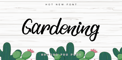 Gardening is a stylish, fun, quirky, whimsical, and incredibly distinct script font. Its friendly feel makes this font incredibly versatile, fitting a wide range of contexts. Whether you’re using it for crafting, digital designing, presentations, or greeting card making, it’s perfect! This font is PUA encoded which means you can access all of the awesome glyphs with ease! It also features a wealth of special features including ligatures.
 - Varisse Variable by AVP,
$79.00 Varisse spans over two centuries of type design and draws its inspiration from well-loved classics that are as fresh today as they were when they were created. The range stretches from a quintessential 18th century transitional serif to an uncompromising 20th century sans. Think Baskerville, think Gill. The idea was to create a family that shared similar forms and the same vertical metrics, allowing them to be mixed to provide impact and readability as required. With a generous x-height and a host of options, Varisse Variable is ideally suited to branding, packaging, magazines and editorial. It also provides a wealth of opportunity in website presentation. The variable axes of weight and serif allow selection of styles from sans light to serif heavy with all the options in between.
 - Distressed Telegraph by Stiggy & Sands,
$29.00 Our Distressed Telegraph brings the unique individuality of the Large Elite Type No. 44 vintage typewriter keyset to the digital age. Vintage typewriters evoke a warmth and comfort to them, primarily because of their unpredictable "grunge" results from force of keystrokes to ribbon and paper. The SmallCaps and extensive figure sets add a more serious note to the nature of the typeface. See the 5th graphic for a comprehensive character map preview. Opentype features include: - SmallCaps. - Full set of Inferiors and Superiors for limitless fractions. - Tabular, Proportional, and Oldstyle figure sets (along with SmallCaps versions of the figures). - Stylistic Alternates for Caps to SmallCaps conversion.
 - Anele Pro by Ole Sondergaard,
$14.28 Anele is a classic grotesque in the bedt sense of the word in 5 weights and Italic that communicates in 140 languages. The font is created by the danish designer Ole Sondergaard who is also behind the award-winning FF Signa super family.
 - Munika by Gravitype,
$24.90 Munika is a modern sans serif born from the equilibrium between geometric shapes and humanist details. Its lines were forged with the concept of clarity in mind, to make it the perfectly accessible typeface. This global family comes in 9 weights plus matching italics, with ligatures that facilitate readability and the alternative letter “a” in both versions. These features were conceived to further expand the range of use of the type system, to offer multiple aesthetic and technical options. Munika’s unique personality and fresh style make it perfect for a rebrand. Multilingual support is available.
 - HS Hadeel by Hiba Studio,
$50.00 HS Hadeel is a versatile display typeface designed for use in titles and graphic projects that require both Arabic, Persian and English characters. It draws inspiration from the modern kufi style and boasts a unique blend of sharp and curved lines that lend a beautiful and geometric structure to each character. The sharp endings at the bottom of each character add an additional aesthetic touch. With five weights available, ranging from Light to Black, HS Hadeel offers a diverse range of options for designers seeking to elevate their Arabic typography. Overall, HS Hadeel is a great choice for those seeking a visually striking and flexible typeface for their projects.
 - LiebeDoris by LiebeFonts,
$29.00 Inspired by a workshop with iconic American sign painter Mike Meyer, Ulrike of LiebeFonts set out to create a versatile, lovely typeface for sign painting that looks not at all like a font but rather like the letters on a unique, hand-painted storefront sign. LiebeDoris combines the best of two worlds: the beauty of all-American sign painting and the meticulous craft of German engineering. Each and every letter in each of the four different styles in LiebeDoris was hand-painted on large sheets of paper with a brush and ink, then carefully transferred for digital typesetting. So rather than being one typeface with different weights, think of LiebeDoris as a package of four individual designs that go together very well. Advanced OpenType features enable this font to really shine: every letter in this all-caps font comes in four variations, so that two of the same letters typed in a row won’t look the same, giving a truly handmade charm. (This feature requires layout software or a word processor with OpenType support.) And if you do have a storefront or a restaurant menu to prettify with LiebeDoris, you will love the integrated collection of store-themed catch words like “FREE”, “NEW”, and “SALE”. If you fall in love with LiebeDoris, you may also like our other best-selling fonts, LiebeErika and LiebeGerda, or our whimsical pictogram fonts such as LiebeMenu.
 - Black Oak - Personal use only

- Diediedie - Unknown license

- Gunplay - Unknown license

- Hangbord DSG - Unknown license

- esthervandenbos - Unknown license

- Olho de Boi - Personal use only

- ArTarumianBehrensInitialen by Tarumian,
$100.00 Behrens Initialen is based on the type graphics of the German architect and type designer Peter Behrens (1868-1940). The drawing of the original typeface is in tune with the Art Nouveau (Jugendstil) style in which Behrens worked. This is a light, delicate, somewhat theatrical typeface, the forms of which bear at the same time a certain shade of Gothic and modernity, and can be used, in particular, when there is a need to make a reference to medieval graphics while maintaining the modern style of composition. In the proposed version, the original initial graphics are used not only for uppercase letters, but also for Arabic figures, while for lowercase letters and for the base of other characters are used the letters themselves - without decorative framing. This feature can be useful for obtaining various effects when using both lower and upper cases in parallel, including when they are overlaid. The font includes the Latin, Cyrillic and Armenian ranges. Created by Ruben Tarumian in 2020.
 - Amica Pro by Eclectotype,
$40.00 Welcome Amica Pro, a workhorse sans designed to give your branding a friendly, approachable look. What is it that makes a typeface friendly? Eclectotype undertook extensive research* in this and the results are in! To cut a long story short, friendliness in sans serif fonts can be summed up in two words – short and fat. Basically, think Danny DeVito in letter form. The shortness in Amica Pro is achieved (somewhat counterintuitively) by pushing up the x-height. This, coupled with short ascenders and descenders, gives the text a squat appearance. For the fatness, that's easy in the bolder weights, but how to carry this through to the lights? Here, the fatness equates to roundness, so the letterforms, even if the stroke weight is light, have a rotund appearance from the wideness and roundness of the circular glyphs. When thinking about friendliness, we think about inclusiveness. To this end, Amica Pro supports a super wide range of latin-based languages, as it uses Underware's Latin Plus character set, as well as extra support for Vietnamese. Amica Pro is best used for branding, logos, infographics etc. It will give your UI a friendlier feel, but that doesn't mean it's not serious. There are many useful typographic features, including alternates, numerous figure styles, automatic fractions and case-sensitive forms. The italics are carefully optically corrected "sloped romans" and as such they are the same width as their upright equivalent, so changing your copy to italics will not mess around with the spacing. *I looked at a few fonts and drew some lazy conclusions.
 - Luxca by Shakira Studio,
$17.00 Introducing Luxca, a font that epitomizes modern luxury within the serif category. This typeface seamlessly blends contemporary sophistication with timeless elegance, making it the perfect choice for designers seeking to infuse their projects with an air of opulence and refinement. With Luxca as your font of choice, you have at your fingertips a versatile tool that can elevate a wide range of design applications. Whether it's high-end branding, editorial layouts, invitations, or packaging.
 - Ostent by Stuart Hazley,
$10.00 Ostent is a font family which is inspired by the early Din-Type fonts. In particular, Din 1451. This is reflected in Ostents simple and uncomplicated design, which results in creating a good sense of legibility. Each of the three weights have been carefully designed to work in conjunction with one another, or individually, complimenting other typefaces. Ostent can be used across a wide range of design mediums (both print and screen).
 - Allesia by AEN Creative Studio,
$14.00 Allesia is a gorgeous handwritten font that brings its own unique style to any design project. It will elevate a wide range of design projects to the highest level, be it branding, headings, wedding designs, invitations, signatures, logos, labels, and much more! This font is PUA encoded which means you can access all of the cute glyphs and swashes with ease! It also features a wealth of special features including alternate glyphs and ligatures.


