10,000 search results
(0.058 seconds)
- Cobbler Sans by Juri Zaech,
$30.00 Cobbler Sans is a friendly type family in six weights and the humble cousin to Cobbler. With its rounded aspect and proportions of geometric type Cobbler Sans is expressively soft and contemporary. All terminals are shaped organically and even inner corners are rounded. The few remaining straight lines give the typeface the stability of a workhorse while keeping the playfulness that characterizes the entire Cobbler family so much. Additionally there is a pile of OpenType features built in. For example loads of discretionary ligatures that make capital letters interlock left and right. Other features include automatic fractions, case sensitive punctuation and contextual alternates. Cobbler Sans works great for branding, packaging, editorial or any display application – and it comes with an expansive character set that covers over 200 languages. Furthermore Cobbler Sans is manually kerned and auto-hinted for crisp display on screen also in small sizes.
 - Aure Sable by Aure Font Design,
$23.00 Aure Sable embodies the entrancing mistique of an adventurous spirit. The fluid forms of this brush font engage the reader with a subtext of serendipitious happenstance. Sable Regular brings the soft touch of familiarity to text and titles and imbues astrological expressions and chartwheels with an exotic intrigue. The graceful forms of Sable Italic add the flowing touch of a personal comunique. Sable is an original design developed by Aurora Isaac. After more than a decade in development, 2018 marks the first release of the CJ and KB glyphsets in regular and italic. The CJ glyphset is a full text font with an extended set of lowercase and uppercase glyphs supporting a variety of European languages. Additional glyphs include standard ligatures, four variations of the ampersand, and check-mark and happy-face with their companions x-mark and grumpy-face. Numbers are available in lining and oldstyle versions, with numerators and denominators for forming fractions. Companion glyphs include Roman numerals, specialized glyphs for indicating ordinals, and a variety of mathematical symbols and operators. The CJ glyphset also includes an extended set of glyphs for typesetting Western Astrology. These glyphs are also available separately in the KB glyphset: a symbol font re-coded to allow easy keyboard access for the most commonly used glyphs. Aure Sable is engaging as a text font, but its empathic nature radiates against more traditional fonts that provide the perfect foil to Sable's casual persona. Pair Sable with the formal look of geometric fonts such as Aure Jane and Aure Declare to accentuate Sable's heartfelt nature. Give Aure Sable a trial run! You may discover a permanent place for this font family in your typographic palette. AureFontDesign.com
 - Marmellata Jar 01 by Fontscafe,
$39.00 When you think of marmalade or jam (that’s Marmellata in Italian), images of a happy breakfast table are conjured up into the mind, with of course the unforgettable emotive response accompanied. These emotions are exactly what our Marmellata fonts can conjure up for your designs as well (we agree, nothing can beat marmalade on a hot toast)! Our Jar 1 is ideal for all designs where you need to send across a feeling of care, childhood, comfort, motherhood or friendship...amongst all those ideas you will get on your own! With that classic breakfast table feel, you are sure to connect on a very comforting level with all those who view your designs using these fonts. May we suggest, these fonts go very well with unusually dull colours, and can add a spark of life to the most mundane of words! Try getting a taste of our Jar 2 if you want even more of the classic taste (sorry, touch!).
 - Sportzan by Pixesia Studio,
$19.00 Introducing Sportzan - A Sporty Display Font Sportzan, as its name, is a sport font. Sportzan brings you the kind of cheerful and sporty vibes which spreads the playful energy for the game. Sportzan is designed to have sharp-corners to express the strength. With its bold design, sportzan will be suitable to be associated to any kind of sport product such as poster, jersey design, sport-slogan, and any writing which needs a strong-bold vibe. FEATURES - PUA Encoded - Uppercase and Lowercase letters - Numbering and Punctuations - Multilingual Support - Works on PC or Mac - Simple Installation - Support Adobe Illustrator, Adobe Photoshop, Adobe InDesign, also works on Microsoft Word Hope you Like it. Thanks.
 - Rogie by Mokatype Studio,
$25.00Rogie is an elegant and unique font that uses ligatures to smoothly link letters. Perfect for adding a unique twist to word-mark logos. Rogie - Ligature has 22 ligatures & 5 Alternate as well making it super fantastic. Ligature can be turned off if required standard writing needs. What's Included : Standard glyphs Ligatures Alternates International Accent Works on PC & Mac Simple installations Accessible in Adobe Illustrator, Adobe Photoshop, Adobe InDesign, even work on Microsoft Word. PUA Encoded Characters - Fully accessible without additional design software. Fonts include multilingual support Image used: All photographs/pictures/vectors used in the preview are not included, they are intended for illustration purposes only. - Bestagrach by Mokatype Studio,
$25.00Bestagrach - Unique Ligatures Connected Serif is an elegant and font that uses ligatures to smoothly link letters. Perfect for adding a unique twist to word-mark logos, monograms or pull quotes. Bestagrach has 12 ligatures as well making it super fantastic. Ligature can be turned off if required standard writing needs. What's Included : Standard glyphs Ligatures International Accent Works on PC & Mac Simple installations Accessible in Adobe Illustrator, Adobe Photoshop, Adobe InDesign, even work on Microsoft Word. PUA Encoded Characters - Fully accessible without additional design software. Fonts include multilingual support Image used: All photographs/pictures/vectors used in the preview are not included, they are intended for illustration purposes only. - Goodbye Crewel World NF - Unknown license

- Cheerful Monday by Redy Studio,
$10.00 So glad we found each other! Enjoy Cheerful Monday, a handwritten font that has 2 variations (regular and bold), and to enhance your hand-lettering we provide 72 ligatures as your choice to summarize the words/sentences made. Also equipped with doodles as a bonus. This is perfect for quote designs, quaint logos, clever packaging, signboards, greeting cards, merchandise designs, trending Instagram photos and so much more! Cheerful Monday features: A full set of upper & lowercase characters Numbers & punctuation 72 Gorgeous ligatures Lowercase alternate (doodles) Multilingual symbols PUA Encoded Characters – Fully accessible without additional design software. Feel free to give me a message if you have a problem or question. Thank you so much for taking the time to look at one of our products.
 - Pradock Sans by Genesislab,
$100.00 Pradock The newest geometric Sans-Serif font for a family is easy to use almost anywhere on your website, be it in the header or as smaller text with the Variable concept. A font with a bold aesthetic that is energetic and youthful, this is an excellent choice for the millennial demographic - which is why it is so well suited to use by digital and creative agencies. - 18 Font +1 Variable Fonts Family, Opentype Feature - Free updates and added features - Multilingual support for various languages including: French, Spanish, Swedish, German, Italian, Portuguese, Dutch, and more ... Software support (Adobe, MS Word, Pages, etc.). if you want to take advantage of additional OpenType features and style alternatives, use OpenType-savvy software (such as Adobe applications etc.).
 - Bouncer by Ingrimayne Type,
$6.95 The letters in Bouncer are round because they all begin as a ball and then have parts of the ball cut away. Bouncer was one of the earliest typefaces from Ingrimayne Type. Lower-case letters are smaller versions of the upper-case letters. BouncerTwo, designed twenty years after the original Bouncer, continues playing with the idea of making letters by cutting out parts of a circle, but in this case the circles are interlocking. All letters are upper-case but some of those on the lower-case keys differ from those on the upper-case keys. BouncerTwo is eye-catching but not highly legible.
 - Racoste by HansCo,
$15.00 Racoste is a retro vintage lettering font style. Use this display font to add that special retro touch to any design idea you can think of!. Equipped with all complete characters ranging from uppercase letters, lowercase letters, numbers, punctuation marks and multi-lingual support, this font is ready to be used in any project. Very suitable for logotype, Stickers, Packaging design, Cricut Project, headlines, brand identity, t shirt or apparel industry, posters, magazines, books, YouTube, Instagram, websites, or any of your creative design projects. Enjoy!
 - Engria by Eclectotype,
$40.00 Engria is a type family of four weights with corresponding italics that treads the fine line between sans and serif. There are serifs, of a sort, inspired by the brush. Not the marks made by a brush, but the actual splayed shape the bristles make when clamped together. Wedge-like chunks that resemble engraved forms, as the name Engria hints at. But it also has the appearance of a stressed, flared sans. This mixed approach lends a unique voice. Highly legible at text sizes, as indeed it is optimized for, Engria does however shine at display sizes thanks to its characteristic details – flared stems, angular counterforms, rugged ink traps and fluid curves. (I would recommend tracking it a little tighter at larger sizes.) Engria started life way back in 2014, and has been worked and reworked tirelessly to get to this finished product. My intent was to really push the idea of the white shapes being as important, if not more so, than the black. Engria is equipped for typographically demanding applications, boasting as it does an array of OpenType features, including small caps, automatic fractions, stylistic sets, various figure styles, arrows, case sensitive forms and more. It will make a very useful addition to your typographic arsenal, with a flare (ahem) for editorial work, but the individuality for packaging, branding, and logo work.
 - Ulian by Typodermic,
$11.95 In the world of typography, there’s always a desire for something new and innovative that can make your design stand out. If you’re looking for a typeface that is as unique as it is bold, look no further than Ulian. Ulian is a striking display typeface that fuses the best of two worlds: the flat sides of traditional blackletter and the contemporary shapes of modern letterforms. The result is a typeface with a refreshing twist that is sure to capture the attention of your audience. One of the most striking features of Ulian is its distinctive flat sides. These straight lines give the typeface a bold and confident feel, perfect for grabbing attention and making a statement. But Ulian doesn’t stop there; it also features elements of modern typefaces, including curved serifs and varying thickness in the strokes. The squared geometric typefaces have also been incorporated into the design, adding a touch of sleekness and modernity. This combination of traditional and contemporary design elements creates a unique visual impact that is both striking and memorable. Ulian also comes with a range of variants, including Regular, Italic, Bold, and Bold-Italic. This versatility allows you to use the typeface across a range of applications, from logos to headlines and everything in between. But Ulian doesn’t just look good—it’s also functional. In OpenType-capable applications, you can access old-style lowercase numerals, giving you even more flexibility in your designs. Overall, Ulian is a one-of-a-kind typeface that is sure to elevate your design game. With its distinctive flat sides, modern letterforms, and unique flair, it’s the perfect choice for anyone looking to make a dauntless statement. So why settle for ordinary typography when you can have Ulian? Most Latin-based European writing systems are supported, including the following languages. Afaan Oromo, Afar, Afrikaans, Albanian, Alsatian, Aromanian, Aymara, Bashkir (Latin), Basque, Belarusian (Latin), Bemba, Bikol, Bosnian, Breton, Cape Verdean, Creole, Catalan, Cebuano, Chamorro, Chavacano, Chichewa, Crimean Tatar (Latin), Croatian, Czech, Danish, Dawan, Dholuo, Dutch, English, Estonian, Faroese, Fijian, Filipino, Finnish, French, Frisian, Friulian, Gagauz (Latin), Galician, Ganda, Genoese, German, Greenlandic, Guadeloupean Creole, Haitian Creole, Hawaiian, Hiligaynon, Hungarian, Icelandic, Ilocano, Indonesian, Irish, Italian, Jamaican, Kaqchikel, Karakalpak (Latin), Kashubian, Kikongo, Kinyarwanda, Kirundi, Kurdish (Latin), Latvian, Lithuanian, Lombard, Low Saxon, Luxembourgish, Maasai, Makhuwa, Malay, Maltese, Māori, Moldovan, Montenegrin, Ndebele, Neapolitan, Norwegian, Novial, Occitan, Ossetian (Latin), Papiamento, Piedmontese, Polish, Portuguese, Quechua, Rarotongan, Romanian, Romansh, Sami, Sango, Saramaccan, Sardinian, Scottish Gaelic, Serbian (Latin), Shona, Sicilian, Silesian, Slovak, Slovenian, Somali, Sorbian, Sotho, Spanish, Swahili, Swazi, Swedish, Tagalog, Tahitian, Tetum, Tongan, Tshiluba, Tsonga, Tswana, Tumbuka, Turkish, Turkmen (Latin), Tuvaluan, Uzbek (Latin), Venetian, Vepsian, Võro, Walloon, Waray-Waray, Wayuu, Welsh, Wolof, Xhosa, Yapese, Zapotec Zulu and Zuni.
 - ALS Direct by Art. Lebedev Studio,
$63.00 ALS Direct is an open and dynamic typeface with clear-cut letterforms that make it instantly readable. It lends text a neutral, yet agreeable and modern feel. Direct has nine font styles convenient for the purposes of navigation signage. Regular-style letterforms are rather wide, because direction signs are likely to appear before readers at an angle, so the type needs to withstand perspective distortions. And as signs and boards may vary in size, Direct was developed to include several width variations. Condensed fonts can be used where horizontal space is limited, allowing you to keep proper height and readability of the characters. A signage typeface must be easily readable from some distance away and have simple letterfoms with clear-cut features to quickly identify characters. Designing a type for a potentially wide range of purposes calls for a universal approach. If not destined to be used for navigation in a particular building, it shouldn’t incorporate any peculiar elements to agree with certain design or architecture. All of the above determined our choice of a sans serif with large apertures and definite features allowing readers to instantly recognize letters. Descenders are made compact not to interfere with the line below. And the low contrast between thick and thin strokes renders all elements equally perceptible. The x-height is significant, close to the cap height, which inhances readability of the lowercase type. There are two reasons why directions must not be set in all caps. Firstly, lowercase letters are more diverse and include ascenders and descenders identifying some of the letters in the line. And secondly, having learned to read, people recognize word shapes rather than individual letters, which makes lowercase text more readable. With Direct being a signage typeface, first to be developed were its width variations, and different weight styles and italics were added later. Another thing to be kept in mind was that signs often use dark background colors, and black type on a white background appears smaller than white type on a black background. Direct is the first Cyrillic typeface created for navigation purposes. Before that, designers could use the Cyrillic version of Frutiger (Freeset) developed by Adrian Frutiger for the Paris Charles de Gaulle International Airport, and a number of other, mostly body copy, neutral sans serif types. However, signs and boards were dominated by Arial, which Direct would be glad to replace offering elegance and lucidity of form instead of type bluntess. Direct was designed as a signage typeface, but its neutral style and clear-cut letterforms suggest various other ways of application.
 - Orliet Pro by Arttype7,
$15.00 Elevate Your Designs with Elegant Luxury Orliet Pro is a meticulously crafted serif font designed to add a touch of elegance and luxury to your visual creations, especially ideal for enhancing the sophistication of logos. This font stands out for its uniqueness, boasting over 50 ligatures and alternative characters with artistic flair. Its well-designed script optimizes your designs, ensuring a seamless integration into your projects. Key Features: Versatile Ligatures and Alternatives: With over 50 ligatures and alternative characters, Orliet Pro provides a wide range of design possibilities. Each character exudes a unique artistic charm, allowing you to customize your text in a myriad of ways. Elegance in Every Detail: The design of Orliet Pro aims for elegance. The serif style adds a touch of class to your projects, making it perfect for creating logos that exude luxury and simplicity simultaneously. Seamless Font Families: Each member of the Orliet Pro font family complements one another effortlessly. Whether you choose the Orliet Pro script or Orliet Pro icons, they work harmoniously to enhance your overall design. Enhanced Design Flexibility: Orliet Pro script and Orliet Pro icons contribute to the ease of design integration. The script is thoughtfully designed to optimize your creative process, while the icons provide additional elements for a professional touch. Cyrillic Alphabet Inclusion: For an added layer of versatility, Orliet Pro includes the Cyrillic alphabet in regular, italic, bold, and bold italic styles. This ensures that your designs can reach a broader audience with diverse language preferences. Optional Details: Design Concept: Orliet Pro was conceptualized to bring an air of sophistication to your designs, with a focus on creating an elegant and timeless serif font. Creation Inspiration: The font draws inspiration from classic design elements, aiming to provide a timeless aesthetic that resonates with a modern audience. Historical Context: While not a revival, Orliet Pro pays homage to the timeless elegance of serif fonts, adding a contemporary twist to meet the demands of today's design trends. Elevate your designs with the timeless elegance of Orliet Pro. Explore the possibilities of serif and script styles, accompanied by convenient font icons, all seamlessly integrated into one versatile font family. Embrace luxury and simplicity in every character.
 - ZF Captiva by ZooFont,
$22.00 The name Captiva is derived from the word captivate, meaning 'enchanting' or 'capturing the heart'. Captiva is a geometric sans serif font with a harmonious blend of clean shapes and straight lines, diagonal lines, and curves. The simple yet sophisticated design shows a soft yet hard, hard yet beautiful appearance. It has a total of 9 thickness levels, and the edges and strokes are rounded to give the user a peaceful impression. The non-decorated form gives the user a comfortable reading of the text, and the high height value and wide inner space make it stand out from other fonts. In addition, it provides comfortable readability in various digital media as well as in general printing environments. Captiva has the following features: 9 thickness levels (from thin to heavy) extended latin 450+ glyphs fixed width numbers The Latin extension offers more than 130 languages with extensive multilingual Latin support for Western, Central, and Southeastern Europe.
 - Quell by Underscore,
$35.00 Quell is a novel attempt to bridge the gap between geometrically constructed shapes on the one hand, and modulated strokes and subtle calligraphic influence on the other hand. The visual tension in Quell stems from conflict between two tendencies: The perfectly round shapes are geometrically constructed, yet the contrast of stroke widths and oblique line terminations suggest calligraphic roots. How this dualism affects typographic impression is up to designers and typographers using Quell — as variable font the seamless transition between modulated contrast and linear appearance offers unique typographic possibilities. Linear appearance gives the text a solid and compelling voice, whereas the modulated styles convey elegance, vibrance and a delicate tone. Quell is suited to display setting, headlines, way finding and identity. The combination of linear and contrast variants provides typographic range to convey different stance while rooted in the same visual heritage. In short paragraph typesetting the fonts have a modern look and characterful tone, but should not be overused for longer texts. Quell has been in development for over a year, and is the proud third release under the Underscore label. Released in 2018 this design by Johannes Neumeier is available from the Underscore webshop as well as selected retailers.
 - Rush by Canada Type,
$24.95Follow us to the future. It is in your face. It is fashionable. It is friendly. It is fly, far-out, funkadelic, fun. But first of all, the future is fast and full. Named after the most famous Canadian rock group of all, Rush is a typeface that wants your full attention. It is square like a bodybuilder's jaw, round like a football player's muscles, and tight like an abdomen after a thousand sit-ups. It gives you plenty of attitude. It commands your respect and lets you know that if you've been thinking of giving up on macho in this brave new world, think again. It tells you that everything has an underlying engine, that every engine hums clockwise, that adrenaline is the name of the game, and if you don't like it, get your sensitive self back to your silly scripts. Rush comes in two fully interchangeable variations: Rush One and Rush Two. While Rush Two is the somewhat predictable, determined pedal-to-the-metal contemporary brute, Rush One is sharper, smarter and more sophisticated in the way it affects a design. While Rush Two's message is a straight-forward one of strength and speed belonging in an overall design, Rush One calls attention to itself first then turns on the wonder about everything surrounding it. Expertly mixing shapes from both fonts in the same word or line can achieve just that perfect form a design needs for its message. Such flexibility and distinction in character design and degree of message relay makes Rush the perfect font package for any design that has anything to do with speed, strength, and proud pursuit of adrenaline. - Bank Sans EF by Elsner+Flake,
$35.00 With its extended complement, this comprehensive redesign of Bank Gothic by Elsner+Flake offers a wide spectrum for usage. After 80 years, the typeface Bank Gothic, designed by Morris Fuller Benton in 1930, is still as desirable for all areas of graphic design as it has ever been. Its usage spans the design of headlines to exterior design. Game manufacturers adopt this spry typeface, so reminiscent of the Bauhaus and its geometric forms, as often as do architects and web designers. The creative path of the Bank Gothic from hot metal type via phototypesetting to digital variations created by desktop designers has by now taken on great breadth. The number of cuts has increased. The original Roman weight has been augmented by Oblique and Italic variants. The original versions came with just a complement of Small Caps. Now, they are, however, enlarged by often quite individualized lower case letters. In order to do justice to the form changes and in order to differentiate between the various versions, the Bank Gothic, since 2007 a US trademark of the Grosse Pointe Group (Trademark FontHaus, USA), is nowadays available under a variety of different names. Some of these variations remain close to the original concept, others strive for greater individualism in their designs. The typeface family which was cut by the American typefoundry ATF (American Type Founders) in the early 1930’s consisted of a normal and a narrow type family, each one in the weights Light, Medium and Bold. In addition to its basic ornamental structure which has its origin in square or rectangular geometric forms, there is another unique feature of the Bank Gothic: the normally round upper case letters such as B, C, G, O, P, Q, R and U are also rectangular. The one exception is the upper case letter D, which remains round, most likely for legibility reasons (there is the danger of mistaking it for the letter O.) Because of the huge success of this type design, which follows the design principles of the more square and the more contemporary adaption of the already existing Copperplate, it was soon adopted by all of the major type and typesetting manufacturers. Thus, the Bank Gothic appeared at Linotype; as Commerce Gothic it was brought out by Ludlow; and as Deluxe Gothic on Intertype typesetters. Among others, it was also available from Monotype and sold under the name Stationer’s Gothic. In 1936, Linotype introduced 6pt and 12pt weights of the condensed version as Card Gothic. Lateron, Linotype came out with Bank Gothic Medium Condensed in larger sizes and a more narrow set width and named it Poster Gothic. With the advent of photoypesetters and CRT technologies, the Bank Gothic experienced an even wider acceptance. The first digital versions, designed according to present computing technologies, was created by Bitstream whose PostScript fonts in Regular and Medium weights have been available through FontShop since 1991. These were followed by digital redesigns by FontHaus, USA, and, in 1996, by Elsner+Flake who were also the first company to add cursive cuts. In 2009, they extended the family to 16 weights in both Roman and Oblique designs. In addition, they created the long-awaited Cyrillic complement. In 2010, Elsner+Flake completed the set with lowercase letters and small caps. Since its redesign the type family has been available from Elsner+Flake under the name Bank Sans®. The character set of the Bank Sans® Caps and the Bank Sans® covers almost all latin-based languages (Europe Plus) as well as the Cyrillic character set MAC OS Cyrillic and MS Windows 1251. Both families are available in Normal, Condensed and Compressed weights in 4 stroke widths each (Light, Regular, Medium and Bold). The basic stroke widths of the different weights have been kept even which allows the mixing of, for instance, normal upper case letters and the more narrow small caps. This gives the family an even wider and more interactive range of use. There are, furthermore, extensive sets of numerals which can be accessed via OpenType-Features. The Bank Sans® type family, as opposed to the Bank Sans® Caps family, contains, instead of the optically reduced upper case letters, newly designed lower case letters and the matching small caps. Bank Sans® fonts are available in the formats OpenType and TrueType.
 - Adelphi PE by Rosetta,
$70.00 Adelphi is a geometric sans, redefined for the northern side of the English Channel. Typographic modernism was a late arrival in Britain — due partly to the Second World War and to the strong local type tradition. This delay provided for fruitful divergence, thus modernism was not adored in quite the same way as it had been in Germany and central Europe. It was instead rethought and repurposed against the backdrop of the bleak British weather and postwar social reform – a continental fashion statement reshaped into a more humanist variant. Likewise, when crafting Adelphi, Nick Job reimagined the constraints that defined the geometric sans as a genre. Whereas other typefaces seem overly bound by the rules, Adelphi feels relaxed and approachable. Elementary square and circular shapes are merely implied. A keen observer may notice that the uncomplicated letterforms occasionally reveal a subtle naïveté associated with early Grotesques. Brunel’s bridges and Harry Beck’s tube map spring to mind alongside the Bauhaus and Futura. But Adelphi is by no means nostalgic! It is a contemporary, comprehensive, and durable system with a pragmatic set of features. These include a wide array of weights, ‘uniwidth italics’, and variable extenders that go from tall and flat in Adelphi Text to short and sharp in Adelphi Display, with default Adelphi standing midway between these two extremes. You can set the extenders to your preference in the all-inclusive variable font or use one of the three static fonts that come packed together, priced as a single font. The pan-European support for Latin, Cyrillic and Greek scripts already makes for a vast character set, but Adelphi takes things a step further by including alternate glyphs to satisfy the DIN1450 legibility norm, a range of ordinals that can be used to create specialist compositions in all three scripts and two kinds of fractions and arrows. Play with the alternates or use it as-is. Either way, this understated beauty will carry you through.
 - Lovely Brought Dreams script by Nk Studio,
$15.00 Lovely Brought Dreams Script and Sans are beautiful and romantic writing fonts. Looks amazing on wedding invitations, thank you cards, quotes, greeting cards, logos, business cards and other designs. This font is PUA encoded which means you can access all the glyphs and sweeps easily! This font includes OpenType features with alternative styles, ligatures, and multiple language support. To enable the OpenType Stylistic alternative, you need a program that supports OpenType features such as Adobe Illustrator CS, Adobe Indesign & CorelDraw X6-X7, Microsoft Word 2010 or later. There are additional ways to swap/swap, using Character Map (Windows), Nexus Fonts (Windows), Font Book (Mac) or software programs like PopChar (for Windows and Mac). How to access all alternative characters, using Windows Character Map with Photoshop: https://www.youtube.com/watch?v=Go9vacoYmBw How to access all alternative characters using Adobe Illustrator: http://youtu.be/iptSFA7feQ0 How to use the stylish font set in Microsoft Word 2010 or later versions: https://youtu.be/x1A_ilsBsGs Happy Designing!
 - Drunken Pixel by TypoGraphicDesign,
$- The typeface Drunken Pixel is designed from 2021 for the font foundry Typo Graphic Design by Manuel Viergutz. The font system (sans-serif, slab serif, small caps & unicase) of the display typeface is inspired in the past and present. 20 font-styles (Bottle, BottleCorkBottle, BottleCork, Crown Cork × Sans Serif, Small Caps, Slab Serif, Unicase) + 4 icon-styles with 903 glyphs (Adobe Latin 3) incl. 300+ decorative extras like icons, arrows, dingbats, emojis, symbols, geometric shapes, catchwords, decorative ligatures (type the word #LOVE for ♥︎ or #SMILE for ☺ as OpenType-Feature dlig) and stylistic alternates (6 stylistic sets). PROST! For use in logos, magazines, posters, advertisement and packaging plus as webfont for decorative headlines. The font works best for display size. Have fun with this font & use the DEMO-FONT (with reduced glyph-set) FOR FREE!
 - Referenz Grotesk by Sudtipos,
$49.00 Made in Germany, Referenz Grotesk is a typeface full of references referring to the type design history of Stuttgart State Academy of Art and Design. Its typographic history holds a broad spectrum of shapes and characters, including F.H. Ernst Schneidler (1882–1956), Imre Reiner (1900–1987), Walter Brudi (1907–1987), Kurt Weidemann (1922–2011) and Frank Heine (1964–2003). During extensive research phases for Referenz Grotesk included collection and analysis. This led to further research in the Academy’s collection and archive where the majority of Weidemann’s estate is housed next to works of other designers and professors like F.H. Ernst Schneidler and Walter Brudi. Another place of research was the typesetting workshop where Schneidler had previously taught and worked. Some of his freshly cast fonts were tested and used there for the first time and are still stored in several of the type cases. Regarding the more recent history, for instance about the Emigre designer Frank Heine, former colleagues and professors have been consulted. These studies resulted in the new font Referenz Grotesk that includes traces of Kurt Weidemann’s Corporate as well as calligraphic hints that link to Schneidler’s Stuttgarter Schule (Stuttgart School) where writing played an important role during the form finding process. For the regular text fonts these features are integrated in a subtle manner whereas several alternative glyphs pick up more expressive forms. The final sans serif type family has a clarity and contemporary straightness that becomes more characteristic in its heavier weights. Additionally more than 60 alternative glyphs per weight allow for individual combinations that can be tailored specifically for each application and context. They open up a broad range of visual expressions, from subtle to playful and eccentric characteristics. Referenz Grotesk is available in six weights: Light, Regular, Medium, Bold, Extra Bold and Black, plus italics. In addition, the family includes multiple OpenType functions such as Stylistic Sets, Tabular Figures and Case Sensitive forms. Variable version of the font is included when you license the full pack.
 - Stagehand JNL by Jeff Levine,
$29.00 Too often, familiarity in type design can fool us into mislabeling similar styles of lettering. The Art Deco years provided many variations of the thick-and-thin alphabet, and we tend to lump all of them together as being "a version of Broadway", as this is the most popular of the genre. However, if one looks closely at each design, they will see variations of line thickness, angles and even individual character design. One such variation is Stagehand JNL, based on a set of wood type and now presented in digital form.
 - Blue Elfira by Qwrtype Foundry,
$14.00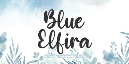 Proudly presenting: Blue Elfira Blue Elfira is a beautyful handwritten script font. Blue Elfira is perfect for product packaging, branding projects, magazines, social media, wedding invitations, or just used to express words above the background. Blue Elfira also comes with multillingual support. Enjoy the font, thank you!
 - Hello Magnolia by Adante Creative,
$23.00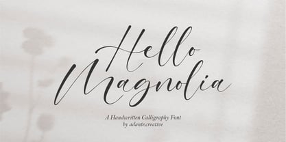 Hello Magnolia A Handwritten Calligraphy Font Hello Magnolia is perfect for product packaging, branding project, megazine, social media, wedding, or just used to express words above the background. Magnolia also multilingual support. Enjoy the font, feel free to comment or feedback, send me PM or email.
 - Blushmine by Adante Creative,
$23.00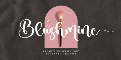 Introducing by Adante.Creative Proudly Present, Blushmine Blushmine A Beautiful Script Font Blushmine is perfect for product packaging, branding project, magazine, social media, wedding, or just used to express words above the background. Enjoy the font, feel free to comment or feedback, send me PM or email.
 - Biograf by Balpirick,
$15.00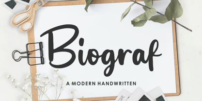 Biograf is a Modern Handwritten Font. Biograf is perfect for product packaging, branding project, megazine, social media, wedding, or just used to express words above the background. Biograf also multilingual support. Enjoy the font, feel free to comment or feedback, send me PM or email. Thank you!
 - Rumaisha by Zeenesia Studio,
$14.00 Proudly Present, Rumaisha Script Font. Rumaisha is an Elegant Calligraphy Font. Rumaisha is perfect for product packaging, branding project, megazine, social media, wedding, or just used to express words above the background. Rumaisha also multilingual support, and you get extras ligature and more alternate Enjoy the font!
 - Goldmind by Balpirick,
$15.00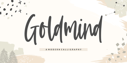 Proudly Present, Goldmind Font. Goldmind is a Modern Calligraphy font. Goldmind is perfect for product packaging, branding project, megazine, social media, wedding, or just used to express words above the background. Enjoy the font, feel free to comment or feedback, send me PM or email. Thank you!
 - Silentclaire by Allouse Studio,
$16.00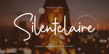 Proudly Presenting, Silentclaire A Monoline Handwritten Font Silentclaire is perfect for product packaging, branding project, megazine, social media, wedding, or just used to express words above the background. Silentclaire also multilingual support. Enjoy the font, feel free to comment or feedback, send me PM or email.
 - Thinna Bell by Allouse Studio,
$16.00 Proudly PresentingTinna Bell, a Bold Script Font. Tinna Bell is perfect on any tittle, product packaging, branding project, megazine, social media, wedding, or just used to express words above the background. Enjoy the font, feel free to comment or feedback, send me PM or email. Thank You!
 - Rolasand by Balpirick,
$15.00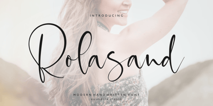 Rolasand is a Modern Handwritten Font. Rolasand is perfect for product packaging, branding project, megazine, social media, wedding, or just used to express words above the background. Rolasand also multilingual support. Enjoy the font, feel free to comment or feedback, send me PM or email. Thank you!
 - Malpicamoln by Allouse Studio,
$16.00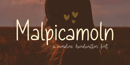 Proudly Presenting, Malpicamoln A Monoline Handwritten Font Malpicamoln is perfect for product packaging, branding project, megazine, social media, wedding, or just used to express words above the background. Malpicamoln also multilingual support. Enjoy the font, feel free to comment or feedback, send me PM or email.
 - Amberstone by Timurtype,
$14.00 Introducing by Timur type Amberstone A Handwritten Script Font Amberstone is perfect for product packaging, branding project, magazine, social media, wedding, or just used to express words above the background. Amberstone also has multilingual support. Embelish your designs with our original fonts. Enjoy the font, thank you!
 - Avarice by VP Creative Shop,
$14.00 Introducing Avarice - serif typeface | 4 fonts Avarice is long and elegant typeface loaded with 4 fonts and multilingual support. It's a very versatile font that works great in large and small sizes. This font is perfect for branding projects, home-ware designs, product packaging, magazine headers - or simply as a stylish text overlay to any background image. FEATURES Uppercase, lowercase, numeral, punctuation & Symbol Regular 2 alternate styles italic Multilingual support No special software is required to type out the standard characters of the Typeface. Canva friendly Feel free to contact me if you have any questions! Mock ups and backgrounds used are not included. Thank you! Enjoy!
 - Ghadys by ErlosDesign,
$15.00 Ghadys is a sweet, romantic and timeless handwritten font. It looks stunning on wedding invitations, thank you cards, quotes, greeting cards, logos, business cards and every other design which needs a handwritten touch. This font is PUA encoded which means you can access all of the glyphs and swashes with ease! It features a varying baseline, smooth lines, gorgeous glyphs and stunning alternates. The file you will get is: • Works on PC & Mac • Simple installation • Can be accessed in Adobe Illustrator, Adobe Photoshop, Adobe InDesign, and even works in Microsoft Word. • Encoded PUA Character - Can be accessed completely without additional design software. Happy Crafting!
 - Rabble by VP Creative Shop,
$14.00 Introducing Rabble - display typeface - 4 fonts Rabble is fragile and vintage typeface loaded with 4 fonts and multilingual support. It's a very versatile font that works great in large and small sizes. This font is perfect for branding projects, home-ware designs, product packaging, magazine headers - or simply as a stylish text overlay to any background image. FEATURES Uppercase, lowercase, numeral, punctuation & Symbol Regular 2 alternate styles Italic Multilingual support No special software is required to type out the standard characters of the Typeface. Canva friendly Feel free to contact me if you have any questions! Mock ups and backgrounds used are not included. Thank you! Enjoy!
 - Kingsmith by Keristyper Studio,
$14.00 Kingsmith is a script typeface inspired by vintage typography and fonts in the 40s. The basic letters are simple but modified with stylistics to make it look more attractive, there are many alternatives. Great for logos, titles, t-shirts, packages, and anywhere else you need this kind of lined, legible script font. Kingsmith Font multilingual support: Afrikaans, Albanian, Catalan, Danish, Dutch, English, Estonian, French, Finnish, German, Icelandic, Indonesian, Italian, Malay, Norwegian, Portuguese, Spanish, Swedish, Zulu, and many more. What’s Included : Web Fonts Standard & Multilingual glyphs Ligature Works on PC & Mac Simple installations Accessible in Adobe Illustrator, Adobe Photoshop, Adobe InDesign, and even work on Microsoft Word. Hope you enjoy our font!
 - Footle by VP Creative Shop,
$14.00 Introducing Footle - serif font Footle is gentle and elegant font combined in it regular and italic styles, loaded with multilingual support. It's a very versatile font that works great in large and small sizes. This font is perfect for branding projects, home-ware designs, product packaging, magazine headers - or simply as a stylish text overlay to any background image. FEATURES Uppercase, numeral, punctuation & Symbol Uppercase letters - regular glyphs Lowercase letters - italic glyphs Multilingual support No special software is required to type out the standard characters of the Typeface. Canva friendly Feel free to contact me if you have any questions! Mock ups and backgrounds used are not included. Thank you! Enjoy!
