10,000 search results
(0.081 seconds)
- URW Form by URW Type Foundry,
$35.99 URW Form by Volker Schnebel is the quintessence of a modern sans. Originally inspired by the timeless classic Futura, URW Form is a mix of classic and modern geometric typefaces, yet still incorporates the fundamental rules of design and looks and functions like a contemporary sans. In addition to its strong identity, URW Form has all the quality characteristics we come to expect from a Schnebel typeface. Available in 80 styles and four widths, there is also a much sought-after semi-condensed extension to broaden its creative spectrum. Weights range from the filigree Thin to the forceful Poster, making it a truly versatile sans serif typeface.
 - Plywood by Canada Type,
$24.95 Plywood is based on a long lost American film classic: Franklin Typefounders's Barker Flare from the early 1970s. Plywood is a surprisingly effective mix between the rigid confidence of nineteenth century wood types and the smooth feminine curves of twentieth century art nouveau ideas. With many variations on almost every letter in the alphabet, it's a versatile typeface that can make itself timelessly at home in multiple design environments, with motifs ranging from the strong and western to the crafty and artsy. Plywood's very expanded character set comes in all popular font formats, including a Pro version that takes advantage of OpenType's many character alternating features in supporting programs.
 - Qadi by Linotype,
$187.99Qadi is a modern Arabic display face that includes the traditional range of letterforms. These extra bold shapes are striking, graceful, and confidently calligraphic. Produced in the mid 1980s under the design direction of the noted British typographer Walter Tracy, Qadi proved to be a very popular typeface for magazine and newspaper publications. Qadi has been updated to take full advantage of digital technology for accurate diacritical positioning and kerning refinements, ensuring high quality Arabic typesetting. The OpenType font incorporates the Arabic codepage, and supports Arabic and Persian. It also includes both tabular Arabic and Persian numerals, as well as Latin figures and complete punctuation. - Pricing Labels JNL by Jeff Levine,
$29.00Pricing Labels JNL gives you a set of digital price gun labels in fifty-one of the most common store departments, plus an untitled title label on the lower case ‘z’ key. Additionally, numbers for creating prices are on the standard keystrokes (for dollar amounts), and smaller numbers/underscores (for cents amounts) are on the shift key groupings for the number keys. The dollar and cents sign are on the left and right brackets, the decimal point is on the period key and the words “each” and “for” [set sideways] are on the greater and lesser keys. - Reverie by District,
$15.00 Reverie is a cheerful band of letters that bounce across the page and get together to create words in three weights. Generous spacing and a modest x-height project an airy typeface that's open but not frail. Quirky without being too whimsical. Use the regular weight for surprisingly readable text or put the light and bold weights to use for decorative headlines and titles.
 - Cypher by Typeco,
$29.00Cypher is a techno looking font that attempts to employ the Gestalt principal of closure. It may, at larger sizes look like some sort of code or a bunch of dots and dashes, but when viewed at smaller sizes it falls together into legible words. This font family was first inspired by an experiment to try to make a legible upper and lower alphabet with the smallest grid possible that would still describe the letterforms. The original conclusion was that it could be done in a 3x6 grid. This made a fun design exercise, but it makes a lousy font. The grid was expanded a bit for aesthetic reasons to a 3x8 grid, But not restricted so severely and so occasionally goes wider than 3 for the certain letterforms. From this a whole family of widths and weights was born, and rather than simply obliquing for italics, a true italic of sorts was created. Cypher is a versatile family of 24 fonts – 4 widths, each with 3 weights and their accompanying italics. - Adobe Caslon by Adobe,
$35.00The Englishman William Caslon punchcut many roman, italic, and non-Latin typefaces from 1720 until his death in 1766. At that time most types were being imported to England from Dutch sources, so Caslon was influenced by the characteristics of Dutch types. He did, however, achieve a level of craft that enabled his recognition as the first great English punchcutter. Caslon's roman became so popular that it was known as the script of kings, although on the other side of the political spectrum (and the ocean), the Americans used it for their Declaration of Independence in 1776. The original Caslon specimen sheets and punches have long provided a fertile source for the range of types bearing his name. Identifying characteristics of most Caslons include a cap A with a scooped-out apex; a cap C with two full serifs; and in the italic, a swashed lowercase v and w. Caslon's types have achieved legendary status among printers and typographers, and are considered safe, solid, and dependable. Carol Twombly designed this Caslon revival for Adobe in 1990, after studying Caslon's own specimen sheets from the mid-eighteenth century. This elegant version is quite true to the source, and has been optimized for the demands of digital design and printing. Adobe Caslon? makes an excellent text font and includes just about everything needed by the discriminating typographer: small caps, Old style Figures, swash letters, alternates, ligatures, expert characters, central European characters, and a plethora of period ornaments. - Multiple by Latinotype,
$39.00 As its name suggests, Multiple is a family with multiple font styles. The idea that sums up the concept behind the typeface is “workhorse”. The challenge was to develop a useful font fit for any scenario and suitable for any design needs: editorial design, packaging, branding, screen use, etc. Multiple features soft, rounded shapes and large counterforms which make it well-suited for both text and display usage. The proportions are based on classic typefaces yet its design was specially created to provide a high degree of versatility. Multiple contains different stylistic sets whose variety of glyphs provides a wide range of choices for any design project. Partly humanist and partly grotesque, Multiple comes with a number of font variants that will help you choose the style that will best meet your needs. The font also includes a serif version with the same number of variants as its sans counterpart. The sans version includes 4 stylistic sets while its slab companion comes with 3 sets, both available as separate alt family packages (ideal for those seeking ready-to-use alternate glyph sets). These alternate characters are also available as OpenType features in the regular versions. Multiple comes in 5 weights—ranging from Extra Light to Bold - with matching italics, and contains a 395-character set that supports 207 different languages. Multiple: one font, multiple faces.
 - Joker by ParaType,
$30.00 The original sketch of Joker was drawn by Viktor Kharyk in 1978 as experiment on creation type by a method of subtraction. In 2000 the font was digitized, modified and Hebrew, Greek, Georgian, Armenian and Arabi? alphabets and outline style were added. As a display face, Joker allows the creation of decorative compositions, easily combining a vertical and horizontal arrangement of words. Its characters are easy for filling with images. In line the face creates ornamental effect very appropriate for logotype design. The font is good to set small expressive advertising texts also. Joker type family received the third prize at TypeArt 2001 Cyrillic type design competition in Moscow.
 - Arendahl by insigne,
$21.99Arendahl is a natural-looking, irregular connected handwriting script. The script has a fluctuating baseline and swirling ending swashes to give the lettering a soothing flow. Arendahl utilizes OpenType ligatures and alternates to prevent duplicate letterforms, and automatically substitutes the best letter combination or word glyph. Arendahl includes 64 discretionary ligatures based on the most common pairs in the English language, a full set of alternates for every English letter, ending swashes and ornaments. The Arendahl family is made up of eight fonts, including an alternate, bold weights and script versions. - arnica by Justi,
$15.00 Arnica is a display font based on a simple geometry that uses circles (and modules) as a structure. It is an experimental project where, in place of upercases, has alternate characters and swashes. Furthermore, arnica has 50 discretionary ligatures which, when activated, give a totally different touch to the font and also has the bold weight, which reinforce the experimentalism of the project. Combining lowercases with upercases, plus discretionary ligatures and bolds, you can write the same word in several different ways. The character set offers more than 400 glyphs and support for many languages.
 - Verily Serif Mono - Unknown license

- Boilermaker by Stiggy & Sands,
$29.00 A Stylish Condensed Sans Boilermaker began as a digitization of a film typeface from LetterGraphics dubbed Flair G100. From this origin, it has evolved to a much more robust character set than its original. From the inclusion of original unicase and lowercase alternates to the addition of a Russian language expansion, Boilermaker really shines. See the 4th graphic for a comprehensive character map preview. Boilermaker is loaded with features to give you plenty of customisation options: - Stylistic Alternates feature for Unicase & Lowercase alternates. - Russian language coverage. - A Full set of Inferiors and Superiors for Limitless Fractions - Tabular and Proportional figure sets Approx. 602 Character Glyph Set: Boilermaker comes with a glyphset that includes standard & punctuation, international language support, unicase & lowercase alternates, alternate numeral styles, subscript and superscript.
 - Willow by Adobe,
$29.00Willow is an Adobe Originals typeface designed in 1990 by Joy Redick for the Adobe Wood Type series. Willow is a condensed typeface modeled on nineteenth-century wood types known as Clarendons (wood type Clarendons do not resemble the English metal types of that name). Clarendon condensed faces were originally so well-designed that words or a line of display type have an even color that is remarkable for wood types. Taken from proofs of type in the Rob Roy Kelly Collection housed at the University of Texas at Austin, Willow can be used for display work such packaging, advertising, and posters. - Haboro Slab by insigne,
$- Haboro Slab. It’s a nose-to-the-grindstone kind of font like the first of its family. This slab serif pushes through the clutter powerfully in editorial and corporate work such as business websites and software. The Haboro hyperfamily as a whole is known for its ability to make the work clear and simple, even with the fonts’ advanced angle--and Slab is no change here. Consistent with Haboro, too, the simplified geometric features of the slab face just make sense, no matter where you use it. Its timeless wedge-molded serifs give this family the formula it needs to function flexibly in jobs from fashion to packaging. Enhance your output with the font’s wide range of ligatures and alternates, including OpenType alternates. Use Haboro Slab’s large pair of solution glyphs and various other OpenType specifics, too, to give your message the clarity it deserves. Even more, it couples well with the sophisticated didone of the Haboro hyperfamily to further expand your capabilities. Haboro Slab has every quality you need for successful lettering. Use this modification on a classy tradition to mold and shape your next layout, whether website, iPhone app, advertising, or newspaper. There is no work Haboro Slab won’t power through.
 - Elyzabeth Pro by moriztype,
$15.00 Elyzabeth Pro is a very elegant and practical sans serif font family and precise in its creation. clean fonts that stand upright elegantly that are soft and familiar and easy to read, Not boring to the reader. This type of font is great to use for very large writing purposes, ranging from notes on daily activities, magazines, newspapers, logos, posters, product compositions, product descriptions to be sold and indications of any product composition that requires writing shadows. Elizabeth Pro contains eight fonts. Broadly speaking, this font has two models, namely Regular and Italic. (Thin, Thin Italic, Regular, Regular Italic, Semi Bold, Semi Bold Italic, Bold and Bold Italic. They all support Latin, Greek, and Cryillic characters. This font will be a great asset to your font library, as it has the potential to enhance your next project creation.
 - Letraflex by Art Grootfontein,
$19.00 Letraflex is a bold retro-inspired typeface with a slightly futuristic style. The family is based on old computer lettering and Magnetic Ink Character Recognition, with a little contemporary twist including ink traps. Letraflex layered fonts provide users with a wide range of choices for any design project. This family is an excellent pick for eye-catching designs, including Headline, Poster, Branding, Logos, Concert, and any other heavy design! Take a look at this video to see Letraflex in motion!
 - Musical Comedy JNL by Jeff Levine,
$29.00 The hand lettered show card brush lettering in the trailer for the 1960 musical comedy “Bells are Ringing” (starring Dean Martin and Judy Holliday) inspired Musical Comedy JNL, which is available in both regular and oblique versions.
 - DT Paperside by Dragon Tongue Foundry,
$15.00 Paperside: Neither Papyrus nor SSI Countryside. Inspired in some ways by the Papyrus form, but untextured and smoother, with the dimensions and proportions more open, like that of Countryside SSi, with its larger easily readable lowercase body, and more consistent, shorter stems. Paperside has an open scripted feel which is pleasing on the eye and easy to read. Paperside can enhance the first letter of most sentences automatically, and changes other letters to suit their position within words, and the letters they appear beside. Now comes in 5 weights plus italic. For best results, use this ‘smart font’ with Contextual Ligatures turned on. Mulitiple Stylistic Alternatives are included. Inspiration for this font came from two other fonts. Papyrus: was designed by Chris Costello and created in 1982, it is a hand-drawn textured typeface, emulating texts written in biblical times. One of the most used (and misused) fonts of all times. Owned by Letraset, and currently published by the Internation Typeface Corporating (ITC). Countryside SSi: The serif font of an unknown designer, is currently licensed by Southern Software Inc. Feel free to preview some of the Dragon Tongue fonts that are yet to be released, at https://www.dragon-tongue.com/fonts
 - Cohort by insigne,
$22.00 Cohort is a strong and crisp geometric sans serif. Cohort uses a rounded rectangle as its central motif. Although the geometric design is minimalistic, Cohort has a variety of unique letterforms that keep the design from being too predictable and maintains a bit of beautiful nuance with plenty of legibility. Cohort's six different weights give it a great deal of versatility, from its sharp and potent black weight to the fresh and razor sharp thin. Cohort can be used for logotypes, headlines or short blocks of text. Cohort includes many useful OpenType features, including a set of upright italic swash alternates, ligatures, small caps, fractions and old style figures, sharper and more unique counterforms and simplified characters for titling. OpenType-capable applications such as the Adobe suite or Quark can take full advantage of automatically replacing ligatures and alternates. This family also includes the glyphs to support a wide range of latin based languages.
 - Salsabila by BBA Key,
$14.00 Salsabila is a new and fresh script with decorative. It works well for greeting cards, branding material, business cards, quotes, posters, and more. This font comes with 473 glyphs. Alternate characters are divided into several OpenType features such as Swashes, Stylistic Sets, Stylistic Alternates, and Contextual Alternates. OpenType features are accessible by using Open Type savvy programs such as Adobe Illustrator, Adobe InDesign, Adobe Photoshop Corel Draw X versions, and Microsoft Word. And this font has code PUA unicode (font with special code), so that all alternative characters can be easily accessed by craftsmen or designers. This Font The comes with Uppercase & lowercase International signature & symbol Punctuation Support & PUA number Unicode Style Style Alternative Style Style Range 1-11 Contextual Character Variations. If you do not have programs that support OpenType features like Adobe Illustrator and CorelDraw X Versions, you can access all alternative flying machines using Font Book (Mac) or Character Map (Windows).
 - Golden Clouds by Anastasia Kuznetsova,
$22.00 Say hello to Golden Clouds :) A charming and cute font duo with handwritten letters and doodles!! Bring some irresistible fun to your design with Golden Clouds Font Duo! This playful font duo consists of a fast-flowing signature font and a charming font with small capital letters as the perfect companion. But that's not all - the set also includes a bonus Doodle font containing hand-drawn drawings designed to give your "Golden Clouds" fonts the appeal of handmade. Golden Clouds Script • A clean, smooth handwritten signature font containing uppercase and lowercase characters, numbers and a wide range of punctuation marks. Golden Clouds SmallCaps • Clean, charming handwritten font with capital letters. Golden Clouds Doodles • A set of hand-drawn drawings designed in combination with Script and Small Caps fonts. Just set it as your own font and enter any character to create each drawing. "Golden Clouds" is ideal for everyday use in greeting cards, illustrations, quotes, original branding, book covers, children's books, packaging and much more :) Font Features: A-Z; a-z character set; 1 language (English); numbers and punctuation marks, symbols. Fonts can be opened and used in any software that can read standard fonts, even in MS Word. No special software is required to get started. It is recommended to use it in Adobe Illustrator or Adobe Photoshop. Made with love and magic ♡ Thank you for reading it, and do not hesitate to send me a message if you have any questions! ~ Anastasia
 - Simah Zaza Arabic by Zaza type,
$24.00 Simah zaza typeface - خط سمة ظاظا Simah Zaza is an Arabic typeface that has luxury yet warm and humane feelings. It's legible, soft, clear, flexible, simple, and contemporary. The design is inspired by the Kufic calligraphic style and influenced by the Naskh style. Simah Zaza is highly crafted in order to perform well both on screen and in print. it functions well even on small font sizes. It has a wide range of use possibilities headlines, logotypes, branding, books, magazines, motion graphics, and use on the web and Tv. Simah Zaza consists of five weights.
 - Chandello by Cooldesignlab,
$10.00 Chandello is a handwritten signature script with a natural & stylish flow, perfectly suited to signature, stationery, logo, typography quotes, magazine or book cover, website header, clothing, branding, packaging design and more. A handwritten script font containing upper and lowercase characters, numerals and a large range of punctuation. Chandello is a must-have signature script that has a diverse set of alternates that will surely be used many times over in various projects in the future. This collection fills a void and separates itself from other scripts available.
 - Orange Street by Putracetol,
$24.00 Orange Street - Rounded Modern Sans Font is an all-caps sans-serif typeface that offers three distinct versions: clean, rough, and textured. With its versatile character set, this font seamlessly adapts to various design themes. Its flexibility is further enhanced by the range of available versions, making it a valuable asset for design projects spanning modern, retro, classic, and playful aesthetics. Whether it's for logos, branding, posters, titles, headlines, printing materials, quotes, or more, Orange Street lends itself perfectly to an array of creative applications.
 - Mix String Cheese by Mix Fonts,
$13.00 Flexi. Bendy. Stringy. Rubbery. Introducing Mix String Cheese – the ultimate handwritten font for adding personality and playfulness to your designs. This font is perfect for logos, titles, and packaging design, and comes with a full range of characters including uppercase letters, punctuation, numbers, and special symbols and accents. Mix String Cheese is a versatile font that is sure to bring fun and creativity to all of your projects. Don’t settle for boring, generic fonts – add some flavor to your designs with Mix String Cheese.
 - Qiblat Sans by Studio Fat Cat,
$15.00 Qiblat Sans is a modern sans serif font designed with calligraphy style for wide range of need. It also provided 5 styles of weight to give it's users freedom when using it.
 - TheSans by LucasFonts,
$59.00 TheSans is a modern classic. A favourite for corporate design, editorial design and new media, it comes in an astounding range of widths and weights, including a large set of hairline fonts.
 - banister by One Fonty Day,
$15.00 Banister looks both contemporary and vintage. It contains a total of 12 styles including two main styles (Normal and Loaded), and for each style it comes with two widths (Semi-condensed and Semi-Expanded) and three weights (Light, Regular and Bold). The 40’s inspired style is subtle in banister, so it comes across more contemporary. Also, slightly curved strokes can be found on some letters, which gives a more organic feeling overall. To gain full advantage of banister, you can toggle “Fill” and “Stroke” on any editable applications to experiment the style, also layering normal and loaded styles let you discover something unexpected. Banister is versatile, simple and organic looking typeface, and good for headlines, logos, tiles and any large texts.
 - Vintage Painting by Aestherica Studio,
$12.00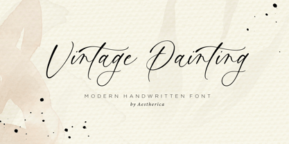 Introducing the new Handwritten Script Font by Aestherica Studio. Proudly Present, Vintage Painting Vintage Painting is perfect for product packaging, branding project, megazine, social media, wedding, or just used to express words above the background. This font includes multilingual support. Enjoy the font, feel free to comment or feedback, send me PM or email.
 - Bowline Script by Andrew Footit,
$22.00 Bowline Script is a classic monoline cursive script font. This family of 3 fonts has 2 weight options and a Vintage version. Bowline Script is inspired by classic cursive handwriting, the great thing about Bowline Script is its versatile use, it can be used in a retro way or a more modern, clean approach. Anchor script was created with the designer in mind by including some useful stylistic alternates and some swash elements that compliment the font. Use Bowline Script in a range of items like packaging, posters, logotypes, branding, book covers, magazines, wedding stationery and much more. You have the options to keep it clean and modern or take it back to a vintage era.
 - FM Bolyar TypeCraft by The Fontmaker,
$29.00 A super font family mastered to an unparalleled level of precision, Bolyar TypeCraft is a collection multiple textured styles that represent historical printing techniques. A proud member of our successful Bolyar lineage this unique type family provides unlimited options for your creativity and is quite able to satisfy every typographic taste. If you are addicted to classic vintage style, then you could easily use Bolyar TypeCraft for almost any project of desire - from letterheads, logos and catchy headlines to elegant packaging, book covers and wine labels. Alternates, Swashes and Ligatures will help you customize almost every single letter and fit perfectly to your artwork. Bolyar TypeCraft provides a broad range of advanced typographical features: Multiple subfamilies each packing the two classic Bolyar styles - Regular (N) and Ornate (O). Five weights per style ranging from thin (100) to black (900) with full multilingual support for all Latin based languages as well as Cyrillic. A 1000+ glyphs per weight including three multilingual stylistic sets, swash designs and useful discretionary ligatures. Sub- and superscript basic Latin and Cyrillic glyphs as well as figures. Two positional models for lowercase accessed as OpenType case sensitive forms - baseline (default) or vertical centering. Contextual alternates and special stylistic set with different contour roughness exclusively developed for Bolyar Rough subfamily. A multifunctional Bolyar Shadow family witch can be flawlessly paired with any of the sub-family styles provided. Check out some great examples of Bolyar TypeCraft in use by the Labelmaker
 - Katarine by Suitcase Type Foundry,
$75.00From today's point of view Katarine has a rather unusual origin. Initially an all-caps display face, what was to become the Medium weight of the family was augmented with a lower case, then the character set was completed by adding all the missing glyphs. The next step was the creation of the Light and the Bold weights with matching Italics. This working method compromised the relationships between the characters across the different weights After some consideration the decision was made to start over and draw the complete family from scratch. This time the "conventional" process was followed — first the Light and Bold weights were designed. Those extremes were used to interpolate the Regular, Medium and Semibold weights. When compared to the original, the glyphs of the new fonts are slightly wider. The construction of the letters is sturdy, with an x-height that varies from the heaviest to the lightest weights. The relationship of the stem weight between the horizontal and vertical strokes is carefully balanced. Characters are open and firm; the italics have room to breathe. The original fonts included two sets of small caps — Small Caps and Petite Caps. However neither set were suited for emphasis, with the Small Caps being too tall and the Petite Caps too short. We decided to replace them both with one set of traditional small caps, slightly taller than the x-height, perfectly suited for emphasis in text usage. The original version of Katarine was partly incorporated into the new OpenType versions. Thus most of the original arrows, frames and boxes can be found in the new Katarine. Each individual weight now contains 830 glyphs, nine sets of numerals, small caps, numerous ligatures and fractions. An additional font named Numbers contains numerals in circles and squares, and is now augmented with accented caps and a number of terminal alternatives, which can easily be accessed through stylistic sets. We also added two extra variants, Experts Regular and Experts Black (in inverted form). Katarine Std preserves the solid construction and excellent legibility of the original family, but has now become a fully featured OpenType typeface. Katarine is suited for a broad range of applications, from simple layouts to intricate corporate systems. It is the typeface of choice where the cold, austere character of modern sans serifs are inappropriate, yet simple shapes and good legibility are required. - Imagist by Fenotype,
$35.00 The mystic sadness of the sight Of a far town seen in the night. Like the poetry movement of the early 20th century, from which the font takes its name, Imagist relies on the power of concrete images and brings an organic vibration to the words it forms. Imagist is a lively and decorative serif typeface with prominent features that appear especially in the letters K, R, M, N, W, V, k, w, v and y. Powerful ball terminals also bring recognizable attraction. Imagist contains six weights and corresponding Italics. Italics have a cursive-style letter s for as Stylistic Alternate. Old Style Numerals and Small Caps can be found in all cuts. Poem by T. E. Hulme.
 - Final Six by Type-Ø-Tones,
$64.00 FinalSix is the typographic adaptation of a lettering. Working on the graphic image for a sports event (the European Waterpolo Final in 2014) we had the idea of creating a character set that reflected the idea of the undulating movement of water in a pool. In practice, we draw characters with rounded tops, bottoms and diagonals and using the word WATERPOLO as a visual reference for a wavy feeling, in a process that we could define as “form follows meaning.” To preserve its personality as much as possible, the most idiosyncratic characters are found in the Default set, while we can find more standardized variations for editorial use in a Stylistic set.
 - Power Talks by Essqué Productions,
$35.00 Inspired by fonts used in financial and law arenas. Bold style reminiscent of 1920s deco era. Great font for play cash or Monopoly-themed party invitations. Vibes of Wall Street movers and shakers. Includes letters from Latin, Greek, Hebrew, and Cyrillic Alphabets - with some common diacritics. Also includes small caps and English feature words like "the", "of", "with", "and", etc. for marquee style accents.
 - I'm Fashionista! by Fontscafe,
$39.00 We’re delighted to bring you ‘I’m Fashionista,’ which simply oozes trendiness, style, glamour, and of course high fashion! This is a font that sings out ‘elite’ in the design sense of the word. Its sophisticated sensibility sets it apart from any other font you may have used. If you’ve ever needed to create your own fonts to use on a fashion flyer, you can already appreciate the value of having ready-to-use fonts such as ‘I’m Fashionsita’ in your bag of tricks! Anything to do with fashion and glamour needs to have that touch of delicacy, charm, beauty, and exclusivity to it, and we find the ‘I’m Fashionsita’ a perfect fit for such jobs. ‘I’m Fashionista’ is a must-have for any designer, especially those working with modern and upmarket designs.
 - Mariage by Linotype,
$40.99Morris Fuller Benton, the principal designer of the American Type Founders, designed Mariage in 1901. Mariage, which has been sold under a plethora of different names during the last century, is a blackletter typeface belonging to the Old English category. The term blackletter refers to typefaces that stem out of the historical printing traditions of northern Europe. These letters, called gebrochene Schriften, or "broken type" in German, are normally elaborately bent and distorted. Their forms often print large amounts of ink upon the page, creating text that leaves a heavy, black impression. The Old English style is a subset of blackletter type that dates back to 1498, when Wynken de Worde introduced textura style printing to England. Continental printers had been printing with textura style letters since Gutenberg's invention of the printing press fifty years earlier. Italian printers stopped using them around 1470. For northern Europeans, texturas remained the most popular form of typeface design until the invention of the fraktur style in Nuremberg. Mariage is heavily classicized sort of Old English type. During the Victorian era, designers admired the Middle Ages for its chivalric, community-based values and its pre-industrial lifestyle. Yet they also found the basic medieval textura letterform too difficult to read by present standards. They desired to modernize this old style. Today, this sort of update is often referred to not as "modernization" but as classicism. Benton's design for ATF builds upon earlier Victorian classicist interpretations of Old English/textura letters. For an example of what these Victorian designs looked like, check out the popular 1990 revival of the genre, Old English . Old English style types often appear drastically different from other blackletters. For contrast, compare Mariage to a classical German fraktur design, Fette Fraktur , a schwabacher style face, or the popular early 20th Century calligraphic gothic from Linotype, Wilhelm Klingspor Gotisch . Especially in the United States, classicist Old English typefaces are thought to espouse tradition and journalistic integrity. These features, together with the inherent, complex beauty of Mariage's forms, make this typeface a perfect choice for certificates, awards, and newsletter mastheads. - Block Gothic by Red Rooster Collection,
$45.00 In 1992, Red Rooster Typefounders created Block Gothic Extra Condensed based on the TP Collection Block Gothic. In 1994, the company created and produced Block Gothic Condensed loosely based on the Extra Condensed; the weight range is markedly different than the earlier release.
 - Torus Pro by Monotype,
$40.00 Torus Pro is a rounded monoline typeface. As its name suggests, this is a more professional version of my original Torus family released in 2017. Each glyph has been scrutinised and redrawn where necessary. In addition, there are now italics, small caps, old style figures, and numerous other improvements. Torus Pro includes many new decorative alternates and ligatures that will add distinctive flourishes to your typographic compositions. With up to nine alternates for some glyphs, these additional styles include stencilled, simple dots, looped and smooth swashes, plus a more aggressive angled option for those looking for something a little different. When used subtly, these alternates and glyph combinations will add flair and personality to your own creations. Perfect for titling and branding, Torus Pro also packs a punch without these features activated, as well as being a comfortable read in long runs of text. There are 12 fonts altogether, ranging from Thin to Heavy weights in both roman and italic. The variable font versions of the family allow you to define the weight exactly to your liking. Torus Pro has an extensive character set that covers all Latin European languages. Key features: 6 weights in both roman and italic Variable fonts included with full family 212 Alternates 20 Ligatures Small Caps Full European character set (Latin only) 1450+ glyphs per font.
