10,000 search results
(0.118 seconds)
- Sofimaria by Qaratype,
$18.00 Sofimaria is a super unique ligature font that you wont forget! It’s a high contrast serif that has loads of style. A modern take on a Caslon style typeface, this font is ideal for those bold headings or wedding invitations. It’s got hundreds of characters and ligatures plus all those European letters! Sofimaria pairs perfectly with a light scripts font or minimal sans serif. Main Features: Uppercase & Lowercase letters Punctuation and special characters Multilingual support Ligatures & Alternate glyphs
 - Ongunkan Varna Vinca by Runic World Tamgacı,
$50.00 The Vinča script is a cache of symbols found belonging to the Vinča culture of the central Balkans over 7000 years ago. The symbols have been a topic of debate amongst historians. The Tărtăria tablets are three tablets discovered in 1961 in the village of Tărtăria(Hungarian: Alsótatárlaka). This is about 30 km (19 mi) from Alba Iulia in Romania.The tablets, dated to around 5300 BC, have symbols inclay: the Vinča symbols. Some claim they are a yet undeciphered language. If this is so, they would be the earliest known form of writing. In 1908 similar symbols were found during excavations, by Miloje Vasić (1869–1956) in Vinča. This is a suburb of Belgrade (Serbia), some 300 km from Turdaș. Later, more were found in another part of Belgrade. Since 1875 over one hundred and fifty Vinča sites have been found in Serbia alone. Many, including Vinča itself, have not been fully excavated. The culture of the whole area is called the Vinča culture. Although some of these symbols look exactly the same as some letters in Etruscan, Greek, and Aramaic, they are generally regarded as a an original, independent development.
 - Cerulean Love by Studio Indigo,
$15.00 Cerulean Love is a soft and clean sans serif font with a strong handwritten feeling. The letter shapes are based on letters written with a brush pen. Its rounded shapes, soft terminals and easy-to read letters adds a friendly look to it which makes it useful for many different kinds of purposes such as products for children, menus, posters, logos etc. It comes with dicritic letters for all European languages. It has quite tall uppercase letters and quite long ascenders and descenders.
 - Aago by Positype,
$22.00 Aago is year-long project to create sans inspired by Positype's popular Aaux Next typeface, but not beholden to its previous conventions. 54 fonts spread across 3 widths, 9 weights, and each with matching italics. Drawn from the ground up to “just work well” across print and screen uses, Aago provides a comfortable, not too wide footprint with hopes of becoming a go-to utilitarian typeface perfect for packaging, branding and identity systems, poster and billboards, small and HD screens alike.
 - Street Rats Monoline by Sipanji21,
$18.00 Street Rats is a Handwritten font with a Realistic monoline graffiti style, with awesome swash perfect for your awesome urban designs. It will elevate a wide range of design projects to the highest levels, be it branding, headings, designs, invitations, signatures, logos, labels, and much more! Features: Uppercase Punctuation Swash PUA Encoded open Support for MAC or PC Simple installation for Adobe Illustrator, Corel Draw, Photoshop, or Procreate (New Updated) That's it! If you have any questions don't hesitate to ask! Stay Classy!
 - Faikinlan by IRF Lab Studio,
$11.00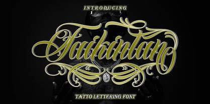 Introducing Faikinlan Tattoo Lettering Font with more details, clean, and more complex. Faikinlan includes uppercase and lowercase letters, numerals, a large range of punctuation, ligatures and multilingual language. All lowercase letters include ending swashes and alternative font. Faikinlan swash In order to use the beautiful swashes, you need a program that supports OpenType features such as Adobe Illustrator CS, Adobe Photoshop CC, Adobe Indesign and Corel Draw. Please contact us if you have any question, we are happy to help you! Thank you !
 - Corsham by Greater Albion Typefounders,
$14.00 Corsham was inspired by traditional stonemason's engraved lettering designs. Designed to be used alone, or in combination with our Corton family, it has wonderfully lively air, with distinctive lively serifs and beautifully swashed downstrokes. Four faces are offered-regular bold and black weights as well as a condensed form. All faces include a range of Opentype features, including ligatures and old-style numerals. The Corsham faces merge 'olde-worlde' charm with fun character, yet remaining clear and legible for text use.
 - SF Liberty by Sultan Fonts,
$9.99 It is a big work that started with Windows in Aden and was redesigned and tuned on an Apple device in Cairo. Liberty is an active contemporary variable font, complete with a flexible range of cases tailored to responsive layouts. The font is clear and legible in small sizes, suitable for printing for large texts, web pages, and other visual uses. Language: Latin default Latin Azerbaijani Latin Catalan Latin Crimean Tatar Latin Kazakh Latin Marshallese Latin Dutch Latin Tatar Latin Turkish
 - Mantika Sans Paneuropean by Linotype,
$67.99With its well-defined characters that are readily legible even in the small font sizes, Mantika Sans by Jürgen Weltin is ideal for typesetting. The elaborately designed and highly individual set of italics enhances the attractiveness of the font.Jürgen Weltin developed the Mantika™ Sans sans serif font using older designs for an serif font as his inspiration. Nothing more than the merest suggestion of the original serifs has survived. Bevelled line endings and the slight variation in thickness of verticals, in particular, provide Mantika Sans with a very dynamic character that evokes manuscript. Short ascenders and descenders give the font a compact appearance that is also underscored by its condensed proportions. Weltin has achieved his aim of producing a typeface with excellent legibility even in small sizes not just by means of the x-height, which is tall in comparison with the capital letters, but also by using clearly defined and well differentiated designs for critical letters, such as i", "I" and "l". Lower case "i", for example, has a serif while the "l" has a curved base.In addition to uppercase numerals, Mantika Sans also has lowercase or old style numerals that have been designed so that they can be used in both tabular and proportional settings. The uppercase numerals are slightly shorter than the uppercase letters, ensuring that the latter can be sympathetically incorporated within continuous text.The Mantika Sans italics are very unusual. They are inclined at only 4.5° (the usual angle for italics is 10 - 12°) and so appear to be almost upright. In addition, they also have quite distinctive forms. The overall effect calls attention to their curvilinear, manuscript character, enhances contrasts and further emphasizes the terminals. Weltin explains: "Within the variety of forms of the italics there are many contrasting terminal elements that create dynamism. The result is a diversity of interaction between the rounded and angular forms". Mantika Sans Italic thus has all the features of a display typeface, but can also be happily used on its own to set longer text passages. Mantika Sans is available in two weights; Regular and Bold, both of which have corresponding italics sets. Mantika Sans has been designed so that the widths of the four related cuts are identical, meaning that a change of font within a single layout will have no effect on justification. In addition, the members of the Mantika Informal font family, designed by Jürgen Weltin in 2010, also have the same thickness. Other font families having weights with equal thickness can be found in the "Linotype Office Alliance series".The Mantika Sans character sets are paneuropean. There are characters for setting texts in Eastern European languages, Greek and Cyrillic. There is also a range of special symbols, including right-angled brackets, subscript and superscript lower case letters, together with numerals, arrows and many different bullet points.As a vibrant and highly legible text font, Mantika Sans has a broad spectrum of potential applications. Its unusual italics are not just perfect for use in display text. The fact that it has only four cuts means that Mantika Sans is particularly suitable for office use or for the setting of business reports. Its excellent legibility even in the small font sizes also makes it ideal as a text for electronic reading devices; this also applies to Mantika Informal.At the 3rd International Eastern Type Design Competition Granshan 2010, Mantika Sans was awarded in the category Greek text typefaces." - Mantika Sans by Linotype,
$50.99 With its well-defined characters that are readily legible even in the small font sizes, Mantika Sans by Jürgen Weltin is ideal for typesetting. The elaborately designed and highly individual set of italics enhances the attractiveness of the font.Jürgen Weltin developed the Mantika™ Sans sans serif font using older designs for an serif font as his inspiration. Nothing more than the merest suggestion of the original serifs has survived. Bevelled line endings and the slight variation in thickness of verticals, in particular, provide Mantika Sans with a very dynamic character that evokes manuscript. Short ascenders and descenders give the font a compact appearance that is also underscored by its condensed proportions. Weltin has achieved his aim of producing a typeface with excellent legibility even in small sizes not just by means of the x-height, which is tall in comparison with the capital letters, but also by using clearly defined and well differentiated designs for critical letters, such as i", "I" and "l". Lower case "i", for example, has a serif while the "l" has a curved base.In addition to uppercase numerals, Mantika Sans also has lowercase or old style numerals that have been designed so that they can be used in both tabular and proportional settings. The uppercase numerals are slightly shorter than the uppercase letters, ensuring that the latter can be sympathetically incorporated within continuous text.The Mantika Sans italics are very unusual. They are inclined at only 4.5° (the usual angle for italics is 10 - 12°) and so appear to be almost upright. In addition, they also have quite distinctive forms. The overall effect calls attention to their curvilinear, manuscript character, enhances contrasts and further emphasizes the terminals. Weltin explains: "Within the variety of forms of the italics there are many contrasting terminal elements that create dynamism. The result is a diversity of interaction between the rounded and angular forms". Mantika Sans Italic thus has all the features of a display typeface, but can also be happily used on its own to set longer text passages. Mantika Sans is available in two weights; Regular and Bold, both of which have corresponding italics sets. Mantika Sans has been designed so that the widths of the four related cuts are identical, meaning that a change of font within a single layout will have no effect on justification. In addition, the members of the Mantika Informal font family, designed by Jürgen Weltin in 2010, also have the same thickness. Other font families having weights with equal thickness can be found in the "Linotype Office Alliance series".The Mantika Sans character sets are paneuropean. There are characters for setting texts in Eastern European languages, Greek and Cyrillic. There is also a range of special symbols, including right-angled brackets, subscript and superscript lower case letters, together with numerals, arrows and many different bullet points.As a vibrant and highly legible text font, Mantika Sans has a broad spectrum of potential applications. Its unusual italics are not just perfect for use in display text. The fact that it has only four cuts means that Mantika Sans is particularly suitable for office use or for the setting of business reports. Its excellent legibility even in the small font sizes also makes it ideal as a text for electronic reading devices; this also applies to Mantika Informal.At the 3rd International Eastern Type Design Competition Granshan 2010, Mantika Sans was awarded in the category Greek text typefaces."
 - Ingrid Font by Enrich Design,
$24.95This font was created from the handwriting of my friend Ingrid. I always felt she had great handwriting and this font is proof of this. There are for styles to choose from, a great alternative to the common handwriting fonts seen everywhere. - Dodo by Indian Summer Studio,
$49.00 Modern antiqua (Victorian, Scotch Roman) «Dodo», 2008–2019. Named so as a portmanteau of Bodoni – Didot. XIX-th century fonts, especially Victorian antiquas, were almost excluded from the modern use by their XX-th century's descendants. And these new books had lost too much of their former beauty, elegance. Their old noble spirit. This project, «Dodo» was started in 2008 year as the first then modern revival for the Old Imperial Russian book scotch antiqua, used 120–170 years ago in almost every printed book. Still keeping the spirit of the Steam æra.
 - MyCRFT by DM Founts,
$28.00 MyCRFT was designed as a custom heading typeface for Drew Maughan's IhNohMinecraft project. ABOUT THE PROJECT Beginning life in 2015 under the name Mascoteers, the project was an ensemble of small-scale characters built from LEGO elements. The challenge was in creating the different figures with the restrictions of existing LEGO elements, while being recognisable as individual characters. The project was initially well received within the LEGO community and with the general public, but was eventually ignored and even ridiculed in favour of LEGO's own BrickHeadz theme, launched in late 2016. It was rebranded IhNohMinecraft as a response to the deliberate cries of "Ih dih Minecraft?" since BrickHeadz' launch. The project has no relation to the popular game. ABOUT THE TYPEFACE The motivation to create MyCRFT was as part of establishing IhNohMinecraft as its own project, by giving it a new visual identity. The typeface could be described as a cross between the ones used for Gears Of War and Overwatch. I liked the boldness of the former, and the italicized straight edges of the latter. MyCRFT was intended to be used in its Black Italic form from the beginning, and was designed around the letters from the word MINECRAFT. Where I couldn't decide on specific characters, I've included the designs as alternative glyphs. I've also included the old "square" Mascoteers logo and the newer "head" IhNohMinecraft logo. MyCRFT is paired with Kanit on the official IhNohMinecraft web site. Let me know if you discover a better pairing! PROJECT LINKS View the IhNohMinecraft "reveal" playlist on YouTube. The official Mascoteers/IhNohMinecraft web site.
 - Assemblage by Latinotype,
$36.00 Assemblage Designed by Daniel Hernández, Alfonso García, Bruno Jara Ahumada and Luciano Vergara. Thanks to Pedro González for his contribution in the initial stage of the design process. Assemblage is a typeface-inspired by Roman square capitals-that comes in 6 different weights and ranging from Thin to Black. The background of the typeface makes it well-suited for branding, short text, titles and complex compositions, thanks to its italic version. Contrary to some conservative fonts, Assemblage includes an italic version with a look based on Elzeverian and Dutch Barroque typefaces, what gives the font an extra dash of elegance, resulting in a very enjoyable design. The family was specially created for labelling wine bottles and general packaging. Assemblage is a font collection consisting of a Sans Serif plus an Italic version of classic features. The family comes in 6 weights and includes ligatures, caps and small caps plus 3 sets of smaller small caps for different kinds of composition. The Italic version-with strong decorative features-comes with swashes. Assemblage also includes a set of dingbats, especially designed for packaging as well as for publishing or branding. The Sans contains 979 characters and the Italic version 620 characters. Assemblage supports 212 different languages and its OpenType features include ligatures, semi oldstyle figures, 3 sets of ornamental small caps (in the Sans version), swashes, ending forms and alternates in the Italic version.
 - Banco by ITC,
$29.00Banco was the first typeface work of French designer Roger Excoffon and was released in 1952. The strong forms look as though they were rolled out of sheet metal and feature upright, tapering strokes. The slight slant, the varying heights of stroke ends, and the relationships between line and curve give Banco font its sense of liveliness and dynamism. Excoffon did not design a matching lower case alphabet for his capitals, but this was accomplished later by Phill Grimshaw, who also designed the light weight. He deliberately 'underdesigned' the lower case forms, producing a more reserved alphabet based on the design ideas of the original. - Seriguela by Latinotype,
$29.00 Seriguela is an ultra condensed sans serif typeface with a unique personality. It comes in normal and display versions, each with 9 weights, as well as italics and reverse italics totaling 54 fonts. Seriguela is flavor in motion and each part of its system works together to captivate you, combining emotion and usability, allowing you to create attractive and unique designs. Seriguela followed a very distinctive recipe to design its alphabet: it started with a grotesque base and applied movement and joy in a very original way. The blacker and more contrasted, the tastier. The contrast in its display version is one of the most important features of Seriguela: the unconventional relationship between thick and thin lines, as it does not strictly follow any historical model of contrast construction and makes it noticeable. Its high contrast is not present in every single character and it is often in the “wrong” places. The original charm of Seriguela is maintained throughout all its styles. With peculiar details: the verticality and its proportions, as well as terminals that resemble hooks in some curves, a characteristic that breaks with the vertical modular rhythm. Seriguela is a versatile font system, designed primarily for display uses with a need of visual impact.
 - HU Hikiki by Heummdesign,
$15.00 English HU Hikiki is a unique typeface with a tilted initial consonant, giving it a feeling of lying down and a sense of rhythm due to its large height. The combination of long vowels compared to small consonants adds to the feeling of handwriting. There are 1 weights of HU Hikiki : Medium Greek Το HU Hikiki είναι μια μοναδική γραμματοσειρά με ένα κεκλιμένο αρχικό σύμφωνο, δίνοντάς του μια αίσθηση ξαπλωμένης και μια αίσθηση ρυθμού λόγω του μεγάλου ύψους της. Ο συνδυασμός μακριών φωνητέρων σε σύγκριση με μικρά σύμφωνα προσθέτει στην αίσθηση του γραφικού χαρακτήρα. Υπάρχουν 1 βάρη hu Hikiki: Μέσο Cyrillic HU Hikiki – уникальный шрифт с наклоненным первоначальным согласоном, дающий ему ощущение лежания и ритма благодаря своей большой высоте. Сочетание длинных гласных по сравнению с небольшими согласные добавляет чувство почерка. Есть 1 вес HU Hikiki : Средний
 - Xamire Monoline by Afkari Studio,
$19.00 Introducing Xamire, the epitome of elegance and modernity in typography. This monoline script font redefines sophistication, blending sleekness with a touch of artistic flair. Its seamless strokes and graceful curves exude a timeless charm, perfect for elevating any design project. Crafted with precision and attention to detail, Xamire offers versatility that transcends traditional boundaries. Whether used for branding, invitations, advertising, or editorial design, its clean lines and effortless flow add a touch of refinement to any visual creation. Embrace the allure of Xamire and unlock a world of creative possibilities. With its extensive character set and seamless connectivity, this font is designed to empower your designs, captivating audiences and leaving a lasting impression. Elevate your projects with Xamire - where modernity meets sophistication in every stroke. Highlighted Features: – Uppercase, Lowercase, Number, and Punctuation – Special alternates and ligatures – Works on PC & Mac – Simple installations – Accessible in Adobe Illustrator, Adobe Photoshop, Adobe InDesign, and even work on Microsoft Word – Fully accessible without additional design software. – Mültîlíñgúãl Sùppört for; ä ö ü Ä Ö Ü ß ¿ ¡ Hope you enjoy our font and this font is a useful font for your projects!
 - Super Puff MX by Xuveki,
$12.00 Super Puff MX is a Y2K inspired variable display typeface that takes from early 2000's futurism, pop, and cartoon aesthetics. Due to its heavy weight and alternates it offers, it's perfect for a variety of logos, 3D, and motion graphics. SPMX was designed specifically for those use cases, and its wide range of styles and alternates gives you lots of freedom for creating unique graphics that still capture the same fun, futuristic, and playful early 2000's aesthetic. Features & What's Included: Variable font file that allows you to choose any slant degree from Regular to Full Tilt. OTF font files in 4 styles or slants, from Regular to Full Tilt. This is included because many young, talented designers around the world don't have access to programs that can take advantage of a variable font. I want them to have the option of using properly slanted and kerned oblique instances of Super Puff. Robust OpenType features including a vast pool of alternates and stylistic sets giving you lots of choices when choosing letters, numbers, and punctuation. Two stylistic sets for letters and numbers One stylistic set for punctuation and symbols One stylistic set that replaces punctuation with Y2K style icons Extensive Latin language support covering almost all of Europe and South America. All multilingual glyphs have access to alternates as well. Super Puff MX was designed and developed by Abe Zeinali/Xuveki.
 - Chubs by Type.p,
$24.00 "Chubs," a typeface specifically designed for large display sizes, perfect for making a bold statement. Each letter in Chubs has been meticulously crafted to possess a thick and prominent appearance, ensuring that your designs leave a lasting impact on viewers. Chubs's distinctive weight and blackness make it an ideal choice for a wide range of applications, including posters, packaging, and logos. Whether you want to create eye-catching promotional materials or design a powerful brand identity, Chubs has got you covered. Within the Chubs typeface family, you'll find two distinct styles, each with its own personality and visual appeal. The first style, "Chubs Black," features letters with a captivating slit, reminiscent of a belly that overlaps. This distinctive groove adds an extra layer of visual interest and uniqueness to your designs. On the other hand, "Chubs Filled" offers a solid and plump appearance, without the characteristic slit. This style amplifies the chubby nature of the letters, resulting in a bold and impactful display. To further enhance your creative options, both styles within the Chubs family include an alternate character set featuring a wink shadow in every letter. These additional characters provide a touch of fanciness and playfulness, allowing you to experiment and add unique elements to your designs. Choose "Chubs" for your next big project, and witness the boldness and charm that sets your designs apart from the rest. Let Chubs bring your ideas to life and make a powerful visual statement that captures attention and leaves a lasting impression.
 - Volatile Serif by Mans Greback,
$59.00 Volatile Serif, designed by Mans Greback, is a luxurious and romantic typeface that exudes an air of softness and delicate beauty. Its flowing, liquified forms, and delicate swirls evoke feelings of empathy, creating a sense of connection and warmth. This font is perfect for high-end projects that demand a touch of fine elegance. Inspired by the gentle movements of water, the designer sought to capture the essence of fluidity in Volatile Serif. The result is a typeface that feels alive, as if its character is organically creating the word, making it a perfect choice for luxury brands, romantic designs, and storytelling. The font is built with advanced OpenType functionality and has a guaranteed top-notch quality, containing stylistic and contextual alternates, ligatures, and more features; all to give you full control and customizability. It has extensive lingual support, covering all Latin-based languages, from Northern Europe to South Africa, from America to South-East Asia. It contains all characters and symbols you'll ever need, including all punctuation and numbers. Mans Greback is a Swedish typeface designer with a passion for creating unique and versatile fonts. With an extensive background in design and typography, Mans has built a reputation for his meticulous attention to detail and prolific craftsmanship. His many fonts are widely used by designers around the world, making his work synonymous with creativity and innovation.
 - Elektrakution by Comicraft,
$19.00 SHE'S DEAD, FRANK It's the year 1991, BC (Before Comicraft) when REM were still making records and Frank Miller’s memorable run on Marvel Comics’ DAREDEVIL was just over ten years old. Comicraft’s Richard Starkings found himself working in Anaheim, California for Graphitti Designs. Graphitti had produced the first hardcover edition of Miller’s Batman tale, DARK KNIGHT RETURNS and was now putting together the sequel to Miller’s DAREDEVIL — ELEKTRA LIVES AGAIN! Richard was not engaged to letter this book, the pages of Frank’s incredible original art that came through Graphitti’s studio were already lettered by Marvel Stalwart, Jim Novak. However, there were some cover elements that needed to be added, based on the logo originally rendered by Frank’s brother, Steve. Starkings set about the task of creating an alphabet that could be used to develop Steve’s idea for the trade dress -- the cover elements, the back cover copy and credits on the interior pages. This was long before Macintosh computers and font programs made this work considerably easier, so Rich sat down with a pencil and a sheet of vellum and rendered an alphabet that could be used as the basis for the text that was needed... Those sketches have languished in a drawer for nearly thirty years, but now, finally, Comicraft’s John Roshell has dusted off those old letterforms and Elektrakuted a font based on those designs, a font we HAD to call ELEKTRAKUTION! As for Elektra; she’s dead, Frank. Features: Ten weights (Light, Regular, Bold; Rough Light, Regular & Bold; Inline, Inline Rough, Outline & Outline Rough) with upper & lowercase characters, Western & Central European accents and Greek characters.
 - Ghostbumps by Rometheme,
$25.00 Introduce our new font “Ghostbumps” is a scary display font, this font looks horror, cool, cartoon, playful, catchy and easy to use. Highlight : - Easy instalation - Work on PC or Mac - PUA Encoded Support - Basic Latin A-Z and a-z - Numbers - Symbols - No special software is required, The fonts can be opened and used in Adobe Illustrator, Adobe Photoshop, Adobe InDesign, even work on Microsoft Word.
 - Lapendos Stripes by Axara Creative,
$10.00 Introducing a new Lapendos Stripes. It comes with OpenType features such contextual alternates, stylistic alternates, stylistic sets, good for logotype, poster, badge, book cover, tshirt design, packaging and any more. This font is suitable for t-shirts, signage, logos, headlines, branding, packaging, etc. Accessible in the Adobe Illustrator, Adobe Photoshop, Adobe InDesign, even work on Microsoft Word. PUA Encoded Characters – Fully accessible without additional design software.
 - Moon Pretty by Forberas Club,
$16.00 Moon Pretty, Font by Forberas Modern and beautiful handwritten script font! Great for wedding greeting cards, logos, branding materials, Invitation, business cards, quotes, posters, Cricut artwork and more! • No special software is required. The fonts can be opened and used in any software that can read standard fonts! • This font works with any application Microsoft Word, Adobe Photoshop, Microsoft Paint, Corel, Adobe Illustrator, Cricut, and many others!
 - Grenale by insigne,
$24.00 The elegant Grenale brings a new look to the classic didone. This shimmering sans-serif family with its mild deco shades alters the typical serifs and terminals of the classic style to form a gracefully eye-catching, high-contrast font. While high-contrast, sans serif forms tend to disappear in the copy, Grenale's meticulously designed features exhibit proper balance in the spacing and in the thorough improvements of its contours. The rigorous consideration given these details leaves a delicate typeface that doesn't get washed out in certain applications. Its pure, polished, geometric structure has a glamorous sensitivity, drawing heavily from the inspiration of the haute couture influence. Grenale's thin weights are simple but vibrant--elegant forms that naturally lend themselves to high fashion journals, high-end branding, and other five star applications. With added energy and power, the thicker weights with their ink traps and optical compensation intensify the gravitas for a statelier look to the graceful forms. Grenale's upright versions are also matched by optically adjusted italics, intentionally tailored to maintain their counterparts' sharp edge, causing the font's fierce characteristics to shine through the refined face. The typeface also includes a wide variety of alternates that can be accessed in any OpenType-enabled application. The stylish features include a large group of alternates, swashes, and meticulously precise details with teardrop terminals and alternate titling caps to accessorize the font. Also included are capital swash alternates, old style figures, and small caps. Take a look at the informative PDF brochure to see these features in action. OpenType enabled applications such as the Adobe suite or Quark can take full advantage of the automatic replacing ligatures and alternates. This family also offers the glyphs to support a wide range of languages. It's time to think high-class. Graceful and confident, Grenale's carefully crafted features transfer pleasantly to each page with elegant charm. With its variety of alternate glyphs and its high, classy contrast, this five star font is a great option for bringing a more refined look to your work. Production assistance for Grenale provided from Lucas Azevedo and iKern.
 - Lovely Signature by Create Big Supply,
$17.00 Discover Lovely Signature, an exquisite handwritten font that adds a touch of elegance and authenticity to your designs. With its flowing lines and natural feel, Lovely Signature resembles real handwriting, bringing a personal and charming element to your projects. Whether you're creating wedding invitations, stationary art, or eye-catching social media posts, this font is perfect for making a lasting impression. Lovely Signature offers a complete character set, including both uppercase and lowercase letters, numbers, and punctuations. This extensive range ensures versatility and compatibility, allowing you to express your creativity across various design applications. The font's multilingual support enables you to incorporate different languages seamlessly, reaching a diverse audience worldwide. With its PUA encoding, Lovely Signature grants easy access to a collection of ligatures, allowing you to enhance the visual appeal of your text. These ligatures offer beautiful connections and flourishes, adding a sophisticated and unique touch to your designs. Whether you're designing logos, branding materials, or personal projects, Lovely Signature provides endless possibilities. Capture the essence of elegance and elevate your designs with Lovely Signature. Perfect for weddings, events, branding, and more, this handwritten font will evoke emotions and create memorable experiences for your audience. Add a personal and enchanting touch to your designs with Lovely Signature, and let your creativity shine.
 - Mule Cargo by Menagerie Type,
$20.00 The Mule is a very special mix – it has a donkey father and horse mother, and they often inherit the best qualities of both. "The mule is an example of hybrid vigor, Charles Darwin wrote: The mule always appears to me a most surprising animal. That a hybrid should possess more reason, memory, obstinacy, social affection, powers of muscular endurance, and length of life, than either of its parents, seems to indicate that art has here outdone nature." They are typically very strong for their size compared to horses and are able to cope with bad weather better than donkeys. Mules rarely become ill and their behavior is Intelligent and sensitive. In the right home, they can make great companions for other equines, and wonderful pets. However, if they are unhandled or not correctly trained, mules have the potential to be dangerous. The inner shapes of Mule Cargo are almost identical between the Regular and the Heavy weight. This shared genom make them very powerful pair and a useful design tool for display purposes.
 - Chalk Hand Marker by TypoGraphicDesign,
$19.00 The typeface Chalk Hand Marker is designed from 2019 for the font foundry Typo Graphic Design by Manuel Viergutz. The rough sans-serif display typeface with 4 font styles (Reg, Bold, Caps, Invert) is inspired by handwriting. 634 glyphs included plus 150+ decorative extras like icons, arrows, dingbats, emojis, symbols, geometric shapes, catchwords, decorative ligatures (type the word #LOVE for ❤️or #SMILE for
 - Script Art by Dedsign,
$10.00 ScriptArt is a modern hand-made font that combines calligraphy, typography and graffiti. This project is inspired by calligraphy and its modern interpretation. Simply put, it is a conscious effort to turn symbols or words into a visual composition. Scriptart comes with a set of capital letters and punctuation marks. This font can be used for many design projects, including printed materials, logos, fashion design, and so on. Supported languages: English, Russian, Ukrainian.
 - Besley Clarendon by HiH,
$12.00 Besley Clarendon ML is our version of the Clarendon registered by Robert Besley and the Fann Street Foundry in 1845. Besley Clarendon ML represents a significant change from the slab-serif Antiques & Egyptians that had become so popular in the prior three decades. Like Caslon’s Ionic of 1844, it brackets the serifs and strongly differentiates between the thick and thin strokes. Besley Clarendon is also what today is considered a condensed face, as a comparison to the various contemporary Clarendons will show. Robert Besley’s Clarendon was so popular that many foundries quickly copied it, a fact that caused him to complain vigorously. The reason it was so widely copied is simple ó it was extremely useful. It provided the attention-getting boldness to highlight a word or phrase, yet at the same time was compact and easier to read than the fat faces and antiques of the period. It wasn't until sixty years later that the concept of a typeface family of different weights was developed with DeVinne and Cheltenham. Until then, Clarendon served as everyone’s all-purpose bold face. It can be used for ads, flyers, headers or even short text. Don't leave home without it. Besley Clarendon ML includes the following features: 1. Glyphs for the 1250 Central Europe, the 1252 Turkish and the 1257 Baltic Code Pages. Added glyphs to complete standard 1252 Western Europe Code Page. Special glyphs relocated and assigned Unicode codepoints, some in Private Use area. Total of 353 glyphs. 158 kerning pairs. 2. OpenType GSUB layout features: pnum, salt, liga, dlig, hist and ornm. 3. Inclusion of tabular (std) and proportional (opt) numbers. 4. Kreska-accented letters.
 - Maison Luxe by FontMesa,
$25.00 Maison Luxe is a revival of a very old font designed in France in or around the year 1820. You may have seen this font in the past under the names of Circus, Roma, Madame and Gillé Classic. As of November 2016 we have changed the name of this font from Gillé Classic to Maison Luxe which means Luxury House in French. For many years Joseph Gillé was credited as the original designer of this font however we've recently been contacted by a type historian in France reporting that he could not find any evidence supporting Joseph Gillé as the designer and to the best of his knowledge an artist by the name of Sylvestre may be the true designer. If you love this classic font then you're sure to enjoy the alternate version also with a matching lowercase available from FontMesa under the name of Home Style. This version of the classic with its squared off shadow is true to the original design where Home Style has diagonal lines creating a cast shadow. New in 2016 for Maison Luxe is a new matching lowercase, an uppercase German Double S (versal eszett), Greek character set, opentype features including case sensitive forms and old style numerals. We know you'll enjoy the new additions to this timeless classic design.
 - Fave by Aerotype,
$48.00 The hand-brushed Fave™ Set has ten informal scripts and other handwritten fonts made up of two subfamilies: Fave and the even-more informal Fave Casual, each have a primary script with a bold version and three other handwritten faces for a total of ten typefaces spanning the casual spectrum. All are optimized for large type use too so they look as good up close as they do set at smaller sizes. OpenType features The Fave family has a few features that happen largely in the background. All of the fonts use the OpenType Standard Ligature feature to automatically differentiate consecutive lowercase letters and numbers (using separate glyphs) and like our previous release Turbinado, they also automatically differentiate like characters that are separated by another letter. Alternate characters The script fonts have alternate uppercase and lowercase characters including multiple t (and double t) crossbar alternates that can be selected from the OpenType glyph table. Enable Contextual Alternates feature to automatically insert a bigger crossbar as the surrounding letters allow throughout a text box or document. You can also make your own custom lowercase t and crossbar to fit any situation–all of the lowercase t ascenders and crossbars are available separately in the OpenType glyph table, and can be combined and moved around manually. Stylistic sets and other goodies Fave Script and its bold counterpart have two Stylistic Sets. When enabled, one automatically substitutes non-connecting alternate characters at the ends of words, the other substitutes even bigger t crossbars than the Standard Ligature feature does. Smart apostrophes and ligatures Other subtle but hopefully helpful features include smart apostrophes, which insert themselves between two script characters in common situations without breaking their connection, and a few ligatures that also make character connections more seamless.
 - Chartu Poo by Enfeeltype,
$15.00 Chartu Poo is a stunning modern sans serif font that exudes a sense of luxury and sophistication. Its futuristic concept is truly unique, and makes it stand out from other fonts in its class. The sleek lines and bold curves of Chartu Poo give it a sense of elegance and refinement, while also conveying a sense of modernity and innovation. One of the things that sets Chartu Poo apart is its versatility. It can be used in a wide range of design projects, from logos and branding materials to website designs and advertising campaigns. Whether you're looking to create a bold and impactful headline, or a subtle and understated body copy, Chartu Poo is the perfect font for the job. Another great feature of Chartu Poo is its readability. Despite its bold and unique design, this font is incredibly easy to read, making it a great choice for both print and digital media. Whether you're designing a brochure or a website, Chartu Poo will ensure that your message is conveyed clearly and effectively. In short, if you're looking for a modern sans serif font that combines luxury, sophistication, and innovation, look no further than Chartu Poo. Its unique and futuristic concept, combined with its versatility and readability, make it the perfect choice for any design project.
 - Mabotim Brush by Creative Lafont,
$10.00 Mabotim Brush Font painted, Fun, modern, multi-purpose and operated bold letters combine letters brushing operates with a natural style. Suitable for review, packaging, titles, posters, t-shirts, logos, quotes, invitation, apparel, wedding, advertising, image overlays, greeting cards and web banners, etc.Get substitute alternate glyphs and characters beginning and end of interest to the composition of your design. Comes with Uppercase and lowercase characters, large set of punctuation glyphs, numerals, supports international languages, stylistic alternates for several key lower case characters And this Font has given PUA unicode (specially coded fonts). Letters replacement can be accessed using a program like Adobe Illustrator and Adobe InDesign OpenType Smart. Adobe Photoshop Corel draw X version, and Microsoft Word. I had a lot of fun designing this font. I hope you have even more fun using it. If you have any questions, please don't hesitate to ask. Thank You for Purchase!
 - All Is Quiet by Kitchen Table Type Foundry,
$15.00 The year 2022 went and 2023 came. I can honestly say that last year was a horrible year and I am happy it ended a couple of days ago. The first week after New Year’s Eve always fills my head with the U2 song ‘New Year’s Day’ - so I named this font after a line from the lyrics. I also happened to watch a fantastic movie called ‘Im Westen Nights Neues’, directed by Edward Berger, but based on a book by Erich Maria Remarque, which, in English, was published as ‘All Quiet On The Western Front’. So there you have it: naming a font in 2 easy steps! ;-) All Is Quiet is a lovely brush font, which I created using my father in law’s Chinese pencil and ink. I can suggest some uses here, but I am convinced you can come up with that yourself.
 - US Bill Sans by Unidaas,
$39.00 US Bill™ Sans A Humanist typefaces sans serif. US Bill Sans has 12 weights, ranging from Light to Extrabold (including italics) and is ideally suited for advertising and packaging, book text, logo, branding and creative industries, small text, wayfinding and signage as well as web and screen design. Provides with features such as ligatures, small capitals, alternate characters, fractions, and super—and subscript characters. It comes with a complete range of figure set options as well as Latin-based languages. Designed and produced by Firman Suci Ananda, Fajar Wahyu Pribadi & Irfan Ulya. Published under Unidaas® Std — Formatika Aksa IDN, 2018.
 - Spitzkant by Julien Fincker,
$29.00 About the design Spitzkant is a serif typeface family that is characterized by strong contrasts. Pointed, sharp serifs and edges contrast with round and fine forms, making it very individual and expressive. This makes it particularly suitable for branding, editorial, packaging and advertising. The high-contrast display version has been complemented by a lower-contrast text version, making Spitzkant in combination suitable for both strong headlines and extensive body text. An allrounder that can be used for many purposes. Features The Spitzkant Head and Text family has a total of 2 optical sizes, 5 weights and 20 styles, from thin to bold and matching italics. With over 850 characters, it covers over 200 Latin-based languages. It also has an extended set of currency symbols and a whole range of open type features. For example, there are alternative characters as Stylistic Sets, Small Caps, automatic fractions and many other features. Ligatures Especially the extensive selection of ligatures (standard and optional) is a special feature which was an important part during the design process. With over 95 different ligatures there are many possibilities to give headlines and logos an individual touch. Get the Variable Font here: https://www.myfonts.com/fonts/julien-fincker/spitzkant-variable/
 - Glerosion by IbraCreative,
$17.00 Glerosion – A Retro Cartoon Sans Serif Font Glerosion, a retro cartoon sans-serif font, exudes a playful and nostalgic charm that effortlessly transports viewers to a bygone era. With its whimsical and rounded letterforms, Glerosion captures the essence of classic cartoon aesthetics, reminiscent of beloved animated shows from the mid-20th century. The font strikes a harmonious balance between a timeless simplicity and a distinct vintage flair, making it a versatile choice for a range of creative projects that seek to evoke a sense of lightheartedness and retro appeal. Glerosion’s characters possess a delightful quirkiness, embodying the spirit of yesteryear while maintaining a modern edge that lends itself well to a variety of design applications, from branding to editorial design and beyond. Glerosion is perfect for branding projects, logo, wedding designs, social media posts, advertisements, product packaging, product designs, label, photography, watermark, invitation, stationery, game, fashion and any projects. Fonts include multilingual support for; Afrikaans, Albanian, Czech, Danish, Dutch, English, Estonian, Finnish, French, German, Hungarian, Italian, Latvian, Lithuanian, Norwegian, Polish, Portuguese, Slovak, Slovenian, Spanish, Swedish.
 - FS Koopman Variable by Fontsmith,
$299.99New York to London via Europe The hardworking FS Koopman is a crossbred workhorse which draws inspiration from Swiss and Germanic grotesks, American gothics and early British grotesques, but refuses to fit neatly into any of these categories. Its neither one nor the other, but all of the above. Fontsmith designers Andy Lethbridge and Stuart de Rozario decided to take the characteristics they admired from each category and distill them down into one functional family. Neo meets Neue FS Koopman aims to swim against the tide of Helvetica-ish derivatives by bringing some personality and soul to a genre that all too often ends up feeling bland and sterile. FS Koopman subtly embraces the quirkiness and charm often seen in early twentieth century designs but pairs this with the functionality of later pioneers of the genre. It’s a grotesque isn’t it? The term grotesque surfaced around the early 1800s and refers to the early sans serif designs that many initially believed were strange or ‘grotesque’ due to their lack of elegant serifs. Later variations became known as neo-grotesques and this moniker stuck around even after they gained mass popularity. Some American variants became known as gothics. FS Koopman takes cues from all three categories and blends them into one cohesive design.