10,000 search results
(0.043 seconds)
- Bratt Graner by Balpirick,
$15.00 Bratt Graner is a modern brush font that is perfect for any title, shop name and logo. and also very suitable for product packaging, branding projects, magazine, social media, or just used to express words over the background. This font includes OTF and multilingual support.
 - Portoluce by Eurotypo,
$28.00 Portoluce is a Roman typeface. This fonts are delicate and highly readable at very small sizes but reveals all its strength and personality when used at big sizes. The contrast of the sharped serifs provides a fresh and very contemporary look. The family has 3 weights with italics, ranging from Regular to Black ideally suited for advertising and packaging, book text, editorial and publishing, logo and branding, small text as well as web and epub. Portoluce provides advanced typographical support with features such as ligatures, old style figures and small capitals. As well as Latin-based, the typeface family also supports Central European languages.
 - Quick Tracer by Keristyper Studio,
$14.00 introduce Quick Tracer font with sporty modern cutouts and dynamic tilt. Ideal for fast car racing sports titles, running matches, cycling, automotive, and other modern dynamic monograms or texts. This font is good for logo design, Social media, Movie Titles, Books Titles, short text even long text letters, and good for your secondary text font with sans or serif. **Featured:** * Standard Uppercase & Lowercase * Numeral & Punctuation * Multilingual : ä ö ü Ä Ö Ü ß ¿ ¡ * Alternate & Ligature * PUA encoded We recommend programs that support the OpenType feature and the Glyphs panel such as Adobe applications or Corel Draw. so you can use all the variations of the glyphs. Hope you enjoy our fonts!
 - Kidsglow by Good Java Studio,
$22.00 Kidsglow is the perfect font for all your fun designs. The font file is equipped with ordinary characters (A-Z, a-z, 0-9, ligature and lots of punctuation), as well as more than 350 glyphs to support most Latin-based languages. Plus, it comes with super fun ligature! Everything is made with the same brush, and everything is the same size as Kids, so you can be sure they will work well together! It is suitable for you to use in making t-shirt design, quote, label, packaging, logo type, or long writing. Because we have compiled kerning and matrices that are tailored to your needs.
 - Pask by Valentino Vergan,
$16.00 Pask is a retro inspired variable font family. Pask has a high-contrast and a thin hairline, this gives the typeface a bold and retro look. Pask comes with standalone fonts and a variable version, the variable version allows you to adjust the width and slant. Pask can cover a wide range of project such as: branding, mastheads, magazines, logos, blog posts, quotes, product packaging, advertisements and much more. WHAT YOU GET: Pask - Condensed Pask - Condensed Oblique Pask - Semi Condensed Pask - Semi Condensed Oblique Pask - Regular Pask - Oblique Pask - Semi Expanded Pask - Semi Expanded Oblique Pask - Expanded Pask - Expanded Oblique I hope you enjoy using the Pask typeface.
 - Bottega by Keristyper Studio,
$14.00 Bottega is a script bold classic font with a relaxed theme, featuring a lovely style. This font was created to look as close to a natural handwritten script as possible. It is good for logo design, Social media, Movie Titles, Books Titles, short text even long text letters, and good for your secondary text font with sans or serif. Featured: Standard Uppercase & Lowercase Numeral & Punctuation Multilingual : ä ö ü Ä Ö Ü ß ¿ ¡ Alternate & Ligature PUA encoded We recommend programs that support the OpenType feature and the Glyphs panel such as Adobe applications or Corel Draw. so you can use all the variations of the glyphs. Hope you enjoy our fonts!
 - Manicuore by PintassilgoPrints,
$29.00 Manicuore is a hand-drawn typeface inspired by Italian movie posters by the prolific movie poster artist Symeoni (a.k.a. Sandro Simeoni). Being a talented and skilled painter, portraitist and illustrator, Symeoni enjoyed a long and fruitful career and was remarkably productive during the sixties and seventies. He counts over 3,000 works to his credit, which truly fed the imagination of several generations. This all-caps font brings different lettershapes on upper and lower case slots, which work as alternates, providing handy options to spice up your compositions. When using it in OpenType savvy applications just turn on contextual alternates feature to instantly cycle lettershapes – a one click way for adding spontaneity while also preventing neighbor double letters from using the same glyph. To put the icing on the cake, Manicuore brings a cool set of graphic elements that match the typeface look and feel. An inspiring toolbox for creative lettering designs. Now... Lights! Camera! Action!
 - Montague Script Bold by Stephen Rapp,
$59.00 Montague Script Bold is a beefed up version of the 2009 Type Directors Club Award winning Montague Script. The added weight makes it more ideal for display purposes like book titling, packaging, and headlines. Like the original award winning version, it features an energetic rhythm with loads of swashes and ligatures. Having its origin in fine sable brush lettering done on smooth vellum paper, both versions are ideal for greeting card and invitation text. There are beginning, ending, and alternate versions for almost every letter.
 - Pokerface by Ascender,
$29.99 Pokerface is an industrious mixed-case display font devised on the theme of playing cards, designed by Jim Ford. Most letterforms in the font have 'four of a kind' while some are only available in pairs. It features Clarendon-style slab serif and grotesque sans serif forms. Furthermore, the letterforms are 'shuffled' to give a random appearance in standard text. It fuses a utilitarian sturdiness with a soft and friendly feel, and adds a bold flare to headlines, logos and posters. Character Set - Latin 1, OpenType extras.
 - Linka by Vanarchiv,
$41.00 This font family is display sans-serif with different stylistic layers available as open type font. The main characters are geometric and neutral but when we change the contextual alternates open type feature the letterforms activate the cursive stylish set. The word composition is divided by initial, medial and final forms, available for all uppercase and lowercase, the diacritics for Latin encodings (Western and central Europe and Baltic countries) are available. However the contextual alternate features (cursive mode) can only work on Adobe CS Indesign and Illustrator softwares. This typeface also has uppercase swash and stylish alternates. A large group of discretionary ligatures are also available to improve better legibility and readability on specific characters combinations, giving a natural and simple solution.
 - Party Doodles by Outside the Line,
$19.00 Party Doodles: the perfect font for that quickie party flyer. Six party words in script and hand printing as well as 24 party drawings of gifts, party hats and party crowns, a sundae, a cupcake, fancy cakes, drinks, party horn and noisemakers, candles and a gift tag. One font, many possible party flyers. It can also be found in the book "1000 Fonts" by Bob Gordon.
 - Cake and Tarts by Joanne Marie,
$15.00 For weekly freebies, follow me on Instagram @joannemarie_cm Cake & TARTS is a cute handwriting font with lots of personality. The caps work so well together too. I’ve loved making hand lettered designs with it (in fact, that’s how I became to make the font - from my own hand lettering) and have shared some of those with you here. It’s perfect for anything casual. It can be used for a wide range of projects, such as logo designs, party & wedding invitations, t-shirt designs, signs, magazine design, greetings cards, poster design and much more! This casual handwriting script font is clear, smooth and easy to read, making it perfect for large amounts of text too! It has alternates, ligatures and international characters.
 - Linex Sans by Monotype,
$29.99Linex Sweet was designed by Albert Boton in the late 1990s. It's a smallish family of three weights; the middle weight has an italic companion face. With its soft corners and slightly quirky head-serifs, Linex Sweet is a friendly design that sees much use. Several years later, Boton began sketching a new design, based on the original Linex Sweet but with a little more authority and grace. Linex Sans is the result. A mix of crisp angles and soft shapes, this new addition to the extended Linex family is both inviting and elegant. The subtle calligraphic overtones distinguish the design from more traditional sans serif designs. A three-weight family with a complementary italic for the Regular weight, Linex Sans is a versatile communications tool in both text and display sizes. It offers that mix of sophistication and joie de vivre that characterizes the designs of Albert Boton. Boton began his professional career as a carpenter. Fortunately for designers and typographers, he quickly turned from pounding nails to hammering out graphic design and constructing great letterforms as a profession. In his long career, he has created hundreds of distinctive, highly useful and award-winning designs. And even though he is now retired from active business, Boton continues to create fresh, new typeface designs. Add Linex Sans to the list. - Qonora by Charles Casimiro Design,
$22.50 Qonora is an innovative new sans-serif text face that combines flowing, almost calligraphic strokes with a post-modern sensibility for a look that works as well on the printed page as it does on screen. Its comfortable proportions and no-nonsense streamlining (note the lack of spurs, serifs or any unnecessary ornamentation) make it an excellent choice for legibility even at very small point sizes. Qonora includes a true italic, drawn independently from the Roman. Strokes for the italic have been re-weighted to complement the Roman, and idiosyncratic italic glyphs have been substituted where appropriate. The typeface’s extensive Hebrew implementation (including diacritics and cantillation marks) is an important part of its character. The Latin, Cyrillic and Greek ranges of the face maintain a consistent ethic of form and function.
 - Grange Text by Device,
$39.00 Grange Text is optimised for smaller text sizes, having more open character shapes and spacing. Use the non-text version of Grange for larger sizes and headlines, which has tighter spacing and detailing. Grange is the Device interpretation of the classic “Grot” thick/thin sans style. Unlike the traditional models on which it is based, Grange takes a rational, consistent approach across wide range of weights and widths for contemporary use. The font includes alternative curved and straighter versions of key characters, most obviously the lower-case ‘g' and capital ‘R', allowing the font to take on either a sharper or warmer, more playful appearance. These can be toggled on or off using the ‘Alts' feature in Illustrator, or ‘Stylistc Sets’ in Indesign. Contains proportional, lining and tabular numerals.
 - LT Beverage - 100% free

- Maintain Theory by Create Big Supply,
$15.00 With its unique combination of uppercase and lowercase letterforms, Maintain Theory offers versatility and creativity for your design projects. Its brush-style strokes exude energy and movement, adding a touch of handcrafted authenticity to your work. The font includes a wide range of characters, including numbers and punctuation marks, making it suitable for various design applications. It also supports multiple languages, ensuring that your message can be communicated effectively to a global audience. Maintain Theory is equipped with PUA Encoding, which allows easy access to special characters, ligatures, and swashes. This feature enhances the font's versatility, allowing you to create custom and eye-catching typography. Embrace the artistic power of Maintain Theory and elevate your designs to new heights. Whether you're designing for branding, advertising, packaging, or any other creative project, this expressive display brush font will add a compelling visual impact that resonates with your audience.
 - Childish by Balpirick,
$15.00 Proudly Present, Childish Font. Childish is a Sweet Handwritten Font. This sweet font has nice smooth lines. Childish is perfect for product packaging, branding project, magazine, social media, wedding, or just used to express words above the background. Enjoy the font, feel free to comment or feedback, send me PM or email. Thank you!
 - Lamar Pen by Three Islands Press,
$39.00 Mirabeau Buonaparte Lamar had an exotic name for a historic Texan, but he left his mark beginning in 1836, the year of Texas independence and the first year that pioneers other than mountain men made their way West. Lamar went on to become the young republic’s first elected vice-president (to President Houston) and second president -- and to author a number of interesting letters in his elegant, stylish hand. (Mirabeau B. Lamar grew up a well-to-do southerner from Georgia, and his penmanship shows it.) One of the most interesting aspects of designing old handwriting fonts, to me, is pausing to reflect on the actual moment that the letter-writer is sitting at his or her desk or table, pen in hand, putting thoughts to words -- 150 to 200 years ago. Has a complete character set, and plenty more.
 - Fabelo Kids by IbraCreative,
$37.00 Fabelo Kids is a delightful and playful children's typeface that sparks imagination and brings joy to any design. With its whimsical letterforms and charming details, Fabelo Kids captures the essence of childhood wonder and innocence. Each letter has a friendly and inviting nature, inviting young readers on a journey of discovery. Whether used in children's books, educational materials, or playful designs, Fabelo Kids adds a touch of magic and excitement to the visual experience. Its vibrant colors and energetic shapes make it a perfect choice for capturing the attention and imagination of young minds, creating a world where learning becomes an adventure. Fabelo Kids is a font that celebrates the joy and creativity of childhood, inspiring young readers to embrace the beauty of words and storytelling.
 - Rapsodia by Andinistas,
$59.00 @andinistas presents Rapsodia, an uncommon roman caps font with serif and high contrast, designed by #carlosfabiancg. Rapsodia was inspired by Stunt Roman, Speedball Textbook for Pen & Brush Lettering by Ross F. George. Rapsodia has a high and sweetened amount of contrast between thin and thick with drop-shaped finishes, reminiscent of Didot, Baskerville and Bodoni. Its artistic accent translates into Tuscan letters drawn with a flexible tip pen. In that order, Rapsodia combines the visual theatricality of an art nouveau corset, with creative historical classics such as Liza Minnelli, Gene Simmons and Freddie Mercury. Its calligraphic curlers full of Mannerist virtuosity are unnatural in Roman caps typefaces with serif. That is why its internal vein in ascending and descending flourishes protrudes with Chicano circus details like triangular diamonds located in vertical strokes. Rapsodia serves to design words and phrases in fine publications, for this reason most of its upper and lower case letters communicate feelings with classic and luxurious sensation through substitutes, ligatures and alternatives for beginning, middle or end of word, functioning as initials and terminals.
 - Contane Condensed by Hoftype,
$49.00 Contane Condensed is the slim complement to the Contane Family. Its economic proportions permit space saving applications, in particularly, eye catching headlines and subheads. Contane Condensed is high-contrasted, and the spiky wedge shaped serifs, still result in an elegant text flow. Contane supports up to 80 languages and it’s OpenType format allows a wide range of typographic applications. 20 styles offer fine graduation of the weights. All weights contain small caps, ligatures, superior characters, proportional lining figures, tabular lining figures, proportional old style figures, lining old style figures, matching currency symbols, fraction- and scientific numerals, matching arrows and alternate characters.
 - Xtra Sans by Typolar,
$58.00 In its characteristics Xtra Sans is a combination of modern grotesks/grotesques and traditional calligraphy. Its upright and compact letterforms generate a sturdy effect as in the early 20th century grotesks Nobel, Kabel or Erbar. On the contrary, dynamic inside forms (counters) give the characters a fluent appearance. As a result, Xtra Sans stands out in large size, while remaining highly legible in small and long text. In 2007 Xtra Sans received a Certificate of Excellence in Type Design from Type Directors Club, New York. In 2002, still unpublished, it was awarded a bronze prize at the Morisawa Awards, Tokyo.
 - Grange by Device,
$39.00 The Device interpretation of the classic “Grot” thick/thin sans style. Unlike the traditional models on which it is based, Grange takes a rational, consistent approach across wide range of weights and widths for contemporary use. The "Text" weights are designed for use at smaller sizes, and have more open character shapes and spacing for legibility. The font includes alternative curved and straighter versions of key characters, most obviously the lower-case ‘g' and capital ‘R', allowing the font to take on either a sharper or warmer, more playful appearance. These can be toggled on or off using the ‘Alts' feature in Illustrator, or ‘Stylistc Sets’ in Indesign. Contains proportional, lining and tabular numerals. Perfect for both headline and text.
 - Mistery Brush by Ditatype,
$29.00 Mistery Brush is a captivating script font that exudes an air of intrigue and enigma. Designed in large letters with a thick weight, this typeface commands attention and makes a powerful statement. Each letter is meticulously crafted with brush-like strokes, adding a touch of handcrafted artistry to the font. The brush details in Mystery Brush lend the font an organic and dynamic feel, as if the letters were painted with the strokes of an enigmatic artist. These artistic details add depth and character, making every word a work of art. For the best legibility you can use this font in the bigger text sizes. Enjoy the available features here. Features: Multilingual Supports PUA Encoded Numerals and Punctuations Mistery Brush fits in headlines, logos, movie posters, flyers, invitations, greeting cards, branding materials, print media, editorial layouts, headers, and many more. Find out more ways to use this font by taking a look at the font preview. Thanks for purchasing our fonts. Hopefully, you have a great time using our font. Feel free to contact us anytime for further information or when you have trouble with the font. Thanks a lot and happy designing.
 - Kis Antiqua Now TB Pro by Elsner+Flake,
$99.00 In the course of the re-vitalization of its Typoart typeface inventory, Elsner+Flake decided in 2006 to offer the “Kis Antiqua” by Hildegard Korger, in a re-worked form and with an extended sortiment, as an OpenType Pro-version. After consultation with Hildegard Korger, Elsner+Flake tasked the Leipzig type designer Erhard Kaiser with the execution of the re-design and expansion of the sortiment. Detlef Schäfer writes in “Fotosatzschriften Type-Design+Schrifthersteller”, VEB Fachbuchverlag Leipzig, 1989: No other printing type has ever generated as far-reaching a controversy as this typeface which Jan Tschichold called the most beautiful of all the old Antiqua types. For a long time, it was thought to have been designed by Anton Janson. In 1720 a large number of the original types were displayed in the catalog of the „Ehrhardische Gycery“ (Ehrhardt Typefoundry) in Leipzig. Recently, thanks to the research performed by Beatrice Warde and especially György Haimann, it has been proven unambiguously that the originator of this typeface was Miklós (Nicholas) Tótfalusi Kis (pronounced „Kisch“) who was born in 1650 in the Hungarian town of Tótfal. His calvinistic church had sent him to the Netherlands to oversee the printing of a Hungarian language bible. He studied printing and punch cutting and earned special recognition for his Armenian and Hebrew types. Upon his return to Hungary, an emergency situation forced him to sell several of his matrice sets to the Ehrhardt Typefoundry in Leipzig. In Hungary he printed from his own typefaces, but religious tensions arose between him and one of his church elders. He died at an early age in 1702. The significant characteristics of the “Dutch Antiqua” by Kis are the larger body size, relatively small lower case letters and strong upper case letters, which show clearly defined contrasts in the stroke widths. The “Kis Antiqua” is less elegant than the Garamond, rather somewhat austere in a calvinistic way, but its expression is unique and full of tension. The upper and lower case serifs are only slightly concave, and the upper case O as well as the lower case o have, for the first time, a vertical axis. In the replica, sensitively and respectfully (responsibly) drawn by Hildegard Korger, these characteristics of this pleasantly readable and beautiful face have been well met. For Typoart it was clear that this typeface has to appear under its only true name “Kis Antiqua.” It will be used primarily in book design. Elsner+Flake added two headline weights, which are available as a separate font family Kis Antiqua Now TH Pro Designer: Miklós (Nicholas) Tótfalusi Kis, 1686 Hildegard Korger, 1986-1988 Erhard Kaiser, 2008
 - Abnormal by Jan Buble,
$20.00 Are you getting bored by the growing number of sans-serif fonts that absolutely lack character? Do clean typography and sleek curves repulse you? Maybe it’s time to forget the normal and set sail into the murky waters of abnormality. Abnormal features four styles, ranging from an almost monolinear Light to a reverse-contrast Bold. The design pays homage to 19th century poster typefaces, with their crude character and unconventional means of catching the eye. It is one of the few typefaces out there that features reversed contrast and no serifs. These properties make it an ideal choice for large headlines, posters, flyers and essentially all applications where getting attention is a paramount. Abnormal offers extended language support, standard ligatures, alternative lowercase “a”, fractions, ordinals and a plethora of quirkiness at your disposal.
 - VLNL Wasabi Turbo by VetteLetters,
$35.00 Wasabi is one of the key ingredients in the Japanese kitchen. Also known as japanese horseradish, it is an extremely spicy condiment made out of the graded root of the Wasabi plant. Its spiciness is different than that of a chili pepper though, more like a hot mustard. The spicy taste shoots right through your nose, but does not last for long. Wasabi is traditionally used in sushi and sashimi dishes, soba noodles, and in a number of Japanese snack foods. Equally sharp and stingy, VLNL Wasabi Turbo was designed by Donald Roos. Despite its japanese outward appearance, the font has its origin in lettering found on a German book. It is hot, and edgy like a samurai sword. Wasabi Turbo will stand out as headline and logo!
 - Pristine Light by Gerald Gallo,
$20.00 Some words from the foundry: The Pristine Light fonts are clean and crisp, sans serif, uppercase only. They were designed specifically for those applications where uppercase text is appropriate, such as display, headline, logotype, branding, and similar applications. There are numbers, punctuation, accented characters, symbols, and miscellaneous characters. For convenience the uppercase alphabet is repeated under their respective lowercase keys.
 - Comic Toon 3 D by Adita Fonts,
$20.00 Comic Toon 3D is a cool and fun Color font 3D Style. It is the perfect font for titles or words needing a more dramatic emphasis. Whatever the topic, this font will be a wonderful asset to your font library, as it has the potential to enhance any creation. COMPATIBILITY Windows Apple/Mac Linux Easily convert to webfont Silhouette Other cutting machines
 - Merced by Latinotype,
$49.00 A fresh, curly and delicious sans serif. Designed by Daniel Hernandez, Merced is a sans serif font that can be given different uses due to its wide variety of alternate types. Its main virtue is the endless number of possibilities for you to write words, texts or paragraphs. Languages include: Basic Latin, Western European, Euro, Catalan, Baltic, Turkish, Central European, Romanian and Pan Africa Latin.
 - Redmarch by BaronWNM,
$12.00 Redmarch is a monoline script font that gives a natural-looking impression that is perfect for those of you who want to use a signature font. Redmarch is very suitable for branding, advertising, name cards, product labels, printing t-shirts, greeting cards, invitation cards, etc. Redmarch has several ligatures, begining and anding swashes to give a sweet touch at the beginning and end of words.
 - Cold Snowflake by Putracetol,
$16.00 Cold Snowflake - Quirky Ice Cream And Candy Theme Font is a delightful typeface designed to capture the essence of ice cream and candy in a playful and fun manner. The font features quirky, bold, and chubby letterforms, mirroring the sweet and indulgent theme it represents. It can be effectively used alone or in combination with its twelve charming variations. With twelve distinctive variations inspired by ice cream, candy, cones, sprinkles, sticks, melting treats, and chocolate, Cold Snowflake is the perfect choice for children's projects, crafting, and any design that seeks to evoke a sense of fun, playfulness, and a vibrant, colorful aesthetic. This font suits a wide range of applications, including logos, crafting projects, invitations, packaging, posters, titles, businesses, greeting cards, stickers, children's books, magazines, and any design related to the delightful world of ice cream and candy. With its sweet and cheerful theme, Cold Snowflake adds a touch of whimsy to your creative work, making it perfect for all things sweet and playful.
 - Resort by Los Andes,
$39.00 This font collection includes a contemporary casual Script typeface and a sophisticated all caps Sans that features high contrast between thick and thin strokes. When used together, these fonts offer high versatility—perfect for magazines, blogs, mockups, use with social networking sites, logos and headlines as well as greeting cards, invitations, book covers, posters, and web and on-screen use. Resort is a font collection consisting of 12 styles and 3 variants: Script, Sans and Ornaments. The font set is intended to provide users with a wide range of choices for any design project. The collection comes with a relaxing Script of 5 weights and a classic 6-weight Sans, and includes lively floral ornaments. Resort evokes the feeling of relaxing barefoot walks along the beach while enjoying the sunset and a refreshing cocktail. Resort was designed by Guisela "Coto" Mendoza and Luciano Vergara. Digital editing by Rodrigo Fuenzalida. Photos courtesy of Sarah Loven—a popular beauty, travel and lifestyle blogger.
 - Salsiccia by Bech Type,
$19.00 Inspired by bold and rounded typefaces on signs from the 1970s, Salsiccia can promote both your hot dog stand and your international toy store enterprise. Its boldness and roundness is combined with classical proportions, with wide letters — like the O — next to little nubby ones — like the T. This not only looks nice, but helps us even out the white spaces across words and sentences.
 - Well Cake by Sign Studio,
$12.00 Well Cake is a font that has a sweet, cute, warm typeface and some retro style. The body is quite thick, so this font is perfect for logo designs, posters, brochures and various other printing needs. Alternate Characters with 2 Stylistic Sets will make it easier to select long texts. Hope this font can help your design project.
 - Isabella by Monotype,
$29.99Isabella was designed by Hermann Ihlenburg in 1892 for MacKellar, Smiths and Jordan, one of many type houses that were later amalgamated into American Type Founders. As testimony to its long-lived appeal, Isabella was one of the first PostScript® language typeface releases (in 1988) of Agfa Compugraphic. With its unmistakable 19th-century characteristics - swirls, loops, and surprising letter shapes - Isabella is a natural for display situations that demand high drama or, dare we say, melodrama. - Breattogis by Hanzel Space,
$25.00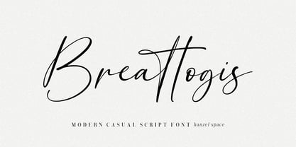 Breattogis modern calligraphy font with contemporary, sophisticated accents. It is perfect for branding, wedding invites, tagline, cards, maybe for label and logo. Breattogis includes full set of gorgeous uppercase and lowercase letters, numerals, a large range of punctuation and ligatures. It expresses beauty of handwriting. What you get, darling? In order to use the beautiful ligatures, you need a program that supports OpenType features such as Adobe Illustrator CS, Adobe Photoshop CC, Adobe Indesign and Corel Draw.
 - Springwood by Hanoded,
$12.00 Spring is in the air! At least, where I live. My two pear trees are in bloom, bees are buzzing and everything turns a brighter shade of green. Time for a new and fresh font package with a spring-inspired name! Springwood is a handmade set of fonts, ranging from a fat display font to a messy script font. Use it for your freshest ideas, your coolest designs or just anything that needs a bit of springtime.
 - Oldion by Locomotype,
$19.00 Oldion is a captivating display font, draws inspiration from the boundless realms of science fiction and modern technology. With its distinctive and futuristic accents adorning each letter, Oldion breathes life and dynamism into your projects. Available in both regular and rounded styles, infuses a touch of innovation and intrigue into your designs. Oldion is your ideal choice for a wide range of creative applications, from commanding movie posters and attention-grabbing headlines to captivating packaging and distinctive logotypes.
