10,000 search results
(0.04 seconds)
- Clarisone by Prestige Artsy Studio,
$25.00 Clarisone is a delicate yet classy modern sans serif font. Designed specifically for clean projects in mind — perfect for creating word mark logos, monograms, quotes, product packaging, invitations, magazines and more... The simplicity of Clarisone introduces a professional, and modern touch to any of your future projects. With its high class clean smooth curves — Clarisone is the perfect font to have in your design arsenal.
 - Heritage Set by Katatrad,
$29.00 Heritage Set is a display font. It was designed specifically for display, headline, logotype, branding, and similar applications. Heritage Set has been designed to equipped with three different widths; Narrow, Normal and Wide, addition to expanding weights to support various usabilities ranging from ExtraLight, Light, Regular, Bold and ExtraBold. Which makes with a Tabular Lining features support the creativities of the designer from the Font Menu.
 - Desperado! - Personal use only

- Beeching by Greater Albion Typefounders,
$14.95 Beeching is a family of six typefaces designed to combine extreme legibility with a hint of retrospective character. It is inspired by the lettering used in the Leslie Green designed stations of the London Underground and is as up to date today as it was the day those stations opened. The Beeching faces (Regular, Bold, Small Capitals, Small Capitals Bold, Shadowed and Small Capitals Shadowed) are ideal for use in large scale signage that needs to be seen over long distances. We feel the family provides a clear demonstration that traditional details, such as serifs and ligatures serve to enhance legibility.
 - Fact by ParaType,
$29.00 Fact is a workhorse open sans serif type system. It is inspired by the great Frutiger typeface. While the Regular style is slightly modernized but still quite close to Frutiger, changing the weight or width makes differences of the design more pronounced. The style range of Fact is wider than of any cognate type family, including weights from Thin to Black and widths from Compressed to Expanded. Fact type system contains 48 upright styles and 48 italics with variations in width and weight. The font was designed by Alexandra Korolkova and Manvel Shmavonyan and released by Paratype in 2018-2019.
 - Zygon Regular by Great Dane Designs,
$24.99 Zygon Regular is a shape changing, unicase display font inspired by British cultures and transcultural theory. Zygon Regular was inspired by the 2012 Royal Diamond Jubilee and the notion that the Jubilee, as a multicultural event, would feature celebrations inclusive of all cultures. The typeface is based on the Panjabi syllabary alphabet (Gurmukhi script) combined with the Latin alphabet. Zygon Regular contains a set of stylistic alternates as well as a range of standard and discretionary ligatures. These are accessible in applications that support OpenType features. Zygon Regular is especially suitable as a headline font for designs seeking a cultural edge.
 - Rydhesti by Twinletter,
$14.00 Rydhesti is an enchanting and charming signature font, the beautiful and smooth curves of each letter make this font seem luxurious, clean and beautiful. not only that, this font is equipped with a flexible choice of letters to produce the right words according to your needs. Use it to add an authentic, heartfelt vibe to any design project. This font is perfect for business cards, photography studios, autographs, interior designs, model names, coffee late, travel, weddings, cosmetics, jewelry, social media posts, product packaging, watermarks, special events, or anything else. Start using this font to add an authentic and heartfelt vibe to any design project.
 - Rasheda by Keristyper Studio,
$14.00 Rasheda is a beautiful italic font. Inspired by classic cursive calligraphy from the Renaissance era in the 8th Century. This font is good for logo design, Social media, Movie Titles, Books Titles, short text even long text letters, and good for your secondary text font with script, sans, or serif. **Featured:** * Standard Uppercase & Lowercase * Numeral & Punctuation * Multilingual : ä ö ü Ä Ö Ü ß ¿ ¡ * Alternate & Ligature * PUA encoded We recommend programs that support the OpenType feature and the Glyphs panel such as Adobe applications or Corel Draw. so you can use all the variations of the glyphs. Hope you enjoy our fonts!
 - Betamod by Keristyper Studio,
$14.00 Introducing Betamod, Designed the typeface with a modern feel to achieve the theme that was inspired by sci-fi and technology. This font is good for logo design, Social media, Movie Titles, Books Titles, short text even long text letters, and good for your secondary text font with sans or serif. **Featured:** * Standard Uppercase & Lowercase * Numeral & Punctuation * Multilingual : ä ö ü Ä Ö Ü ß ¿ ¡ * Alternate & Ligature * PUA encoded We recommend programs that support the OpenType feature and the Glyphs panel such as Adobe applications or Corel Draw. so you can use all the variations of the glyphs. Hope you enjoy our fonts!
 - Mandevilla by Laura Worthington,
$29.00 Mandevilla is a semi-serif that is ideal for titling, display, and logos. Enrich your design with the expansive selection of 210 swashes and alternates. Create with Mandevilla’s decorative default uppercase set or explore the unadorned and non-stylized titling set. Mandevilla includes a 3/4 size capital letters set, listed as small caps. Used with capitals letters, they maintain a sense of a word shape as they are smaller and less ornamented than the initial cap and are serif-free. Thirty-eight complementing ornaments complete the package. See what’s included! http://bit.ly/2bGS00B *NOTE* Basic versions DO NOT include swashes, alternates or ornaments These fonts have been specially coded for access of all the swashes, alternates and ornaments without the need for professional design software! Info and instructions here: http://lauraworthingtontype.com/faqs/
 - Birdfrey by Grappix Studio,
$15.00 More information about this Font Introducing our new modern serif retro bold display font "Birdfrey" Birdfrey is a modern serif font with a fresh and beautiful look. It has a modern and vintage look. It has extra glyphs to give more options for crafters in designing. Swirly extras will make it look classy and elegant. Birdfrey is perfect for any project, for modern or even retro vintage design. It's covering a wide range of project types, from bold magazine imagery, to wedding invitations, to branding, poster design and so much more. Font Features: Uppercase and Lowercase Numeral and Punctuation Can be used in any software, like Adobe Photoshop, Illustrator, Silhouette Studio, even Microsoft Word, PowerPoint and others. Let me know if you have any questions at all :) Thank You! Grappix Studio
 - Couturier Poster by Latinotype,
$29.00 Elegance flows through Couturier Poster soul. The new cousin of early launched Couturier, brings higher contrast and an extended family, perfect for big sizes. Inspired by the didones from the 18th century, its design its heavily influenced by contemporary ideas makes it suitable to use for almost anything you can think of. Equipped with swashes, ligatures, small caps and alternates, this typography is very versatile and allows you to set a big range of compositions with discretion or personality. Couturier Poster comes in six weights and matching true italics, from thin to black. It's a good choice to pair with Couturier for smaller sizes and Couturier Poster for the big titles. It has a set of 1248 characters that cover more than 200 languages derived from latin.
 - Skribblugh by Tom Chalky,
$12.00 This was a creative experiment. Writing for a long period of time prior to starting erased any inhibitions that prohibited forming natural, authentic letters and by adding more duration the hands became sore and weak. Allowing minimal control, and a more eccentric outcome. It was a real slog, but totally worth it. Skribblugh is a wobbly, aesthetically pleasing, and obviously handwritten typeface full of character and versatility. Within a modern design; It adds a human’s touch, a final note, a signature. And within a playful, colorful one it helps exaggerate the atmosphere, bringing playfulness and warmth to the center of the stage. With four choices for every uppercase and lowercase letter, there are plenty of opportunities to make designs look personal and relatable!
 - Sensa by Fontfabric,
$47.00 Sensa is a handmade font family consisting of 21 fonts. It is divided into 6 subfamilies, each contributing to its wide range of visual power – Sensa Brush, Sensa Pen, Sensa Wild, Sensa Sans, Sensa Serif and Sensa Goodies. Only your imagination is the limit. Pick any of the font as a leading one and the rest of the fonts can accompany it with ease. To work together in all possible combinations, all fonts in this package were created with that simple idea in mind. Sensa is applicable for almost every design project - from advertising, packaging, editorial and branding, to web and screen projects. For a beauty and tender sensation or for more male and strong communication – you have a wide selection.
 - Hyperloopa2104 by Andrew Tomson,
$10.00 Hello, friends! I recently bought myself an old game console, the SEGA Mega Drive 2. For a long time I couldn't understand why, when I was a kid, it seemed incredible to play it. Nowadays there are a lot of games with stunning graphics and realism, but still there is something warm and light in old games. Maybe it's just a memory of a carefree childhood. After playing it, I decided to create this font so that everyone could do something in the style of old games that an army of designers and programmers hadn't worked on yet. Good luck and love to you!
 - Cordelia by PintassilgoPrints,
$20.00 Impacting and vibrant, Cordelia family draws inspiration from covers of 'cordel literature’, small booklets of popular story-poems that played an essential role on the folk-popular cultural life of Brazil. Printed in coarse paper, usually with an woodcut illustration and lettering in the front, these booklets were sold on the streets, in marketplaces and town squares, hung in a cord - therefore the name ‘cordel’. The work of these humble printers and poet-singers of northeastern Brazil strongly served as source for acclaimed romances and movies and still inspires writers of all genres, movie makers, painters, musicians. And type designers too :) Cordelia doesn’t bring a picture font yet, but it goes pretty well with Chronic and Manicuore illustrations. It goes well with and without them. It definitely goes well. You bet!
 - Rashavine by Arterfak Project,
$21.00 Introducing our new brush exploration, Rashavine. A freestyle brush font made with the high attention of the brush details. This font has the feel of energic, which challenges you to create a powerful design and fast! Rashavine complete with alternates characters, ligatures, and swashes which you can apply on T-shirt, label, title, books, hoodie, logos, sticker, website, and many more! Rashavine is an all-caps font that you can mix and match from different letterforms. Accented characters available for many different languages. Also, you can access the swashes with ease, by simply type 'underscore' and 1 to 0' from the middle of your word. That's all, folks! Thank you for watching and keep it up!
 - Nokio Slab by TypeUnion,
$25.00 Nokio Slab is the big brother to the popular Nokio & Nokio Sans fonts and provides even more uses for the Nokio range. Nokio Slab is made up of 5 weights + italics and also features an alternate font that uses more traditional character structures to offset the playful original. Nokio Slab is built for multiple uses, from digital applications such as Apps and Websites to logotypes and print applications.
 - Zahar by Apostrof,
$30.00 Zahar type family is based on the lettering developed by the famous Ukrainian graphic artist Georgi Yakutovich and designed for Ivan Franko's book Zakhar Berkut. It is good for the design of children's books, folk tales, songs, etc. Zahar is easy to read in short texts. It supports Extended Latin and Cyrillic (including Old Church Slavonic). A special OT-feature is added to support the Old Church Slavonic alphabetic numeral system.
 - Calmsie by Timurtype,
$14.00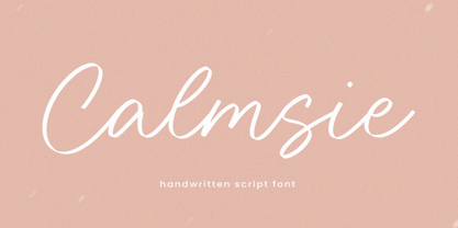 Calmsie A Handwritten Script Font Calmsie is perfect for product packaging, branding project, magazine, social media, weddings, or just used to express words above the background. This Calmsie font includes: Calmsie multilingual support. Embellish your designs with our original fonts. Enjoy the font, Thank you!
 - Wakefield by Galapagos,
$39.00A gentle breeze caressed his face as his body took on the easy posture of a dancer on break. Flickering sparklets of light sprinkled the glass-smooth surface of the aqua liquid on which he floated. His mind wandered; he was only days away from his scheduled departure date. This day was no different from a hundred other days he had spent melded to his windsurfer, skittering along the breadth of the modest lake, soaking up the sun's rays and forgetting about the entire rest of the world. Lake Quannapowitt, and the town of Wakefield, Massachusetts, were familiar to Steve, a long-time resident of the picturesque New England town. This is where he grew up; this is where he married and lived for many years; and this is the place he was preparing to leave, not one week hence. Not generally prone to nostalgia, it was in just such a state he nonetheless found himself once Zephyrus retreated, as was his custom, periodically, while patrolling the resplendent lake. Steve was going to miss the lake, and he was going to miss the town. How many hours of how many days had he spent exactly like this, standing on his motionless board, waiting for his sail to fill, and staring at the lake's shores, its tiny beach, the town Common with its carefully maintained greenery, and equally well-tended gazebo, the Center church - its spire shadow piercing the water's edge, like a scissor-cut the better to begin a full-fabric tear? Yes, he was going to miss this place - this town which all of a sudden had become a place out of time, just as he was about to become a person out of place. Once this idea struck him, he couldn't shake it. He was transported back in time four score years, now watching his ancestors walk along the shore. Nothing in view belied this belief - not the church's century old architecture, not the gazebo frozen in time, nor the timeless sands of the beach, nor the unchanging Common. Everything belonged exactly where it was, and where it always would be. This, he decided, was how he would remember his hometown. And this is when it occurred to Steve to design a typeface that would evoke these images and musings - a typeface with an old-fashioned look, reflected in high crossbars, an x-height small in size relative to its uppercase, and an intangible quality reminiscent of small-town quaintness. Wakefield, the typeface, was born on Lake Quannapowitt in the town for which it was named, shortly before Steve moved away. It is at once a tribute to his birthplace and a keepsake. - 1st Ave by Design is Culture,
$39.00 1st Ave is the most experimental of my typefaces. I took a picture of a metal and neon sign in the East Village of New York City. These signs are slowly being replaced by LED and LCD displays, but if you look hard, you can still find quite a few in the city. The signs give a mid 20th century feel to the city. To design 1st Ave, I took a picture of the sign, scanned it and increased the contrast in Photoshop so that the photographic forms became line art. There weren't enough letterforms in the sign to create the whole alphabet, so I cut up the strokes and collaged them back together to finish the entire alphabet. Important Note: 1st Ave is an experimental typeface and is not compatible with certain software such as Microsoft Word.
 - Lentzers by Ingrimayne Type,
$9.95 The upper-case letters of Lentzers fit into the shape of a convex lens and the lower-case letters fit into the shape of a concave lens. The typeface was designed to have concave shapes alternate with convex shapes so the letters snuggle together. The OpenType contextual alternatives (calt) feature will automatically make this happen if your word processor supports it. (To get only concave or convex shapes, one must turn off the contextual alternatives feature. With only concave shapes the spaces between letters form thin convex lenses and with only convex shapes the spaces between letters form thin concave lenses. The name of the family was inspired by these lens shapes and also by the name of distant ancestors.) Lentzers is caps only. It comes in three weights: light, regular, and bold. It is eye-catching for posters and titles and poorly suited for text.
 - Rutherford by Device,
$39.00 Rutherford is clear, robust and authoritative, and reads well at small text sizes while also having the required heft for larger headlines. A wide range of weights makes it a versatile choice for magazines, branding, brochures and advertising. A slightly condensed obround serif with squared stroke terminals. The t, j and f curve around to harmonize with the terminals on the a and g, as does the tail of the Q. The italic incorporates cursive forms on the ends of the lower right and upper left strokes, and uses a single-story a. Includes full European Latin support and alternate designs for the Q and g in all weights.
 - Velo Serif Display by House Industries,
$33.00 Velo leads layouts with a grand tour champion’s panache but is also a hard-working design domestique for text-heavy applications. Superelliptical shapes and sturdy serifs will keep pace with contemporary culture with an aesthetic agility that will never go out of style. Velo Serif includes sixteen fonts: Twelve display styles ranging from thin to black with complementary italics and four text styles designed for longer settings. Velo Serif Display features an increased x-height for more illustrative headlines while Velo Serif Text maintains a readable cadence in high word count environments. Typeface design by House Industries, Christian Schwartz, Mitja Miklavčič and Ben Kiel. FEATURES Text vs Display: Velo Text maintains the distinctive style of its Display siblings, but is enhanced for optimum legibility in running text settings. Key ligature combinations keep headlines and running text flowing smoothly. Velo Serif Text includes a complete small cap alphabet to add another typographic dimension to your layouts. Select Velo Serif figures include illustrative alternates to display numerical superiority.
 - Vinegar Pro by Jelloween,
$19.95Vinegar Pro is a modern, legible serif typeface. It contains a wide range of characters, sexy ligatures, lining & old style numerals. - Bowie by Latinotype,
$19.00 The name of this typeface comes from the surname of James (Jim) Bowie, American pioneer and inventor of the famous Bowie knife. This is exactly what inspired English rockstar David Jones to change his stage name to David Bowie. Bowie is thenew font by Bercz and Latinotype Team. The typeface is a type system that reflects a strong personality, an urban feel and an unprejudiced style. Bowieis well-suited for publishing projects, branding and packaging. This font family is composed of three sections: a group of sharp-shaped uppercase fonts (smallcaps and all caps) in 5 weights, each with matching regular/back slant italics,providing users with 15 different styles for multiple combinations; a set of script catchwords and eclectic sets of dingbats and flags that communicate the blue-sky thinking and feel of the project. Bowie —a collaborative project between Bercz and Latinotype Team—was developed by Leonidas Loyola, Valentina Vega, Rodrigo Fuenzalida, César Araya and Bruno Jara, under the supervision of Dany Berczeller, Daniel Hernández y Luciano Vergara.. Bowie consists of 5 weights, ranging from Thin toBlack, and comes with a 439-character set that supports 206 languages.
 - Blom by The Northern Block,
$29.95 Blom is a humanist sans with subtle squarish character in reverse contrast. The combination of heavy horizontals and modern geometry give the typeface a unique visual aesthetic whilst making small text perfectly readable. Blom bucks the trend of conventional letterforms in favour of a versatile typeface with bags of originality, that is both inventive in style yet completely functional in a wide range of intended uses. Details include 463 characters, six weights with matching italics and five variations of numerals. Opentype features include inferiors, superiors, fractions, slashed zeros, case-sensitive forms, ligatures and language support covering Western, South and Central Europe.
 - Delikaat by Cubo Fonts,
$19.00 Delikaat is made up of thin & thick strokes - a version of Cubo Font's former Delicate. Most cursive fonts intend to create the look and feel of real handwriting: many letters have a specific drawing, following other letters that come before and after, or its position at the beginning or at the end of the word. “Delicate” resolved that problem thanks to the OpenType technology, and offers many discretionary ligatures (group of pre-drawn letters), adapted to numerous combinations. Therefore, it’s not only a decorative and calligraphic writing, but also a fluent and energetically one. In order to make the most of it, please activate your software’s OpenType features.
 - Automata by NOS,
$29.00 Introducing Automata, the typeface that combines futuristic appearance and easy readability. Great for titles but also for logos and text at medium/small sizes, making Automata suitable for a wide range of applications. In addition to its smooth, clean lines and geometric aesthetic, Automata offers a variety of customizable options such as stylistic alternates, logo discretionary ligatures and multiple weights including extra-light and black. The support for many languages makes Automata a global typeface. Add a touch of the future to your design work.
 - Tzimmes by Dada Studio,
$29.00 Tzimmes is a tasty morsel for those who love tasty letters. The fleshy serifs combined with the subtle references to calligraphy create a distinctive character that will turn every text into a feast for the eyes. The family consists of 22 weights including true italics. This will allow you to freely compose even the most demanding projects. Book? Magazine? Logotype? Everything available à la carte! Light and bold weights, due to their strong personality, are perfect for display uses. At the same time, Regulars create a harmonious structure that provides good legibility in long texts. Tzimmes covers all latin languages and cyrillic. It contains a wide set of numerals, small capitals, fractions, ligatures and other OpenType goodies. Bon appetite!
 - Cowling Sans AOE by Astigmatic,
$24.95 Cowling Sans AOE is a charming Art Deco architectural style typeface. It is the cleaned-up, refined revival and elaboration of a lettering design from “Lettering for Commercial Purposes” by Wm. Hugh Gordon published in 1918. What began as a basic character set of Capitals, lowercase, and two styles of ampersand has been expanded to a full character set including unlimited fractionals, superiors & inferiors, ordinals, tabular, proportional, and oldstyle figures, and an expanded language glyph set, all with a smallcaps and Caps to Smallcap set to match. This lettering style exudes the charm of its era with every word set in it by way of the small details that set it apart from other sans typestyles.
 - Ronet by yasireknc,
$10.00 It can be tricky to find typefaces that can convey the feeling of personal warmth that comes from a handwritten note, custom brandings, special series of products, especially as we type more and more and write with a pen or pencil less and less. To add some more of that warmth to a font, I’ve made Ronet. A duo font based on the my handwriting. Double eponymous styles of the font —Ronet and Ronet Alternative— each have a unique flavor with its own rhythm and character. It can be used on branding designs, product labels, invitation cards, social purposes which is bloggers, influencers but they were capable of so much more, and I’m happy to share them for general use. Ronet has extraordinary alternative characters, that makes these fonts so impressive. These two styles have dynamic substitution, alternates, and beautiful kerning! Nevertheless, they each support an impressive range of languages using the Extended Latin alphabets and because they were designed to work well in a simple tool, a rare feature of these fonts is that they look just as good no matter where you use them. LOTS of writing, and then even more care once I developed and refined digital outlines from the samples. Ronet and Ronet Alternative each wrote pages and pages of letters to produce lots of examples for comparison and selection, in order to get the most authentic overall texture that captured the spirit of my left hand.. Ronet feels friendly and personal, like a neighbor or local shopkeeper who always seems happy to see you. This will perk up your social feeds in a snap. Start with Ronet and just add in your design to make it perfect. What started with a simple pen and paper has become a diverse and ever-expanding creative outlet that blends hand-drawn creativity with cutting-edge technology — and the end results are popping out everywhere, from advertising to design and decor to art and DIY.
 - Bullhorn by Illuminaut Designs,
$10.00 Broad, tightly-spaced verticals make Bullhorn hard to ignore. Perfect for headlines and product names, this font is designed to fill space. Two weights and loads of variable characters give Bullhorn incredible versatility and charm.
 - Arthur Sans by SIAS,
$34.90 Arthur Sans is a new font design in the spirit of the Art Deco era, the age of elegance, stylishness and refinement. Use this unique typeface for distinctive personal stationary, outstanding business papers, captivating brochures and invitations; for marvellous posters, wonderful menus, hotel leaflets, exciting ads … for outstanding designs. You’ll find out that Arthur Sans is your friend for more than just fine typography. Five weights plus Italics – all equipped with a comprehensive Euro-Latin character set – will hardly leave anything to be desired. Additionally, the font Arthur Sans Regular contains an outstanding extra range of 70 ornamental characters, carefully designed to the very tone of the typeface, to give you a very special kick of extra value to enchant your designs. Alternatively, you can get this set of ornaments seperately, look at the Arthur Ornaments! Arthur Sans is but one part of a greater suite of exciting fonts: you may wish to also check out the sister fonts of the gorgeous Arthur Cabinet family, which will offer you another wonderful scope of fascinating typographic possibilities. For a matching Greek font go to Artemis. And finally, Arthur’s Irish friend is the fabulous Ardagh. __________________________________________________________________________________________
 - Atyp BL by Suitcase Type Foundry,
$39.00 The sources of inspiration for the Atyp typeface are spread out widely both stylistically and chronologically. The basic proportions of the uppercase refer to the elementary geometric constructions of the Bauhaus. The subtle details in the drawing of the characters and the microscopic adjustments, which evoke the illusion of uniformity and mechanical purity, pay homage to the rationalism of the typefaces popular in the International Style. The increased contrast of the joints of the bowls and shoulders in the Display weight, which in certain diagonal curves transition into almost deconstructive permutations. For a change these take delight in doing things on purpose, teasing readability and breaking the rules of the new millennium's typography. Atyp was created by adapting a typeface originally made for a commercial television station. The potential of the neutral grotesque, proven by its excellent readability on screens, gave the impetus for its preparation into an extremely wide character set. Coherence across all eight key masters lays the groundwork ideally for using the variable font format. The key benefits of this technology are a significant reduction in data consumption in the case of web fonts, as well as an unlimited access to the full range of styles, which in turn is a significant benefit in the area of responsive design.
 - 1066 Hastings by GLC,
$38.00 In 1066, William, duke of Normandy, was invading England. He was demanding the crown for himself, against King Harold the Saxon. He killed Harold and reached the crown at Hastings, the well-known battlefield. A few years later, in Bayeux (Normandy, French)was displayed a large tapestry (almost 70 m long) who was telling the story of the conquest. Along the tapestry was written a comment in Latin, using Roman capitals influenced a little by English or Scandinavian style (as it is visible in the Eth character). We have created the font, inspired from this design, adapted for contemporary users, making difference between U and V, I and J, which has not any relevance for ancient Latin scribes, and naturally with Thorn, Oslash, Lslash... and usual accented characters did not exist at the time. We also have reconstructed the K, German double s and Z, always using patterns of the time. We have scrupulously respected the poetic irregular and distressed original forms with two or three alternate for each characters, including reconstructed numerals.
 - Delm by Typesketchbook,
$39.00 Delm font family is one of those large and useful families that you really can’t miss if you are looking for typeface combining originality and legibility. Delm is one of these – a sans serif with geometric modern look designed very smart with soft round look and very specific inktraps that complement its uniqueness. It is developed in 9 separate weights ranging from Hairline to Black, each coming with corresponding slanted version (called ‘Oblicua’). The light weights look more elegant, gentle and with more sensible feeling for geometry while the black versions are more soft, friendly even puffy and the geometric skeleton of the family is dominated by the overall roundness. The mid-weights are strong and prominent setting right the middle point in the contrast range of the family. Delm is a font with dedication – with so many options for different character contrast combined with slanted styles, it is perfect for editorial design where it could be easily used either for text or display font. Editorial is not of course the only application – you could successfully rely on this typeface if create brand or corporate identity, typographic posters, signboards, instruction plates, etc. Very diverse and original, this font will not leave you unsatisfied – moreover – it will surely make you try it in more and different designs be it printed or designed for screen. Web sites, banners, applications and e-books are places where Delm will show its best because of its originality, finely tuned contrast and its enhanced legibility. Fully equipped with OpenType features like ligatures and multilingual support, Fontmatters highly recommends to get the whole Delm font family for maximum results and satisfaction.
 - Hypnotique by Comicraft,
$19.00 Do we have a volunteer from the audience! Yes, you young lady, step into the ring, there's no need to be afraid! What's your name? Hypnotique? How appropriate! Now, don't turn away, look into my eyes, look into my eyes, the eyes, the eyes, not around the eyes, don't look around my eyes, look into my eyes, aaaannnndd you're under. And on the menu of mesmerism tonight is a waking dream of letterforms that will keep you on the threshold of consciousness and yet illuminate your every hypnagogic hallucination! Now that we have your focused attention and reduced your peripheral awareness you have an enhanced capacity for response to the suggestion that you should not only purchase this font, but our entire library of fonts. On the count of three you will wake up and you will think of nothing else but acquiring all the tools all good graphic designers should have in their font library. And all we had to do was snap our fingers.
 - Snare by In-House International,
$5.00 A typeface that celebrates marching to the beat of your own drum. Snare is a jazzy little display type that presents like a stencil but behaves in its own way.Featuring angled section breaks and variable heights, Snare keeps each character’s footprint steady as as its heights change, revealing unique crossbars, periscoping capitals and deep-sinking descenders. Because each character follows its own rules, the more each word grows, the more it shows the beautiful rhythm of variety. Or stretch individual characters to shape the contours of your words. Beyond just being playful, fun to dress in colors, and delightfully useful for tight spaces,Snare’s lanky verticals and nervous energy reflect the time it was created. In this second pandemic spring, Snare brings up the drumroll-expectant heartbeat of our uncertainty, and the wish that when we can all meet again, our newfound weirdnesses will find a home in the world. The Snare font family includes one uppercase alphabet with two lowercase variants and comes in ten standard weights-which-are-just-really-heights (.otf) and as a variable type(.ttf) for designers using compatible platforms. Snare was designed by Alexander Wright and In-House International and developed byRodrigo Fuenzalida at FragType. In-House International’s foundry was launched in the summer of 2020 to offer bold, experimental, display typefaces that tell a story. Our previous releases have been featured on Design Milk, DesignBoom, Slanted and all sorts of exciting places.
