10,000 search results
(0.031 seconds)
- Granz by PintassilgoPrints,
$26.00 With a swinging handcut look and fanciful letterforms, Granz is inspired by the iconic Oscar Peterson’s Porgy & Bess album cover by David Stone Martin – the prolific american illustrator who created more than 400 album covers, mostly for the jazz greats of the 1940s and beyond. Granz font is loaded with interlocking pairs, swashes, contextual and stylistic alternates, making it highly flexible, just perfect to jazz up your designs.Great for book covers, titling, headlines, t-shirts and many other applications, this is a font that loves to be seen. Use it big!
 - Cronisse by Almarkha Type,
$35.00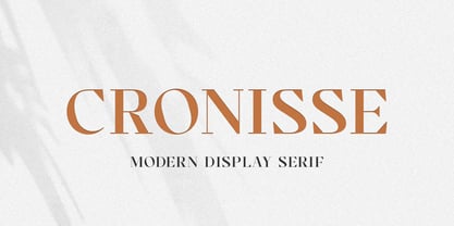 Introducing Cronisse – Modern Display Serif inspired by the famous minimalist logo, perfect for the purposes of designing templates, brochures, videos, advertising branding, logos and more. What’s Included : + Standard glyphs + Web Font + International Accent + Works on PC & Mac + Simple installations Accessible in the Adobe Illustrator, Adobe Photoshop, Adobe InDesign, even work on Microsoft Word. PUA Encoded Characters – Fully accessible without additional design software. Fonts include multilingual support Image used : All photographs/pictures/vector used in the preview are not included, they are intended for illustration purpose only. Cheers! Thank You
 - Waluxe by Almarkha Type,
$27.00 Introducing Waluxe – Luxurious Roman Sans inspired by the famous minimalist logo, perfect for the purposes of designing templates, brochures, videos, advertising branding, logos and more. What’s Included : + Standard glyphs + Web Font + International Accent + Works on PC & Mac + Simple installations Accessible in the Adobe Illustrator, Adobe Photoshop, Adobe InDesign, even work on Microsoft Word. PUA Encoded Characters – Fully accessible without additional design software. Fonts include multilingual support +Image used : All photographs/pictures/vector used in the preview are not included, they are intended for illustration purpose only. Cheers! Thank You
 - Wilkysta by Graphicxell,
$19.00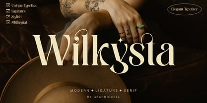 Wilkista Ligature Serif Typeface inspired by the famous minimalist logo perfect for the purposes of designing templates, brochures, videos, advertising branding, logos and more. What's Included : + Standard glyphs + Web Font + Ligatures + International Accent + Works on PC & Mac + Simple installations Accessible in the Adobe Illustrator, Adobe Photoshop, Adobe InDesign, even work on Microsoft Word. PUA Encoded Characters - Fully accessible without additional design software. Fonts include multilingual support Image used : All photographs/pictures/vector used in the preview are not included, they are intended for illustration purpose only. Thank You
 - Westack by Almarkha Type,
$35.00 Introducing Westack – Modern Display Serif inspired by the famous minimalist logo, perfect for the purposes of designing templates, brochures, videos, advertising branding, logos and more. What’s Included : Westack (OTF/TTF) Standard glyphs Ligatures Web Font International Accent Works on PC & Mac Simple installations Accessible in the Adobe Illustrator, Adobe Photoshop, Adobe InDesign, even work on Microsoft Word. PUA Encoded Characters – Fully accessible without additional design software. Fonts include multilingual support +Image used : All photographs/pictures/vector used in the preview are not included, they are intended for illustration purpose only. Cheers! Thank You
 - Market Square by Hanoded,
$12.00 I love markets, especially the farmer’s markets with fresh produce and home made cheese. Too bad I need to travel a long way to get to one, as there is only a ‘regular’ market in my hometown - you know, with cheap duvets, ‘local’ fruit like bananas and a guy selling books about the end of times. I thought it would be great to create a font family you could actually use on a market. Hence Market Square. Market Square consists of 4 different fonts (each with its own Italic style), ranging from a fat marker font to a thin, squarish font. Each of them oozes freshness and authenticity and they were designed to complement each other. The cherry on top is the cute doodle font, loaded with fresh produce and seafood - just like you’d see on a Market Square.
 - Bibliophile Script by Sudtipos,
$79.00 A friend once jokingly told me that what I really do is mine extinct arts for parts to use in modern things, like going to the scrapyard to pick up bumpers, quarter-panels and dashboards off of Datsuns and Ponies to build a shiny new Ferrari. I still kind of grin at that, but I certainly do spend a lot of time looking at old things and imagining ways they would work today. This shiny new Ferrari here is called Bibliophile, and it contains scrap heap parts from various pages by Louis Prang, the Prussian-American printer and publisher who inspired my Prangs fonts. This is my second engagement with the late 19th century man, and it’s quite a bit more intricate than just an italic Didone with a connected lowercase. Bibliophile marries Round Hand calligraphy with Italian capitals, two styles not often relayed in the same alphabet, but work together beautifully when combined well. When you combine them well with a few long-practised tricks of the trade, then mix in a few trusted features from my previous work over the years, you get my usual crazy exuberance, like 17 different shapes for the d, 21 different forms for the y, endings, beginnings, swashes, ornaments, and so on. It’s no secret that I can get carried away when I’m so consumed by an idea. — Bibliophile comes in 2 weights, each of them with over 900 glyphs covering all the latin languages. Bibliophile also comes with a bold weight, something I’m always reluctant to do with something as adventurous and complex as the structure of this historical mashup. But I couldn’t chase away the idea of increasing the contrast while maintaining the hairlines in a lowercase this narrow. Part of it was the curiosity about the outcome, and part was the sheer challenge of it. I think it turned out OK. Words set in either weight will show delicateness and elegance, and the more time you spend inside the font and micro-manage the setting, the more ways you will find to magnify either. Bibliophile can be as muted or luxurious as you want it to be. This is the kind of alphabet that fits well in fashion marketing and high-end packaging, from the very subdued to the super-exquisite. Enjoy the gleaming new vehicle made with freshly polished old parts.
 - Dever by insigne,
$24.00 Dever’s brute, industrial lines are rounded up in this new typeface from Jeremy Dooley. Dever combines plenty of inspirations. It’s the flair of the Wild West melded with a shout out to the sign painters and package lettering artists of the 1800s. Dever’s big, bold, and handy frame moves through all three of the family’s strapping members. First is the sans. No doubts on what this brother’s like. Dever Sans is as straight-forward as you’ll find in this family with its four separate weights and numerous distressed options. The second of the kin’s a bit of half-breed, you might say. Pointed serifs bring a sharpness to this outfit. Rounding out the family is Dever Wedge, a bit of wild rodeo all its own. This poke’s a quick draw with any of its 107 font, and with it’s auto-replacing alternates, no two repeating characters are alike. You’re guaranteed a great show anytime Dever leaves the chute. The route to Dever was long, with many a switchback. The Wedge variant was designed first, shelved, then developed into Plathorn. But I wanted to return to those brutish forms and decided to round out the family with a sans, serif and plenty of other options. Any of the Dever family have an extended character set including Central and Eastern European languages. The strong faces have specially adapted sub-families, too, so they’re bound and determined to have an outstanding impact at whatever size you use ‘em. It’s a hard ride ahead corralling all those words. Be sure and add these able-bodied boys to your posse today!
 - Griezelig by Hanoded,
$15.00 I love creating fairytale fonts, but for some reason I haven’t made one for quite a while. So, without further ado, I present Griezelig! Griezelig in Dutch means ‘scary’ or ‘creepy’. The word itself even looks kind of creepy! Griezelig was loosely based on two of my favourite (but unfortunately rather inconspicuous) fonts called Hexenhammer and Bronwen.
 - Picasso in Paradise by Nicky Laatz,
$22.00 Say hello to 'Picasso in paradise' - an avant-garde script with loads of fresh buoyant character and an abstract, casual feel. The script includes a large selection of natural-looking ligatures, that form automatically as you type when you have your OpenType features active. Perfect for Branding, Greetings, Book covers, advertising, packaging, and so much more.
 - Glaciar by TripleHely,
$16.00 Glaciar is a script typeface based on brush handwriting and inspired by old-style bas-reliefs. All contours were carefully cleaned of brush roughness, but at the same time, minor imperfections were left to create the unique character of this font Glaciar has a built-in auto replacement for lowercase letters without connecting strokes (in the case of word ends) and for ligatures (in the case of letter pairs that do not fit well together). In addition, there are alternates glyphs with starting and ending swashes - the last ones can be used with any OpenType software. And finally, the font has wide multilingual support and can be used in texts in 195 languages Glaciar is a good choice for branding and design projects as well as a cute text overlay to any background image
 - Carlton by ITC,
$29.99Carlton is based on a typeface designed by Prof. F. H. Ehmcke. In 1908, Ehmcke released his Ehmcke-Antiqua design through the Flinsch typefoundry in Germany. Ehmcke-Antiqua was later distributed by the Bauer typefoundry in Frankfurt am Main. The Caslon Letter Foundry in England discovered the design and released their own typeface based upon the model, which they named Carlton. Carlton entered the Stephenson Blake program after they acquired the Caslon Letter Foundry in the late 1930s. As hot and cold metal typesetting became outdated technologies, Carlton and Ehmcke-Antiqua fell out of general use. In the 1990s, Letraset revived this classic design, distributing it under its English name, Carlton. Carlton's clean and generous capitals, as well as its understated yet detailed lower case, have found popularity again in recent years. The elegance of Carlton is best used for displays with large letter and word spacing. Carlton shows all of the hallmarks of a delicate serif typeface design; its forms capture a distinct moment that was common within Central European type design during the first third of the 20th Century. Carlton is similar to several other expressive typefaces from the early 1900s, including Bernhard Modern, Koch Antiqua, Locarno, and Nicolas Cochin." - Beaufort by Shinntype,
$59.00 Engaging the issue of scalability, Beaufort® is configured so that serifs render with great sharpness, independent of type size, limited only by device resolution. This scale of effect empowers the typographer with a design axis stretching from awesomely huge to preciously tiny, further enhanced by weights from Light to Heavy, small caps, and alternate figure styles. In style, Beaufort has a number of affinities. In particular, the bold romans recall a kind of “grotesque with small serifs” style popular with sign painters and package lettering artists in the early 20th century, and still going strong. In proportion, the basic Beaufort is in the vein of the classic oldstyle types that descend from Granjon , via the French Oldstyles, or Elzevirs, to Plantin and Times in the early twentieth century. Designed for optimum clarity, readibility, and word count, these types have a pronounced angle of stress in the lower case, which is quite large and fairly narrow in relation to the caps. None of the caps are exceptionally narrow, and both cases have an evenness of width that makes for a no-nonsense, orthodox appearance. The strength of the capitals distinguishes these types from those of another “optimizing” era, the 1970s and ’80s, when puny caps made for monotonous text. However, strong though they may be, Beaufort’s caps are not as obtrusive in text as those of Times or Plantin.
 - Abelina by Sudtipos,
$69.00 «Abelina» is a typeface that can be used in display sizes for titles where part of the central premise is to emulate certain features of gestural handwriting. Concepts like spontaneity, speed and fluidity, associated with the use of certain calligraphic tools – in this case the pointed brush – led to a typographic result based on the pattern-like structure coming from the chancery and italic calligraphic models. «Abelina» - initially designed by Yanina Arabena (Calligrapher, Graphic Designer and Typographer) - is reborn to make way for “Abelina Pro” through the solid work of Guillermo Vizzari working together with Ale Paul from Sudtipos. Throughout its use, “Abelina Pro” maintains the structure of a firm style, integrating a dynamic rhythm in the composition of short texts and offering personality to each of the words it builds. It has over a thousand glyphs, including several alternates, ligatures combination, initials and miscellaneous to reinforce the idea of the author of merging a calligraphic project in the typographic world; allowing new ways to capture this great universe of italic faces. «Abelina» project was initially born as a typographic project developed by Yanina Arabena – tutored by Ale Paul and Ana Sanfelippo – under completion of the Specialization in Typography Design at University of Buenos Aires, Argentina, during the years 2011 and 2012.
 - Alizé by TypeTogether,
$49.00 Alizé is a three-weight typeface inspired by the chancery italic of the 16th century. It is a high-contrast face, created with syncopations in axes and proportions and subtle irregularities that form a lively and delicate weave, suitable for setting a single word, a special expression, or a short block of prose. The family does not contain a roman, and instead promotes the italic as a primary style, a common printing convention in the 16th and 17th centuries. The italic lowercase predates inclined capitals by about twenty years, and as a nod to this typographic evolution, Alizé’s capitals, small capitals, and figures are very slightly inclined to match the energy of the lowercase. The low x-height and long ascenders and descenders, features associated with finesse and luxury, are reminiscent of the Venetian-style italic, but are further emphasised. Unlike the Venetian italic, however, Alizé has a sharp slope, giving a prominent sweep across the page (alizé is the name of trade wind). Each font of Alizé has a character set count of exceeding 700, and contains an abundance of ligatures, dynamic fractions, ornaments, and pan-European language support. They have also been manually hinted for the highest-quality display on both print and screen.
 - Ryno Slab by Philatype,
$32.00 Ryno Slab is a superslab that was born out of a need for an aggressive, heavy, geometric display face that did not appear clunky. Its serifs are so thick, you could create reasonably legible word shapes by using all caps and masking the words out. Ryno Slab’s tough geometric exterior and squarish forms make it suitable for tight setting in posters, t-shirts, and artwork. Also, an extended character set with support for European languages make Ryno Slab a good fit for magazine headlines.
 - Garden Collection by Cultivated Mind,
$25.00 Introducing the Garden Collection. A new Garden Grown font family by Cultivated Mind Type. This hand-painted collection includes four scripts, two caps fonts, plant art, extras art and free words. Garden Grown Pro scripts includes 260 alternates and 46 ligatures. Ligatures are programmed to pop up when specific letter pairs are typed. Try the alternates and ligatures together to give your designs a realistic hand-painted look. The all caps fonts and basic scripts do not include alternates or ligatures. Use the free words font for keyword and hashtag ideas. Garden Grown works great for cookbook covers, product design, packaging design, restaurant marketing, magazines and film.
 - Minthe by Graphicxell,
$19.00 **Minthe Ligature Typeface** inspired by the famous minimalist logo perfect for the purposes of designing templates, brochures, videos, advertising branding, logos and more. **What's Included:** + Standard glyphs + Web Font + Ligatures + International Accent + Works on PC & Mac + Simple installations Accessible in Adobe Illustrator, Adobe Photoshop, Adobe InDesign, and even work on Microsoft Word. PUA Encoded Characters - Fully accessible without additional design software. Fonts include multilingual support **Image used**: All photographs/pictures/vectors used in the preview are not included, they are intended for illustration purposes only. **Thank You**
 - Bazar by Linotype,
$29.99German Designer Klaus Sutter digitized Bazar, a brush script typeface from the 1950s originally drawn by Imre Reiner (1900-1987) and published in 1956 by D. Stempel AG. Bazar is a calligraphic brush type free from accurate horizontal and vertical strokes and a contrast to the objective body type. It has a more static character and could be perfectly applied in headlines or as a figurative word mark. Like tradional chinese calligraphers, Imre Reiner was also a painter; this is reflected in the glyphs of Bazar. - Calista by Graphicxell,
$19.00 Calista Ligature Serif Font inspired by the famous minimalist logo perfect for the purposes of designing templates, brochures, videos, advertising branding, logos and more. What's Included: + Standard glyphs + Ligatures + International Accent + Works on PC & Mac + Simple installations Accessible in Adobe Illustrator, Adobe Photoshop, Adobe InDesign, and even work on Microsoft Word. PUA Encoded Characters - Fully accessible without additional design software. Fonts include multilingual support **Image used**: All photographs/pictures/vectors used in the preview are not included, they are intended for illustration purposes only. Thank You
 - Markova by Graphicxell,
$19.00 **Minthe Ligature Typeface** inspired by the famous minimalist logo perfect for the purposes of designing templates, brochures, videos, advertising branding, logos and more. **What's Included:** + Standard glyphs + Web Font + Ligatures + International Accent + Works on PC & Mac + Simple installations Accessible in Adobe Illustrator, Adobe Photoshop, Adobe InDesign, and even work on Microsoft Word. PUA Encoded Characters - Fully accessible without additional design software. Fonts include multilingual support **Image used**: All photographs/pictures/vectors used in the preview are not included, they are intended for illustration purposes only. **Thank You**
 - Ribbonetter by Ingrimayne Type,
$5.00 Ribbonetter is an experimental font playing with the calt or contextual alternatives feature of OpenType. This feature alternates letters in ovals with letters in hourglass shapes to create a banner. The letters in the ovals will be determined by the start of the line, whether it starts by typing an upper-case or lower-case letter. Using layers, background color can be added (dot accent and ring characters) or the outline color can be changed (sterling and yen characters). The font may also be useful with the contextual alternatives turned off. Different amounts of character spacing may give interesting results. With default character spacing, ovals with will overlap. If you are typing numbers and want the start to be an oval, switch on OpenType style set 2. In at least one word processor (Pages 5 for Macintosh) the carriage return adds the shape assigned to the space character. If you encounter this, try adding a nonbreaking space (option-space on the Macintosh) before the carriage return.
 - Valibuk by Juraj Chrastina,
$39.00 Valibuk is a compact clean typeface for headlines and short text. No details are small and it’s a bunch of details that make Valibuk as it is. It’s a heavy, condensed face with a high x-height and tight spacing and that’s why Valibuk can write loud. The quality of the spacing and kerning is ensured by Igino Marini. Lomidrevo is a grunge stencil family derived from Valibuk.
 - Chipa by Eurotypo,
$75.00 Chipa has all the advantages of OpenType technology that allows a variety of combinations: Swashes, old style numerals, standard ligatures, contextual alternates, discretional ligatures, word ending and tails. These fonts were specially designed for creating logotypes and packaging design, can also be used in advertising, flyers and posters, for its good legibility and accurate kerning. Chipa support the Central European character set as well as basic Western languages.
 - Salom by Schriftlabor,
$44.00 Salom was designed by Austrian type designer Igor Labudovic during his year at Reading University. Besides Latin, it originally included Arabic and Hebrew. The peaceful coexistence of both writing systems in his fonts led him to combine the words Salaam and Shalom to the font family name. Salom’s sibling, Salom Sans, features the same letter proportions and therefore allows a rich spectrum of diverse typography, yet keeping the harmony between all styles. The sans has an additional light weight, while the serif comes with an expressive stencil style.
 - FairyTale by Comicraft,
$29.00 In its beauty, Comicraft's Fairytale font is without rival in the heavens, the earth, or the stuff of men's dreams! A wee thing it may be, but 'tis like a star pulled from the sky. Luminescent. Radiant. Perfect. Yes! PARADISE can be yours...from the pages of "Captain Stoneheart and the Truth Fairy," comes a font that might very well change your life forever... it's a dream, a myth, a neverending story, it's a FairyTale! Words by Joe Kelly & art by Chris Bachalo from Captain Stoneheart and the Truth Fairy
 - PF Kids Pro by Parachute,
$79.00 This is not just a typeface inspired by a kid’s first attempts to write. This is in fact how exactly a kid writes. Alexandros Papalexis was born again kid when he became a father. This series came about while designing his daughter’s birthday invitations. Since its first release, it has been constantly on our most wanted list. You step into a supermarket, a bookstore or a clothing store and you see tens of products using this typeface. Anything from baby products, food, clothing, children’s books and magazines, print and TV campaigns, you name it. But don't just stick to the name. Every single weight serves the right purpose. This is why this typeface has also been used extensively for grown-up market. Recently, it was upgraded to include Latin, Greek and Cyrillic. Furthermore, the accompanied series of pictograms was completed and loaded with 125 western and eastern European pieces.
 - ITC Quay Sans by ITC,
$41.99 London-based designer David Quay designed ITC Quay Sans in 1990. One of the precursors to the long run of functionalist European sans serif faces that has been a dominating force in type design since the 1990s, ITC Quay sans is based on the proportions of 19th Century Grotesk faces. Grotesk, the German word for sans serif, defines an entire branch of the sans serif movement, which culminated in the 1950s with the design of Helvetica. ITC Quay Sans is made up of very simple, legible letters. The weights of the strokes throughout the alphabet vary very little. Microscopic flares on the ends of each terminal add a bit of dimension to the design. This helps prevent the onset of the monotony, a danger when one repeats countless near mono-weight stroked letters throughout a large body of text. ITC Quay Sans is a very readable face; it works equally well in all sizes. Six fonts of the ITC Quay Sans typeface are available: Book, Book Italic, Medium, Medium Italic, Black, and Black Italic. ITC Quay Sans is similar to Hans Eduard Meier's Syntax, and Tim Ahrens' Linotype Aroma."
 - Aventena by Mokatype Studio,
$24.00Aventena is display sans, inspired by blackletter basic writing system. There is a lot of twist from the basic form, that makes Aventena look simple and yet legible. So you can explore, combine, and create designs such as posters, headlines, interfaces, merch, etc. This is single-weight font only, this font is better used for headlines. If you need a multi-weight of this font, just tell us! What's you get : Standard glyphs Ligatures (Opentype features) Web Font International Accent Works on PC & Mac Simple installations Accessible in Adobe Illustrator, Adobe Photoshop, Adobe InDesign, and even work on Microsoft Word. PUA Encoded Characters - Fully accessible without additional design software. Fonts include multilingual support Image used: All photographs/pictures/vectors used in the preview are not included, they are intended for illustration only. Thank You - Soft Aura by Sarid Ezra,
$15.00 Soft Aura is a minimalist and simple sans family that have four fonts in total. You will get the regular, italic, bold, and bold italic in the package. You can use this font for any purpose, suitable for contrast logotype and branding. Combine the style fonts, italic and bold in one word to get stylish contrast look. This font also support multi language.
 - Complements by Ingrimayne Type,
$9.00 In the typeface family "Complements" two sets of characters complement each other, so much so that they work together much better than they work separately. The two sets are designed to alternate and this alternating is done automatically in applications that support the OpenType feature Contextual Alternatives. Complements is purely for show and display; it is a horrible choice for text. The spacing is very tight, which works well for very large point sizes. At smaller point sizes the user may want to increase character spacing. The typeface is monospaced. If the spacing between words is too large, substitute the non-breaking space (or the underscore) for the space character. Complements is geometric, bizarre, and hard to read, all characteristics that catch the reader's attention. Complements comes in two styles, regular and outline. The outline style was designed to be used in a layer over the regular style.
 - Diamant Handwriting by 38-lineart,
$14.00 Diamant Handwriting is an upright handwritten font, which looks like a thick pen stroke. Form orientation is generally flowing horizontally, this is a reflection of composure in writing, we set the rhythm of each glyph so that the combination of high and low letters is very soft, try it, whatever you type with this font looks very calm. Activate the OpenType feature, because this font is equipped with ligatures (liga), Stylistic(salt), Contextual(calt) and initial alternates. We present all of this so that your writing is automatically setup, we also provide access to all alternates (aalt) features, this allows you to choose the glyph you like manually. We designed this font only for brand identity. Your brand will look different from other brands. You can also use it for short slogans to further amaze views and attract more customers to see you closer. 'Diamant' is another word of diamond that is often used in Europe, we give this name as a representation of the whole font as a symbol of luxury, brilliance and stability and comfort. We do not extend the theory and philosophy of this font, you better try it yourself, and you will be amazed. thank you
 - Kalix by Linotype,
$29.99I have a notation that the summer of 1994, when I worked with Kalix, was a warm one. I had no special typeface in mind when drawing the characters of Kalix, but many typefaces contributed to it, e.g. my own Omnibus from which I borrowed the looks of the smal case g. I think it is a lovely typeface whose use is mainly for books and magazines. Kalix is the name of a northern Swedish town situated along a river called Kalixälven. Its name is of sami origin, *káles, meaning cold. There comes the connection to the warm summer of 1994! But even the Latin word for chalice, calix, has something to do with my choice of name. Kalix was released in 1994. - Syndrome BRK Pro by CheapProFonts,
$10.00 I just loved the design idea behind this font, but the original font had a lot of ugly artifacts - so I have completely redrawn ALL the letters, before expanding the character set. The lowercase has been redrawn with a higher x-height, making the font even more usable (with more "normal" word shapes). ALL fonts from CheapProFonts have very extensive language support: They contain some unusual diacritic letters (some of which are contained in the Latin Extended-B Unicode block) supporting: Cornish, Filipino (Tagalog), Guarani, Luxembourgian, Malagasy, Romanian, Ulithian and Welsh. They also contain all glyphs in the Latin Extended-A Unicode block (which among others cover the Central European and Baltic areas) supporting: Afrikaans, Belarusian (Lacinka), Bosnian, Catalan, Chichewa, Croatian, Czech, Dutch, Esperanto, Greenlandic, Hungarian, Kashubian, Kurdish (Kurmanji), Latvian, Lithuanian, Maltese, Maori, Polish, Saami (Inari), Saami (North), Serbian (latin), Slovak(ian), Slovene, Sorbian (Lower), Sorbian (Upper), Turkish and Turkmen. And they of course contain all the usual "western" glyphs supporting: Albanian, Basque, Breton, Chamorro, Danish, Estonian, Faroese, Finnish, French, Frisian, Galican, German, Icelandic, Indonesian, Irish (Gaelic), Italian, Northern Sotho, Norwegian, Occitan, Portuguese, Rhaeto-Romance, Sami (Lule), Sami (South), Scots (Gaelic), Spanish, Swedish, Tswana, Walloon and Yapese.
 - Kit Cloudkicker by Anastasia Kuznetsova,
$19.00 I present to you the universal everyday font 'Kit Cloudkicker'!! This font is very versatile and can be used in various styles of projects where a fast relaxed handwritten font is required. Filled with fun and energetic brush strokes, this font will undoubtedly add a touch of playfulness to your text - perfect for greeting cards, branding, merchandise, invitations and handmade quotes! The 'Kit Cloudkicker' font is so easy to use and create completely unique, hand-made words every time. It looks so great!! Font Features A-Z; a-z character set; 1 language (English); numbers and punctuation marks, symbols. A font containing uppercase and lowercase letters, numbers, and a wide range of punctuation marks. Fonts can be opened and used in any software that can read standard fonts, even in MS Word. No special software is required, and to get started. It is recommended to use it in Adobe Illustrator or Adobe Photoshop Made with love and magic ♡ Thanks for checking it out, and feel free to drop me a message if you had any queries! ~ Anastasia
 - Cold Brew by Fenotype,
$29.00 Cold Brew is a swift brush script family of three weights and a set of extras. Cold Brew is based on hand drawn letters polished with care to retain the vivid appearance of ink brush. Cold Brew is equipped with OpenType features to give you tools for custom-looking design: turn on Stylistic Alternates or Swash in any OpenType savvy program for flashier letters or manually select from even more Alternates from Glyph Palette. Cold Brew Extras is a set of brush strokes and swashes designed to support the font. You can for example easily create custom letters by combining the swash shapes from Extras with the letters. Combine Extras with uppercase letters or use them as underline or just plain extra strokes to emphasise your words.
 - Vancouver by Letterhend,
$14.00 Instroducinng the sophciated of modern typography with Vancouver - Condensed Display. This font embodies the essence of modernity, allowing your words to command attention on every page. Its condensed form and contemporary design make a striking impression, while maintaining readability and professionalism. Whether it's fashion magazines, cutting-edge websites, or sleek branding materials, Vancouver confidently stands out, commanding attention with its modern editorial flair. Let your creativity soar with a font that embodies the essence of modernity and sets your designs apart from the rest. Features : Uppercase & lowercase Numbers and punctuation Alternates Characters Multilingual PUA encoded We highly recommend using a program that supports OpenType features and Glyphs panels like many of Adobe apps and Corel Draw, so you can see and access all Glyph variations.
 - Heikudo Freedom by Hanzel Space,
$25.00 A typeface that proves its usefulness over time. Letter strokes that produce unique characters on each glyph so that they display a natural impression. This font is very suitable for branding, film titles, book titles, quotes, product names and the business you want to create. What's Included : Heikudo Freedom Standard glyphs Works on PC / Mac Simple installations Accessible in the Adobe Illustrator, Adobe Photoshop, Adobe InDesign, even work on Microsoft Word.
 - Matteson by Hart Foundry,
$15.00 Hallo... Let me introduce you to Matteson font. It comes with two style, Outline and Filled typeface. Matteson comes with a set of OpenType features: Contextual Alternates and Standard Ligatures are automatically on for certain character pairs. In addition it has over 50 alternates for display initials, set in Swash, Stylistic and Titling Alternates. Combine it to find the good composition words. This font are flexible, depends on the display or the style you want, you can make it looks modern or vintage. Also this font for me are good for Logo Type, Branding or event Invitation. just like how it looks in the sample display. To use the Ligature and Alternate you need the application who support OPENTYPE features Thus the description about the font, if there any other question do not hesitate to let me know.... Thanks
 - Winter Glows by Fargun Studio,
$14.00 Thanks for checking out Winter Glows! A fabulously fun yet elegant script font with tons of energy, allowing you to create beautiful hand-made typography in an instant. With extra bouncy curves & loops, Winter Glows is guaranteed to make your text stand out - perfect for logos, printed quotes, invitations, cards, product packaging, headers and whatever your imagination holds. What's really awesome is that Winter Glows comes with a complete set of lowercase alternates, which allows you to create even more authentic custom-feel text. Another great feature is the bonus ornaments font, which allows you to add some really unique and elegant finishing touches to your script text. Winter Glows Family includes 5 font files; Winter Glows • A handwritten script font containing upper & lowercase characters, numerals and a large range of punctuation. Winter Glows Alt 1 • This is a second version Winter Glows, with a completely new set of both lower and uppercase characters. this versions do not contain as many glyphs as the Regular style. If you wanted to avoid letters looking the same each time to recreate a custom-made style, or try a different word shape, simply switch to this font for an additional layout option. Winter Glows Alt 2 • This is a second version Winter Glows, with a completely new set of both lower and uppercase characters. this versions do not contain as many glyphs as the Regular style. If you wanted to avoid letters looking the same each time to recreate a custom-made style, or try a different word shape, simply switch to this font for an additional layout option. Winter Glows Alt 3 • This is a second version Winter Glows, with a completely new set of both lower and uppercase characters. this versions do not contain as many glyphs as the Regular style. If you wanted to avoid letters looking the same each time to recreate a custom-made style, or try a different word shape, simply switch to this font for an additional layout option. Winter Glows Extras • A set of hand-drawn swashes & doodles, the perfect finishing touch to underline your Winter Glows text & doodles for perfect lettering logos. Simply install this as a separate font, select it from your font menu and type any A-Z, a-z & 0-9 character to create a swash & Doodles. Standard Ligatures • Are also available for several lowercase characters (double-letters which flow more naturally). Ligatures will automatically replace the standard letter pairs whenever available, when using any OpenType capable software.