10,000 search results
(0.426 seconds)
- Rashavine by Arterfak Project,
$21.00 Introducing our new brush exploration, Rashavine. A freestyle brush font made with the high attention of the brush details. This font has the feel of energic, which challenges you to create a powerful design and fast! Rashavine complete with alternates characters, ligatures, and swashes which you can apply on T-shirt, label, title, books, hoodie, logos, sticker, website, and many more! Rashavine is an all-caps font that you can mix and match from different letterforms. Accented characters available for many different languages. Also, you can access the swashes with ease, by simply type 'underscore' and 1 to 0' from the middle of your word. That's all, folks! Thank you for watching and keep it up!
 - Calmsie by Timurtype,
$14.00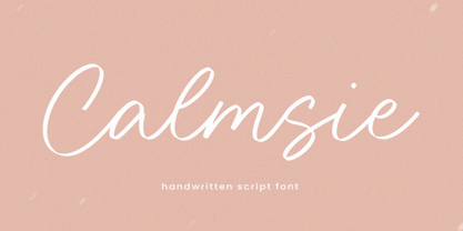 Calmsie A Handwritten Script Font Calmsie is perfect for product packaging, branding project, magazine, social media, weddings, or just used to express words above the background. This Calmsie font includes: Calmsie multilingual support. Embellish your designs with our original fonts. Enjoy the font, Thank you!
 - 1st Ave by Design is Culture,
$39.00 1st Ave is the most experimental of my typefaces. I took a picture of a metal and neon sign in the East Village of New York City. These signs are slowly being replaced by LED and LCD displays, but if you look hard, you can still find quite a few in the city. The signs give a mid 20th century feel to the city. To design 1st Ave, I took a picture of the sign, scanned it and increased the contrast in Photoshop so that the photographic forms became line art. There weren't enough letterforms in the sign to create the whole alphabet, so I cut up the strokes and collaged them back together to finish the entire alphabet. Important Note: 1st Ave is an experimental typeface and is not compatible with certain software such as Microsoft Word.
 - Lentzers by Ingrimayne Type,
$9.95 The upper-case letters of Lentzers fit into the shape of a convex lens and the lower-case letters fit into the shape of a concave lens. The typeface was designed to have concave shapes alternate with convex shapes so the letters snuggle together. The OpenType contextual alternatives (calt) feature will automatically make this happen if your word processor supports it. (To get only concave or convex shapes, one must turn off the contextual alternatives feature. With only concave shapes the spaces between letters form thin convex lenses and with only convex shapes the spaces between letters form thin concave lenses. The name of the family was inspired by these lens shapes and also by the name of distant ancestors.) Lentzers is caps only. It comes in three weights: light, regular, and bold. It is eye-catching for posters and titles and poorly suited for text.
 - Delikaat by Cubo Fonts,
$19.00 Delikaat is made up of thin & thick strokes - a version of Cubo Font's former Delicate. Most cursive fonts intend to create the look and feel of real handwriting: many letters have a specific drawing, following other letters that come before and after, or its position at the beginning or at the end of the word. “Delicate” resolved that problem thanks to the OpenType technology, and offers many discretionary ligatures (group of pre-drawn letters), adapted to numerous combinations. Therefore, it’s not only a decorative and calligraphic writing, but also a fluent and energetically one. In order to make the most of it, please activate your software’s OpenType features.
 - Cowling Sans AOE by Astigmatic,
$24.95 Cowling Sans AOE is a charming Art Deco architectural style typeface. It is the cleaned-up, refined revival and elaboration of a lettering design from “Lettering for Commercial Purposes” by Wm. Hugh Gordon published in 1918. What began as a basic character set of Capitals, lowercase, and two styles of ampersand has been expanded to a full character set including unlimited fractionals, superiors & inferiors, ordinals, tabular, proportional, and oldstyle figures, and an expanded language glyph set, all with a smallcaps and Caps to Smallcap set to match. This lettering style exudes the charm of its era with every word set in it by way of the small details that set it apart from other sans typestyles.
 - Bullhorn by Illuminaut Designs,
$10.00 Broad, tightly-spaced verticals make Bullhorn hard to ignore. Perfect for headlines and product names, this font is designed to fill space. Two weights and loads of variable characters give Bullhorn incredible versatility and charm.
 - Snare by In-House International,
$5.00 A typeface that celebrates marching to the beat of your own drum. Snare is a jazzy little display type that presents like a stencil but behaves in its own way.Featuring angled section breaks and variable heights, Snare keeps each character’s footprint steady as as its heights change, revealing unique crossbars, periscoping capitals and deep-sinking descenders. Because each character follows its own rules, the more each word grows, the more it shows the beautiful rhythm of variety. Or stretch individual characters to shape the contours of your words. Beyond just being playful, fun to dress in colors, and delightfully useful for tight spaces,Snare’s lanky verticals and nervous energy reflect the time it was created. In this second pandemic spring, Snare brings up the drumroll-expectant heartbeat of our uncertainty, and the wish that when we can all meet again, our newfound weirdnesses will find a home in the world. The Snare font family includes one uppercase alphabet with two lowercase variants and comes in ten standard weights-which-are-just-really-heights (.otf) and as a variable type(.ttf) for designers using compatible platforms. Snare was designed by Alexander Wright and In-House International and developed byRodrigo Fuenzalida at FragType. In-House International’s foundry was launched in the summer of 2020 to offer bold, experimental, display typefaces that tell a story. Our previous releases have been featured on Design Milk, DesignBoom, Slanted and all sorts of exciting places.
 - Banknote 1948 by Ingo,
$39.00 A very expanded sans serif font in capital letters inspired by the inscription on a bank note Old bank notes tend to have a very typical typography. Usually they carry decorative and elaborately designed markings. For one thing, they must be practically impossible to forge and for another, they should make a respectable and legitimate impression. And in the days of copper and steel engravings, that meant nothing less than creating ornate, shaded or otherwise complicated scripts. Designing the appropriate script was literally in the hands of the engraver. That’s why I noticed this bank note from 1948. It is the first 20 mark bill in the then newly created currency ”Deutsche Mark.“ All other bank notes of the 1948 series show daintier forms of typography with an obvious tendency toward modern face. The 1949 series which followed shortly thereafter reveals the more complicated script as well. For whatever reason, only this 20 mark bill displays this extremely expanded sans serif variation of the otherwise Roman form applied. This peculiarity led me in the year 2010 to create a complete font from the single word ”Banknote.“ Back to those days in the 40’s, the initial edition of DM bank notes was carried out by a special US-American printer who was under pressure of completing on time and whose engravers not only engraved but also designed. So that’s why the bank notes resemble dollars and don’t even look like European currency. That also explains some of the uniquely designed characters when looked at in detail. Especially the almost serif type form on the letters C, G, S and Z, but also L and T owe their look to the ”American touch.“ The ingoFont Banknote 1948 comprises all characters of the Latin typeface according to ISO 8859 for all European languages including Turkish and Baltic languages. In order to maintain the character of the original, the ”creation“ of lower case letters was waived. This factor doesn’t contribute to legibility, but this kind of type is not intended for long texts anyway; rather, it unfolds its entire attraction when used as a display font, for example on posters. Banknote 1948 is also very suitable for distortion and other alien techniques, without too much harm being done to the characteristic forms. With Banknote 1948 ingoFonts discloses a font like scripts which were used in advertising of the 1940’s and 50’s and were popular around the world. But even today the use of this kind of font can be expedient, especially considering how Banknote 1948, for its time of origin, impresses with amazingly modern detail.
 - Homework Dashed by DAAZ,
$9.00 Homework Dashed font was specially conceived/designed for teaching cursive writing. This resource allows tutors and parents to create worksheets for individual or class teaching. Associated with the Homework font, students can learn and exercise their handwriting abilities. All capital letters, excluding I, F, T and P, link to any following small letter: the sequence of the previous letter stroke always follows the angle of the initial stroke of the subsequent letter. This, in the real world, means that words built with the font can be handwritten without having to lift the pen from the paper (except to cross t and f and dot i and j) or interrupt the writing flow. All the letters are base aligned and all small letters have the same ‘x’ height. Homework Dashed font is a tool with which teachers and tutors can create repetitive alphabetical writing exercises that can be printed on lined sheets.
 - Buum by Ondrej Chory,
$70.00 The Buum typeface evolved from the explosive lettering originally designed as part of a house style for an interactive science centre for kids. Beside its usual application as a strong display font in print and on screen, the bold angular shapes of glyphs are adapted for negative machine- or laser-cutting into structural materials such as iron sheets, plywood, or stone ... and for creating tactile expressive surfaces and 3D objects. This pictogrammic and dazzling font remotely echoes the morphology of the lettering of futurism and constructivism, when avant-garde typography was once an exciting adventure. It is a lettering building kit with a number of stylistic alternatives of glyphs that enable a user to shape the same word differently each time. Buum is recommended by nine out of ten old school futurists, favored by steampunk CNC operators and respected by the majority of infantile anarchists.
 - SF Old South Arabian by Sultan Fonts,
$9.99Historical Background Old South Arabian Script (OSA) was used before the Islamic era not only in the southwest corner of the Arabian Peninsula, but actually in the entire Peninsula. In addition, samples of OSA have been found as far as Uruk in Mesopotamia, Delos in Greece, and Giza in Egypt. Archaeological finds show that as far back as the 8th century BCE, OSA was used in trade, religious writing, and in civil records. Following the spread of Islam in Yemen, the decline of OSA began in the 7th century CE as it was gradually supplanted by Arabic script. OSA was typically known by the name of the then-dominant peoples in the Southern Peninsula. At various times, it was known as Sabaean, Qatabani, or Hadramite, among others. Although it was used for a variety of languages, OSA is most strongly associated with Sabaean. Many Peninsular languages borrowed OSA before introducing further changes of their own. Prime examples are the Thamudic, Safaitic, and Lihyanite scripts which eventually developed into independent scripts. The westward migration of the Sabaean people into the Horn of Africa introduced the South Arabian consonantal alphabet into the region. The transplanted script formed the roots of the Geez script of Ethiopia, which, in time and under presumably external influences, developed into a rich syllabary unlike any other Semitic script in history. Even a cursory examination of the letter forms of Modern Ethiopic writing reveal a striking similarity to South Arabian Script. OSA inscriptions typically reveal a dominant right-to-left directionality, although there are also many cases of alternating directions, known as boustrophedon writing. Figure 1 is a fine example of this style of writing. OSA inscriptions were discovered early in the 19th century. Soon thereafter, two orientalists, Gesenius and Rödiger, made great strides towards deciphering the script. Styles of Writing Old South Arabian inscriptions have survived primarily on stone, ceramic, and metallic surfaces. Hundreds of artifacts have been found and, to this day, continue to be discovered. Some of the best examples number of inscriptions on softer materials, such as wood and leather, have also been discovered. Although there is a significant difference between the styles of letters on the hard surfaces and those on the soft. Old South Arabian (Musnad) is composed of 29 letters , that is one letter more than the Arabic alphabet, which is between “S” and “Sh”, and names “Samekh”. Aspects of difference between Musnad and the present Arabic writing is that Musnad is written in separate letters, and the shape of the letters do not change according to its place in the word. However, some letters change according to the beginning of the writing. Musnad is either prominent, or deep. Prominent writings are for important writings and deep writings are for ordinary. The material on which the Musnad was written were stones, rocks, wood, and metal. In the course of its development the Musnad use appeared in the “Lehyanite’, “Thamudic”, “Safaitic”, pen to which many changes and amendments were made. And from it “Habashi’ writing was born. As regards his place among the Arabs of the Peninsula , when we look at the internet and its role in cultural dialogue , the Arabs of the Peninsula considered Musnad inscription which was indisputably their national writing until the dawn of Islam. It was used by people in all parts of Arabia in their homeland and abroad . It was their means of chronology and record of their glories and history.2- Features of Musnad Script: 1. It is written from right to left and vice versa. 2. Its letters are not joined. 3. Shape of letters are uniform despite their positions in the word. 4. Words are separated by vertical lines. 5. A letter is doubled in case of assertion. 6. No points and punctuations. 7. Easy to be learned by beginners. My OSA Musnad Font My design and technical work is only a treatment of the OSA Musnad as a symbol of writing. And it is possible to use in computer.. My design is not aimed at demonstrating the linguistic and intellectual structure of the Old South Arabian (Musnad). It is so simple that it could be easy to learn by learners and those who are interested in the OSA Musnad letters in computer. The basis of such importance is that it spares a lot of time and effort for researchers and students in this field. Formerly they used to write the Musnad texts either by handwriting or scan them , But now they can easily write its texts in OSA Musnad by using keyboard directly, so that they can change , amend and fulfill easily and accurately . So, we made use of speed, easiness and accuracy. And anyone interested in the South Arabian history in any part of the world can due to this design read and write OSA Musnad letters most easily. This design will also be used by historians and archeologists. , as well as specialist linguistics . The design also demonstrates the aesthetics of the Himyarit writing. About this font family Old South Arabian is An Arabic, Old South Arabian and Latin typeface for desktop applications ,for websites, and for digital ads. Old South Arabian font family contains two types: Old South Arabian and Old South Arabian serif. The font includes a design that supports Arabic, Old South Arabian and Latin languages. Old South Arabian typeface comes with many opentype features. - FF Info Pict by FontFont,
$62.99 Erik Spiekermann, working in collaboration with Ole Schäfer, originally designed FF Info® Display for use in the context of wayfinding systems. The variants FF Info™ Text and FF Info™ Correspondence were developed later for text setting and office communication. FF Info Display The sober and clear forms of the sans serif FF Info Display have been deliberately molded to make them perfect for use on wayfinding systems. The font by Ole Schäfer and Erik Spiekermann not only takes the problem of lack of space into account - it is some 15% narrower than comparable typefaces - the characters have also been designed to ensure they remain legible even in adverse conditions for reading. As text on signs often contains words with which readers are unfamiliar and which are thus deciphered letter for letter rather than perceived as whole words, it is essential to provide for a clear differentiation between glyphs. Additional serifs on the lowercase "i" and uppercase "I" and a small arch on the terminal of the lowercase "l" ensure that it is possible to readily discriminate between these particularly problematic letters. Moreover, sharp corners on glyphs can also make it difficult to read signs with backlighting or when driving past. The rounded corners of FF Info Display counteract this effect and make sure that the character forms remain well defined.FF Info Display is available in five carefully coordinated weights, from Regular to Bold. In the corresponding italic variants, the letters appear overall more rounded while the lowercase "a" has a closed form and the "f" has a descender. Also included among the glyphs of FF Info Display are several ligatures and arrow symbols. Pictograms with different themes that complement the typeface are also available in four weights. FF Info Text Thanks to his know-how gained through designing other typefaces, Erik Spiekermann became aware that fonts created for use in problematic environments can be used in many different situations. In smaller point sizes, FF Info Display cuts a fine figure when used to set longer texts. So Spiekermann carefully reworked FF Info Display to produce FF Info Text, a font perfected for use in this context. Not only can the characters be more generously proportioned, certain features, such as additional serifs to aid with the differentiation of problematic letters, are also no longer necessary in textual surroundings. The upright styles have a double-story "g" while Spiekermann has added oldstyle figures and small caps. FF Info Correspondence FF Info Correspondence has also been designed for setting block text although it recalls the style of old typewriter characters and is specifically intended for use in office communication. The characters of this third member of the family are thus more formal, without rounded terminals but with rectangular punctuation marks. The narrower letters are provided with large serifs to give them more space although, at the same time, this reduces the differences in terms of letter width among the alphabet. In contrast with its two siblings, FF Info Correspondence has only three weights, each with corresponding italic.The three styles of the FF Info super family cover an extensive range of potential applications. If the different kerning is adjusted manually, the three styles harmonize happily with each other and can be readily used in combination to set, for example, headlines and texts and also creative display options.
 - Rose Gold Extrude by ijemrockart,
$13.00 Rose Gold feels playfully nostalgic and delivers an incredible vintage retro aesthetic. Use this display font to add that special retro touch to any design idea you can think of!. Masterfully designed to become a true favorite, this font has the potential to bring each of your creative ideas to the highest level! WHAT'S YOU GET ? Unique Letterforms Works on PC & Mac Simple Installations Accessible in the Adobe Illustrator, Adobe Photoshop, Microsoft Word Fully accessible without additional design software. I really hope you'll get pleasure using Rose Gold and it will be a perfect addition to your font collection! Contact me with an inbox message If you have any questions.
 - No Parking JNL by Jeff Levine,
$29.00 No Parking JNL was inspired by a hand-cut stencil of those words painted in an area of a department store's parking lot.
 - MFC Whitworth Monogram by Monogram Fonts Co.,
$19.00 The inspiration source for MFC Whitworth Monogram is an alphabet set from a vintage embroidery alphabets book, Alphabets Broderies No. 238 by N. Alexandre & Cie. What began as 26 referenced capital letters has been expanded to three sets of alphabets within a single typeface. True to the original reference, the Capitals are the stylized cursive capital letters in all their gorgeousness. The lowercase encapsulates the capital letters intertwined within rectangular frame. By enabling Stylistic Alternates and typing any lowercase letter, you get each letter encapsulated and intertwined within an oval frame. A handful of decorative forms are placed in the 0-6 numeral slots. Originally intended to adorn handkerchiefs and other linens, this digital revival opens it up to a whole new realm of possibilities. This is one of many monogram designs from the late 1800's to early 1900’s that is loaded with panache and intricate detailing.
 - Little Boxes by Resistenza,
$39.00 A new happy handwritten sans serif font has arrived! Little Boxes has been designed with felt pen on smooth paper to create the illusion of human craft and then digitalized. Three different fonts Regular, slanted and dance. Optimized shapes to obtain the best readability without loosing the analogical feeling of the original designing tool, makes this font perfect both for printing and digital environments and it allows the use of the font on any project with different media supports. This fresh font family is ready for text, but check your opentype features window while using the font and discover a beautiful set of alternate letters. Create catchy words and add more fun to any layout, which makes it a perfect match for titles and display too. A friendly typeface to give a whimsical touch to your projects. We highly recommend using Little Boxes for App, web, ePub, digital Ads, Video games, and a great fitting for printing; headlines, posters, DIY hand-lettered artwork, books, holiday cards, invitations, T-shirts, labels, packaging, artisanal goods, etc.
 - Bike Power by PizzaDude.dk,
$19.00 I love my bike, and I couldn't dream of not using it on a daily basis - I use my bike in rain, sun, snow, and windy days...all year, in other words! This font is dedicated to my bike, and is the first in a series of handmade fonts! Play around with the three layers and your favourite colours, for awesome effects. All versions comes with Contextual Alternates, which means several versions of each letter. In this case, every letter has 5 different versions that automatically cycles as you type! A quite awesome thing, because it makes your text more lively and natural looking!
 - Bike Jam by PizzaDude.dk,
$17.00 I love my bike, and I couldn't dream of not using it on a daily basis - I use my bike in rain, sun, snow, and windy days...all year, in other words! This font is dedicated to my bike, and is the second in a series of handmade fonts! Play around with the 5 layers and your favourite colours, for awesome effects. All versions comes with Contextual Alternates, which means several versions of each letter. In this case, every letter has 7 different versions that automatically cycles as you type! A quite awesome thing, because it makes your text more lively and natural looking!
 - Autumn Stories by Tlatous Type,
$19.00 Introducing Autumn Stories by Tlatous Type. Autumn Stories is a Modern Script Handwritten Font. This font is perfect for product packaging, branding project, megazine, social media, wedding, or just used to express words above the background.
 - Semiotic by Letterhend,
$19.00 Semiotic is a stylish condensed font. The uniqueness of this font is have the same size of uppercase and lowercase, so you can playaround to create a nice wording with this font. Very suitable for logo, headline, tittle, and the other various formal forms such as invitations, labels, logos, magazines, books, greeting / wedding cards, packaging, fashion, make up, stationery, novels, labels or any type of advertising purpose. Features : uppercase and lowercase numbers and punctuation multilingual ligatures alternates PUA encoded We highly recommend using a program that supports OpenType features and Glyphs panels like many of Adobe apps and Corel Draw, so you can see and access all Glyph variations. How to access opentype feature : letterhend.com/tutorials/using-opentype-feature-in-any-software/
 - Stancilo by Ardyanatypes,
$15.00 Stancilo is a type of serif font that offers uniqueness in its form. With a distinctive design and superior aesthetics, this font gives each character an elegant and modern touch. Stancilo font has nine different thicknesses, ranging from thin to bold, providing flexibility and variation. Thus, this font can be used for various design purposes, from main headings to body text, with the ability to adjust the desired intensity and emphasis. One of the advantages of Stancilo is the presence of alternate letters and ligatures that provide character variations for each letter. Allows users to combine alternate letters or use special ligatures to create more harmonious combinations and relationships between characters within words. This feature adds a sense of personalization and additional creativity to the design. Furthermore, Stancilo font also supports multiple languages, making it suitable for multilingual design projects. With the support of diverse languages, this font enables effective and comprehensive visual communication in various cultural contexts. Stancilo is a prominent serif font with a unique form, providing nine different thicknesses, alternate letters, and ligatures. These advantages make it suitable for elegant, modern designs and allow for creative exploration in using its letters. With support for multiple languages, this font becomes a versatile and inclusive choice for diverse design projects.
 - Nouveau Showcard JNL by Jeff Levine,
$29.00 The 1920 song “Noah’s Wife Lived a Wonderful Life (‘Cause Noah Had to Stay Home)” is another example of one of those overly-worded song titles from early 20th Century composers. What’s more important for type enthusiasts is that the title was hand lettered with a round nib pen in a slightly ragged Art Nouveau style. Cleaning up the ragged design, the end result became Nouveau Showcard JNL, which is available in both regular and oblique versions.
 - VLNL Brak by VetteLetters,
$35.00 Brak is the dutch word for ‘brackish’, the mix of fresh and salten sea water found in river deltas and estuaries. Brak is also VetteLetters’ straightforward display font with straight lines and rounded ends, and comes in two weights. It does really well in sea food dishes like fish, lobster, mussels and shrimps. Brak doesn't beat around the bush, it is an all-caps typeface with alternative capital letterforms assigned to the lowercase positions, for a variety of combinations.
 - Fitz Sans SRF by Stella Roberts Fonts,
$25.00 Fitz Sans SRF was contributed to the Stella Roberts Fonts project by graphic designer Matt Yow after receiving word of the project from Ray Larabie of Typodermic Fonts. A light, attractive text face, Fitz Sans SRF also lends itself well to headlines and titles. The font is available in both regular and oblique versions. The net profits from my font sales help defer medical expenses for my siblings, who both suffer with Cystic Fibrosis and diabetes. Thank you.
 - Fashion Country by Balpirick,
$15.00 Fashion Country is a outline style handbrushed font, meticulously crafted to deliver a distinct and captivating visual impact. With our outline style handbrushed font, each letter is carefully hand-drawn, capturing the essence of the brush strokes to create an effortlessly stylish and modern look. The outline style adds a subtle yet striking touch, making your words stand out with an air of sophistication. The unique characteristics of our handbrushed font make it ideal for a wide range of applications. Whether it's crafting eye-catching logos, designing captivating posters, or composing inspiring quotes, our font seamlessly integrates into your creative endeavors, leaving a lasting impression. This font only has allcaps letters. - also multilingual support Enjoy the font! Feel free to comment or feedback! Thank you!
 - Our Infinity Love by Putracetol,
$28.00 Our Infinity Love - Monoline Wedding Font. Our Infinity Love wedding script fresh & modern script with handmade calligraphy style. This font is inspired by monoline the character's style which shows the romance of a relationship through hand strokes with the added "love" symbol at the end of the line. This font is perfect for a professional touch making this font more elegant and suitable for all types of projects you are working on, especially for romantic-themed work. But this font is also suitable for logos, branding, greeting cards, invitation cards, advertisements, titles, healines, book titles, stickers, packaging, quotes, posters, t-shirts/apparel, billboards and others. The alternative characters were divided into several Open Type features such as Swash, Stylistic Sets, Stylistic Alternates, Contextual Alternates, and Ligature. The Open Type features can be accessed by using Open Type savvy programs such as Adobe Illustrator, Adobe InDesign, Adobe Photoshop Corel Draw X version, And Microsoft Word. This font is also support multi language.
 - Xard by Sryga,
$10.00 Introducing Xard, a typeface that brings a cosmic flair to your words. Its captivating contours mirror the fractured elegance of crystal asteroids adrift in space, infusing your text with an otherworldly charm. With Xard, every letter becomes a celestial fragment, forming a captivating constellation of characters that will leave your readers stargazing in awe
 - Papillon Script by Fenotype,
$30.00 Papillon Script is an eloquent pen script with large display capitals and small but legible lowercase letters. It’s ideal for logo, headline, brochure, model for a neon sign or any display use like that. Papillon Script is completely monolinear and it gives a clear but vivid impression of a hand writing style. Papillon Script is equipped with following OpenType features: • Standard Ligatures is automatically on and it adds variation and smoothness to typing. If a same letter repeats in the same word the latter will automatically change to an alternative version. • Contextual Alternates is an optional feature that cuts the connection between letters every once in awhile. • Titling Alternates changes the last character in every word into an ending Swash alternative. • From Stylistic Set 1 you’ll find a set of 34 ornaments, strokes and arrows. • Small Caps turns lowercase into a set of legible capital letters.
 - Harietta by Gleb Guralnyk,
$12.00 Harietta is a decorative, smooth font with rounded shapes and lot's of OpenType features. Harietta has lot's of additional glyphs (Ligatures, Stylistic Alternates, Swashes), that will help you to create a unique lettering composition. To create a swash in the end of the word just type one or two underscore symbols and number from 1 to 9 and it will be replaced with one of the swashes (check out that “Standard Ligatures” feature is enabled in OpenType panel). Thank you and have a nice day!
 - Herlianty by MJB Letters,
$15.00 Say hi to our newest product called ‘Herlianty‘ which is a natural handwritten font, with an original handwritten look, highlighting the uniqueness of each character and having several ligatures that will add an elegant impression to the design. This font is very perfect for wedding designs, wedding invitations, stationery, logotype, branding, display, fashion design, poster and more. Herlianty includes full set of uppercase and lowercase letters, numeral, punctuations and ligatures. Included in this set: Works on PC & Mac Simple installations Accessible in Adobe Illustrator, Adobe Photoshop, Adobe InDesign, even work on Microsoft Word. PUA Encoded Characters – Fully accessible without additional design software
 - Alliette by Krafted,
$10.00 Introducing Alliette - A Handwritten Font One of the most elegant,exquisite yet strong font, can be used for loads of different projects, advertisements and promotions. Go ahead and use it on your website, for your social media branding, Pinterest banners, printed invitations, and more! Inspire your audience, clients, or guests with this stylish, handwritten font. What you’ll get: Multilingual & Ligature Support Full sets of Punctuation and Numerals Compatible with: Adobe Suite Microsoft Office KeyNote Pages Software Requirements: The fonts that you’ll receive in the pack are widely supported by most software. In order to get the full functionality of the selection of standard ligatures (custom created letters) in the script font, any software that can read OpenType fonts will work. We hope you enjoy this font and that it makes your branding sparkle! Feel free to reach out to us if you’d like more information or if you have any concerns.
 - Generale Script by Alpha Bento,
$12.00 Generale Script is the font of choice for writing things that go beyond words. This font type is designed with high detail to deliver stylish elegance. So, it can be said, the character of the change is very beautiful, a kind of classical decorative copper script. Generale Script presents alternative variants of most letters, binders, and many calligraphy tips, ideal for elegant labels, high-end packaging, stationery, and compositions for certain brands, beautiful titling, verses, letters and short texts, which are intended to be read only with the eyes or intended to whisper into someone's ear. Generale Script has 300+ glyphs and alternative characters, including various language support. With the OpenType feature with an alternative style and elegant binder. The OpenType feature does not function automatically, but you can access it manually and for the best results needed for your creativity in combining these Glyph variations. To enable the OpenType Stylistic alternates, you need a program that supports OpenType features such as Adobe Illustrator CS, Adobe Indesign & CorelDraw X6-X7, Microsoft Word 2010 or later versions. (Windows), Font Book (Mac) or a software program such as PopChar (for Windows and Mac). How to access all alternative characters using Adobe Illustrator: https://www.youtube.com/watch?v=XzwjMkbB-wQ How to use stylistic sets fonts in Microsoft Word 2010 or later versions: https://www.youtube.com/watch?v=NVJlZQ3EZU0 There are additional ways to access alternates / swashes, using the Character Map (Windows), Nexus Font (Windows) Font Book (Mac) or a software program such as PopChar (for Windows and Mac). How to access all the alternative characters, using the Windows Character Map with Photoshop: https://www.youtube.com/watch?v=Go9vacoYmBw If you need help or advice, please contact me. :) Thank You, Alpha Bento
 - Boyish & Weird by Rachel White Art,
$16.00 Say hello to Boyish & Weird! (I actually don't know what boyish is, but I do like how that word looks with these letters.) I had a lot of fun making this weird little font. It has oval cutouts, heavy lines, and plenty of whimsical details.
 - TA Bankslab by Tural Alisoy,
$33.00 The building of the Northern Bank of St. Petersburg's Baku branch was built in 1903-1905. It was the first Art Nouveau-style building in Baku, Azerbaijan. Later the bank was transformed into the Russian-Asian Bank. After the oil boom in Baku in the 19th century, branches of many banks and new banks were opened in the city. The branch of the Northern Bank of St. Petersburg was among the first banks that was opened in Baku. N.Bayev was the architect of the building for the branch of the Northern Bank of St. Petersburg located at Gorchakovskaya 3 in 1903-1905. The building currently houses the Central Branch of the International Bank of Azerbaijan. My purpose in writing this is not to copy and paste the information from Wikipedia. What attracted me to the building was the word "Банкъ" (Bank) written in Cyrillic letters, which was also used in Azerbaijan during the Soviet era. The exact date of the writing is not known. Every time I pass by this building, I always thought of creating a font of this writing someday. I had taken a photo of the building and saved it on my phone. I did a lot of research on the font and asked a lot of people. However, some did not provide information at all and some said they did not have any information. I was interested in the history of this font but I do not know if this font really existed or it was created by the architect out of nowhere. If there was such a history of this font, I wanted to recreate this font and make it available. If not, I had to create it from scratch in the same way, using only existing letters on the building. Finally, I made up my mind and decided to develop the font with all letters I have got. It was difficult to create a font based on the word, Банкъ. Because in the appearance of the letters, the midline of the letters on A, H, K was very distinct, both in the form of inclination and in more precise degrees. The serif part of the letters, the height of the upper and lower sides, differed from each other. I don't know whether it was done this way when the building was constructed or it happened over time. I prepared and kept the initial version of the font. I took a break for a while. I started digging on the story of the font again. Meanwhile, I was researching and got inspired by similar fonts. Unfortunately, my research on the font's history did not yield any results. I decided to continue finishing up the font. After developing the demo, I created the font by keeping certain parts of these differences in the letters. In addition, I had to consider the development of letters in the Cyrillic, as well as the Latin alphabet, over the past period. Thus, I began to look at the appearance of slab-serif or serif fonts of that time. In general, as I gain more experience in developing fonts, I try to focus on the precision of the design for each font. In recent years, I specifically paid attention to this matter. YouTube channel and articles by Alexandra K.'s of ParaType, as well as, information and samples from TypeType and Fontfabric studios on the Cyrillic alphabet were quite useful. I gathered data regarding the Latin alphabet from various credible sources. I do not know if I could accomplish what I aimed at but I know one thing that I could develop the font. Maybe someday I'll have to revise this font. For now, I share it with you. I created the font in 10 styles. 7 weight from Thin to Extra Black, an Outline, Shadow, and Art Nouveau. The Art Nouveau style was inspired by the texture in the background used for the text on the building. The texture I applied to capital letters adds beauty to the font. If you like the font feel free to use it or simply let me know if your current alphabet doesn't support this font.
 - TA Bankslab Art Nouveau by Tural Alisoy,
$40.00 TA Bankslab graphic presentation at Behance The building of the Northern Bank of St. Petersburg's Baku branch was built in 1903-1905. It was the first Art Nouveau-style building in Baku, Azerbaijan. Later the bank was transformed into the Russian-Asian Bank. After the oil boom in Baku in the 19th century, branches of many banks and new banks were opened in the city. The branch of the Northern Bank of St. Petersburg was among the first banks that was opened in Baku. N.Bayev was the architect of the building for the branch of the Northern Bank of St. Petersburg located at Gorchakovskaya 3 in 1903-1905. The building currently houses the Central Branch of the International Bank of Azerbaijan. My purpose in writing this is not to copy and paste the information from Wikipedia. What attracted me to the building was the word "Банкъ" (Bank) written in Cyrillic letters, which was also used in Azerbaijan during the Soviet era. The exact date of the writing is not known. Every time I pass by this building, I always thought of creating a font of this writing someday. I had taken a photo of the building and saved it on my phone. I did a lot of research on the font and asked a lot of people. However, some did not provide information at all and some said they did not have any information. I was interested in the history of this font but I do not know if this font really existed or it was created by the architect out of nowhere. If there was such a history of this font, I wanted to recreate this font and make it available. If not, I had to create it from scratch in the same way, using only existing letters on the building. Finally, I made up my mind and decided to develop the font with all letters I have got. It was difficult to create a font based on the word, Банкъ. Because in the appearance of the letters, the midline of the letters on A, H, K was very distinct, both in the form of inclination and in more precise degrees. The serif part of the letters, the height of the upper and lower sides, differed from each other. I don't know whether it was done this way when the building was constructed or it happened over time. I prepared and kept the initial version of the font. I took a break for a while. I started digging on the story of the font again. Meanwhile, I was researching and got inspired by similar fonts. Unfortunately, my research on the font's history did not yield any results. I decided to continue finishing up the font. After developing the demo, I created the font by keeping certain parts of these differences in the letters. In addition, I had to consider the development of letters in the Cyrillic, as well as the Latin alphabet, over the past period. Thus, I began to look at the appearance of slab-serif or serif fonts of that time. In general, as I gain more experience in developing fonts, I try to focus on the precision of the design for each font. In recent years, I specifically paid attention to this matter. YouTube channel and articles by Alexandra K.'s of ParaType, as well as, information and samples from TypeType and Fontfabric studios on the Cyrillic alphabet were quite useful. I gathered data regarding the Latin alphabet from various credible sources. I do not know if I could accomplish what I aimed at but I know one thing that I could develop the font. Maybe someday I'll have to revise this font. For now, I share it with you. I created the font in 10 styles. 7 weight from Thin to Extra Black, an Outline, Shadow, and Art Nouveau. The Art Nouveau style was inspired by the texture in the background used for the text on the building. The texture I applied to capital letters adds beauty to the font. If you like the font feel free to use it or simply let me know if your current alphabet doesn't support this font.
 - Cavas by Authentype,
$20.00 Cavas modern & elegant font with discretionary ligatures that give each word a different shape. Also contains a swash with an elegant, contrasting, and clean, perfect for logo designs, posters, and various types of promotional media. – Standard glyphs uppercase and lowercase letters – Numerals, a large range of punctuation and ligatures. – Swashes. – Multilingual – Works on PC & Mac. Simple installations, accessible in Adobe Illustrator, Adobe Photoshop, Adobe InDesign, even work on Microsoft Word. PUA Encoded Characters – Fully accessible without additional design software. Fonts include multilingual support for; ä ö ü Ä Ö Ü ß ¿¡ _________________________________________________________________________________________________________________________________ Image used: All photographs/pictures/logo/vectors used in the preview are not included, they are intended for illustration purposes only. Thank you for your purchase! Hope you enjoy our font! Designers: Authentype | Ekayasa.
 - DB Circles - Christmas by Illustration Ink,
$3.00DoodleBat Circles - Christmas is a collection of Christmas themed words and clipart thrown together in classic circles. - Finocchio by The Ampersand Forest,
$45.00 Finocchio (yes, we know — wink) has the playful, round shapes of a French Ronde with the sharp angles of Italian Futurism. It's a bold, fun, excellent branding face — wherever you need some gusto or brio or forza! Finocchio comes with a large number of ligatures for fluidity. It also comes with a solid, readable set of non-script small caps, so all you need for that sign is one coordinated font! It also comes with loads of fun alternates! Finocchio is made with love in The Ampersand Forest.
 - Secca Art Std by astype,
$36.00 Secca Art recovers some of the expressive forms of early art nouveau and art deco grotesques — not copying it, but carefully adapting it for today. Secca Art is based on the Secca typeface family and is full interchangeable. Both are equal in weights, widths and word spacing, so you can decide to give your layout a more expressive or serious look. If you need Italic styles just use the Italics from Secca .