10,000 search results
(0.034 seconds)
- Sumida Script by Hanoded,
$15.00 Sumida is a special ward in Tokyo AND the river running through the city. Sumida script is a nice, handwritten font, which was made using a sharpie pen. Sumida Script comes with double letter ligatures and an extensive language support.
 - Forgotten Futurist - Unknown license

- ITC Connectivities by ITC,
$29.99Some words from the designer... West coast artist Teri Kahan developed a "design font" of 68 pictographs capturing the sentiments of relationship, connection and synchronicity. Many of the characters were created with phrases in mind like, "handing you the world on a platter", "howling at the moon", and "message in a bottle". Others represent life experiences. The clean, simple illustration style originates from the look of hand-carved rubber stamps, and lends itself beautifully to logos and graphics. - Elephantmen Greater and Taller by Comicraft,
$19.00 Roll up! Roll up! The world’s largest three (letter-)ring circus of Great and Tall Elephantmen fonts is now touring cities and towns in your area! See the amazing exploits of fonts of heretofore unimagined heights and weights! Gasp as x-heightwire artist John Roshell walks great and tall on the typerope up above your headlines! Look in wonder as Elephantmen get greater and taller on stilts, staggering around with their trunks high in the air as well as loose around their waists! Peer cautiously into the sky as the greatest and tallest Elephantmen disappear into the clouds as they swing up on the trapeze... Yes, the Comicraft Big Top is always full of surprises... so hurry, hurry, hurry to download your ticket to the Greatest and Tallest Show on Earth in the comfort of your own home! See the families related to Elephantmen Greater & Taller: Elephantmen, Elephantmen Great & Tall, & Elephantmen Greatest & Tallest.
 - Elephantmen Greatest and Tallest by Comicraft,
$19.00 Roll up! Roll up! The world’s largest three (letter-)ring circus of Great and Tall Elephantmen fonts is now touring cities and towns in your area! See the amazing exploits of fonts of heretofore unimagined heights and weights! Gasp as x-heightwire artist John Roshell walks great and tall on the typerope up above your headlines! Look in wonder as Elephantmen get greater and taller on stilts, staggering around with their trunks high in the air as well as loose around their waists! Peer cautiously into the sky as the greatest and tallest Elephantmen disappear into the clouds as they swing up on the trapeze... Yes, the Comicraft Big Top is always full of surprises... so hurry, hurry, hurry to download your ticket to the Greatest and Tallest Show on Earth in the comfort of your own home! See the families related to Elephantmen Greatest & Tallest: Elephantmen, Elephantmen Great & Tall, & Elephantmen Greater & Taller.
 - LiebeLotte Swell by LiebeFonts,
$29.90 Have you heard? It’s in the stars: next July we collide with Mars! But until then, there are plenty of good reasons to treat yourself to this swell typeface. LiebeLotte Swell is a great investment for letter lovers who design beautiful things for their friends and family and also for designers who love their clients: Your next birthday invitation? Check. That photo album you’re making for your mom? Check. The business cards you’re designing for your friend who runs a deli? Check. There are so many nice things that want to be designed, and LiebeLotte Swell wants to be your assistant in the old-fashioned way: polite and friendly. Just like her monolinear siblings in the LiebeLotte family, charming LiebeLotte Swell knows how to impress with her perfectly drawn curves and her perfectly connected loopy letterforms. Of course LiebeLotte Swell comes with a state-of-the-art character set. She also sports a variety of ligatures and alternative forms, available through OpenType features. (Please make sure your software supports ligatures for the letter connections and OpenType if you wish to use the advanced features.) Advanced designers, check out the complete LiebeLotte family with six weights of monolinear loopiness. You may also want to take a look at our best-sellers LiebeErika and LiebeKlara, they get along great with LiebeLotte Swell.
 - Geometry Script Pro by CheapProFonts,
$10.00 The Geometry Pro family has been designed to be the final word in purely geometric fonts, and this rounded Script sub-family is a nod to the 50s style of connected logomarks. Words set with both the Regular and the Alternate (with its more flourished capitals and alternate stem connections) can be extended by using the underscore character between letters. You can freely mix and match glyphs from both fonts to create a little bit of variety, and finding that perfect combination. For a matching set of capitals (and disconnected lowercase letters): check out the Regular weights of the Geometry Soft Pro family. All the Geometry Pro fonts are strictly geometric (as drawn with a compass and a ruler fixed to 90 and 45 degree angles) but they are not slavishly modular. ALL fonts from CheapProFonts have very extensive language support: They contain some unusual diacritic letters (some of which are contained in the Latin Extended-B Unicode block) supporting: Cornish, Filipino (Tagalog), Guarani, Luxembourgian, Malagasy, Romanian, Ulithian and Welsh. They also contain all glyphs in the Latin Extended-A Unicode block (which among others cover the Central European and Baltic areas) supporting: Afrikaans, Belarusian (Lacinka), Bosnian, Catalan, Chichewa, Croatian, Czech, Dutch, Esperanto, Greenlandic, Hungarian, Kashubian, Kurdish (Kurmanji), Latvian, Lithuanian, Maltese, Maori, Polish, Saami (Inari), Saami (North), Serbian (latin), Slovak(ian), Slovene, Sorbian (Lower), Sorbian (Upper), Turkish and Turkmen. And they of course contain all the usual "western" glyphs supporting: Albanian, Basque, Breton, Chamorro, Danish, Estonian, Faroese, Finnish, French, Frisian, Galican, German, Icelandic, Indonesian, Irish (Gaelic), Italian, Northern Sotho, Norwegian, Occitan, Portuguese, Rhaeto-Romance, Sami (Lule), Sami (South), Scots (Gaelic), Spanish, Swedish, Tswana, Walloon and Yapese.
 - Buena by mazefonts,
$53.00 Hello Buena - From Wood to Digital Type Buena is the first word I read on a letterpress paper, printed by my colleague and friend Wolfgang Wick. I was fascinated by the power of this fat wooden letters at first glance. So I started to create a digital version of it and »Buena Black« was born. Due to the fact that the original punches had only upper- case glyphs, I created the lowercase characters by myself. After that it was time to design the family... Buena is full of OpenType features. To get fully acces, go to www.mazefonts.de and Download the Type Specimen.
 - Qukiha by Twinletter,
$15.00 Looking for the perfect font for your next gothic project? Do not look elsewhere than QUKIHA! A great place to look for fonts for your most recent logo, label, badge, music video, or movie is the QUKIHA Blackletter font. You can select the ideal word for your project by choosing from the beautiful and harmonious shapes available in the QUKIHA font. The capital letters are impressive, and the letters are slick and fashionable. QUKIHA Blackletter is a necessity if you’re designing labels, posters, or other things. They are also of a professional caliber, making them ideal for any design task.
 - BLancos by PojolType,
$15.00 Blancos is a new font for minimalist logo designs. This font is suitable for creating word marks, titles, taglines. Use alternatives to emphasize separate letters in your text. The font contains: 4 choices of Uppercase letters 1 choice of lowercase letters Ligatures Multilingual Support (Europe Latin West), Numbers and Punctuation All options of the characters are included in one font. You can use alternates in most major image editors, just find menu item Glyphs (Alternates) there.
 - PeaceNow Basic - Unknown license

- Rainee by Forberas Club,
$16.00 Rain is modern handwritten. Recommended to use this font for signature, wedding party, invitation, memorable moment, love story and many more with special moment.
 - Linotype Zootype by Linotype,
$29.99Zootype –the first original single font– was designed in 1997 by Victor Garcia of Argentina and as a winner of Linotype's Second International Type Design Contest is included in the TakeType Library. The three additional family styles –Zootype Air, Zootype Land, Zootype Water– were added in 1999. In the words of the designer, the design concept is meant to display the funny, happy joy of animal nature.’ Animal heads peek into the block forms of the letters, giving the font a unique whimsical character. - Sada by Arabetics,
$45.00 Sada is a text font designed with hand held devices and ebooks in mind. Glyphs are designed to be larger than usual and very clear with soft visual characteristics and many traditional Arabic calligraphic transitional features incorporated to improve legibility. The word “sada” means “echo” in Arabic. Even though Sada is a cursive style font it offers clearly distinguished and visually unified letter shapes in every position of a word. Sada supports all Arabetic scripts covered by Unicode 6.1, and the latest Arabic Supplement and Extended-A Unicode blocks, including support for Quranic texts. It comes with three weights, regular, bold, and ultra-light. Each weight has normal and left-slanted “italic” styles. The script design of this font family follows the Arabetics Mutamathil Taqlidi style and utilizes varying x-heights. The Mutamathil Taqlidi type style uses one glyph per every basic Arabic Unicode character or letter, as defined by the Unicode Standards, and one additional final form glyph, for each freely-connecting letter in an Arabic text. Sada includes the required Lam-Alif ligatures in addition to all vowel diacritic ligatures. Sada’s soft-vowel diacritic marks (harakat) are only selectively positioned with most of them appearing on similar lower or upper positions to emphasize they are not part of letters. Kashida is zero width glyph.
 - Billastim by Din Studio,
$29.00 If you’re looking for a elegant font to attract your audiences or customers then we’ve got the font for you! This typeface with elegant and classy style looks very interesting for loads of different projects and promotions. It is perfect to be used on your website, for your social media branding, Pinterest banners, printed products, and more! Features: Standart Ligatures Stylistic Set Swashes Multilingual Support PUA Encoded Numerals and Punctuation
 - Gryffensee by Catharsis Fonts,
$30.00 Gryffensee is designed to be the Futura of blackletter, combining the time-honored gravity and relentlessness of the Gothic script with the clean, contemporary freshness of the geometric sans. Built from a tightly controlled inventory of lines, arcs, sharp cuts, and OpenType features, Gryffensee was born and raised in the digital age, yet retains the powerful charisma and human warmth of its mediaeval blackletter ancestors. As a result, it excels in a wide range of display settings, logotypes, and short text. Unlike most conventional blackletters, it even handles all-caps usage with grace, and includes an extensive Cyrillic character set (in the Pro version). Apart from a generous range of automatic ligatures and contextual alternates, Gryffensee offers stylistic alternates that allow users to customize its appearance to their tastes. The capital letters |AGHIKZ| come in alternate cuts that trade traditional shapes for increased legibility, while the letter |s| appears in three cuts, each with a unique, distinct flavor. All these options are accessible through OpenType stylistic sets in the main Latin font, Gryffensee Eins. For easy use in applications without OpenType support, we provide two additional Latin fonts (Gryffensee Zwei and Drei) in which these options replace the default cuts. Finally, Gryffensee Pro offers all the functionality of Gryffensee Eins, plus Cyrillic support. My intention to devise a contemporary geometric blackletter was inspired by four hand-painted letters, |ABCD|, in Sasha Prood�s online portfolio. I later found out that he had, in turn, taken those letters from an existing font, Bastard, by Jonathan Barnbrook. Luckily, by that time my project had taken on a life of its own. Gryffensee is an original design that bears only the most superficial resemblance to Bastard. Gryffensee is a mediaeval spelling of the lake Greifensee near which I grew up. It is pronounced [?gri?f?n?se?], or "GRIEF-un-say" in English approximation. This font is dedicated to Simone.
 - Barchowsky Fluent Hand by Swansbury,
$24.00Swansbury, Inc. provides handwriting instruction to all ages, accompanied by two exemplar fonts, Barchowsky Fluent Hand.otf and Barchowsky Dot.otf. The basis for the design of the characters is the italic of the Renaissance. With the advantage of contextual alternates, Barchowsky Fluent Hand automatically joins lowercase letters so it can be used in any venue where a clean and elegant appearance of handwriting is desired. The fonts allow maximum instructional flexibility. Aside from their use in lesson plans, educators can customize pages for specific student interests, studies and needs. Included are all math symbols that one typically encounters in school curricula. Nan Jay Barchowsky, designer of this font, believes that children should hone their handwriting skills as they learn all subjects, reading, math, history and foreign languages. Both fonts support all Western European languages and Turkish. Barchowsky Dot is for young children or others who need remediation. The letterforms are identical to those in Barchowsky Fluent Hand. Used at a large point size open dots appear within the lines that form the characters indicating where one should start each stroke in a letter or number. Once formations are learned Barchowsky Fluent Hand can be used with the contextual alternates turned off until students are ready to write in the joined-up manner of a true cursive. Specifications: The technology for fonts that automatically join letters, or allow them to be unjoined is relatively new. At present, both fonts work on Windows XP with Service Pack 1 or later (or Vista), using AbiWord, a free word processor (go to abisource.com). They also work well with InDesign 2. Currently there is an unknown factor in later versions of InDesign for Windows that disallows joining. Macs completely support the fonts using InDesign 2 and later, PhotoshopCS and IllustratorCS. If you do not have these applications, there is an inexpensive word processor for Macs. - Barchowsky Dot by Swansbury,
$17.00Swansbury, Inc. provides handwriting instruction to all ages, accompanied by two exemplar fonts, Barchowsky Fluent Hand.otf and Barchowsky Dot.otf. The basis for the design of the characters is the italic of the Renaissance. With the advantage of contextual alternates, Barchowsky Fluent Hand automatically joins lowercase letters so it can be used in any venue where a clean and elegant appearance of handwriting is desired. The fonts allow maximum instructional flexibility. Aside from their use in lesson plans, educators can customize pages for specific student interests, studies and needs. Included are all math symbols that one typically encounters in school curricula. Nan Jay Barchowsky, designer of this font, believes that children should hone their handwriting skills as they learn all subjects, reading, math, history and foreign languages. Both fonts support all Western European languages and Turkish. Barchowsky Dot is for young children or others who need remediation. The letterforms are identical to those in Barchowsky Fluent Hand. Used at a large point size open dots appear within the lines that form the characters indicating where one should start each stroke in a letter or number. Once formations are learned Barchowsky Fluent Hand can be used with the contextual alternates turned off until students are ready to write in the joined-up manner of a true cursive. Specifications: The technology for fonts that automatically join letters, or allow them to be unjoined is relatively new. At present, both fonts work on Windows XP with Service Pack 1 or later (or Vista), using AbiWord, a free word processor (go to abisource.com). They also work well with InDesign 2. Currently there is an unknown factor in later versions of InDesign for Windows that disallows joining. Macs completely support the fonts using InDesign 2 and later, PhotoshopCS and IllustratorCS. If you do not have these applications, there is an inexpensive word processor for Macs. - Oldskool Script by Eclectotype,
$40.00 Oldskool Script is a bouncy, connected script inspired by graffiti lettering. OpenType features abound to make a powerhouse of a font. It’s so versatile it could grace the cover of a hiphop album or your baby shower invites. You can go all out with the swashes and alternates, or rein it in for a more subtle approach. Whatever aesthetic you choose, Oldskool Script will surely fit the bill. I had a lot of fun making it; now it’s over to you to have fun using it. Check out the user guide in the gallery section for more in-depth info on the OpenType features.
 - Gamerock by Din Studio,
$29.00 Gamerock is a classic sport font. Made for any professional project especially that related to the sports. Beside that, this font can be used for printing, branding and quotes. Includes: Gamerock (OTF) Features: Alternates PUA Encoded Multilingual Support Numerals and Punctuation Thank you for downloading premium fonts from Din Studio
 - Lemonlove by Din Studio,
$29.00 Lemonlove is a condensed display font. This font come with modern themes. It matches applies in some designs such as the logotype, brand, packaging, quotes, t-shirt, cover book and more custom design. Features: Multilingual Support PUA Encoded Numerals and Punctuation Thank you for downloading premium fonts from Din Studio
 - Gothiks Round Compressed by Blackletra,
$50.00 Gothiks Round Compressed is the rounded version of Gothiks Compressed. It is a 6-weight display sans-serif influenced by Texturas. The rhythm and verticality of Texturas can be easily identified on the letters with diagonal strokes like A N M K k V v W w X x Y y Z z: here they are all vertical. This kind of morphology was chosen because it accepts condensation in a very natural way, giving to this sans-serif a very unique personality. It has an extensive character set—with extensive language support—and many OpenType features like fractions, small capitals and different figure sets. Default figures align with lowercase. The typeface’s name refers to the plural of the word Gothic, which in turn can refer to both sans-serifs or Blackletter, depending on geographic location. Use it BIG!
 - Gothiks Round Condensed by Blackletra,
$50.00 Gothiks Round Condensed is the rounded version of Gothiks Condensed. It is a 6-weight display sanserif influenced by Texturas. The rhythm and verticality of Texturas can be easily identified on the letters with diagonal strokes like A N M K k V v W w X x Y y Z z: here they are all vertical. This kind of morphology was chosen because it accepts condensation in a very natural way, giving to this sans-serif a very unique personality. It has an extensive character set—with extensive language support—and many OpenType features like fractions, small capitals and different figure sets. Default figures align with lowercase. The typeface’s name refers to the plural of the word Gothic, which in turn can refer to both san-serifs or Blackletter, depending on geographic location. Use it BIG!
 - Retail Packaging JNL by Jeff Levine,
$29.00 The retail storage box for a vintage metal numbering stamp manufactured by the American Numbering Machine Company had its brand name hand lettered in an Art Nouveau style that most likely went back to the 1920s, as the company was in existence from 1908 to around 1971. Numbering machines were used in offices, schools, libraries, and anywhere a series of numbers needed to be marked onto printed items. Similar to what was called a ‘crash numberer’ used in letterpress shops, the machines could be set to do a run of digits [for example: 4000, 4001, 4002] or repeat numbers for forms used as carbon copies. As computers took over most forms of printing, the use of numbering machines dwindled, but they are still available. The American Numbering Machine Company was one of several Brooklyn, New York companies that specialized in the manufacture of these machines. Retail Packaging JNL replicates the lettering from their packaging, and is available in both regular and oblique versions.
 - P22 Cezanne by P22 Type Foundry,
$79.94 This font set, created for the Philadelphia Museum of Art, celebrates the work of influential French artist Paul Cézanne. P22’s Cezanne font allows you to beautify your documents with a faithful rendition of the artist’s handwriting, while Cezanne Sketches recreates a variety of imagery from the artist’s work. Cezanne Pro includes full western and central European character sets and Cyrillic for typesetting in dozens of languages. It features several types of numerals, ligatures, snap-on swashes, and word glyphs. The Pro version includes over 1,200 glyphs and “smart features” that will automatically substitute letter combination's to create an even more natural handwriting effect than was possible with Cezanne Regular.
 - HiH Firmin Didot by HiH,
$10.00 Before Bodoni, there was Didot. With the publication by Francois Ambroise Didot of Paris in 1784 of his prospectus for Tasso’s La Gerusalemme Liberata, the rococo typographical style of Fournier de Jeune was replaced with a spartan, neo-classical style that John Baskerville pioneered. The typeface Didot used for this work was of Didot’s own creation and is considered by both G. Dowding and P. Meggs to be the first modern face. Three years later, Bodoni of Parma is using a very similar face. Just as Bodoni’s typeface evolved over time, so did that of the Didot family. The eldest son of Francois Ambroise Didot, Pierre, ran the printing office; and Firmin ran the typefoundry. Pierre used the flattened, wove paper, again pioneered by Baskerville, to permit a more accurate impression and allow the use of more delicate letterforms. Firmin took full advantage of the improved paper by further refining the typeface introduced by his father. The printing of Racine’s Oeuvres in 1801 (seen in our gallery image #2) shows the symbiotic results of their efforts, especially in the marked increase in the sharpness of the serifs when compared to their owns works of only six years earlier. It has been suggested that one reason Bodoni achieved greater popularity than Didot is the thinner hairlines of Didot were more fragile when cast in metal type and thus more expensive for printers to use than Bodoni. This ceased to be a problem with the advent of phototypesetting, opening the door for a renewed interest in the work of the Didot family and especially that of Firmin Didot. Although further refinements in the Didot typeface were to come (notably the lower case ‘g’ shown in 1819), we have chosen 1801 as the nominal basis for our presentation of HiH Firmin Didot. We like the thick-thin circumflex that replaced the evenly-stroked version of 1795, possible only with the flatter wove paper. We like the unusual coat-hanger cedilla. We like the organic, leaf-like tail of the ‘Q.’ We like the strange, little number ‘2’ and the wonderfully assertive ‘4.’ And we like the distinctive and delightful awkwardness of the double-v (w). Please note that we have provided alternative versions of the upper and lower case w that are slightly more conventional than the original designs. Personally, I find the moderns (often called Didones) hard on the eyes in extended blocks of text. That does not stop me from enjoying their cold, crisp clarity. They represent the Age of Reason and the power of man’s intellect, while reflecting also its limitations. In the title pages set by Bodoni, Bulmer and Didot, I see the spare beauty of a winter landscape. That appeals to a New Englander like myself. Another aspect that appeals to me is setting a page in HiH Firmin Didot and watching people try to figure out what typeface it is. It looks a lot like Bodoni, but it isn't!
 - Requista by Timurtype,
$14.00 Introducing by Timur type Proudly Present, Requista Requista A Handwritten Script Font Requista is perfect for product packaging, branding project, megazine, social media, wedding, or just used to express words above the background. This Claritty font includes: -Full Set of standard alphabet and punctuation & symbol -Extra set Ligature -multilingual support. Embelish your designs with our original fonts.Enjoy the font,Thank you!
 - Roundwell by Javanice Studio,
$16.00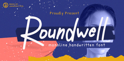 Introducing Roundwell by Javanice Studio Roundwell is A Moniline Handwritten Font Roundwell is perfect for branding project, apparel, labels, magazines, books, greeting / wedding cards, packaging, fashion, make up, stationery, and any type of advertising purpose or just used to express words above the background. This font includes multilingual support. Enjoy the font, feel free to comment or feedback, send me PM or email.
 - Kempoka by Hanoded,
$15.00 Kempoka is a Japanese word describing someone who practices Kempo. Kempo, or Chuan Fa in Chinese, is a martial art with roots in China and Japan. I thought of this brush font just before my weekly kempo-training and I figured the name suited the font style. Kempoka comes with alternates and ligatures, and has a black belt in diacritics!
 - Baileyone by Timurtype,
$14.00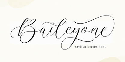 Introducing by Timur type Baileyone, a handwritten script font Baileyone is perfect for product packaging, branding project, magazines, social media, wedding, or just used to express words above the background. This Baileyone font includes: -Full Set of standard alphabet and punctuation & symbol -Extra set Alternate ending lowercase -multilingual support. Embelish your designs with our original fonts. Enjoy the font, thank you!
 - Elephunky NF by Nick's Fonts,
$10.00This hefty little number is an amalgam of two typefaces from the Flower Power era, Dave West’s Elephant Gothic and Wayne Stettler’s Neil Bold. It’s an extrabold, sassy headline face that will get your message across, loud and clear. Both versions include the complete Latin 1252, Central European 1250 and Turkish 1254 character sets, as well as localization for Moldovan and Romanian. - Speakons by Alex Schnaible,
$20.00 The Speakons are made out of 500 icons in three different styles. They change automatically into icons by typing the right words through its OpenType feature. It was specially designed to break down our language barriers. To be understood internationally. It’s also perfect if you just need a huge icon family. Give it a try! You don’t want to miss it.
 - Roseglow by Timurtype,
$14.00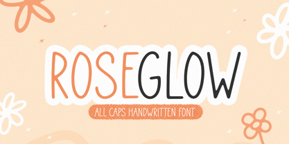 Introducing by Timur type Proudly Present, Roseglow Roseglow A fun Handwritten Font Roseglow is perfect for product packaging, branding project, megazine, social media, wedding, or just used to express words above the background. This Roseglow font includes: -Full Set of standard alphabet and punctuation & symbol -Extra set doodles -multilingual support. Embelish your designs with our original fonts.Enjoy the font,Thank you!
 - Ashley Bergamote by Letterday Studio,
$19.00 Ashley Bergamote is a superb handwritten font that will make your work stand out through its elegant and curvy lines. It is perfect for product packaging, branding project, magazine covers, social media, wedding, or just used to express words above the background. This font is PUA encoded which means you can access all of the glyphs and swashes with ease!
 - Ballistone by Timurtype,
$14.00 Introducing by Timur type Proudly Present, Ballistone Ballistone A Handwritten Script Font Ballistone is perfect for product packaging, branding project, megazine, social media, wedding, or just used to express words above the background. This Ballistone font includes: -Full Set of standard alphabet and punctuation & symbol -Extra set ligature & underline -multilingual support. Embelish your designs with our original fonts.Enjoy the font,Thank you!
 - Bold Marker by Timurtype,
$14.00 Introducing by Timur type Proudly Present, Bold Marker Bold Marker A Handwritten Font Bold Marker is perfect for product packaging, branding project, megazine, social media, wedding, or just used to express words above the background. This Bold Marker font includes: -Full Set of standard alphabet and punctuation & symbol -multilingual support. Embelish your designs with our original fonts.Enjoy the font,Thank you!
 - Halloween Party by Yoga Letter,
$14.00 This font is named "Halloween Party". This font was intentionally made to add to the excitement of the Hallowen event that will soon arrive. This "Halloween Party" font is very scary because there is blood on it. This font is perfect for adding to the excitement and mysticism of your Halloween event. In addition to Halloween events, this font can also be used as a movie title, book title or something else that is horror, can also be used to write quote words, tell mystical things, or as a horror and mystical pickle invitation card, and others.
 - beaaaar - Unknown license

- Publica Play by FaceType,
$- Publica Play is Publica Sans’ and Publica Slab’s playful sister. It comes with loads of subtle open type features, tabular options, rare currencies signs and symbols and arrows – ‘Publica Play’ has everything you need for playful design tasks. Take a close look at our gallery (especially ‘OpenType Features 1–7’) to discover the versatility of Publica Play. Alternates and Stylistic Sets Give your typography a certain spin with the variety of alternate letters provided. Explore the Stylistic Sets provided. Currency You need to set prices in exotic countries? No problem: Publica Play gives you loads of rare currency symbols. Case Sensitive Forms Sometimes you write in all caps and there are some symbols (e.g. brackets) that need some extra treatment to make it look perfect – that’s what case sensitive forms are for. Figures Publica Play provides 6 sets of figures, like lining, tabular, oldstyle, numerators ... Discretionary Ligatures Ligatures can make your logo or headline look spicy. So there are plenty of them.
 - Fargo Tuscan by Greater Albion Typefounders,
$20.00 Fargo Tuscan is the first of seven typefaces exploring the decorative possibilities of the Tuscan letter form, all of which are releasing in 2017. It’s the most European of the seven- it’s a Mid-Victorian inspired display face which would have been (and is) at home on either side of the Atlantic, unlike some of the others in this batch of Tuscan faces which are distinctly ‘trans-Atlantic’ (we know, that depends on your point of view but we are Greater ALBION Typefounders after all) in flavour. Fargo Tuscan is replete with decorative features, including Swash Capitals, alternate numeric forms and stylistic alternates ideal for the beginning and ending of words. Have some mid-Victorian mid-Atlantic fun with your next design project!


