10,000 search results
(0.034 seconds)
- Camar by Phoenix Group,
$13.00 Camar is a dynamic font that has sharp and pleasant edges, this font represents the word freedom and comfort in socializing and socializing.
 - Budskab by Bogstav,
$17.00 This is the kind of font which is up to trouble. Not trouble in a bad way, but trouble like when you are in no way prepared what is going to happen. The font is handmade and playful - and to help that playfullness come to live, the 5 different versions of each letter helps! Watch your words change while you write with Budskab! And, by the way..."budskab" is message in danish...just thought you should know!
 - Polaris by AVP,
$10.00 Polaris is a rounded sans-serif family with four styles designed for easy reading. Perfect for print - brochures, posters, newsletters and stationery. For signage, Polaris comes with a variety of compatible arrows. Polaris is also great on-screen: use it on your website as an alternative to the over-used standards. Polaris works in the background, creating an atmosphere of harmony and modernity while your words deliver the message and your graphics and images achieve the prominence they deserve.
 - 1715 Jonathan Swift by GLC,
$42.00 The famous Irish poet and novelist Jonathan Swift (Dublin 1667-1745) has a large personal library of which he noticed carefully the book list by himself. We have used a facsimile from this catalogue to reconstruct this present font, as one example of the poet’s personal hands but also as a typical example of the British quill pen handwriting from about mid 1600’s to the beginning of 1700’s . It is a “Pro” font containing Western (including Celtic) and Northern European, Icelandic, Baltic, Eastern, Central European and Turquish diacritics. The numerous alternates and ligatures allow to made the font looking as closely as possible to the real hand. Using an OTF software, the features allow to vary automatically almost each character of a word without anything to do but to select contextual alternates and standard ligatures and/or stylistic alternates options.
 - Mondera by Twinletter,
$17.00 Introducing MONDERA, our newest san serif font. We created this font by paying close attention to the harmony between each letter, resulting in a lovely blend of words when viewed or read. If you use this font for all of your projects, both official and informal, everything will look the same. of course, your various design projects will be perfect and extraordinary if you use this font because this font is equipped with a font family, both for titles and subtitles and sentence text, start using our fonts for your extraordinary projects.
 - P22 Sneaky Pro by IHOF,
$39.95 P22 Sneaky is the newest font by award winning type designer Michael Clark. Sneaky is a connecting-script and sibling of his popular Pooper Black type which shares a similar flow and casual elegance. It features shared details and relative size so that with careful design, the two can be mixed and matched. Sneaky Pro features over 500 glyphs with alternates and a Central European character set.
 - Barbados by Kaidosan,
$16.00 Barbados is a modern font that is eccentric for its versatility. a typeface that conveys a sense of comfort by combining the solidity of modern proportions with the strict precision of its profile image. His personality develops through his particular modulation, which grows with load; making it a rather jovial typeface that doesn't abandon its more elegant modern characteristics. This font brings compatibility in a global aspect due to its extraordinary versatility for your designs.
 - Malibu Punch by Rachel White Art,
$12.00 Malibu Punch. I am loving this sassy script font! There are two versions: rough, with tons of texture, and smooth! I made it with an itty bitty brush and pretty watercolors. It's got loads of texture - check out those edges! Wobbly, rough watercolor edges! The capital letters work together, so it's like two fonts in one! The lowercase script is so sassy and full of attitude. Great for branding, logos, and quote art.
 - ITC Grapefruit by ITC,
$29.99ITC Grapefruit is the work of Hungarian designer Gyori Attila, an angular, mannered and geometric display face with a loud appearance. ITC Grapefruit combines strong display characteristics with legibility and is suitable for a wide variety of uses. - Flexion Pro by Red Rooster Collection,
$60.00 Flexion developed out of design philosophy and ambigramatic artwork of John Langdon. Based on the contents in John’s book Wordplay, author Dan Brown hired John to create ambigrams for his forthcoming novel Angels & Demons. Mr. Brown was so impressed with his work he even named the main character Robert Langdon after John. After the success of Angels & Demons, Dan Brown wrote The Da Vinci Code. When the movie adaptation of that book was in the works, Dan suggested that John create titles for the movie based on ambigrams. John contacted Hal Taylor to create a font based on the lettering treatment to be used for the credits at the end of the movie. Unfortunately, it was decided that the film was running long and the original title concept was scrapped. By this time, Hal was well into developing a full type family, including small caps, alternate characters, lining and ranging figures. John was impressed with the way the design was turning out and decided that it had enough merit to be released as Flexion.
 - Ford's Folly by Ascender,
$50.99Ford's Folly is a lively yet sophisticated handwriting font designed by Ascender's Jim Ford. It captures the look and spirit of the designer's handwriting using a using a Sharpie™ Extra Fine felt pen. This casual script font evokes an energetic feeling, and has very legible letterforms without quirky distractions. Jim Ford took his hand global by creating a massive multilingual character set. The font features the WGL Pan-European character set (Eastern Europe, Cyrillic, Greek and Turkish) and advanced typographic features for use with OpenType-savvy applications. The font is a fun and attractive handwriting font that is great for greeting cards, menus, advertisements, scrapbooking and many other projects that can benefit a personal appearance. - Dream Script by Lián Types,
$49.00 One of my dreams as a type-designer was making a good looking chancery cursive. Full of life, like some of the best calligraphers around the world do on their artworks. With Julian Waters, John Stevens and Denis Brown (just to name a few of them) (1) chancery, or italic script, was transformed into a new, exciting and very fresh style of calligraphy mainly at the end of 20th Century. Dream Script may be that dream named above made true. I have been practicing chancery in the way I learnt from those calligraphers for many years now. Making a font out of my ink-sketches was a tough work, since they were closer of -being art- than of -being type-. However, this font rescues many aspects of handmade calligraphy: You have to look at it really close to notice it is actually a font, and that was one of my goals. The secret of a good looking chancery is on its subtle details: pen angle is constantly changing, even on the strokes which seem straight. Capitals and swashes have to be done a little faster than lowercase letters. The rhythm has to be even, in spite of its playful look. The fact that makes Dream look alive is that it has many alternates per glyph. This makes each word look unique like it happens in calligraphy: you will find alternates for the beginning/ending of a word/phrase, some for the middle of it, some interchangeable. Also, to accompany the script, you will find Dream Caps, which was inspired in the eternally beautiful trajan capitals. Place them like I did on the posters and you will have great results for sure. The font works great in small, middle and big sizes and can be a great selection for magazines, wedding invitations, perfumes, and posters. Close your eyes, and Dream with me... TECHNICAL Dream Script Pro is the most complete style, it contains all the alternates and ligatures (OT programmed, better if you use Adobe applications) If you plan to use the font for text, be sure to activate the less decorative capitals, which are placed in the “salt” group of alternates. Dream Script Standard has less glyphs than the Pro one, it contains just some ligatures for a better legibility. (OT programmed, better if you use Adobe applications) NOTES (1) Not only are they great artists, but also good people, who are always willing to share with their students all what they know. I would also like to thank Ricardo Rousselot, whose work inspired me this time to make “The Dream Script” exlibris; and to Alisara Tareekes, a very talented friend which international calligraphy conferences gave me: She kindly helped me with some tips to make this font better.
 - Manly Beard by Mightyfire,
$15.00 Introducing Manly Beard , the typewriter font. Typewriter font is a timeless and iconic typeface, seamlessly bridges the realms of nostalgia and functionality. Inspired by the mechanical simplicity of traditional typewriters, this font exudes a distinct charm that harks back to an era when the written word was synonymous with the rhythmic clatter of keys striking paper. Characterized by monospacing, each letter and symbol occupies the same amount of horizontal space, mirroring the uniformity of characters produced by the typewriter's fixed-width mechanical arms. The result is a text that maintains a deliberate and organized appearance, evoking a sense of order and precision. We're honored and proud if Manly Beard can be the part of your special masterpiece. Thankyou! :)
 - Urban Blocker by Din Studio,
$25.00 Have you been looking for a graffiti font? Do you dream of creating headings that stand out and inspire creativity, imagination, modernity, and endless fun? Then we’ve got just the font for you! Introducing Urban Blocker-A Graffiti Font This bubble graffiti font can be used for a host of different content needs and projects. An excellent choice to add the right amount of street vibe and playfulness. Create gorgeous printed quotes, standout packaging, or beautiful t-shirts! You can even use it to create amazing headings, logos, menus, and social media graphics. Chalkboard includes multilingual options to make your branding reach a global audience. Features: Standart Ligatures Multilingual Support PUA Encoded Numerals and Punctuation Thank you for downloading premium fonts from Din Studio
 - Conrad by Linotype,
$29.00The award-winning Conrad was created by Japanese type designer Akira Kobayashi. Its design was based on the fifteenth-century type by Conrad Sweynheym and Arnold Pannartz, two German printers active in Rome at that time. They produced a unique, slightly unbalanced yet attractive type. Kobayashi says of his typeface, “I have designed a couple of typefaces inspired from the past, but this time the original print acted merely as a reference. The distinctive lowercase ‘a’ and some other letters were inspired by Sweynheym and Pannartz’s second roman type, but I revived the type in a more informal way. Here I used the historical type as a springboard. The resulting type looks different, taking on a rather temporary and lively look. I assume that the Conrad is the first revival of the Sweynheym and Pannartz type, though it does not closely resemble the original.” Conrad won first prize for the text typeface category in Linotype’s Third International Typeface Design Contest (2000) as well as the Certificate of Excellence in Type Design from the Type Directors Club (2001). - Videomax by PizzaDude.dk,
$16.00 Videomax looks like something from the future - perhaps even something from a future where the world lies in ruins and is about to be taken over by hostile aliens. The worn letters represent the decades of war against the computers...or the aliens...or maybe the letters comes from a sign of a computer company from the eighties, which was recently found in an abandoned place. The speculations are many, but one thing is definitely true: Videomax got that grungy / computer / worldwar feeling! Write your text, and watch how the randomness of letters make your text look really good. I've put it 4 different versions of each letter, which makes it look really nice and worn!
 - Odin by ITC,
$29.00The extravagant Odin was designed by Bob Newman in 1972. Its figures display constructed basic forms and when set into words, the typeface builds closely set lines. The strong serifs catch the reader's eye and draws it horizontally across the page. The forms of the capital letters are particularly distinctive. In the upper third, the stroke beginnings seem to form a roof over the body of the letter, fragmented by a fine white line that lends them independence and dominance. Odin is best used for headlines in display point sizes. - Baby Font - Unknown license

- Testament by Canada Type,
$24.95 From the standpoint of calligraphy, a font family of capitals and uncials makes perfect sense. The Roman square capitals, the quadrata, are matched by round capitals of older Greek origin; the word "uncus" means hook-shaped like a beak or talon. Interrelated and often interchangeable, these capital letters served as book hands for both the Latin West and the Greek-speaking East before they evolved into minuscule alphabets. The Testament family is based on the few formal capital manuscripts of the Bible, Virgil and Homer that have survived from the ancient world. Throughout the Middle Ages both uncials and square capitals were used, often together, for headings and initial characters. By their nature the Roman capitals are the voice of Caesar and hold the place of authority, while the uncials speak for the Church in a balanced relationship. In ancient times church and state were not as separate as they are now, and the alphabets were not as different as typographic tradition has made them. In this calligraphic rendering it is clear that they are of the same substance and can be written in the same style, conveying even to the modern eye the eternal and classical quality of epic and scripture. Testament comes in all popular font formats, and includes support for a vaster-than-usual range of Latin-based languages.
 - Bahn by Stawix,
$45.00 Bahn is heavily inspired by the sturdiness in the simplicity of the Autobahn together with the German highway typeface DIN 1451. Designed with straight-forward concept, clean and simple, direct and comprehensible. Nevertheless, Bahn still mange to insert the friendliness touch to the character which makes it easy to use and well-suited with other typefaces, letters or in various styles and possibilities of layouts that may occurred in the future. Bahn comes with 9 weights from the thinnest to the heaviest possible, accompanied with Italics for extensive usage. Not satisfied? Bahn also comes with Variables that will sure suited your needs.
 - Sporting Event JNL by Jeff Levine,
$29.00 A British boxing film from 1953 called “The Square Ring” had its titles and credits hand lettered in a slab serif type style commonly referred to as “Egyptian”. Other familiar type fonts which share this influence are Karnak, Stymie and Beton. Sporting Event JNL was modeled from the film’s titles and is available in both regular and oblique versions.
 - Hand Stamp Wood by TypoGraphicDesign,
$9.00 The typeface Hand Stamp Wood is designed from 2020 for the font foundry Typo Graphic Design by Manuel Viergutz. The display font based on original old wood letter, stamps, DIY and is inspired in the past and present. 4 font-styles (Rough, Mix, Circle, CircleMix) with 370 glyphs (Adobe Latin 1) incl. decorative extras like arrows, dingbats, emojis, symbols, geometric shapes, decorative ligatures (type the word #LOVE for ❤ or #SMILE for ☺ as OpenType-Feature dlig) and stylistic alternates (2 stylistic sets). For use in logos, magazines, posters, advertisement plus as webfont for decorative headlines. The font works best for display size. Have fun with this font & use the DEMO-FONT (with reduced glyph-set) FOR FREE! Font Specifications ■ Font Name: Hand Stamp Wood ■ Font Weights: 4 (Rough, Mix, Circle, CircleMix) + DEMO (with reduced glyph-set) ■ Font Category: Display for headline size ■ Font Format:.otf (Mac + Win, for Print) + .woff (for Web) ■ Glyph Set: 370 glyphs (Adobe Latin 1) incl. decorative extras like arrows, dingbats, emojis, symbols ■ Design Date: 2020 ■ Type Designer: Manuel Viergutz
 - Klein Rough Gemein by TypoGraphicDesign,
$19.00 The typeface Klein Rough & Gemein(e) is designed from 2020 for the font foundry Typo Graphic Design by Inga Luft and Manuel Viergutz. The display font based on original old german rubber stamps and is inspired in the past and present. 4 font-styles (Rough, Rougher, Roughest, Rough Mix) + 1 icon-style with 432 glyphs (Adobe Latin 2) incl. 100+ decorative extras like icons, arrows, dingbats, emojis, symbols, geometric shapes, catchwords, decorative ligatures (type the word #LOVE for ❤ or #SMILE for ☺ as OpenType-Feature dlig) and stylistic alternates (7 stylistic sets). For use in logos, magazines, posters, advertisement plus as webfont for decorative headlines. The font works best for display size. Have fun with this font & use the DEMO-FONT (with reduced glyph-set) FOR FREE! ■ Font Name: Klein Rough & Gemein(e) ■ Font Weights: 4 + 1 (Icons) + DEMO (with reduced glyph-set) ■ Font Category: Display for headline size ■ Font Format:.otf (Mac + Win, for Print) + .woff (for Web) ■ Glyph Set: 432 glyphs (Adobe Latin 2) incl. 100+ decorative extras like dingbats ■ Design Date: 2020 ■ Type Designer: Manuel Viergutz und Inga Luft
 - VAG-HandWritten - 100% free

- ND Gestalt by NeueDeutsche,
$9.00 If you watched ND Gestalt glitter in the dark near the Tannhauser gate. You know all these sans serifs will be lost in time, like tears in rain… If you like circles you will like ND Gestalt just as much. The unconventional stem to counter bridge in the lowercase gives this one its rather unique appeal. Fonts like this are unlike any other font – they’re either a benefit or a hazard. Beware!
 - Erotica by Lián Types,
$49.00 “A picture is worth a thousand words” and here, that’s more than true. Take a look at Erotica’s Booklet; Erotica’s Poster Design and Erotica’s User’s Guide before reading below. THE STYLES The difference between Pro and Std styles is the quantity of glyphs. Therefore, Pro styles include all the decorative alternates and ligatures while Std styles are a reduced version of Pro ones. Big and Small styles were thought for better printing results. While Big is recommended to be printed in big sizes, Small may be printed in tiny sizes and will still show its hairlines well. INTRODUCTION I have always wondered if the circle could ever be considered as an imperfect shape. Thousands of years have passed and we still consider circles as synonyms of infinite beauty. Some believe that there is something intrinsically “divine” that could be found in them. Sensuality is many times related to perfectly shaped strong curves, exuberant forms and a big contrasts. Erotica is a font created with this in mind. THE PROCESS This story begins one fine day of March in 2012. I was looking for something new. Something which would express the deep love I feel regarding calligraphy in a new way. At that time, I was practicing a lot of roundhand, testing and feeling different kinds of nibs; hearing the sometimes sharp, sometimes soft, sound of them sliding on the paper. This kind of calligraphy has some really strict rules: An even pattern of repetition is required, so you have to be absolutely aware of the pressure of the flexible pen; and of the distance between characters. Also, learning copperplate can be really useful to understand about proportion in letters and how a minimum change of it can drastically affect the look of the word and text. Many times I would forget about type-design and I would let myself go(1): Nothing like making the pen dance when adding some accolades above and below the written word. Once something is mastered, you are able to break some rules. At least, that’s my philosophy. (2) After some research, I found that the world was in need of a really sexy yet formal copperplate. (3) I started Erotica with the idea of taking some rules of this style to the extreme. Some characters were drawn with a pencil first because what I had in mind was impossible to be made with a pen. (4) Finding a graceful way to combine really thick thicks with really thin hairlines with satisfactory results demanded months of tough work: The embryo of Erotica was a lot more bolder than now and had a shorter x-height. Changing proportions of Erotica was crucial for its final look. The taller it became the sexier it looked. Like women again? The result is a font filled with tons of alternates which can make the user think he/she is the actual designer of the word/phrase due to the huge amount of possibilities when choosing glyphs. To make Erotica work well in small sizes too, I designed Erotica Small which can be printed in tiny sizes without any problems. For a more elegant purpose, I designed Erotica Inline, with exactly the same features you can find in the other styles. After finishing these styles, I needed a partner for Erotica. Inspired again in some old calligraphic books I found that Bickham used to accompany his wonderful scripts with some ornated roman caps. Erotica Capitals follows the essentials of those capitals and can be used with or without its alternates to accompany Erotica. In 2013, Erotica received a Certificate of Excellence in Type Design in the 59th TDC Type Directors Club Typeface Design Competition. Meet Erotica, beauty and elegance guaranteed. Notes (1) It is supossed that I'm a typographer rather than a calligrapher, but the truth is that I'm in the middle. Being a graphic designer makes me a little stubborn sometimes. But, I found that the more you don't think of type rules, the more graceful and lively pieces of calligraphy can be done. (2) “Know the forms well before you attempt to make them” used to say E. A. Lupfer, a master of this kind of script a century ago. And I would add “And once you know them, it’s time to fly...” (3) Some script fonts by my compatriots Sabrina Lopez, Ramiro Espinoza and Alejandro Paul deserve a mention here because of their undeniable beauty. The fact that many great copperplate fonts come from Argentina makes me feel really proud. Take a look at: Parfumerie, Medusa, Burgues, Poem and Bellisima. (4) Some calligraphers, graphic and type designer experimented in this field in the mid-to-late 20th century and made a really playful style out of it: Letters show a lot of personality and sometimes they seem drawn rather than written. I want to express my sincere admiration to the fantastic Herb Lubalin, and his friends Tony DiSpigna, Tom Carnase, and of course my fellow countryman Ricardo Rousselot. All of them, amazing.
 - Relista by Jos Gandos,
$15.00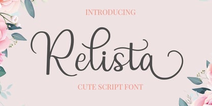 Relista is a beautiful handwritten font carefully created with a touch of elegance. This font is suitable for any projects such wedding cards, watermarks, quotes, social media, posters, invitations, and more. This font is PUA encoded so it will be accessible in the Adobe Illustrator, Adobe Photoshop, Adobe InDesign, even work on Microsoft Word.
 - Geometric Patterns JNL by Jeff Levine,
$29.00 Geometric Patterns JNL offers a large and varied assortment of interesting design variations in a 'tiled' (square) format that can be adapted to spot embellishments, running borders or repetitive patterns.
 - Hardbop by W Type Foundry,
$29.00 Hardbop is a typographic system inspired by jazz, especially the style it's named after "Hardbop". It's also inspired by the prolific graphic work of Reid Miles for the covers of Blue Notes Records in the '50s, Japanese jazz album covers of the '70s and condensed and grotesque hand painted signs. Hardbop also references classic fonts such as Impact, Bebas, Din, Frontage and TT Trailers, the latter in the exaggeration of certain characteristics such as counterforms and endings. Hardbop design works for titles and wide spaces and was specially designed for covers and posters, where its intention is not to go unnoticed. Although it is a small family, it allows game possibilities with a wide set of characters. Enjoy!
 - Eagle Lake Pro by Stiggy & Sands,
$29.00 A Practical Calligraphic Hand. Eagle Lake Pro is based on the calligraphic lettering style known based on the practical Running Book Hand. It has shorter capitals that create a visually taller x-height lending to high legibility and fluidity. Classic, clean, and casual, Eagle Lake Pro fits a lot of design uses. The SmallCaps and extensive figure sets only work to further expand the usefulness of the typeface across a wider breadth of applications. See the 5th graphic for a comprehensive character map preview. Opentype features include: - SmallCaps. - Full set of Inferiors and Superiors for limitless fractions. - Tabular, Proportional, and Oldstyle figure sets (along with SmallCaps versions of the figures). - Stylistic Alternates for Caps to SmallCaps conversion.
 - CA Cula by Cape Arcona Type Foundry,
$40.00 CA Cula is standing in the tradition of cool tempered sans serif typefaces like DIN. But at a closer look it reveals a tendency towards rounder reading-friendly forms. The denaturalized ink traps give CA Cula a very special and individual look in display sizes, whereas in smaller sizes the positive aspects of huge ink traps show effect. The text looks clean and bright without black dots in the typographic image. This makes CA Cula suitable even for longer text, while the bold weight makes pretty cool headlines. The choice of weights aims at an easy straight forward use. A set of five well balanced weights ought to be enough to cover most needs without throwing the typographer into questions like: demibold or semibold? If you are looking for the extra kick, look out for CA Cula Superfat.
 - Celtic Monograms by Kaer,
$24.00 Here is my next Celtic Monograms font family. I used a lot of authentic knots and curves to imitate Insular art style. The term derives from insula, the Latin term for “island” in this period Britain and Ireland shared a largely common style different from that of the rest of Europe. I've drawn sketches set, manually vectorized it and assemble the font family. In an attempt to replicate the intricate patterns found in Celtic art, I endeavored to create a design that embodied the essence of true Celtic knot work. The interweaving lines, which were prominent motifs in Celtic art prior to the arrival of Christian influence around 450, served as the foundation for my creation. Over time, these designs seamlessly integrated into early Christian manuscripts and artwork, incorporating depictions of various elements from everyday life, including animals, plants, and even human figures. In the beginning, the patterns were intricate interwoven cords, called plaits. This particular style is often linked to the Celtic regions, but it was also widely embraced in England and spread throughout Europe through the efforts of Irish and Northumbrian monks. The utilization of the Celtic knot as a tattoo design gained popularity during the 1970s and 1980s in the United States. Consequently, it has proven to be a highly advantageous font choice for various applications such as posters, banners, and sportswear. You can also create a vintage color shift effect. Please note, you should use graphic applications such as Adobe Illustrator or Photoshop, but not Microsoft Word. All you need is put Two or Three lines style initial on the top of Back style. I’m happy to present you the Rough, Two lines, Three lines, and Back styles for your design. You’ll get uppercase and numbers set. Thank you!
 - ITC Stone Sans by ITC,
$40.99 Sumner Stone worked together with Bob Ishi of Adobe to create the Stone family fonts, which appeared in 1987. Coincidentally, ishi is the Japanese word for stone, which precluded any squabbling about whose name the font would carry. The family consists of three types of fonts, a serif, a sans-serif and an informal style. The Stone fonts are very legible and make a modern, dynamic impression.
 - ITC Stone Informal by ITC,
$29.00 Sumner Stone worked together with Bob Ishi of Adobe to create the Stone family fonts, which appeared in 1987. Coincidentally, ishi is the Japanese word for stone, which precluded any squabbling about whose name the font would carry. The family consists of three types of fonts, a serif, a sans-serif and an informal style. The Stone fonts are very legible and make a modern, dynamic impression.
 - ITC Stone Serif by ITC,
$29.99 Sumner Stone worked together with Bob Ishi of Adobe to create the Stone family fonts, which appeared in 1987. Coincidentally, ishi is the Japanese word for stone, which precluded any squabbling about whose name the font would carry. The family consists of three types of fonts, a serif, a sans-serif and an informal style. The Stone fonts are very legible and make a modern, dynamic impression.
 - Linotype Cethubala by Linotype,
$29.99Linotype Cethubala is part of the Take Type Library, chosen from contestants of Linotype’s International Digital Type Design Contests of 1994 and 1997. Designed by the Portuguese artist Patricia Carvalho, it is a playful and unusual font. Its roots lie in the characters of runes and old alphabets and the font is, in the words of the designer, ’an attempt to interpret and carry the knowledge of the magic world.’ Linotype Cethubala is intended exclusively for headlines in large point sizes. - Goudy Text by Monotype,
$29.99The word Text" in Goudy Text™ is short for Textura, and textura is the style of blackletter or gothic writing developed in Northern Europe in the middle ages. The use of space in blackletter is quite different from what we know about Roman letterforms. Lowercase forms in blackletter writing and typefaces must be evenly textured with black and white elements, like the texture of weaving or fabric. Capital letters can provide either an integration of the even texture (by the use of decoration in their construction) or, if they are wide and open and filled with white, they provide bright spots of visual emphasis. Goudy, despite being an American in the twentieth century, understood well the fundamental texture of medieval blackletter and the importance of both density and light. He designed Goudy Text in 1928 for Lanston Monotype after studying the type in Gutenberg's 42-line bible; still one of the best models for designers of blackletter typefaces. The lowercase of Goudy Text has impact and medieval authenticity. The standard caps have some Victorian eccentricities but are mostly well drawn. The alternate, or "Lombardic" caps are spectacular - they set beautifully with the lowercase letters, providing the proverbial shafts of light through the Gothic cathedral's stained glass windows. Use this potent font in sizes 14 point or larger, for Christmas greetings, certificates, wedding invitations, advertising, or music collateral pieces." - Vernon by Giles Edwards,
$25.00 Vernon’s inspiration came while researching and investigating a 'legible' typeface design for tangible purpose. The main characteristics of ‘Vernon’ can be seen in the slightly modulated strokes that reference the natural and friendly humanist proportions of the humanist hand, with open interior letterspace characteristics. The subtle detailing and finishing of strokes and junctions – seen in the curved tail of the lowercase ‘l’ and the head serif of the lowercase ‘i’, create a smooth rhythm along the baseline. Utilizing the ‘contextual alternative’ feature of OpenType, Vernon substitutes select characters in words with word-shapes that may cause visual confusion to some readers. Vernon uses subtle character differentiation in the detailing of the inner-shape / counter space from similar letter shapes (for example: ‘p’, ‘d’, ‘g’ and ‘q’) to assist in creating the contextual alternate designs. Vernon is recommended for use as a text typeface, as it performs well at small text sizes (12 point size and below) intended for continuous reading of printed instructional and presentational information, especially where an inclusive audience demographic is required.
 - Loose Pen by Pedro Teixeira,
$14.00 Do you suffer from OCD? Then this font is perfect for you. Or maybe not. Sometimes I like confusion, chaos, imperfect things, because I can often see beauty in them. In this font I drew the letters with a pen and or with just the index finger on a tablet, completely free, without improvement. The chaos ensuing. As if I was rushing notes just for me. Then, without changing the design any further, but to make the chaos minimally legible, I decided - look at this madness! - to organize the chaos. In other words, I aligned metrics and kerning, and the end result was this. I hope you like it and that it is very useful for you. Cheers.
 - Eirinn by Linotype,
$29.99Eirinn was designed by Norbert Reiners for Linotype in 1994. Its forms are based on those of Irish scripts of the 7th and 8th centuries, an example of which can be found in the Book of Kells in Dublin. Characteristic of this style are for example the lower case f with its short cross stroke on the base line and long cross stroke above, the unusual form of the g, and the t, whose form is almost like that of a c. This style consisted of a mixture of lower case and capital letters at the time of its conception, but Eirinn has a full set of both lower case and capital alphabets. At first glance the viewer is reminded of ancient and indecipherable writings of the Celts before the forms of our contemporary letters and words become evident. Eirinn will lend a touch of mysticism and secrecy to any text.

