10,000 search results
(0.065 seconds)
- MVB Solitaire Pro by MVB,
$39.00 A typeface is a tool. Sure, there are frilly fonts that are more art than craft, showy faces that exist merely to call attention to themselves. But, in the end, any functional typeface worth its salt lives to serve one thing first: the text, the content. Everything else—the fashion of the moment, the allure of individual words and letters—is secondary. MVB Solitaire™ epitomizes this universal typographic mandate. As a tempered sans serif somewhere between a humanist and a gothic, MVB Solitaire captures a 21st-century neutrality. But practical doesn’t have to mean banal. MVB Solitaire has a soul. While some “neutral” type is dead the moment the ink hits the page, MVB Solitaire delivers text that feels lively, contemporary, relevant. Readers will not tire of this type. Behind the useful exterior is an arsenal of thoughtful technical features. It’s no surprise that this family’s creator, Mark van Bronkhorst, was first a graphic designer before becoming a type designer. Mark built all the goodies into MVB Solitaire that he would appreciate as a user: case-sensitive punctuation; alternate forms that can be invoked individually or together; oldstyle and lining figures in both tabular and proportional widths; slightly shorter lining figures that don’t stand out in running text, but also cap-height figures for all-cap settings; and the ability to speak nearly any Latin-based language. MVB Solitaire aspires to be the sort of workhorse that a designer keeps installed on their system at all times. It is a family bound to have a permanent spot in the font menu, always at the ready for projects (those most common of all) where the typography mustn’t mask the message. It has that quality that all truly useful typefaces have: the capacity to get the job done without getting in the way.
 - Crystal Falls by Epiclinez,
$18.00 If you're into that bold, fun, modern look, then Crystal Falls is the right choice for you. This versatile font is great for headlines, apparel, posters, logos, and product packaging, due to its simplicity and playfulness. Get creative with this compact gem of font and let your imagination run wild! So what’s included : Standard Latin Numbers, symbols, and punctuations Multilingual Support. Accented Characters : ÀÁÂÃÄÅÆÇÈÉÊËÌÍÎÏÑÒÓÔÕÖØŒŠÙÚÛÜŸÝŽàáâãäåæçèéêëìíîïñòóôõöøœšùúûüýÿžß PUA Encoded and fully accessible without additional design software Simple Installations Works on PC & Mac Thank You!
 - Rotisserie Menu JNL by Jeff Levine,
$29.00 A 1928 menu for the restaurant “Rotisserie Du Cardinal” had the word “Cardinal” hand lettered in quite an unusual Art Nouveau type design consisting of thick and thin lines using angles to form the letter shapes. This eccentric (yet charming) style of lettering is now available as Rotisserie Menu JNL in both regular and oblique versions.
 - Freibeuter NR by Otto Maurer,
$23.00 FREIBEUTER NR is a typical Western font but this is based on a FAMOUS Motorcycle Club from the television that everyone knows. The word FREIBEUTER is the German version of pirate. FREIBEUTER did in earlier times what pirates do, but they do it with the government togetherness. NR stands for NIEDERRHEIN, this is the area where I live and work. The PATCH Version is the best way to make fast a nice Banner or Patch with this font. You can use the WrapTEXT tool in Illustrator or Photoshop to wrap the banner in al forms!
 - Bandung Pro by Majestype,
$34.00 Bandung Pro from Majestype was made to capture the natural movement of a brush script infused with the elegance of copperplate hand. With 6 months in the making, we want to make sure that the character set connects each other as natural and seamless as handwriting would be. We give you vast amounts of glyph options(700+) added with lots of swashes and flourishes to give you an authentic look of hand-made brush letters. Aceserif Pro is an all-caps serif font inspired by traditional serif and art deco design. Equipped with 220 Glyphs and has the current OpenType features. We made the uppercase letters slightly larger than the lowercase letters to give a good impression when used in designs that don’t require a lot of words, such as headlines or headers. You can try it like this, “HeadlineS” - Capital letters are at the beginning and end of a word. Bandung Pro & Aceserif Pro is suitable for a wine label, photography, invitation, ID card, tattoo, poster, logo, title, tees, branding, etc.
 - Kitchen Stink by Bogstav,
$15.00 Just like a nice breakfast, Kitchen Stink is a great way to start the day! :) You may already have guessed that the fontname is the result of a wordplay. Sometimes it's funny how a single letter can completely change the meaning of a word. In this case! With this font, you are dealing with a gentle mixture of a basic handwritten font, a comic font and oldschool grafitti! The result is this steady, sometimes a bit off, but legible crunchy handwritten font!
 - Blueberry Spring by Balpirick,
$15.00 Blueberry Spring is a Handwritten Font. Our handwritten font takes inspiration from the fluidity and uniqueness of human handwriting, ensuring that each letter carries a sense of character and charm. With its graceful curves and delicate strokes, this font adds an intimate and personal feel to your written words. Perfect for creating notes, memos, journal entries, or beautiful quote designs, our handwritten font elevates your messages with a sense of authenticity and warmth. It transforms your ordinary words into a beautiful composition, breathing life into your writing. This font only has allcaps letters. - also multilingual support Enjoy the font! Feel free to comment or feedback! Thank you!
 - Dive Gear Stencil JNL by Jeff Levine,
$29.00 Some vintage 1960s-era packaging for dive gear (masks, swim fins, etc.) manufactured by the Voit division of AMF had various merchandise boxes hand-lettered [with some variation of design] in an interesting sans stencil. These packages formed the inspiration of Dive Gear Stencil JNL. Thanks once again to Gene Gable, whom on many occasions has provided Jeff Levine material for type design inspiration.
 - Pedell by profonts,
$41.99 Pedell ist eine neue Schreibschrift, die das Schreiben mit Kreide simuliert. Ein Font mit eben diesem ‚Kreidecharakter’ fehlte bisher noch in der profonts Library. Also wurde der Schriftdesigner Ralph M. Unger beauftragt, eine Kreideschrift zu schreiben und zu digitalisieren. Pedell ist eine gut lesbare, lebendige und nicht kindische Handschrift, die nicht nur für schulische Zwecke hervorragend einsetzbar ist.
 - Work Yard Stencil by Jeff Levine,
$29.00 The image of a set of vintage French tin stencils spotted online was the starting point in designing Freight Yard Stencil JNL. A more traditional ‘B’ and ‘R’ replaces the original characters (which looked kind of awkward due to extra ‘stencil breaks’ within the letters). However, there are a few interesting variants in other characters to set the design apart from similar stencil fonts. Work Yard Stencil JNL is available in both regular and oblique versions.
 - Hernández Niu by Latinotype,
$29.00 In the typedesign industry the terms ‘nova’, ‘neue’, ‘next’, ‘new’ are often used to refer to a typeface that has been modified in different ways: redesign, technical readjustments, greater number of characters, etc. At Latinotype we are now starting to use the word ‘niu’ to refer to these kinds of typefaces. Niu is an adaptation of the original word ‘new’, i.e., we have adapted this English word to the phonology and spelling of our own language but keeping the original meaning. Race mixing, diversity, change and adaptation are part of the essence of Latin American culture and, at Latinotype, we are all constantly expressing these elements in everything we do. Latin Power! Hernández Niu was designed by César Araya and Daniel Hernández. The font is based on the design of Hernández Bold: the thickest weight has been adapted to fit small text better. Five new styles have been added, ranging from neutral to more expressive fonts. Hernández Niu is a display slab serif font of thickened serifs, functional expressive ink-traps and true italics. Detailed forms and counterforms allow this typeface to be used in very large sizes. Hernández Niu is well-suited for publishing, small text and headlines. A wide variety of weights make the font a perfect choice for hierarchical type-setting, branding, logotypes, magazines, etc. This font consists of 6 weights, ranging from Extra Light to Heavy, each with matching true italics. Hernández Niu comes with a set of 397 characters, making it possible to use the font in 212 different languages.
 - Sonata Allegro by Tamar Fonts,
$35.00 “The Emperor Has Clothes” Like in music — the Allegro Sonata form consists of three main sections—the Exposition (section), the Development, and the Recapitulation — so in regard to this Allegro Sonata font family — there is an Exposition (font), a Development, and a Recapitulation—in which each theme is restated alongside its development material. While the Recapitulation font is perfect for titling and branding, the Exposition is perfect for branding {as demonstrated in the Inspiration Gallery pertaining this font} as well as being a comfortable read in long runs of text. The Exposition rounded, mono-line, with great x height, contemporary—A Synthesis Between Geometric & Hand-drawn—font, is at times geometric and at times hand drawn; in the end it all came down to finding the balance in a typeface between the robustness needed to function as a text face and enough refinement to look good as a display font. Following the Exposition, comes the Development (section), decorative, botanic-like, exuberant and playful font, signifying ABUNDANCE [of possibilities] & BENEVOLENCE—in regard to each theme/character, and to demonstrate—that 'structures' in music, are solid structures—like architecture {contrary to the words of J. W. von Goethe, who said: “Music is liquid architecture; Architecture is frozen music”}, just in some spiritual domain that is far beyond one's physical senses to grasp. Like in my art and music works in which I consider its 'Texture' element of vital importance, so is the case when it comes to type, as apparent in my previous Phone Pro/Polyphony font, as well as in this current Sonata Allegro/Development font. Each glyph has its own uniqueness, and when meeting with others, will provide dynamic and pleasing proximity. And due to the [individualistic] nature of this Development font, just a minimal amount of kerning/pairing were necessary... The development font is an extravagant design that looks best when used at large sizes—perfect for titling, logo, product packaging, branding project, wedding, or just used to express words against some [light or dark] background. Finally, “The (Exposition Font) Emperor Has (the Development Font) Clothes!” As said, there are three fonts/styles altogether in this Sonata Allegro type family, designed with the intention of harmonizing between Latin and Hebrew, which makes it an ideal font for the side-by-side use of Latin and Hebrew characters. However, they are being sold separately (kindly search for “Sonata Allegro Hebrew” on this MyFonts site), so they are economical for those interested just in either one of them. My aim is to shake up the type-design world with a range of distinctive fonts which break away from the generic letterforms, to make your design projects stand out—as a graphic designer, add this font to your most creative ideas for projects. This typeface has [lots of ligatures /] OpenType features, to enhance your designs even more — happy designing! Sonata Allegro Features: · 3 Weights/Styles · Multilingual Support · Proportional Figures & Ligatures While using this product, if you encounter any problem or spot something we may have missed, please don't hesitate to write to us; we would love to hear your feedback—in order to further fine-tune our products. Copyright Tamar Fonts/Hillel Glueck 2022 ALL RIGHTS RESERVED Any unauthorized distribution of my work is strictly prohibited, and will be prosecuted; do the right thing, and do not participate in the piracy of my typefaces; if you appreciate my work, then please pay for it and help me prosper — thank you!
 - Sonata Allegro Hebrew by Tamar Fonts,
$35.00 “The Emperor Has Clothes” Like in music — the Allegro Sonata form consists of three main sections—the Exposition (section), the Development, and the Recapitulation — so in regard to this Allegro Sonata font family — there is an Exposition (font), a Development, and a Recapitulation—in which each theme is restated alongside its development material. While the Recapitulation font is perfect for titling and branding, the Exposition is perfect for branding {as demonstrated in the Inspiration Gallery pertaining this font} as well as being a comfortable read in long runs of text. The Exposition rounded, mono-line, with great x height, contemporary—A Synthesis Between Geometric & Hand-drawn—font, is at times geometric and at times hand drawn; in the end it all came down to finding the balance in a typeface between the robustness needed to function as a text face and enough refinement to look good as a display font. Following the Exposition, comes the Development (section), decorative, botanic-like, exuberant and playful font, signifying ABUNDANCE [of possibilities] & BENEVOLENCE—in regard to each theme/character, and to demonstrate—that 'structures' in music, are solid structures—like architecture {contrary to the words of J. W. von Goethe, who said: “Music is liquid architecture; Architecture is frozen music”}, just in some spiritual domain that is far beyond one's physical senses to grasp. Like in my art and music works in which I consider its 'Texture' element of vital importance, so is the case when it comes to type, as apparent in my previous Phone Pro/Polyphony font, as well as in this current Sonata Allegro/Development font. Each glyph has its own uniqueness, and when meeting with others, will provide dynamic and pleasing proximity. And due to the [individualistic] nature of this Development font, just a minimal amount of kerning/pairing were necessary... The development font is an extravagant design that looks best when used at large sizes—perfect for titling, logo, product packaging, branding project, wedding, or just used to express words against some [light or dark] background. Finally, “The (Exposition Font) Emperor Has (the Development Font) Clothes!” As said, there are three fonts/styles altogether in this Sonata Allegro type family, designed with the intention of harmonizing between Latin and Hebrew, which makes it an ideal font for the side-by-side use of Latin and Hebrew characters. However, they are being sold separately (kindly search for “Sonata Allegro Hebrew” on this MyFonts site), so they are economical for those interested just in either one of them. My aim is to shake up the type-design world with a range of distinctive fonts which break away from the generic letterforms, to make your design projects stand out—as a graphic designer, add this font to your most creative ideas for projects. This typeface has [lots of ligatures /] OpenType features, to enhance your designs even more — happy designing! Sonata Allegro Features: · 3 Weights/Styles · Multilingual Support · Proportional Figures & Ligatures While using this product, if you encounter any problem or spot something we may have missed, please don't hesitate to write to us; we would love to hear your feedback—in order to further fine-tune our products. Copyright Tamar Fonts/Hillel Glueck 2022 ALL RIGHTS RESERVED Any unauthorized distribution of my work is strictly prohibited, and will be prosecuted; do the right thing, and do not participate in the piracy of my typefaces; if you appreciate my work, then please pay for it and help me prosper — thank you!
 - Spur Stencil JNL by Jeff Levine,
$29.00 Spur Stencil JNL gets its inspiration from the single word "stencils" lettered on a vintage package of Glass Wax Christmas stencils.
 - American Sensation by Megami Studios,
$12.50 This font is styled after artwork from the cola signs of old. Signs that talked about "America's Sensation", with "Cool, Refreshing Taste" and other words of a bygone era, one with cane sugar and not corn syrup. Filled with a retro feeling of sophistication and playfulness, this font can be used in a variety of fashions.
 - Sandwich by Suitcase Type Foundry,
$85.00The all-caps display face Sandwich was inspired by historic, hand lettered sans serif alphabets with slightly sloping terminals, as found in showcard lettering and on billboards. Besides a number of alternate glyphs located in the lowercase area of the font, the typeface features about forty 'ligatures'. These are not ligatures in the traditional sense of the word, but short two- or three-letter combinations — mostly prepositions, conjunctions, articles and so on — in different languages, which are positioned vertically, not horizontally. Since the number of such pre-fabricated ligatures in a font is limited and cannot possibly cover all the desired combinations, a special algorithm programmed into the OpenType font permits the user to compose any two- or three-letter words, provided no accented characters are used. This is why Sandwich includes five versions of each letter. Using the full possibilities offered by the OpenType format, the automatic vertical aligning of glyphs is based on a combination of optional ligatures, style sets, and modified kerning. - Vagebond by Characters Font Foundry,
$17.50 Vagebond is a monoline family in three widths, Condensed (C), Normal (N), and Extended (XT). With Vagebond I was inspired by a very old television I once saw on a junkyard. I wanted to create a typeface with round edges that would fit within the 4 x 3 proportion of the screen. It had to be monoline, because that gives it a very simplistic and minimalistic look. Having created the XT width I felt it needed the both complementing widths to make it complete. The Condensed version, for me, is the funky rounded version of the DIN. I love DIN, but it sometimes feels just a bit to ‘normed’ for me. Vagebond C brings in a bit more personality. Although Vagebond looks kinda ‘oldstyle’, it works very well in futuristic designs. It feels best in combination with a super futuristic 3d object.
 - Lilla Letter Lover by Letterground Foundry,
$11.99 "Lilla Letter Lover" is a captivating font designed specifically for children's books. This delightful typeface brings an element of playfulness to reading, while also enhancing phonemic awareness. The font's remarkable strength lies in bridging the gap between handwritten and printed letters. For early readers, this transition can be challenging, but "Lilla Letter Lover" simplifies the process. It merges the familiar aspects of handwritten letterforms with the clarity of printed text, providing a seamless reading experience. This feature ensures that children can comfortably navigate both forms of writing, enhancing their overall literacy skills. The whimsical charm of "Lilla Letter Lover" instantly captures young readers' imaginations. Each letter is thoughtfully designed with basic shapes and simplicity in mind, for an experience where letters come to life, fostering a love for reading and storytelling. Additionally, "Lilla Letter Lover" offers a unique opportunity for sight-based spelling learning. The visually distinctive presentation of words helps young readers to develop a strong visual memory of spelling patterns. This visual association enables them to recognize and recall words with ease, strengthening their reading and writing proficiency. In summary, "Lilla Letter Lover" is not just a font; it is an enchanting gateway to make reading a joyous adventure for children of all ages.
 - Black Forest by Haksen,
$12.00 Black Forest is a beautiful high fashion font duo that makes for gorgeous logos, posters, wedding invitations, blog posts, social media, and more!I love using them together with layer masks in Photoshop, so it looks like the script is running through the lines of the sans. The sans looks stunning. Black Forest Script includes ligatures to make everything look totally hand-done, and alternates for each letter. What Includes: Black Forest Script OTF Black Forest Sans OTF Thanks
 - Compressed Wood JNL by Jeff Levine,
$29.00 Two word examples (“nice” and “bud”) from the J.G. Cooley & Co.’s Specimens of Wood Type catalog for the typeface ‘Roman Triple Extra Condensed Fifty Line’ offered only seven letters to work with. Despite this lack of characters, it inspired Compressed Wood JNL, which is available in both regular and oblique versions.
 - Sassoon Primary Cond by Sassoon-Williams,
$48.00 Those who design books for young children should consider the different needs of their readers. When laying out pages for young readers, particular care should be taken over word spacing. Don't forget that justifying short lines disrupts spacing. Justification should be used only when absolutely necessary. In the research undertaken with young readers the importance of consistent spacing was clear. It also appeared that the poorer readers profited from wider word spacing, while spacing that suited the poorest readers, positively annoyed the better readers. These typefaces have built-in letter spacing because of their exit strokes, as well as extra clarity designed into them. Sassoon Primary Medium Condensed is a compact style for headlines combining the right amount of weight, yet in a friendly style. When used at large sizes the friendliness of Sassoon types really shines. Why not use it for headings throughout a book. You can find many other new ways to use this typeface. Ideal perhaps for the masthead or a magazine? Free to download resources: How to access Stylistic Sets of alternative letters in these fonts
 - Taylor Hand by Mans Greback,
$59.00 Taylor Hand is an elegant signature font. Drawn by hand and created to be a typeface for chic and modern work in a classy setting. Use { } [ ] < > anywhere in a word where you want a swash. Example: Tay[lor The font comes in two styles, Upright and Italic, and also includes a Swash style for decorative additions to your lettering. It is completed with a full alternate alphabet and a big set of ligatures, which together give the handwriting genuine dynamics and a natural flow. It has extensive lingual support, covering all European Latin scripts. The font contains all characters you'll ever need, including all punctuation and numbers.
 - Chopped Black by Tipo Pèpel,
$24.00 This typeface was inspired by the font Pabst Heavy, designed by Chauncey Hawley Griffith in 1928 for Linotype. Because of its formal characteristics, recalls the popular Cooper Black and probably was the reaction of Linotype to counter the popularity of this font distributed by the "American Type Founders" was acquired. It's a heavy typeface, ideal for headlines or for use in creating logos, rounded shapes and gestures evoke dynamism and make it perfect to highlight specific words or phrases.
 - Corner by URW Type Foundry,
$35.99 A unique kind of type by Michael Herold: The 14 cuts of Corner are equally distributed to the two style variants A and B. From Thin to Extra Bold, variant A comes with technical and pure forms while B appears with a soft, more personal character. In combination, the two variants add up to a highly versatile family which is very well suited for branding purposes, thanks to its diverse forms of expression. Eine besondere Schriftfamilie von Michael Herold: Die 14 Schnitte der Corner sind auf die beiden Stilvarianten A und B verteilt. Von Thin bis Extra Bold kommt die Corner im Stil A mit technischen, reinen Formen und im Stil B mit weichem, persönlicherem Charakter. Als Kombination ergibt sich eine sehr vielfältige Familie, die sich mit ihren verschiedenen Ausdrucksformen besonders fürs Branding eignet.
 - Showgirl JNL by Jeff Levine,
$29.00 Showgirl JNL was inspired by a photo of a 1940s-era Minsky's Burlesque theater. The neon letters on the marquee spelling out the word 'burlesque' exuded a wonderful period look.
 - Revolancer Pro by Popskraft,
$18.00 The Revolancer Pro font was designed in addition to the unique Revolancer font, so this font looks more familiar. But this is only at first glance. This typeface combines the simplicity of classic grotesque typefaces with the freedom and independence of a Revolancer typeface. This font will give you freedom. The freedom to be unique, not like everyone else. Each character in Revolancer font knows its place, and it is impossible to achieve such a smooth and organic flow of words using a regular font.
 - TC Europa by Monotype,
$29.99Europa gives a rectangular appearance to words. Strokes have lightly flaired terminals to give the effect of serifs. The Europa font is excellent for headlines in journals. - se7en - Unknown license

- Carimbo by Misprinted Type,
$15.00 Carimbo is probably one of the most handy dirty fonts around. It works well with most projects, creating that stamp-like effect, without being too much distressed. It has 2 uppercase variations, so you can combine letters without repeating them in the same word.
 - African Elephant Trunk by Dharma Type,
$14.99 Based on retro vinyl records in the early and middle of 20th century. This font includes small caps for advanced typography. There are three other fonts designed by in the same concept. -Moon Star Soul -Rebel Train Goes -Word From Radio -African Elephant Trunk
 - Janetanice by Essentials Studio,
$16.00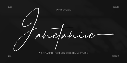 Janetanice Is a Luxury Signature Font Janetanice is perfect for product packaging, branding project, magazines, social media, weddings, or just used to express words above the background. This font is PUA encoded, which means you can access all of the glyphs and swashes with ease!
 - Coriander by Adobe,
$29.00Coriander is the work of British designer Timothy Donaldson. It started out as a doodle one afternoon Donaldson was bored and uninspired. He wrote the word Coriander" and was then distracted by the sun beating through an adjacent window. He taped the writing paper up on the window as a shade. He took it down a few months later, folded it up, and stuck it in his pocket. When the piece of paper fell out of his pocket a week later, he was inspied to draw the rest of the characters, two alphabets in his sketchbook. The final digitized characters were created by Donaldson using a Wacom tablet and later refined on the screen." - Knitting And Sewing Doodles by Outside the Line,
$19.00Knitting & Sewing Doodles are just that. If you type all caps you get 15 knitting icons and lower case is 15 sewing doodles. Knitting items include yarn, knitting, needles, ball winder, spinning supplies, stitch counter, etc. Sewing machine, buttons, thread, pin cushion, bobbin, thimble and needles, scissors, label, tape measure, darning egg, zipper, seam ripper, and pins, all in the Outside the Line style. - Hangulatin EN by URW Type Foundry,
$99.99 To obtain maximum pleasure in working with Hangulatin, please use the typeface as follows: 1 Open an OpenType-savvy program 2 Select the "Hangulatin“ typeface. 3 Copy the following test text into your document: HEL LO WORLD ! THE QUICK BROWN FOX JUMPS O VER THE LA ZY DOG . If this fails to bring about the desired result, please make sure that you are using an OpenType-savvy program and that usage of the OpenType features is activated in that program. Standard graphic programs are suited to that purpose. The same applies to Microsoft Word starting from the 2010 version upwards.To have fun and success with your new typeface, please write all words in the format shown in the sample text, i.e. all syllables need to be written in capital letters and separated from one another using spacecharacters (for single letters leave 2 spaces). If, however, a desired syllable is not to be substituted, proceed as follows: Please check + to see whether it is a word from the English language; + whether the word has been spelled correctly; + whether the word has been subdivided into syllables correctly; + whether the syllable has been terminated with a space character (allow 2 spaces for single letters).
 - Bandoliers by PintassilgoPrints,
$19.90 Dusty and charmingly rustic, Bandoliers is a hand-drawn family of eight loud speaking fonts. Not quite sure which one to pick? Ask the dust... Or just take them all! (Be sure to put your earplugs in!)
 - Kilo by Sudtipos,
$59.00 Kilo is not only almost exactly equal to the mass of one liter of water. It also flows like one. This font has edgy caps that certainly know how to keep it together at high velocities, and vowels that grin and salute you while speeding by. Sometimes you want it connected and sometimes, well, freestyle. Kilo abides. It has plenty of alternates to fulfill your three wishes and mix a hell of a cocktail for you.
 - Rainboface by Forberas Club,
$16.00 This cute font create with love and inspired below the rainbow. When the rain is coming, the rainbow definitely will blooming. So what make you think twice? just grab it fast, crafter should do crafting. The magical weapon is here, do your thing as invitation card, greeting card, gift card, or wedding decoration this font sure ready for you.
 - Eckhardt Trilinear JNL by Jeff Levine,
$29.00 Eckhardt Trilinear JNL was inspired by [and modeled from] a pen-drawn alphabet found in a 1960 edition of the Speedball® lettering textbook. As with many other "sign painter-oriented" typefaces by Jeff Levine, it is named in honor of Jeff's good friend -- the late Albert Eckhardt, Jr. Al ran Allied Signs in Miami, Florida from 1959 until his passing.
 - Made For Japan by Font Aid V,
$20.00 In March 2011, the Society of Typographic Aficionados began organizing a collaborative project that would unite the typographic and design communities. The goal of Font Aid V: Made for Japan was to raise funds to expedite relief efforts after the devastating earthquake and tsunami in Japan. Nearly 300 contributors from 45 countries sent in over 500 glyphs in a single week. Behind the scenes, volunteers Neil Summerour, Silas Dilworth, Delve Withrington, and Grant Hutchinson were up to their elbows in Adobe Illustrator and Fontlab assembling the typeface. The sheer number of submissions coupled with the complexity of some of the designs caused unforeseen delays in completing the typeface. The team not only managed the immense influx of submissions, it also had several technical hurdles and multiple content reviews to mitigate before the final font could be produced. Several months after the project was initiated, Font Aid V: Made for Japan was finally ready for distribution. With the help of Sogo Japan, all proceeds from sales of this typeface will be delivered directly to organizations in Japan, such as Second Hand and AMDA International (Association of Medical Doctors of Asia). Sogo Japan strives to help circumvent regular international charity channels and the inefficiencies associated with them. Thanks to everyone who participated and helped us spread the word about the Font Aid V: Made for Japan project. In particular, we would like to acknowledge the following individuals and groups for their participation and involvement: Jonathan Abbott, Rui Abreu, Frank Adebiaye, Tim Ahrens, Anonymous, Eero Antturi, Leonardo Aranda, Hector Carrillo Aspano, Danielle Atnip, Alejandro Cabrera Avila, Christophe Badani, Joanne Gyo Young Bae, Ben Balvanz, Cynthia Bataille, Priyanka Batra, Donald Beekman, Hannes Beer, David Berlow, Kevin Beronilla, Fabian Bertschinger, Nicole Bittner, Bart Blubaugh, Dathan Boardman, Andrew Boardman, Joel Vilas Boas, Konstantin Boldovskiy, Scott Boms, Michael Browers, Vickie Burns, Matt Burvill, Daniele Capo, Seymour Caprice, Mauro Caramella, Matevž Čas, Eli Castellanos, Sarah Castillo, Tom Censani, Pinar Ceyhan, Ivette Chacon, Hin-Ching Chan, Sarah Charalambides, Karen Charatan, Sinde Cheung, Todd Childers, Justin Chodzko, Felipe Coca, Antonio Coelho, Jefferson Cortinove, Alan Lima Coutinho, Nick Cox, Nick Curtis, Girish Dalvi, Christopher DeCaro, Thomas C Dempsey, Matt Desmond, Chank Diesel, Anum Durvesh, Suzie Eland, Engy Elboreini, Craig Eliason, Emi Eliason, James Elliott, Grace Engels, Exljbris, Hillary Fayle, Carol Fillip, Jeff Fisher, Scott Fisk, John Foley, Stuart Ford, Mathias Forslund, Brock French, Anina Frischknecht, Eric Frisino, Chiyo Fujimori, Kaela Gallo, Ayesha Garrett, Harald Geisler, Alfonso Gómez-Arzola, Adriana Esteve González, Richard Gregory, James Grieshaber, Grupoingenio, Kemie Guaida, Carlos Fabián Camargo Guerrero, Rachel Han, Erin Harris, Stefan Hattenbach, Magnus Hearn, Marissa Heiken, Georg Herold-Wildfellner, Jamie Homer, Ed Hoskin, Dav[id Hubner], Jonathan Hughes, Rian Hughes, Grant Hutchinson, Xerxes Irani, Masayuki Izumi, Jan Janeček, Hyun Kyung Jang, Julien Janiszewski, Dušan Jelesijevic, Cal Jepps, Meghan Jossick, Evamaria Judkins, July Twenty Fourth, Erica Jung, William K, Claes Källarsson, Kapitza, Asutosh Kar, Arno Kathollnig, Sami Kaunisvirta, Hajime Kawakami, Scott Kaye, Richard Kegler, Anna Keroullé, Bizhan Khodabandeh, Lara Assouad Khoury, Ilona Kincses, Becky King, Sean King, Megan Kirby, Max Kisman, Keith Kitz, Romy Klessen, Akira Kobayashi, Kokin, Kozyndan & Silas Dilworth, Atushi Kunimune, Andreas Kuschner, John Langdon, Ray Larabie, Jess Latham, Kelly D Lawrence, Matic Leban, Chien-Hao Lee, Bryan Levay, Enrico Limcaco, Andreas Lindholm, Andrew Loschiavo, Chris Lozos, Ian Lynam, John Lyttle, Gustavo Machado, Jonathan Mak, Ricardo Marcin, Jeannie Mecorney, Steve Mehallo, Cristina Melo, Martin Mendelsberg, The Midnight Umbrella Studio, Goro Mihok, Ojasvi Mohanty, Ahmed Mohtadi, Alixe Monteil, Veronica Monterosso, Dani Montesinos, Masanobu Moriyama, Misa Moriyama, Pedro Moura, John Moy Jr, Marc Marius Mueller, Shoko Mugikura, Joachim Müller-Lancé, Diane Myers, John Nahmias, Yoshihisa Nakai, Hiroshi Nakayama, Reiko Nara, Nathoo, Titus Nemeth, Nathanael Ng, Ngoc Ngo, Antoninus Niemiec, James Ockelford, Kunihiko Okano, Naotatsu Okuda, Toshi Omagari, Onikeiji, Ozlem Ozkal, Jason Pagura, Hrant Papazian, Brian Jongseong Park, John Passafiume, Patrick Griffin, Alejandro Paul, Vian Peanu, Dylan Pech, Rebecca Penmore, Peter Brugger, Jean François Porchez, Carolyn Porter, Andrew Pothecary, James Puckett, Rachel Hernández Pumarejo, James Random, Liam Roberts, Tom Rogers, David Jonathan Ross, Sumio Sakai, Sana, Stuart Sandler, Rafael Saraiva, Riccardo Sartori, Ai Sasaki, Yee Wen Sat, Agnes Schlenke, Giovanna Scolaro, Roland Scriver, Alessandro Segalini, Shawn Semmes, Jane Sheppard, Josh Sherwood, Paulo Silva, Mark Simonson, Luis Siquot, Greg Smith, Owen Song, James L. Stirling, Nina Stössinger, Tanya Turipamwe Stroh, Kevin Strzelczyk, Neil Summerour, Superfried, Shiho Takahashi, Shuji Takahashi, Yusuke Takeda, Naoyuki Takeshita, Bruno Tenan, Chung-Deh Tien, Tom, Ryoichi Tsunekawa, Alex Tye, Matthew Tyndall, TypoVar, Virginia Valdez, Beatriz Valerio, Tom Varisco, Brayden Varr, Catarina Vaz, Andy Veale, Yvette Claudia Velez, Marie-Anne Verougstraete, Abbie Vickress, Ray Villarreal, Pat Vining, Courtney Waite, Hoyle Wang, Viola Wang, Jim Ward, Grace Watling, Terrance Weinzierl, Robert Weiss, Stuart Weston, Kevin Wijaya, Dave Williams, Beau Williamson, Delve Withrington, Katherine Wood, Neil Woodyatt, Jesvin Yeo, Yokokaku, Kazuhi Yoshikawa, YouWorkForThem, Matt Yow, Charlton Yu, Yuriko, Ron Za, Jayson Zaleski, Víctor Zúñiga
 - Riborn by Garisman Studio,
$15.00 Rebirth begins with light streaks that form a vintage style with a touch of rough and stamp. Riborn with 4 fonts in number, as "ribs" in your design work, and able to beautify also strengthen your work in the form of type logos, typography, hand-lettering, packaging, t-shirts, labels, and much more. This family also equipped with an extras weight, which includes beautiful ornaments in a classic and minimalist impression.
