10,000 search results
(0.035 seconds)
- Bibliophile Script by Sudtipos,
$79.00 A friend once jokingly told me that what I really do is mine extinct arts for parts to use in modern things, like going to the scrapyard to pick up bumpers, quarter-panels and dashboards off of Datsuns and Ponies to build a shiny new Ferrari. I still kind of grin at that, but I certainly do spend a lot of time looking at old things and imagining ways they would work today. This shiny new Ferrari here is called Bibliophile, and it contains scrap heap parts from various pages by Louis Prang, the Prussian-American printer and publisher who inspired my Prangs fonts. This is my second engagement with the late 19th century man, and it’s quite a bit more intricate than just an italic Didone with a connected lowercase. Bibliophile marries Round Hand calligraphy with Italian capitals, two styles not often relayed in the same alphabet, but work together beautifully when combined well. When you combine them well with a few long-practised tricks of the trade, then mix in a few trusted features from my previous work over the years, you get my usual crazy exuberance, like 17 different shapes for the d, 21 different forms for the y, endings, beginnings, swashes, ornaments, and so on. It’s no secret that I can get carried away when I’m so consumed by an idea. — Bibliophile comes in 2 weights, each of them with over 900 glyphs covering all the latin languages. Bibliophile also comes with a bold weight, something I’m always reluctant to do with something as adventurous and complex as the structure of this historical mashup. But I couldn’t chase away the idea of increasing the contrast while maintaining the hairlines in a lowercase this narrow. Part of it was the curiosity about the outcome, and part was the sheer challenge of it. I think it turned out OK. Words set in either weight will show delicateness and elegance, and the more time you spend inside the font and micro-manage the setting, the more ways you will find to magnify either. Bibliophile can be as muted or luxurious as you want it to be. This is the kind of alphabet that fits well in fashion marketing and high-end packaging, from the very subdued to the super-exquisite. Enjoy the gleaming new vehicle made with freshly polished old parts.
 - Geminian by Sudtipos,
$49.00 Geminian is a set of fonts that started as a simple idea based on a theoretical level and developed during a long time, to be able to take shape under a creative impulse inspired by the need to communicate, today more than ever. From an astrological point of view, it celebrates and contributes to this practice, the study of stars position and movement and their influence on people's destiny. As a good Gemini, this set revives the main features of the opposite twins sign. Gemini is associated with thoughts, creativity, and communication. Its ruler Mercury (Hermes for the ancient Greeks), messenger of the Gods, and spokesman of the divine word, gives the natives of this sign intelligence, wit, eloquence and poetry. Geminian aims to be a medium to carry different messages from one end to the other. And this is because when using words, Geminis always surprise. Thanks to this gitf (and language and communication), they are able to bring up the most ingenious ideas, to solve any problem and to contribute new perspectives. These qualities may be the secret of its magnetism. The Geminian set comes in 5 styles including a script with multiple ligatures and alternates, 3 sets of caps and dingbats. In addition the complete font family supports a wide variety of Latin alphabet-based languages.
 - Vialog 1450 by Linotype,
$40.99Designed by Werner Schneider and Helmut Ness, the Vialog® 1450 typeface family has been drawn within the standards of the German DIN 1450 regulations. The typefaces conform to the DIN specifications for proportion and line thickness and also contain characters designed in accordance with its requirements. These include characters that can be easily confused, such as uppercase I and lowercase l, and the uppercase O and figure 0, with the corresponding accentuating graphemes and ligatures. In addition, letter pairs that can readily seem to merge together under less than ideal reading environments have also been redesigned. Characters like the g, J and R have also been redrawn to be more legible. Normal glyphs are available as alternatives. - New Year Poster by FontaZY,
$10.00 This display font is perfect choice for the whole variety of New Year greeting cards, advertisements, posters and banners. It has alternative graphic symbols, that fills any word or line with holiday spirit.
 - dearJoe 3 by JOEBOB graphics,
$39.00 Finally it’s done! The DearJoe 3 ‘Ultimate handwriting’ font, composed of scanned handwriting which makes it look quite convincingly real. It contains over 500 characters, 200 of them ligatures. Typing your text with this font feels like old-school writing with a pen, especially since every word will be constructed of different letter combinations. Give it a try and you’ll probably be surprised…
 - Monocolo by Kprojects,
$25.00 Monocolo is the result of a reflection on communication and of the language evolution in the new media. For this reason, some emoticons have been added to the usual glyphs and symbols and icons have been added to the regular. These glyphs, through the use of Discretionary Ligatures (DL) feature, can be recalled by using their name or idea associated with them (in the English language). This feature is designed to retrieve the icons quickly and not to be applied to a text, therefore you have to pay attention to compound words when used through DL.
 - Koobler by Zang-O-Fonts,
$25.00Named in homage of Toronto writer and spoken word performer Monica S. Kuebler, Koobler is an interesting interpretation of the classic roman font. - Shizzle by 38-lineart,
$15.00 Shizzle is a font with a graffiti marker style. The lettterform of ‘Shizzle’ essentially made by the combination of downward and upward stroke base on -15 degres angle guideline. The basic of downward stroke is pulling pen from the top left to thw bottom right with full width of marker, then the basic shape of upward stroke look like the ligh flick by using the tip of the pen from bottom right to the top left. Inspired by Hip Hop and Rap style style. ‘Shizzle’ is a slang way of saying "Sure". People generally use it to communicate agreement to another person. This term is a product of Snoop Dogg's penchant for replacing the end of words with "izzle" to sound cooler. And ‘Fo Shizzle’ (for sure) this font offers beautiful typographic harmony for a diversity of design projects, including logos & branding, social media posts and advertisements, especially with graffiti look.
 - Belly Laugh by Comicraft,
$19.00 When we asked Dave Gibbons to name the typestyle he created for the sound effects in GIVE ME LIBERTY, he must've thought we were kidding. So we humored him, and now you can get in on the joke when you order BELLY LAUGH and Dave's signature font for just $99. It's a rib-tickler alright, and it's also available separately for those of you who like to laugh alone.
 - Filibuster NF by Nick's Fonts,
$10.00The Ayes have it! The 1909 specimen catalog from the H. C. Hansen Type Foundry of Boston contained a lovely decorative face named Congress, which is the pattern for this font. It's a winning choice for distinctive headlines, and the uppercase letters are also suitable by themselves for use as decorative initials. The PC Postscript, Truetype and Opentype versions contain the complete Latin language character set (Unicode 1252) plus Central European (Unicode 1250) languages as well. - Akumaru Japanese Style by Twinletter,
$15.00 Akumaru, our newest font, is now available. In every area of the eye, there are typefaces made with unique and appealing shapes. if you want your unique project to be charming, unique, gorgeous, and sophisticated enough to hypnotize the entire audience. Then this font should be used in your project. because the letters and words in this typeface have a gorgeous, elegant, and pleasant appearance. Logotypes, food banners, branding, brochure, posters, movie titles, book titles, quotes, and more may all benefit from this font. Of course, using this font in your various design projects will make them excellent and outstanding; many viewers are drawn to the striking and unusual graphic display. Start utilizing this typeface in your projects to make them stand out.
 - Brassmark Stencil JNL by Jeff Levine,
$29.00 An antique hand-cut brass stencil of the phrase "No Hunting on These Premmises" (with the word "premises" misspelled) was the model for Brassmark Stencil JNL.
 - Soliloquous by Comicraft,
$49.00 Talking to yourself out loud? Jabbering? Muttering? Wittering away on some flight of fancy? Why not? Why wait to get compliments from someone else? If you deserve them, pat yourself on the back, give yourself a good pep talk! Create a dialogue with yourself so that you can hear what you're thinking! Whether you’re living on your own or living with others, you’re always living with yourself and you can always be there FOR yourself with a cheerful word of wisdom or two hundred. So, help yourself yourself with Soliloquous! You won't feel alone without it. But please, remember to be respectful and try not to hurt your own feelings. And shut up when you hear yourself tell yourself that’s enough. See the families related to Soliloquous: Monologous .
 - Futura Classic by Wiescher Design,
$39.50 FuturaClassic is a recut of Paul Renners original Futura. This version was what Mr. Renner wanted the Futura to look like. He had to change his very stringent design because the market wanted a more pleasing typeface. I think the original design is worth saving because it is much more typical and has a personal and distinguished touch. I have also designed Geometra Rounded with rounded endings that looks more interesting than your usual DIN type Yours trying to save the typographical past Gert Wiescher
 - Excritura by Linotype,
$29.99Excritura is the third typeface created by the Spanish designer Alex Camacho. The robust personality of this original calligraphy-derived italic font will undoubtedly also win you over.Organic shapes determine the character of Excritura, a calligraphic typeface by Alex Camacho. The font has been modelled on the work of the Spanish Architect Antoni Gaudí and was inspired by his love of natural forms and craftsmanship. This is perhaps unsurprising in view of the fact that Camacho grew up in Barcelona, home to much of Gaudí’s creative oeuvre. Organic shapes determine the character of Excritura, a calligraphic typeface by Alex Camacho. The font has been modelled on the work of the Spanish Architect Antoni Gaudí and was inspired by his love of natural forms and craftsmanship. This is perhaps unsurprising in view of the fact that Camacho grew up in Barcelona, home to much of Gaudí’s creative oeuvre. - Amoresa by Andrey Sharonov,
$22.00 Amoresa script was handwritten under inspiration of traditional calligraphy and the wonderful mystic soundtrack of Wojciech Kilar. This font comes with a clean and aged version, beautiful uppercase and lowercase alternates, ligatures and end-swashes. You can easy get alternate characters just by adding number 2, 3, or 4 after any uppercase. Each of them has from one to four stylistic alternates. Lowercase has alternates too. Aurora has eight lengths of end-swashes. Just add underscore and a number from 1 to 8 after any letter at the end of the word ( _1 _2 _3 ... _8). Amoresa has multi-lingual support (Western European characters) for the following languages: English, Danish, Dutch, Estonian, Faroese, Filipino, Finnish, French, German, Hungarian, Icelandic, Irish, Italian, Norwegian, Polish, Portuguese, Spanish, Swedish. In my examples I show how this script can be used. It's very well suited for logotypes, wedding invitations, alcohol labels, romantic cards and others. Recommended to use in Adobe Illustrator or Photoshop. The special features don't work in Microsoft Word.
 - Love seed by Aestherica Studio,
$12.00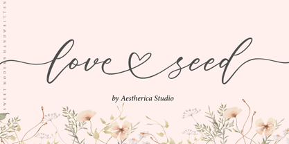 Love Seed is perfect for product packaging, branding project, magazines, social media, weddings, or just used to express words above the background. This font is PUA encoded, which means you can access all of the glyphs and swashes with ease!
 - MFC Fantasie Monogram by Monogram Fonts Co.,
$169.00 The inspiration source for Fantasie Monogram is another hand-drawn design from a vintage embroidery publication which relies on rigid geometric letterforms on a dynamic slant stepping downwards. This monogram, which evokes visions of it embossed or printed on antique cookie tins, was originally intended to adorn handkerchiefs, but the possibilities of its use are up to your imagination. This is one of many monogram designs from the early 1900’s which fall into a two letter format that is either adorned or interwoven decorative elements. Download and view the MFC Fantasie Guidebook if you would like to learn a little more.
 - Porceleina by PizzaDude.dk,
$20.00 Porceleina is elegant, what more can I say? This handmade and handdrawn font comes with a heavy loadful of diacritics - and the Opentype contextual alternates makes sure that the font cycles between the six different...yes SIX different...versions of each letter from a-z! That's quite awesome, if you ask me!
 - Nimbus Sans L by URW Type Foundry,
$89.99The first versions of Nimbus Sans have been designed and digitized in the 1980s for the URW SIGNUS sign-making system. Highest precision of all characters (1/100 mm accuracy) as well as spacing and kerning were required because the fonts should be cut in any size in vinyl or other material used for sign-making. During this period three size ranges were created for text (T), the display (D) and poster (P) for small, medium and very large font sizes. In addition, we produced a so-called L-version that was compatible to Adobe’s PostScript version of Helvetica. Nimbus was also the product name of a URW-proprietary renderer for high quality and fast rasterization of outline fonts, a software provided to the developers of PostScript clone RIPs (Hyphen, Harlequin, etc.) back then. - Prestige Elite M by URW Type Foundry,
$35.99 Prestige Elite is a word processor face which offers clear and monospaced type. The slanted versions have kept the same design as the roman font. The word Elite denoted a specific size of typewriter face. The Prestige Elite font family is easy to read, even in small sizes and is useful for tabular material with narrow columns, such as directories and lists.
 - Sculptura CT by CastleType,
$29.00 A wonderful, very condensed, 3D font. A few years ago, I was commissioned to digitize the letters from this typeface for the words 'LEGENDS OF RODEO' and liked the look of it so much that I went ahead and digitized the rest of the alphabet. This CastleType revival is very clean-cut and contains uppercase, numerals, and punctuation. Sculptura was originally designed by the Swiss designer, Walter J. Diethelm (1913-1986) in 1957.
 - Breuckelen by Glyphobet,
$14.99 Breuckelen was inspired by the regular patterns of the New York City plan. The grid of any large modern city is immediately recognizable by the distinctive pattern of major roads curving or slanting through it. This face is intended to be recognizable in the same way. It is named after the Dutch town after which Brooklyn is named, a word which also roughly translates as "broken land".
 - Hyggemand by Hanoded,
$16.00 Hyggemand is not a real word: it is a combination of Hygge (meaning ‘fun’ or ‘coziness’ in Danish) and Mand (which means man in Danish). Combined it means something like ‘Nice Man’. I just like the sound and look of this name, so if I offend Danish languages purists, then I apologise for this monstrosity! ;-) Hyggemand is a happy kids font that comes with extensive language support and a set of alternates for the lower case glyphs. If you want the cute Huggeman face, you will find it as a stylistic alternate for the asterisk.
 - Thievery by Hanoded,
$15.00 The idea behind Thievery… is that there is no idea behind it. Thievery is just a nice, legible, happy typeface. It is hand made, has lots of curly swirly bits and looks good as well. So… grab it and run!
 - French Stencil Sans JNL by Jeff Levine,
$29.00 French Stencil Sans JNL is another typeface based on vintage French tin/zinc stencils. Slightly rounded corners and a "hand-cut" look add an interesting and charming variation that breaks away from the "standard" design of other metal stencil sets.
 - Komu by DizajnDesign,
$39.00 Komu is the revival of a style of letters frequently used on billboards during the socialist period in the former Czechoslovakia. These were usually uppercase letters made of paper and covered with a layer of aluminum foil. People just had to pick the letters (that included a variety of widths and sizes) out from a box and pin them up on a styrofoam billboard, thus making it easy to announce any event. Komu consists of two styles. Version A is rather squarish and includes some weird characters (K, 5, narrow E, strange diacritics) while version B is more rounded with most letters equally wide (with the exception of E, F and L, which look really wide next to the rest). The optical disparity of the original letters was kept, so that some of them look slightly darker than the others. Komu is intended to be used on posters, books and other products about Socialism in our region and includes full support for languages based on latin script.
 - Hoax by More Etc,
$18.00 Introducing Hoax – a pre-worn sans serif with spirit, personality and distinction. This bold and semi-condensed sans serif is inspired by old copy machines and vintage prints. It is lively and eye-catching, ideal for where and when you want to make a lasting impression. Hoax is a celebration of character, a tribute to curiosity. Use this typeface and let everyone know that you mean business. OPENTYPE FEATURES: This font includes over 40 discretionary ligatures of prepositions and common words in English. These OpenType features can be accessed using OpenType friendly applications that allow the use of discretionary ligatures and stylistic sets. MULTILINGUAL SUPPORT: With over 700 glyphs, it has support for more than 150 languages, including Cyrillic script. List of discretionary ligatures: AND, ARE, AT, BY, FOR, EST, FEAT., FROM, IN, IS, OF, ON, OR, OUR, THAN, THAT, THE, TO, WITH, YOUR, CO. Each word is available in both upright and slanted versions. How to use: Activate the discretionary ligatures as you normally do in your OpenType friendly application. When activated, the words are in upright versions. To access the slanted versions, activate the first stylistic set (“Slanted Ligatures”). Happy typing!
 - Zera JNL by Jeff Levine,
$29.00Zera JNL is one of those fonts that defy any simple description. While trying out effects on Transactive JNL, Jeff Levine came up with a set of letters comprised of intersecting rings that could illustrate chain, cellular structure, bubbles or probably anything your imagination can come up with to adapt the font to a particular project. Please keep in mind this design works best in larger point sizes. - Dee by Chantra,
$18.00The Dee font family started from letter "d" and "e" followed by the rest of the letters. "Dee" is Thai word mean "Good" in English that is the source of this font name. The Dee XTS style has alternate stroke ends relative to the Dee XT style. It is included as a bonus style in the Dee Regular Set and Dee Complete packages. - Bougainville by Type Associates,
$29.95 Bougainville was inspired by many of my favorites and has been on the drawing board in excess of ten years. Only this year I decided to expand the original 1994 design to include other weight variants. The quirky Binner Gothic-inspired high axis and its funky g, rounded e, angled stroke endings together with the influence of contemporary designs such as Officina Sans, Din Mittelschrift and MetaPlus, Bougainville exhibits a similar flavor and compactness to Bodega Sans. This typeface family has been named in honor of the renowned eighteen-century French mathematician and explorer Louis-Antoine de Bougainville to whom we owe the naming of South Sea Islands and colorful tropical flora he discovered along his journey. Bougainville makes for effective headings at any size and is equally readable at semi-display sizes.
 - Sinah by Linotype,
$29.99Linotype Sinah is part of the Take Type Library, selected from the contestants of Linotype’s International Type Design Contests of 1994 and 1997. Designed by the German artist Peter Huschka, Linotype Sinah is a rounded, ornamental font with many strokes ending in teardrop forms. The letters of this wide-running font do not share a common base line. The capital S and the lower case l both drop under it although neither have descenders. Overall, Linotype Sinah has an almost Asian or Indian feel. The font must be used with generous line spacing and is intended exclusively for headlines or shorter texts in point sizes of 12 or larger. - Sinah Sans by Linotype,
$29.99Linotype Sinah is part of the Take Type Library, selected from the contestants of Linotype’s International Type Design Contests of 1994 and 1997. Designed by the German artist Peter Huschka, Linotype Sinah is a rounded, ornamental font with many strokes ending in teardrop forms. The letters of this wide-running font do not share a common base line. The capital S and the lower case l both drop under it although neither have descenders. Overall, Linotype Sinah has an almost Asian or Indian feel. The font must be used with generous line spacing and is intended exclusively for headlines or shorter texts in point sizes of 12 or larger. - Reminder Notes by Sarid Ezra,
$15.00 A new handwriting font, Reminder Notes! Reminder Notes is a handwritten font that have special features. This font have ability to add the doodle/ correction line and underline in specific word. You can add the correction line for natural looks or add the underline to highlight some word. This font also including a unique lowercase and uppercase with alternates in some alphabet. You can use this font for quotes, your cover book or playing with words in your instagram post. This font also support multilingual!
 - Skater Girl by Gleb Guralnyk,
$15.00 Hi! Presenting a cute pin-up style font named Skater Girl. It has a modern and vintage look at the same time. Also few ligatures and alternate glyphs are available in this typeface.
 - FF Identification by FontFont,
$30.99 British type designer Rian Hughes created this display FontFont in 1993. The family has 5 weights, and is ideally suited for music and nightlife. It comes with tabular lining and proportional lining figures.
 - Bathysphere by Kickingbird,
$24.00 This steam era typeface, created by Gustav Schroeder in 1884, found popular use on soap box labels and tobacco tins during its initial release. Then, later, a successful and stout revival of Gustav's face, named Othello, was carried out by Morris Fuller Benton in 1934, and the typeface's appeal widened to include items such as broadside posters featuring Boris Karloff's Frankenstein. After metal gave way to film type, Gustav's creation experienced a brief fashion moment in the 1960's, but then disappeared entirely, never re-surfacing as a full digital typeface. With the release of Bathysphere, the typeface comes full circle, having been completely redrawn from scratch using Gustav's original specimens. The new extended language support establishes the typeface firmly in the modern era, while Bathysphere's refinement of subtle blunt corners restores a deep-sea grace to this iron giant.
 - Sparkling Horizon by Letterhanna Studio,
$19.00 Introducing "Sparkling Horizon" – a mesmerizing handwritten font that captures the essence of boundless creativity and shimmering elegance. With every stroke, this font evokes the sensation of glistening sunlight on the horizon, infusing your designs with a touch of radiant charm. Whether used for invitations, logos, or creative projects, "Sparkling Horizon" brings a sense of enchantment to your words. Let your imagination take flight as you create with this font.
 - Retrozoid by PizzaDude.dk,
$20.00Retrozoid is the first Open Type font from Pizzadude. It has got loads of different autoligs, just take a look at the preview pic! - Demian by ITC,
$29.99Demian is the work of Dutch designer Jan Van Dijk. It is an informal script font whose capitals should serve as initials to the word settings of the lower case letters. Demian has the spontaneous, flowing look of true handwriting.