10,000 search results
(0.042 seconds)
- Iwan Stencil by Linotype,
$40.99 Iwan Stencil is a new revival of an old display typeface. Based on type originally designed by Jan Tschichold in 1929, the style was revived by Klaus Sutter in 2008. The letterforms in this peculiar design are very high contrast; all of the thin bits are much thinner than the thick parts. They have a modern, upright axis. All in all, the creation has a bit of a Bodoni-gone-crazy touch. The thin elements are the unique part of the design that binds this face together. They almost naturally fade away in the stencil gaps (or pylons), making you wonder if you are really looking at a stencil face at all. These thins contribute greatly to the typeface's overall serif-style, making the design at least a semi serif typeface, if not a full serif one. The lowercase n, for instance, has no serifs of its own, but many of the other letters have clear ones, or serif-like terminals. A serif stencil face is a peculiar variety, especially in this day and age, but in the past they were much more common, if not the norm, The Iwan Stencil typeface has only one weight. Naturally, this is just for display. Use Iwan Stencil to cut real stencils, or only to create the effect of stenciled type in your design work. Ivan Stencil includes all of the characters that you have come to expect in a font. Just because this design was originally made in 1929 does not mean that is has a 1929 character set. Instead, it includes a 21st century, with extended European language support Jan Tschichold, who we have to thank for today's Iwan Stencil inspiration, was a man of many faces. A trained calligrapher who went on to codify the New Typography, would go on to become a teacher, a classical book designer, and the creator of the Sabon typeface. Like all young designers, he was occasionally in need of money. Before his emigration from Germany in 1933, he took on many kinds of commissions. In the late 1920s, a time full of waves of economic turmoil within Germany and across the world, he began designing a typefaces for different European companies, mostly display things like this. For a time during the mid-1920s, Jan Tschichold went by the name Iwan" "
 - Letric by Mans Greback,
$59.00 Letric is a high-energy capital typeface. With traits of a brush comic title, it has rough and cut edges, electric in nature but with smooth curves. The strokes are reminiscent of a tiger's skin, making for a great jungle or wildlife font. Used in the right context, with the right wording, it fits perfectly as a vintage thriller/splatter/horror movie header typography. This cartoon sans-serif is slanted/italic as default but also comes with a professional upright style. The font is built with advanced OpenType functionality and has a guaranteed top-notch quality, containing stylistic and contextual alternates, ligatures and more features; all to give you full control and customizability. It has extensive lingual support, covering all Latin-based languages, from North Europe to South Africa, from America to South-East Asia. It contains all characters and symbols you'll ever need, including all punctuation and numbers.
 - Konseric by Picatype,
$18.00 Konseric is an elegant serif display font of a classic style that has been modernized with unique curves and cut-ins making it one of the most memorable top fonts on the market. It represents vintage aesthetics in a modern and minimalist way. Fonts include special uppercase letters, alternative characters and beautiful ties and multilingual support. This versatile font can be used for wordmark logos, mastheads, pull quotes & monograms that show feminine and masculine qualities, elegant packaging or invitation cards and almost all creative designs. To enable the OpenType Stylistic alternates, you need a program that supports OpenType features such as Adobe Illustrator CS, Adobe Indesign & CorelDraw X6-X7, Microsoft Word 2010 or later versions. We hope you enjoy the font, please feel free to comment if you have any thoughts or feedback. Or simply send me a PM or email me at picatypestudio@gmail.com. Thanks for purchasing and have fun!
 - Quirky by Fine Fonts,
$29.00 The origin of Quirky lay in the Duke Ellington number It don't mean a thing if it ain't got that swing. For some time I had wanted to create a font from expanded stroked lines. I wanted to produce a light-hearted font, but with some classic touches. One day, whilst doodling in Adobe Illustrator, Quirky’s letterforms just appeared on screen as if from nowhere. First I drew the test word ‘hamburgefonts’ and then just kept going, unable to stop. Character after character appeared as if by magic. From the start, Quirky had a life of its own. The letterforms are rather more sophisticated than merely outlined stroked lines. Subtle adjustments to compensate for optical effects have been been incorporated. For example, horizontal stems have thicknesses slightly less than vertical stems and where stems join together, the thickening effect has been reduced by cutting into the joint. Being almost monoline, Quirky works well reversed out of a solid background and for TV credits. The Quirky fonts are fun fonts, so set, laugh and enjoy! I hope Quirky will give you as much pleasure in using it as I got in creating it! Shortly after the roman version was born, an italic version and then a thin version were created to form a family of three fonts.
 - Vinetters by Ingrimayne Type,
$6.50 Vinetters has letters on the alternating leaves of a vine. It is monospaced and uses the OpenType contextual alternatives (calt) feature to alternate leaves as the vine snakes its way across the page, putting leaves with the base down between leaves with the base up. The family has two styles, one with transparent leaves and the other with solid leaves, and these two styles can be used in layers to add color. The family has a large set of accented characters but omits some symbols that are used primarily in technical text. Spaces between words can be left blank or filled with connecting vine using the brackets, trademark-infinity, doubledagger-summation, radical-approximatelyequal, or fi-fl characters. The characters on the leaves are derived from the typeface IngrianaCasual. Topics for which using Vinetters may be appropriate include trees, plants, leaves, nature, changing seasons, and outdoor life.
 - Bigruns Brush by Din Studio,
$29.00 Looking for a font that will make your branding stand out? Do you sometimes have an appetite for a bit more wholesome typography? Looking for a fabulous, stylish, and adventure font? We've got what you want. Bigruns Brush - A Display Brush Font Bigruns Brush is a display font is accompanied by a gorgeous handcrafted script brush font that works together in perfect harmony. This font made all in uppercase that easy on the eyes and nice to look while it’s also easy to read. Designed primarily as a captivating font to add the right amount of modernity and style, The best choice to ensure a great font match for your designs and projects! Well suited to titles, poster designs, branding, quotes, and logos. Our font always includes Multilingual Support to make your branding reach a global audience. Features: Ligatures Stylistic Set PUA Encoded Numerals and Punctuation Thank you for downloading premium fonts from Din Studio
 - Nautilus Text by Linotype,
$29.99Hellmut G. Bomm first released his Linotype Nautilus typeface in 1999. Ten years later, he updated and expanded the design. Now users have two additional families at their disposal: Nautilus Text and Nautilus Monoline. Nautilus Text bears more similarities to the original Linotype Nautilus. The letters shows a high degree of contrast in their stroke modulation. Bomm's intention was to create a clear, highly legible face. While the even strokes of most sans serif types eventually tire the eyes in long texts, the marked stroke contrast of Nautilus Text lends the face its legibility. The characters were drawn with a broad tipped pen. Like serif typefaces, the forms of Nautilus Text display a variety of elements. Its characters are narrow, with relatively large spaces between them. This helps create an overall open appearance, and allows a large quantity of text to fit into a small space. Nautilus Monoline's letters share the same overall proportions as Nautilus Text's. But as their name implies, they are monolinear. Their strokes do not have the calligraphic modulation that Nautilus Text features. This allows them to set another sort of headline, making Nautilus Monoline a refreshing display type choice to pair with body text set in Nautilus Text. - Nautilus Monoline by Linotype,
$29.99Hellmut G. Bomm first released his Linotype Nautilus typeface in 1999. Ten years later, he updated and expanded the design. Now users have two additional families at their disposal: Nautilus Text and Nautilus Monoline. Nautilus Text bears more similarities to the original Linotype Nautilus. The letters shows a high degree of contrast in their stroke modulation. Bomm's intention was to create a clear, highly legible face. While the even strokes of most sans serif types eventually tire the eyes in long texts, the marked stroke contrast of Nautilus Text lends the face its legibility. The characters were drawn with a broad tipped pen. Like serif typefaces, the forms of Nautilus Text display a variety of elements. Its characters are narrow, with relatively large spaces between them. This helps create an overall open appearance, and allows a large quantity of text to fit into a small space. Nautilus Monoline's letters share the same overall proportions as Nautilus Text's. But as their name implies, they are monolinear. Their strokes do not have the calligraphic modulation that Nautilus Text features. This allows them to set another sort of headline, making Nautilus Monoline a refreshing display type choice to pair with body text set in Nautilus Text. - Silo Slab by TypeUnion,
$25.00 Designed and built in London by TypeUnion, Silo Slab is a fluid slab serif typeface embodying energetic curves and a clean, functional structure. The Silo Slab Family is made up of 6 weights, which range from a delicate Extra-Light, all the way through to a punchy, loud Extra-bold and each carry a versatility for multiple applications and uses. Each weight has a matching italic. Silo Slab features open type alternate characters, and extensive language support to provide a flexible, substantial user experience.
 - Mykilove by Allouse Studio,
$16.00 Mykilove a Fun Lovely Font. Mykilove is perfect for any tittles, logo, product packaging, branding project, megazine, social media, wedding, or just used to express words above the background. Mykilove come with lovely stylistic alternates, ending swash, and Multi-Lingual Support. We highly recommend using a program that supports OpenType features and Glyphs panels like many of Adobe apps and Corel Draw, so you can see and access all Glyph variations. Enjoy the font, feel free to comment or feedback, send me PM or email. Thank You!
 - Kikyo by Allouse Studio,
$16.00 Kikyo a Bold Handwritten Font that will bring you an a "badass" impression. Kikyo come with Multi-Lingual Suopport. We highly recommend using a program that supports OpenType features and Glyphs panels like many of Adobe apps and Corel Draw, so you can see and access all Glyph variations. Kikyö is perfect for product packaging, branding project, megazine, social media, wedding, or just used to express words above the background. Enjoy the font, feel free to comment or feedback, send me PM or email.
 - Quesited by Allouse Studio,
$16.00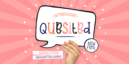 Proudly Preseningt, Quesited is a Handwritten Quirky Font. Quesited is perfect for any tittles, logo, product packaging, branding project, megazine, social media, wedding, or just used to express words above the background. Quesited come with Multi-Lingual Support. We highly recommend using a program that supports OpenType features and Glyphs panels like many of Adobe apps and Corel Draw, so you can see and access all Glyph variations. Enjoy the font, feel free to comment or feedback, send me PM or email. Thank You!
 - Realitta by Allouse Studio,
$16.00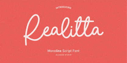 Proudly Presenting, Ralitta a Monoline Script Font. Ralitta is perfect for any tittles, logo, product packaging, branding project, megazine, social media, wedding, or just used to express words above the background. Ralitta also come with Multi-Lingual Support. We highly recommend using a program that supports OpenType features and Glyphs panels like many of Adobe apps and Corel Draw, so you can see and access all Glyph variations. Enjoy the font, feel free to comment or feedback, send me PM or email. Thank You!
 - Keithey by Enigma Lettering Studio,
$16.00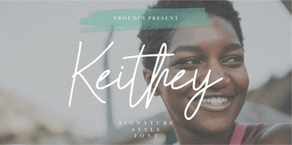 Introducing by Enigma Lettering Studio Proudly Present, Keithey Kithey is a Signature Style Font Keithey is perfect for product packaging, branding project, megazine, social media, wedding, or just used to express words above the background. Keithey also come with Multi-Lingual Support. We highly recommend using a program that supports OpenType features and Glyphs panels like many of Adobe apps and Corel Draw, so you can see and access all Glyph variations. Enjoy the font, feel free to comment or feedback, send me PM or email.
 - Asher Punk by Allouse Studio,
$16.00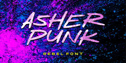 Proudly Presenting, Asher Punk a Rebel Handwritten Font. Asher Punk is perfect for any tittles, logo, product packaging, branding project, megazine, social media, wedding, or just used to express words above the background. Asher Punk also come with Multi-Lingual support. We highly recommend using a program that supports OpenType features and Glyphs panels like many of Adobe apps and Corel Draw, so you can see and access all Glyph variations. Enjoy the font, feel free to comment or feedback, send me PM or email. Thank You!
 - Naofumi by Allouse Studio,
$16.00 Proudly Present, Naoufumi a Rough Brush Font. Naofumi come along with Multi-Lingual Support to fulfill your need. We highly recommend using a program that supports OpenType features and Glyphs panels like many of Adobe apps and Corel Draw, so you can see and access all Glyph variations. Naoufumi is perfect for any tittle, product packaging, branding project, megazine, social media, wedding, or just used to express words above the background. Enjoy the font, feel free to comment or feedback, send me PM or email. Thank You!
 - Tall Tales by Comicraft,
$39.00 In a World where no stories are small stories... In a Land where words need to be Bold, Meaningful and maybe even Italic... Comes a font worthy of telling Marvelous Tales some thought Too Tall, Too Astonishing to be told... And when those Untold Stories, those Astounding Tall Tales, are finally told... THAT WORLD WILL NEVER BE THE SAME AGAIN! From Visionary Font Director John Roshell and the Studio that brought you BlahBlahBlah, you must not miss TALL TALES! In theaters and Streaming now.
 - Kamuy by Andinistas,
$39.95 Kamui is a font designed by Carlos Fabian Camargo G. and used to write headlines. Its strategy makes it ideal for covers and advertisements with Japanese-style manga comics requiring latin style. Precisely its purpose was inspired by typographical classics such as Mistral by R. Excoffon and Zapfino by H. Zapf that then were diluted by separate strokes as blackletter calligraphy. However, high doses of miscegenation and lettering untimely torn between 50% esthetic and 50% legibility. That way his radical expression is highly profitable for composing and designing words and phrases with Eastern look. And more importantly, the writing seems drawn quickly with thin-tipped brush staining over a rough surface, from that process comes the idea of corroded outlines and changes in contrast. In conclusion, some diagonal strokes, horizontal, curved and vertical stand or hide from their simulation of scarcity or abundance of ink clots. That way each stroke seems inconsistent, footprint of the 423 brush drawing glyphs in Regular Kamuy. In that sense, the OpenType features included are: Standard Ligatures, Contextual Alternates, discretionary ligatures, swash, stylistic alternates, alternatives for titles, ordinals, fractions. And to end the Variable “Kamuy Dingbats” has is 52 fictitious drawings and zamurais.
 - Machtwerk by Volcano Type,
$29.00Religions are filled with signs and symbols. Some of them, like the the star of David and the Swastika-Rune received other significance during the third Reich. The superimposition of these two shapes creates the basis for this font. Matchwerk is a font, that critically questions and recalls the darkest chapter of our history. - Salvador by Homelessfonts,
$49.00 Homelessfonts is an initiative by the Arrels foundation to support, raise awareness and bring some dignity to the life of homeless people in Barcelona Spain. Each of the fonts was carefully digitized from the handwriting of different homeless people who agreed to participate in this initiative. A biography/story of each homeless person captures their story, to help raise awareness and bring some dignity to the life of homeless people. Monotype is pleased to donate all revenue from the sales of Homelessfonts to the Arrels foundation in support of their mission to provide the homeless people in Barcelona with a path to independence with accommodations, food, social and health care. Salvador was born in a small village in the province of Seville, Spain where he lived until 2002. During many years he worked in restaurants, construction, and in the fields, until he decided to go try his luck in Palma de Mallorca. There he worked in hotels and in construction, until the economic crisis erupted and he was left without work or benefits of any kind and he began to live in the street: “The street has few good things, but it teaches you to be more selfless, to share with others what you have, even if it isn’t much.” In 2006, a friend encouraged him to come along to Barcelona and bought his plane ticket. Once there, things did not go much better and he had to continue living in the street. A year ago he left behind that life and now he explains his experience in guided tours to school groups: “I like it because I see that many of them are interested and they ask questions. It is good that they learn.”
 - D-block A by AType,
$19.95The history of this font is those. Once I assorted the old children's books which have stayed from times of my childhood. On one of them I have seen a trade mark of a printing house consisting of two Russian letters "L" and "B". From they were begun also with my font. And though finally from these letters a little that remained, elements of these letters can be seen in font D-block B. - La Luxes by Set Sail Studios,
$22.00 Indulge yourself in a luxurious typography pairing with La Luxes; a classic font duo consisting of an elegant Script & ligature-rich Serif. These fonts are designed to pair harmoniously, and lend themselves to high end branding, logo designs, product packaging & invitation designs. Here’s a run through the fonts in more detail; 1. La Luxes Script • A clean, elegant hand-drawn script font containing upper & lowercase characters, all punctuation and numerals. Also contains 30 ligatures to help the text flow naturally and add a custom-made feel. 2. La Luxes Serif • A stylish & modern all-caps serif containing upper & new lowercase characters, all punctuation & numerals. Also contains 38 ligatures and 11 special characters giving you a variety of layout options. Using Ligatures and Special Characters; Both fonts contain a large range of ligatures (unique double-letter pairings) to provide you with more customisation options; Most programs will automatically have Standard Ligatures switched on for you, if not you will need to enable this OpenType feature. The Serif font contains a number of raised ‘small caps’ (A, E, O, U, C) and characters with elongated tails (L, K, R,). These can be accessed by switching on ‘Stylistic Alternates’ in any OpenType capable software and typing these characters. The star icon can be accessed simply by typing the asterisk key (*) with the Serif font. All Ligatures and Special Characters can also be accessed via a Glyphs panel. This is available on most Adobe software & Affinity Designer. The stylised vertical ‘AND’ and ‘CO’ icons can only be accessed this way. Language Support; Both fonts support English, French, Italian, Spanish, Portuguese, German, Swedish, Norwegian, Danish, Dutch, Finnish, Indonesian, Malay, Hungarian, Polish, Turkish, Slovenian
 - Cohen by TripleHely,
$16.00 Hello! Let me introduce Cohen – a handwritten font named in memory of the great poet and singer Leonard Cohen. On the day he passed away I did my routine calligraphy practice and wrote a part of his song 'Night Comes On'. You may see this work in presentation pictures, and after time I designed a font based on this calligraphy. Cohen signature font is perfect for logos, branding, web, blog headlines, invitations, magazine and book design, product packaging – or for any text on postcards and on your favorite photos. Cohen includes: a standard set of characters with wide multilingual support: Western-, Central- and Eastern-European, Baltic, Turkish, Latin-type Africans, and Asian (94 languages in total) two additional character sets: lowercase letters with alternates shapes and lowercase letters with a little end-swash - for the position at the end of a word 39 ligatures for double letters and frequent combinations Cohen has a large number of embedded context-dependent auto-replacement features that give the text a natural, handwritten look and correct inharmonious combinations of letters. These features work well in many apps (even simple ones like Notepad/TextEdit), and if you need to customize their application – you could use programs that support OpenType features (for example, Adobe apps or CorelDraw). All these additional glyphs are PUA-encoded, so if your software does not support OpenType — you could access them through Character Map (Windows) or Font Book (Mac). I hope you will like Cohen and create great designs with it! And if you have any questions, feel free to contact me via e-mail: triple.hely@gmail.com
 - Rough Motion by Atharuah Studios,
$16.00 Introducing the Rough Motion Font Duo! Rough Motion is strong and high-energy font. Make it a balanced composition in a sans serif font and a brush pen in a script font to show the realistic elements of the font. This is a font that is suitable for you to use in all your creative needs. Such as branding, logos, posters, web design, music artwork, etc. Each font file includes uppercase, lowercase, numbers, punctuation, and multilingual support. Rough Motion Script also includes a set of 10 swashes, ideal for underlining individual words and adding that extra 'custom' style. You can access it in every alternative letter A-J. That's it! I hope you enjoy it. Feel free to comment if there are issues or queries. You can also say hello to me on Instagram: https://www.instagram.com/atharuah_ Thank You!
 - Gridiot by Peter Bain,
$10.00 Gridiot is a constructed, semi-serif, two-weight stencil family that expands an approach taken by Josef Albers. Intended for display or headline setting, it features chamfered or bevel-cut corners, used instead of curves. The individual letter components sometimes vary in depth, avoiding a strictly modular approach, while the widths are kept consistent. The lining figures provide a standard set of numbers, and the oldstyle figures align with the lowercase, encouraging lowercase-only setting. Currency and other useful numerical symbols are provided in both versions. The zero is intentionally lighter, following early Renaissance types; there are filled versions as stylistic alternates. While horizontal scaling distorts the relationship between verticals and horizontals in a typeface, since every chamfer in Gridiot is at 45°, changing the horizontal scaling of the type will affect all diagonals equally. When used at a large size, or for a just few words, Gridiot can be very tightly spaced. Remember, any idiot can design a typeface on a grid: Gridiot.
 - NT Gagarin by Novo Typo,
$26.00 Anna Gagarin is the loving matriarch of the Gagarin Family. Her life was full of love and passion. She had several affairs with Futurist and Contstructivist artist in the beginning of the 20th century. She was in love with the Russian poet Vladimir Majakovski (born on July 19th, 1893 and died in Moscow on the April 14th, 1930). She gave birth to his son Boris. She called him 'a cloud with trousers'. After this love story, Anna Gagarin met the designer and artist Gustav Klucis in Italy. His radical and political ideas were much too childish for her. After a period of love and passion Anna gave birth to his son. At that time they were in Italy, which explains his italic forms. After her return to Moscow in the beginning of the 1920's Anna was introduced by Alexander Rodchenko. They were heavenly in love but Ilja Stepanova was very jealous on her husband. Anna once said that 'Alexander fills mine construction with love...' That phrase can be an explanation for the term Constructuvism as an art movement. Alexander was the great love of Anna. She gave birth to their love-baby Dimitri Gagarin. That night Alexander designed his most famous poster. A decade before that Anna told it was 'a time for a change'. In a local bar in Sint Petersburg she met Gregory Rasputin. At that time Rasputin was a well known person and a respected member of the Sint Petersburg upper class.His diabolic character influenced Anna and after several months she gave birth to their son Kurt. He inherited the main characteristics of his father. The Gagarin Family wants to give love and wants be loved...
 - Elegant Hand Script by TypoGraphicDesign,
$19.00 KONZEPT/BESONDERHEITEN Der schludrige und raue handgeschriebene Charakter, geben der Schrift eine hohe Wiedererkennung und eine gewisse Einzigartigkeit. Das Motto lautet handgemacht, rau und elegant. EINSATZGEBIETE Das dreckige, elegante Aussehen der handgeschriebenen Schrift würde sich über folgende Gebiete sehr freuen und sich dort dreckig heimisch fühlen: Logos/Wortmarken aller Art, Flyer für fast jede Party, PlattenCover, Comic-Cover und Graphic Novel Lettering, Plakat Design, Movie-Font, als Headlineschrift für print und digitale Magazine, Bücher und Webseiten u.v.m. TECHNISCHE INFORMATIONEN Überschriften | Auszeichnungsschrift | dreckige Handschrift »elegant hand script«. OpenType Schrift mit 223 Glyphen & 1 Schriftschnitt (regular). Symbole und Ligaturen (mit diakritischen Zeichen & €)
 - MODERN Hand Fraktur by TypoGraphicDesign,
$19.00 KONZEPT/BESONDERHEITEN Der schludrige und raue handgeschriebene Fraktur Charakter, geben der Schrift eine hohe Wiedererkennung und eine gewisse Einzigartigkeit. Das Motto lautet handgemacht, rau, Fraktur & modern. EINSATZGEBIETE Das dreckige, dicke Aussehen der handgeschriebenen Schrift würde sich über folgende Gebiete sehr freuen und sich dort dreckig heimisch fühlen: Logos/Wortmarken aller Art, Flyer für fast jede Party, PlattenCover, Comic-Cover und Graphic Novel Lettering, Plakat Design, Movie-Font, als Headlineschrift für print und digitale Magazine, Bücher und Webseiten u.v.m. TECHNISCHE INFORMATIONEN Überschriften | Auszeichnungsschrift | Fraktur Handschrift »Modern Hand Fraktur«. OpenType Schrift mit 258 Glyphen & 1 Schriftschnitt (regular). Symbole und Ligaturen (mit diakritischen Zeichen & €)
 - Helena Luis by Romie Creative,
$13.00 Helena Luis is a modern and elegant calligraphic script font that comes with beautiful character changes, a kind of classic decorative copper script with a modern touch, designed with high detail to bring stylish elegance. Helena Luis is smooth, clean, feminine, sensual, glamorous, simple and very easy to read, because there are many fancy and simple letter connections. I also offer several alternative styles suitable for many letters. This font style is perfect for various designs of your work, such as invitations, labels, restaurant menus, logos, fashion, makeup, stationery, novels, magazines, books, greeting / wedding cards, packaging, labels and others. Helena Luis contains 385 characters and alternatives, including various language options. With OpenType features with alternative styles and elegant ties. The OpenType feature does not use manuals, but you can access it manually and for the best results needed for your creativity in this variation of glyphs. The Open Type feature can be accessed using Open Type savvy programs such as Adobe Illustrator, Adobe In Design, Adobe Photoshop Version of Corel Draw X, and Microsoft Word. And this font has provided unicode PUA (special code font). All alternative characters can be easily accessed by craftsmen or designers.
 - Klartext Mono by Fonts With Love,
$20.00 Klartext [plain talking, clear words] A modern monospaced type family of 10 weights. Klartext Mono combines a classical monospaced font and modern monolined sans-serif with a humanistic touch. It is characterized by a large x-height, slightly condensed glyphs with well shaped curves and soft strokes. As a special feature, Klartext contains a bunch of uncommon glyphs like the German capital sharp S, a nice arrowset and a basic phonetic alphabet (20 letters in IPA Extensions, some more in Latin Basic thru Extended B).
 - Sherbet BF by Bomparte's Fonts,
$39.00 Sherbet BF is a robust, bouncy handwritten-style script with an enthusiastic voice. A number of Automatic Ligatures and Contextual Alternates, are included in the font, along with Stylistic Alternates for lowercase letters g, and y. Enable these features in OpenType-savvy programs (such as InDesign CS+, Illustrator CS+ and QuarkXpress 7 and later) to enhance your typography. As with most scripts, it is not recommended that word settings be in all uppercase, but rather in settings of initial capitals together with lowercase letters.
 - Kaffemoster by Hanoded,
$16.00 Kaffemoster is a Swedish slang word for a lady, usually a bit older, who likes to drink coffee and gossip while she’s drinking it. I have decided to study a bit of Swedish, so I downloaded an app and I am practising my Swedish vocabulary every night! Det går långsamt, men jag klarar det! Kaffemoster is a nice, handmade pencil font. It comes with extensive language support (including Swedish) and a nice set of alternates for the lower case letters. Kaffemoster är ett riktigt bra typsnitt!
 - Bessemer by Sivioco,
$10.00 Bessemer is an all-caps sans-serif display font inspired by industrial lettering from the 20th century. On its own, it has a predominantly factory-made feel, but is versatile enough to work well in a variety of settings. In other words, it feels just at home on a series of technical guides as it does on a range of hair styling products. Bessemer comes in 5 weights ranging from Light to Bold and has been designed with chamfered edges. This makes it really easy to customize and create your own custom type. It also includes the following OpenType features: • Proportional Lining Figures • Tabular Lining Figures • Superior & Inferior Figures • Numerators & Denominators • Ordinals • Fractions Perfect for logos, posters, t-shirts, packaging and use in video. Delivered in TTF and OTF format. Supports all Western, Central and South Eastern European languages.
 - Aviano Future Variable by insigne,
$99.99 Because you demanded it, the Aviano series is back with a variable version of the futuristic sans serif Aviano Future. Aviano Future’s strong letterforms will make you look like a rock star. Aviano Future Variable is a medium-contrast sans serif titling face that has a bold and futuristic look. It has a bowed square shape which gives it an interesting appearance that is both unique and eye-catching. Given that it has a variable axis any weight can be selected with no loss of clarity or legibility. Aviano Future's expanded forms give the letterforms heft and intensity. Aviano Future is a powerful yet adaptable title face that builds on the award-winning traits of Aviano and elevates them. Aviano Future Variable contains a ton of OpenType capabilities and comes in ten different defined weight instances with "fast" italic forms for emphasis. Want to use more traditional rounded forms? Need swash forms? Art Deco alternates? Aviano Future includes 400 alternate characters. Twelve style sets are available, two sets of art deco inspired alternates, small forms, tough swash, constructivist titling and traditional stylistic alternates. Aviano Future also includes 40 discretionary ligatures for artistic typographic compositions. Additionally, there are glyphs in this family to accommodate a variety of languages, and Cyrillic support was added in 2022. An extensive selection of sans serif typographic systems can be found in the Aviano family. The typefaces can be used alone or in combination to suit the needs of any project. The family's fonts have all been meticulously designed to assist ensure maximum impact and usability at any size. Aviano, Aviano Serif, Aviano Sans, Aviano Didone, Aviano Flare, Aviano Copper, and Aviano Slab are presently part of the Aviano collection. A skilled designer who wishes to create a technological, futuristic, or epic design should consider Aviano Future. Aviano Future Variable will make your design stand out from the competition, regardless of whether you are designing a logo, poster, flyer, website header, or banner ad. Why wait? With the exciting and versatile Aviano Future Variable at your disposal, reach new heights and create a brand that stands out from the rest.
 - Jetlab by Swell Type,
$15.00 Jetlab is a typographic time machine that drops you squarely into the techno-futuristic optimism of the 1960s, 1970s and 1980s! While certain weights may conjure familiar space race-era logos from the sci-fi movies, board games, sports teams, new wave bands and sneaker brands of the late 20th century, the complete 45-weight Jetlab font family is loaded with modern features to power your retro-futuristic designs with near-infinite versatility. Features: 45 weights provide widths from squeezed to stretched and weights from light to heavy, plus reverse-stress (that's thick horizontal strokes with thin verticals) high, medium and low crossbar options upper and lowercase letters provide two distinct styles a four-axis variable font provides precise control of width, vertical & horizontal weight, and crossbar height 500 glyphs support 223 languages, including Western & Central Europe and Vietnamese
 - Baldufa by Letterjuice,
$66.00Baldufa is a charming typeface with strong personality, which looks very comfortable in text. There is a search to obtain complicated curves and detailed features, which give the typeface a touch of beauty and elegance. However, this is also a self-conscious design that claims appreciation for quirkiness and human imperfection through the rounded serifs and irregular vertical stems. The typeface family is also a multi script project, containing Latin and Arabic scripts. The Latin consists of Regular, Bold and Italic styles, including Small Caps and many other typographic features. Whereas Arabic Naskh includes Regular and Bold weights. The whole family has been designed to work harmoniously together to help to produce catalogues and small publications of cultural content. We believe that Baldufa is a tiny but nice contribution to build bridges between cultures and this make us very happy. The letterforms in the Latin are inspired by the slight distortions and idiosyncrasies that came with old printing methods. It has distinct, features such as rounded serifs, irregular vertical streams, ink traps and extremely thin junctions. In the Italic, serifs have been removed to enhance movement and expressivity. These experiments in form have not come at the cost of legibility: The typeface remains suitable for both small and display text. To certain extent, the design of the Arabic gathers the same interest for experimentation than its Latin companion. Baldufa Arabic respects the basic features of Arabic script such as thick stokes in the baseline, multiple vertical axis, genuine stem modulation and good linking between words. However, it steps away from traditional Calligraphic Style. It has rounded top terminals and the traditional contrast between curves and straight stokes has been softened. Letter shapes sometimes slightly differs from tradition in order to obtain more expressivity. Overall, Arabic has been designed to acquire the same elegant and quirky aspect of the Latin. - Wendling by Good Java Studio,
$20.00 Wendling - with Sweet Swashes is romantic script font make with many swashes in start and ending character. Make a beautiful style heart with swash. This font includes full set of swash heart lowercase letters, numerals, and punctuation. Also it includes: - short lowercase beginning and ending swashes - lowercase ending heart swashes, which serve to connect two words or letters. This is so perfect for invitations, monograms, wedding, fashion, branding, label. or logotype.
 - Coffee & Tea Doodles by Outside the Line,
$19.00 Coffee and Tea Doodles are a font of coffee and tea things-- beans, cups, drinks, tea bag, iced tea, tea sets etc. Perfect set of clip art for coffee or tea shop menus, ads, invitations, etc. Includes scripted words that include coffee, tea, coffee break and tea for 2.
 - Miss Donna by Scholtz Fonts,
$15.00 Miss Donna - contemporary, powerful, versatile and casual. Curvy, sassy, fast-talking, and utterly useable, she takes you into the world of movie posters, decor ads, fashion posters and tags, greeting cards and invitations. Her lines are bold, clean and legible. The Miss Donna family comes in four styles: - REGULAR - clean good lines and generous curves - for decor ads, greeting cards, copy - NARROW - slim (more compact), and elegant with contained curves - for greeting cards, invitations, copy - BLACK - bold statement, round, generous curves - for movie posters, fashion posters - BLACK CAPS - especially designed for "all-caps" printed text. Use for headings & subheads. Miss Donna Black Caps contains capitals in two sizes and this gives you the ability to generate text of two types: - a correctly spaced and kerned upper case, OR - a TRUE Small Caps -- as opposed to the false Small Caps produced by a well-known word processing application. In a correctly proportioned Small Caps the stroke width should not be reduced in the same proportion as the letter height is reduced. The stroke width of the small capitals should rather be equal or close to the stroke width of the corresponding upper case characters. Note: When using script fonts it is NOT usually advisable to use text in ALL caps. The best effects for headings and subheads are obtained with an initial upper case letter followed by lower case characters. BUT, Miss Donna will still produce excellent results with all caps if you are using an application that supports kerning. If you are using upper and lower case then it is not necessary to use kerning, although it may make a slight difference on occasion. Miss Donna contains over 235 characters - (upper and lower case characters, punctuation, numerals, symbols and accented characters are present). It has all the accented characters used in the major European languages.
 - Postal JNL by Jeff Levine,
$29.00Postal JNL lets you print out initials, words or phrases emulating postage stamps. Although there's a limited character set, it can be used along with Printing Set JNL to match any additional word copy.